|
| Group |
Round |
C/R |
Comment |
Date |
Image |
| 75 |
Aug 23 |
Reply |
Murphy, your comments are appreciated. What border (color/width) do you suggest for this image and I will try it. Ray |
Aug 17th |
| 75 |
Aug 23 |
Reply |
Vince, I have to admit that I have never used borders so using one does not come to mind - in fact, I have been in competitions where borders were used by given negative comments by the judge. Given that I might try in the future just to see how the final image appears. Yes, upper right darker due to junk in that corner and if not so dark would need a lot of cloning. Thanks, Ray |
Aug 10th |
| 75 |
Aug 23 |
Reply |
Thanks Gaetan - While I still use my Nikon D850 for most photography, its nice to have something in my pocket that is easy to use and more flexible in terms of taking photos in difficult to reach subjects. |
Aug 8th |
| 75 |
Aug 23 |
Comment |
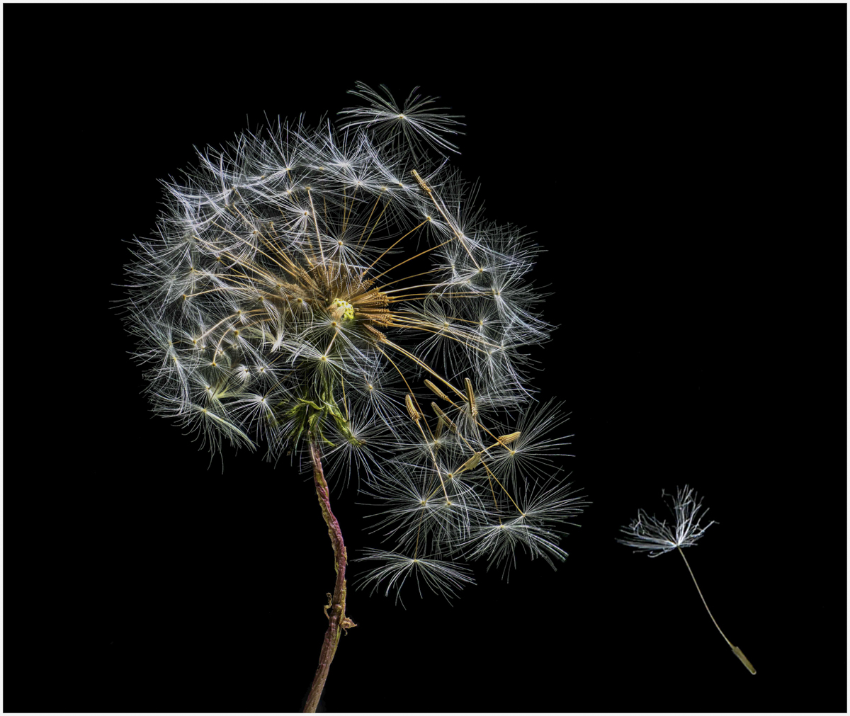
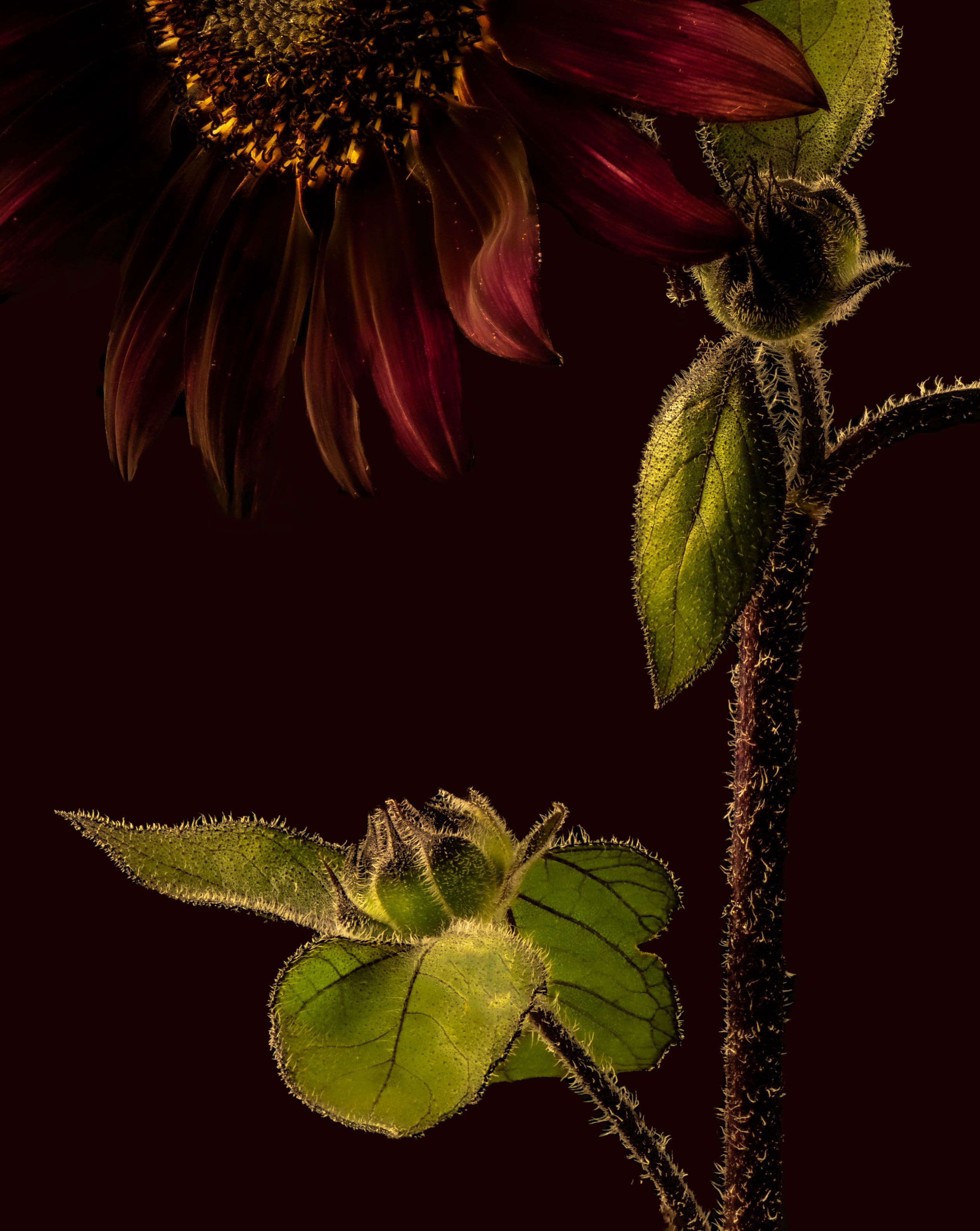
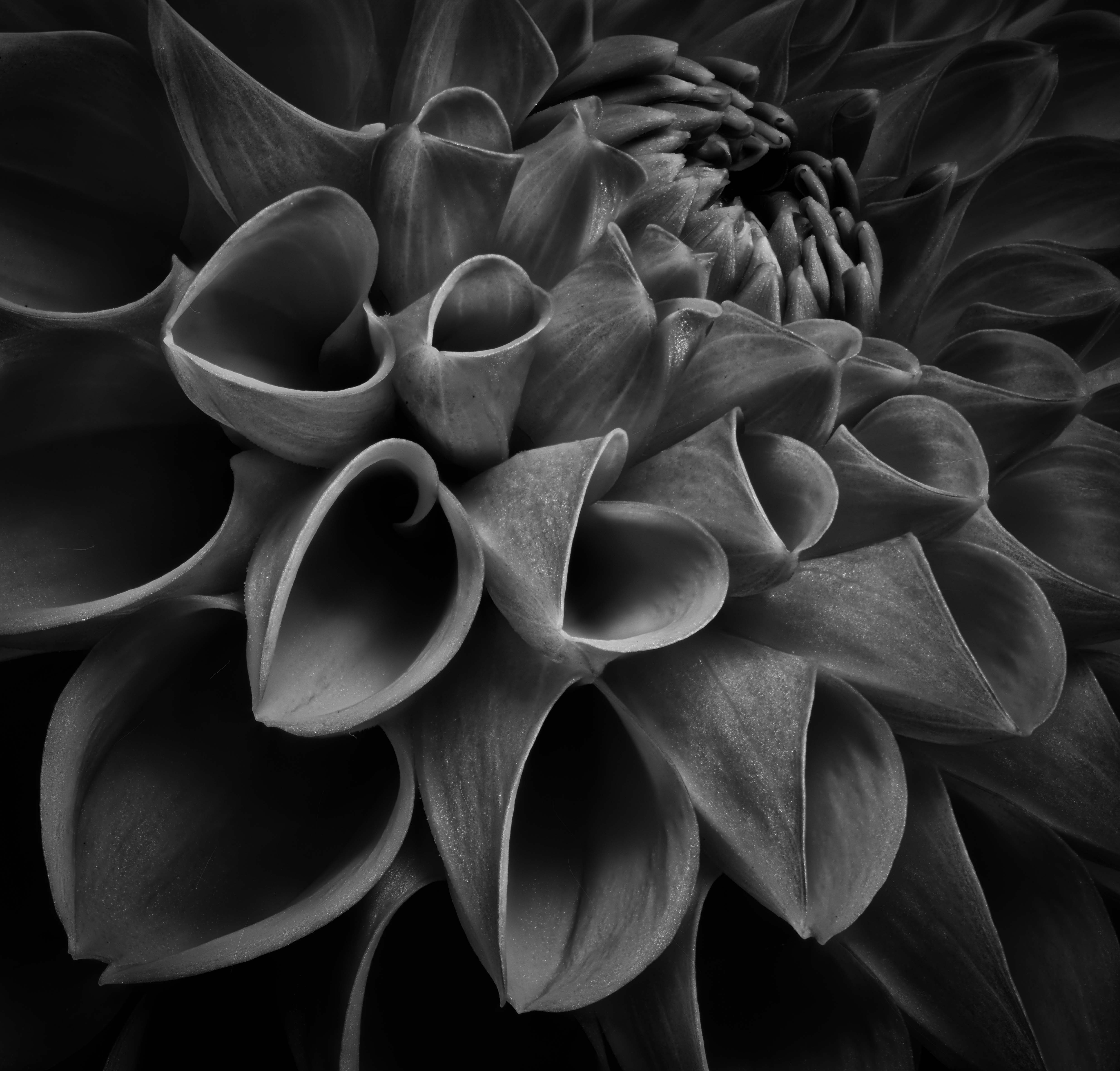
Dan, I like the composition both in terms of complexity and color. I might have had a tad more space between the lower right flower and the right edge (when is enough space enough or too much?). What I am surprised by given it's a stack is the lack of sharpness in some areas - for example, in the fern leaves by the top flower at 11 o'clock ish. I also agree with cloning out the stem in the lower left but am not sure how to handle the distractions in the upper right corner. btw - I keep trying for a good fern shot but have never thought about including flowers for contrast so thanks. Ray |
Aug 7th |
| 75 |
Aug 23 |
Comment |
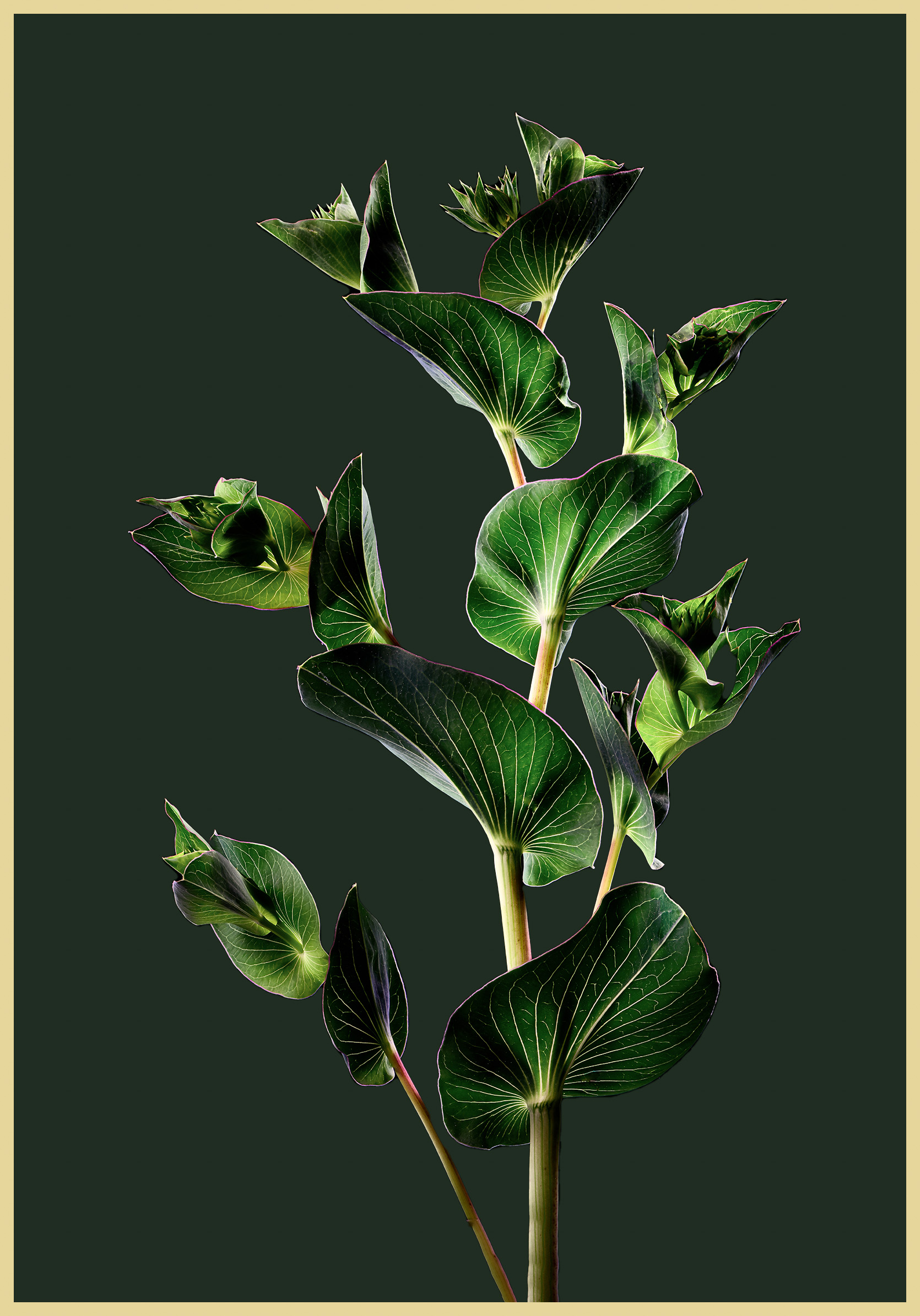
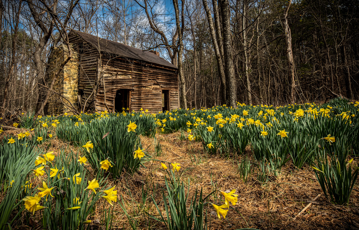
Gaetan, welcome also - it's a good group to share your photos with. It's a good composition but for me, I would have cropped in the left side more as much of the stem is not in focus (would an aperture with a better depth of field helped?) and as suggested by Dan and Murphy, darkened the background while brightening the fern. |
Aug 7th |
| 75 |
Aug 23 |
Comment |
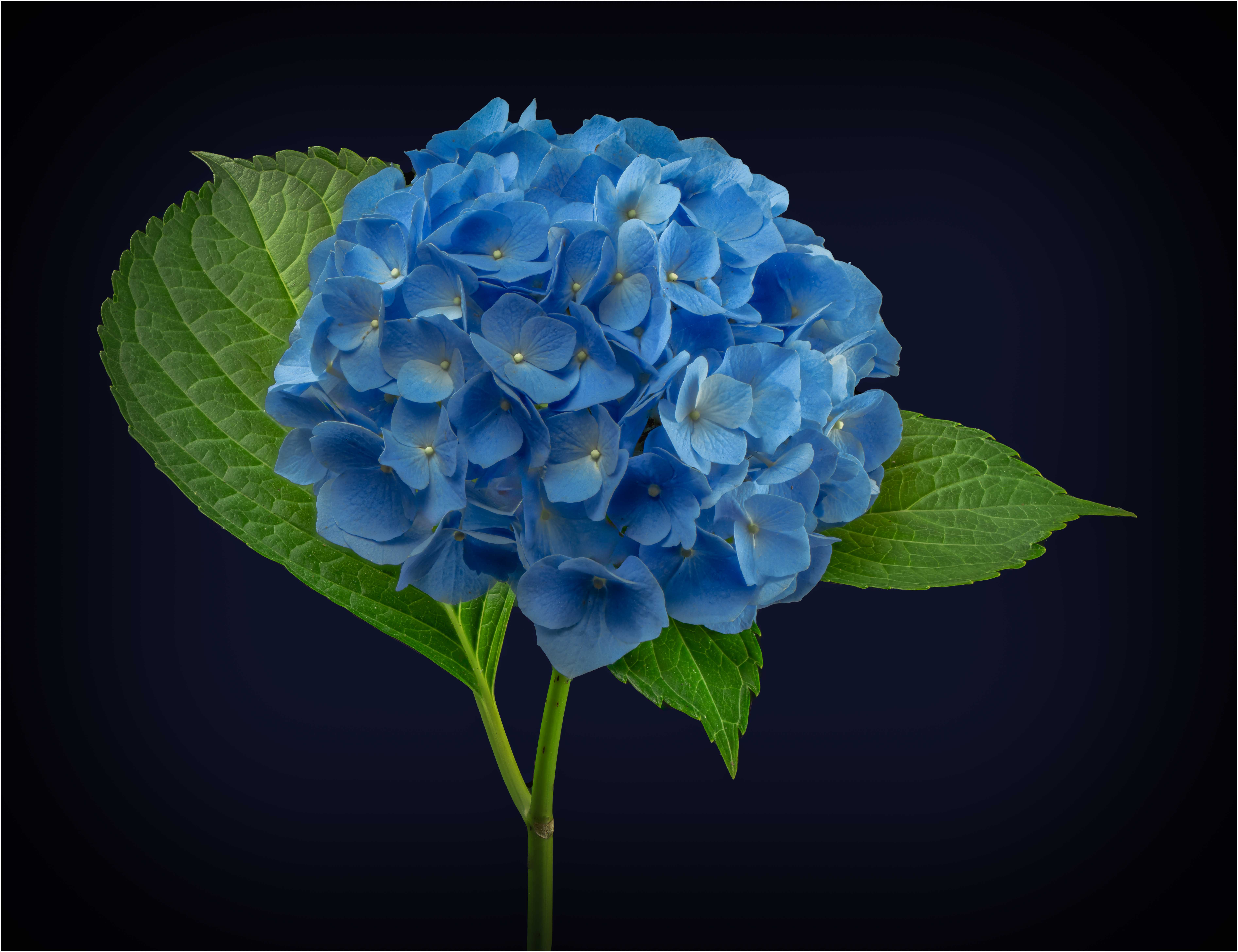
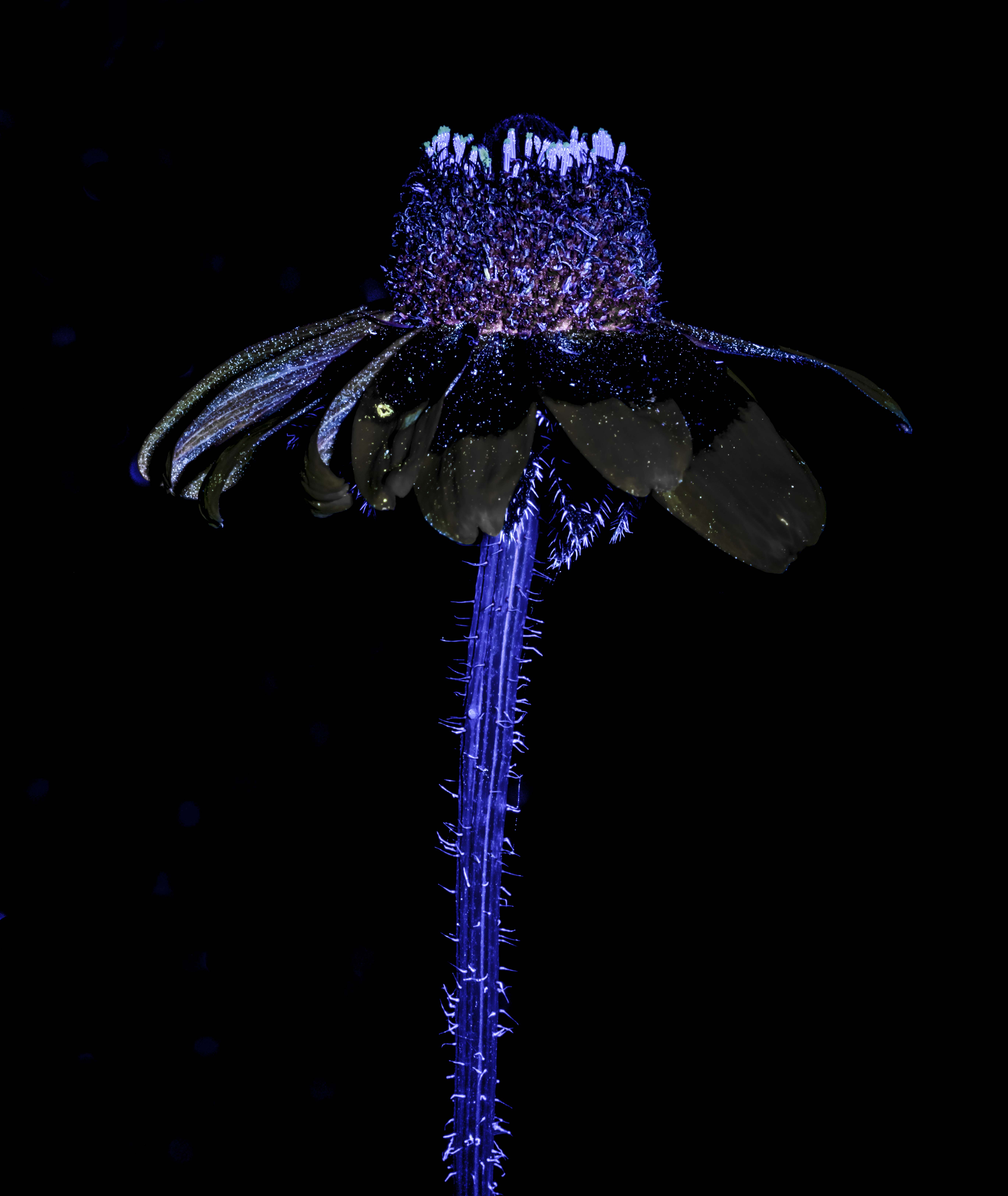
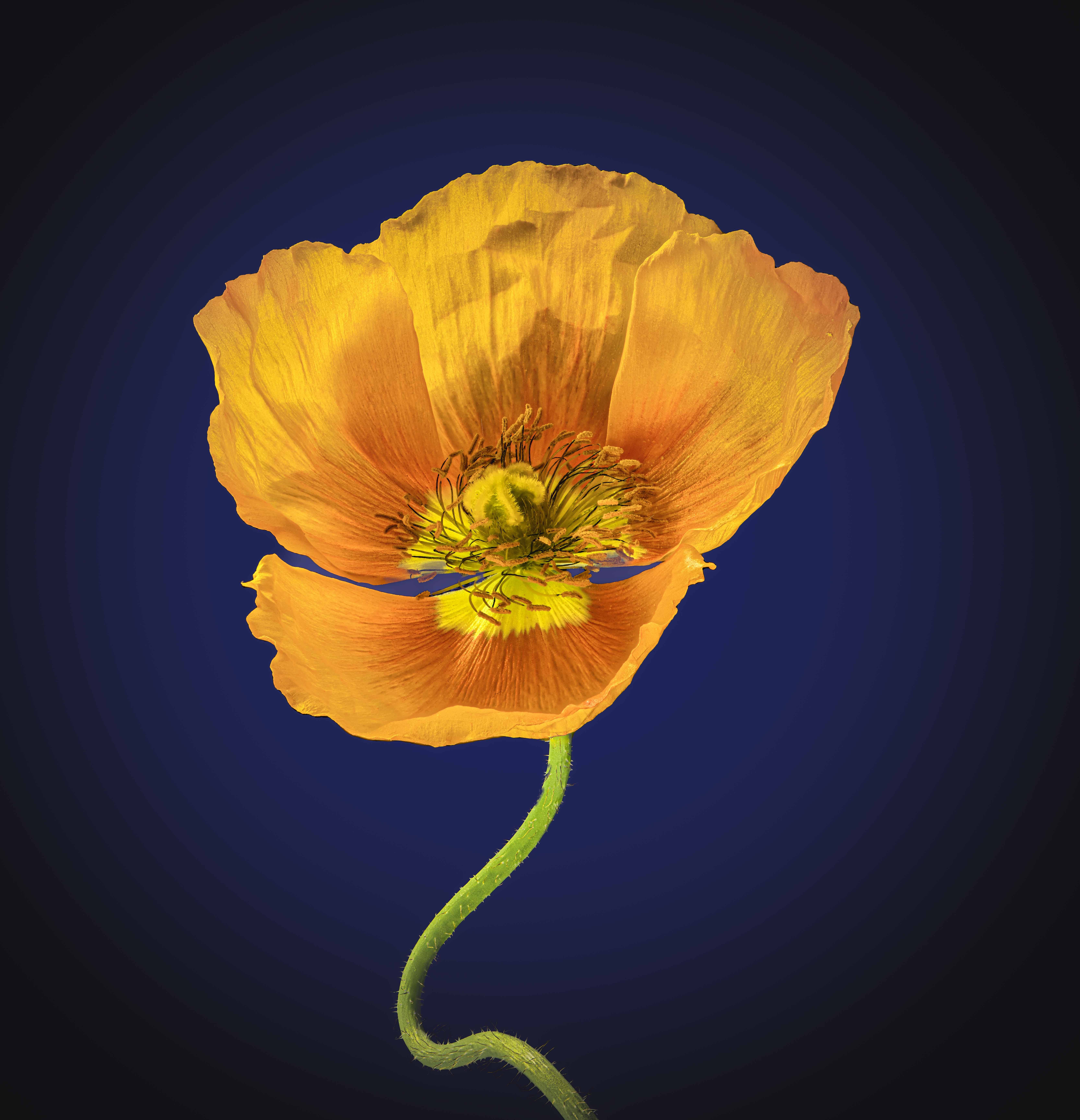
Judy, enjoyable image. The outer edges are soft with increasing definition as you move to the center. I like the colors and the presence of a few drops of water on some petals. I think a little more space at the top would help the composition but even with that I applaud your picture, Ray
|
Aug 7th |
| 75 |
Aug 23 |
Comment |
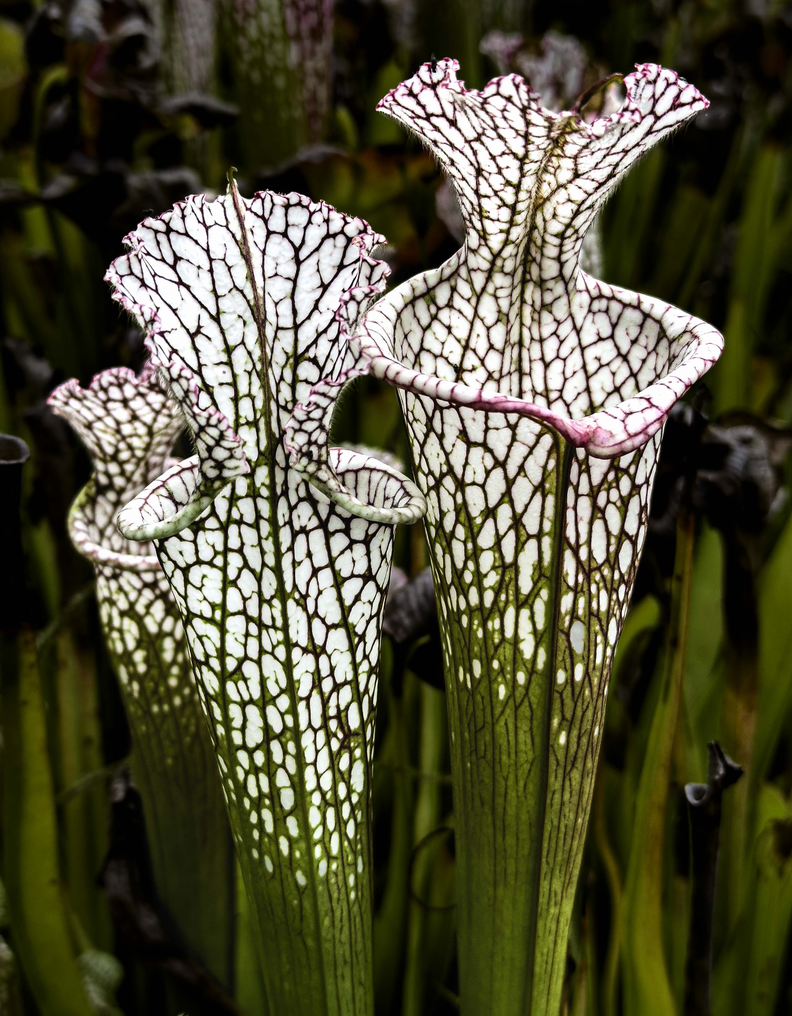
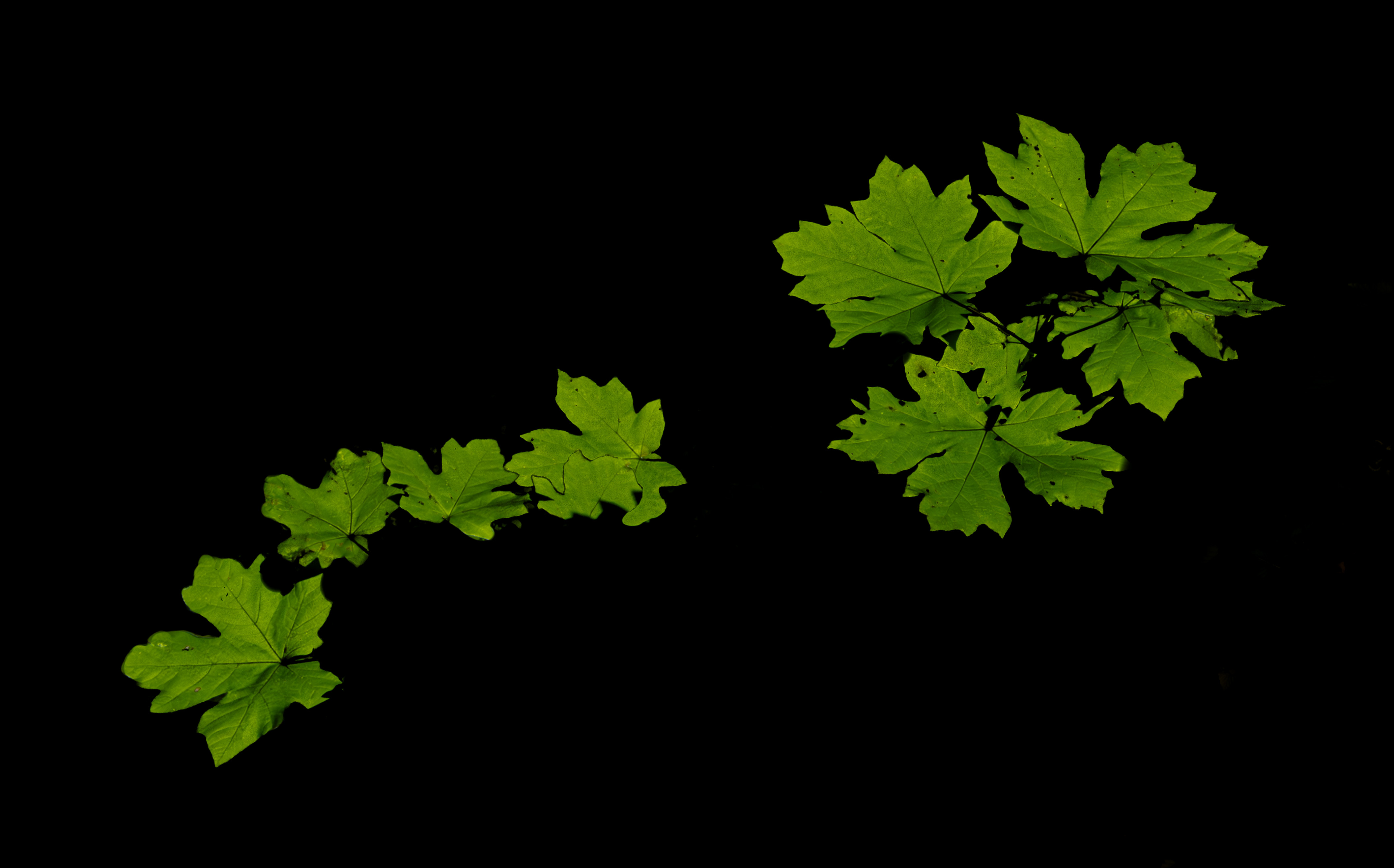
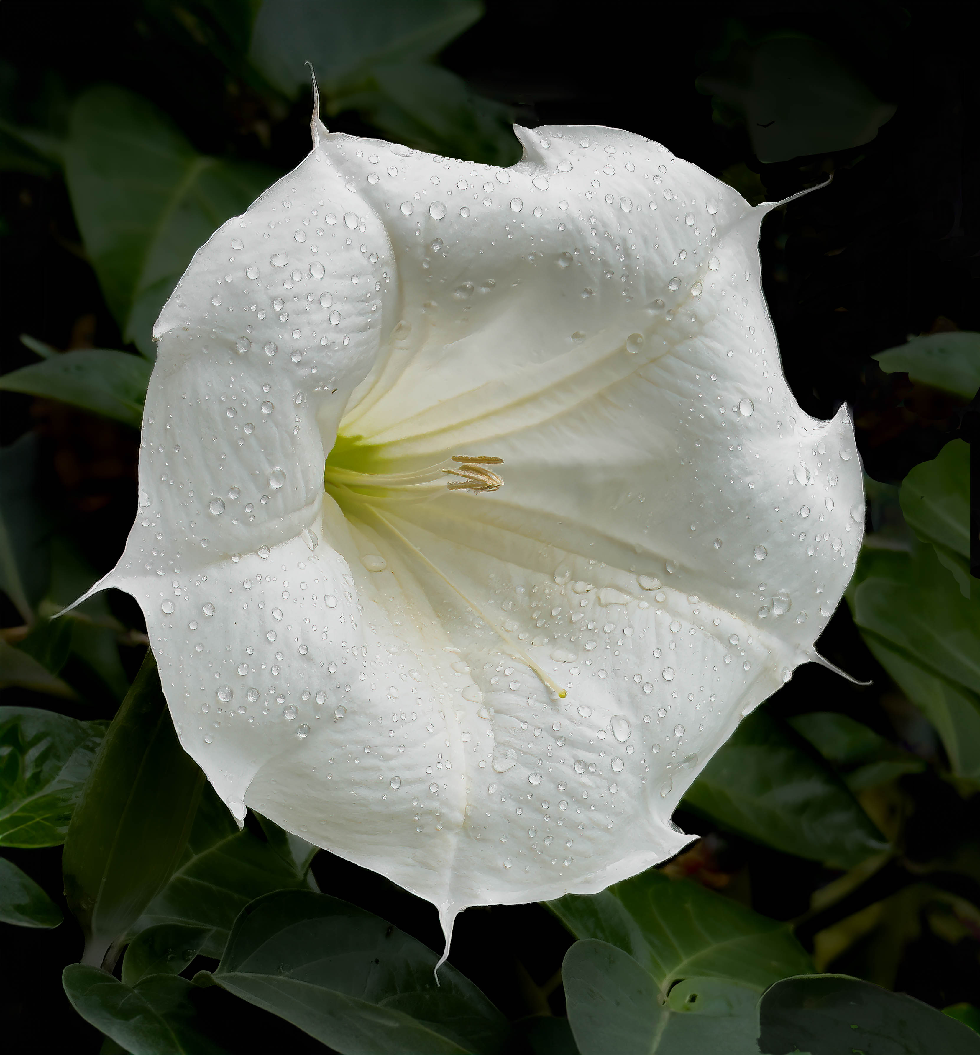
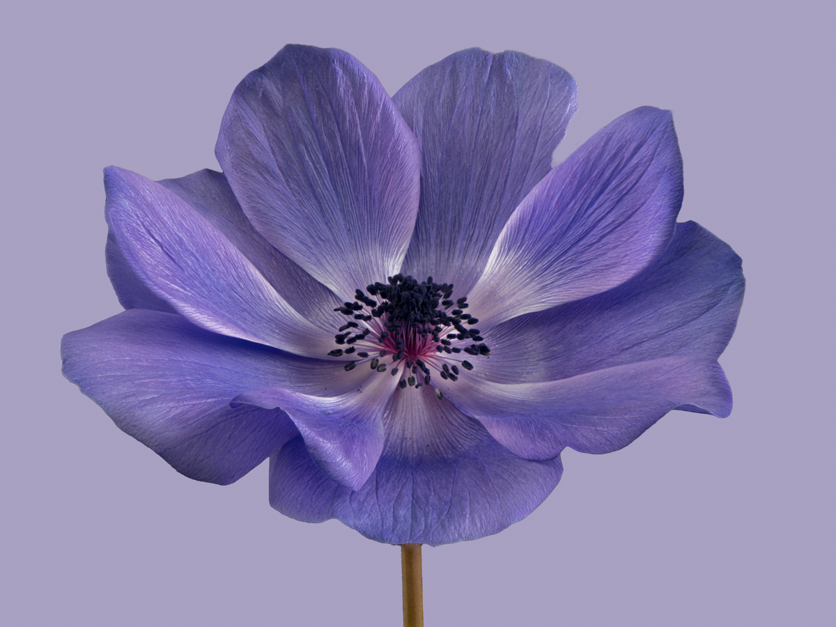
Murphy, your photos just made me smile - bright colors standing tall against a subtle green background with brighter green leaves at the bottom. great composition and format. One thing I keep getting told is to avoid white and/or bright objects on the edges so would cropping in the left side to eliminate the white flower be useful? Ray |
Aug 7th |
| 75 |
Aug 23 |
Comment |
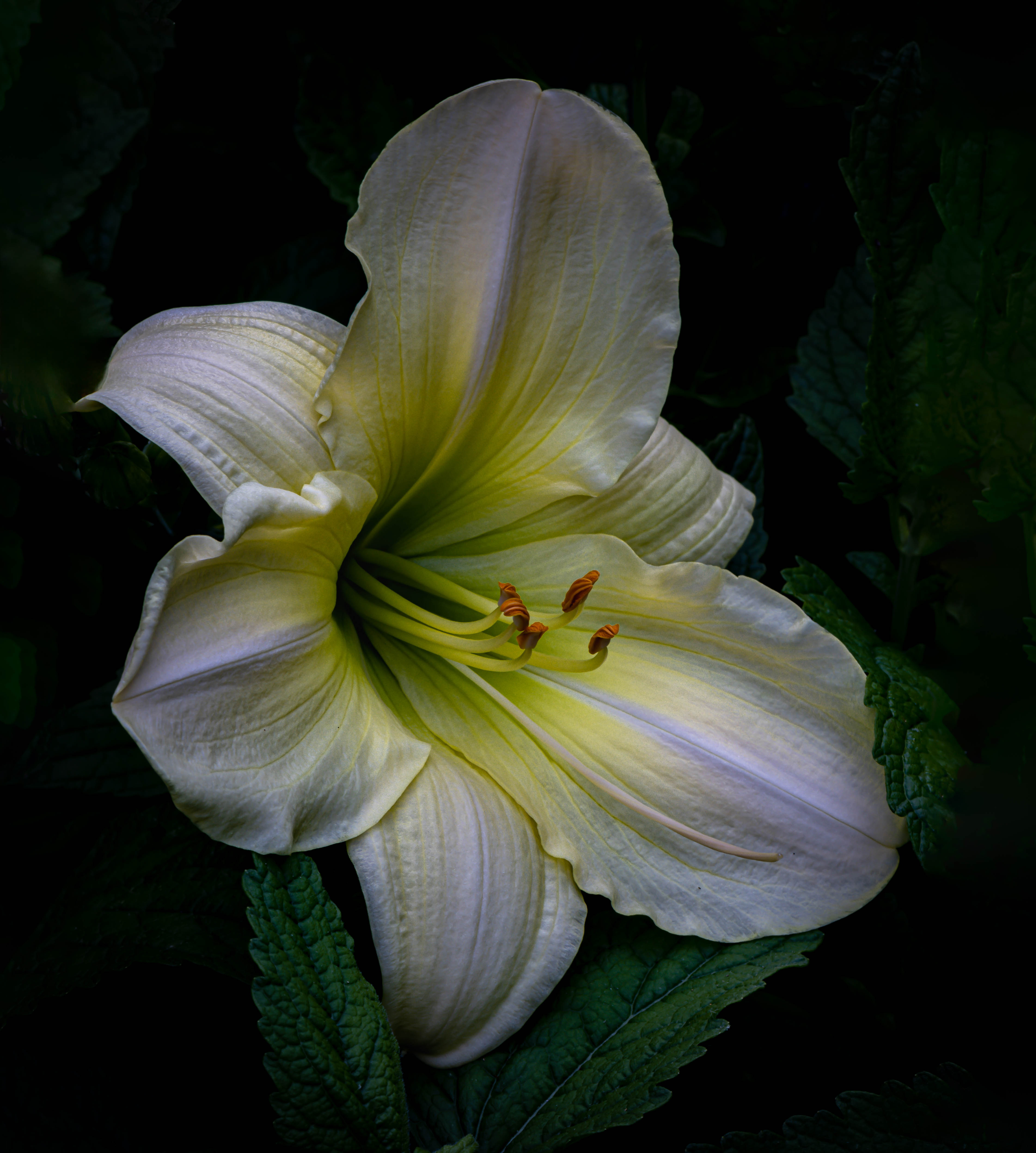
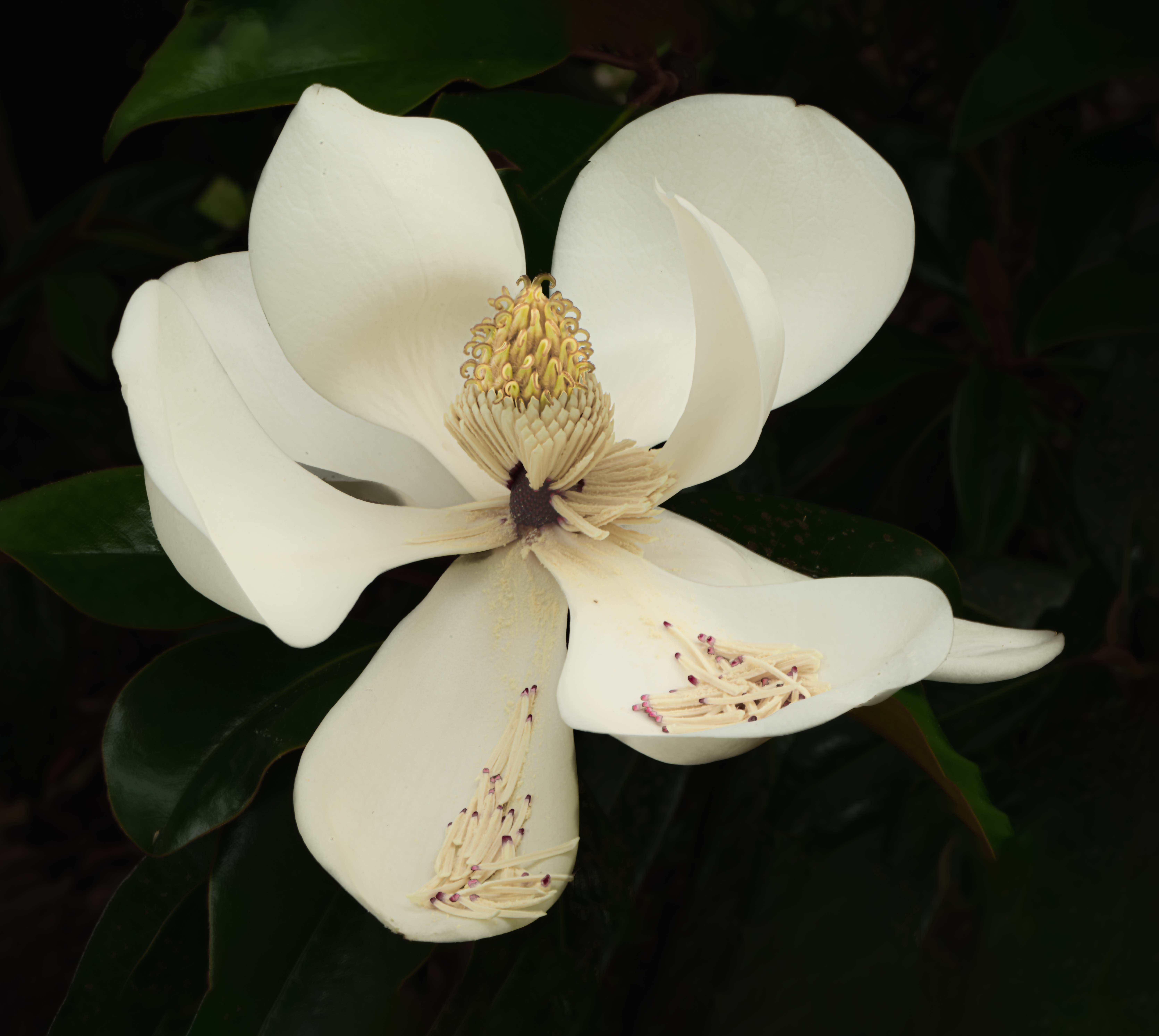
Vincent, an interesting subject and yes I prefer the portrait format as well. My flower detection app says it is sweet cherry, a species of Prunus. Some of the petals especially in the upper left looks a little soft so I wonder if a program like Topaz Photo Ai might help and I am not so sure about the blue color of the sky as it seems a little off (at least compared to what I see locally) maybe a tad too much dehaze. |
Aug 7th |
| 75 |
Aug 23 |
Comment |
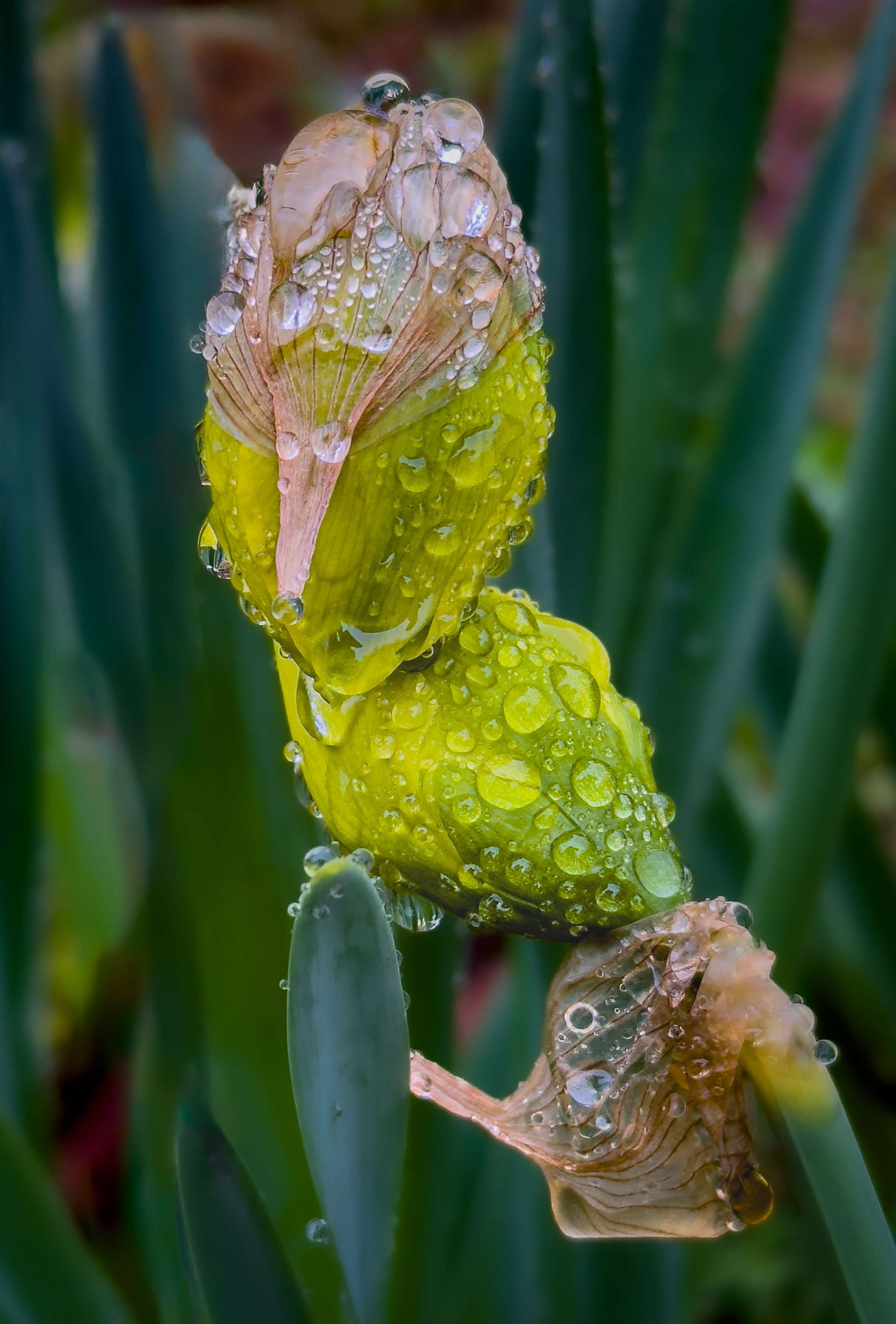
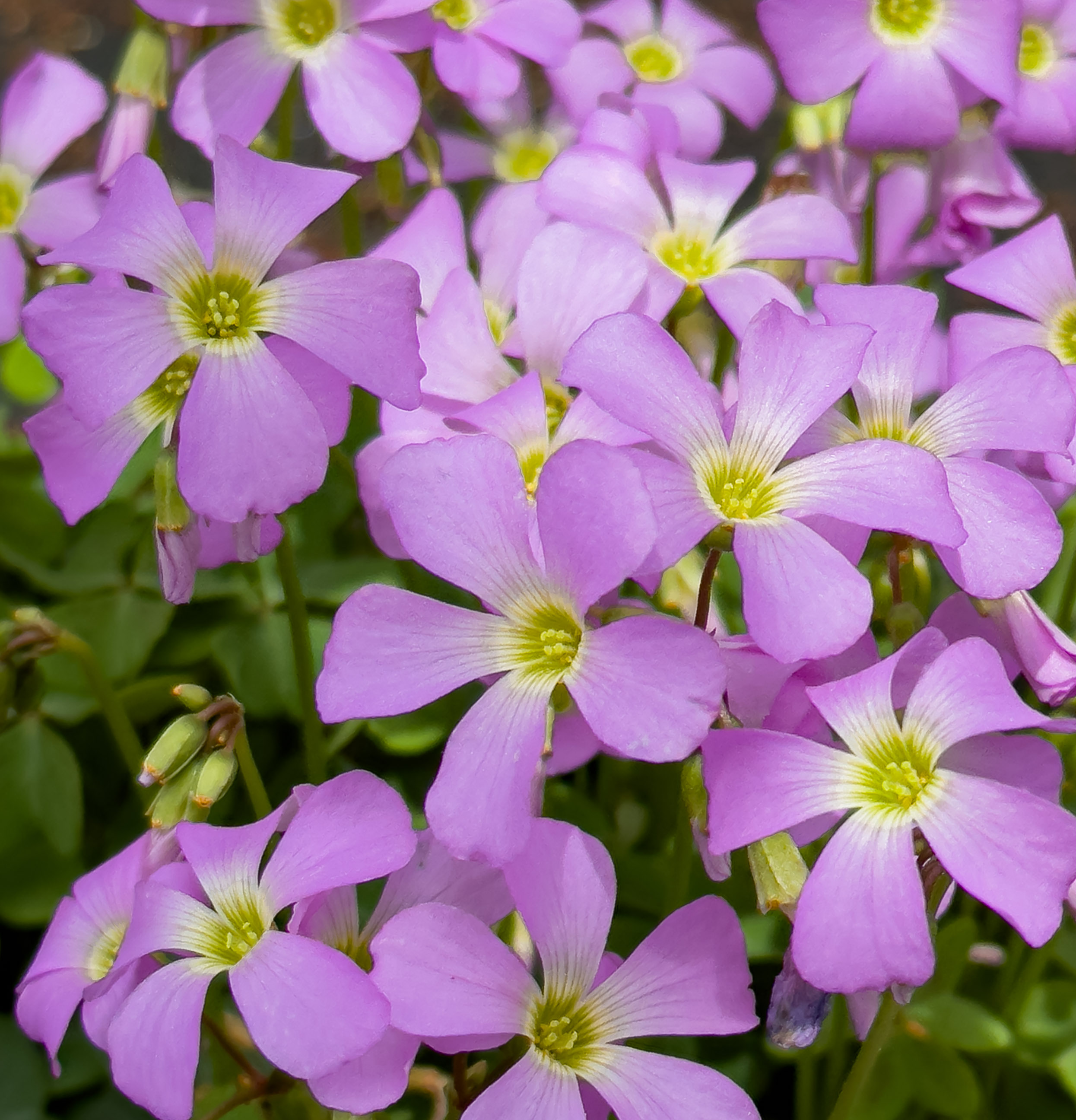
Thanks Murphy and I agree that white flowers are difficult and cell phone camera are getting better all the time. |
Aug 7th |
6 comments - 3 replies for Group 75
|
6 comments - 3 replies Total
|