|
| Group |
Round |
C/R |
Comment |
Date |
Image |
| 75 |
Jul 23 |
Reply |
Thanks Judy - I thought about that but had decided to leave some texture to the background - but agree to eliminate those in the future. Ray |
Jul 7th |
| 75 |
Jul 23 |
Comment |
Dan, I was at f/36 (max) and the only way I could have increased the DOF is to move farther away which was just not possible given the location of the flower or stack also not possible as occasionally there was a breeze moving the limb but it is something I will definitely consider in the future, wherever possible. Ray |
Jul 5th |
| 75 |
Jul 23 |
Reply |
Thanks Murphy for the suggestion. Ray |
Jul 4th |
| 75 |
Jul 23 |
Comment |
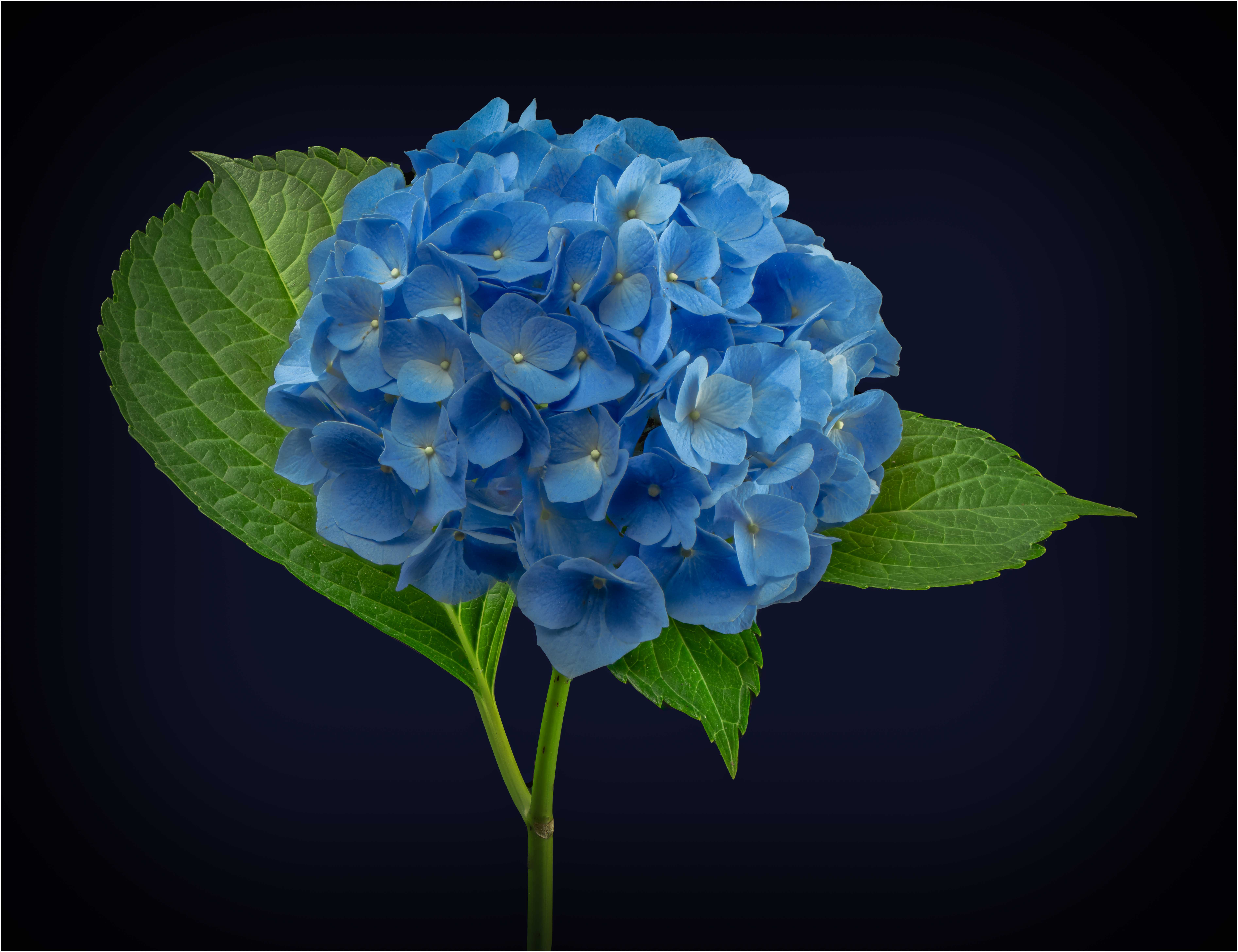
Judy, wonderful subject and a difficult one since all red, I was trying to decide whether I would have cropped out the 2nd cluster and I think not as it does help with the impression of depth. I agree that making the background a little darker (but not much) would help focus the viewer's eye on the main cluster. Good eye for a good topic. |
Jul 3rd |
| 75 |
Jul 23 |
Comment |
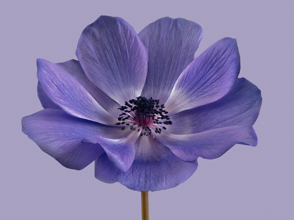
Vincent - good photo of a yellow rose in morning light and as Murphy said - a challenge in sunlight, even early morning sunlight. I like the square format and having bugs on the flower is always a plus to me. A suggestion is to clone out the 2 light areas in the lower left and the bright stem? at the bottom. I also wonder if a little less darkening of the background would be useful to help place the flower in context. Just suggestions as it always get back to what the photographer wants to show. Ray |
Jul 3rd |
| 75 |
Jul 23 |
Comment |
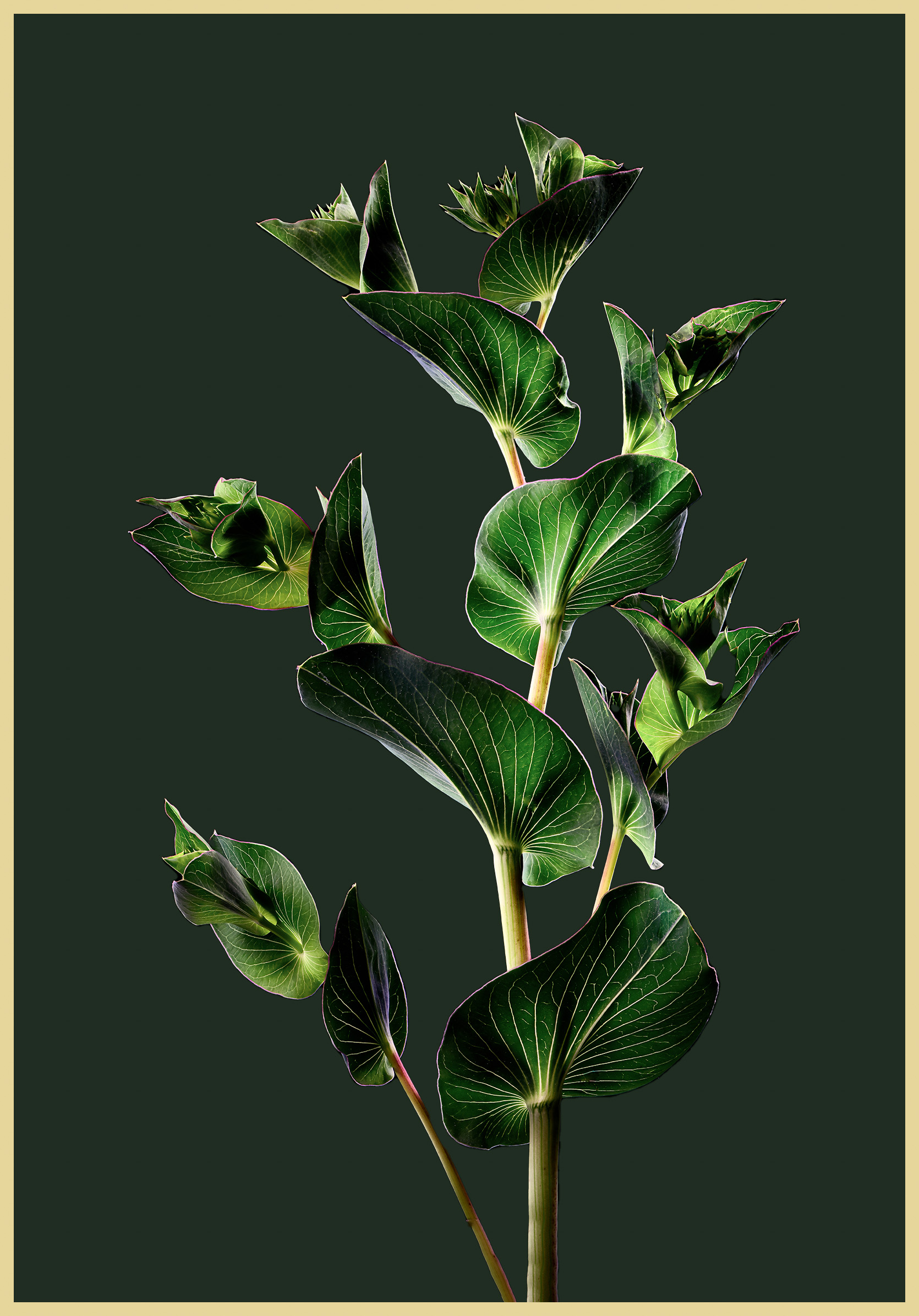
Charles, great subject, great composition. I would be interested in seeing the original just to understand how much post processing you did or was the processing in camera? I note the slightly out of focus leaves but am not bothered by those as they help give an impression of depth. Ray |
Jul 3rd |
| 75 |
Jul 23 |
Comment |
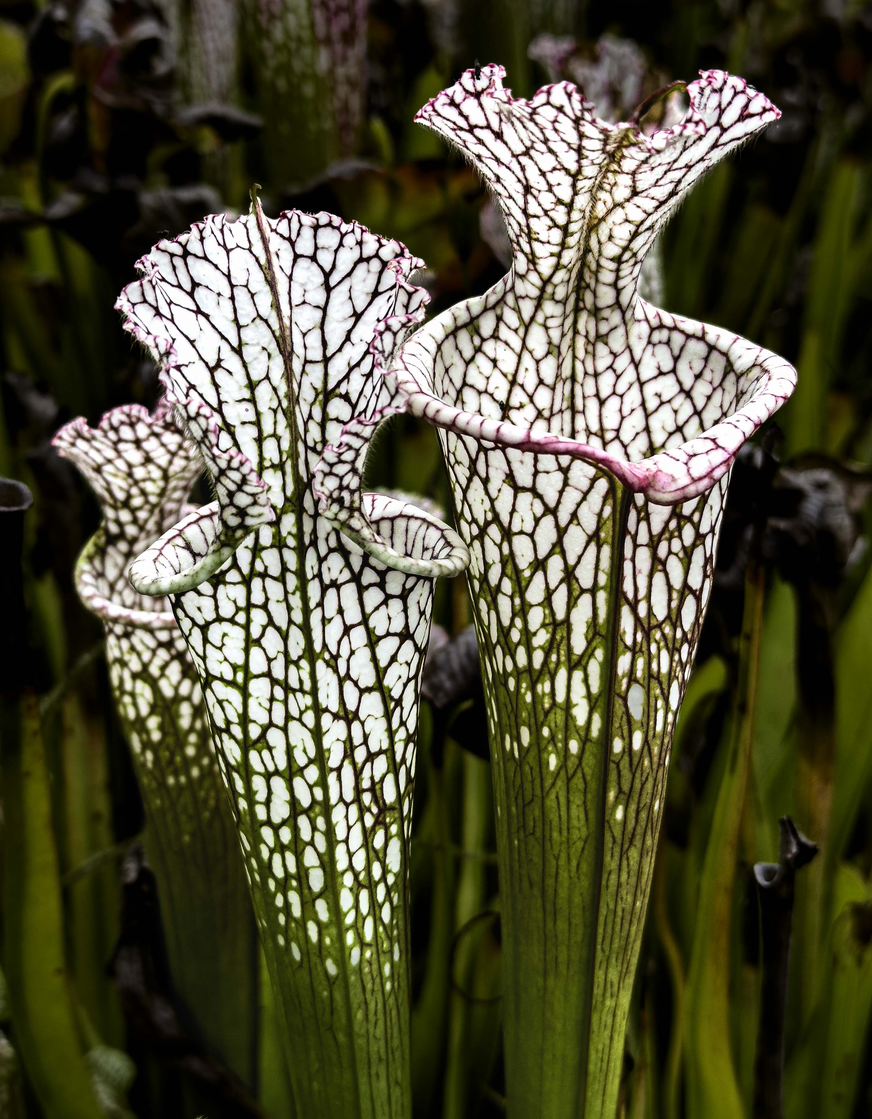
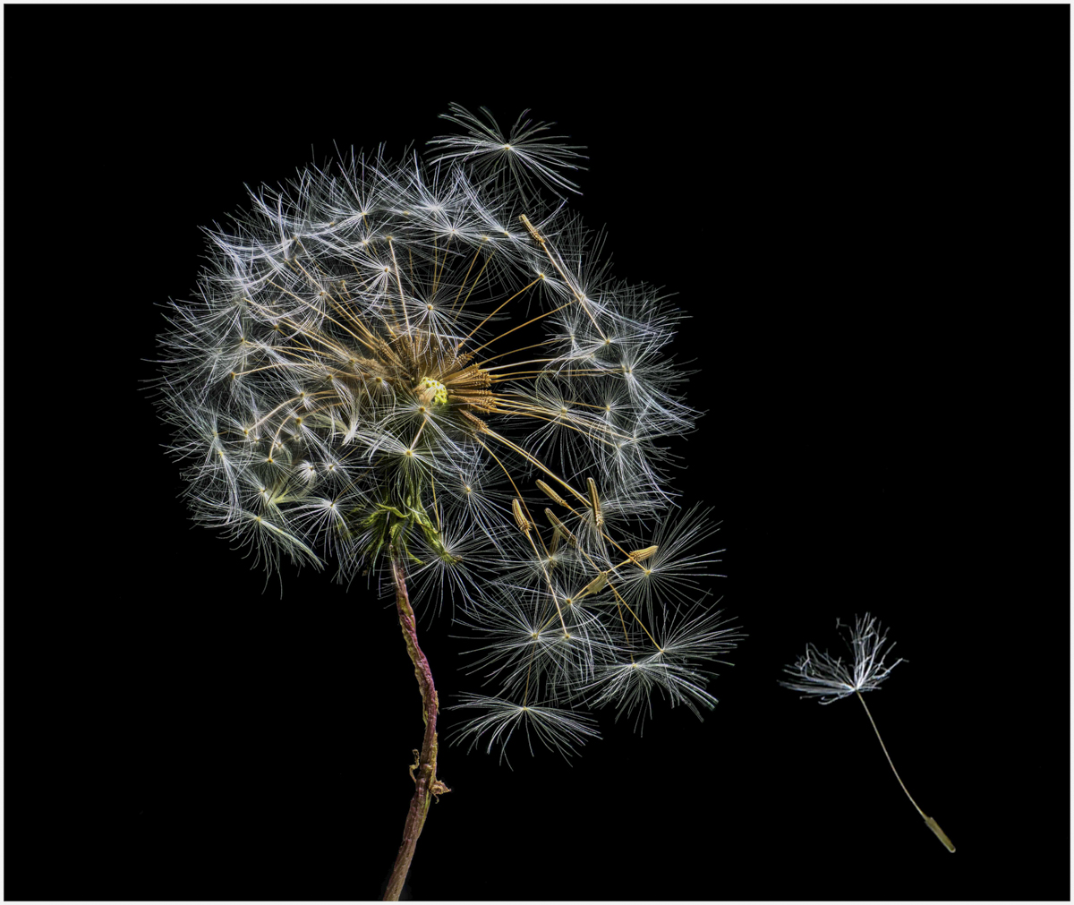
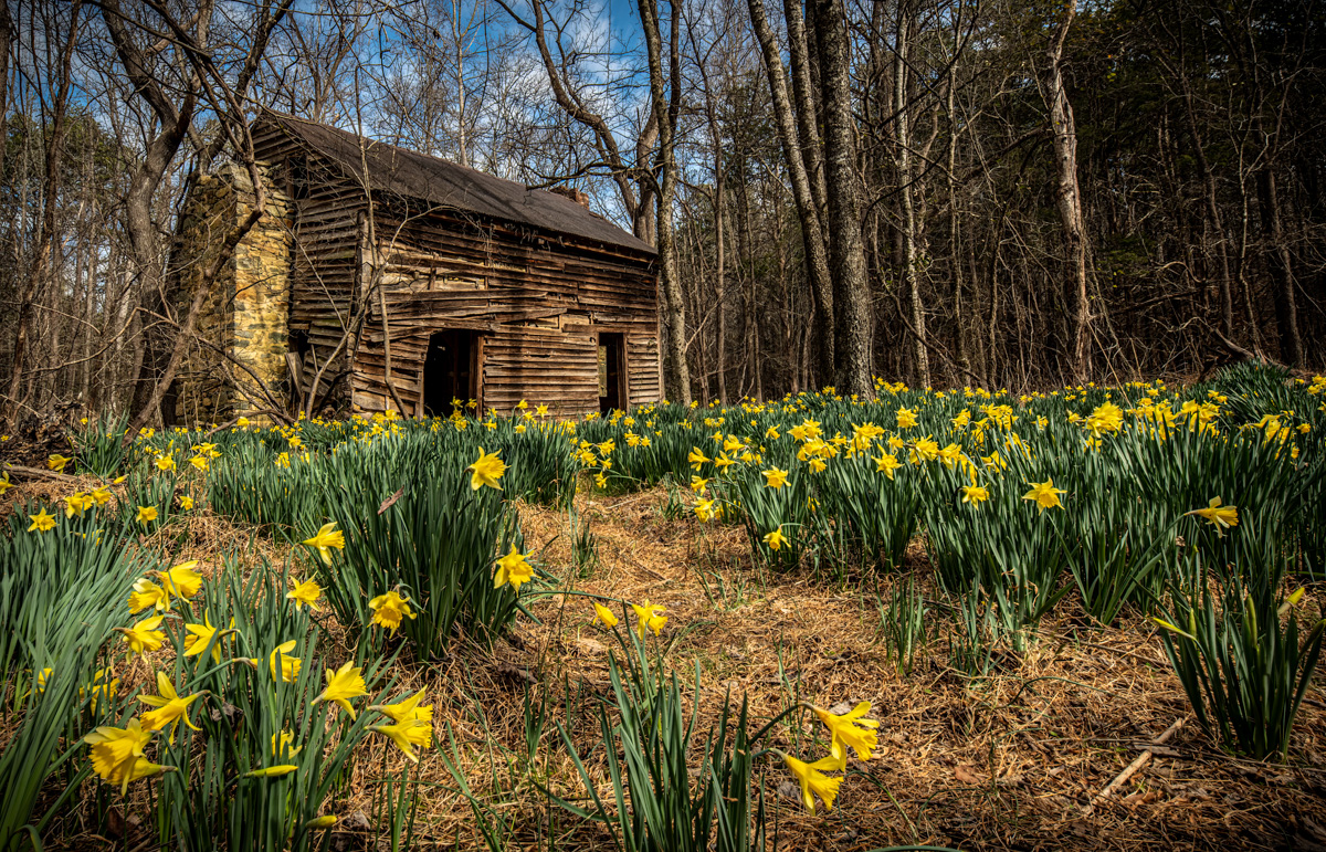
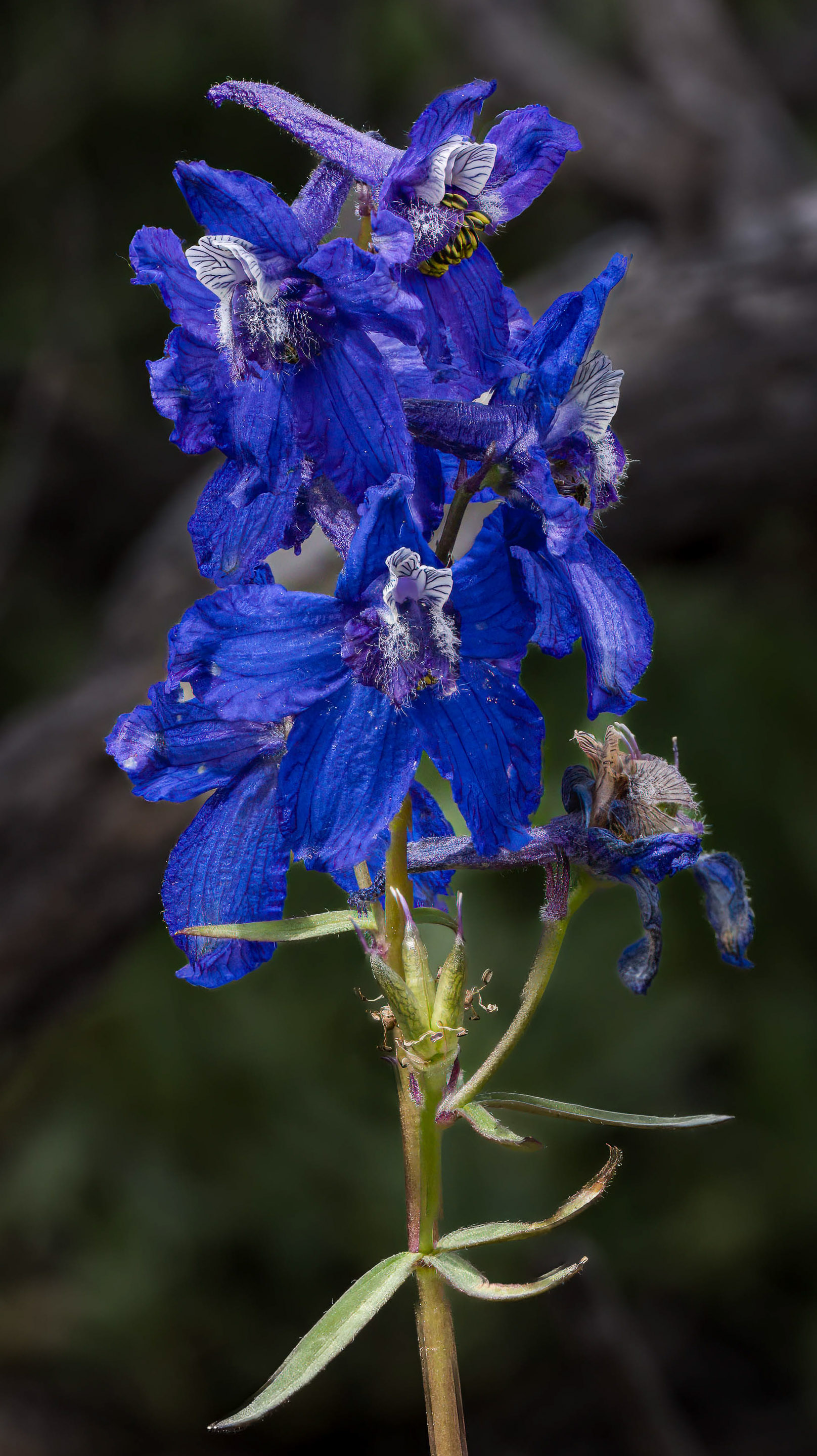
Dan - great stack of a great flower. I agree with Murphy as my eye keeps going to the tree limb on the left but in general I think there is too much space around the flower which means a viewer would not appreciate the detail and texture in the flower. I have attached one crop version as an example. Looks like that was a great place to hike. Ray |
Jul 3rd |
 |
| 75 |
Jul 23 |
Comment |
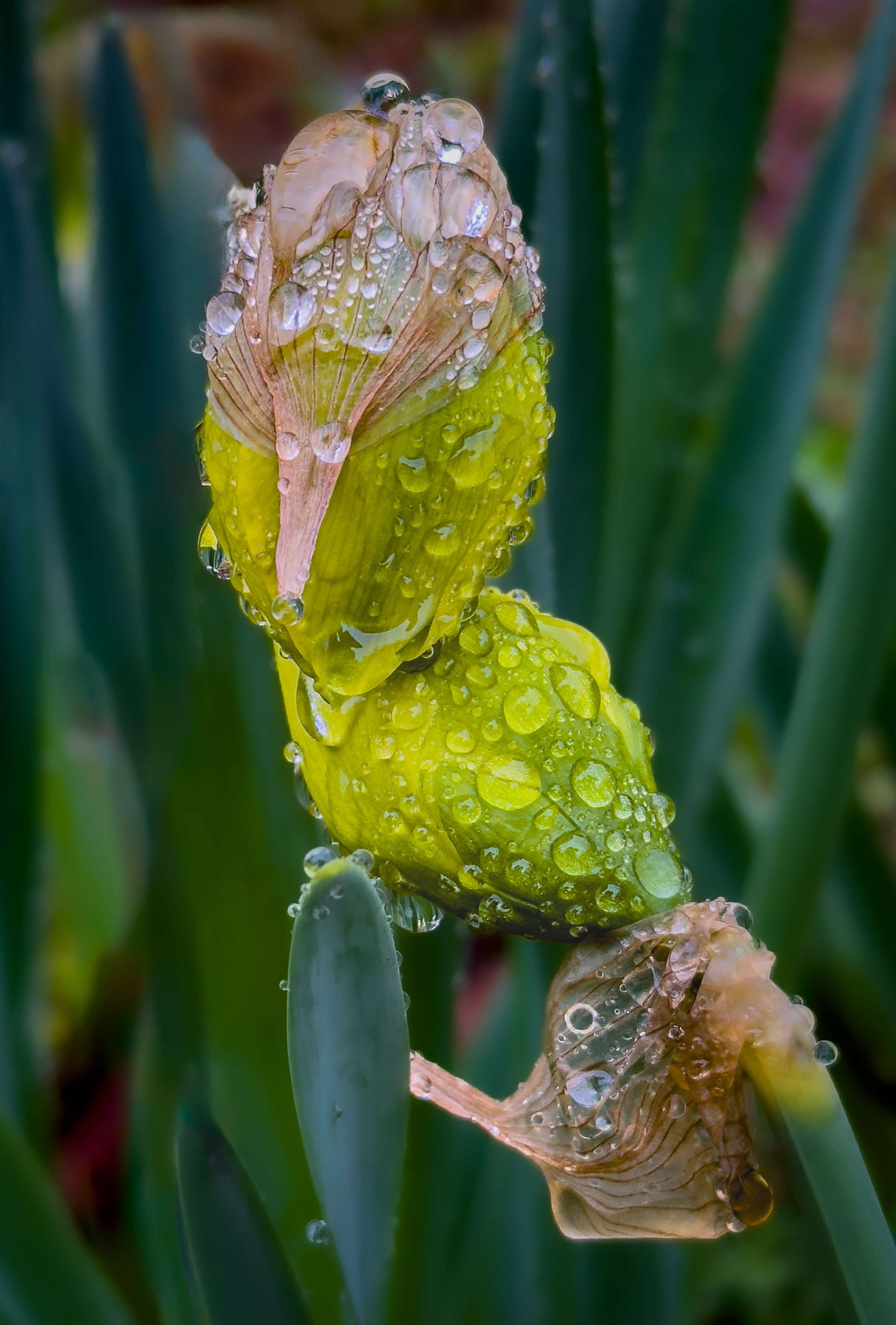
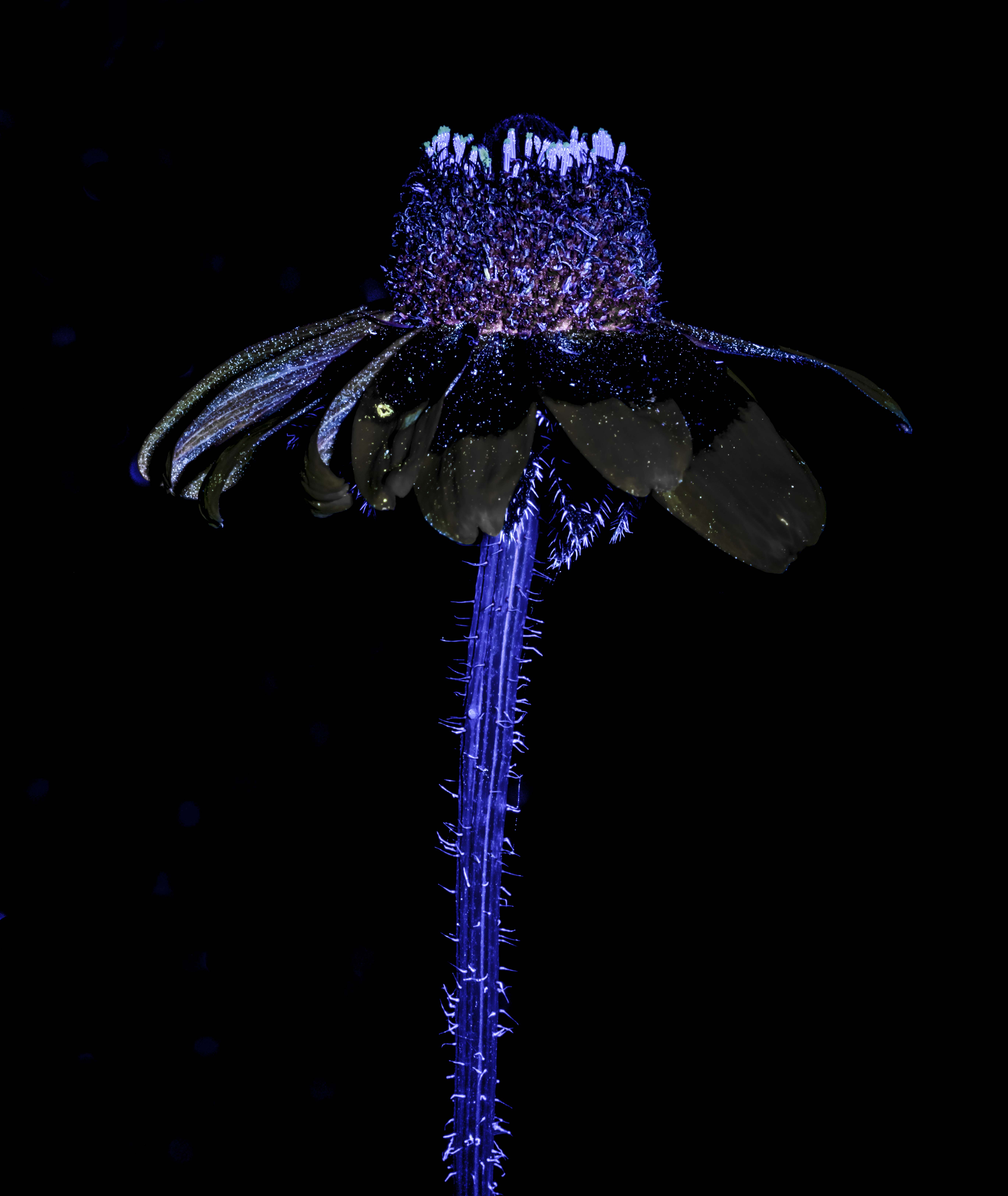
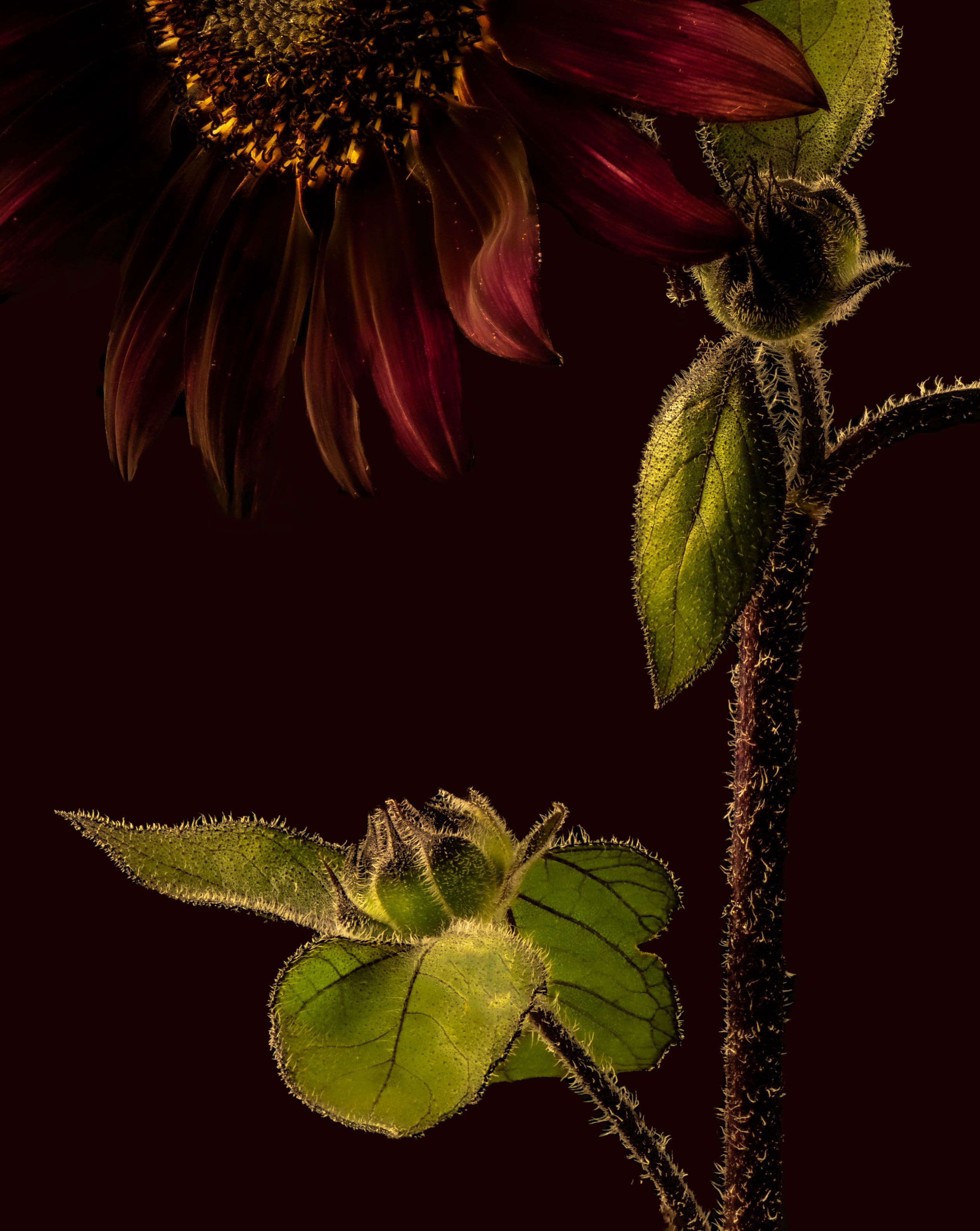
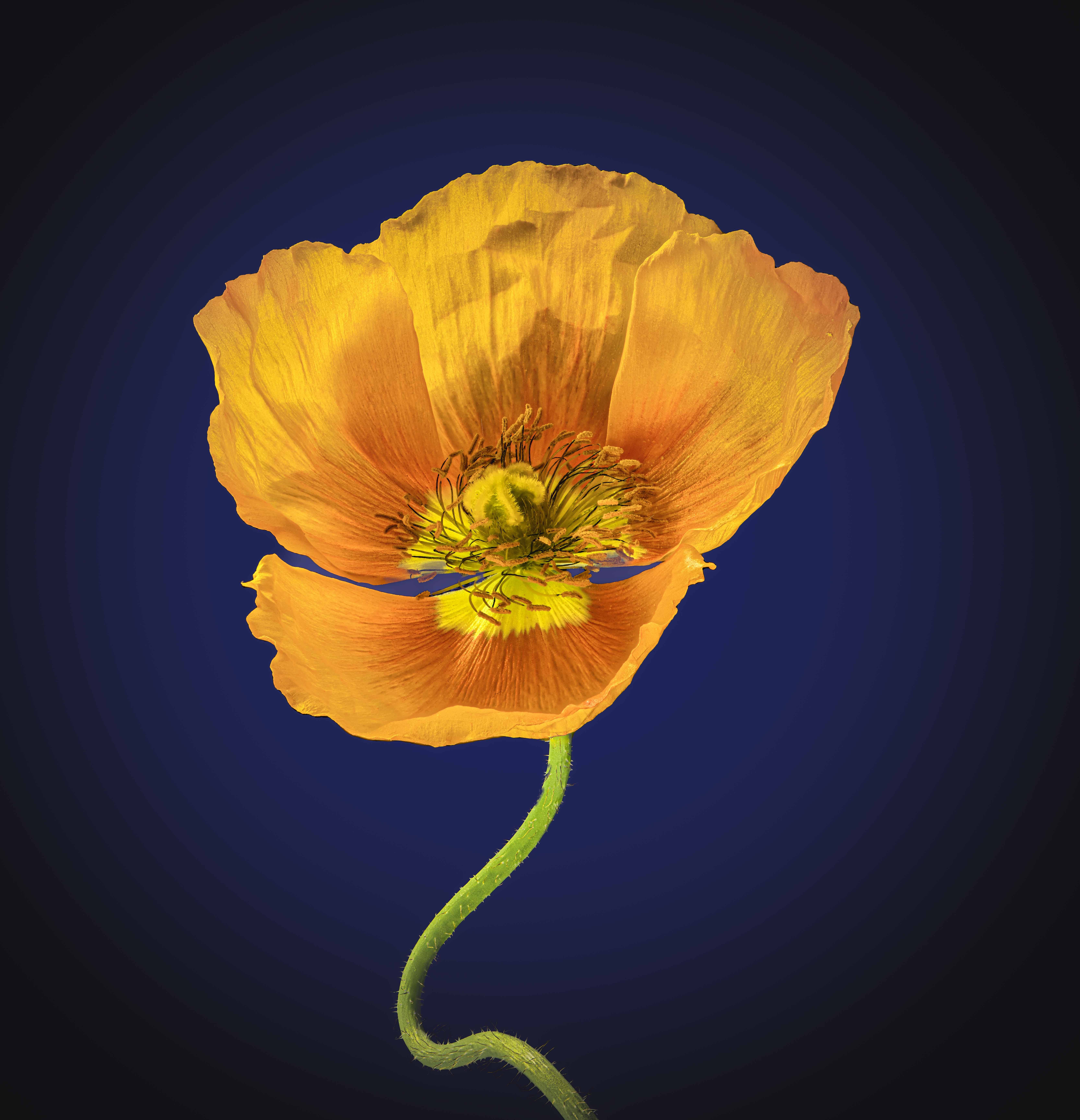
Super photo but I wonder about the lack of hairs on the stems except where the unopened poppy bends over and in that area the original background shows (yes, that would be difficult to get rid of but possible). Is it that in making the background black, you needed to get rid of the hairs? Plus, it looks like the stems have no texture so they look a little fake. I really like the composition. Ray |
Jul 3rd |
| 75 |
Jul 23 |
Comment |
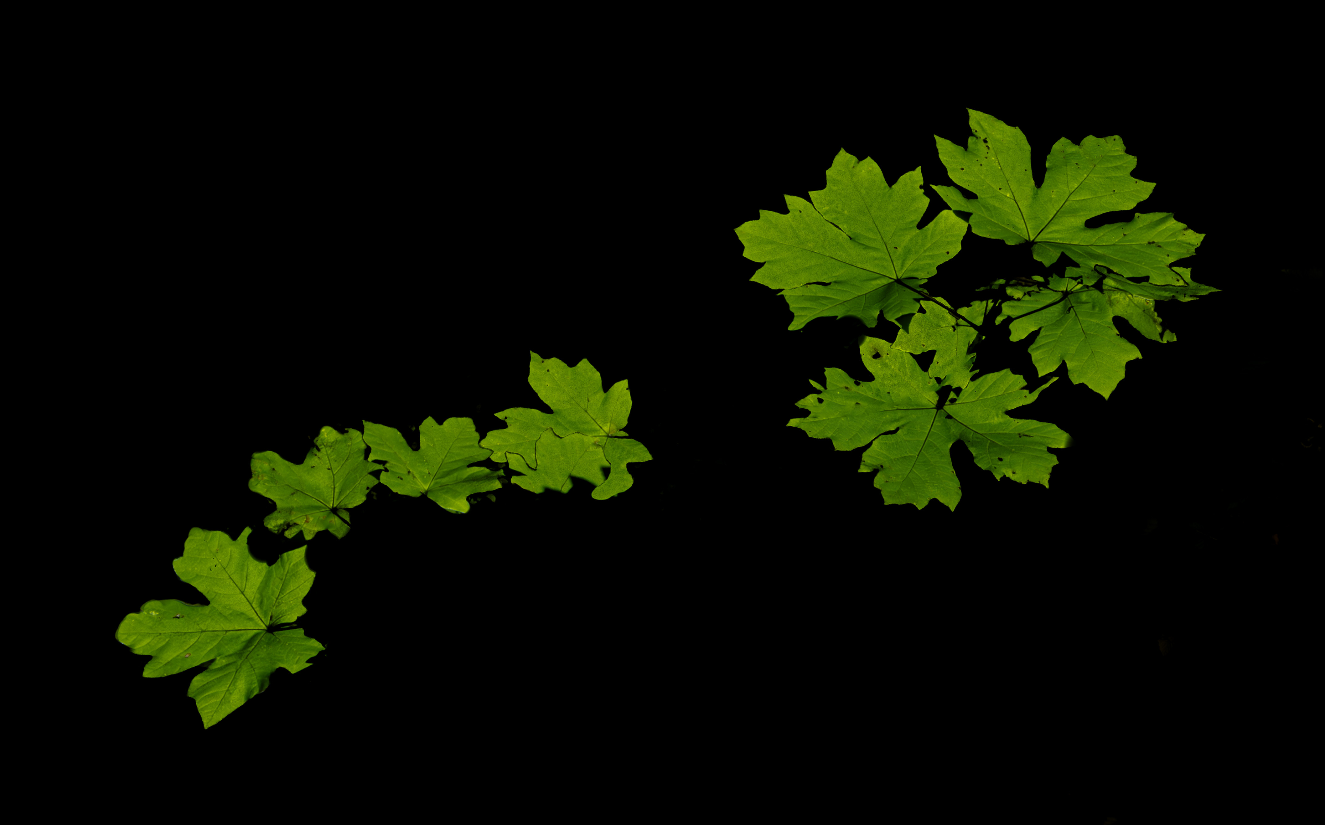
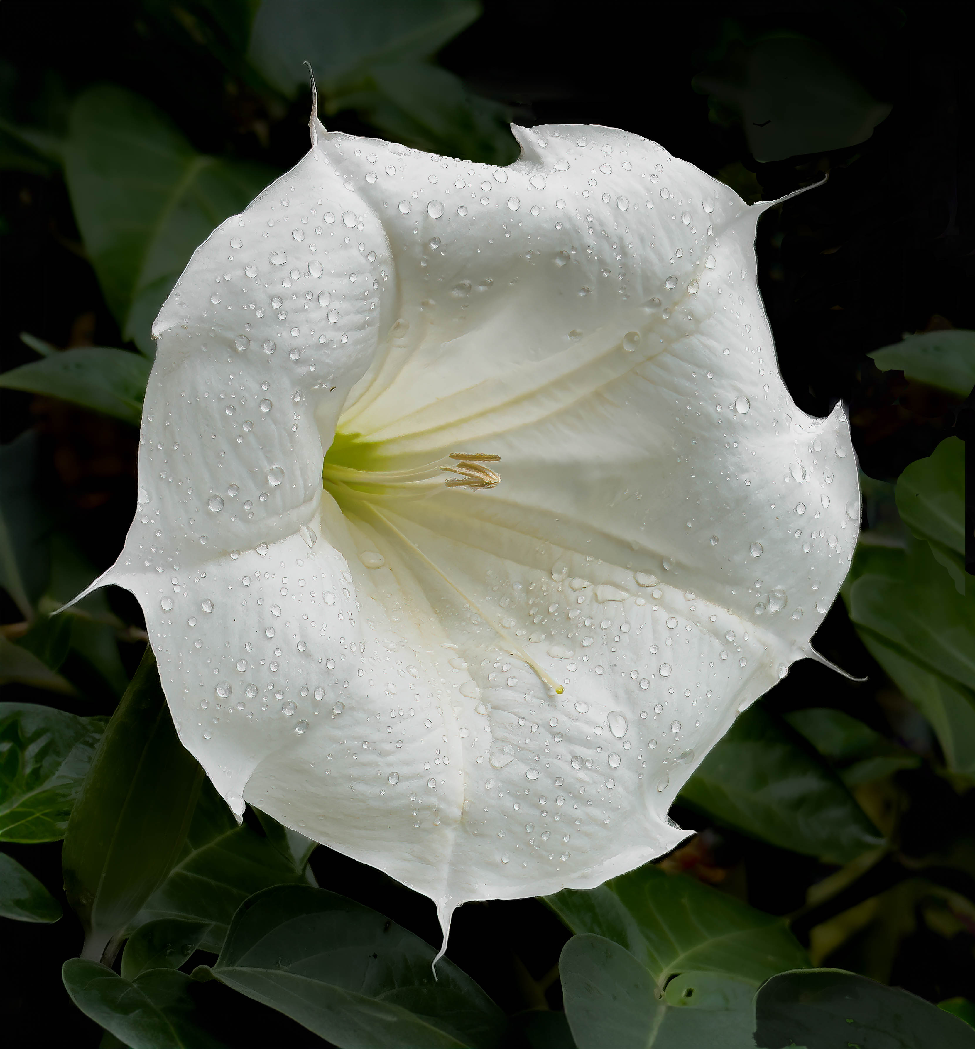
Thanks Murphy - is this a situation where a border would have been useful? |
Jul 3rd |
7 comments - 2 replies for Group 75
|
7 comments - 2 replies Total
|