|
| Group |
Round |
C/R |
Comment |
Date |
Image |
| 75 |
Feb 23 |
Comment |
Thanks Marge and congratulations on the selection of your image for the showcase! Ray |
Feb 17th |
| 75 |
Feb 23 |
Comment |
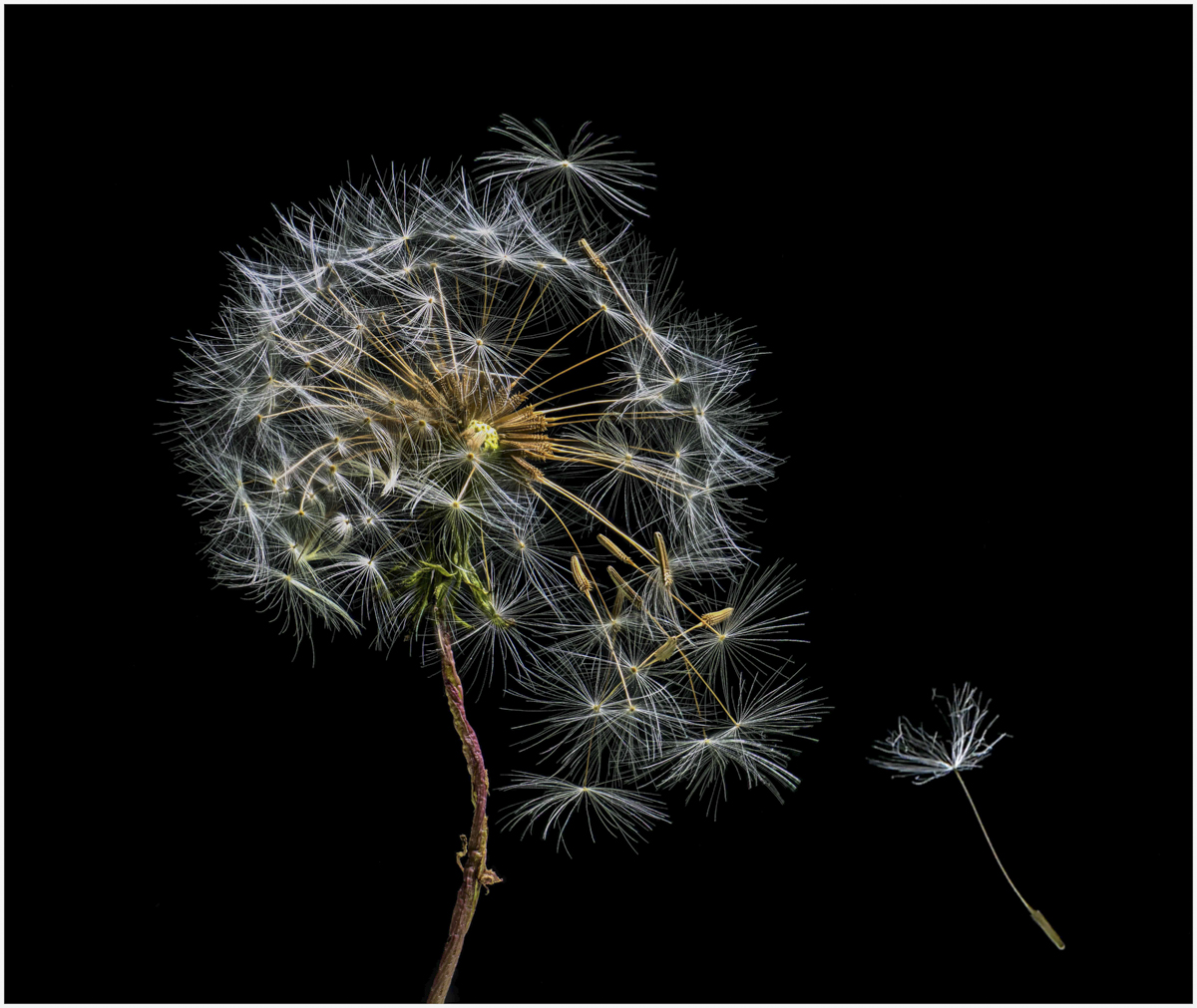
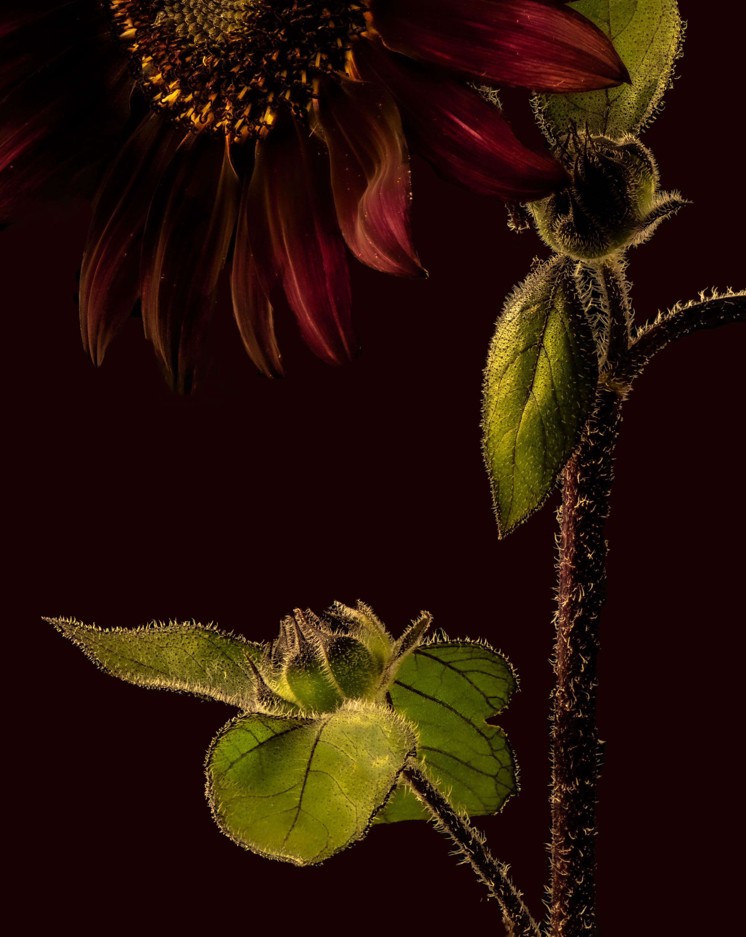
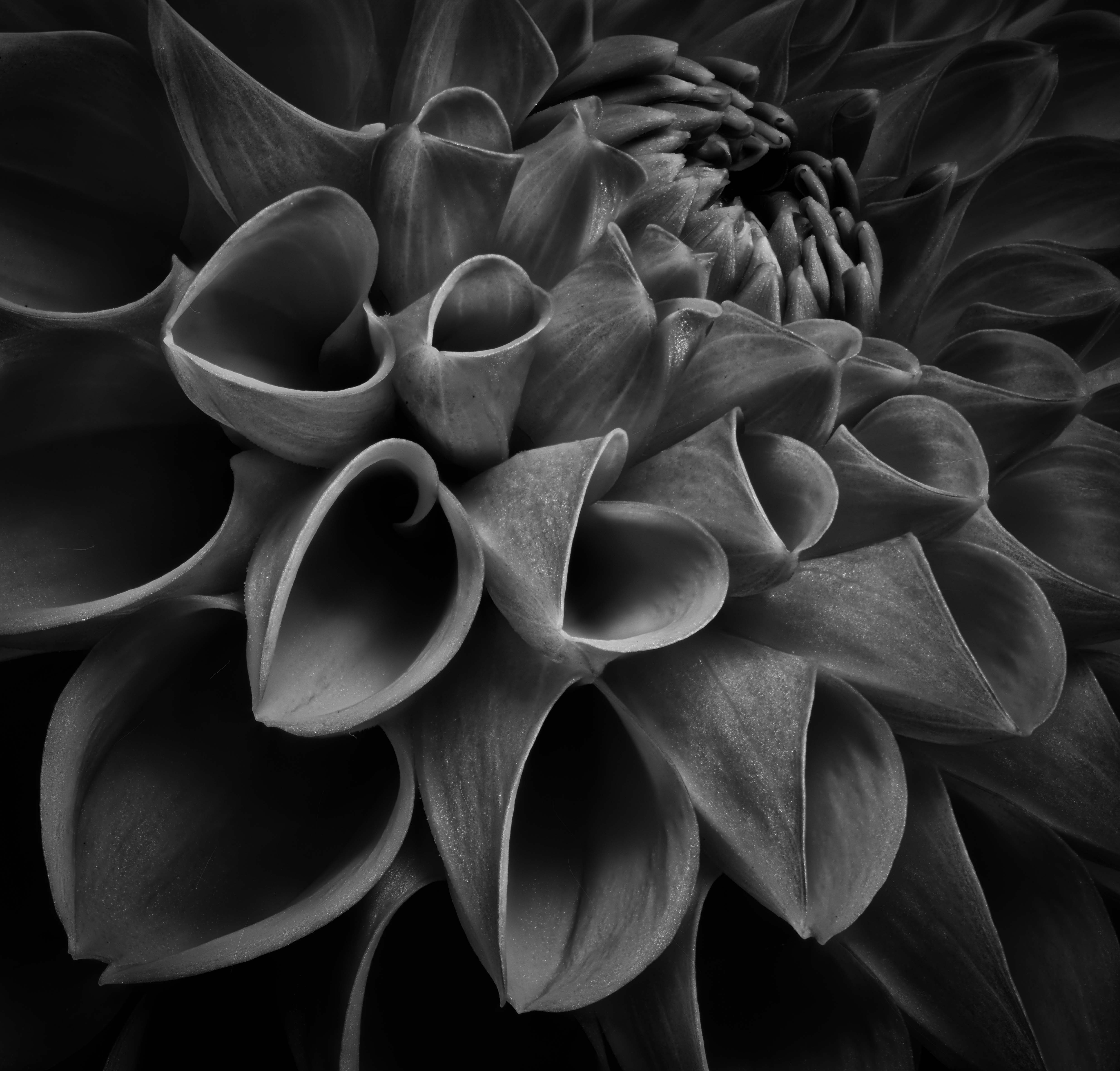
Marge, I appreciate the subject as I have a set of images of dying to dead flowers and the B&W works well. I agree with Murphy regarding cleanup appreciating that making an image "perfect" is not everyone's desire but at least knowing those blemishes exist is useful. For me, I am bothered by the part of the flower that is just to the right of the stem on the bottom as it leads me out of the image. Thanks for sharing. Ray |
Feb 15th |
| 75 |
Feb 23 |
Comment |
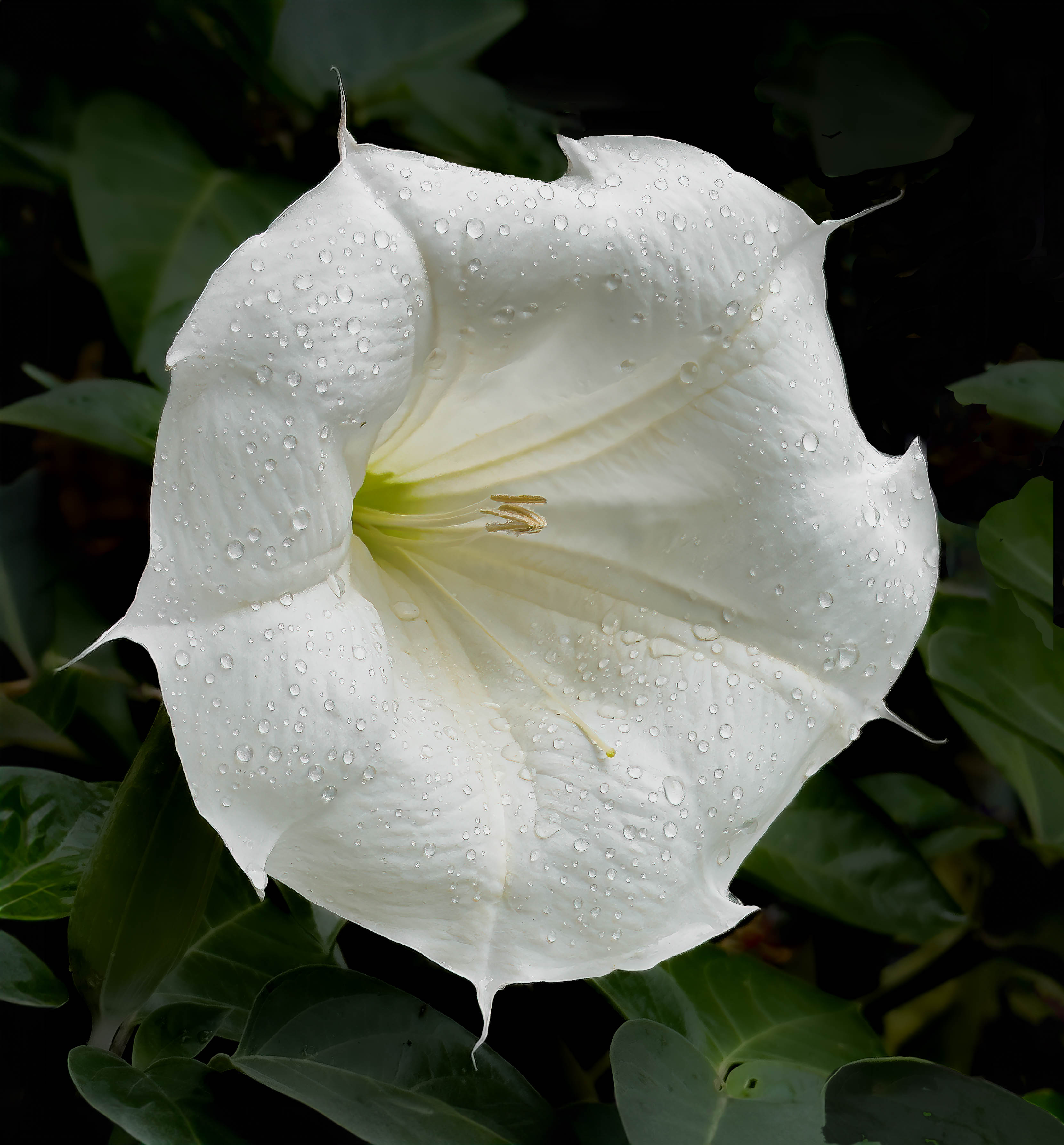
Judy - a lovely B&W image of one of my favorite subjects and I like the fact that the background is not solid black but has some texture to it. Also, the shadows of the stamen help provide depth to the image. While I don't feel negative at all about the petal cut off I do wish the one of the upper left had more space between it and the edge. I need to learn about framing as just not something I have done. It is amazing what one can do with a phone these days. |
Feb 15th |
| 75 |
Feb 23 |
Reply |
Thanks Judy - given the great comments and suggestions I have received so far, I have already tried Charlie's suggestion (above) for a vignette as well as trying other colors for the background but like you I like the one I have. Ray |
Feb 15th |
| 75 |
Feb 23 |
Reply |
Charles, in regard to your offer, I have spent some time trying to replicate how you added a vignette of color to my image with a black background and quite frankly failed so yes any information you can provide on how to accomplish that would be greatly appreciated. For me, the optimal learning approach, if you don't mind, is to send written directions for me to try and then we zoom or chat - that way I have some understanding even if not complete of the process. Very much appreciated, Ray |
Feb 7th |
| 75 |
Feb 23 |
Reply |
Vincent - thanks to you and the rest of the group for making my first interaction so rewarding. I look forward to next month. Ray |
Feb 5th |
| 75 |
Feb 23 |
Reply |
Dan, I much appreciate you sending me the color wheel as it helped me consider how to balance complementary colors - so far I have been picking out colors in the image and adjusting to what I think looks pleasing. Ray |
Feb 5th |
| 75 |
Feb 23 |
Comment |
Charles, I have spent some time trying to replicate how you added a vignette of color to my image with a black background and quite frankly failed so yes any information you can provide on how to accomplish that would be greatly appreciated. For me, the optimal learning approach, if you don't mind, is to send written directions for me to try and then we zoom or chat - that way I have some understanding even if not complete of the process. Very much appreciated, Ray |
Feb 5th |
| 75 |
Feb 23 |
Reply |
I should read what I type - raving = removing |
Feb 3rd |
| 75 |
Feb 23 |
Comment |
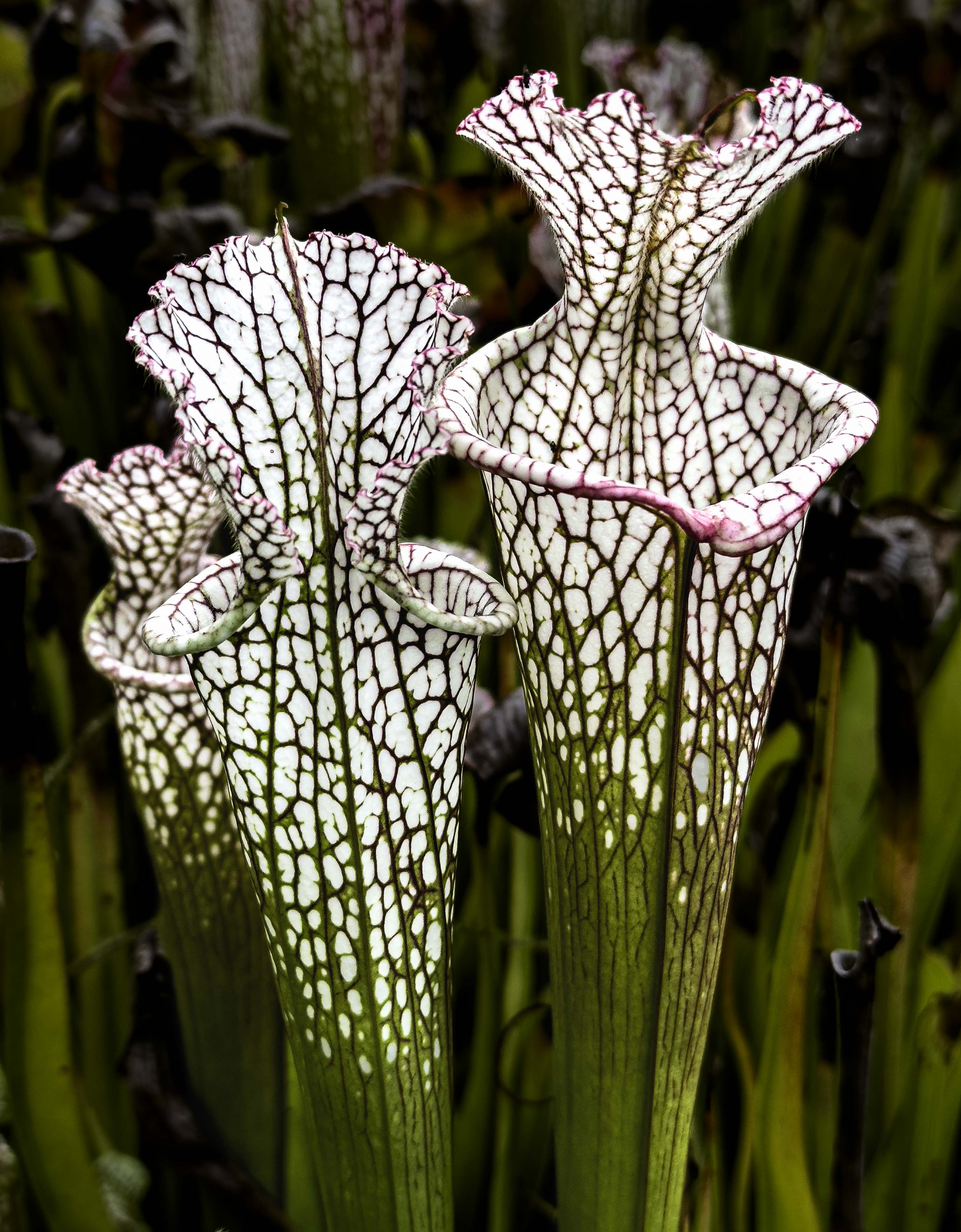
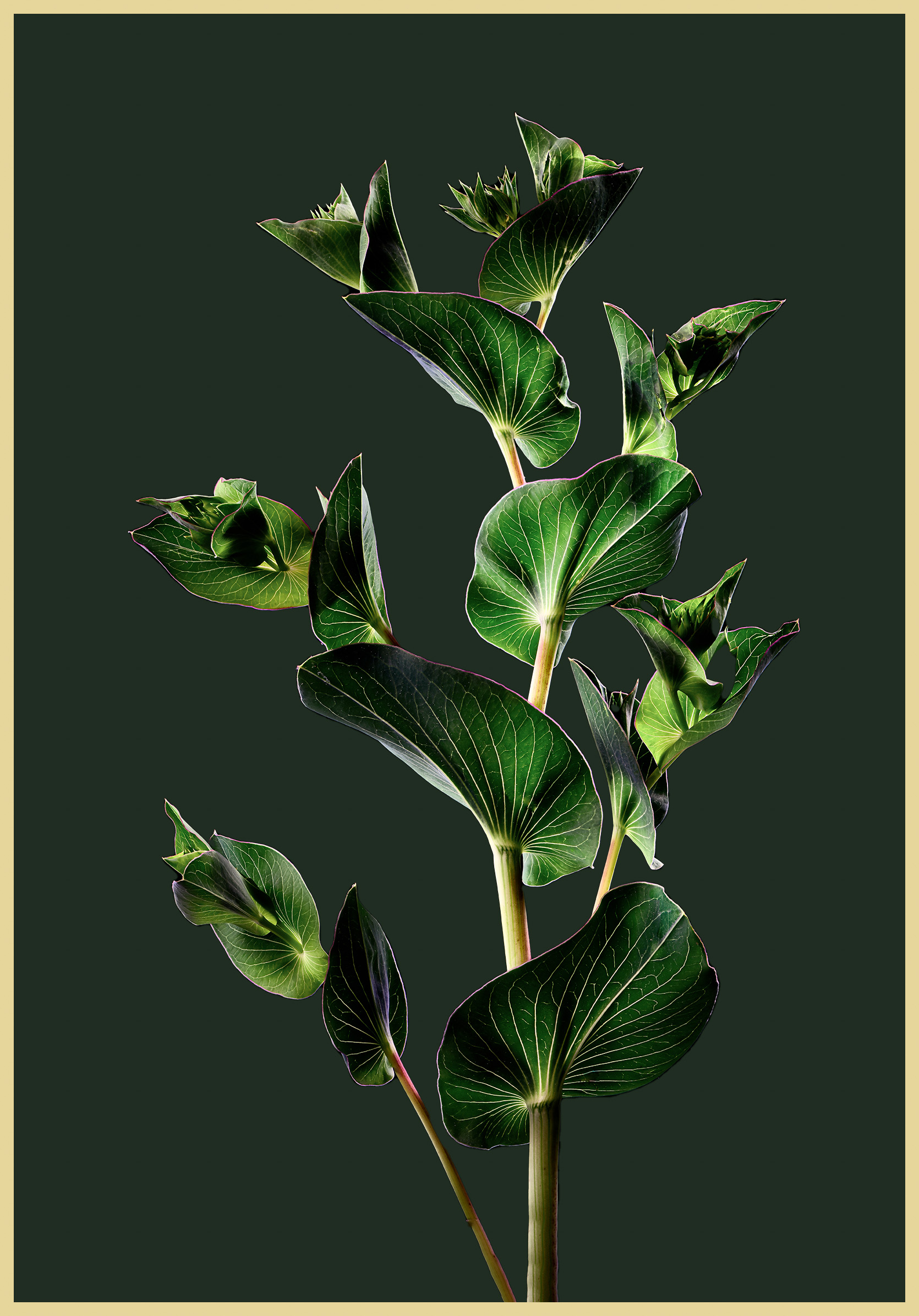
Charles - great image of an interesting subject - I like the shadows on the plant and that you left the tear in the leaf at 5 o'clock. The only area that looks a tad off is the leaf in the shadow at 10:00 o'clock but I can't tell you why - I like the background you used as it fits in nicely. I am pleasantly surprised by what a smart phone can do, photo wise.
|
Feb 3rd |
| 75 |
Feb 23 |
Comment |
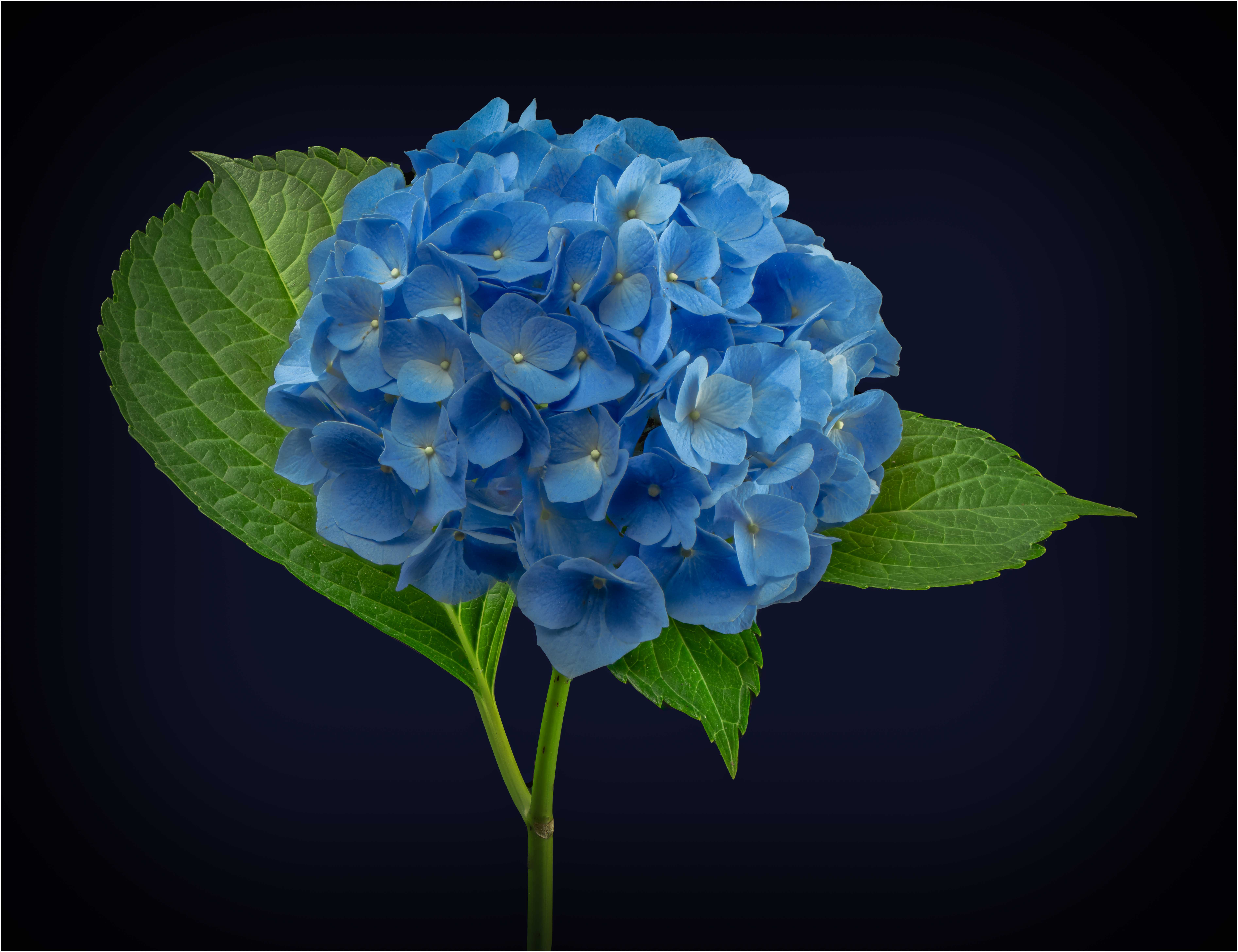
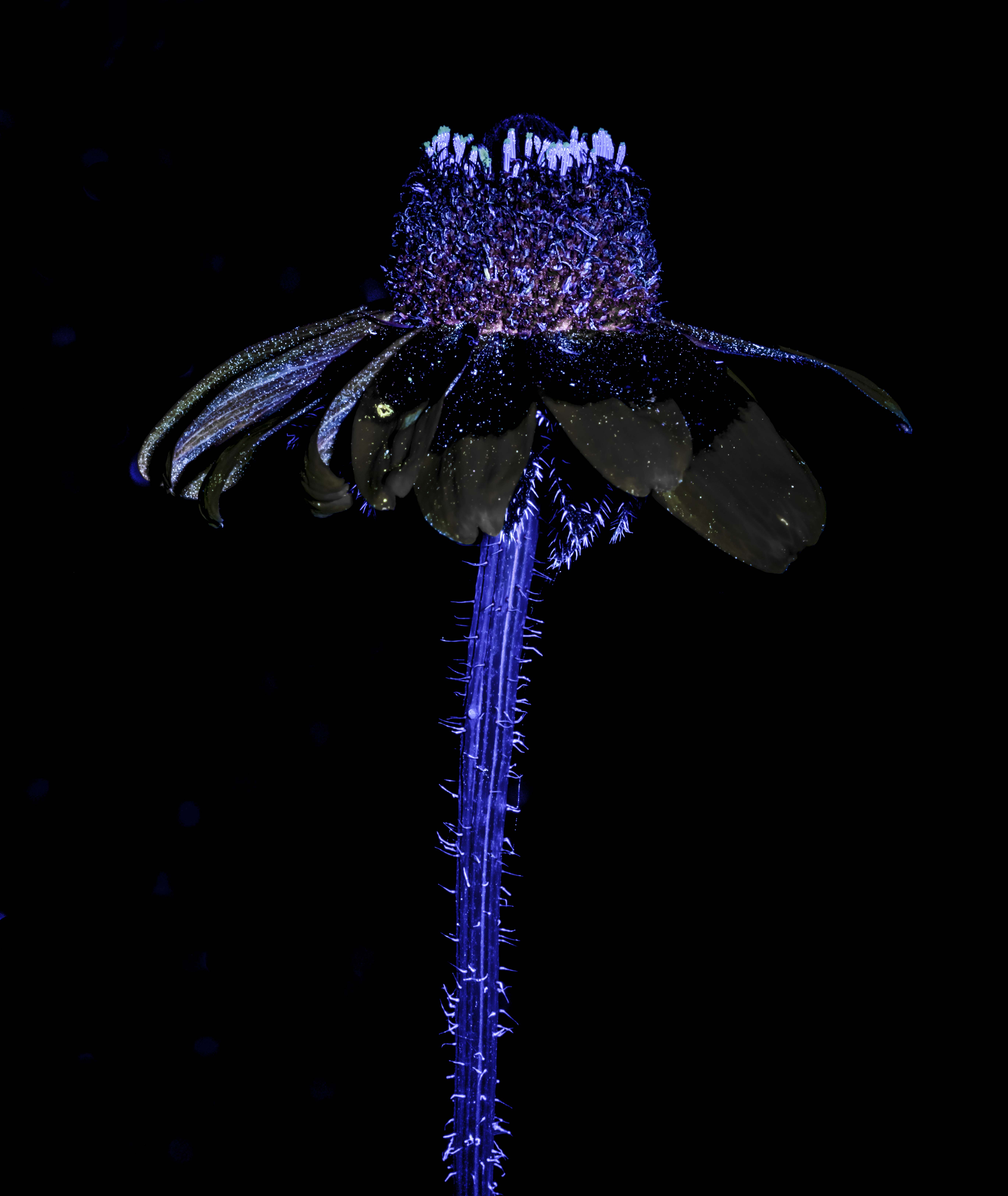
I like the subject, and the red color combination against the dark background. Like Charles, I would crop a little more but maybe not as much. We all come to the same image with slightly different viewpoints much I find helpful - as in I like the web elements as I think they add reality and I am not so sure the brighter areas are a problem. I wold have liked the stem to be more in focus but not sure what can be done about that. One criticism I have encountered from judges that critique images in my club's monthly competitions is when the object of attention is dead center in an image - they complain but I am not sure what could be accomplished here. My eye tens to go from lower left to upper right on the berries - would something like the crop in the attached move the subject and make the image more interesting - I don't know. |
Feb 3rd |
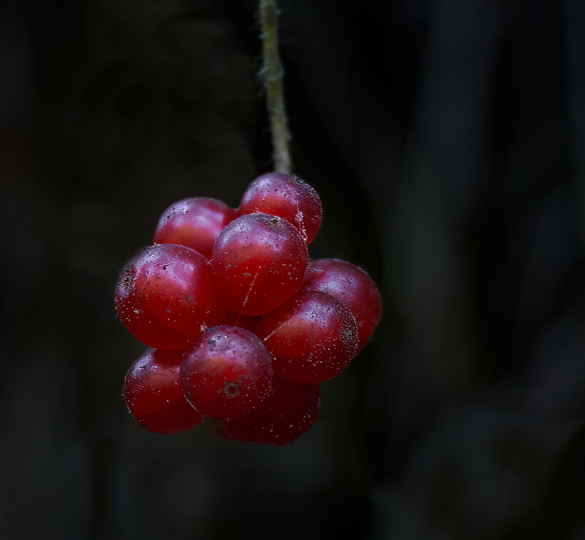 |
| 75 |
Feb 23 |
Comment |
I forgot to mention - thanks for leaving the spider web parts in the image - it adds reality |
Feb 3rd |
| 75 |
Feb 23 |
Comment |
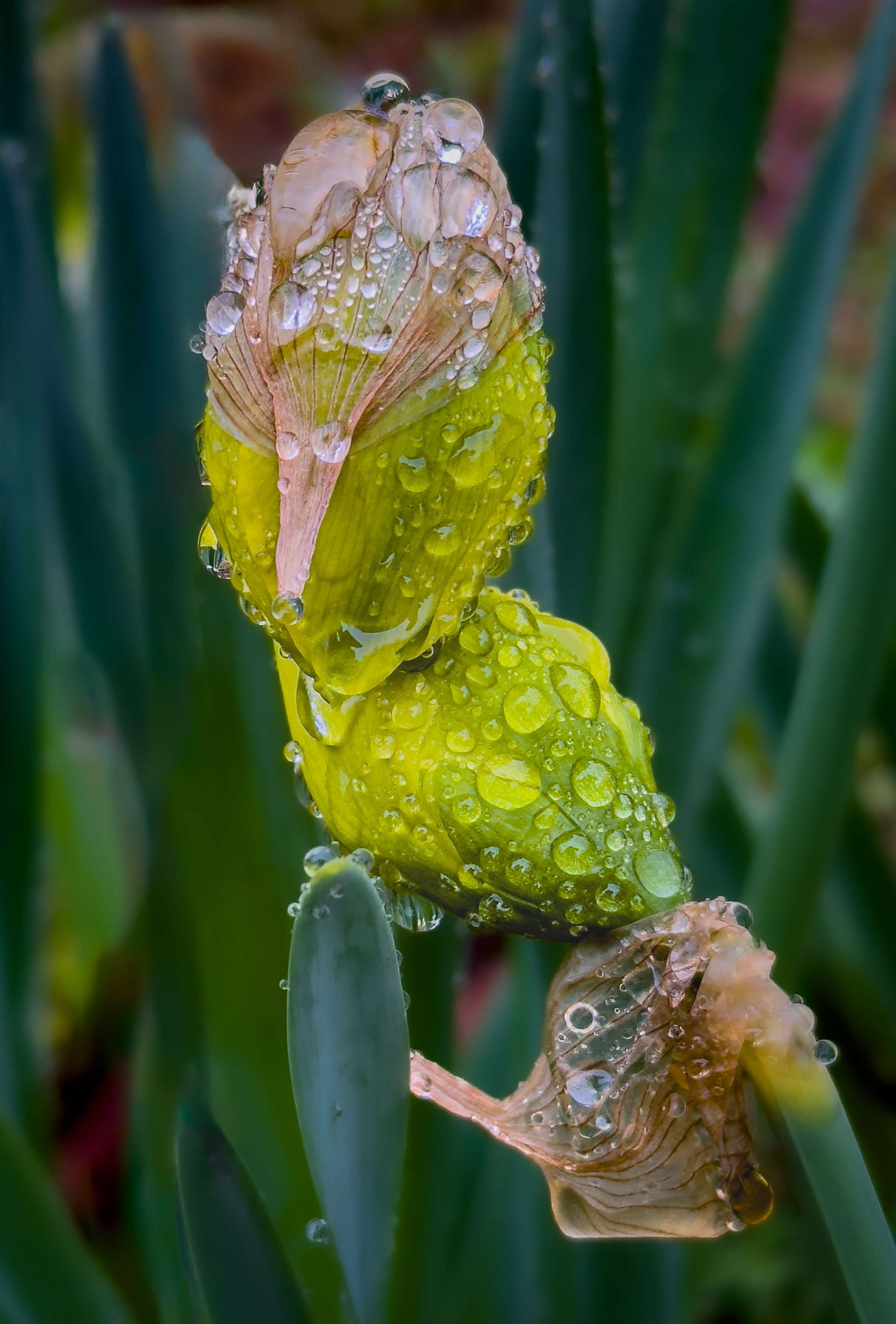
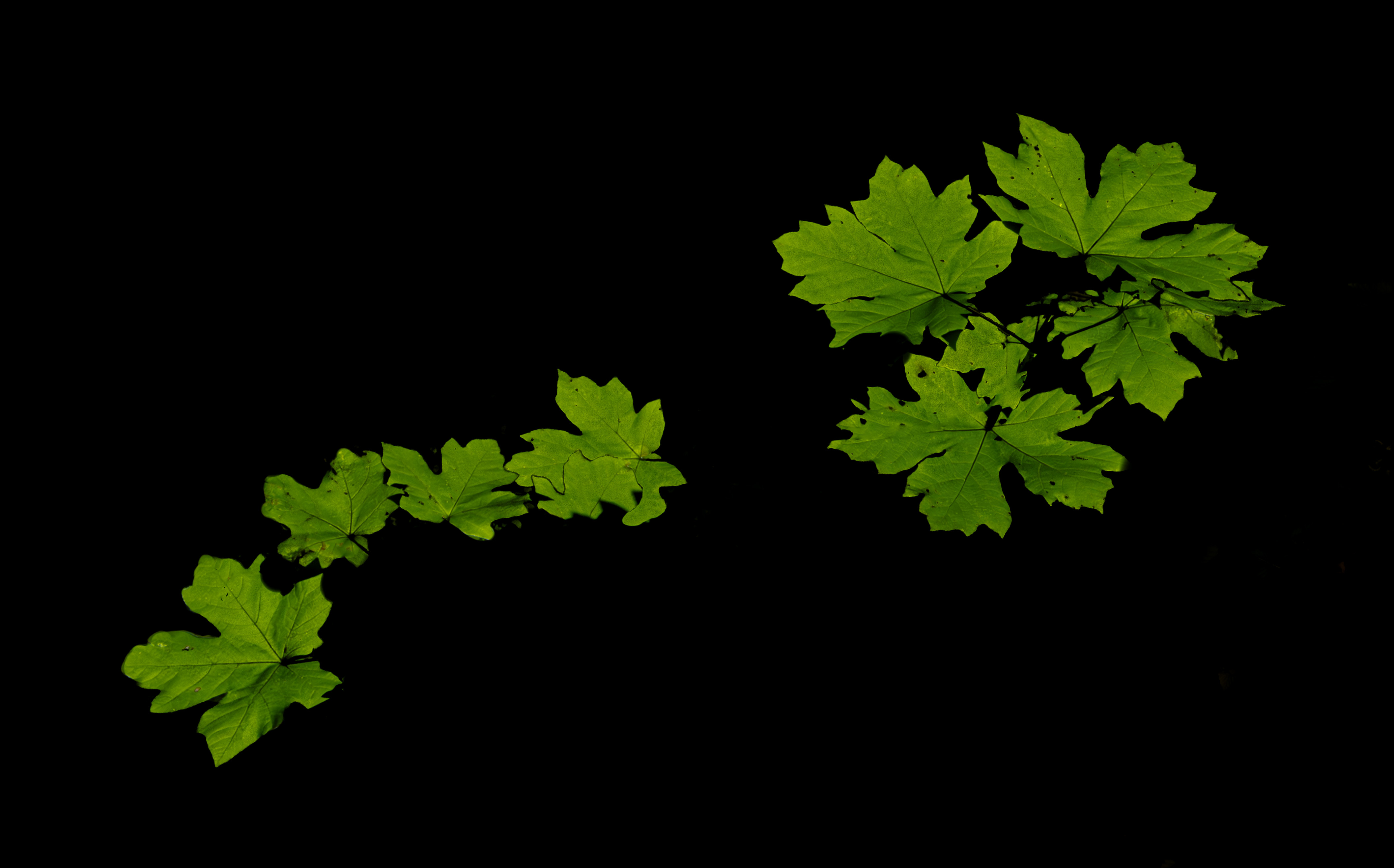
I agree with Charles that raving the bloom structure at the upper left might be useful/. Still, a wonderful composition with a great soft background. One issue I have been trying to pay attention to is how much space to have in the image around the subject - for example, in this image would just a touch more room at the bottom keep the viewer's eye from dropping to the edge? I like the border as well - not something I have ever tried but should. |
Feb 3rd |
| 75 |
Feb 23 |
Comment |
Vincent - one thought is to use a higher f stop for greater depth of field, let the iso adjust accordingly, and in LR or PS make the background more out of focus and less noticeable - that way the flower is in focus. I have been using some different programs to deal with noise (like Topaz Denoise) which works really well so I am much less concerned about noise than I used to be. Also, Topaz Sharpen AI works well in sharpening but not so much on low res jpegs. |
Feb 3rd |
| 75 |
Feb 23 |
Reply |
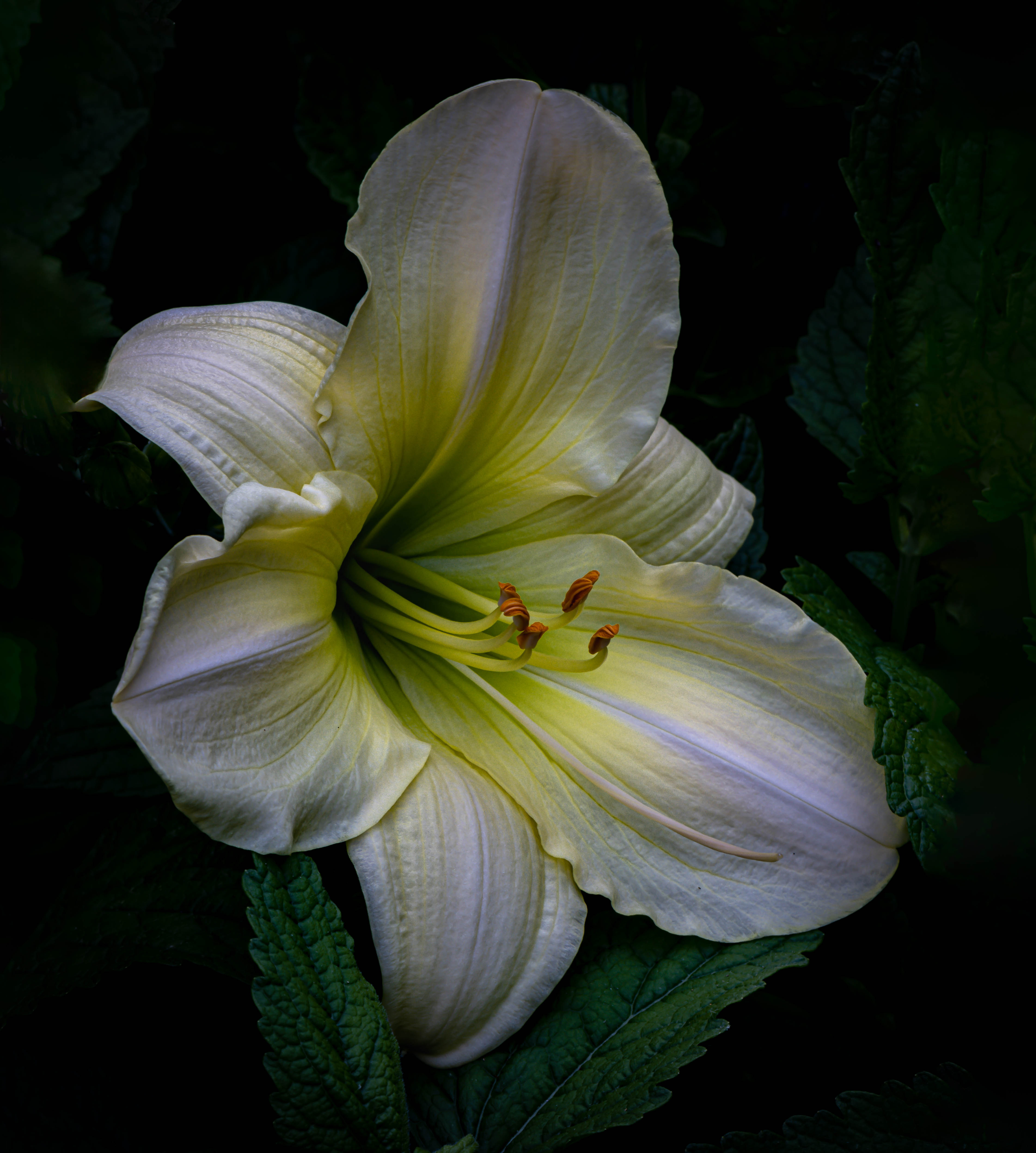
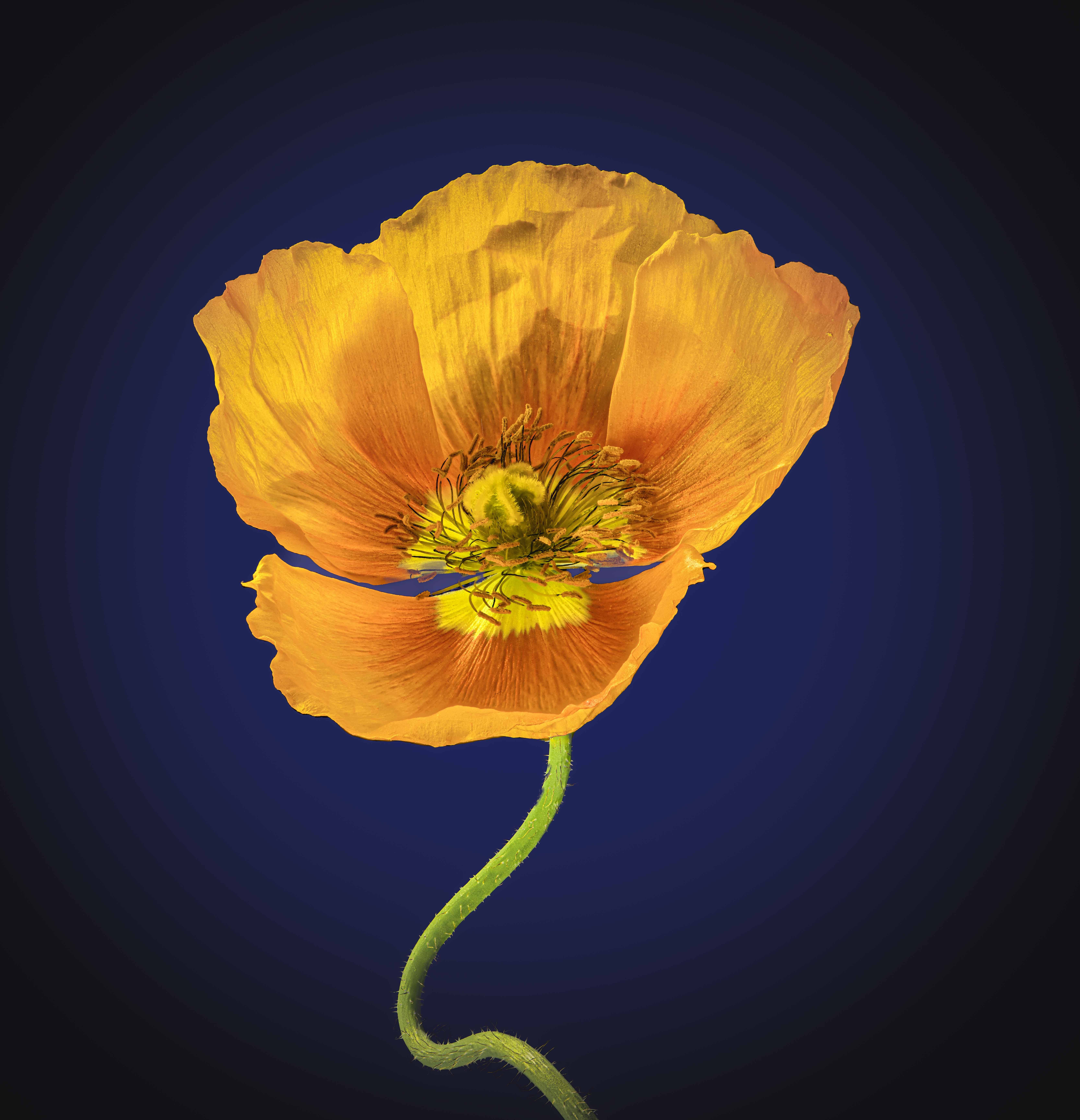
Thanks Vincent. My typical background is black (attached) but my wife has strongly recommended that I don't use black as she does not find it attractive and by extrapolation neither would others. This is my first try at a non-black background.
Dan - I tried different Helicon methods and ended up with method C because many of my flower images are much more complex than this one. Their website says that if the image has many crossing lines and changes in surface level, then C is best and B not at all so likely just depends on complexity. I use the eye dropper in PS to point at different colors in the flower and then played with colors near that color. Again, since my past has always been a black background, I am not yet familiar with using complementary colors - what color might you think would work well here?
Charles, you opened a whole new approach for me with adding a vignette - not something I had thought of but it looks great (with black, adding a vignette is just silly). I had worked on the anthers some - in another image by doing 3 stacked sets in HDR and then combining as the anthers are really black.
Thanks so much for the comments and suggestions, Ray
|
Feb 3rd |
 |
10 comments - 6 replies for Group 75
|
10 comments - 6 replies Total
|