|
| Group |
Round |
C/R |
Comment |
Date |
Image |
| 47 |
Feb 23 |
Comment |
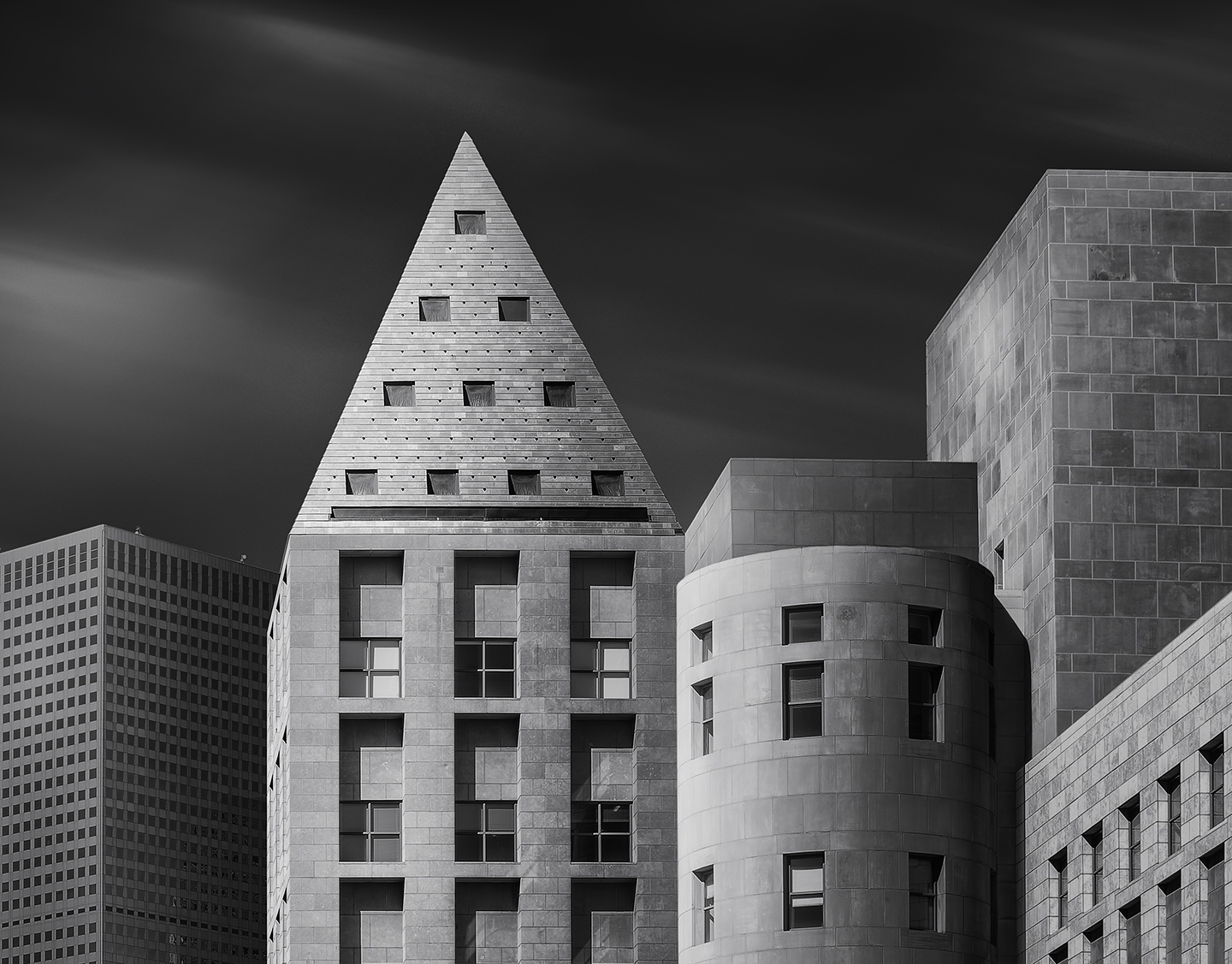
Kirsti. Great shot. Here are my 2 cents. Since our eyes generally tend to "follow" the light, I would try and darken the foreground sky maybe 50%. I would use a gradient to lighten more as you approach the background to the intensity that is there now. I would do the same with the buildings. Darken more in the foreground to mid ground and leave the furthest parts of the buildings as they are now. |
Feb 7th |
| 47 |
Feb 23 |
Comment |
Ed, I have agree with most of the comments. I especially think that the sky overpowers the scene, simply because it is too bright. You can certainly tone down the brightest areas. I think that would greatly improve the image. It is a cool looking building and I like the way it is presented, aside from the sky. |
Feb 7th |
| 47 |
Feb 23 |
Comment |
Albert, Let me start by saying, if it moves, I don't photograph it. That's people, cars, birds etc. :o) So for sure, I am no bird expert.
First I love the bird, the pose and the detail. What I am not sure about is the background. It doesn't appear blurred to me. It appears more as if you brought up the shadows, which gave it more of a hazy or milky look. For me, the branches seem to look too much like branches, rather than blurred. How did you blur the background? |
Feb 7th |
| 47 |
Feb 23 |
Comment |
Sweet image Trung. I like everything about it. Composition, lighting, Impact, quality etc. All great. |
Feb 7th |
| 47 |
Feb 23 |
Comment |
Robert,
I like the image. Was there a specific reason for making the image as light in tone as it is? I have never shot a ceiling of any kind, so I am curious. It's quite sharp and has loads of detail. I'll be embarrassed if you tell me the ceiling was a bright white. :o) |
Feb 7th |
| 47 |
Feb 23 |
Comment |
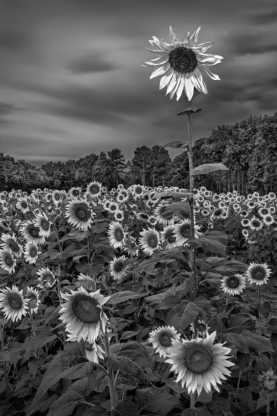
Thanks All. I appreciate all the suggestions and positive comments...... |
Feb 7th |
| 47 |
Feb 23 |
Reply |
Thanks Jeff and Albert. I actually cropped and handled the building on the left as I did, based on comments from several photographers. However, I had suggestions similar to Albert's. Actually the building on the left was darkened over 50% compared to my original version. In the end, I went with this version simply because I liked it more. Believe me, I made at least six versions of this image before going with this one.
|
Feb 7th |
| 47 |
Feb 23 |
Comment |
Jeff,
I really like this shot. Great "mood". I do like the crop in the original as well. A great shot with tonality that adds to the "story".
Dom |
Feb 6th |
7 comments - 1 reply for Group 47
|
7 comments - 1 reply Total
|