|
| Group |
Round |
C/R |
Comment |
Date |
Image |
| 78 |
Mar 24 |
Reply |
Thank you for your comments, Sunil! When you refer to the right-side of the building, are you referencing the building's own RH side, meaning the brighter face of the building that appears on the LH side as we view it? |
Mar 25th |
| 78 |
Mar 24 |
Reply |
I wish I could say it was something super technical and fancy. Sadly, I cannot. Rather, saying a background is shredded is the same as saying a background "melts away" or "fades into oblivion."
It's nothing more than a colloquial term for a lot of bokeh, specifically referring to it in a desirable or favorable kind of way.
I know... boring! ;-) |
Mar 16th |
| 78 |
Mar 24 |
Reply |
Thank you, Ed, for your very detailed response and listing out the specific changes in your reworked version! I do like the majority of your changes. For my personal taste, I tend to only like low-contrast when combined with sepia tones. In pure monochrome, I like higher contrast akin to an Ansel Adams type of style. |
Mar 14th |
| 78 |
Mar 24 |
Comment |
Thanks to those of you who have chimed in already... I will be home late tomorrow for the first time in 9 weeks and I will be able to enjoy it for 10 full days to come!
I look forward to being able to spend some time steeped in the hobby and playing around with stuff during that time.
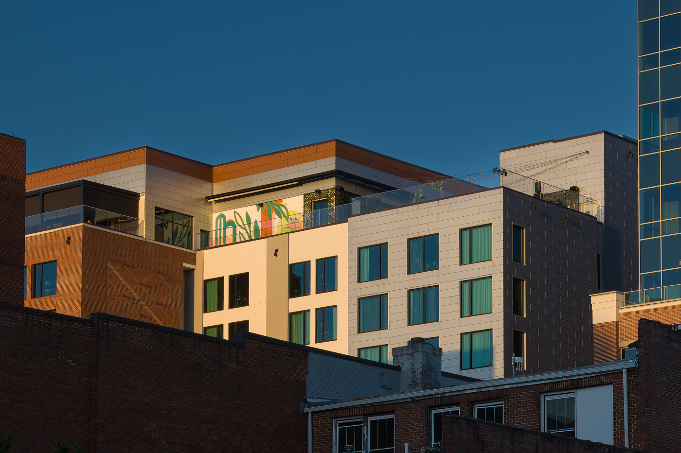
While I generally side with Jim on having a preference for the "keystoning" that results from the odd angle of capture, y'all have my curiosity piqued with the comments on using NIK filters or "warp transformation" within Lr so I will investigate.
As for the sky, I understand the lack of "interest" it can offer and that is a contributor to why I chose to go darker with the sky. I personally like the lack of interest is offers and thus the creation of "negative space" in this current form. |
Mar 14th |
| 78 |
Mar 24 |
Comment |
This is amazing, Ed. It looks like it belongs in a trailer for some crazy new Sci-Fi movie, or the cover of Asimov's Science Fiction Magazine ... certainly some primitive life-form in appearance only and that is actually an overlord of sorts in reality.
One of the best macro shots I have seen in some time! I have nothing to suggest. |
Mar 14th |
| 78 |
Mar 24 |
Comment |
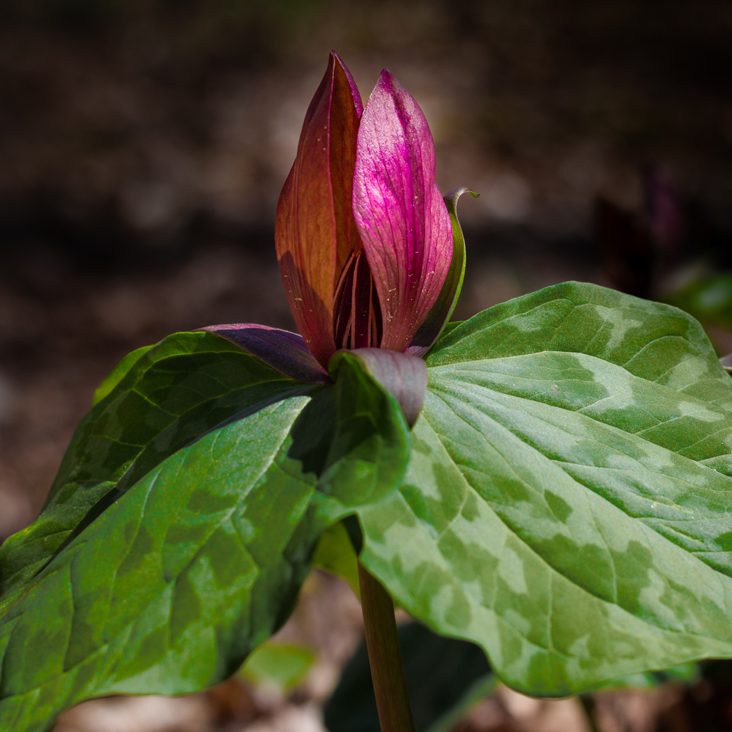
Wow ... this is one of my personal favorite of your flower images, Robert. And I almost universally like all of them.
Your original is great and the rework is even better.
The only suggestion I can offer is to consider removing the very top green leaf so as to remove it's contrasting competition with the amazing sunflower bloom itself.
Great capture! |
Mar 14th |
| 78 |
Mar 24 |
Comment |
What a wonderful image, Pei-Fan... I am most impressed with your skill at merging multiple images into something uniquely different both as you did last month and now this month as well.
I like the merging of the two images together. I also feel it is just a touch too bright and also a little too "hazy" (similar to what Jim and Ed have said). Using your original merge of the two images plus the reduced haze and brightness as shown in Jim's rework might be a very appealing blend of what you've already done with some minor modifications. |
Mar 14th |
| 78 |
Mar 24 |
Comment |
I definitely have nothing to "add" here, Sunil. I always love your monochrome conversions. Your original was incredible and I like your rework even more. Well done as always! |
Mar 14th |
| 78 |
Mar 24 |
Comment |
This is a wonderful image, Jim!
I agree with Ed that I prefer your original to the reworked image. I also agree with Brenda and Robert that the bottom half of the background is just a touch too bright. Because this brightness also results in the reflection of light through the glass bottles in the bottom half to also be a bit bright, you might wish to consider simply applying a gradient filter from the bottom up to just past half-way, then first dialing back the highlights and if that's not enough, also dialing back the exposure within that same gradient ever so slightly.
I like that there is change/transition in brightness from top to bottom, it just feels a bit too much to my eye. |
Mar 14th |
| 78 |
Mar 24 |
Reply |
Nothing beats Scooby-Doo in my childhood memories. :-D
I'm a little surprised you haven't heard "shredded" before ... I've heard it for many years and I'm nowhere into the mix of competition and critique to the level you are! |
Mar 14th |
| 78 |
Mar 24 |
Comment |
Brenda,
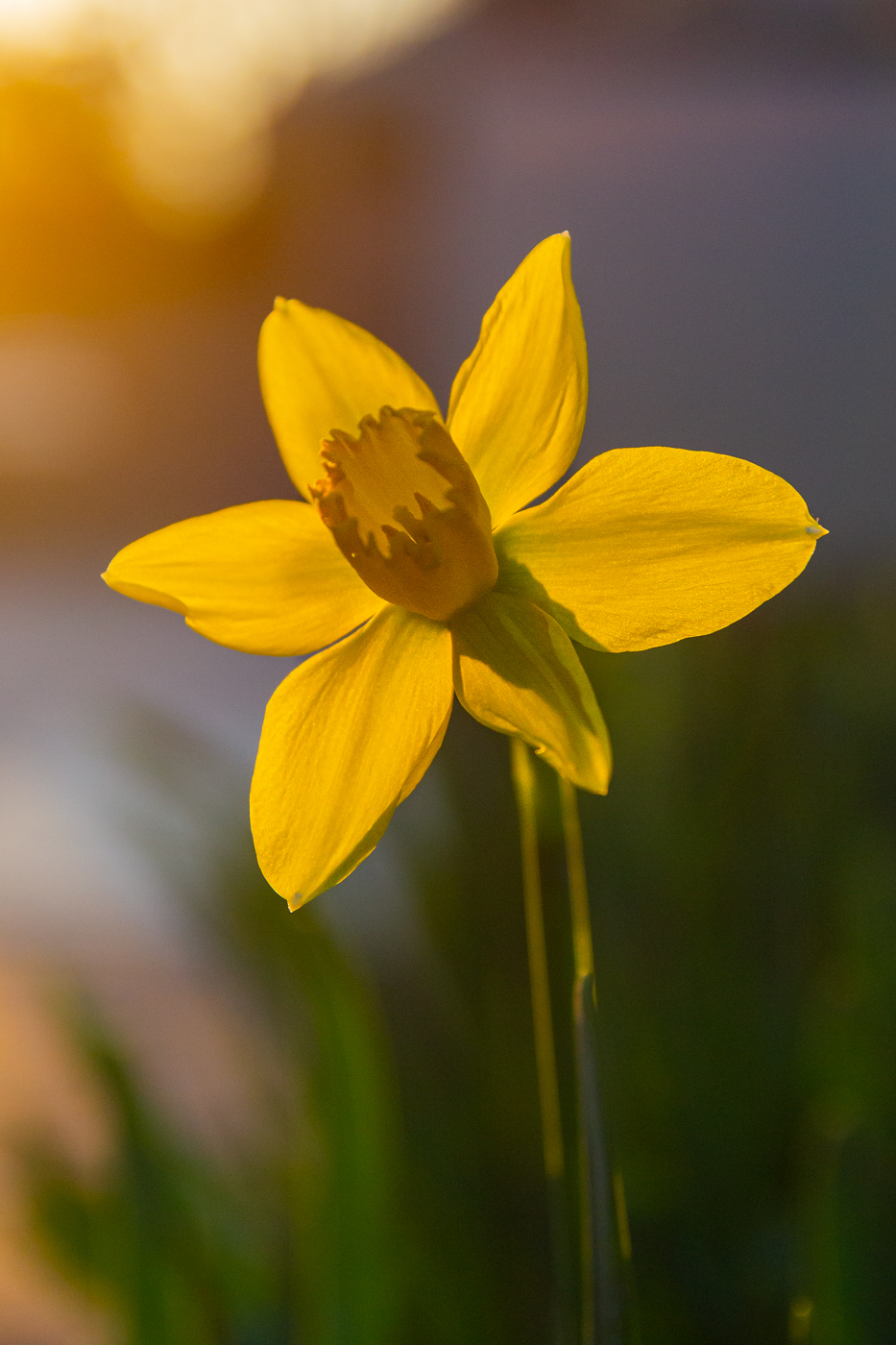
I love this image on so many levels. I love that you kept the original direction, I love the sharpness of the subject while the background is almost completely shredded, especially in your rework. The extra shredding of the background almost gives it a Scooby-Doo "toxic fog feel" that I particularly enjoy personally.
I like Sunil's rework a lot ... I also am firmly in Jim Hagan's camp that I cannot really offer any significant critique on the image... I love what you have done with it already. |
Mar 14th |
| 78 |
Mar 24 |
Reply |
Brenda, I especially appreciate your input regarding left-to-right vs. right-to-left. For me personally, this is one of the most overstated things in camera club circles and within photography within the U.S. overall. At a minimum, it is very subjective... on the more critical end, the use of the argument for left-to-right reading precludes a significant portion of the world's population. I personally always favor the "how it happened" approach above all else. From my personal thought bank, kudos for leaving it as it was captured. |
Mar 14th |
7 comments - 5 replies for Group 78
|
7 comments - 5 replies Total
|

