|
| Group |
Round |
C/R |
Comment |
Date |
Image |
| 78 |
Feb 24 |
Reply |
This is great Ed! Despite feeling that more separation between the moon and the trees would be preferred, this version with the moon more behind the trees is even better!
It looks like I might imagine a scene from a movie made about a science fiction novel. |
Feb 27th |
| 78 |
Feb 24 |
Reply |
Mu,
It is really nice to see your reworked image! I share Brenda's thoughts here in that this version "feels" too toned back with regard to the water droplets and their contribution to the feeling of action. Somewhere in between your original edit and this most recent version might be a really nice balance! |
Feb 27th |
| 78 |
Feb 24 |
Reply |
Jim, While I did not find the brightness of the flooring in your original edit to be a distraction, I also agree that it is less distracting when darkened as in your last edit. It remains a great image and I maintain it could be a very fund one to do in monotone! |
Feb 27th |
| 78 |
Feb 24 |
Reply |
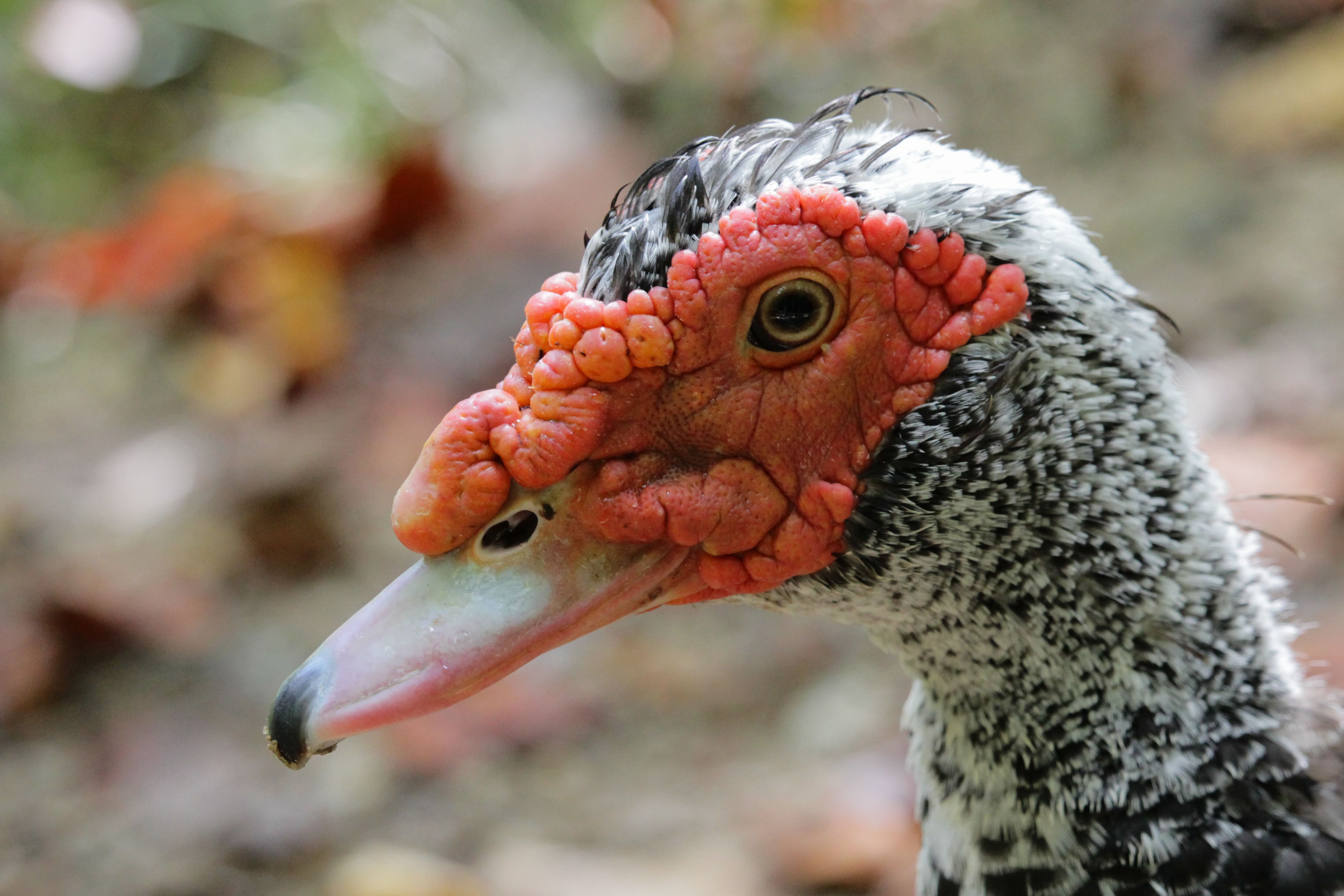
Hi Brenda,
You still have a wonderful image here. I find that my personal preference leans toward the brightness of your original background. I believe this is due to keeping the crack there... with the crack present, darkening too much feels "off."
I also liked the brighter and contrastier owl in your original edit.
Something still looks a little off on the owl's RH wing to me. Some of it seems like it could be from the perceived curvature of the lower half of its right wing but I now realize that it might also be in part to what I now believe is the owl's right foot hanging just below the tip of its wing. The optical illusion, of sorts, is compounded (to my eye) in this version partly due to the darker background with the crack still present.
Given your preference to keep the crack, I would personally brighten it up more.
What are your thoughts on removing the owl's foot? |
Feb 20th |
| 78 |
Feb 24 |
Reply |
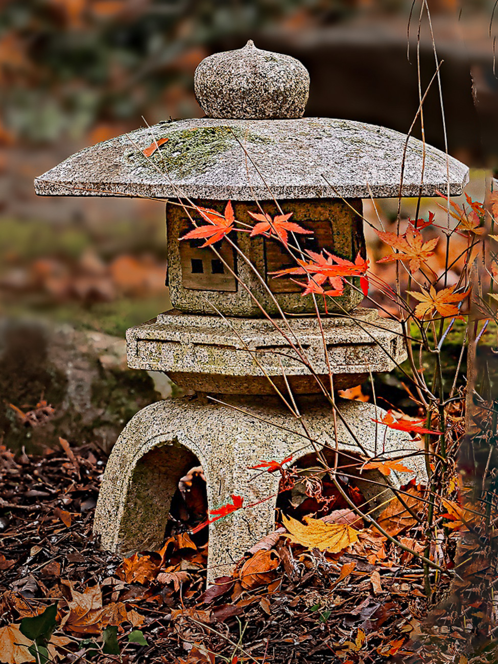
It is a wonderful image, Robert. Highlighting the Japanese Maple leaves and the lantern, while minimizing most everything else is what seems most apropos for the subject.
Huge kudos for sticking with a subject through multiple seasons and scenarios. Great patience! |
Feb 5th |
| 78 |
Feb 24 |
Reply |
Thanks Brenda!
I don't really find the differing opinions to be frustrating. Rather, it's eye-opening... as I said in my comment back to you, it's "amazing." There are many accomplished, decorated, well-respected photographers, for whom I value the opinions of greatly. Within PSA. Within my camera clubs. Etc.
And despite the commonality, there is also such a significant subjective aspect.
Such is life in the realm of "art." I've been involved in theatre and music for my entire life. There are many parallels there. Despite art being very technical in nature, it is also very subjective.
I wouldn't want to change a thing about any of it. The variety of expert/highly-regarded opinion still amazes me all the same. :-D |
Feb 5th |
| 78 |
Feb 24 |
Reply |
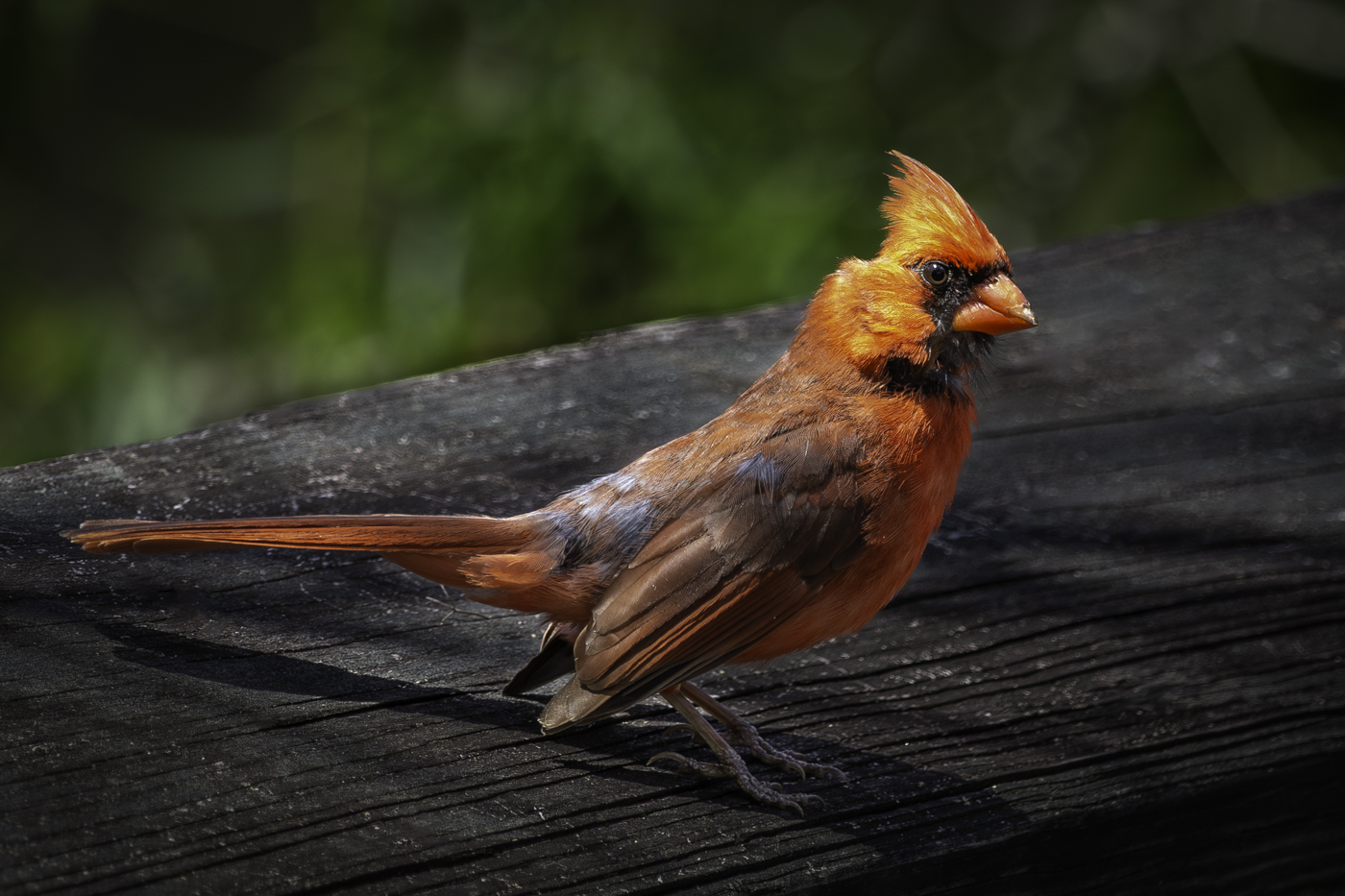
Very nice Sunil! I do prefer it without the iced coffee by his feet. Very nice image! |
Feb 4th |
| 78 |
Feb 24 |
Comment |
Phenomenal monochrome conversion!!!
My only critique would be to have a slight bit of "separation" between the moon and the top of the trees.
I like this a lot. Well done!
|
Feb 4th |
| 78 |
Feb 24 |
Comment |
Nice image, Robert!
Similar to what Jim has already offered, I would prefer the "windows" of the lantern to be a bit brighter.
And as with what Brenda offered, the background is still a bit distracting for my personal preference.
Here is a very quick rework with the tree on the right-hand side removed. The background has been selectively darkened through reduced exposure and color desaturation. The color of the maple leaves was selected as a color mask and enhance through more saturation. And the windows of the lantern were brightened a bit. Plus a slightly tighter crop.
|
Feb 4th |
 |
| 78 |
Feb 24 |
Comment |
Welcome to DD78 Pei-Fan!
What a wonderful composite image you have created!
As observed by Brenda, the droplets of water from the splash/spray are slightly distracting for me personally. Personally, I feel they are just too bright and contrasty compared to the rest, but not necessarily overly sharpened.
Potentially dialing back the level of the highlights and/or the whites might be enough. Also pulling back the overall contrast a touch as an addition if the highlights and whites are not sufficient on their own might help.
I look forward to "dialoguing" with you and seeing many more of your images in the months to come! |
Feb 4th |
| 78 |
Feb 24 |
Comment |
Sunil,
Wow. I love this... the contrast and mono conversion is fantastic. I especially like your removal of the gentleman standing further back and the woman with the tie-dye shirt on the right-third of the frame and left only the young man interacting with his backpack centered for human interest.
I also especially appreciate your darkening of the areas left of the pillars, where the actual subway tracks are. That really helps keep the viewer's focus in the main part of the frame.
My only (very nitpicky) suggestion is to consider removing the young man's iced latte that is sitting in between and slightly in front of his feet. |
Feb 4th |
| 78 |
Feb 24 |
Comment |
This is a wonderful image, Jim. I love what you did with layering a bracketed exposure together to get the best of the brightly lit areas as well as the darker areas.
I've not yet tried a bracketed exposure myself, despite the fact that my cameras will do so if I wish. I clearly need to try this.
Despite the wide angle, I see no distortion as I would normally expect to see. I suspect you already corrected this in post-processing. Well done!
(Side note: This one also looks like it would be very well-suited for monotone).
|
Feb 4th |
| 78 |
Feb 24 |
Comment |
This is a wonderful image, Brenda.
I love the frame rate/speed the modern digital cameras offer ... I also find that many times, the artifacts/geometric distortion that occurs with higher burst rates is a bit distracting. Fortunately, you were not trying to capture a fast moving ball or an aircraft rotor in this one, thus the distortion appears minimal to my eye. My mind at least believes I see some minor distortion in the owl's right-hand wing, whereby the lower/foremost portion of the wing does not look completely natural to me.
The color and contrast is wonderful. I love what Jim Hagan did with the crack in the wall and generally blurring the background/wall in its entirety. I also like what he did with darkening the background... I personally prefer the owl a little lighter and "poppier" though suspect the owl being too bright with the background too dark would in general look too artificial as well. Maybe split the difference? |
Feb 4th |
| 78 |
Feb 24 |
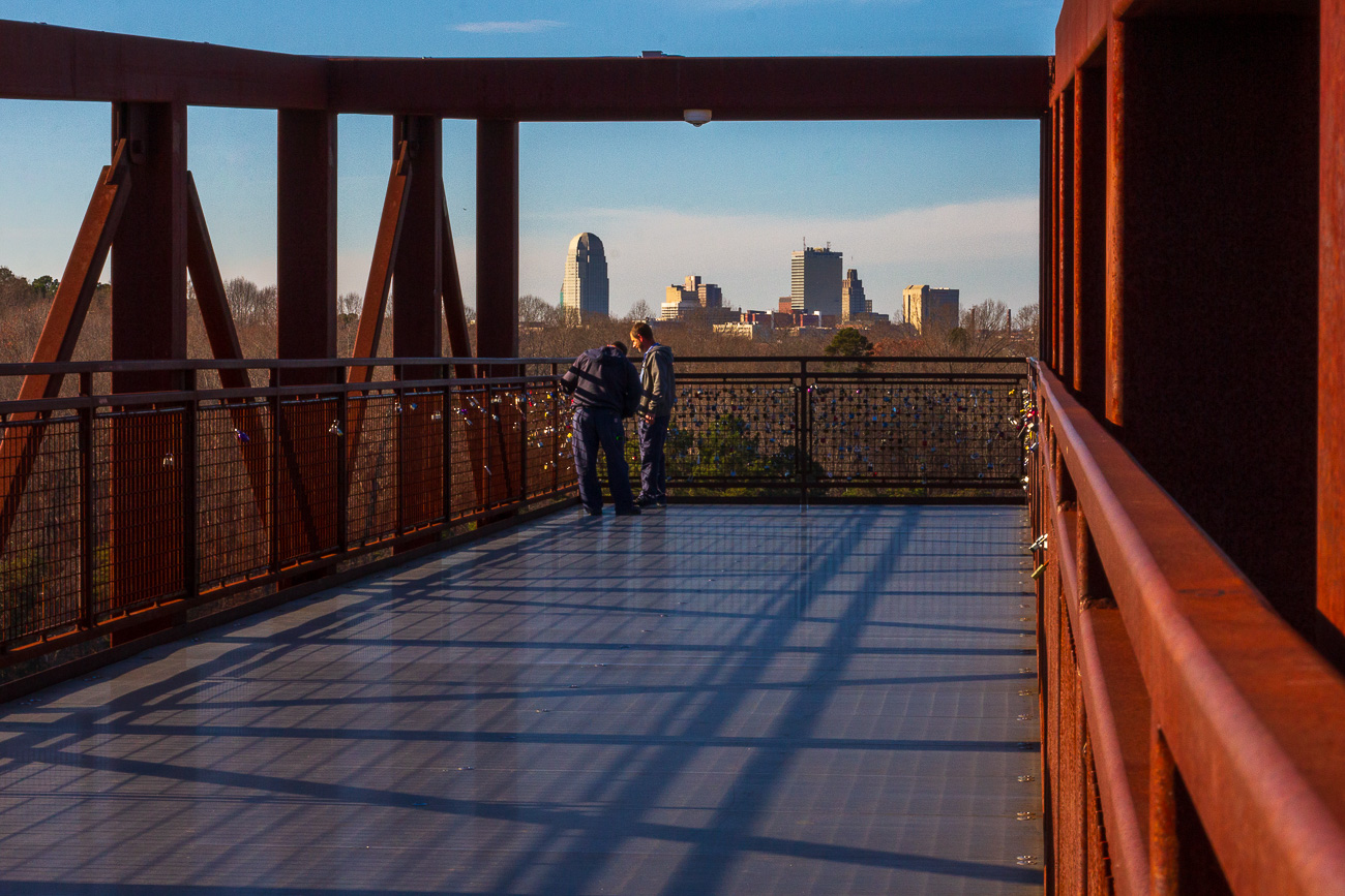
Reply |
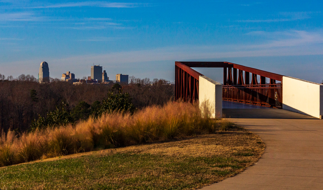
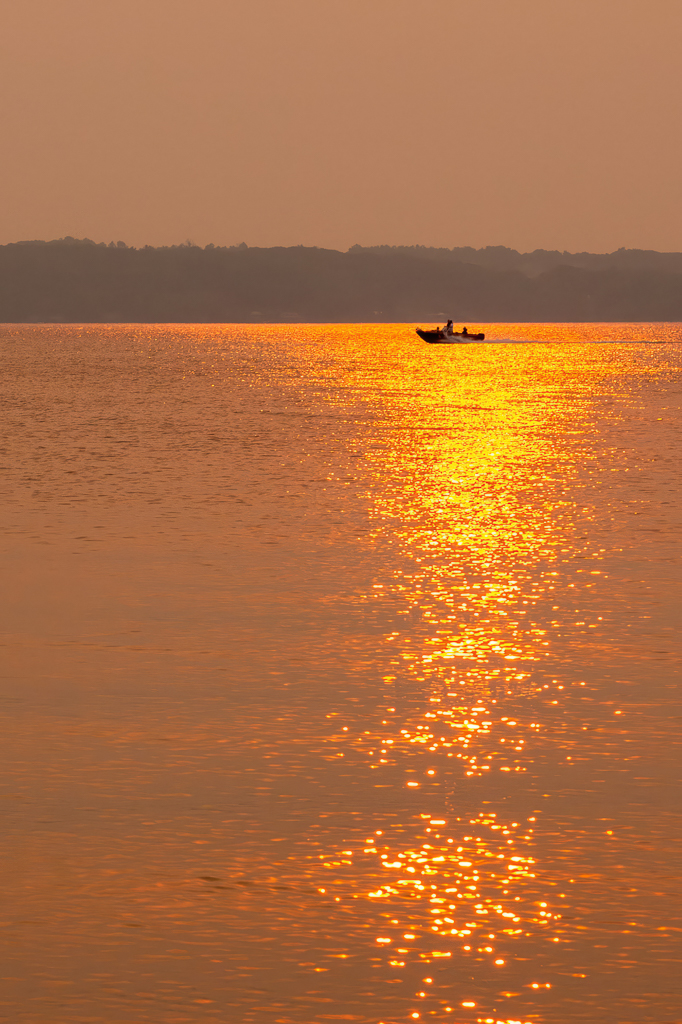
Jim,
Your comments share some similar thought lines to what Brenda shared above, with a bit more emphasis on the desire to see the skyline through the observation deck and the addition of people. I happen to have taken many photos on that afternoon, one of which offers a perspective very similar to what you have highlighted.
As commented to Brenda above regarding my having submitted the initial Feb. Photo for a photo lesson on a PSA online class, I also submitted this other perspective photo for that same lesson and received favorable comments from the instructor for this one as well.
I like the framing of the skyline in this photo... I love the gentlemen that are checking out the padlocks on the fencing... I love the leading lines.
The initial photo offers some adherence to the golden spiral (Fibonacci principle) that this one does not have. I like them both; different things about each. |
Feb 4th |
 |
| 78 |
Feb 24 |
Reply |
Hi Brenda,
Yes, I do have some other images from that same day, from different perspectives. One of them is more along the line of what Jim is referring to below.
I used narrow aperture and focused in the supposedly magical front third point of the focal plane (using a manually selected focus point of the 9 available to me in my older camera), giving me the maximum amount of in-focus depth of field. To my eyes, this entire image is as in-focus as is possible with my given camera and lens.
I also did not apply any temperature shifts to the observation deck and foreground separate from the sky. I slightly warmed the entire image the same amount. Thus, the sky and the rest of the image "should" be an accurate representation of the actual conditions on that particular day.
One of the other perspectives is shared in a reply to Jim Hagan below.
Short-term, the exif data for the above photo is as follows:
+ Canon 60D
+ Sigma 17-50mm f/2.8 lens
+ 43 mm focal distance
+ f/22 using aperture priority
+ ISO 400
+ 1/320 sec shutter speed
It will forever be amazing to me how much variation there is in an analysis of an image from person to person. It highlights the subjective nature of photography for sure ... while there are common elements of "good photography," we are also all uniquely different. I submitted a less modified (only cropped) version of this photo as a lesson submission for the digital photography online course through PSA. The instructor's comments were: "Excellent composition and your exposure is good. I like your choice of aperture since it has both your foreground and background in sharp focus. You have powerful leading lines."
|
Feb 4th |
6 comments - 9 replies for Group 78
|
6 comments - 9 replies Total
|