|
| Group |
Round |
C/R |
Comment |
Date |
Image |
| 78 |
Dec 23 |
Reply |
And the one through Topaz Photo AI |
Dec 24th |
 |
| 78 |
Dec 23 |
Comment |
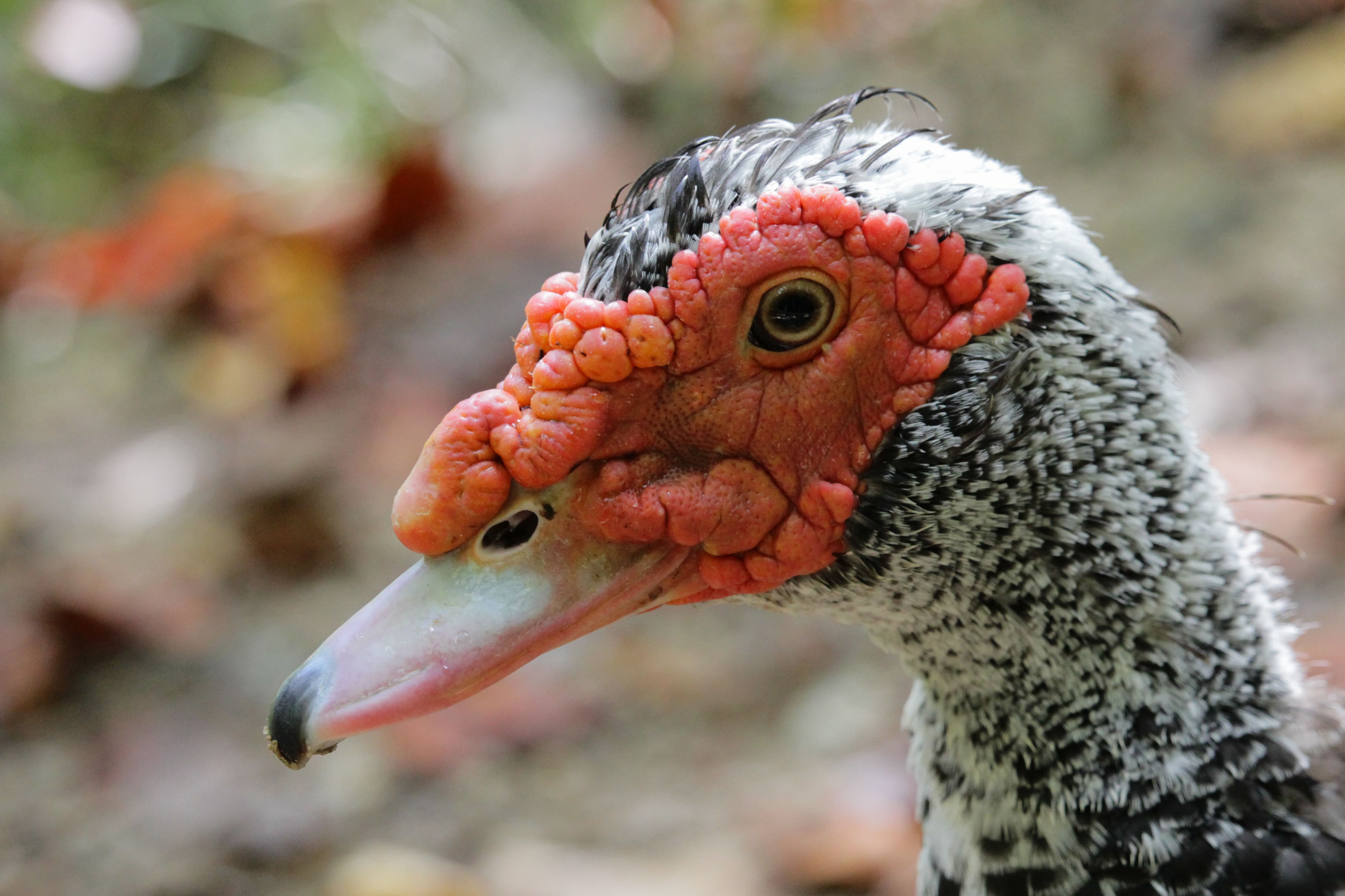
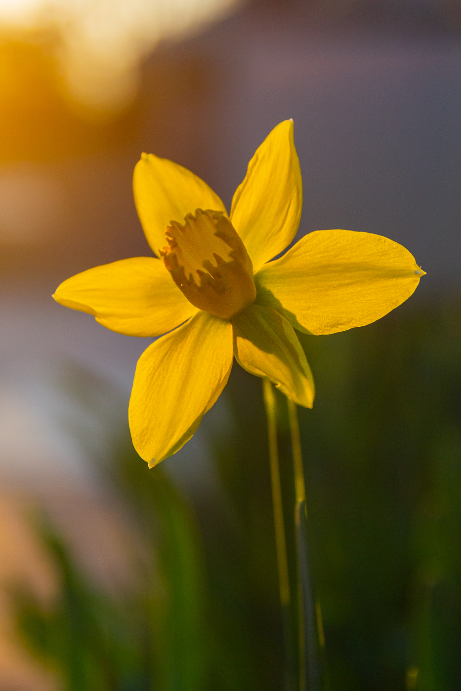
Played around with this more today in my preferred Lightroom CC and attained better results for my liking. Many tweaks done.
One version exported straight from Lightroom and the other run through Topaz Photo AI.
For the purpose of our screens, I can see where the Photo AI can be appealing. I still personally prefer the noise/grain of the non Photo AI version as I feel it looks more real/true to what my eye expects of a photo. From my darkroom days, some films were very much preferred specifically because of their texture/grain ... I feel so much of that is lost is today's realm of digital photography.
This attachment is the straight Lightroom export after today's post-processing.
|
Dec 24th |
 |
| 78 |
Dec 23 |
Reply |
Ed ... please see the reworked version below ... toned down the overall background and played with the eye... mostly the very center. |
Dec 21st |
| 78 |
Dec 23 |
Reply |
Reworked version below ... played around with it a bit too much for my liking but used some of the tools and things we covered yesterday. The learning part of it was fun. |
Dec 21st |
| 78 |
Dec 23 |
Reply |
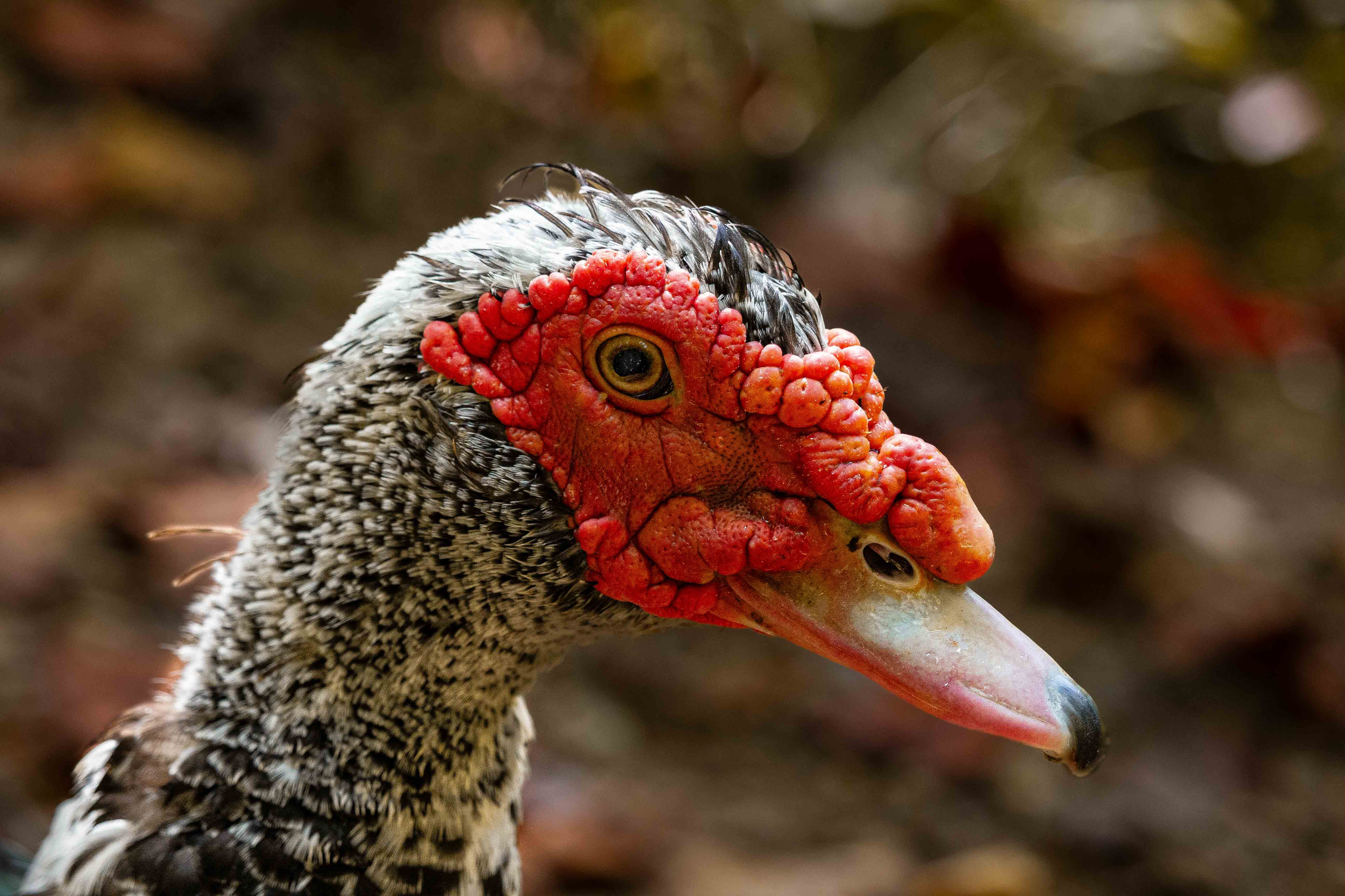
Check out the flipped rework version below Robert. I still prefer the left-facing version. It is interesting to see the difference in them. |
Dec 21st |
| 78 |
Dec 23 |
Comment |
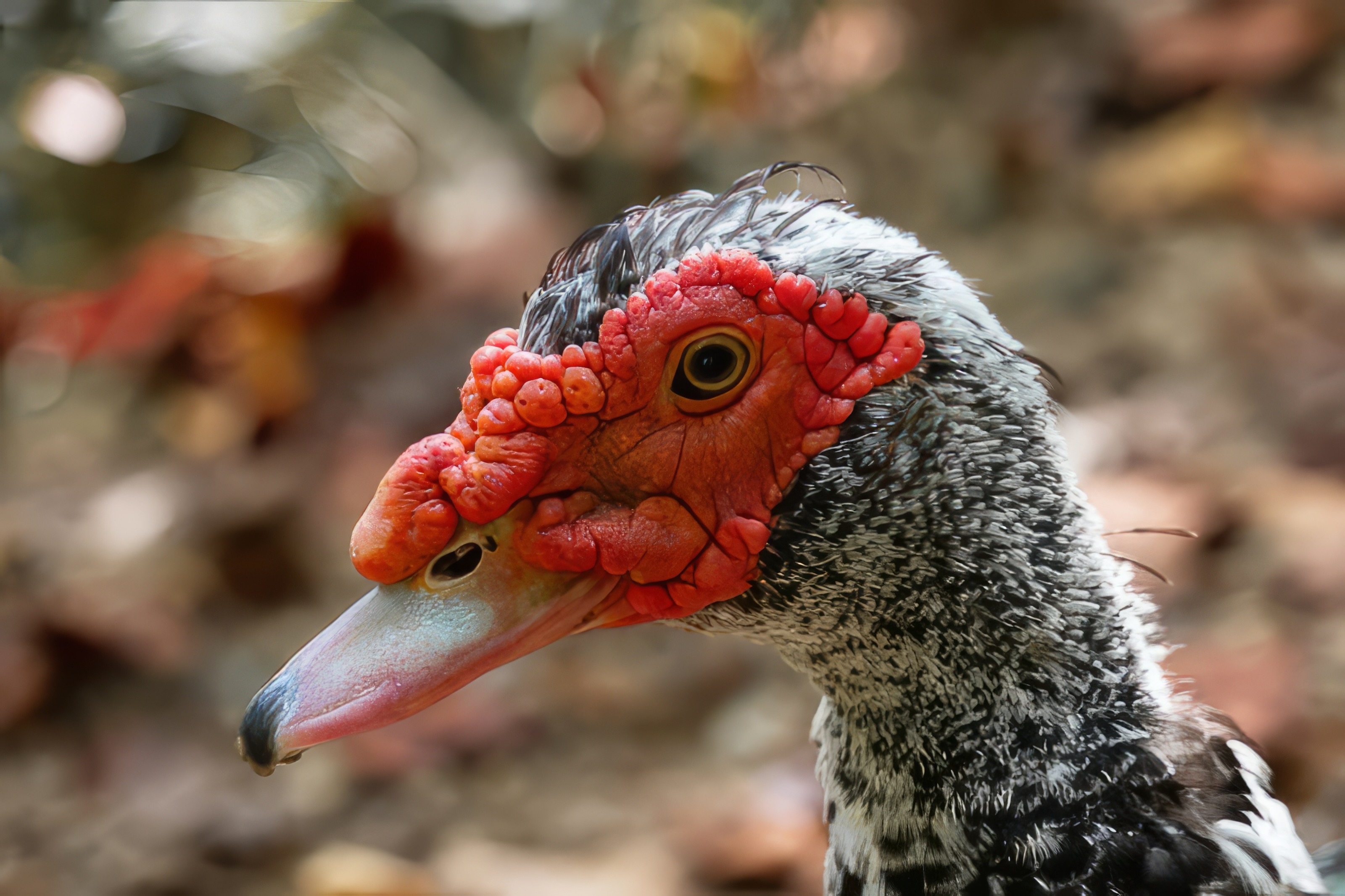
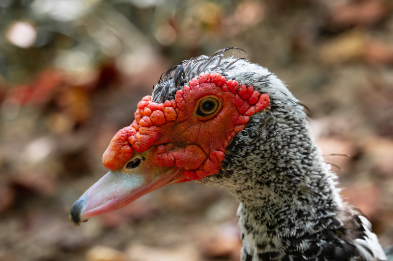
Thx to Brenda for going over a few things in Lightroom with me yesterday, I played around with the Muscovy portrait today... a little too much.
Sharpened subject, darkened and blurred background a touch, selected Adobe Vivid for color and still warmed it up just a touch from that, played with the eye (a bit too much).
And ... drum roll ... flipped it horizontally to have it facing right to see how it looks.
I still prefer it left facing myself ... most of the other reworks I'm pretty happy with except for the two feathers off the back of its neck. I messed them up with one of my masks, could not figure out which one, and didn't feel like putting in the time to redo all of it.
I've also determined that I personally do not prefer Lightroom Classic; I find the interface with Lightroom CC to be more intuitive and the rest of the operations within it to be much less clunky. Lightroom Classic, for me personally, feels like a carry over from the Windows 3.11 days. |
Dec 21st |
 |
| 78 |
Dec 23 |
Reply |
Thank you Brenda! I'll go check it out. |
Dec 17th |
| 78 |
Dec 23 |
Reply |
Thank you for sharing this Brenda!
I had just found it myself last week and bookmarked it.
I appreciate your support of us DD78 members by sharing these resources when you find them. :-)
From this sheet, combined with what Jim H. mentioned earlier in this thread, I do believe the image is acceptable for nature provided I don't perform any unacceptable edits.
I might try this one a few times to see if I get any acceptances. |
Dec 16th |
| 78 |
Dec 23 |
Reply |
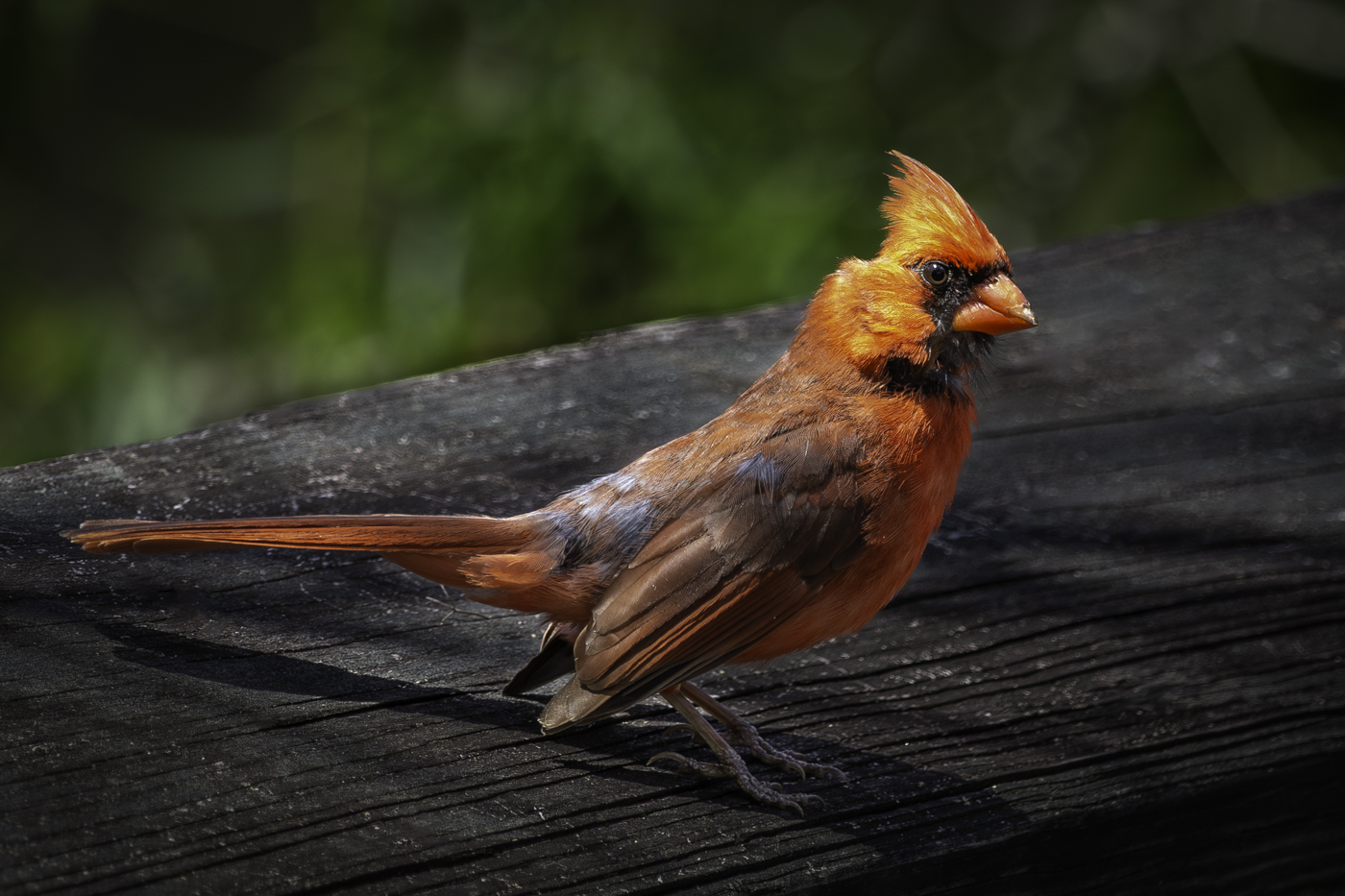
This version looks much more pleasing to my eye Brenda ... well done!
I am in the same camp with Sunil in that I prefer standard crop ratios. It's not a matter of "what's allowed" within a competition format to me. Rather, it comes down to what my mind prefers when I am viewing the images. The long-standing "standard" crop ratios always lead me to feel more at ease/comfortable when viewing images. Conversely, nonstandard crop ratios often lead me to feeling some level of tension/dissonance, much like a minor diminished chord compared to a major chord within the realm of music; it feels so comforting when it finally resolves. :-)
Your decision to consider this image for color, with the freedom to modify more elements than nature comes across wonderful with the sticks removed and the toned down color saturation on the legs, etc.
Wonderful rework! |
Dec 16th |
| 78 |
Dec 23 |
Reply |
This is along the lines of what I was envisioning. You might crop even further if the resolution is there to do so, and possibly consider cropping out the brighter green vegetation that cuts across the top-left corner and removing the partial dew drops along the edges of the image. The intricate spider web details are clearer with this tighter crop, and the clear indication of a reflection in the larger dew droplets adds interest due to the slight variation in what is reflected in each individual drops. Nice! |
Dec 16th |
| 78 |
Dec 23 |
Comment |
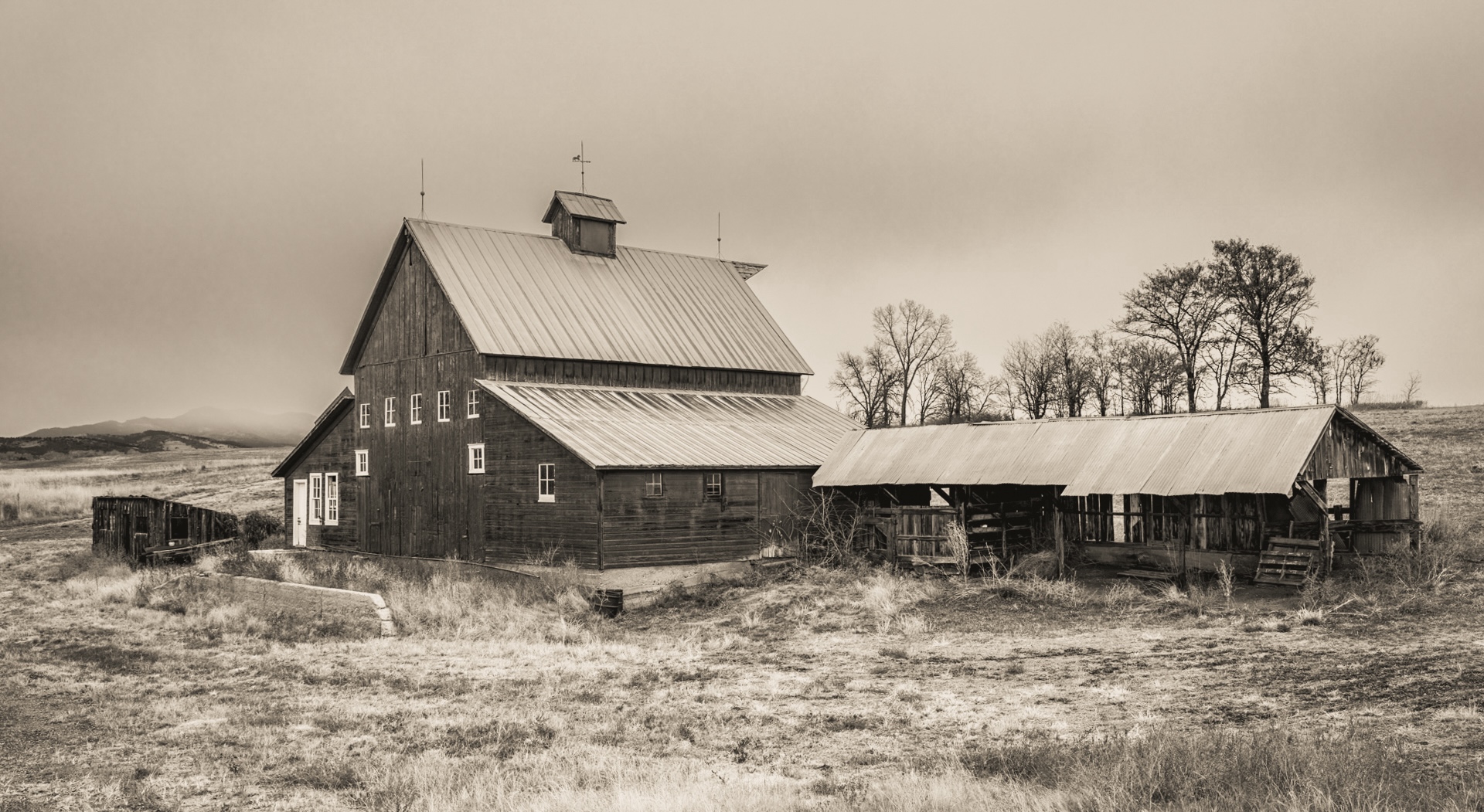
This is a wonderful image, Ed. There have been some great comments offered by others already. I agree that the sky in the monotone version feels a bit stark for my personal liking.
I like the monotone version you did initially and feel the monotone fits the scene rather well. I've also highlighted multiple times that I have a personal preference toward sepia toned images in the monotone realm; likely due to having created sepia toned images almost exclusively when working the B&W dark room for a photography studio during my high school days.
With that, I took a shot at adding sepia toning, selectively applying some masks to darken the sky a touch, adding just a little more contrast, and also letting Lightroom apply automatic geometry "corrections."
I especially find the sepia tone adds to the "aged" feel of this photo because of the barn as the subject.
|
Dec 13th |
 |
| 78 |
Dec 23 |
Comment |
This is a very unique and interesting photograph Robert. There are aspects of all three of your images that I like ... I also agree with Brenda on cropping out the pine needle as it is not clearly identifiable as a pine needle in the images.
As you have the original high resolution images, one other thought is the possibility of selecting an area of the image (of your choosing) that you might try to zoom in even more such that there are only a small handful of the dew drops present (maybe 10-15, or even less) and seeing if it is possible to selectively sharpen just a few of them in an attempt to enhance what is being shown in the reflection of the individual dew drops. It's challenging with the lower res files but it looks like a combination of sky and flora (the plant/bush itself) being reflected in the drops. With a very tight crop, you might be able to have fun with the reflections and really enhance the visibility of the intricate and delicate details of the spider's weaving skills that you already like. |
Dec 13th |
| 78 |
Dec 23 |
Reply |
Responded ... thx Brenda! |
Dec 12th |
| 78 |
Dec 23 |
Reply |
Thank you for your comments Robert!
Given the aperture of f/7.1, I have no explanation for why some feathers don't seem sharp when the eye and parts of the comb are relatively sharp.
|
Dec 12th |
| 78 |
Dec 23 |
Reply |
Thank fro the input Ed!
|
Dec 12th |
| 78 |
Dec 23 |
Reply |
Thank you for your input Robert. I have seen you comment in past months on the direction an animal or subject is facing. I genuinely appreciate your thoughts on this.
I also believe the direction is largely overblown. There is a lot of psychological study data available on this topic and there is no clearly defined definition here. Right-handed people tend to prefer right-facing animals, while left-handed people tend to slightly prefer left-facing animals. Even that is not concrete.
As a photographer, viewer, and left-handed person, I find I have no preference and may like or dislike an image regardless of the direction the animal is facing. Neither direction feels more or less "natural" to me. When capturing and processing, I will always favor leaving it as it was. No value added in spending thought or time to mirror the direction for me personally. |
Dec 12th |
| 78 |
Dec 23 |
Reply |
Thank you Jim!
I really like the extra touch of sharpness on your rework ... and it is encouraging to hear that I might be able to enter this one in nature.
|
Dec 12th |
| 78 |
Dec 23 |
Reply |
Thank you for the offer, Brenda! I just might take you up on that offer next week if you have time... I'll finally be home for an extended period and able to really hone in on such things for the first time in awhile. Tues-Thurs, 12/19 - 12/21 would be best for me if you have any availability?
|
Dec 12th |
| 78 |
Dec 23 |
Comment |
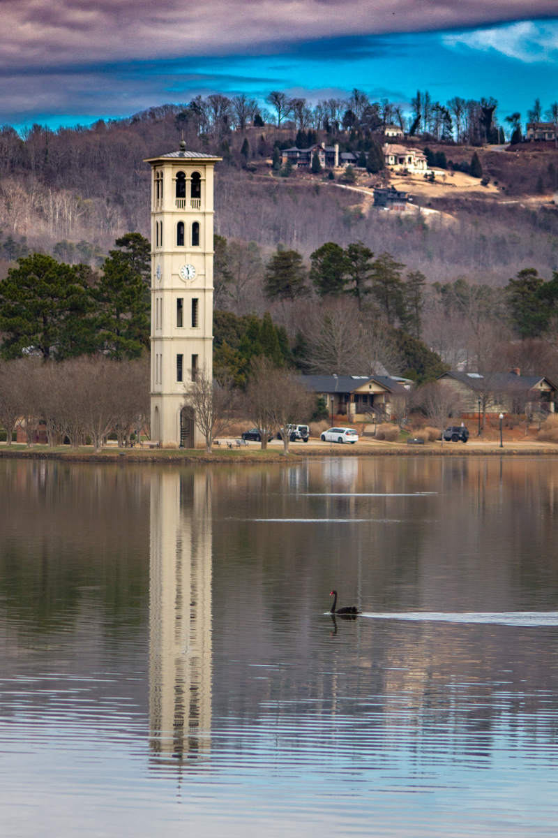
Sunil,
I will plant myself in the minority here and be the first to say that I absolutely love your sepia toned version of this.
I also like what Robert did with it; the higher contrast and starker B&W rendition.
I prefer the sepia toned version myself and it feels like an image that I might review in a museum or some other similar venue dedicated to archival.
Your choice for cropping and the geometric corrections are fantastic for this image and my eyes go back and forth between the detail of the building to moses. |
Dec 9th |
| 78 |
Dec 23 |
Comment |
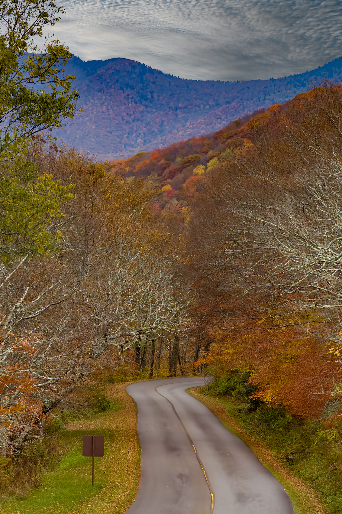
This is a very nice image and I have a ton of respect for your skills on what you have done with it in post processing.
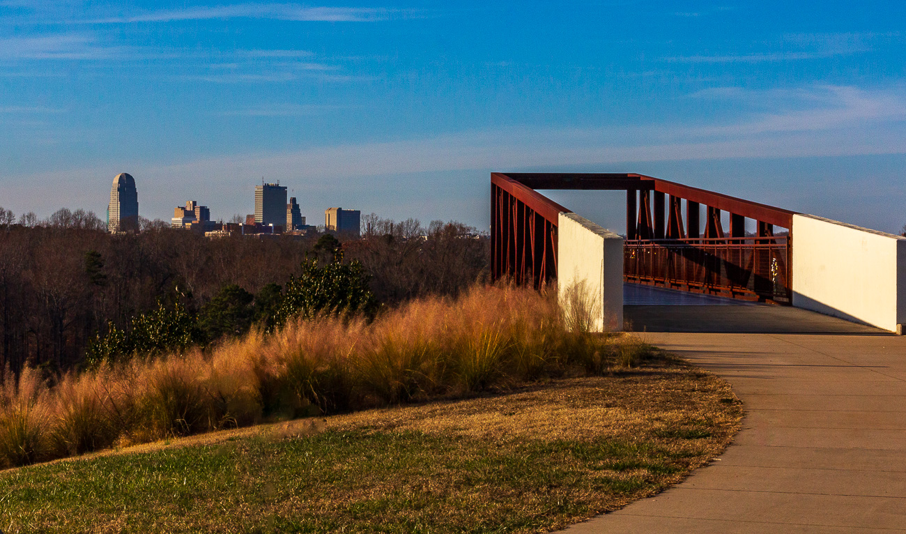
I also find myself increasingly having a preference to scenes that are left as they were. With that, the tighter crop from your edited version, with all of the road signs and even the transmission tower still remaining would gain my personal preference as it shows the reality of the world as it is today, even in the remote stretches of Iowa. |
Dec 9th |
| 78 |
Dec 23 |
Reply |
|
Dec 9th |
 |
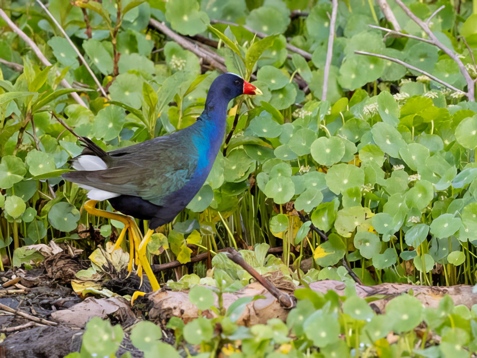
| 78 |
Dec 23 |
Comment |
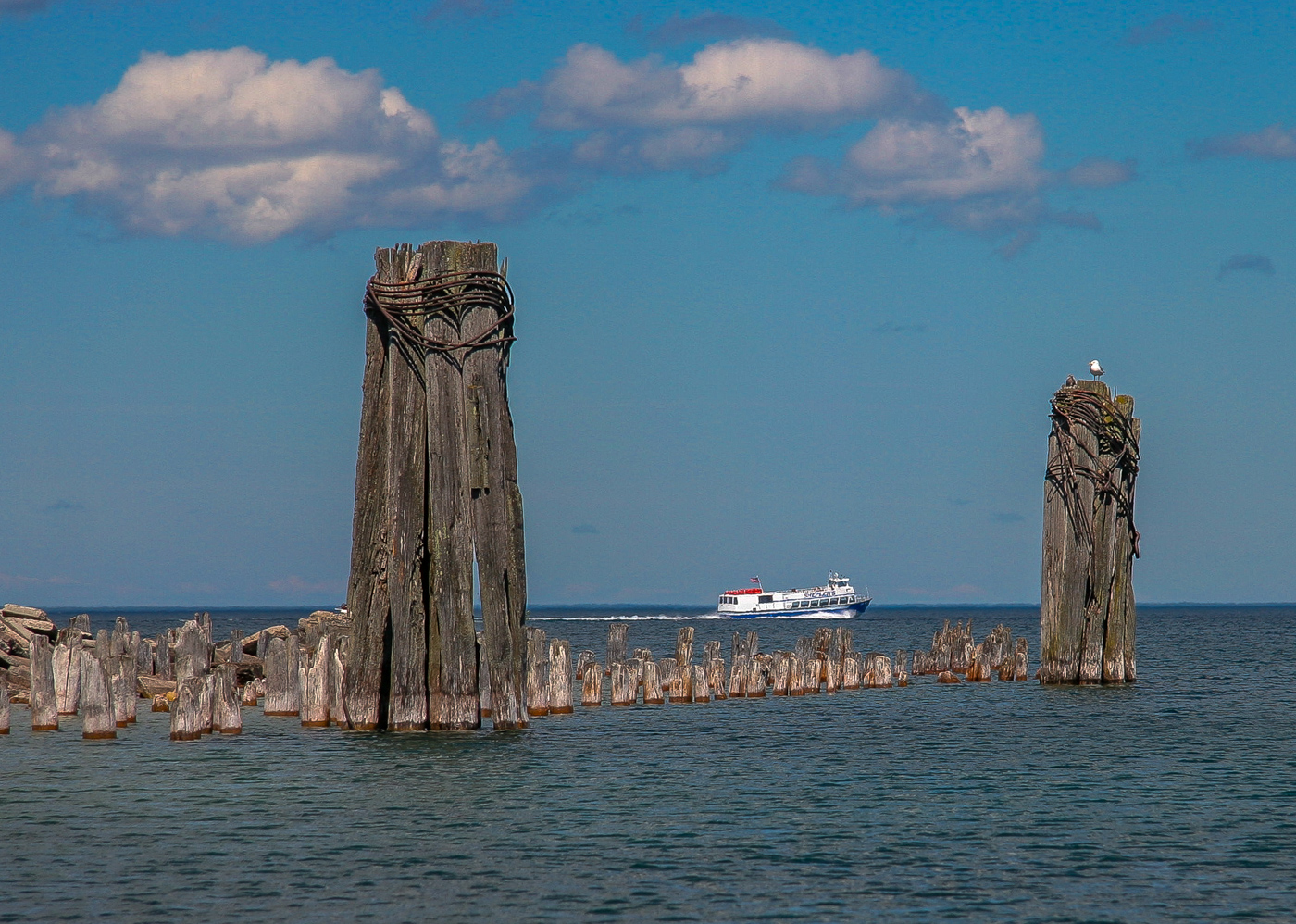
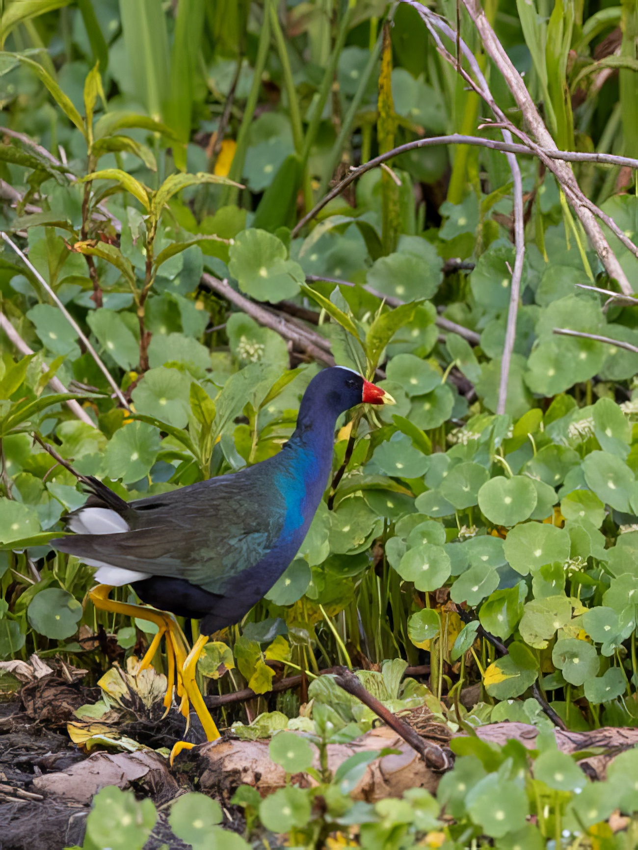
Hi Brenda. This is a wonderful image of an amazing bird! I agree with what has already been shared regarding a brightening of the eye and a slight toning down of the legs.
I also largely agree that your cropping is excellent; I would also like just a little more of the surrounding area for a bit more perspective. While it would be really nice to my eye if we could have water, land, and both types of flora in the frame, I've tried and don't like how it comes out.
I also find that for nature specifically, things like branches and such do not really bother me that much. Often, I find that they help convey the "genuine" aspects of the image whereas overly processed images do not look as real to me. I am a huge fan of "real."
Here are two potential alternate ideas for cropping... they are not optimized for color or anything else; only cropped from the original, "Auto" adjusted in LightRoom, then run through Topaz Photo AI to get rid of the jaggies from the low res we are limited to. |
Dec 9th |
 |
7 comments - 15 replies for Group 78
|
7 comments - 15 replies Total
|