|
| Group |
Round |
C/R |
Comment |
Date |
Image |
| 78 |
Nov 23 |
Reply |
I love to keep the conversation going!
We risk losing so much in the "digital realm" ... we must put in extra effort to overcome that risk. :-)
Printed in color, even if smallish in size, and hung proudly above the work station/desk/computer or even in the family room would be a lot of fun I believe! |
Nov 27th |
| 78 |
Nov 23 |
Reply |
This monochrome version is very nice Brenda!
I also like the reworked color image you did, keeping the sagebrush a little more true to color with that silvery blue.
I think I prefer this monochrome image though... and even if you decide not to enter it into competition, you could post it online in various social media formats, and even print a copy for you to enjoy yourself at home either north or south! |
Nov 27th |
| 78 |
Nov 23 |
Reply |
Thanks for following up Brenda!
I had one of PSA's instructors take a look at this image as part of a course I am doing and he is encouraging me to enter this image in competition as he feels it has potential for acceptance and possibly doing well also.
I haven't heard back from him yet on what specifically he was recommending I submit it to, but I am thinking I would start with PJD. I welcome any other thoughts you might have on that as well... I still have yet to enter a single photo into PSA competition! |
Nov 27th |
| 78 |
Nov 23 |
Reply |
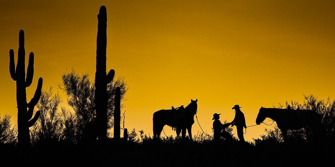
This version looks fantastic, Brenda. I agree that it's a shame these horses aren't looking at each other ... that they are looking at the viewer helps.
The colors on this version are so much better to my eye... the brown tone of the horses looks much more natural ... and the sagebrush very much has the silvery-blue color tone that also looks and feels much more natural to my eye.
Well done! |
Nov 15th |
| 78 |
Nov 23 |
Reply |
This is really helpful insight from your extensive experience in this category, Jim ... thank you for sharing! |
Nov 8th |
| 78 |
Nov 23 |
Reply |
Foreground blur can be just as effective a tool as background blur.
It's OK to have the foreground in clear focus, of course.
It's also OK to have a bit of blur in the foreground... and that foreground blur can even add to the mind trickery of "depth." |
Nov 8th |
| 78 |
Nov 23 |
Reply |
Thank you for your comments Robert... as with Brenda's, I'm unsure how to make the droplets be more conspicuous with having them be blatantly "fake" to my eye. Or by cropping in so far as to lose the "frozen action" aspects offered by the fuel man asking for a fresh canister of racing fuel. |
Nov 7th |
| 78 |
Nov 23 |
Reply |
It's not the driver ... all pit crew members who go "over the wall" have to wear a helmet... rules.
Thanks for the commentary on the fuel spray ... you and Robert have both commented on it. Perhaps because I know exactly what I'm looking at, the fuel spray stands out to me like a flashing neon sign. I doubt I would like cloning any more of them in, as the spray in its current pattern helps show the effects of both gravity and the motion of the fuel man passing the empty canister off and asking for a full one.
And that's not a wrecked car on the top-right... that is a car out on the track making laps during an end-of-stage caution! |
Nov 7th |
| 78 |
Nov 23 |
Comment |
Excellent processing, especially on the sky, Ed!
I agree with Robert that the teepee feels much to bright for a night sky Milky Way shot. A darker foreground and teepee would benefit this image from my perspective.
An ever so subtle/soft glow/illumination from inside the teepee, with a cooler tone, could also have been a fun element to try. |
Nov 4th |
| 78 |
Nov 23 |
Comment |
This is wonderful Robert ... the rain/water accumulation adds a very nice element to the photo and the focus stack on this is perfect with the entire blossom in tack-sharp focus and the background absolutely shredded. I have nothing to add. |
Nov 4th |
| 78 |
Nov 23 |
Comment |
Very interesting image Ken.
There are multiple photos within this photo, I believe. I agree with Robert that it seems a shame to lose the amazing saguaro cactus on the far left, and the sky feels a bit off to my eye as well.
For a different take, I cropped the attached image to a 2:1 aspect ratio, kept the far-left saguaro, kept the entirety of the horse on the far-right, and kept the original sky. I selected the sky in Lightroom, intersected it with a linear gradient, then darkened the exposure a touch, increased color saturation a touch, added contrast.
For an alternative title, you might also consider: Sunrise Proposal, A Horsemans Proposal, or something similar. |
Nov 4th |
 |
| 78 |
Nov 23 |
Comment |
This is a very interesting composition Sunil... it has a bit of a Sci-Fi/other-worldy feel to it and because of that, I believe you could play with color tints and other "creative elements" to turn it into something very unique.
Having never tried to capture an eclipse nor track planets/stars/moons in the sky, I am unfortunately of no help for any suggestions on how to approach the intended shoot differently. |
Nov 4th |
| 78 |
Nov 23 |
Comment |
This is really nice Jim! Other than Robert's comment on the clouds and whether you would decide to try to do a sky replacement, I have nothing to offer. A great image that keeps me engaged! |
Nov 4th |
| 78 |
Nov 23 |
Comment |
This is a wonderful image, Brenda, and I agree that keeping it a little more wide on the crop is a great choice. I also really like how you left a little more space on the left.
I'm with Robert on the horses being lightened a little too much for my personal liking... I also think the added warm-tone radiants changes the horse's color too much from the original. I like the brown tone of their natural coloring, and especially with the horse on the right, the golden radiant actually gives the horse an appearance of being both brown and blondish in color (after playing with the original in Lightroom, it seems it is present on the original too).
My only other suggestion is to keep playing with the crop and the placement.
I took a real quick stab at changing the whit balance, black balance, shadows, highlights, color saturation, selective masking for contrast and bring more shadows up, then cropped as with the attached for just a slightly different look... not a drastic change; more of a tweak. This version made from the original. |
Nov 4th |
 |
6 comments - 8 replies for Group 78
|
6 comments - 8 replies Total
|