|
| Group |
Round |
C/R |
Comment |
Date |
Image |
| 78 |
Oct 23 |
Reply |
Your 10/19 revision looks excellent Brenda! I love what you did with the crop especially. |
Oct 29th |
| 78 |
Oct 23 |
Reply |
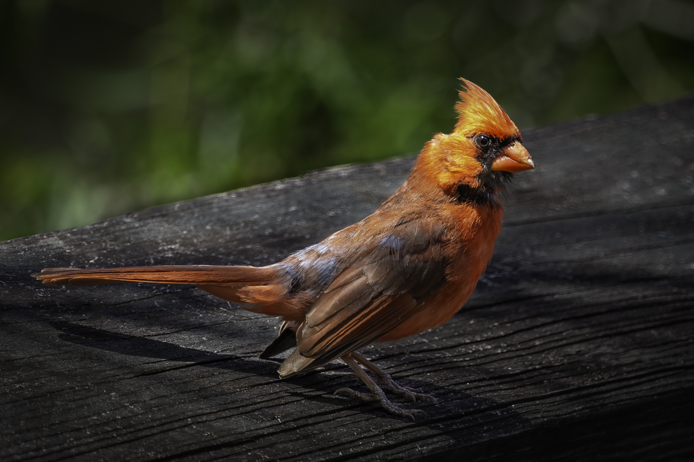
Thank you for your comments Sunil.
The title of "Official Bird" is admittedly a little bit of a play on words with two different meanings.
First, the Cardinal is the state bird of North Carolina and I had initially submitted this image for my NC-based camera club's monthly "Gimme Your Best Shot" gallery. Thus "official bird" as it is the official state bird.
Second, within the Catholic faith, a Cardinal is a very high-ranking official appointed by the Pope. While I am not Catholic myself, I felt the word play fit well with either of the two potential meanings. If I were to submit the image for competition (which I will not), I would pick a different title for sure... probably something as simple as "What are You Looking at?". |
Oct 20th |
| 78 |
Oct 23 |
Reply |
Thanks, Ken... while it would have been nice if I could have ordered up a perfect specimen, I was happy to catch what I did with this one. As one of my personal best songbird pictures to date, sometimes beggars can't be choosers! |
Oct 13th |
| 78 |
Oct 23 |
Reply |
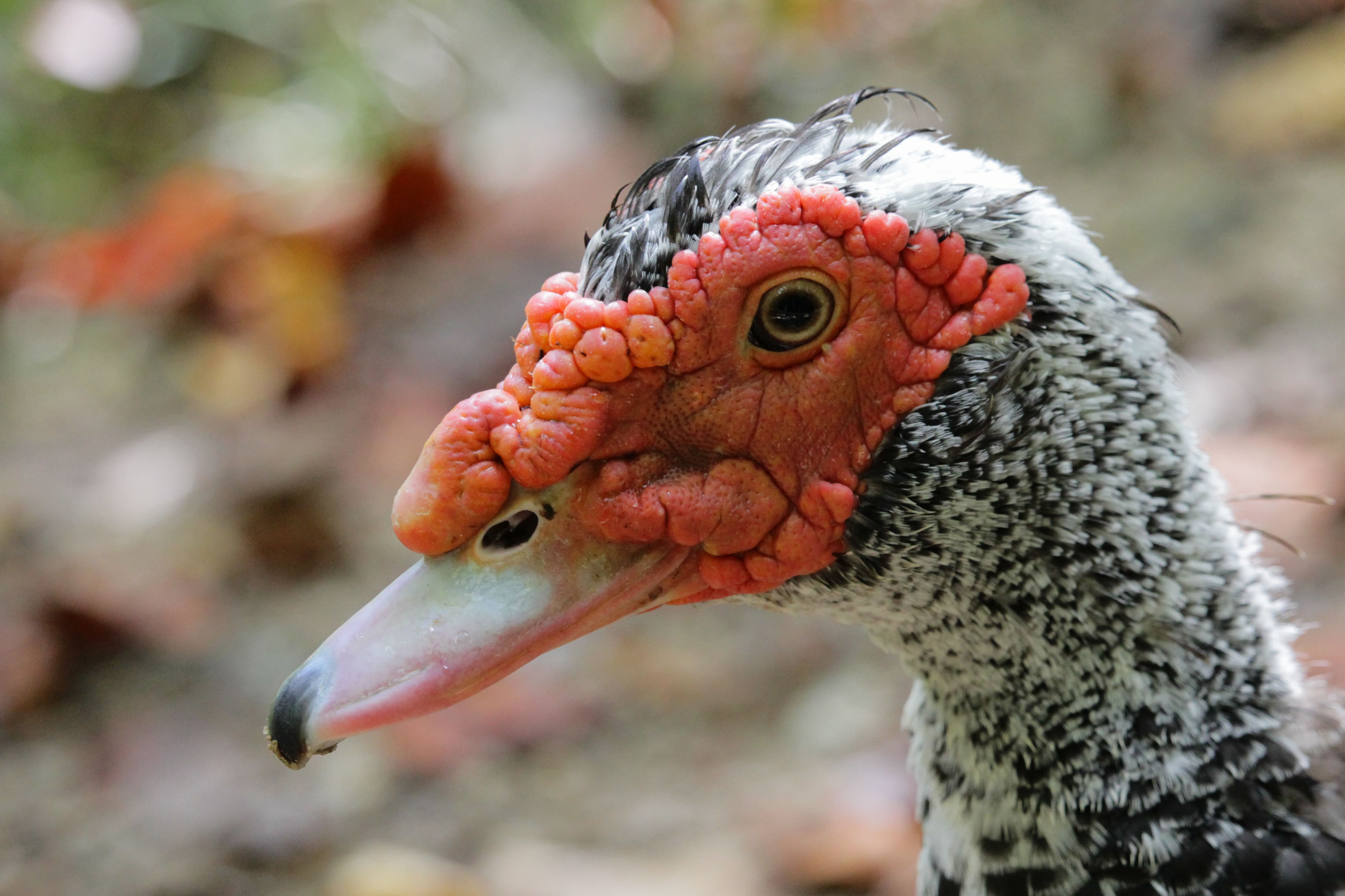
Thanks Ed ... It was a cameo appearance only and he refused any form of payment. Seemingly just wanted to check what our intentions were before moving along on his journey! |
Oct 13th |
| 78 |
Oct 23 |
Reply |
Thank you for your comments, Robert.
The bird is sitting on a handrail along a boardwalk. There is somewhat of an artifact present in the original as well though it is made worse after the Gaussian blur was applied on Photoshop... my skills in this area are gradually improving though I still have a long ways to go. I often consider migrating to a full-frame format camera so I get better bokeh SOOC and need to rely on my Photoshop skills less anyhow as the software side of it is already much less enjoyable for me than is just getting out and shooting. |
Oct 13th |
| 78 |
Oct 23 |
Reply |
Thanks for your comments, Brenda!
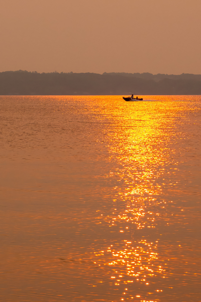
My venture into the world of birding with this one was very happenstance... I was out on a boardwalk along the edge of Hartwell Lake near Clemson, SC and this cardinal just plopped down and posed. I was glad to have captured what I did and for it to have offered the sharpness that it did when captured so quickly. |
Oct 13th |
| 78 |
Oct 23 |
Comment |
Excellent image, Ed, with some great work already done!
I also really like the second of the two that Brenda has proposed ... the grittiness of it seems to match the theme especially well. |
Oct 13th |
| 78 |
Oct 23 |
Comment |
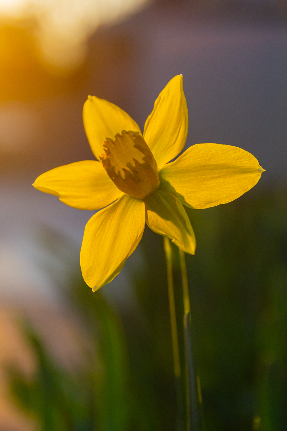
While I personally do not often enjoy photos of flowers past their prime, I can understand your intent here, Robert, and believe it is very well done.
With the color saturation already having been discussed ad nauseam, I will add that your slightly desaturated image from 10/6 looks better as it opens on my screen and that definitely helps convey the theme of the title. |
Oct 13th |
| 78 |
Oct 23 |
Comment |
Great recovery on this image Ken!
I might have tried keeping the skull sketch that was on the flagon as I feel it adds a little to the context/story.
Aside from a nice bit of frothy beer cascading over the edge of the flagon, there is really nothing else I can add here. It is a very well-done recovery.
|
Oct 13th |
| 78 |
Oct 23 |
Comment |
This is fantastic, Sunil. I'm always impressed by these stitched together panos and yours is excellent.
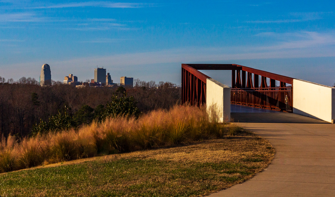
A little straightening to make the buildings a touch more vertical (they look rotated slightly left/counter-clockwise to my eye) as Ed mentioned, and a touch more saturation and contrast as Brenda mentioned is about all I can suggest here. I'm not as keen on the increased exposure of the buildings in the lower-left as Brenda did. I believe keeping the exposure where it was and increasing contrast for even blacker blacks in the shadow areas of the buildings may add to the overall mood of the photo. |
Oct 13th |
| 78 |
Oct 23 |
Comment |
Great rework form the original already, Jim! My only real observation here is that after fixing the perspectives and angles, there is a little bit of residual barrel distortion than distracts my eye.
I really like the crop idea that Robert proposed, and agree with Ed that it feels a bit like there are two competing images here. Playing off of Robert's idea, I offer the attached re-crop... I used a 4x3 crop, added more space in front of the gals so the viewer's eye can envision them moving toward something, included the white strip with the artist and location name to help provide just a little context.
With a little more tweaking to correct the barrel distortion plus removing the bright sun spots again, this crop tells feels a little more natural with aspects of storytelling to my eye.
Great image!
|
Oct 13th |
 |
| 78 |
Oct 23 |
Comment |
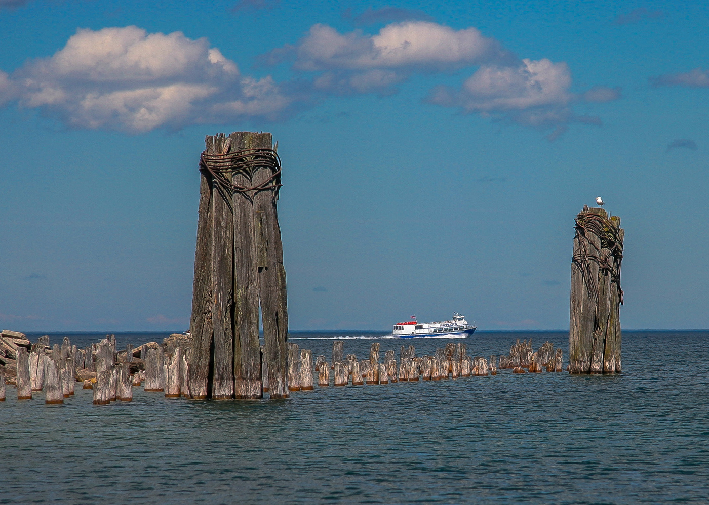
This is a wonderful image, Brenda!
I agree with Jim and Ed on the benefits of making some portions (especially the sand) less blue while keeping the sky and the reflections rich with the magenta tones like you have.
And, of course, the straightening of the horizon that has already been mentioned throughout.
I really like Jim's and Ed's reworks |
Oct 13th |
6 comments - 6 replies for Group 78
|
6 comments - 6 replies Total
|