|
| Group |
Round |
C/R |
Comment |
Date |
Image |
| 78 |
Sep 23 |
Comment |
Hi Brenda ... I like your redone image a lot better than the first one!
If anything for me, the stars could potentially feel a bit better if they had a bit more of a fake/mystical feel to them. They also do not bother me as they are.
I still disagree with Robert regarding the background not fitting together well with the sleeve/cloak. I'm willing to concede that perhaps they do not fit the theme/title of "Merlin," specifically, but I do believe they work together very well and in my mind, they conjure up images of the evil Yen Sid from Disney's Fantasia.
Maybe just change the title to "The Magic of Yen Sid" or something similar?
|
Sep 27th |
| 78 |
Sep 23 |
Reply |
Thanks Robert ... he is an awesome dog (we pretty much love all dogs in our household). I appreciate your suggestion on the crop. I did try playing around with a tighter crop in several different ways but just couldn't fall in love with it. My reworked image is below, using different masking techniques followed by changing the background. |
Sep 24th |
| 78 |
Sep 23 |
Reply |
Thanks Sunil, the masking AI change Brenda suggested helped significantly, combined with removal of the background all together rather than just trying to blur it. |
Sep 24th |
| 78 |
Sep 23 |
Reply |
Thanks for the pin tool tip, Ed!
I've flagged some pin tool lessons in my new KelbyOne membership and will definitely investigate them further in the future. |
Sep 24th |
| 78 |
Sep 23 |
Reply |
Thanks for the feedback and the tips, Ken! |
Sep 24th |
| 78 |
Sep 23 |
Reply |
Thanks Brenda! You led me down the proverbial "Rabbit Hole" ... and now I have a subscription to KelbyOne and will be trying out all sorts of things. |
Sep 24th |
| 78 |
Sep 23 |
Comment |
Thanks to all for your comments on my Granddog image and also the tips on the additional tools, software, etc.
Brenda's tip regarding the use of cloud AI masking through Photoshop and changing the background led me down the path of deciding to embrace learning Lightroom and Photoshop in much greater detail and signing up for a one year subscription to KelbyOne (we receive a nice discount through PSA too!).
Using that tip combined with some learning in KelbyOne, I opened the original in Lightroom, took it over to Photoshop, created some additional layers, masked using the Cloud version of the AI masking, then used the "Refine Hair" feature to get it as good as I could within a reasonable amount of time, inverted the selection to make it be a highlight of the background, then I painted the background black. I finally took it back over to Lightroom, made a few more tweaks on the highlights, shadows, blacks, whites, etc., selectively increased sharpness on the eyes and snout, then reexported it.
I liked my original crop the best (thanks Robert for suggesting a tighter crop, I did play with it but couldn't love it).
Ken's amazing image with the black background led me to try that as a background color for my image as well.
The new one represents the most I have personally done with Photoshop to date. |
Sep 24th |
 |
| 78 |
Sep 23 |
Comment |
This is a very interesting image Brenda! I love what you've done with the original to completely change the look!
I agree with Ken in that the fogginess is a bit overdone. I do not find the amount or size of the sleeve to be distracting nor the hand to lack sufficient "age" to offer interest.
All that said, I do like the crop that Jim H. offered, even with the bottom of the sleeve cut off. And I really like what Sunil did as far as the light direction and color striations.
|
Sep 17th |
| 78 |
Sep 23 |
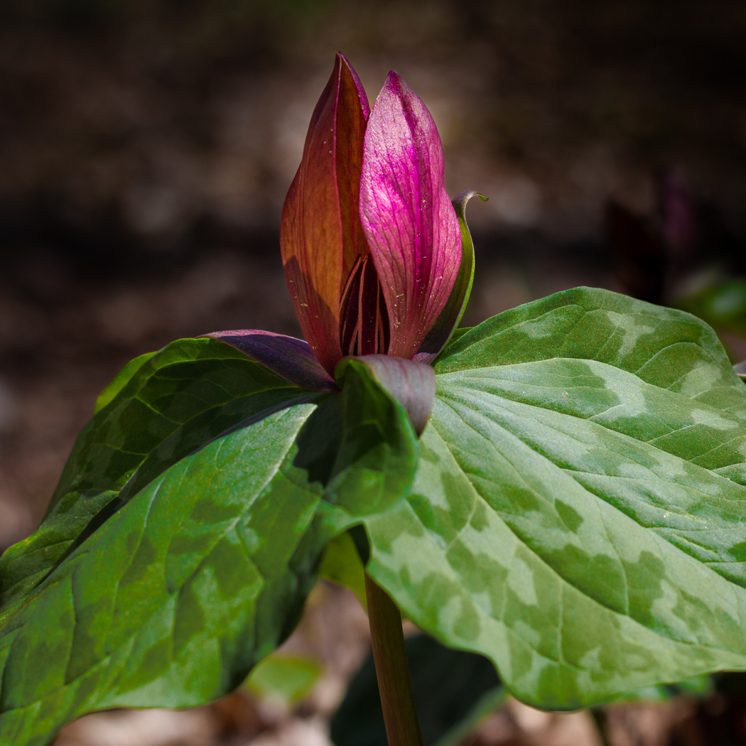
Comment |
I like your use of the photostack on this one Robert. Especially with limiting the depth of field to include only the pink flowers, still keeping some level of bokeh for the background. Selectively removing the one tallest blossom in the center might offer a different perspective and also removing the dark-stemmed with dark orange either very young or past prime blossoms in the background. Further blurring the background with a Gaussian blur and selectively pulling back the saturation of the brighter green colors just a touch might also help the blossoms stand out even more. |
Sep 2nd |
| 78 |
Sep 23 |
Comment |
Your edits and re-imagining of this photo are incredible, Ken! Similar to your cowgal photo a couple months ago, your ability to isolate the subject and modify the perspective in a way to really draw the viewer into the subject and dwell there is amazing.I have nothing to offer on this ... it's wonderful. |
Sep 2nd |
| 78 |
Sep 23 |
Comment |
Admittedly, I'm not sure how to respond when you do not submit a monotone image, Sunil!
The work you have put into it already is fantastic ... as Robert mentioned, the repetition of the tree pattern is notable.
Your comment on another cropping plan is also what I thought initially when I looked at it.
Here, I took your original, cropped it to primarily show the horse and stream, tweaked color, contrast, dehaze, etc., and ran it through Topaz Photo AI. I left the far shore primarily alone and left a little bit of the other "stuff" in the top of the crop as it felt to me as though it offered the image of a camp setup on the far shore and that the horse is facing toward its camp. |
Sep 2nd |
 |
| 78 |
Sep 23 |
Comment |
This is a very fun photo Jim. What you have done with the sky replacement and painstaking attention to each individual flower is very nice as it is.
I also really like IR photos relatively true to their IR original state and thus really like your original just as it is as well.
I took you IR original, removed the trees on the left and lower-right (sloppily), and the played around with the individual colors in an attempt to get just a bit more separation between the blossoms and the sky. Finally, I applied the "sunset" LR color preset to it to help make the bottom of the sky pop a little more.
You are making me want to send one of my old cameras out for conversion now. |
Sep 2nd |
 |
7 comments - 5 replies for Group 78
|
7 comments - 5 replies Total
|