|
| Group |
Round |
C/R |
Comment |
Date |
Image |
| 78 |
Jun 23 |
Reply |
Brenda,
I'm with your husband and Sunil in that your first processing is better; the warmer tones of the tree especially.
The extra contrast on the owl does help it pop (especially the eyes) a little more but it feels like too much now. Maybe the original processing for the tree and background plus split the difference on the owl?
I didn't notice any objectionable noise in the original; only artifacts in the feathers on the sharpened version Ken offered.
My eyes do not see either in your most recent version.
|
Jun 21st |
| 78 |
Jun 23 |
Reply |
Also curious what you used on this one Ken ... Lr, Ps, or something else? |
Jun 19th |
| 78 |
Jun 23 |
Reply |
Ed, did you use Ps, Lr, or something else? I cannot get the background to blur that significantly using Lr. |
Jun 19th |
| 78 |
Jun 23 |
Reply |
Brenda, did you use Ps, Lr, or something else? |
Jun 19th |
| 78 |
Jun 23 |
Reply |
Thank you for your rework on this one, Ken. If I were to keep it in color, your suggestions made me look at it differently. |
Jun 18th |
| 78 |
Jun 23 |
Reply |
Thanks for your rework on this and your comments, Ed. |
Jun 18th |
| 78 |
Jun 23 |
Reply |
Thank you for your rework and some excellent thought provocation on this one Brenda! |
Jun 18th |
| 78 |
Jun 23 |
Reply |
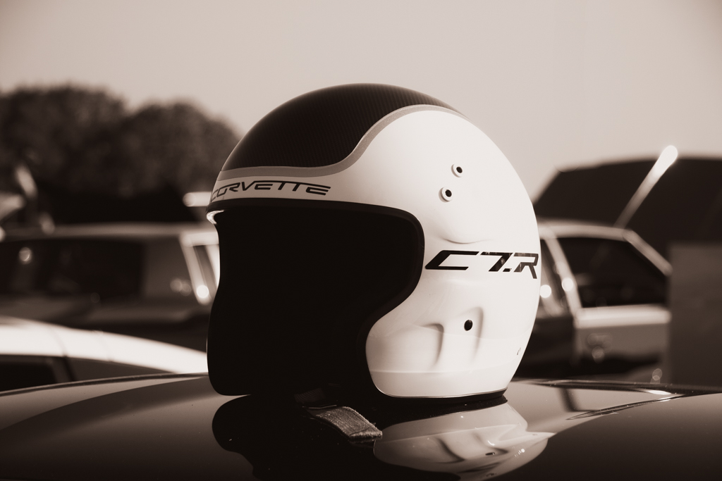
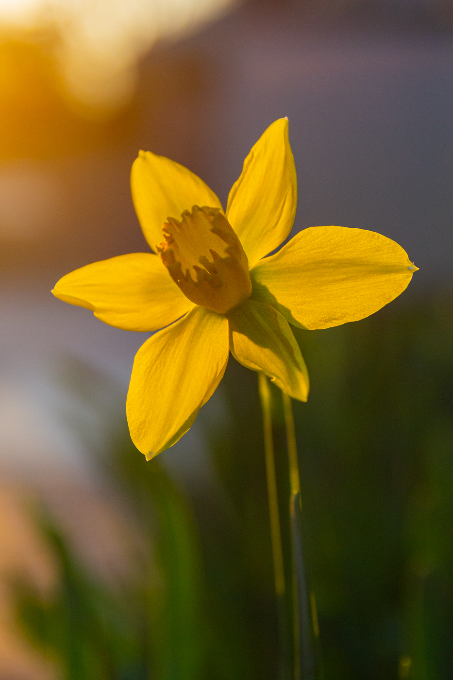
Thank you for your comments Robert.
I offer that given the insignia on the helmet, it ought to feel a little threatening. If the pitch black on the inside of the helmet helps convey a bit of ominousness, all the better. The C7.R Corvette was a beast of a race car with 491 hp and 485 lb-ft of torque. It won its class (GTLM) at the 24 hour of LeMans in 2015 and crossed the finish line in first position a remarkable 16 times in 65 starts/races from 2014-2019. It's successor, the C8.R is winning even more frequently, having notched its 20th victory already since its debit in 2020.
As noted in my initial comments with the posting this month, I too wanted much more bokeh than I got when I took the image. |
Jun 18th |
| 78 |
Jun 23 |
Reply |
Thank you for a very unique take on this image Jim!
|
Jun 18th |
| 78 |
Jun 23 |
Reply |
So glad you were able to find the feeling you were looking for in there Robert! |
Jun 18th |
| 78 |
Jun 23 |
Comment |
I love the creativity of this Ed ... All y'all with crazy photoshop skills make me envious.
I liked Jim's initial edits a lot and then Ken's edits really sealed it for me. With everything else removed and just the hands and ball on the black background, it loos mystical indeed! |
Jun 17th |
| 78 |
Jun 23 |
Comment |
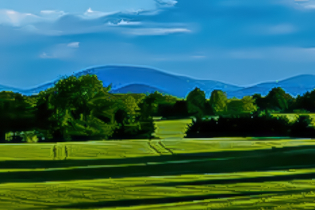
Hi Robert,
Given the image you have, I agree with what most others have already offered: The image is best reworked with the mailboxes and fence as more of the subject; utilizing the great beyond as complementary. Sunil's recent crop is excellent as I like seeing all of the mailboxes.
Given what you said you were hoping to capture, I went after a vastly different crop. To capture this one, you would have likely needed to get closer to the fence and also used a tighter zoom/crop in camera. With the crop I have done here, we're zooming in so far that there is no chance at preserving any resolution ... I also used a Lightroom preset to get more color saturation. I've brought back what resolution I could with Gigapixel AI and then did some more work with it in Photo AI.
There are some cool tire tracks through the field that help lead the viewer toward those mountains and the rest of the great beyond you were trying to capture. The green field offers all the foreground that is needed; we need nothing man-made here to help frame the beauty of the mountains and the serenity of the field and scene. |
Jun 17th |
 |
| 78 |
Jun 23 |
Comment |
Ken, this is such a great example of taking one photo and turning it into something else entirely. Best wishes for much success with this one in the print competition!
I also really like Sunil's monotone version! |
Jun 17th |
| 78 |
Jun 23 |
Comment |
This is a very nice image, Sunil. And I am with you in that after seeing what Jim did with his edits and suggestions, I have nothing more to offer. His edits really made it stand out. |
Jun 17th |
| 78 |
Jun 23 |
Comment |
This is a great image Jim!
The contrail did not particularly bother me in the first image ... it also looks good without it.
For a color version, I do really like the darker & richer sky color like in your SOOC image and also like what Ken offered for a proposed edit. I also feel leaving color saturation and related attributes untouched form your SOOC and simply applying your desired crop would look great.
I also really like the monotone version as suggested by Ed though I would personally add a touch of sepia tone to it to help convey the feeling of natural colors of the area. |
Jun 17th |
| 78 |
Jun 23 |
Comment |
Hi Brenda,
I land in the camp of liking your original crop as I agree with you that the owl's "window" at the back if its apartment adds to the image.
I also really enjoyed your original processing. Admittedly, I also really like what Ken did with the image in post-processing. Might try to meet halfway between them?
I like the added sharpness of the tree and the owls eyes especially. When I look at the sharpened version, my eyes also detect what appears to be some artifacts on the body of the owl that I do not detect with your post-processed image. |
Jun 17th |
6 comments - 10 replies for Group 78
|
6 comments - 10 replies Total
|