|
| Group |
Round |
C/R |
Comment |
Date |
Image |
| 78 |
May 23 |
Comment |
I've played around in both Lightroom and Photoshop. Between yesterday and today, I probably have 6 hours into figuring out how to remove the wall in the lower-right corner. Regardless of the "removal" tool, the program, or how many videos I watch, I cannot replicate the appearance of the post-removal that Sunil obtained.
I believe I have a lot of time left to invest in exploring the cloning tool, possibly.
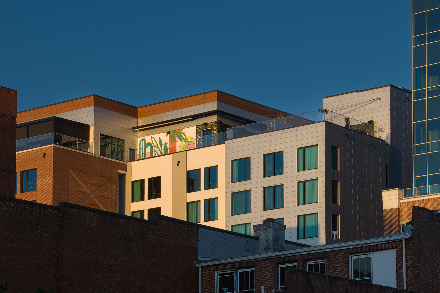
Here is my attempt to recreate some of the magic Sunil came up with. I edited the sky separate from all of the window, which I selected each individually, then the main parts of the building separate from that, and finally the artwork /mural at the to-middle on the "party deck." |
May 25th |
 |
| 78 |
May 23 |
Reply |
Thank you Sunil!
This is a great start.
While I have Photoshop, I almost never use it. I do use Lightroom a lot.
You are encouraging me to experiment and begin to learn Photoshop.
I really like what you did with my image in monotone. Thank you! |
May 24th |
| 78 |
May 23 |
Reply |
Hi Sunil,
This "quick edit" you offered up is amazing to me. I'm very intrigued. For one, I see you kept a larger, more wide-angle crop. Second, in Monotone, I absolutely love this wider angle crop.
Darkening the sky by itself seems straight forward enough but your other edits, such as what seems to be selective darkening of the windows facing the southwest direction, are less clear for me.
I most definitely enjoy this image more in monotone... any chance you can walk me through your "quick edit" workflow? |
May 24th |
| 78 |
May 23 |
Reply |
The geometry looks much better in this version Brenda ... love the monochrome take on it too!
|
May 19th |
| 78 |
May 23 |
Reply |
Thank you, Sunil ... an attempt at monochrome is included below! |
May 19th |
| 78 |
May 23 |
Reply |
Thanks for the commentary on the plain ol' vanilla titles Brenda! Another update below with a more simplified title. |
May 19th |
| 78 |
May 23 |
Comment |
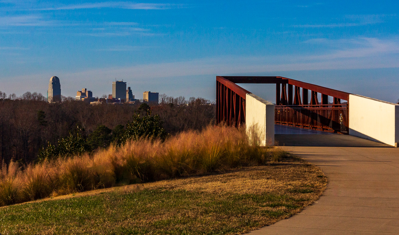
Thank you all for your continued comments and suggestions.
Here is an attempt at monochrome, with the tighter crop suggested. Deleted almost all of my selective masks, re-did my sky mask, and played around with a number of B&W presets in Lightroom until I found one that I thought looked decent enough for starters.
And for a more vanilla title, I just now call it "Greenville Skyline." :-D |
May 19th |
 |
| 78 |
May 23 |
Reply |
Very nice rework, Sunil.
The figurine and the bowl look very nice in the rework.
After seeing it, I actually agree with Terry in that I preferred the lighter background despite having believed I would prefer the darker background. |
May 11th |
| 78 |
May 23 |
Reply |
This looks much more natural to my eye, as though the bench was placed in a location that might offer a view over the pond as opposed to the tree. And the chains are a good win too!
Very nice Jim! |
May 11th |
| 78 |
May 23 |
Reply |
Thank you Terry!
My understanding was that judges weren't supposed to see the titles until after judging was complete?
In what way does titling an image impact judging? |
May 11th |
| 78 |
May 23 |
Reply |
Thank you for stopping by DD 78 and commenting on my image Stephen!
I've incorporated a number of recommendations ... my most recent revision is included below. |
May 10th |
| 78 |
May 23 |
Reply |
Thank you for the initial Hopper reference and the suggestion for a title modification Robert ... the current version is attached below. |
May 10th |
| 78 |
May 23 |
Reply |
Thank you Brenda ... cropped much tighter and played with contrast more... revision attached below. |
May 10th |
| 78 |
May 23 |
Reply |
Hey Jim, the updated revision as of this evening is attached below. |
May 10th |
| 78 |
May 23 |
Reply |
Please check out the most recent revision ... thanks! |
May 10th |
| 78 |
May 23 |
Comment |
I've played a lot with the crop, color saturation, contrast, and sky, using selective masking.
The I ran through Topaz Labs' DeNoise, Sharpen, and Gigapixel AI at the very end, in sequence.
Overall, I am genuinely more pleased with this version.
Admittedly, I still also feels like it is missing something. I might just be too close to it and too critical in my assessment at this point. That point of diminishing returns when we've looked at something too much. |
May 10th |
 |
| 78 |
May 23 |
Reply |
I'll also ad again that Jim's cloning "out" skills are unmatched from anything I've personally seen.
I've a long way to go on this.
|
May 9th |
| 78 |
May 23 |
Comment |
A HUGE thanks to all for the input, ideas, concepts, and more!
I'm not gonna lie, I REALLY like the starker contrast on this image; similar to what Terry has offered up.
Similarly, looking at it more objectively, I can see how the bottom-right wall is distracting, no matter how much it's presence is very "real."
I also very much appreciate the Hopper references... I knew when I was capturing it that it reminded me of something but I really could not place it until so many of you mentioned Hopper.
Robert's suggestion of "After Hopper" as a title is brilliant ... I just want to add either "Greenville" or "GVL" to the name in front, to help separate the specific skyline.
I'm going to try my best to start back from RAW, modifying my workflow to do crop, geometry, color, etc. first, then run it through DeNoise, Sharpen, and GigaPixel in order to see what I get.
Hopefully I'll have a rework ready for more commentary by this weekend.
Thank you all again!
|
May 9th |
| 78 |
May 23 |
Comment |
I really like your image Ed!
I had been contemplating what I might suggest with this one for the past few days. The flaring from your lens can be very distracting if brightened too much.
More pop from both contrast and color saturation is what I was going to suggest ... then I logged on this morning and saw what Jim did with a rework yesterday... and I really like what he did. There is nothing more I can offer than what he's already done with it.
Great starburst from using the narrow aperture! |
May 7th |
| 78 |
May 23 |
Comment |
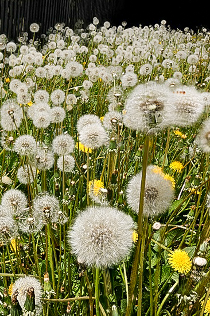
Interesting image Robert ... especially with your backstory on it.
Given what you indicated you were trying to accomplish, I believe your choice of focus stacking here might have worked against you.When there is no depth-of-field, due to the focus stack, it feels a bit challenging to visually see the "vastness" of the patch of dandelions.
Additionally, it might have been easier to show the desired effect if you had gotten a little lower on your vantage point/perspective in relation to the dandelions.
I played very slightly with the rotation of the image and crop, but kept it constrained to normal 3:2 to try and help keep some of the desired depth. I then played around with the geometry settings in Lightroom to modify the perspective in a manner that helped make the dandelions feel a little taller and create more depth. Finally, I applied a linear gradient at the bottom to selectively sharpen just the bottom third of the image, artificially creating depth-of-field. Minor modifications to contrast and shadows but not much else.
|
May 7th |
 |
| 78 |
May 23 |
Comment |
What a great and fun model shoot project!
I love the lighting and really like what Jim proposed with his updated version bringing up the shadows a little and toning down the highlights a little.
While I have no idea how you would blend the haze/smoke with e new background, I agree that adding a Gotham-like city/street scene background to the image would be pretty amazing ... might be possible to find a street setting with some smoke in it already and then layer a little more of your own in for extra? |
May 7th |
| 78 |
May 23 |
Comment |
As echoed by others already, Sunil, your monochrome conversions are always a joy.
I offer the same comment on brightening the left face, and darkening the top-leading edge of the bowl.
Additionally, darkening the entire background just a touch more might help make the statue/fountain stand out even further. Especially darkening the top-left in the area where the brighter-colored bush is such that it's brightness and contrast levels are similar to the darker-colored bush to its right may help it compete less with the figurine on the left of the statue. Similarly, darkening the bottom half of the background so it contrasts more starkly with the bowl might help the subject stand out even further. |
May 7th |
| 78 |
May 23 |
Comment |
This is an interesting image... I love the concept/idea of it. From my perspective, I wish there was something more interesting in front of the ladies as it feels like they should either be looking out at "something" or "nothing" ... the woods are nice and I like the pond I can see in the mid-distance. Simultaneously, the bench being built/placed where it was in such close proximity to the trees feels "strange" given what I can see in the image.
For me, I believe softening of the trees and surrounding background (foreground for the ladies) might help keep the focus on the ladies as the subject. The woods, lacking anything identifiable of interest, feels busy and pulls my eye away from the ladies and the bench, causing me to hunt instead for "exactly what are they looking at?"
I agree with Robert regarding the second chain, I would have kept it.
I also would have left the girth of the lady on the right unchanged ... for both reasons of personal preference toward presenting people genuinely, irrespective of their shape, and also as I felt that the asymmetry the contrasting shapes/sizes of the two ladies offered something of additional interest in the photo.
I am blown away by your editing skills at the same time... both the chain removal and the modifications to the lady's size. Well-executed cloning skills! |
May 7th |
| 78 |
May 23 |
Comment |
This is an amazing and powerful image, Brenda. The sky/clouds might be a touch too contrasty but not by much ... it does not look out-of-place to me. It looks very much like what the skies often looked like in Central Florida or the Palm Coast right as the daily thunderstorm started to clear out and just before the sun started its work to evaporate the rain and make it even more humid. It honestly reminds me of my years spent living in the Orlando area.
I also believe the symmetry works great with this photo ... what does throw me off a little is the geometry ... unsure if it is just an artifact of the Tamron wide-angle lens you used or the angle of the shot... or both.
Finally, this photo could be really fun to play around with turning into a largely monotone photo, leaving just the roof of the keeper's quarters and the lantern room at the top colorized in red.
I played around with it a bit in Lightroom. First, I modified the geometry to make it feel a little more pleasing to my eye (+3 Distortion, -26 Vertical, -1 Horizontal, -1 Rotate, -100 Aspect, all others unchanged). I then constrained the crop to a standard 3:2 format and moved the crop around to compensate for some of the image loss resulting from modifying the aspect so much. Finally, I used Lightroom to desaturate every color to -100 except for Red.
Because there is some red in the brick, the pathway still has some color to it, but this could be fixed by using object selection when desaturating.
I've attached the result from this quick playing around with it so you can see what I'm trying to verbalize. |
May 5th |
 |
10 comments - 14 replies for Group 78
|
10 comments - 14 replies Total
|