|
| Group |
Round |
C/R |
Comment |
Date |
Image |
| 78 |
Feb 23 |
Reply |
Thanks for the vote of confidence on the 1:1 image Brenda!
And best wishes for great fun testing out your gear in a UV-filter-free kinda way! I'll be very curious to see what your experiences are! |
Feb 18th |
| 78 |
Feb 23 |
Reply |
|
Feb 16th |
 |
| 78 |
Feb 23 |
Comment |
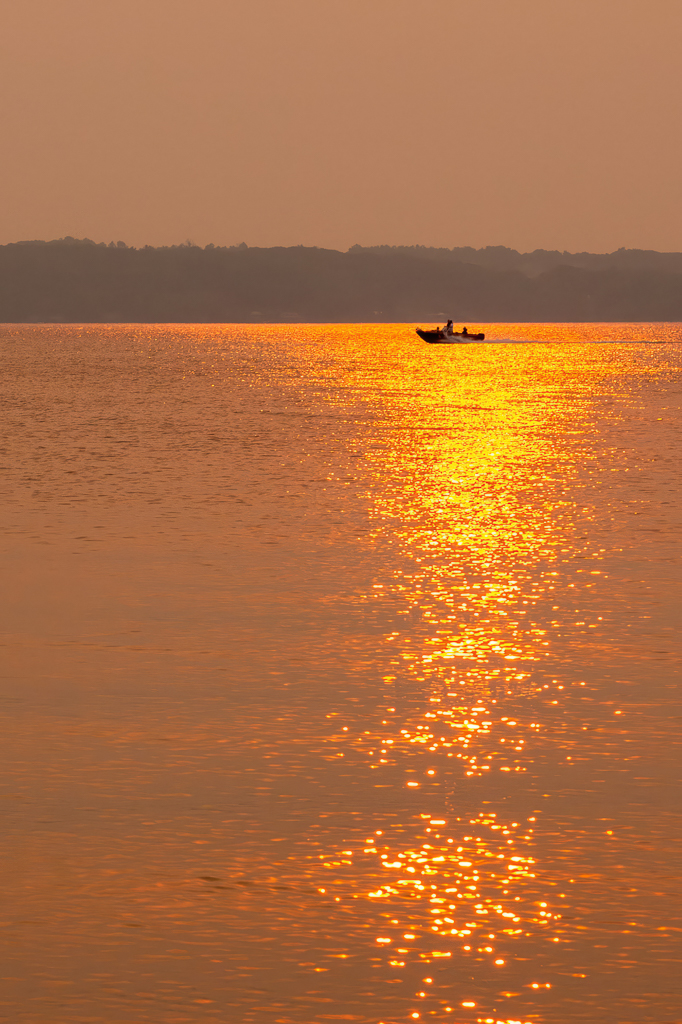
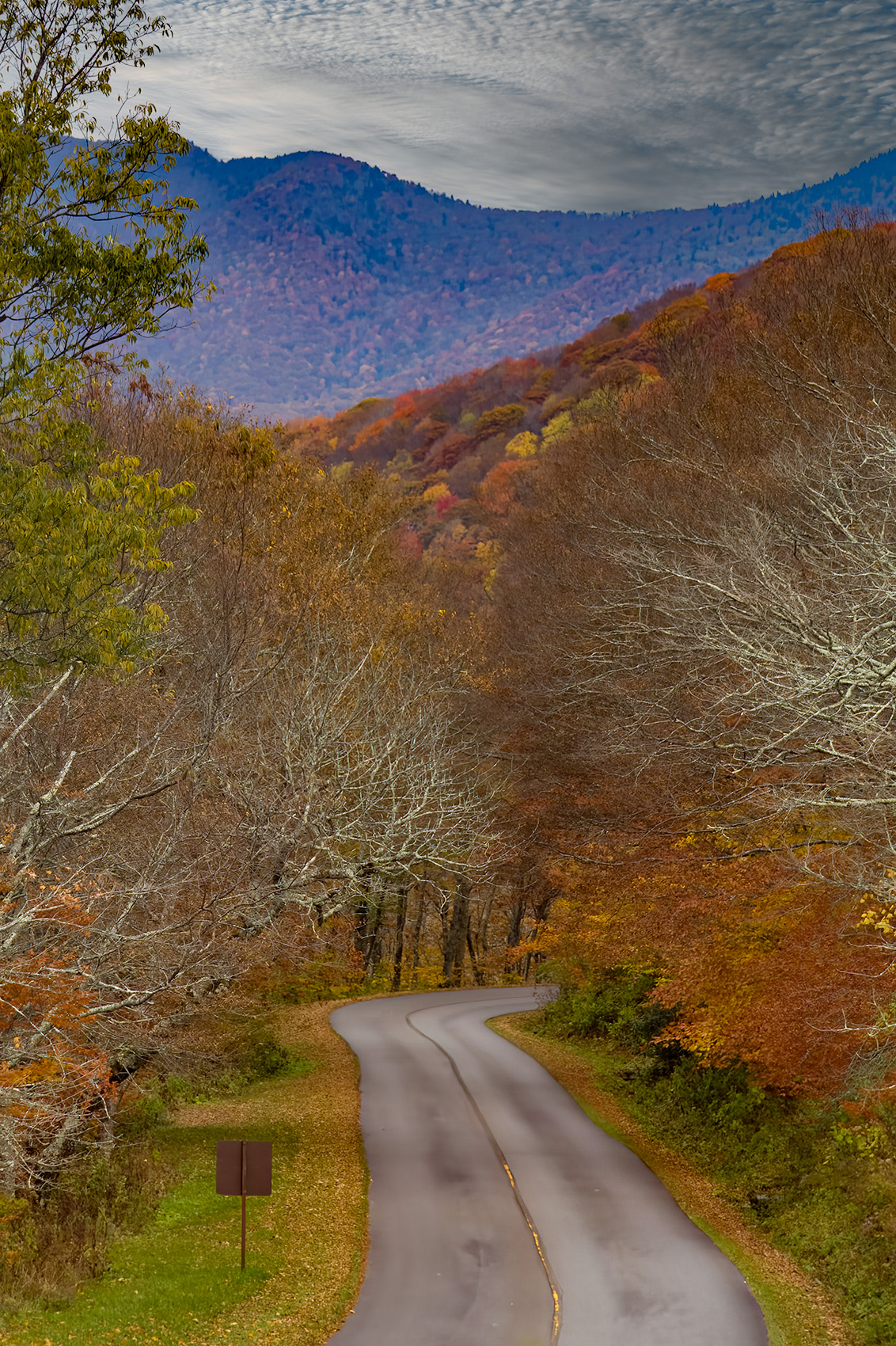
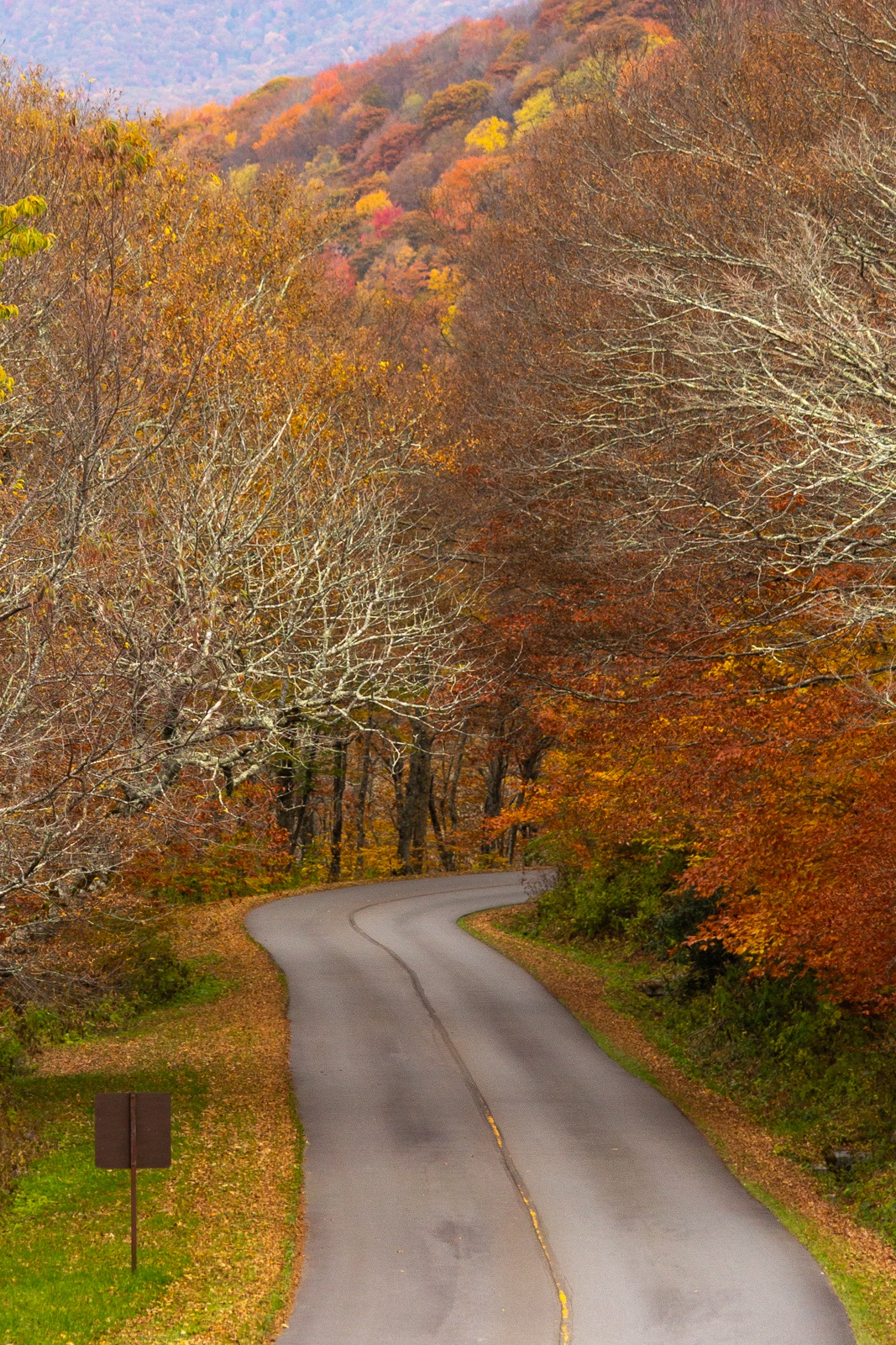
Thanks to all for the great dialogue, different takes, etc.
I've re-worked the photo from RAW in two ways:
1) Keeping the original crop ratio but with a slightly tighter crop, leaving some of the mountains in the distance to show depth, keeping the road sharp, slight straightening, and adjustments to color saturation, contrast, and bringing the whites up.
2) All of the above, but with a 1:1 aspect ratio and an even tighter crop. While I typically to not find square photos to be as pleasing to my eye, I have to say I really like this tighter crop. Thanks to Robert for commenting on the leafless trees helping to frame the photo plus Terry and Jim for showing a bit more of a square aspect crop. |
Feb 16th |
 |
| 78 |
Feb 23 |
Reply |
Thank you for your comments and crop, Jim.
Your crop is in the same general spirit as the alternative crop I had considered initially but abandoned. With the extra color saturation and other tweaks you did, I really like this take on the image the best.
Not sure I'll be able to figure out how to straighten just the trees beyond the curve in the road... a new challenge to learn and work on!
|
Feb 16th |
| 78 |
Feb 23 |
Reply |
Thank you for your comments and rework of the image Robert! |
Feb 16th |
| 78 |
Feb 23 |
Reply |
Thank you, Mitch, for your comments and amended crop. As noted in the background comments I provided with the image, I was struggling with the sky from the onset, not liking the original and trying to find "something" that would work to keep the image "whole." With the path you started down and the similar comments made by others, I will start back from the scratch RAW file and make some edits. |
Feb 16th |
| 78 |
Feb 23 |
Reply |
Terry,
Thank you for your comments and thought provocations regarding the UV lens. While I am using a polished glass UV lens filter, I have never really questioned how much it may or may not affect quality, nor have I ever really experimented without it. I've had numerous respected photographers tell me in the past to use it and just kind of blindly followed.
Your comments spurred me to dig into the topic more and also to remove the UV filter and do some shooting.
Despite the quality of the filter I had been using, I was rather shocked at the delta in overall IQ with the filter off vs on, with a heavy preference to the filter-free shots! Even on my not-so-favorite kit lens, the difference in IQ was notable.
Not sure I'll ever put a UV filter on another lens in the future.
I love the different perspectives we get from others through this dialogue group.
Thanks! |
Feb 16th |
| 78 |
Feb 23 |
Reply |
Thanks for the humorous candor in your response Robert. Your setup sounds wonderful and is most definitely a high dollar setup for what I am willing to spend at this point in my journey as a photographer. It is also encouraging to know that we all have our share of less-than-desirable images, no matter what we are shooting them with. :-) |
Feb 13th |
| 78 |
Feb 23 |
Reply |
Wow, Jim ... this is incredible. I imagine the time spent removing the structure to the left was significant ... this version of the image is captivating.
The conversion to B&W really helps take the viewer on a trip back in time.
Very nice! |
Feb 13th |
| 78 |
Feb 23 |
Reply |
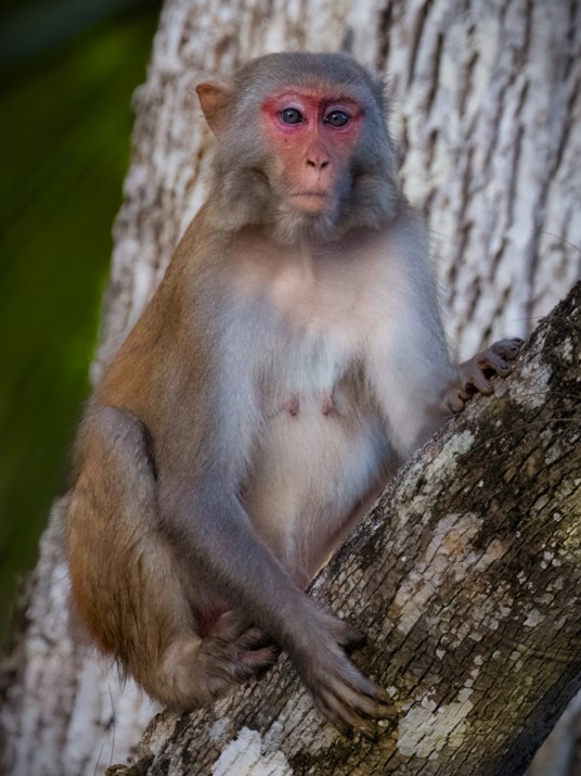
Hi Brenda,
This newer version looks wonderful. You've done well with incorporating the widely varied feedback and creating a stunning image.
I understand the desire to keep some of the "surrounds" in order to present the "environmental portrait" for PSA Nature. Where I disagree is when the surrounding environment detracts from the subject and/or does not provide enough of the environment to truly show context.
For example, the amount of environment included in your original was not sufficient to suggest the photo was unquestionably captured in the wild. As a viewer, I could believe it was captured at the Sanford Zoo just north of Orlando, or even Lowry Park Zoo in Tampa, both of which offer similar scenery/surrounds.
Likewise with the wider angle original, the inclusion of both bromeliad plants off the bottom of the tree trunk the monkey is sitting on served to pull my eye away from the monkey.
The colors are wonderful, the brightening and sharpening of the monkey's eyes are fantastic, and the remaining bromeliad within the focal plane plus the wonderful bokeh of the palm/palmetto fronds in the background still provide a good balance of context. Great updates to the photo! |
Feb 13th |
| 78 |
Feb 23 |
Reply |
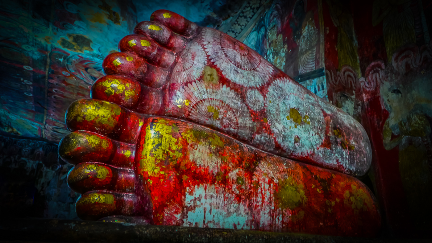
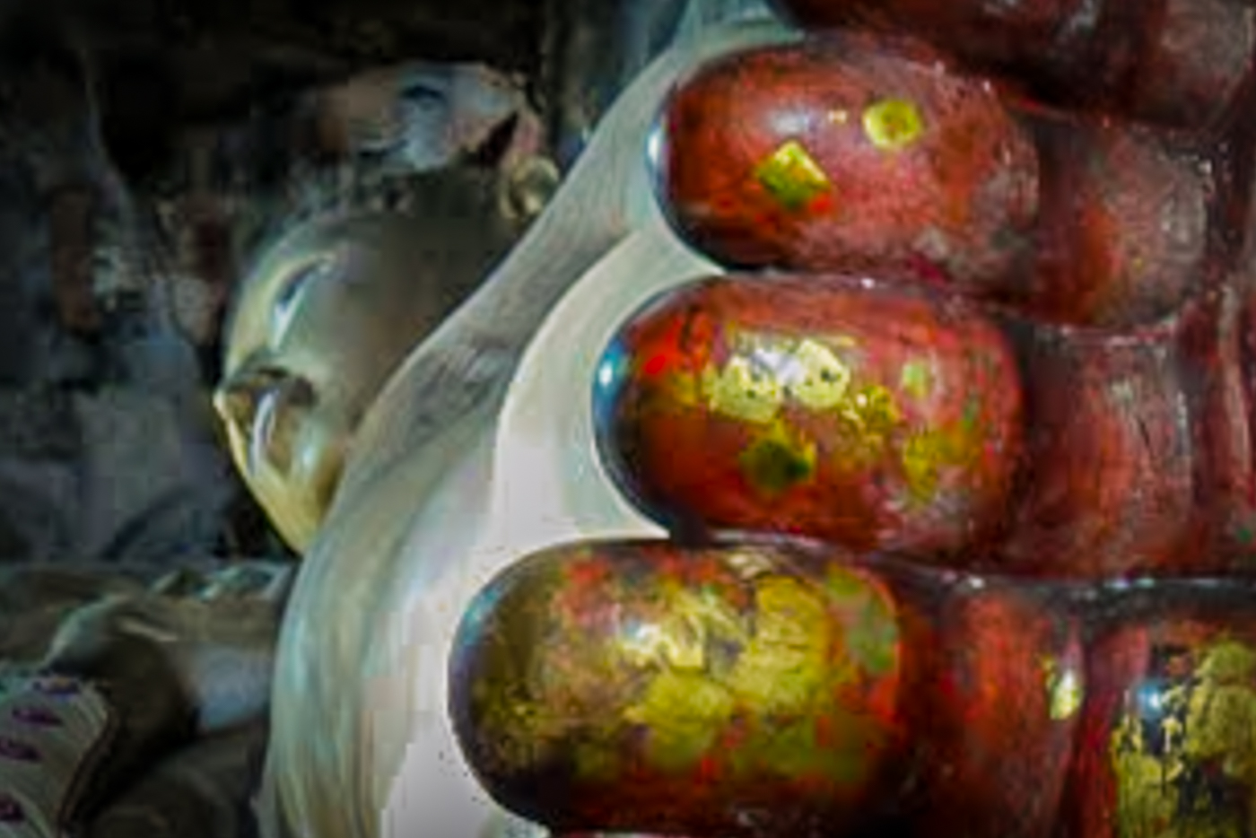
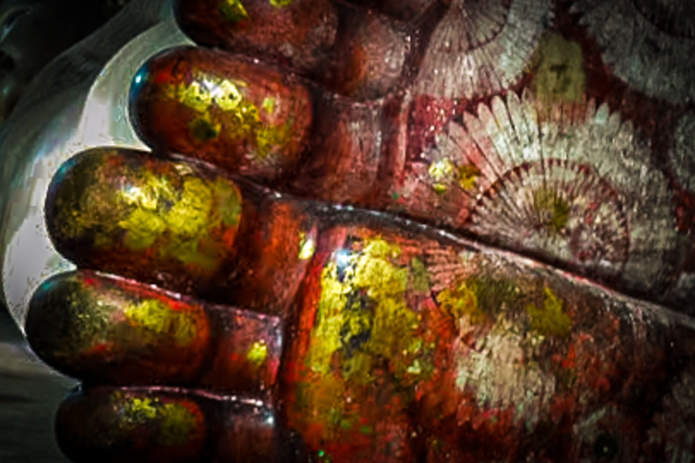
I like this one Sunil!
Buddha included would be great with the better angle and likely for more deeply personal reasons as well. As that isn't possible, trying to focus more in on the primary subject of the feet makes the photo more impactful for me.
I took that image, cropped just slightly more and then applied a moderate dark vignette to the corners and now the feet feel like the prime subject to my eye.
Again, great photo! |
Feb 2nd |
 |
| 78 |
Feb 23 |
Comment |
This is a great photo Mitch!
I especially like your chosen crop and the straightening you did to the edited version.
I do like the contrast and color saturation better in the original.
I like what Sunil was going for also.
Having been in the LoC building myself previously, I would caution against oversaturating color too much as from my memory, the colors almost have a pastel appearance to them.
Maybe something between the original and Sunil's edition for color saturation and contrast but with the straightening you already completed? Some selective masks on the blue windows in the center to modify exposure and pull out more detail, in addition to selective masks on the top, and right of the frame to match exposure to the left side of the frame might also be interesting.
This picture offers a lot of geometric attraction... the eye can wander all around the frame without ever leaving it. That's really cool.
|
Feb 2nd |
| 78 |
Feb 23 |
Comment |
Welcome to the group, Robert!
Mmmmm... bokeh. Wonderful, completely shredded background bokeh. And I love the constrained crop to a common size/format.
Using the stack as you have, the sharpness and clarity is amazing in contrast to that envious bokeh. You say 100mm macro lens... what brand lens? What camera?
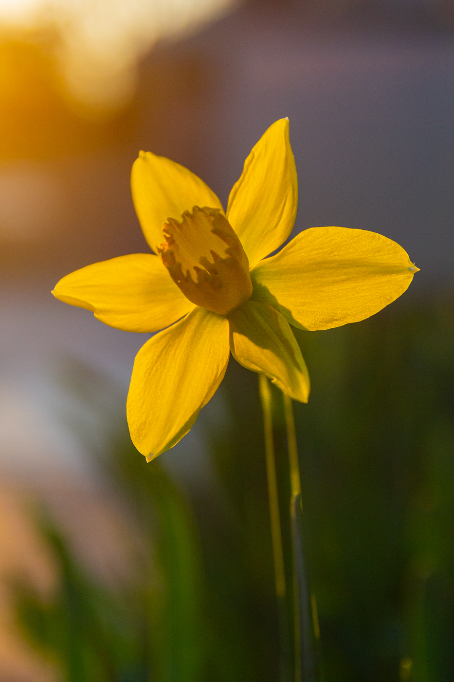
The image quality at f2.8 makes me very jealous. Do you attribute this to the use of the focus stack, or is it a high dollar lens?
If I was to offer any critique, it would be to rotate the entire image a few degrees counter-clockwise such that the bottom of the two tails lined up almost horizontally, which would make the left and right pedals also be a little more horizontal and make the tip of the stamen point almost directly south.
Amazing image.
|
Feb 2nd |
| 78 |
Feb 23 |
Comment |
WOW!
This is amazing. The eyes are haunting, not boring.
Sunil's suggestion and edit of single catchlight takes it over the top.
I normally prefer standard format crops vs square ... this one is amazing just as it is with the single catchlight.
T offer "something," maybe try to pull a little more detail out of the painted side of the face in the teeth and forehead area, and try to get more separation between the black background the dark hair on the same side of the head as the facepaint.
Truly though... this is hauntingly wonderful just as it is in the monotone version. Far superior to color IMHO. |
Feb 2nd |
| 78 |
Feb 23 |
Reply |
|
Feb 2nd |
 |
| 78 |
Feb 23 |
Comment |
This is a very fun photo with some great comments already added. As you yourself suggested Sunil, a wider angle lens would have added a very different perspective.
To offer something very different, I am including two different "crop until it hurts" perspectives that can focus the subject very differently. The first focuses on just the feet, and plays with the angles a bit. The second includes Buddha's face and some of the toes.
Crops this aggressive are clearly a challenge without the RAW data... and as such, they are for perspective suggestions only. |
Feb 2nd |
 |
| 78 |
Feb 23 |
Comment |
Hi Jim,
This is a really cool photo. I love what you have already done with regard to the trash removal and agree it looks much better without it ... for me, mostly because the trash looked like "new" trash rather than historical trash. Historical trash could have added a unique and fun element.
I am in agreement with Sunil that this one could also be really nice in B&W or sepia toned.
My only other recommendations are to possibly try and clone out the red/brown structure to the left side of the frame, and, if you leave it color, to bump up contrast and color saturation just a little. I personally really like the contrast and saturation of the Original 2; perhaps something in-between that and tour edited version?
Also, and very much a personal preference thing, I prefer constrained crops of standard formats ... 3x5, 4x3, 4x6, 5x7, etc. I fully acknowledge we do not need to adhere to this in our digital age and it is probably a subconscious carryover from my years as a darkroom tech ... using constrained crops to standard formats is more pleasing to the eye for me.
Great photo! |
Feb 2nd |
| 78 |
Feb 23 |
Comment |
Hi Brenda,
I am absolutely enjoying the Macaque photos from your trip to Silver Springs!
I like all of the edits you have already done. To further play off of what Sunil offered, I would crop this much tighter.
I recently attended a photo critique hosted by a professional photographer couple... two of th recurring things of the evening were:
1) "fill the frame with beauty" (the subject) ... leave out anything that can pull the eye away from the subject and distract.
2) "avoid significant diagonal lines that leave the frame at a corner" ... while they admit their stance is not shared by all, their take on it is that a significant diagonal that leaves directly in the corner of the frame can risk "dumping" the eye out of the frame.
With those, I re-cropped your edited version, added a dark vignette at the corners, tweaked exposure, contrast, and saturation very slightly and came up with the attached.
The subject of the monkey takes center stage. |
Feb 2nd |
 |
7 comments - 11 replies for Group 78
|
7 comments - 11 replies Total
|