|
| Group |
Round |
C/R |
Comment |
Date |
Image |
| 78 |
Jan 23 |
Reply |
Wow, Brenda ... this looks great! To my eye, there is a lot more detail in the Macaque's face and the cypress knees definitely seem less stark. And the left side of its face and hand look excellent as well! Very nice! |
Jan 20th |
| 78 |
Jan 23 |
Reply |
The rework looks fantastic Terry ... and I love the full door! |
Jan 15th |
| 78 |
Jan 23 |
Reply |
Here it is with some sepia tone added to it plus a number of radial, linear, and brush masks to play with the foreground/parking area, the sky, a few of the street lamps, plus the houses themselves.
Most of the changes or changing contrast, whites, blacks, highlights, shadows, etc. And also a little tweaks on clarity and sharpness.
I like how the sky looks with the sepia tone.
|
Jan 15th |
 |
| 78 |
Jan 23 |
Reply |
Feathering is definitely at 100% ... I kept the increased exposure and pulled out all added yellow in this version.
I hadn't added much yellow as it was (only +2) ... I do like it better with no added yellow and just the increased exposure. |
Jan 15th |
 |
| 78 |
Jan 23 |
Reply |
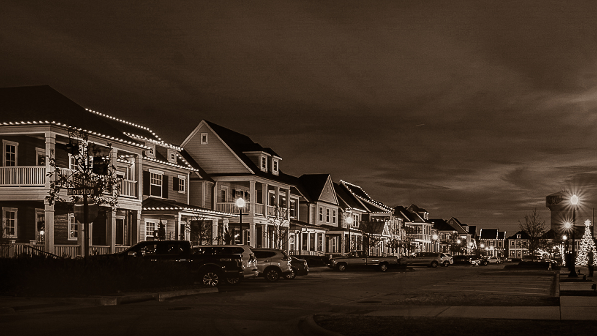
Thanks for the further commentary Brenda!
I've tweaked that black swan just a tad more using your suggestions. :-)
Here it is with those updates included. |
Jan 15th |
 |
| 78 |
Jan 23 |
Comment |
Thanks to all again for the insights, suggestions, and different perspectives!
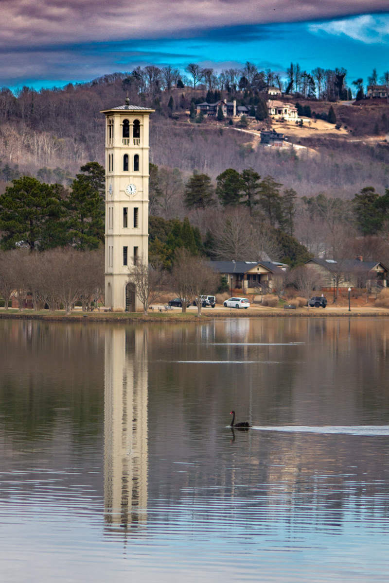
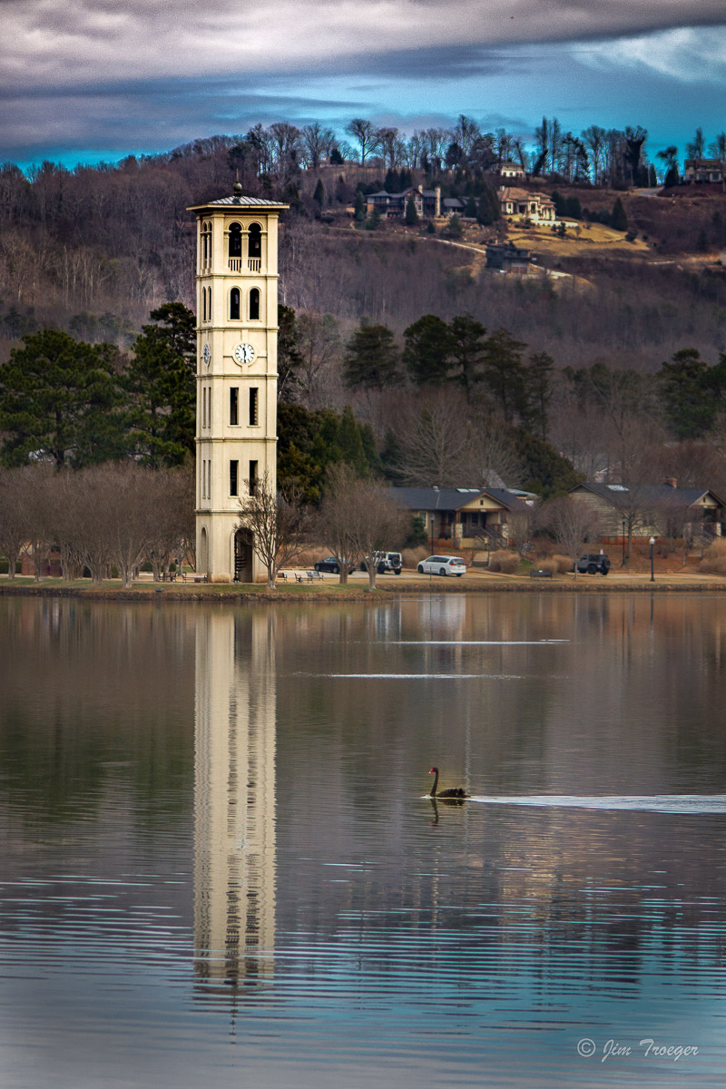
I experimented with more selective masking; finding that using the object/subject selection for the bell tower also wanted to select the reflection. Instead, I used the brush masking tool to brush just the tower itself for selective sharpening of the bellow tower itself.
I also pulled back the cyan and overall color saturation in the sky, applied a number of selective masks to the houses in the upper-right, the grass at the edge of the lake, and even the remaining areas of barren trees/woods to reduce overall exposure and tone down the highlights and whites. I further toned down the very bottom of the lake where the reflection of the sky was a little blown out, then applied a very slight dark vignette to the corners.
Overall, I do like this version better than my originally edited version.
|
Jan 15th |
 |
| 78 |
Jan 23 |
Comment |
I did end up deciding it would be fun to play around with this one a little more.
Using your edited image, Mitch, I played around with multiple layers of masking, including some linear gradients, a number of brush masks, and even some further global edits.
All of them were aimed at getting the sky to be a little darker with less color wash from the AB, trying to get the streaks/striations in the AB to pop a little more, making the foreground a little darker, and toning down the clouds a little more, plus selectively increasing the vibrance and color saturation of the AB itself.
This is where I ended up with about 20 minutes worth of tinkering. |
Jan 15th |
 |
| 78 |
Jan 23 |
Comment |
What a fun photo of the AB!
The edits you have already done, such as removing the cell tower lights, and the road, etc. are all great.
The clouds and background do not seem to be quite as out of focus in the original as they are in some of the edited images. In general, I feel that super crisp, sharp edges on everything is at times given too much attention and weight... some softness is perfectly acceptable and in the original, that is how the clouds and the background feel to me: slightly softened. |
Jan 14th |
| 78 |
Jan 23 |
Comment |
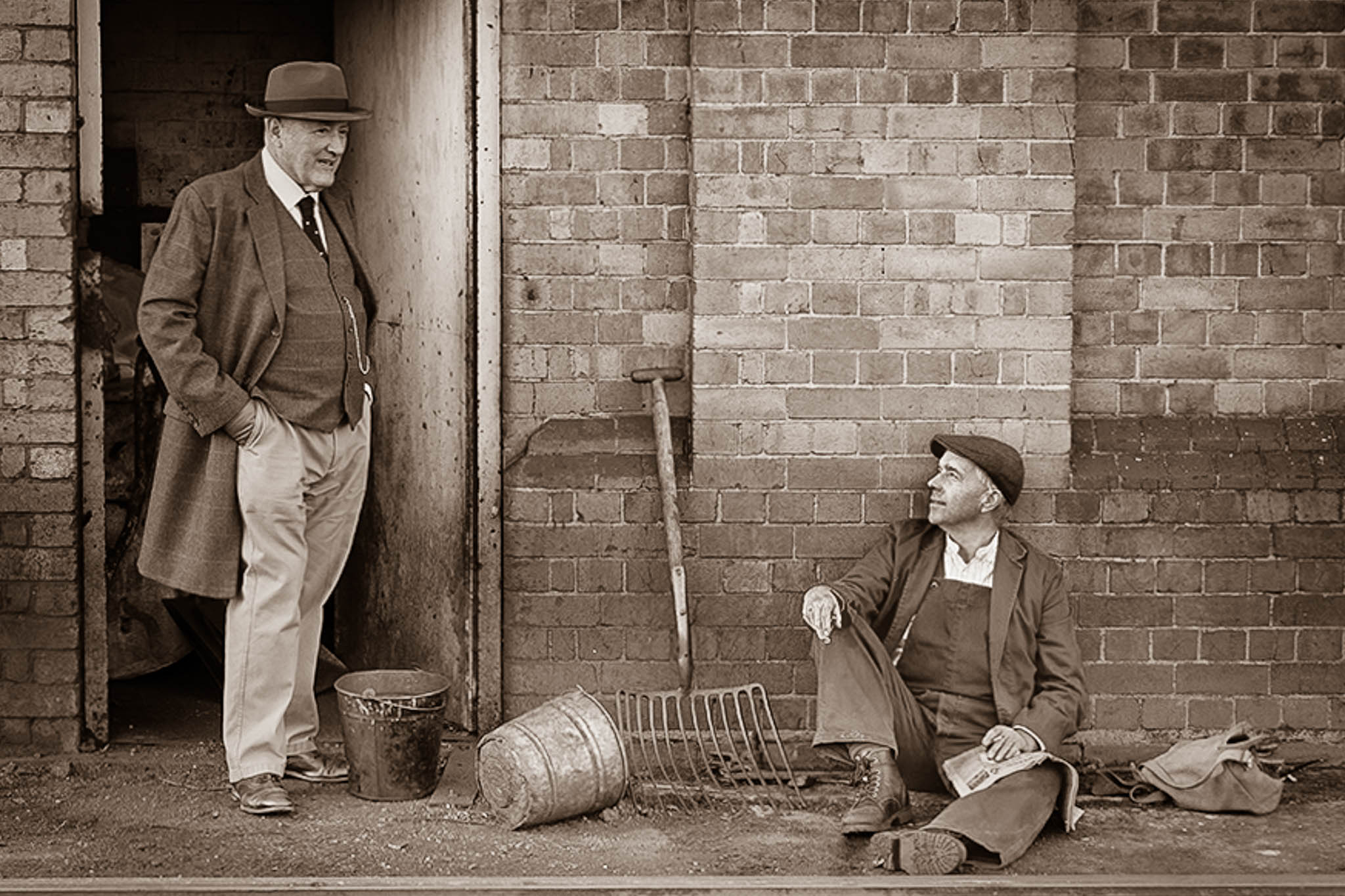
Hi Terry,
This is a very neat image and one which feels like it has a story behind it... almost as though there is history and meaningful relationship between the manager and the worker, who are mutually ruminating on some topic of significance.
I love the photo in all of its color glory and everything everyone has already offered.
This is also another example of a photo that I feel tells the story in a different way when done in monotone with a touch of sepia tone to it.
Applying some of the straightening and removal of the paper near the worker's foot already mentioned by others, then transitioning it to monotone with sepia toning and using a number of vertical, radial, and person masks to tweak light settings, I came up with this as an example.
|
Jan 14th |
 |
| 78 |
Jan 23 |
Comment |
Hi Sunil,
This is a great image ... especially given your indication it was a discard. I'm with others in that it is so fun to see what someone can do when making something out of nothing!
I especially like your modified photo and can really not offer much else as far as suggestions.
For something fun and different, this could potentially be one to try applying a sepia tone to. The sepia tone, I believe, might add a different dimension to the cloud cover in the sky. |
Jan 14th |
| 78 |
Jan 23 |
Comment |
Hi Jim,
I love this photo! As others have expressed, the expression on her face is great.
I especially like your chosen crop on this photo and the straightening you did of the vertical lines on the granite and the structural picture in the background.
The only two observations I have to offer are
1) I personally prefer the skin tone, her hair color, and the slight redness of her lipstick in the original... in the edited photo, her hair and skin tone seem a bit more orange to my eyes and her lipstick color has lost its red tinge.
2) Her face feels almost too sharpened in the edited version for my liking. Just a touch more softness might help reduce the harshness of the leading edges of her facial outline. |
Jan 14th |
| 78 |
Jan 23 |
Comment |
Hi Brenda,
Great image!
I love Silver Springs ... and the Macaques are always fun. When we lived near St. Pete, my eldest daughter worked for the Suncoast Primate Sanctuary for a little over a year and they cared for a number of Macaques. Always so expressive!
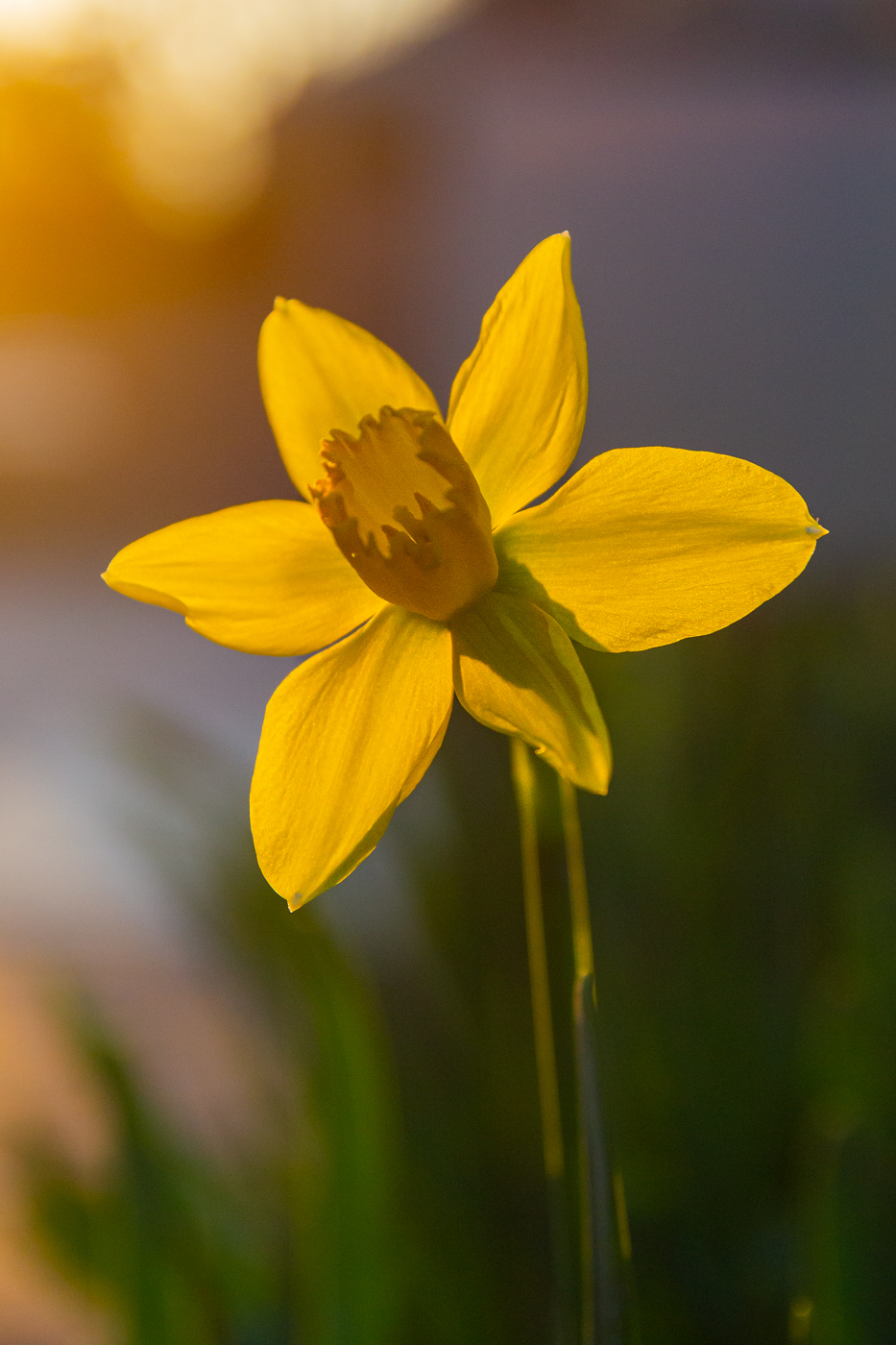
As with others, there is little I can suggest to improve your image. To play off of what Jim suggested on the brightness of the cypress knees and the central part of the Macaque's face, maybe rather than toning down the brightness overall, consider taking the same radial masks you used for brightening and just pulling back the highlights a little in those mask areas. Also, potentially try applying a couple additional radial masks on the macaque's hand and the dark side of its face to lighten the shadows just a touch and see if there is any additional detail in those couple of areas that could be brought out.
Looks like your crew had a lot of fun that day! |
Jan 14th |
| 78 |
Jan 23 |
Reply |
Thank you for the welcome, Mitch.
I share your preference to full reflections when possible.
I look forward to working virtually with you as well! |
Jan 14th |
| 78 |
Jan 23 |
Reply |
Hi Jim,
Thank you for offering a very unique view on my image. I especially like what you did with darkening the houses in the upper-right, similar to what Terry had suggested and can see how the reduced vibrancy in the sky helps soften the overall feel of the image.
As for the crop, it is indeed a unique take. While I still prefer the inclusion of both the black swan and the full reflection, I can see how it makes the focus be all about the bell tower. |
Jan 14th |
| 78 |
Jan 23 |
Reply |
Hi Terry,
Thank you for your comments and suggestions. I do have Photoshop with my package and to date, I have done almost nothing with it ... I plan to take the Intro to Photoshop online course through PSA in a few months. I will also try to see what I can find for easy tutorials for using the clone tool in it for comparison to LightRoom.
Your suggestion regarding the brightness of the house also resonated with me well... and when I work on some further edits with it, I will also play around with that. |
Jan 14th |
| 78 |
Jan 23 |
Reply |
Thank you, Sunil. I will be playing with the blues and striving to tone them down a bit. |
Jan 14th |
| 78 |
Jan 23 |
Reply |
Hi Brenda,
Thank you for your comments and suggestions! I especially like the suggestion for adding selective sharpening of just the bell tower and to possibly tone back the cyan a bit. I will play around with both and see how I like it! |
Jan 14th |
7 comments - 10 replies for Group 78
|
7 comments - 10 replies Total
|