|
| Group |
Round |
C/R |
Comment |
Date |
Image |
| 12 |
Mar 23 |
Comment |
Hi Connie
Thank you! I enjoyed creating it and presenting it.
You can find my slides here: https://group.neccc.org/using-a-photos-impact-to-influence-commenting-miniseries-episode-3-mar-31-2023/
The recording will be posted in about a week.
Chane |
Mar 31st |
| 12 |
Mar 23 |
Reply |
Thanks. After reducing the sharpening a little, I entered it into my local camera club "open" competition last week and won first place. I was tied with another, but we break ties. I was tied with an amazing barn with pond relection. |
Mar 30th |
| 12 |
Mar 23 |
Comment |
I agree on the framing, we don't see many photos with a framing composition leading us directly where to look.
|
Mar 29th |
| 12 |
Mar 23 |
Comment |
The drop of water adds a great story potential, since I think many of us starting thinking about rain - and wishing we could find some like this someday 😊|
Mar 29th |
| 12 |
Mar 23 |
Comment |
Hi Fran
Enjoy wherever life leads you.
Chane |
Mar 29th |
| 12 |
Mar 23 |
Comment |
With these various edits making the crab more visible, consider a square crop to make this more of a portrait of a crab. |
Mar 29th |
| 12 |
Mar 23 |
Comment |
Taking another look at composition, consider if the left side leaf in the foreground needs a little more space sense it seems a little visually squished. |
Mar 29th |
| 12 |
Mar 23 |
Comment |
When I look at this embroidery work, I start thinking when my mom and sisters would embroidery and how it made things look better. People that weren't around embroidery are probably missing out on a great story. With the close up view we can see the time and patience required to craft this type of art. Plus, it is a unique and creativity look at the details. As mentioned about, the leading line to direct viewers to see the blue with yellow flower helps my eyes jump to the beauty you want me to see. This lighting helps add depth, however it is a little inconsistent and too bright in some areas, I wonder if a more directed side light would even add more depth. |
Mar 29th |
| 12 |
Mar 23 |
Comment |
Starting to think about an architecture photo I need for a competition next month. Mostly thinking steel, glass, bricks, lines and sharp angles. Then I took another look at this flower. Clearly Carole's close up shows off what real life architecture we have all around us. Thanks for the inspiration to look beyond buildings! |
Mar 24th |
| 12 |
Mar 23 |
Comment |
I do like green as well. |
Mar 14th |
| 12 |
Mar 23 |
Comment |
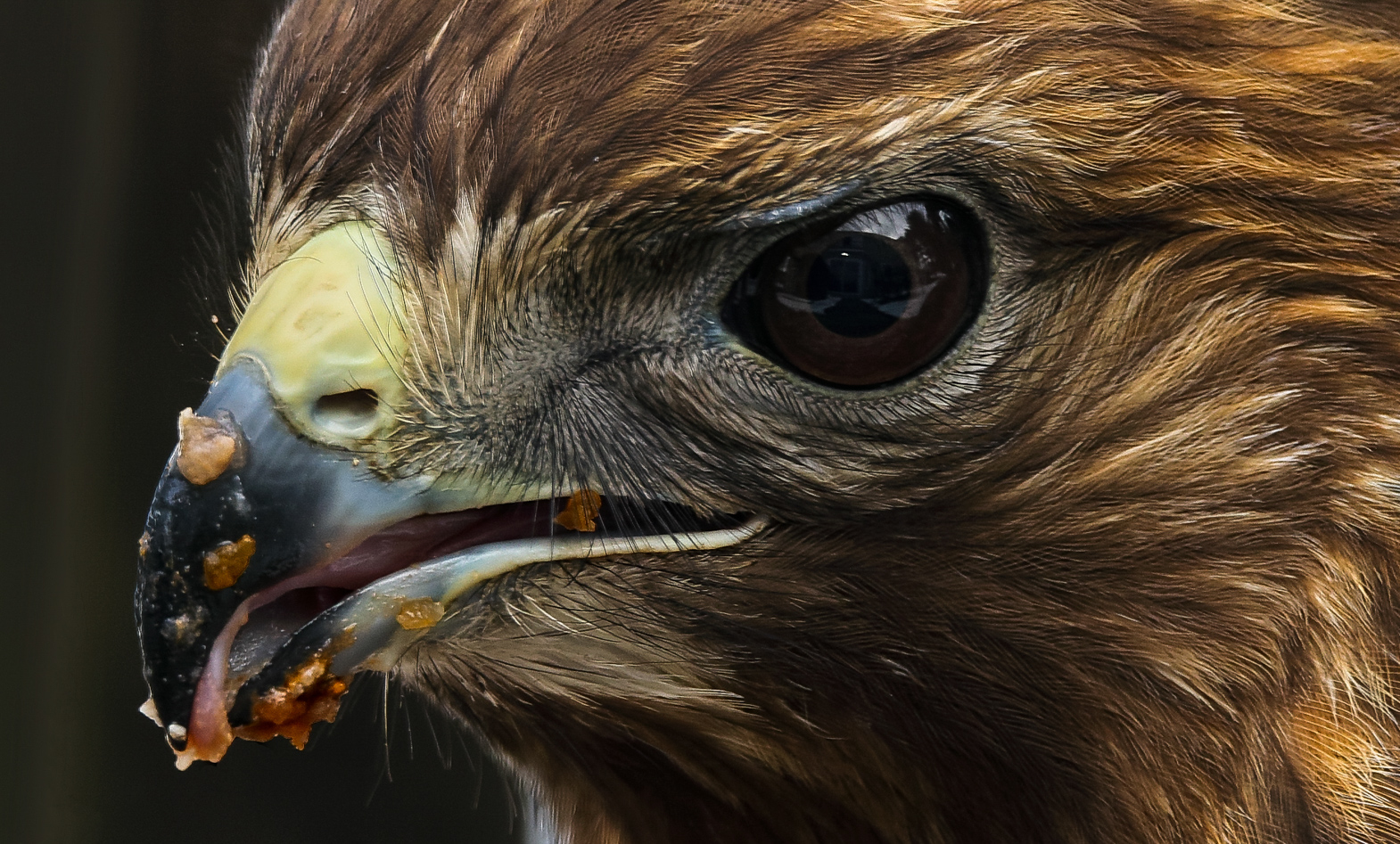
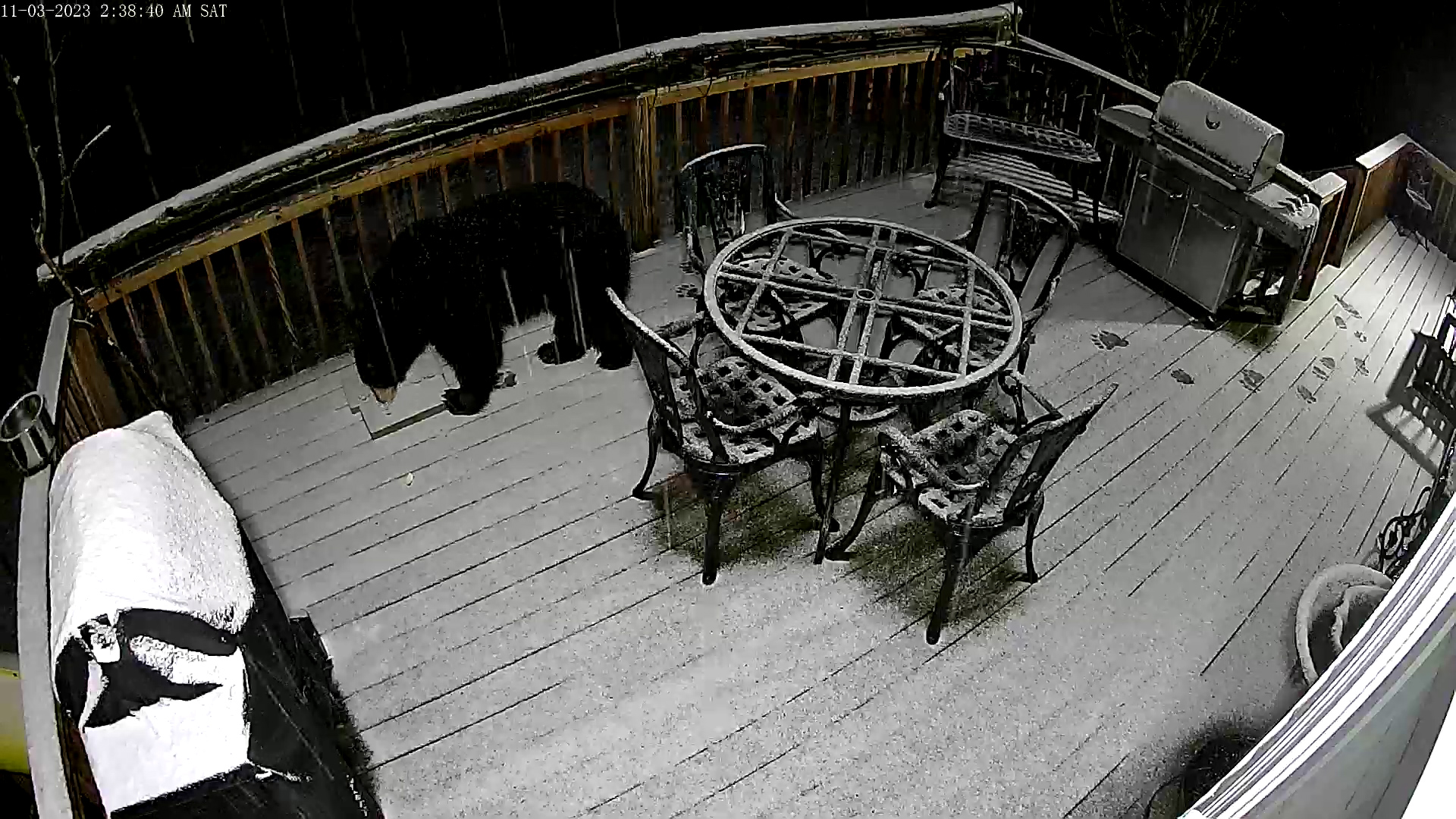
I'll take another look at my sharpening process. I was so sharp directly from Canon's Digital Photo Professional's new neural (AI) raw processor I was amazed. I'll look closer at each step and see which slider I push too hard on.
p.s. the photo below is from March 11, a bear stopped by to clean up anything the birds left behind :-). The bear is licking the spot I feed the hawk.
|
Mar 13th |
 |
| 12 |
Mar 23 |
Comment |
Always, tough to comment after several good ones. Using a blue background does make the yellow/green pop from the background. Larger aperture to more focus depth would be impactful. |
Mar 13th |
| 12 |
Mar 23 |
Comment |
Like Ally, I really like the original version. Probably because that is what I'm used to. "I wonder", if in a closeup should the shutter speed be slow to capture a silky look or fast to freeze the action. It depends on what feeling you want the photo to have. Having captured many water running over rocks photos and always being amazed that none of the photos ever expressed the emotions I felt while taking the photos. Back to your photo. See what it looks like with a portrait cropped, remove the right side of the rock, maybe add a tiny bit more space at the top and more at the bottom. |
Mar 13th |
| 12 |
Mar 23 |
Comment |
It must of been a little fun working to around this crab getting the right spot at the right time :-). I agree with the cropping, and maybe more cropping. Since you have the mask, crank several sliders up to see if more of natural camouflage disappears. |
Mar 13th |
| 12 |
Mar 23 |
Comment |
Good choices for colors and lighting. You mentioned focus stacking, which leaves me wondering why you choose to half of the yellow bits out of focus. That is, I was expecting them to be in focus as well. The left third provides more of the environment around the photo. If the left third was gone you lose the nice green color to complement the red flower. The opposite is, removing the left third brings the macro work more up front. |
Mar 13th |
| 12 |
Mar 23 |
Comment |
A great example of using a closeup to see what we can't with just our eyes. The thread really does look like rope. You choice to rotate/flip to create a left to right leading line is great. You postprocessing brings it up another notch. |
Mar 13th |
| 12 |
Mar 23 |
Comment |
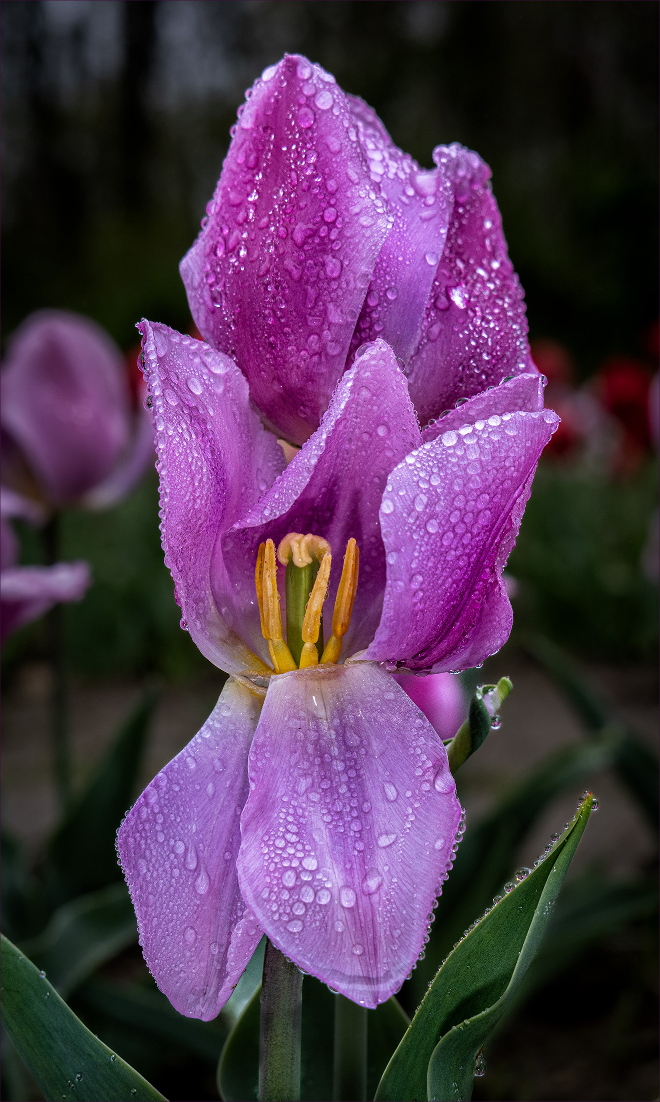
Your choice to lighten and sharpen the center worked very well. It draws my eyes directly to the beauty you want me to see. The pink petal on the right (blurry about 1/3 in) is a little distracting, but that's the way nature made it. |
Mar 13th |
| 12 |
Mar 23 |
Comment |
Thank you! |
Mar 9th |
17 comments - 1 reply for Group 12
|
17 comments - 1 reply Total
|