|
| Group |
Round |
C/R |
Comment |
Date |
Image |
| 63 |
Jul 17 |
Comment |
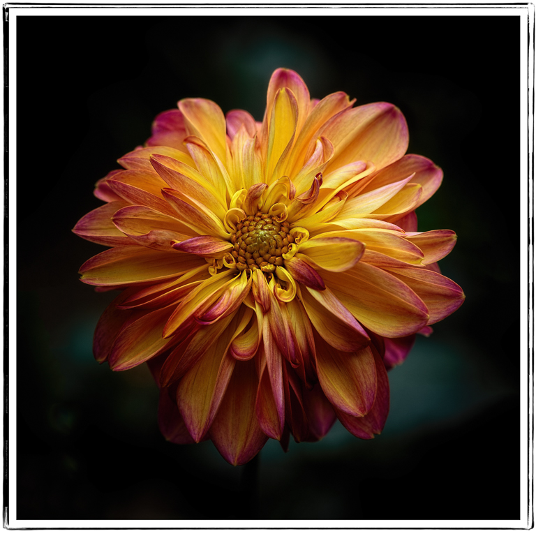
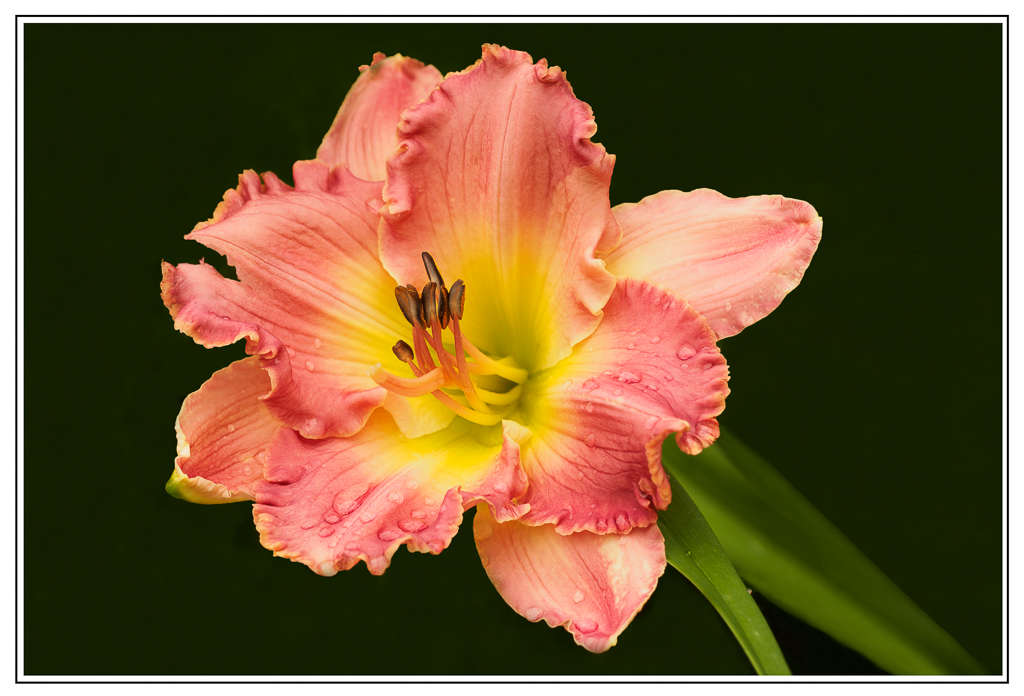
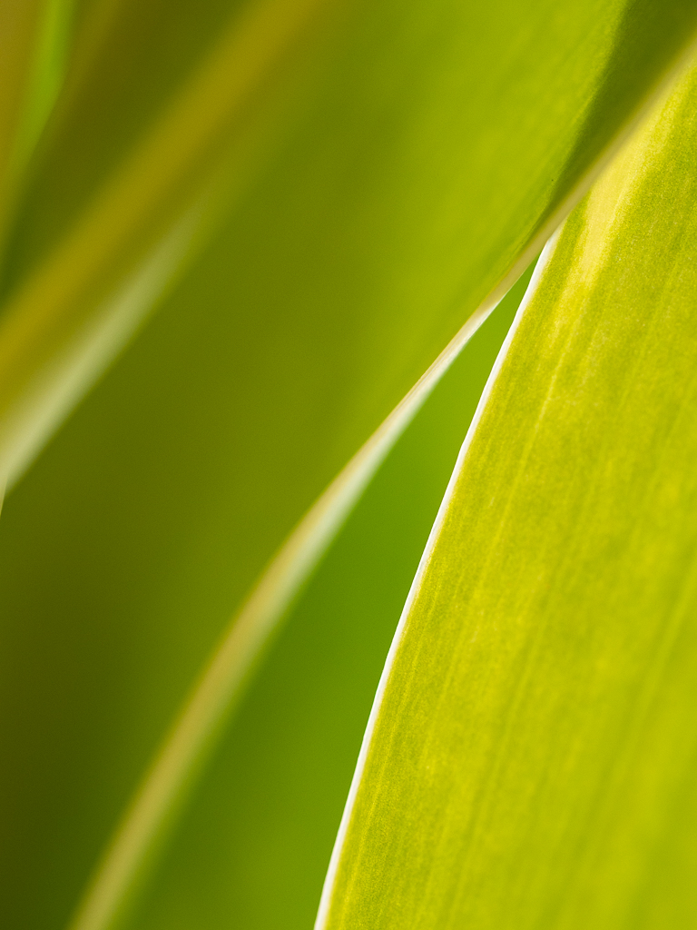
Priscilla, this is a beautiful image, well done. I like the sharpness and the colors in the image. The yellow, white and green work together very well. As Karen has said, I do find the other parts of the image distracting and think they could easily be removed, blurred, or subdued in some way to focus more clearly on the subject. I think the black in the background works well and it might make a nice image to simply remove those other pieces and replace them with black. Thanks for sharing. |
Jul 26th |
| 63 |
Jul 17 |
Comment |
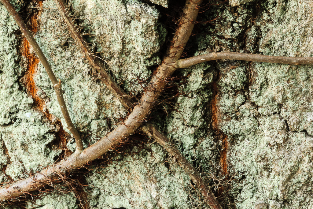
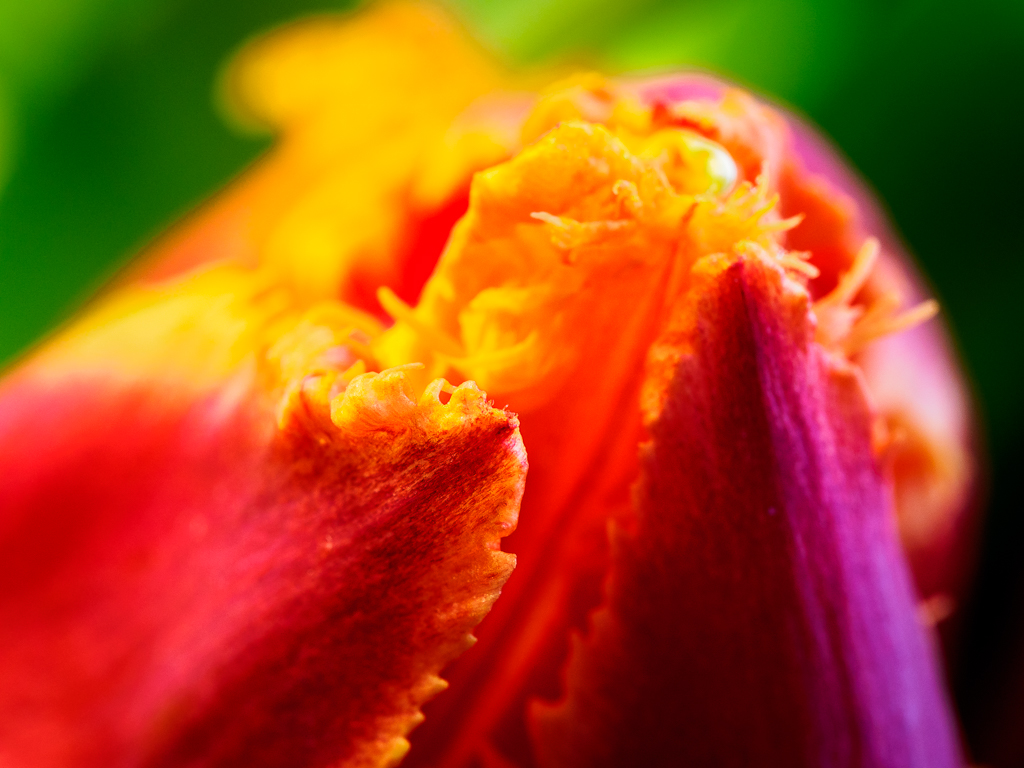
Pat, We have to realize that the thistles you have in Ireland as those in Scotland are so much a part of the beautiful landscape; unlike the variety of thistle we have here in the states, at least in the south. The subject itself is very sharp and the blurred background is particularly nice. The only suggestion I might have would be to blur and soften the other parts of the image to emphasize the subject and keep them from distracting. A slight vignette might also move the eye more toward the central image. I so enjoyed these when traveling in your country. |
Jul 26th |
| 63 |
Jul 17 |
Comment |
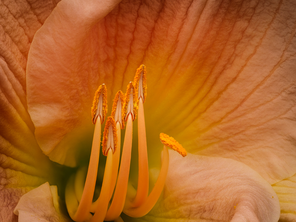
Murphy, so beautiful and so sharp. I love the complimentary colors and the way they are arranged. Such a nice composition the the texture (which I always enjoy as you know) is so clear and nice. I know that Lisa likes it better flipped and I looked at it both ways, but believe I prefer the original. Maybe I'm dyslexic and don't know it. Thanks for a beautiful image that I have enjoyed looking at. |
Jul 26th |
| 63 |
Jul 17 |
Comment |
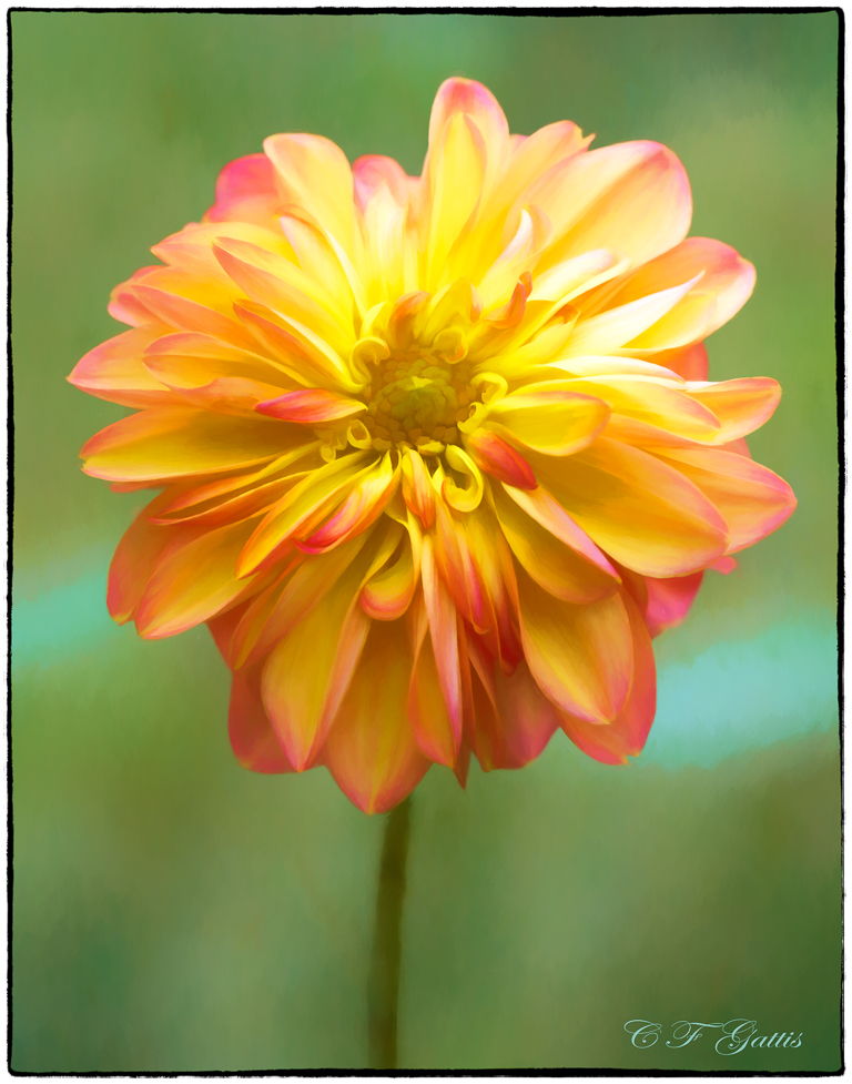
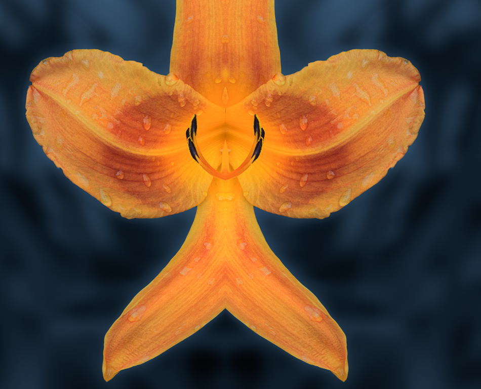
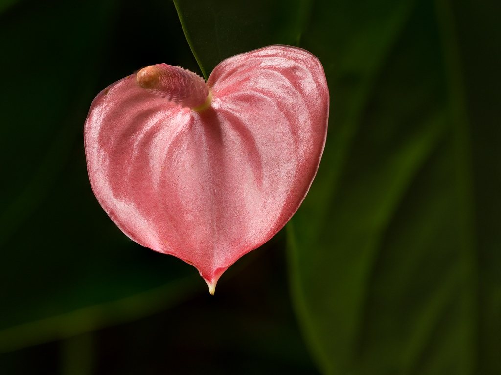
Hi Khai, your images are always so sharp and clear, and I love the details in this beautiful flower. I will admit that the "stuff" in the background bothers me, and I think you are right, that some completely solid background would not work well. Lisa's suggestion seems like an excellent solution. The flower is just too pretty to have to deal with a distractive background--somewhat of a metaphor for the lives of some people I have known. |
Jul 25th |
| 63 |
Jul 17 |
Comment |
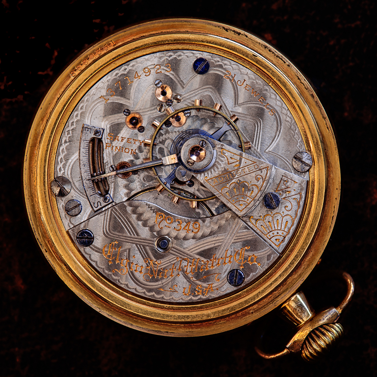
Love this sort of thing as I am always fascinated with Pat's tools. I particularly like the way you have brought out the texture without over doing it as I often do. The differences between the texture of the wood and the metal fascinates me and you have presented it well. I like the colors and the way the orange and the green work together. My eye went immediately to the lettering which is so clear and sharp, then the brighter light in the center let me explore and enjoy that area for awhile. I see no distractions and really found the image most interesting. |
Jul 25th |
| 63 |
Jul 17 |
Comment |
I really like the creativity here as well as the use of focus stacking. Good arrangement of the dice and the glass along with the overall presentation of the image. The blown out top is a little distracting but not too much as the focus of my eye went right to the well focused dice in the middle. |
Jul 25th |
7 comments - 0 replies for Group 63
|
7 comments - 0 replies Total
|