|
| Group |
Round |
C/R |
Comment |
Date |
Image |
| 63 |
Mar 17 |
Comment |
Hi Priscilla, You do such an amazing job with these flower arrangements that I am tempted to take a course, even though this is certainly not my forte. The colors blend so well with the vase, the flowers and the cloth background. I particularly like the flowing curves of the cloth. The solid background behind the cloth seems to draw my attention and bother me a little, but I wouldn't know how to avoid that. Beautiful image. Thanks for sharing it. Almost forgot to mention the great detail in the image. |
Mar 24th |
| 63 |
Mar 17 |
Comment |
Hi Pat, Really neat image. I like the perspective of the shot, coming from underneath to emphasize the white subject against the nicely blurred green background. Your aperture provides a nice blur, but also includes enough detail in the background for us to preserve a natural location. Including just a small amount of the brown wood also provides a foundation for the subject. In particular, I like the sheen on the fungus and gives it that porcelain look as the subject is so nicely named. The lighting of the subject is also very nice as it provides a progression of hues from the side to the center of the of the main subject. I think the only thing I might change would be to slightly burn the lighter areas of the background in order to draw more attention to the subject. |
Mar 21st |
| 63 |
Mar 17 |
Comment |
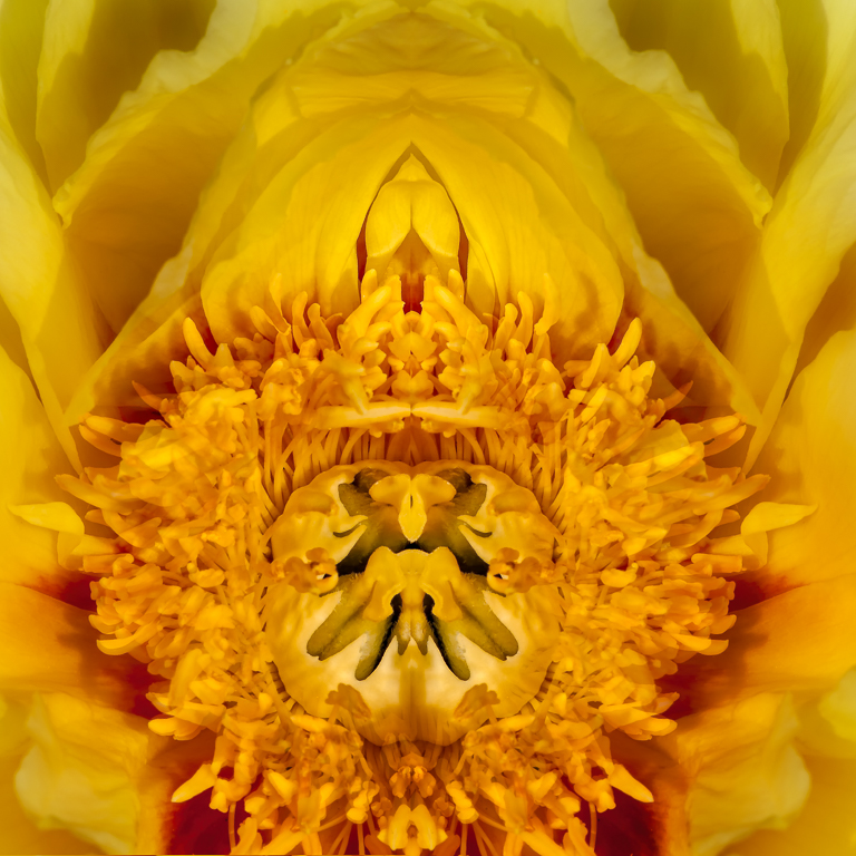
Hi Murphy, You’ve shared one of these before and the technique is something I really want to try. I love the sharp edges it produces as well as the array of colors which seem to follow a very interesting repeated spectrum. The image is nicely done with the center offset to the top right, and I am assuming the original image was much larger and able to be cropped into a nice composition with the leading lines coming into the center. |
Mar 20th |
| 63 |
Mar 17 |
Reply |
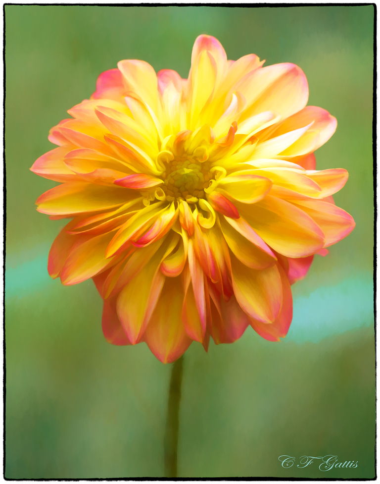
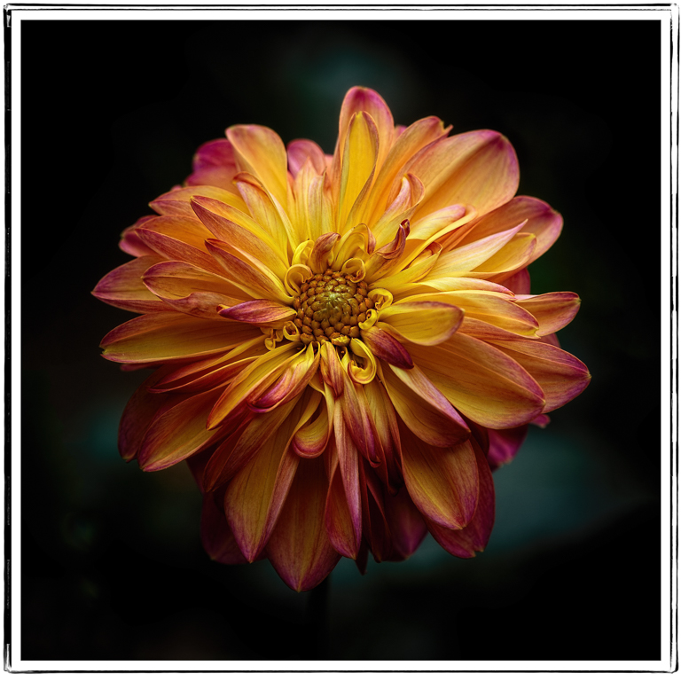
I like Priscilla's suggestions and decided to give them a try. I'm not sure what was meant by the stem coming in from the right so I tried it on both sides and for some reason, this way seemed best. Of course, Murphy has reminded me over and over again that images with dark backgrounds (which I like) need a boarder to show up well on our site. I'll learn that eventually. |
Mar 20th |
 |
| 63 |
Mar 17 |
Comment |
Hi Karen, Interesting and very creative image. I like the background and the way you mounted the queen The twist effect is also a nice addition to the image. |
Mar 20th |
| 63 |
Mar 17 |
Comment |
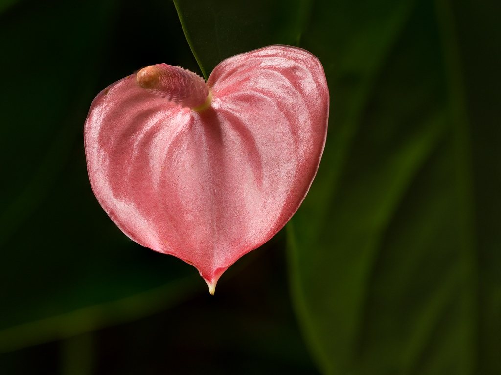
Hi Khai, beautiful shot here. I love how sharp the blossom is compared to the slightly blurred background. The image is sharp without becoming “crunchy,” even when I move in very close. I also like the way you have done the background by blurring it, yet leaving some very nice detail. The temptation is always to over blur the background, at least I always fight that urge. Very nice shot with great post processing. |
Mar 6th |
| 63 |
Mar 17 |
Comment |
Hi Lisa, I must confess that in my current condition, hobbling around on a walker following hip surgery, seeing that amputated leg causes me a lot of pain. That said, however, I think it is a delightful image. I love the muted colors and the way you kept them in the texture you used. I also like the curved petal and the way it frames the mantis, its curves somewhat imitating the golden spiral. Contrast those curves with the straight lines in the mantis’ body and the triangle formed by his head—not to mention that the little creature is tack sharp against a nicely blurred background. The color and composition make for a fascinating image in my opinion. I’m not familiar with the point system, but the only reason I can see why the judge might have marked off some points would be if the judge had recently had hip surgery and just found the loss of that limb to painful to look at. |
Mar 5th |
6 comments - 1 reply for Group 63
|
6 comments - 1 reply Total
|