|
| Group |
Round |
C/R |
Comment |
Date |
Image |
| 36 |
Oct 25 |
Comment |
Hi B,
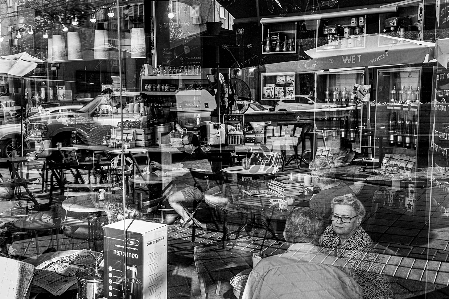
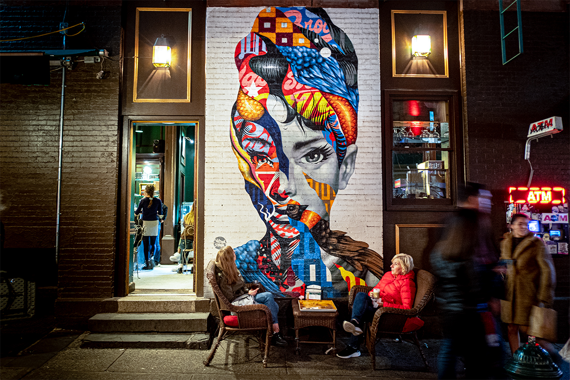
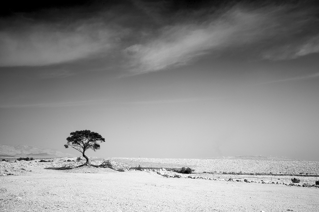
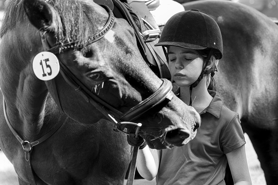
Thanks for the comment. I do not clone out items. In my view the picture should reflect reality when I took it. I agree that some space would have been better. I chose this angel to hide other distractions behind the tree.
|
Oct 28th |
| 36 |
Oct 25 |
Reply |
Thank you. See my response to Grace about cropping.
|
Oct 28th |
| 36 |
Oct 25 |
Reply |
M,
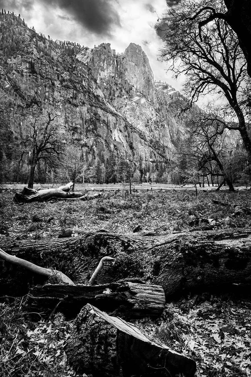
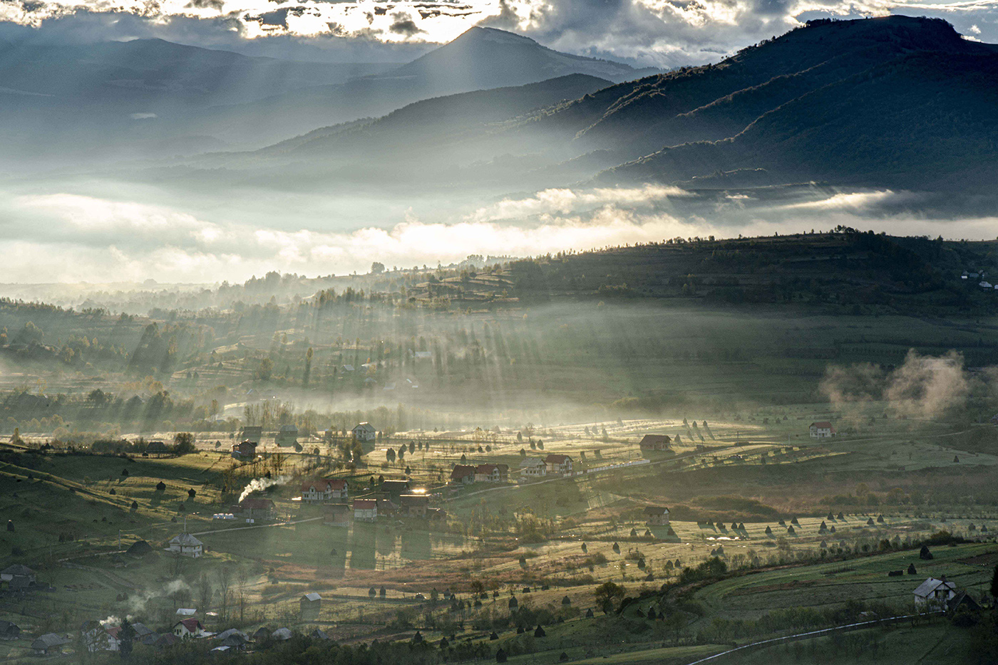
I can brighten the green area but then the viewer will concentrate more on the grass and less on the mountain. |
Oct 28th |
| 36 |
Oct 25 |
Reply |
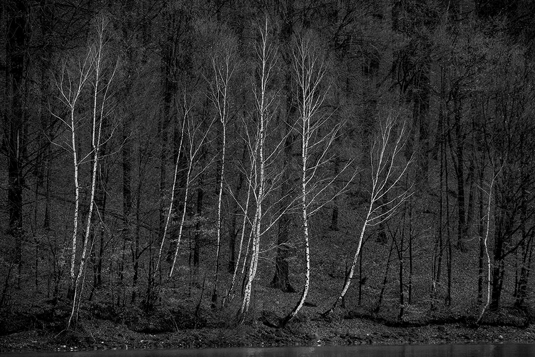
Thx L,
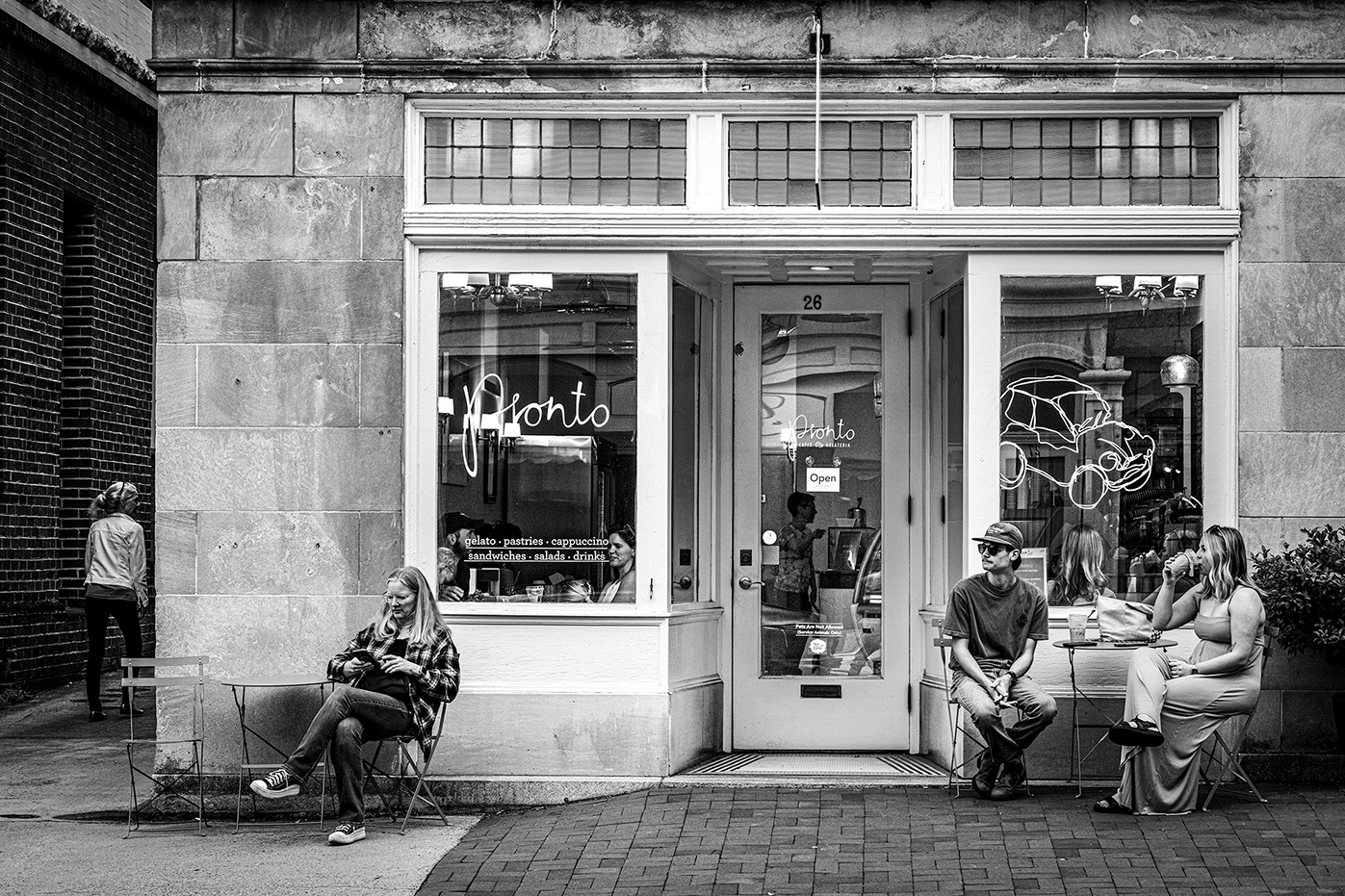
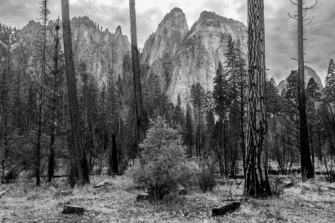
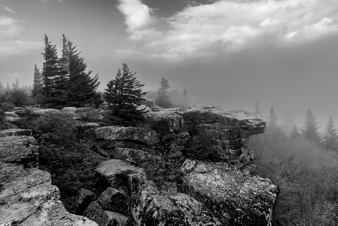
Yes this is exactly the intent: to make the tree the form study and the surrounding - context. Now think of the tree as human... That is the name of the project. The Human Side Of Trees. |
Oct 24th |
| 36 |
Oct 25 |
Reply |
Thank you Grace.
Your proposed crop is beautiful. Yet I do not crop pictures in anyway shape or form that are not aligned with the original proportions of the frame 4:6. That is one of the common elements of this project. Glad you enjoyed the article. The book is in publication process currently. Ill keep you posted. |
Oct 24th |
| 36 |
Oct 25 |
Comment |
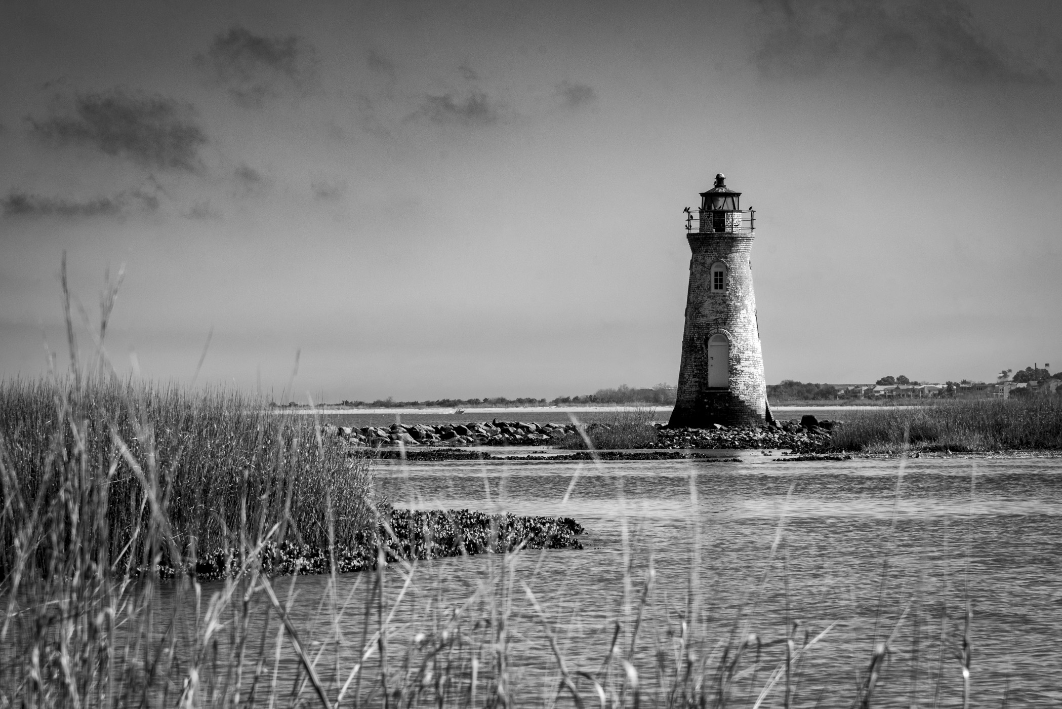
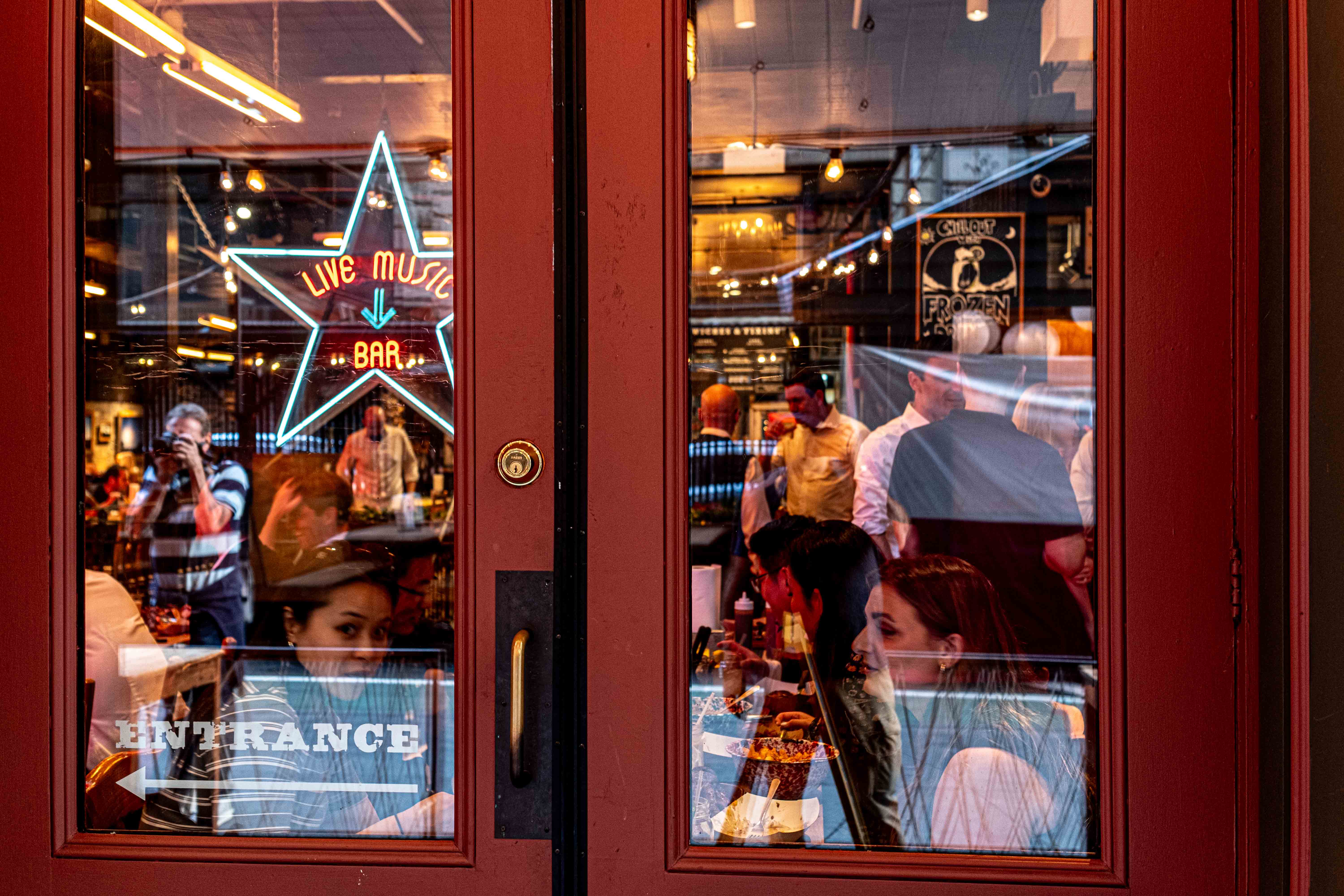
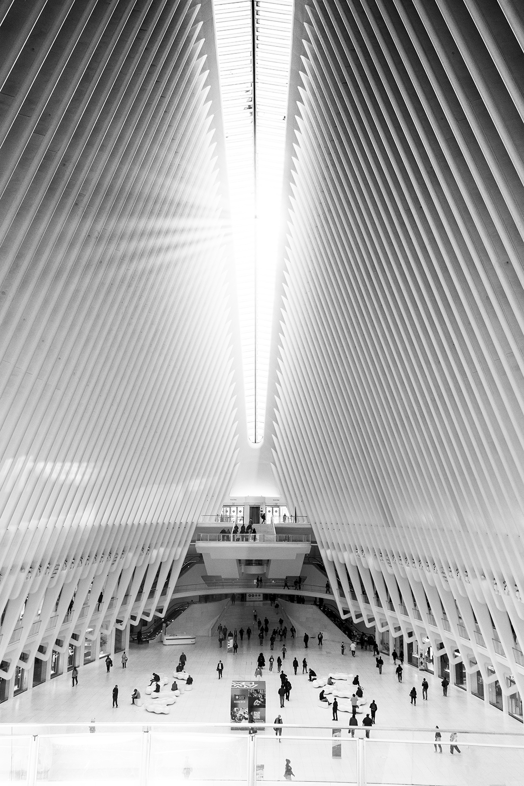
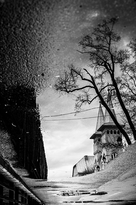
I like the composition. I like the crop. I would increase a bit the contrast to have to reflect on the clouds and on the wall under the tower. I think this picture will work beautifully in portrait too. |
Oct 24th |
| 36 |
Oct 25 |
Comment |
Now this is art.
Frame it put on the wall. Well done !!! |
Oct 24th |
| 36 |
Oct 25 |
Comment |
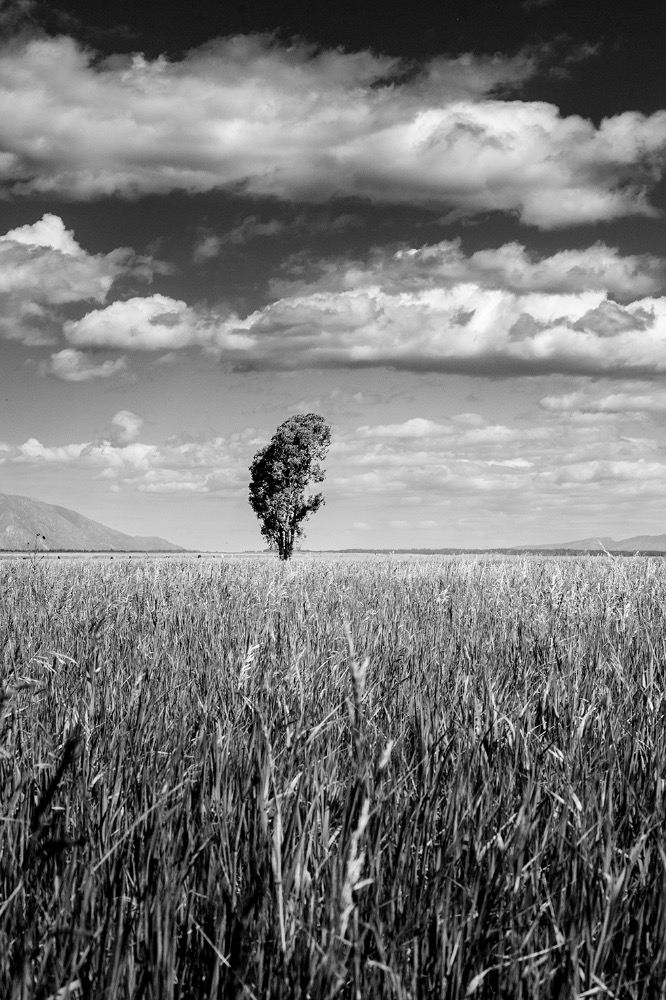
WoW what a wonderful picture. It is the perfect composition for the perfect lens. I like both options but prefer the B&W.
On the edit - I would shift the histogram abit to have more dark tones (+5%).
|
Oct 24th |
| 36 |
Oct 25 |
Comment |
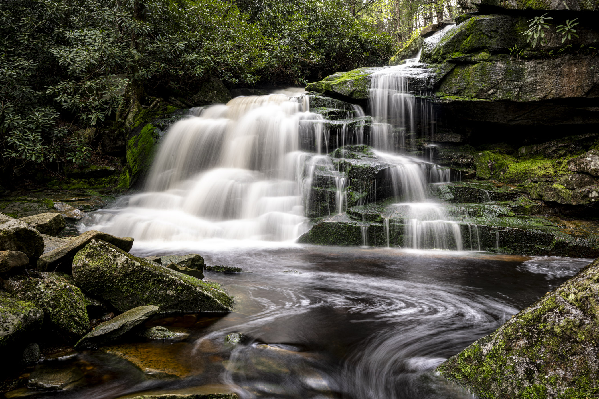
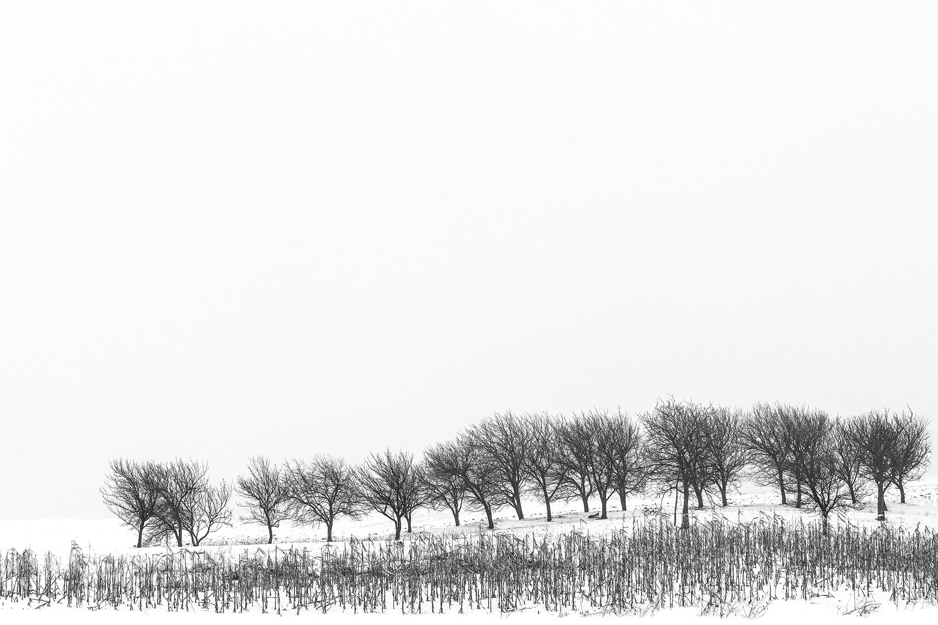
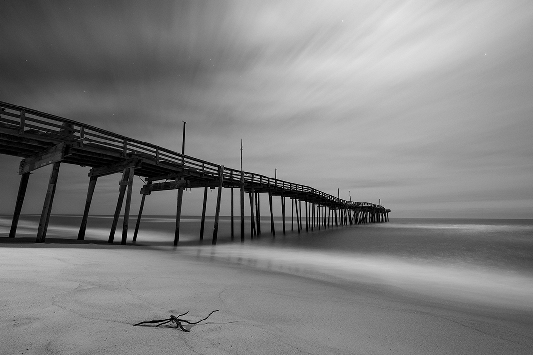
splendid ! the light gradient from dark to bright the layers - all perfect !. Nitpicking:
1. Brighten a bit the fore foreground
2. Clone out the spot on the right side on the margin. |
Oct 24th |
| 36 |
Oct 25 |
Comment |
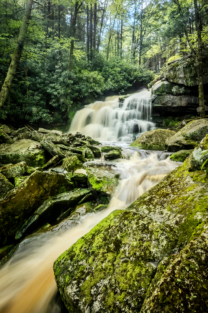
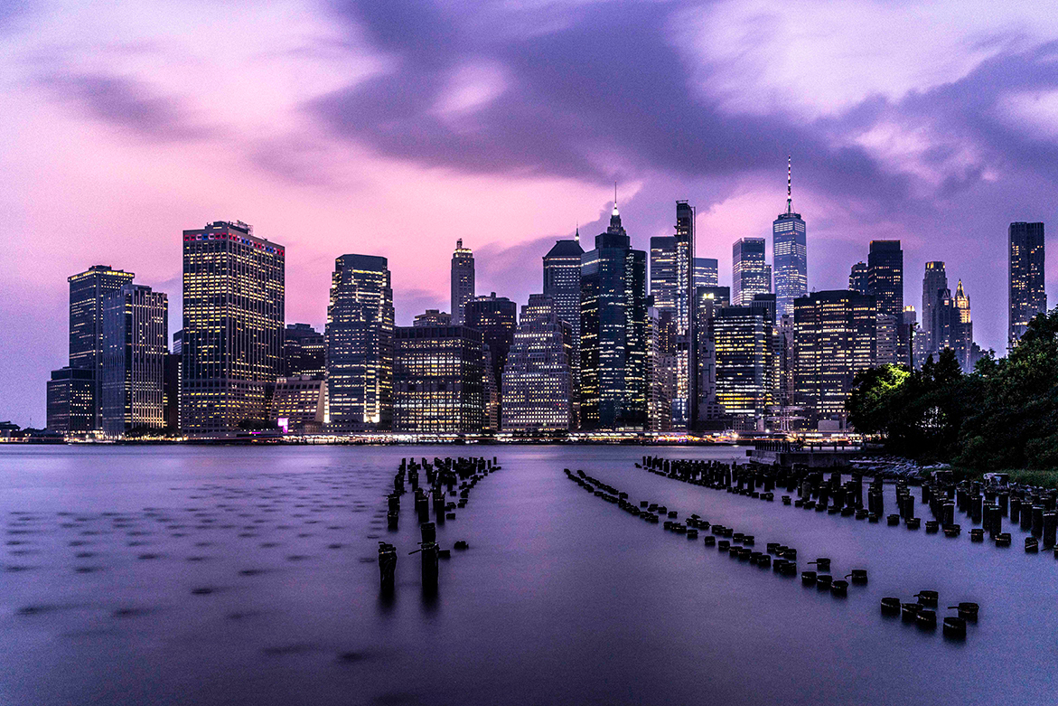
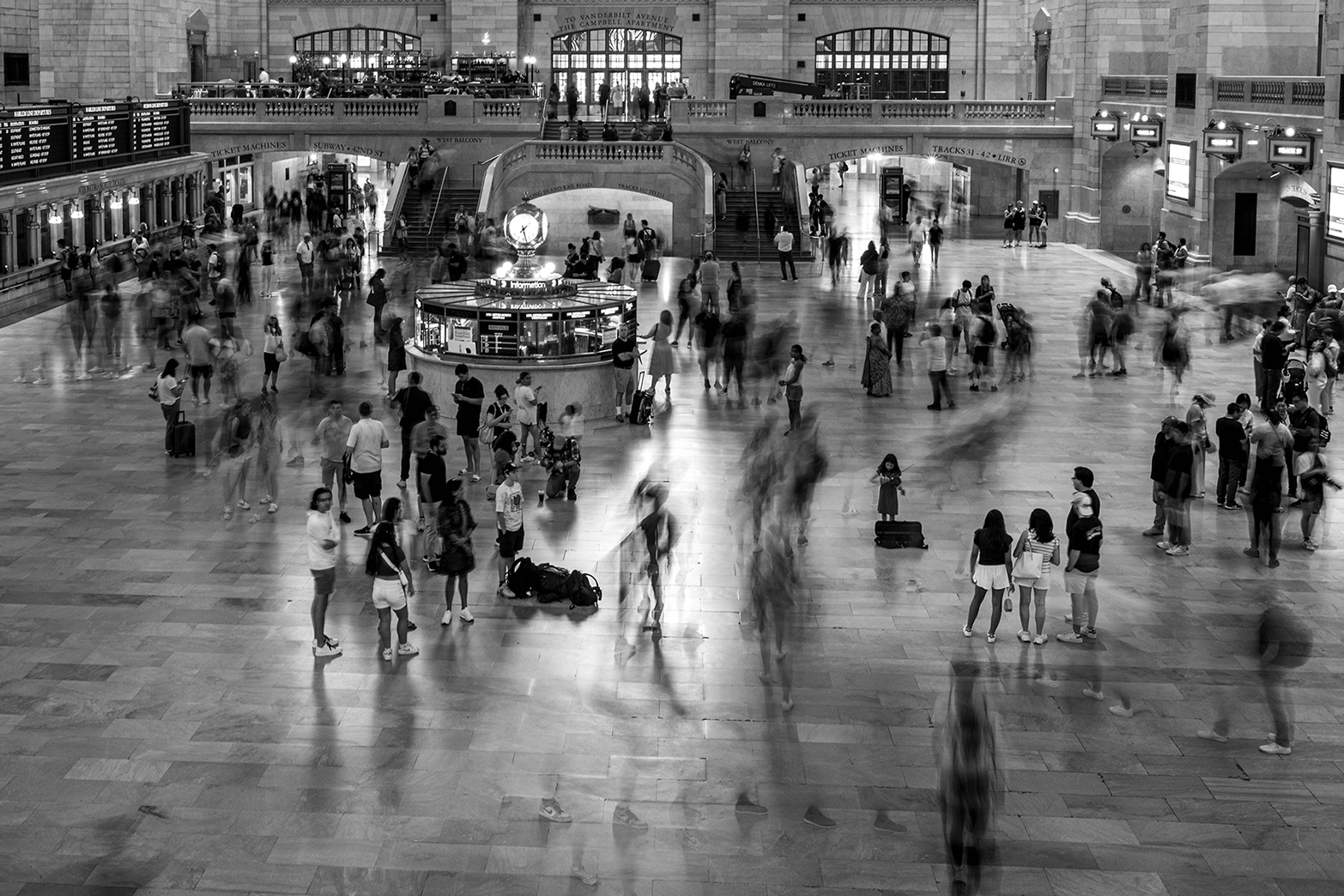
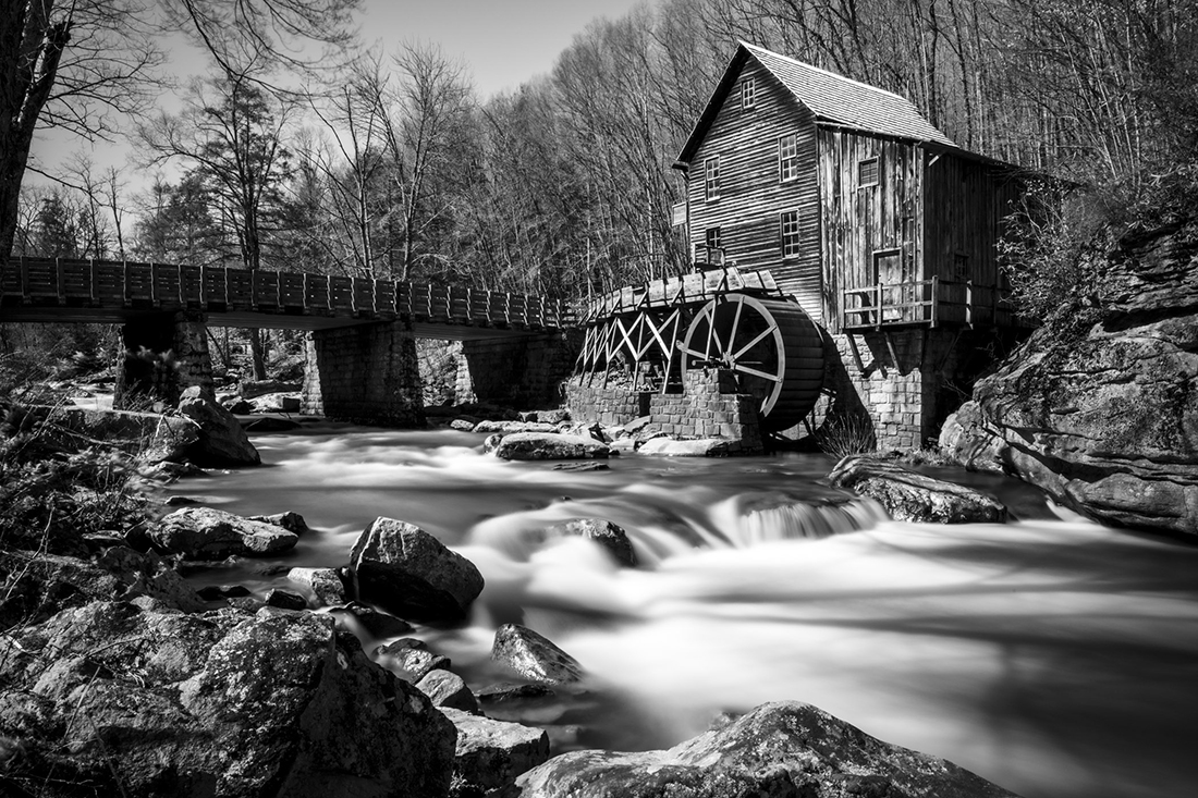
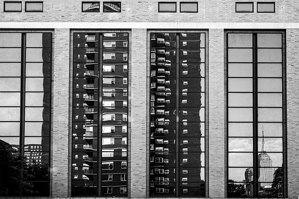
The color and exposure are superb. Beautiful picture. I am not sue if the picture is not perfectly sharp or this is because the small file size. If this is a singular picture I understand the cropping restrictions imposed (1:2.73 currently). However if this picture makes a part of a project I do recommend keeping one specific ratio of the entire project. Such as the iconic 6:17 (1:2.83). |
Oct 24th |
| 36 |
Oct 25 |
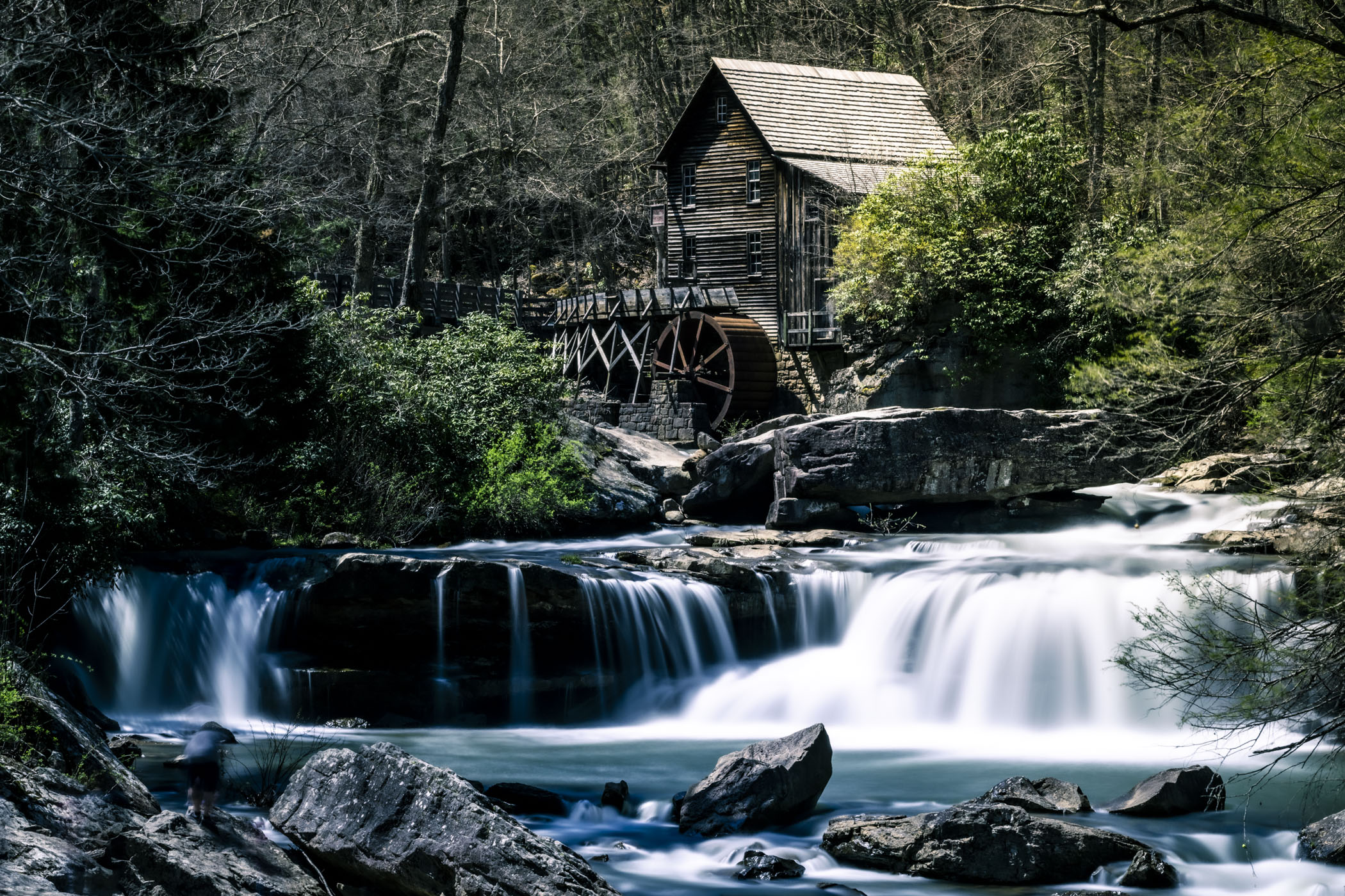
Comment |
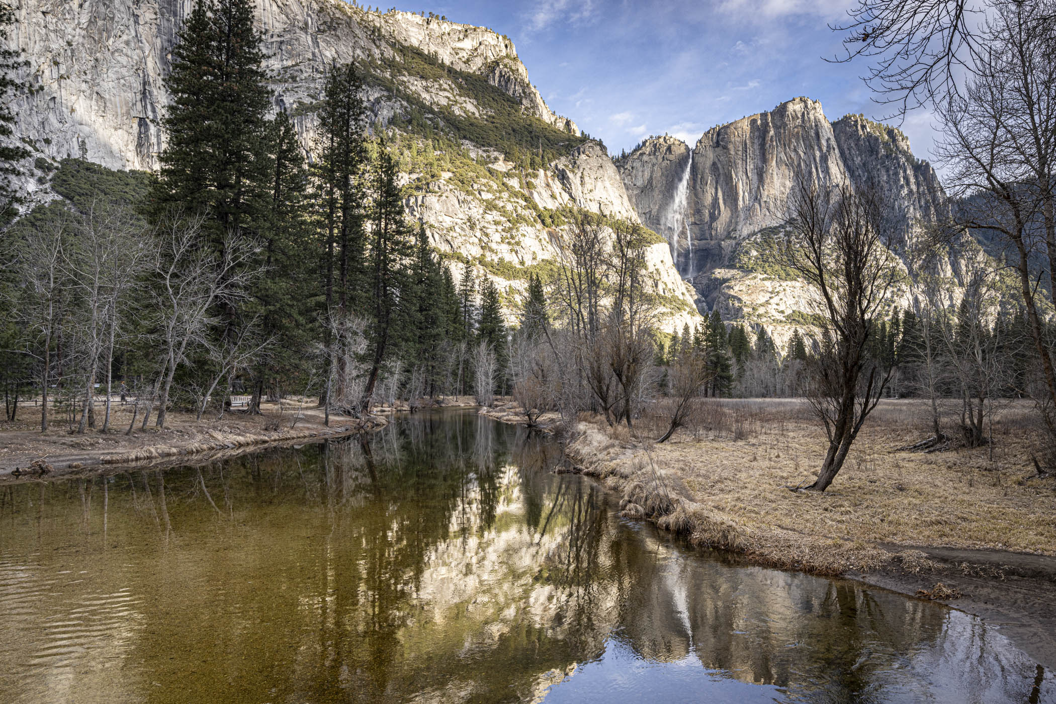
Hi Barbara,
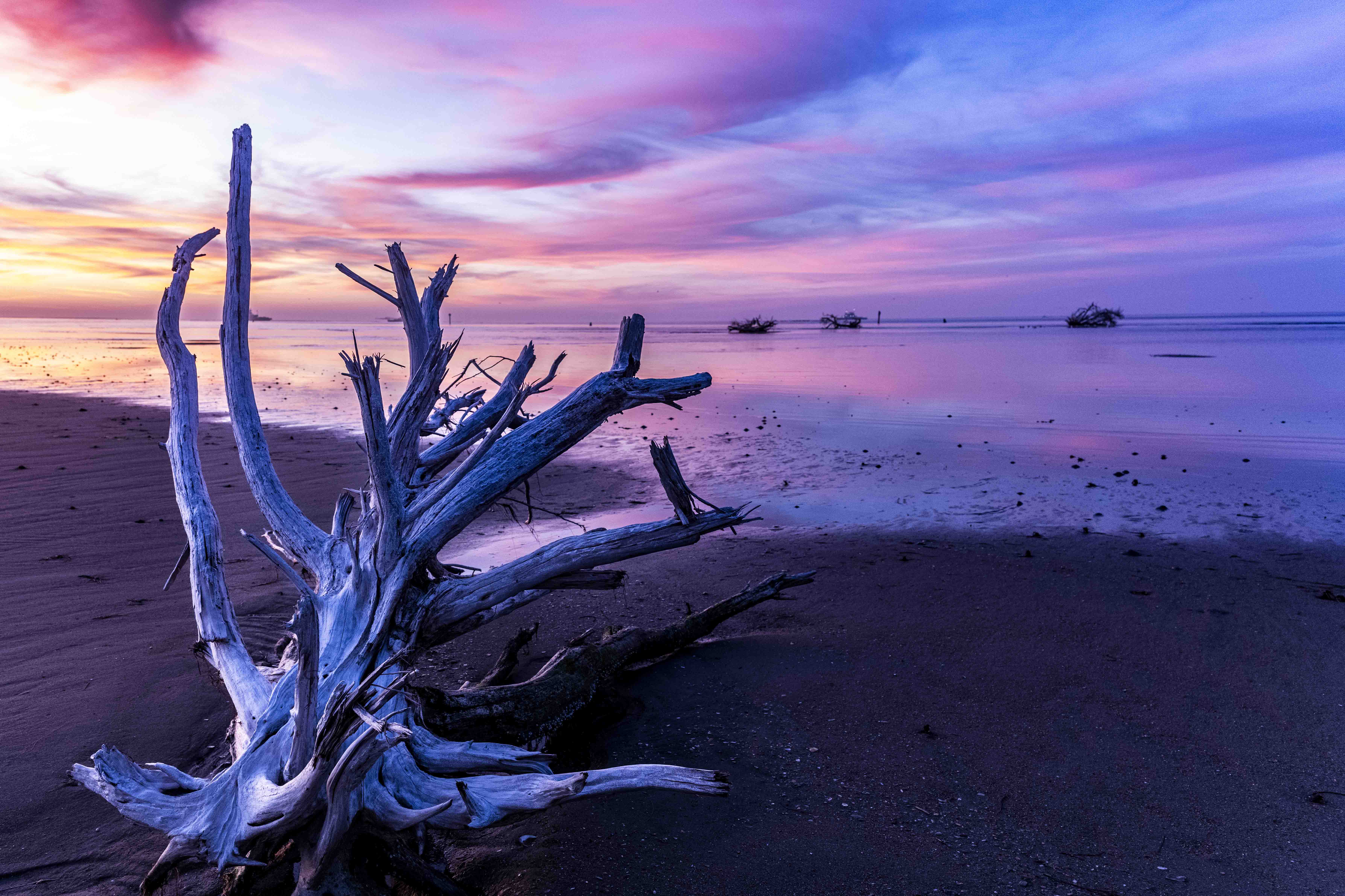
I like the diagonal line of the water going to the bottom left corner. The dodging treatment of the water at the bottom is too strong for my taste.Very good picture. |
Oct 24th |
7 comments - 4 replies for Group 36
|
| 83 |
Oct 25 |
Reply |
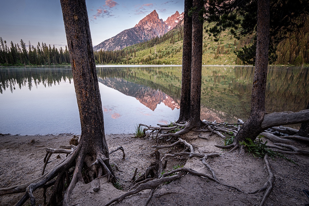
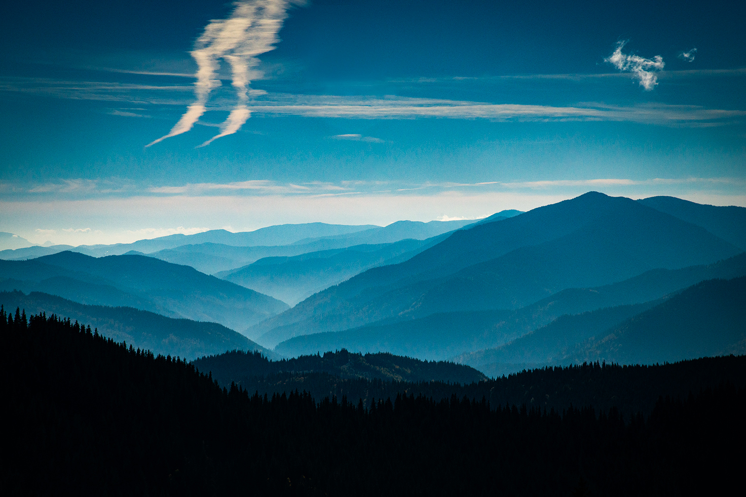
More tonality = distraction from the context. the tree is the subject yet the mountain the focal point (context)
|
Oct 29th |
| 83 |
Oct 25 |
Reply |
glad you like it. ND + graduated filter upside down did the trick.
|
Oct 29th |
| 83 |
Oct 25 |
Comment |
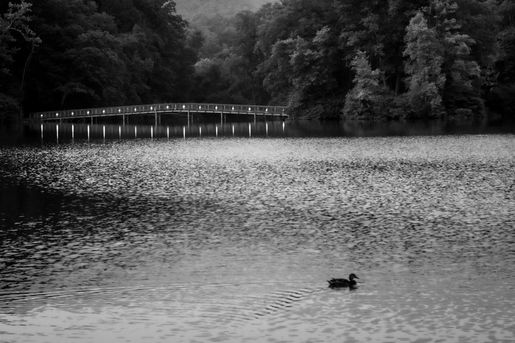
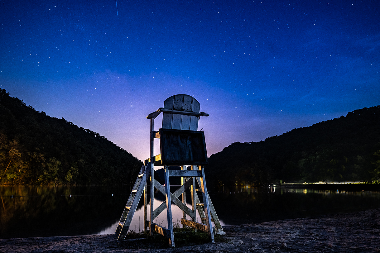
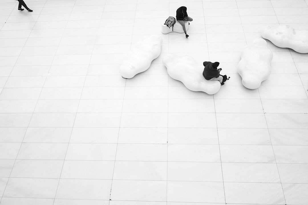
What a beautiful picture Elise,
I love the high key treatment and the positioning of the subject under the horizon line. having the subject on the third is great. |
Oct 29th |
| 83 |
Oct 25 |
Comment |
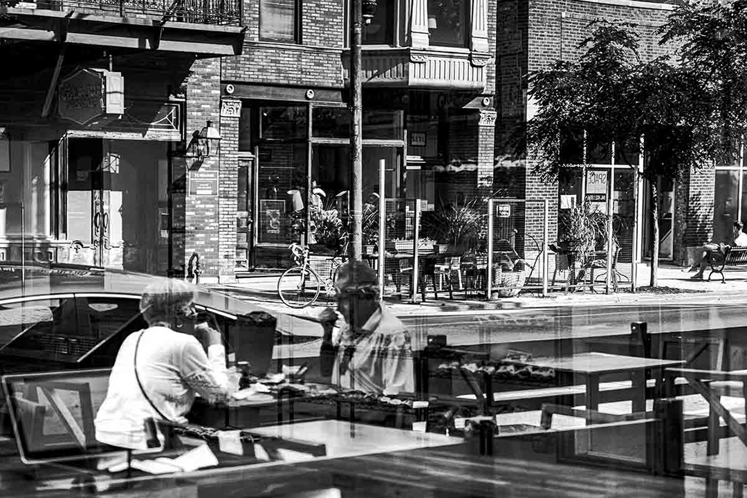
Very interesting M,
The diagonal adds interest. I like the different textures. The edit is good. Very nicely done
|
Oct 29th |
| 83 |
Oct 25 |
Comment |
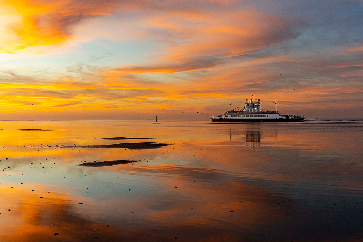
Very interesting composition. I like the idea of having the subject on the side. I do recommend decreasing the brightness a bit on the ground. |
Oct 29th |
3 comments - 2 replies for Group 83
|
10 comments - 6 replies Total
|