|
| Group |
Round |
C/R |
Comment |
Date |
Image |
| 36 |
May 25 |
Comment |
Im glad of your reaction. Confusion is the intent. Actually, I feel that your reaction and the other members is meaningful and serves the intent of the group so I will share more!
Side note - I never remove elements nor modify pictures. No stacking no AI No cropping that is not 2:3 etc.
|
May 27th |
| 36 |
May 25 |
Reply |
Thank you |
May 27th |
| 36 |
May 25 |
Reply |
I agree! Thank you will do |
May 17th |
| 36 |
May 25 |
Comment |
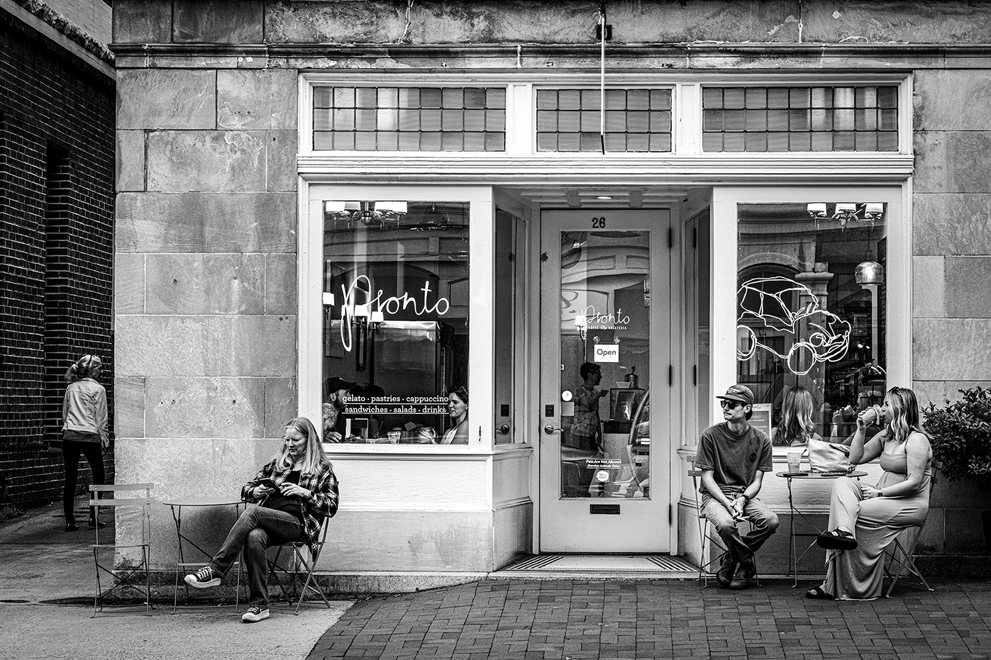
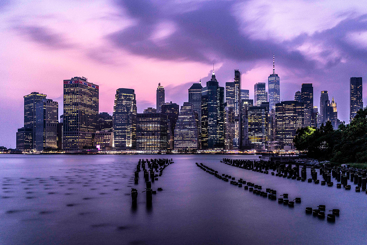
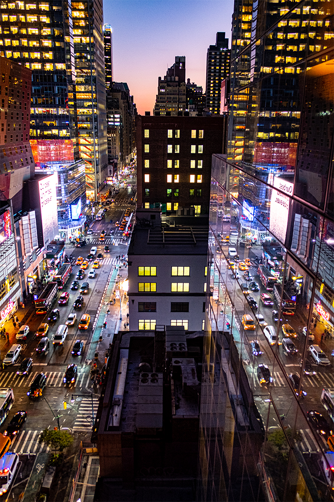
I love the layers from the front to the back. The color repetitions and the textures. |
May 17th |
| 36 |
May 25 |
Reply |
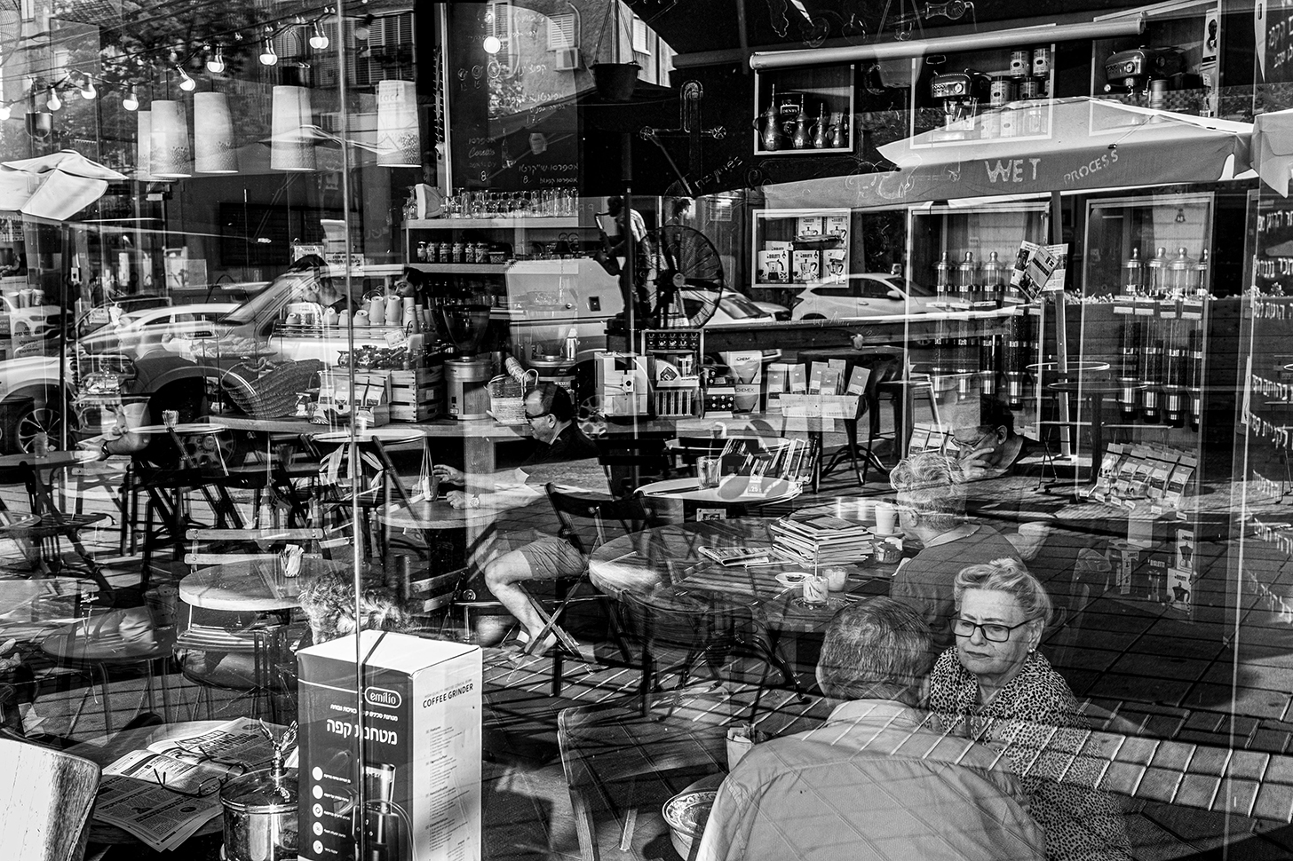
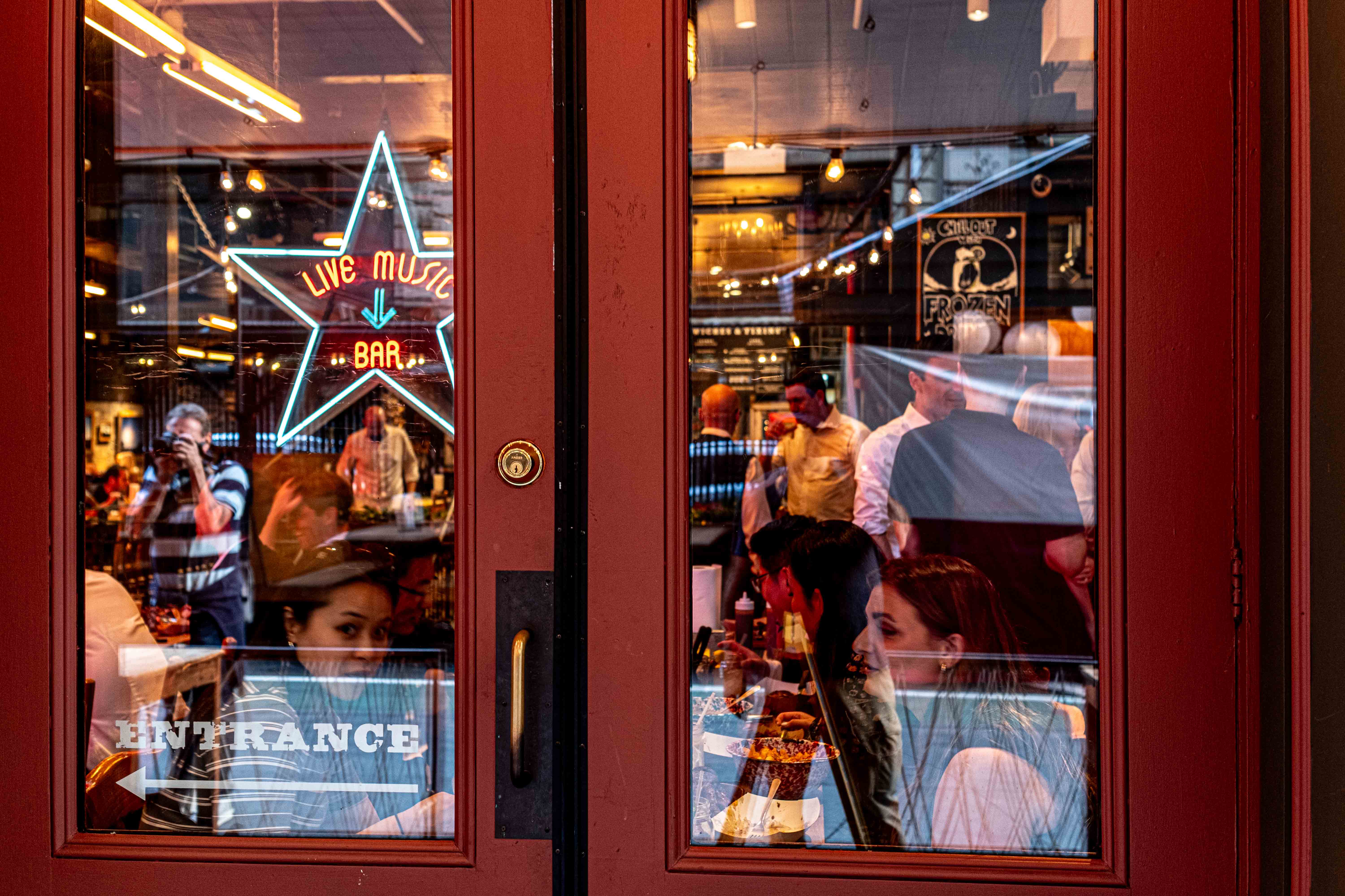
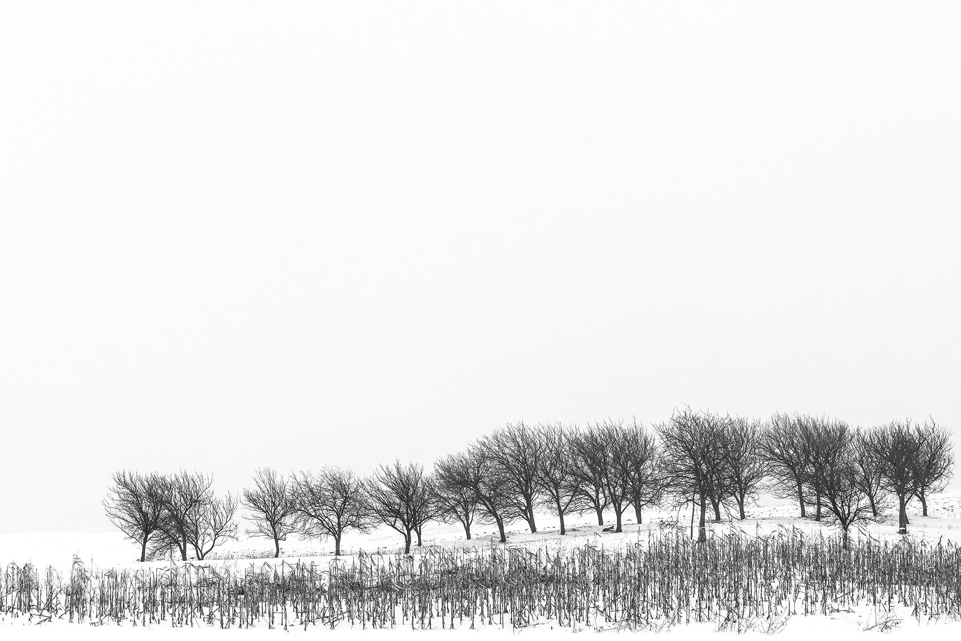
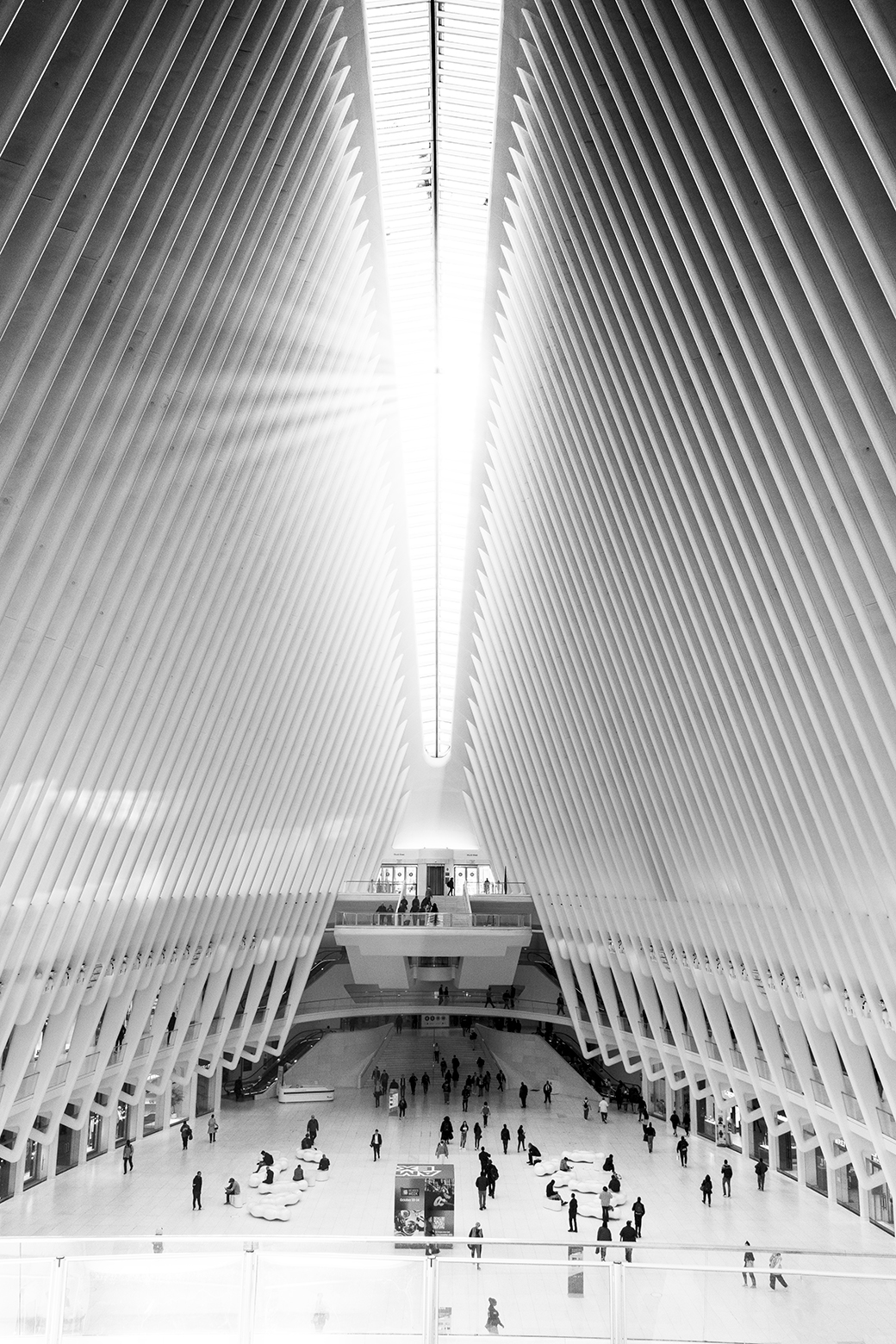
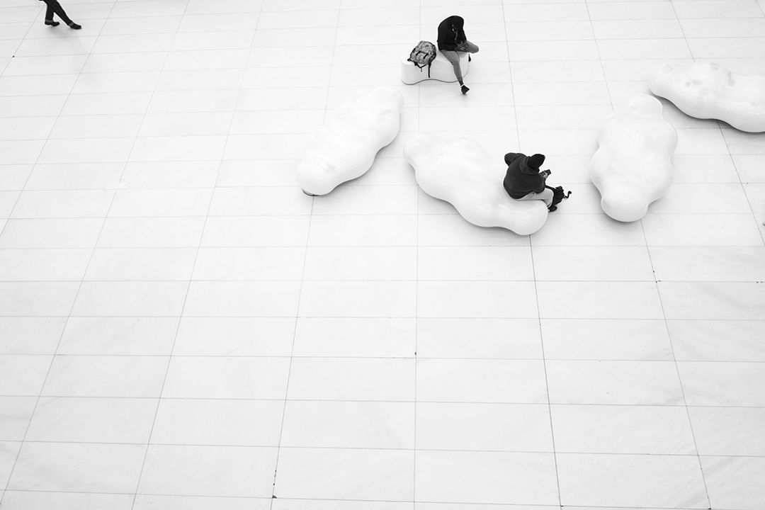
First - your strong negative reaction to the picture is very good. It means you have interacted with it. For me this is the essence of good. For me the worst is when someone is just scrolling through and does not engage. Specifically - this is an intent (entire project) of giving the viewer a very different perspective of life. what is in the front what is in the back where are people. Perhaps too philosophical for PID 36. Nothing is random in the photo. See where the humans are exactly 1/3 and 1/3 ...power points. Why?
Please do not hesitate to give me your honest critique. Thank you |
May 17th |
| 36 |
May 25 |
Comment |
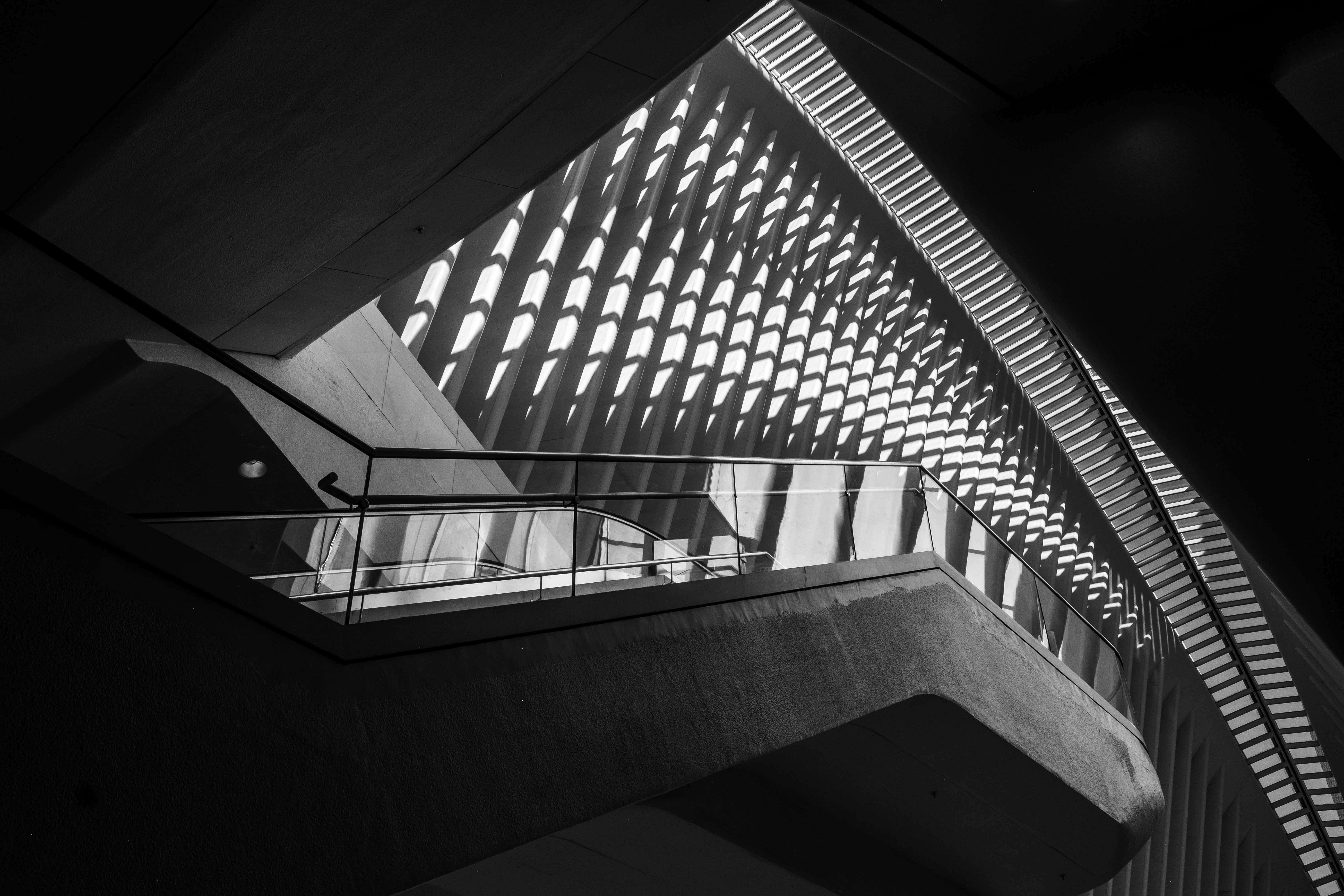
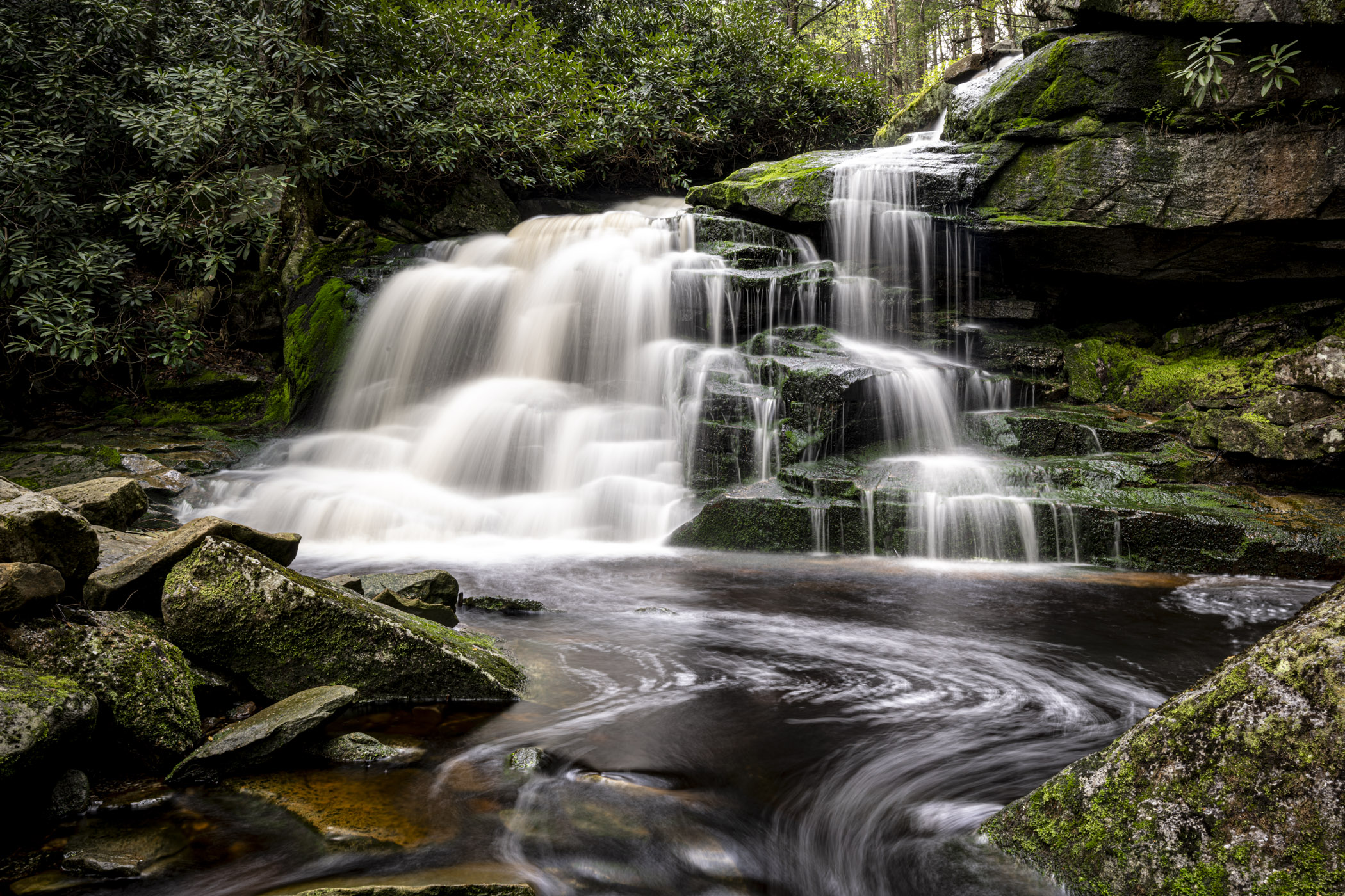
Larry,
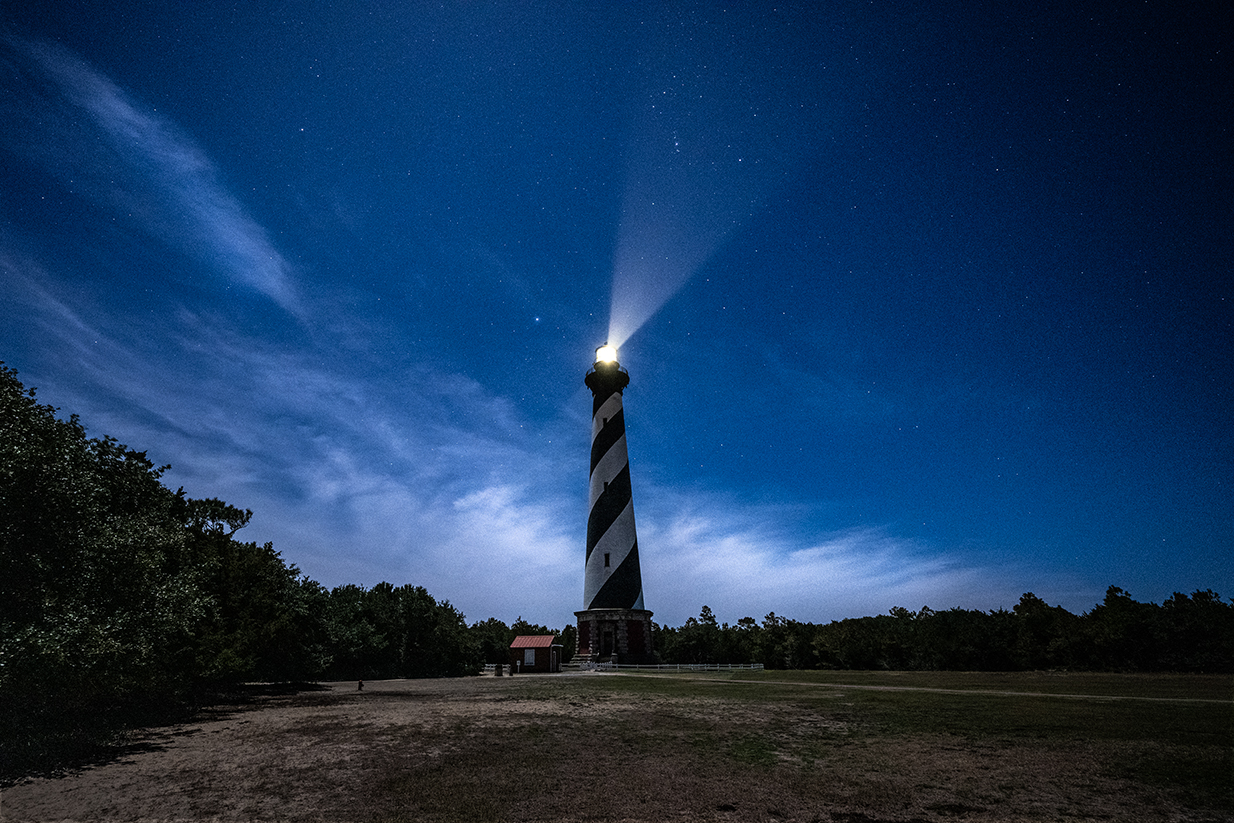
Editing technique in abundance and if I may add well done !
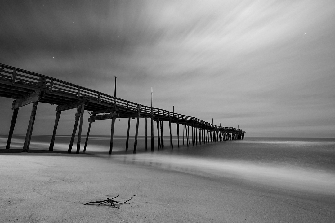
The stacking effect the beams in different locations gave me a a feeling of a flickering light rather than a continuous natural line. This feels to me unnatural.
On a different note the warm yellow on the beautiful blue background in the original gives a warm feeling. I prefer the original better in many ways.
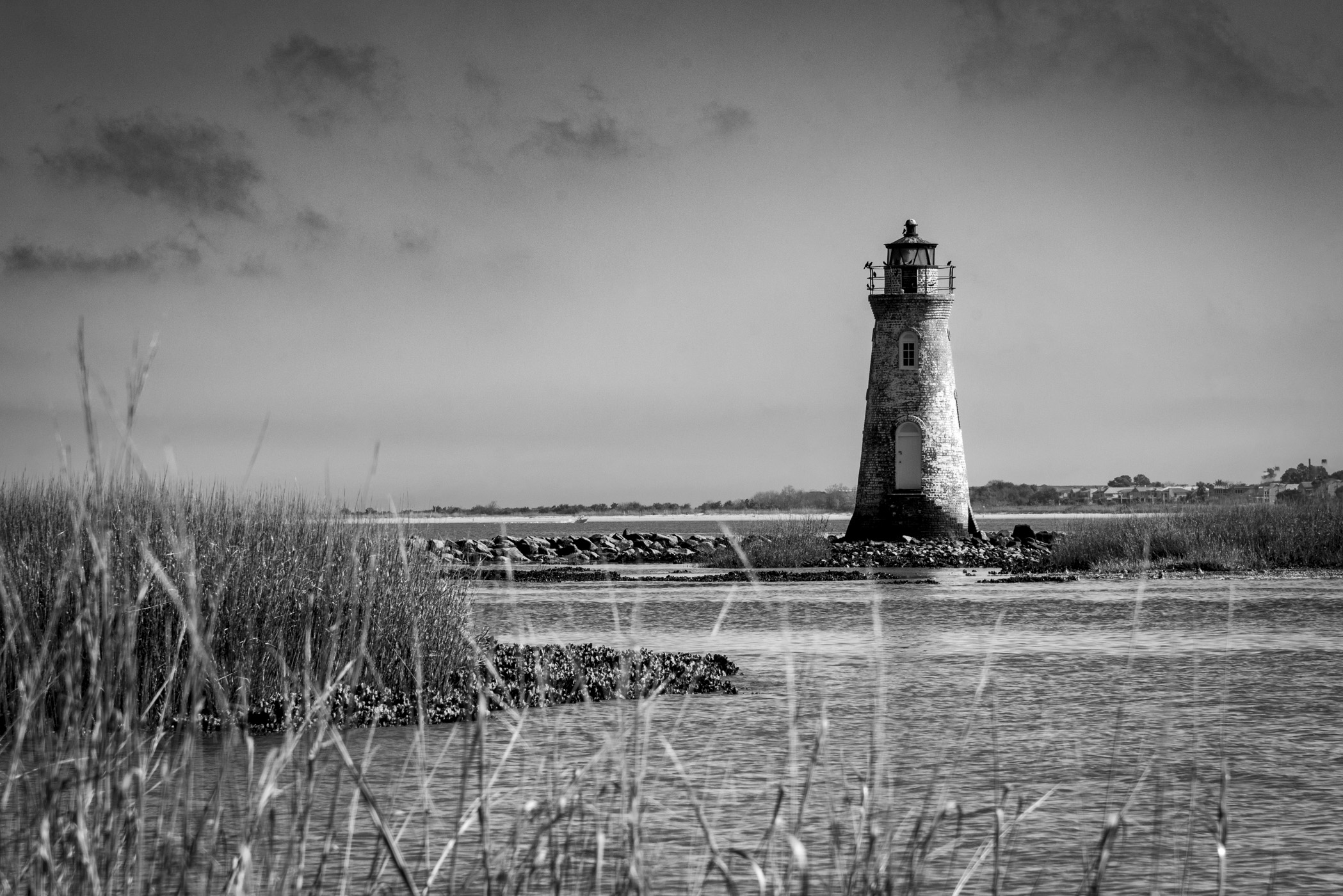
If you want the flickering effect in photography rather than editing - then double expose. I have done that with the lighthouse of the OBX works like a charm.
Last - crop out the half white house on the left.
|
May 17th |
| 36 |
May 25 |
Comment |
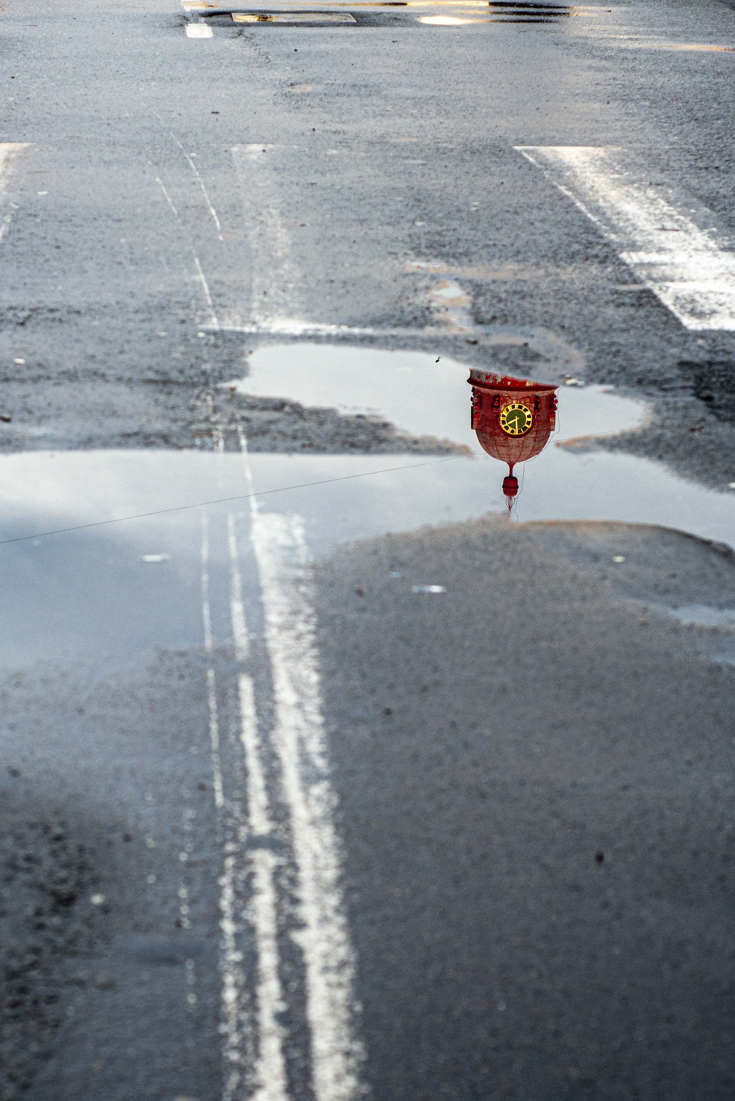
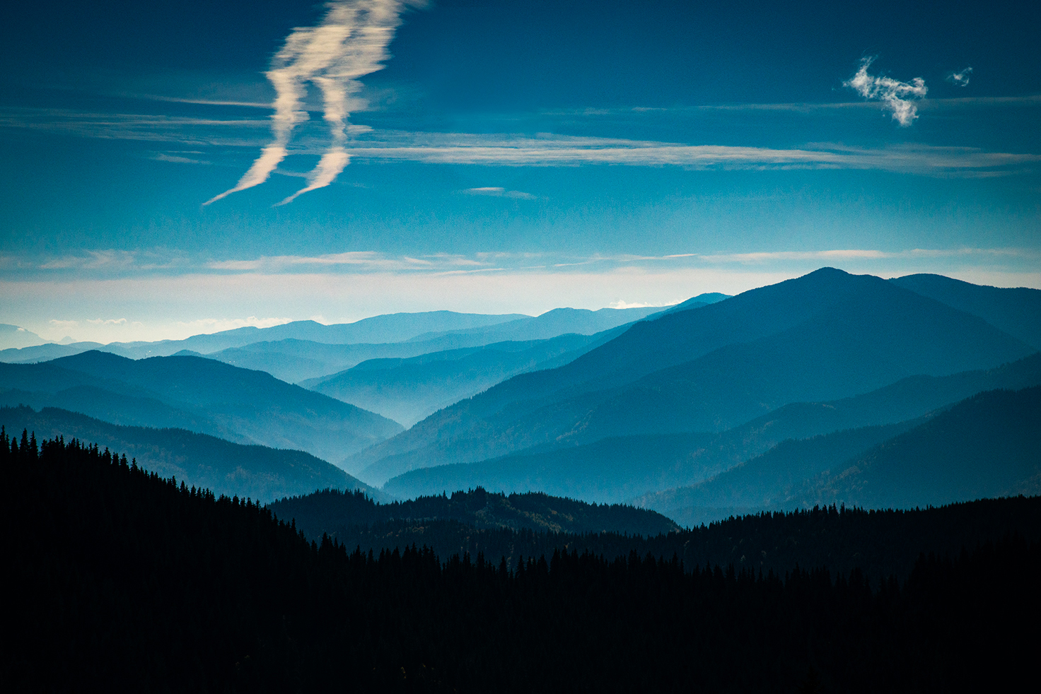
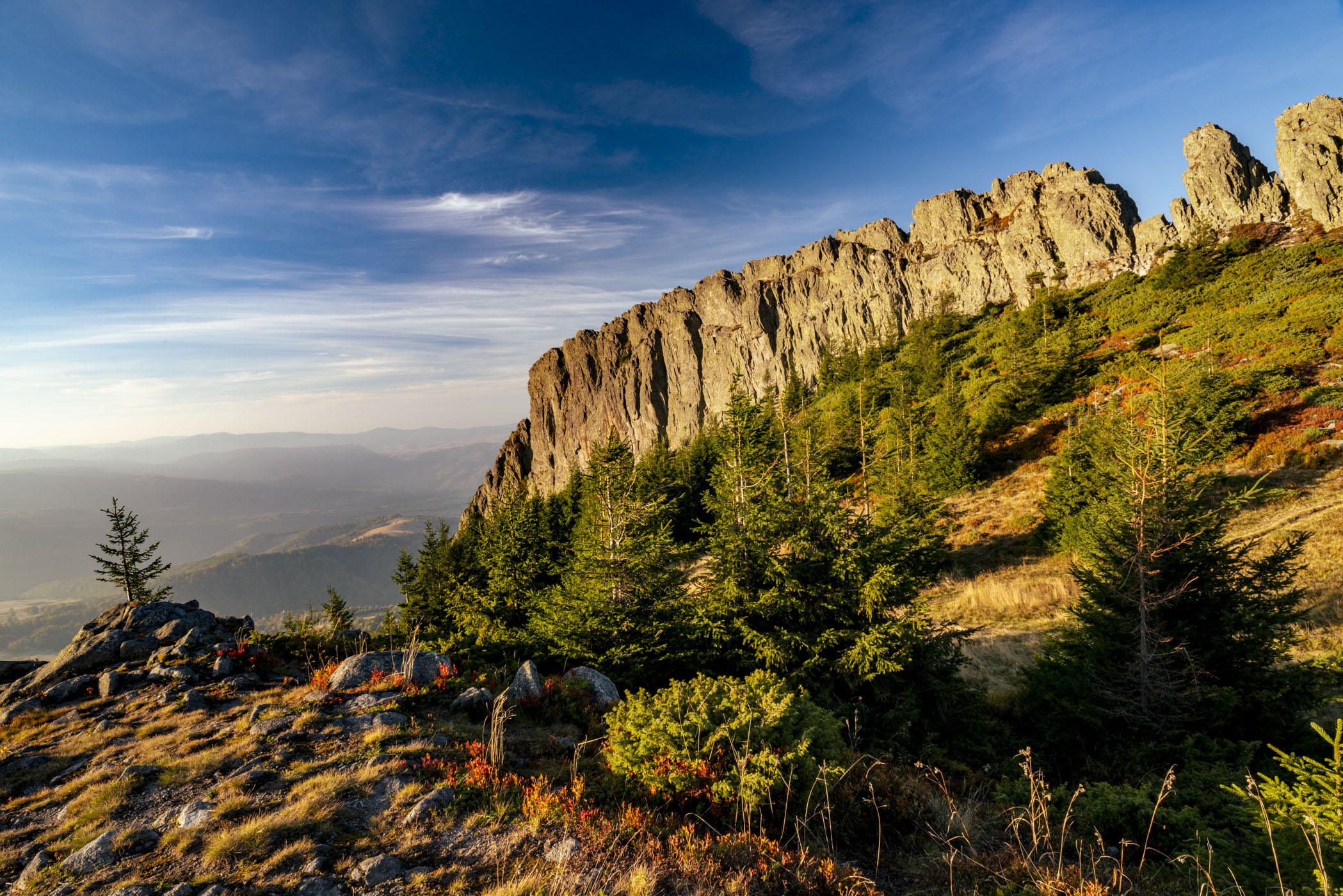
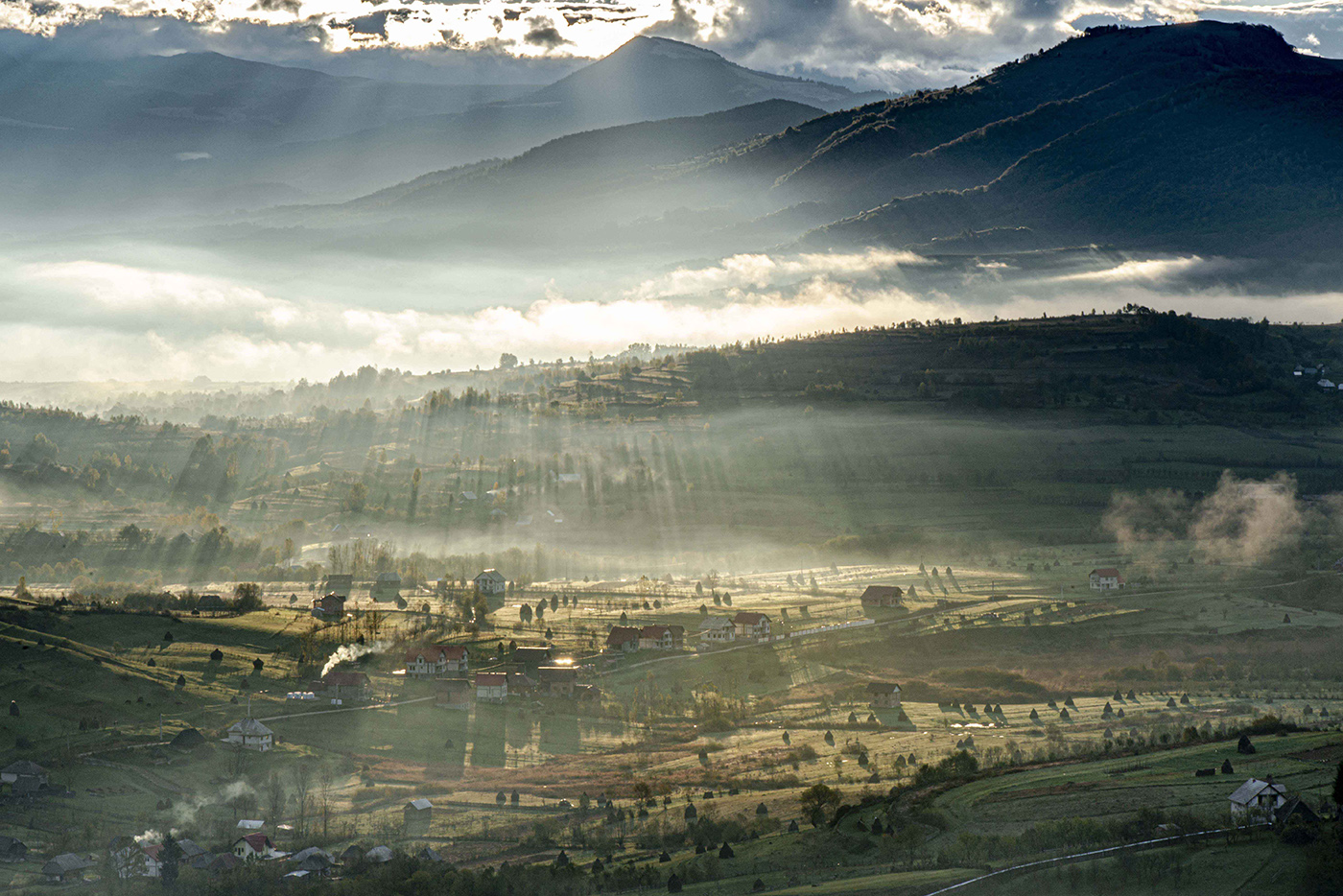
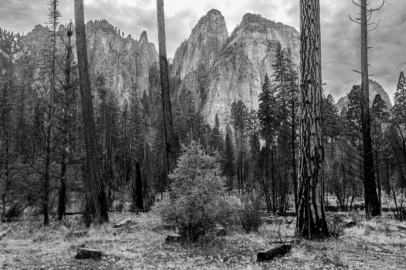
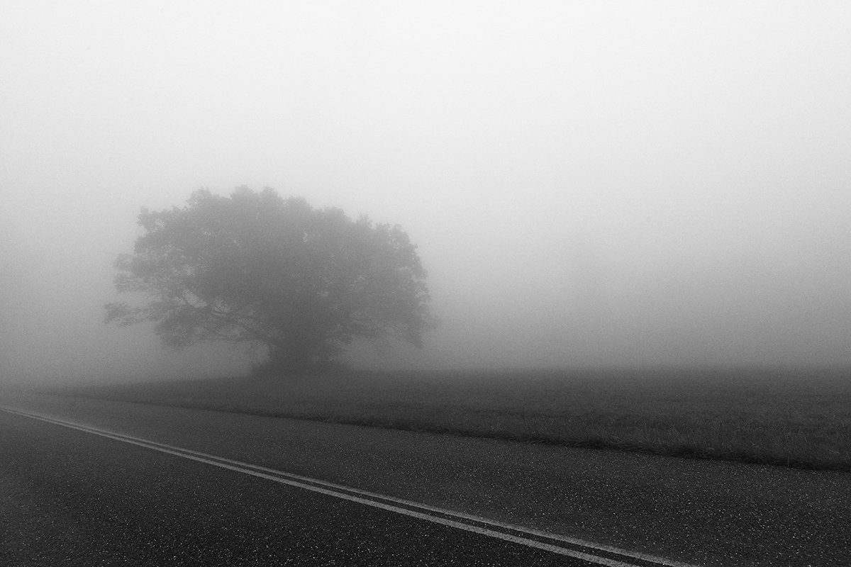
Hi Bill,
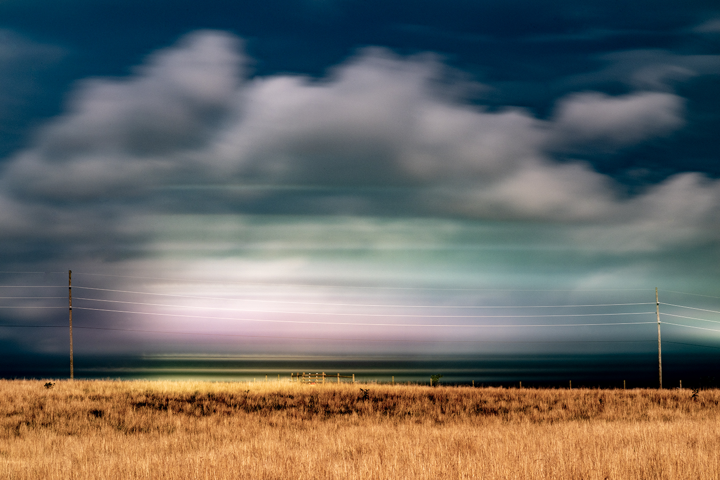
I understand the intent of the zones and the good edit. I think the rolling fog over the hills deserves a trip and a tripod of its own mind as well if this is your backyard.
|
May 17th |
| 36 |
May 25 |
Comment |
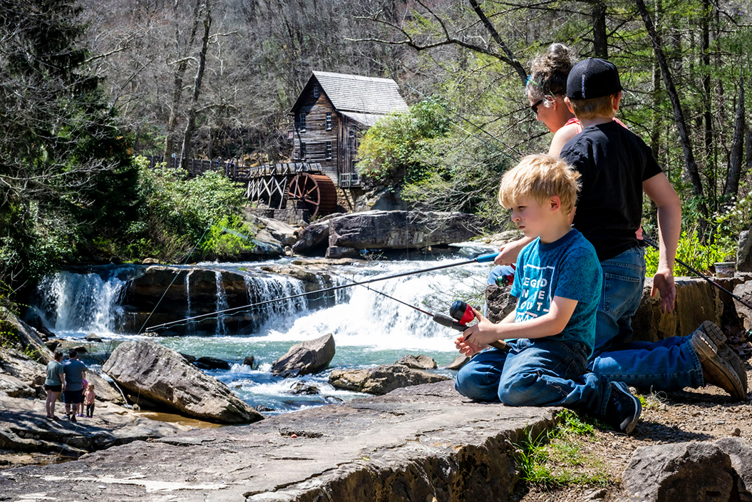
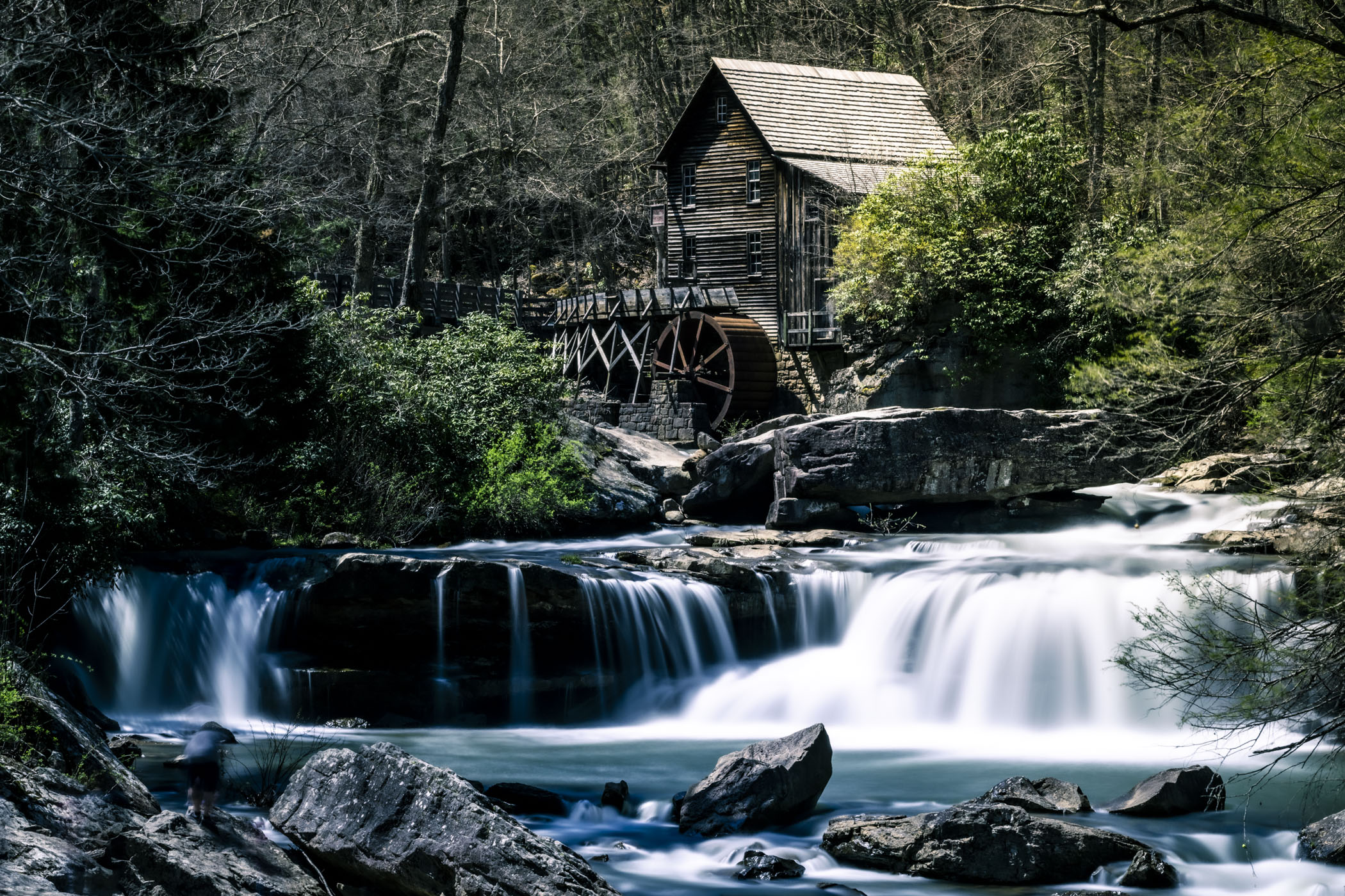
15 year project. |
May 12th |
| 36 |
May 25 |
Reply |
WEll, you do not have to like it all and definitely not to be afraid of saying you do not like it at all. or it is bad in your view. If you think this is too much,wait till you see my project " color beyond structure" LOL.
|
May 11th |
| 36 |
May 25 |
Comment |
M,
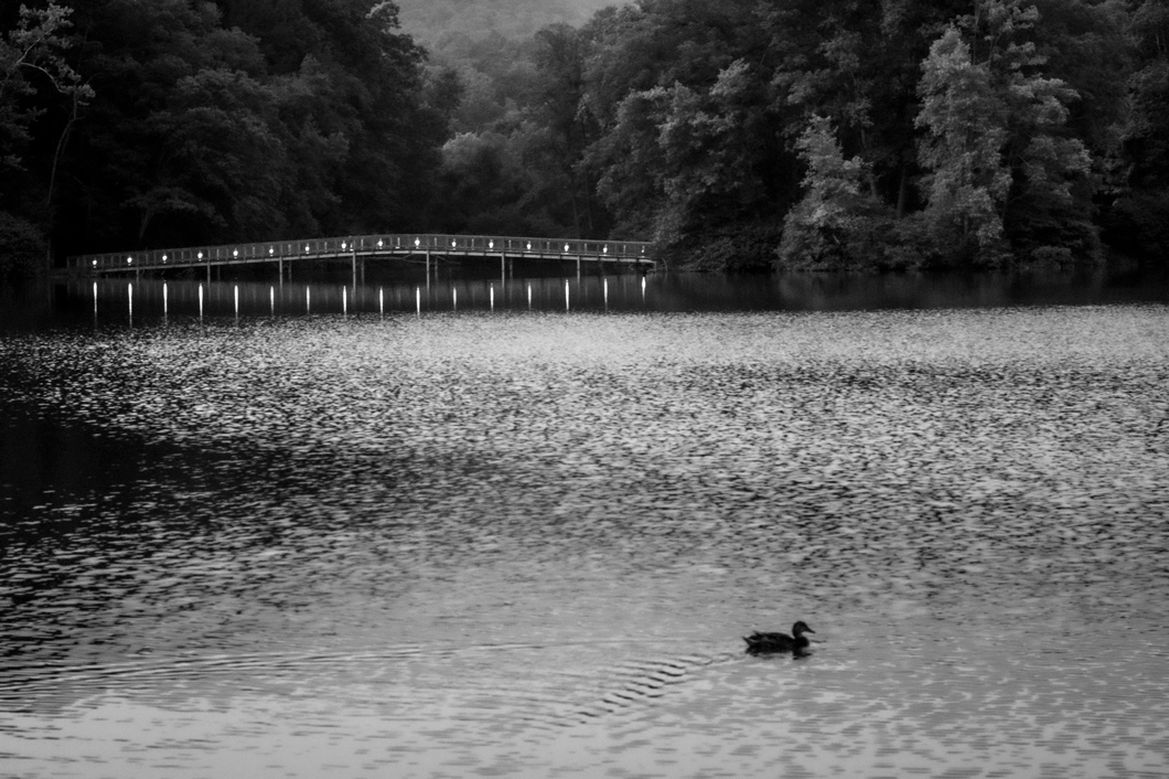
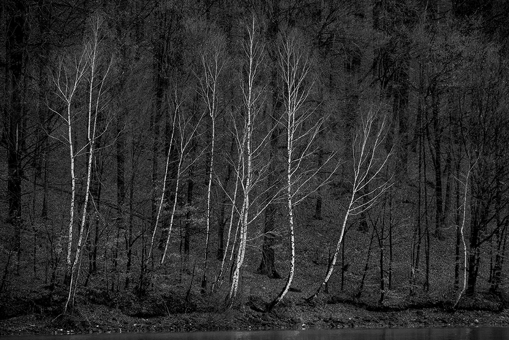
I understand the intent of showing the closed bridge over the water leading to standing perpendicular direction to the water.However, the other side of the river is full of distractions to the eye. Color spots, vacant sky, shades, shape and trees all right in direct eye sight.Even the low contrast / HDR treatment can not eliminate those. This is too good of a picture to miss out. If you can, I recommend re taking it at night. |
May 6th |
6 comments - 4 replies for Group 36
|
| 83 |
May 25 |
Comment |
Welcome Clark,
I wonder if the name Pure Energy is just a name or comes from Simple Harmonic Movement in Physics. This is actually how a pendulum movement presents it self in a sinus like waves. Anyway, very nice composition and presentation.
|
May 29th |
| 83 |
May 25 |
Comment |
Very strong capture.
I agree with H and M |
May 29th |
| 83 |
May 25 |
Reply |
Glad you like it H.
This is referred generally as negative space. Locking in the subject in a corner is a new "rule" I made - Rule of 4ths.
|
May 29th |
| 83 |
May 25 |
Reply |
Sky, Bird, Atmosphere, Freedom, Space, are all words describing the subject. You hit on the head.
As for Noise in a different era we use to call it Grain. I love it. the noiseless texture is at times missing in my view.
|
May 27th |
| 83 |
May 25 |
Reply |
Thx Dale, The question becomes - how important are these details? Are they a distraction to the composition? Or Are they the main subject? In my view the details re not important . Think of it as Impressionism. Look at Boudin Le Havre (painter)
|
May 27th |
| 83 |
May 25 |
Comment |
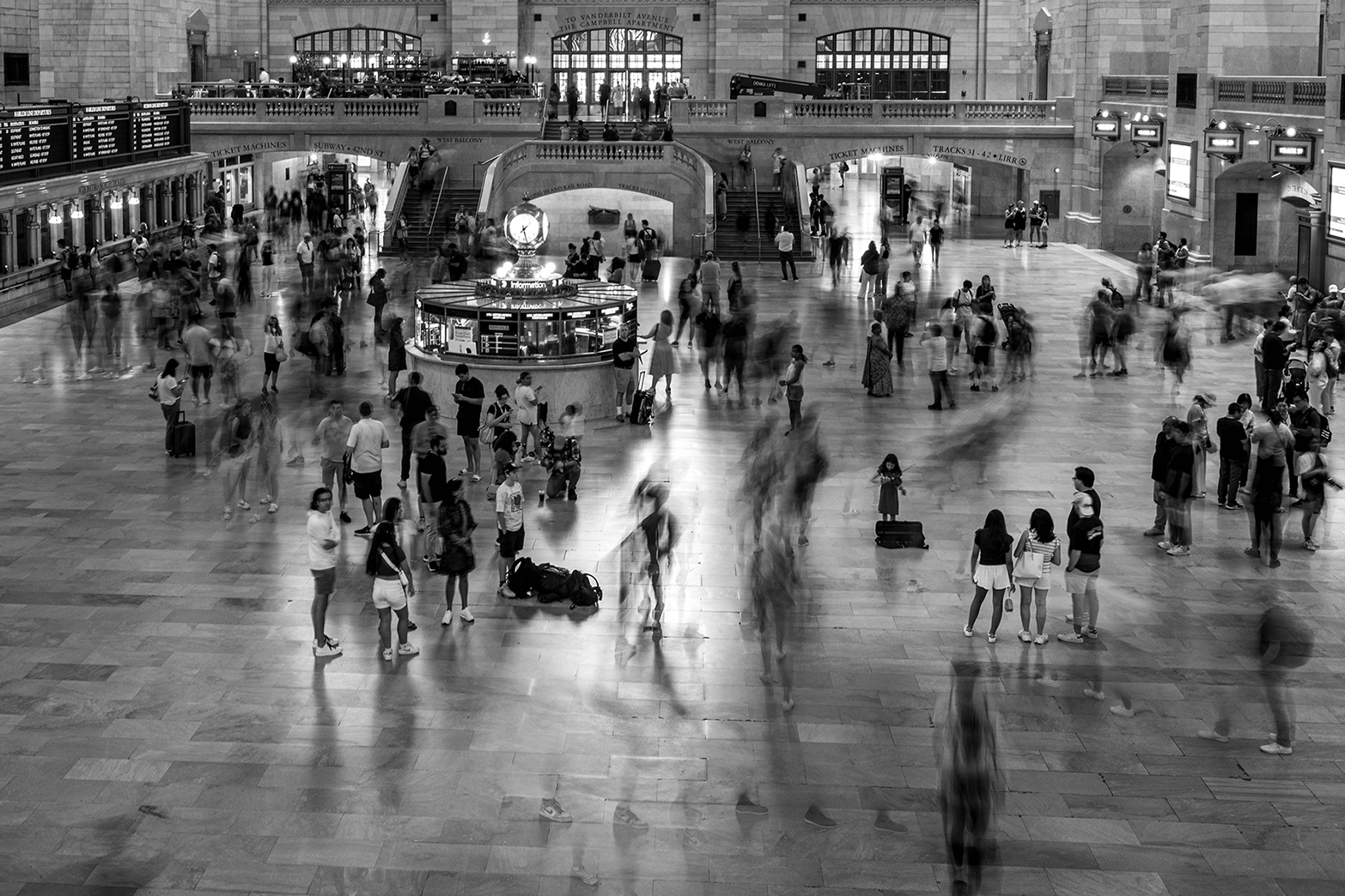
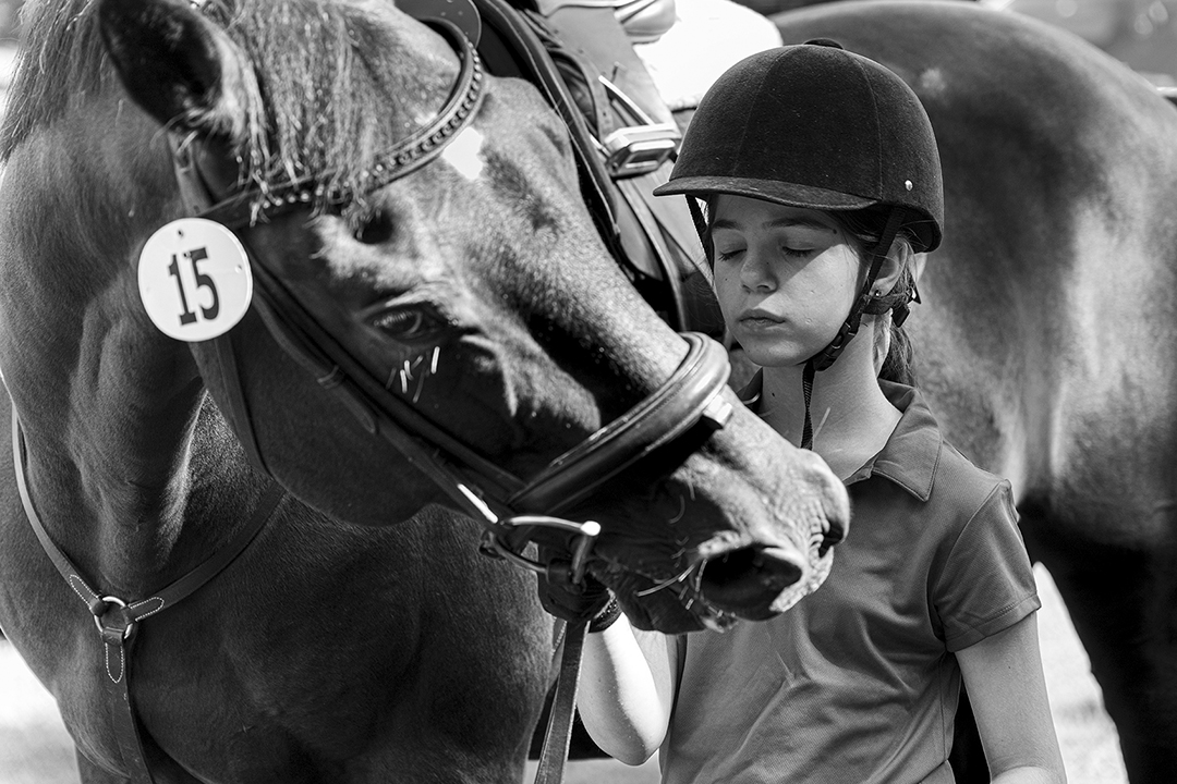
I love the sense of urgency the picture has. To me this is done by cropping the head out and the blurry hair. It gives a feeling of a moving subject. Very pleasing image.
|
May 6th |
| 83 |
May 25 |
Comment |
Dale,
Nice picture nice composition. One comment - the histogram is missing black tones (low gamut). |
May 6th |
| 83 |
May 25 |
Comment |
Yes. You are correct I should darken the T shirts |
May 5th |
| 83 |
May 25 |
Comment |
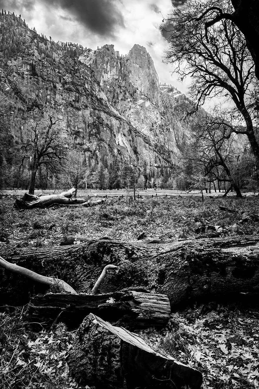
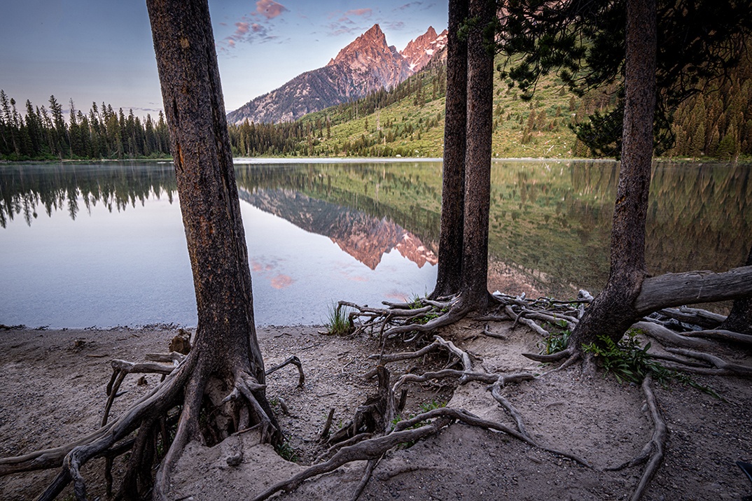
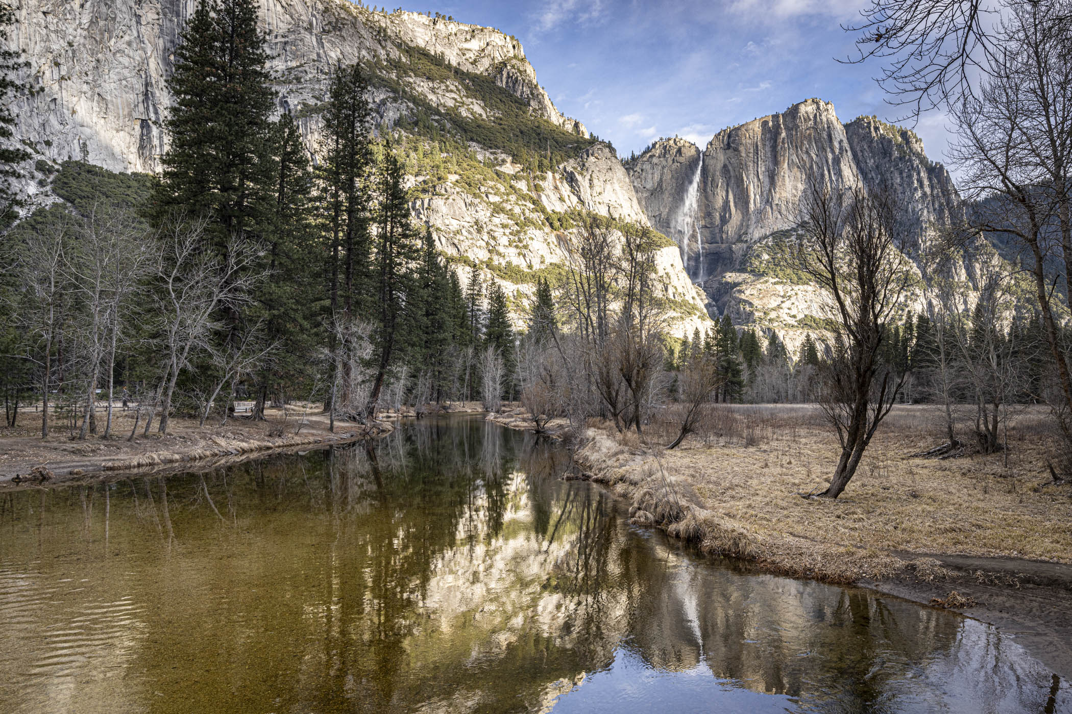
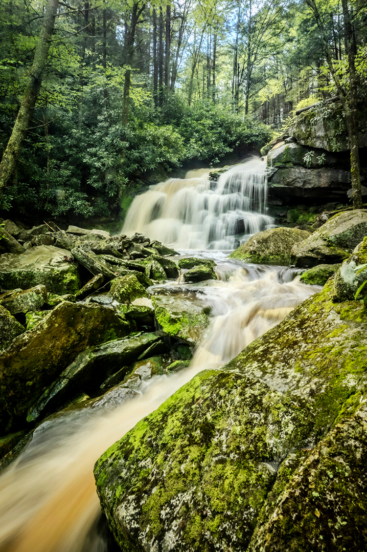
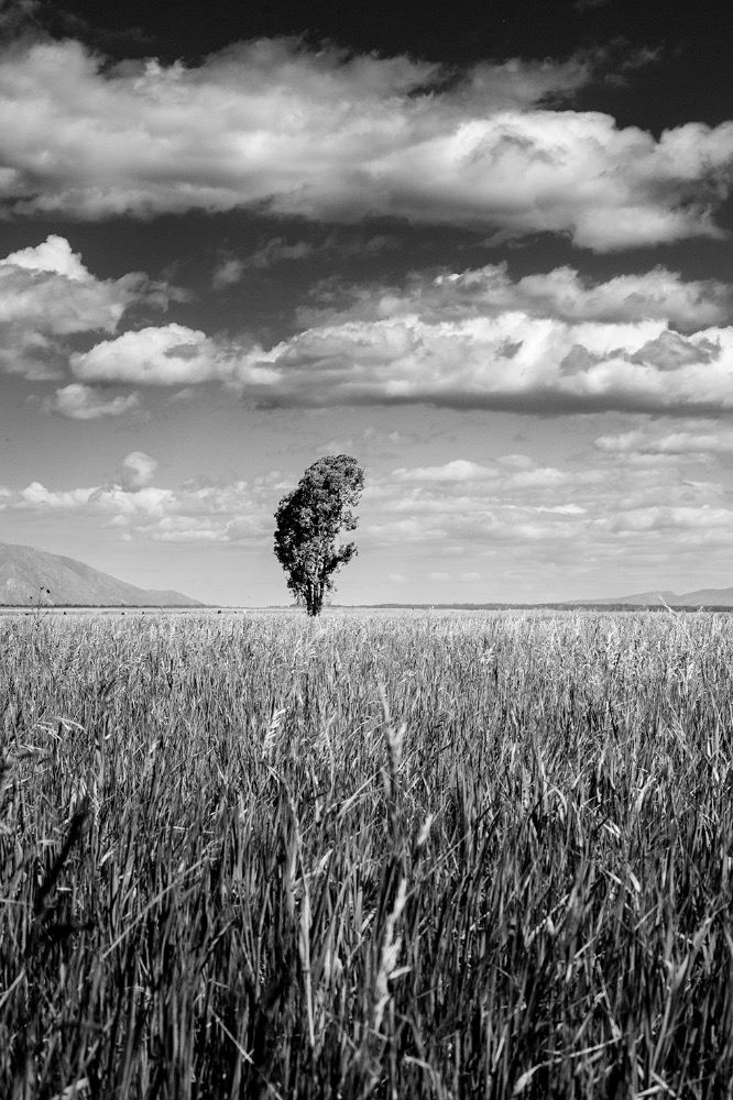
Placing the subject above the peak line is a very wise choice M. and the fact the water line is narrow adds more interest. iN total I recognize 4 layers. It seems you opened up the shadows on the trunk that is good too. Next time try this: spot measurement from the trunk and to avoid over exposure of the sky use a gradual ND filter.
This is a keeper !
|
May 5th |
| 83 |
May 25 |
Comment |
Elise,
This is a very nice composition. I have a question: what is the purpose of the white diagonal line on the right hand leading to the subject?
|
May 5th |
7 comments - 3 replies for Group 83
|
13 comments - 7 replies Total
|