|
| Group |
Round |
C/R |
Comment |
Date |
Image |
| 19 |
Oct 24 |
Reply |
Not sure. It is there but not to the level i want to distract the viewers from the general composition.
|
Oct 29th |
| 19 |
Oct 24 |
Comment |
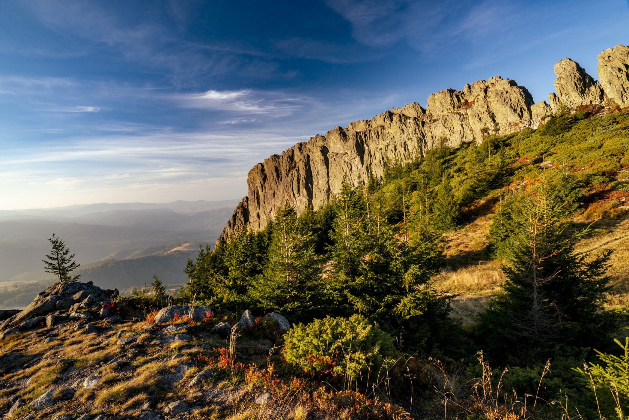
This is a very worthy effort and nicely done!
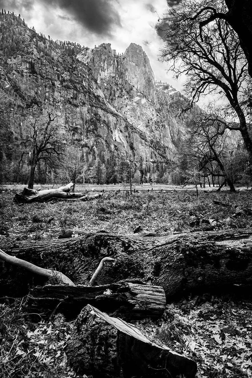
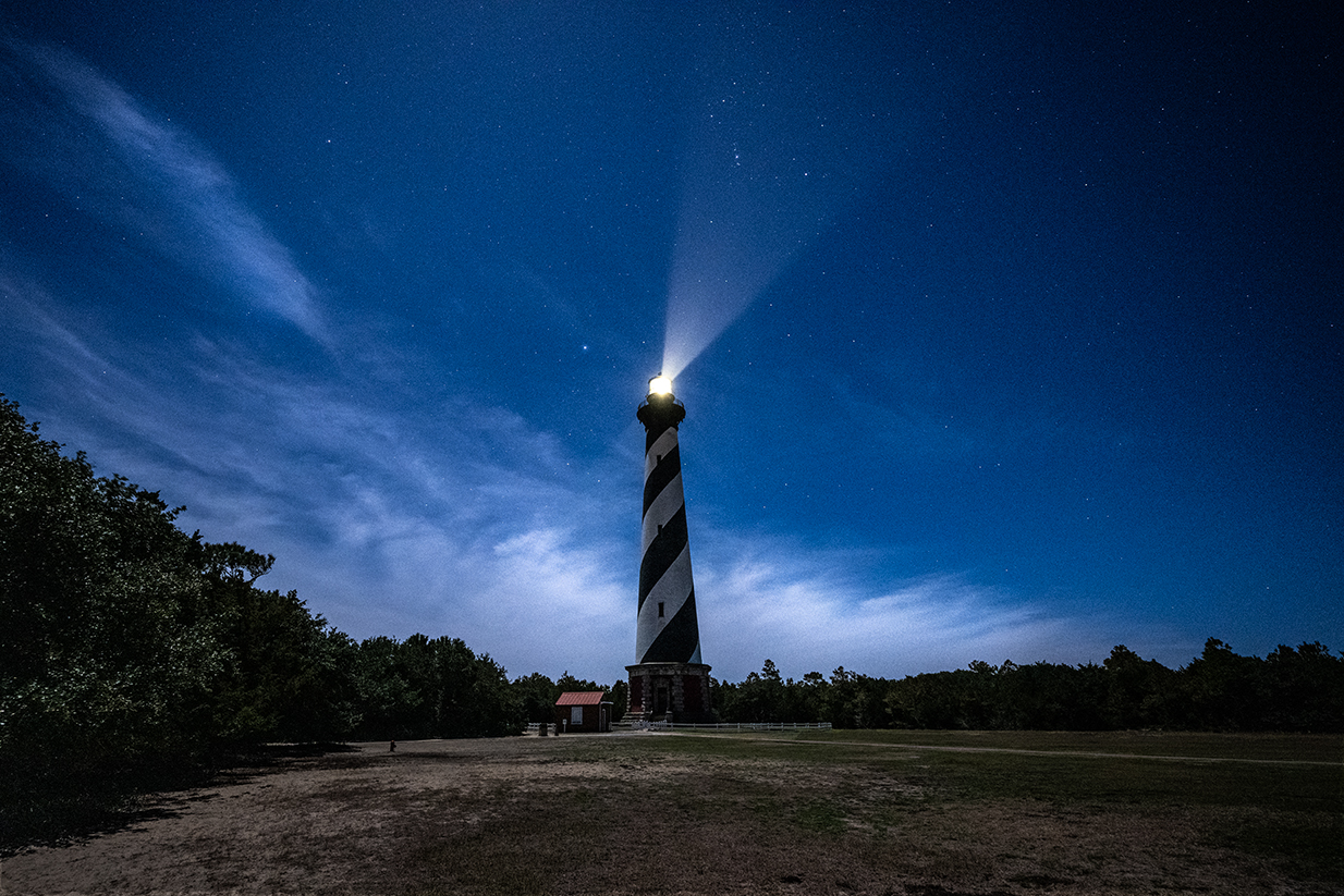
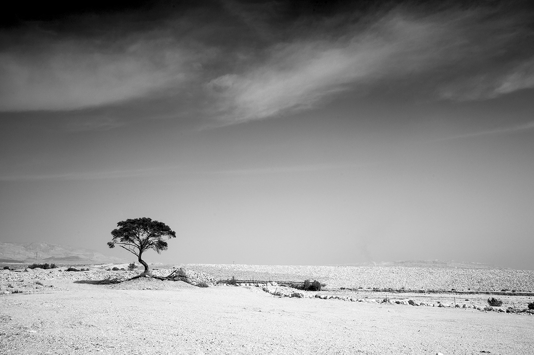
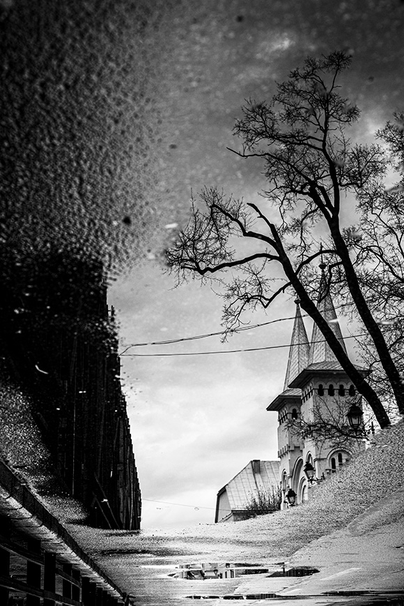
perhaps I can give you 2 thoughts:
1. Stage the canon above the tree line. it will emphasis it.
2. brighten the canon / fore ground by 1EV it will make it more visible against the background.
I like it a lot. It reminds me of time travel. As if the canon is shooting to the psst
|
Oct 29th |
| 19 |
Oct 24 |
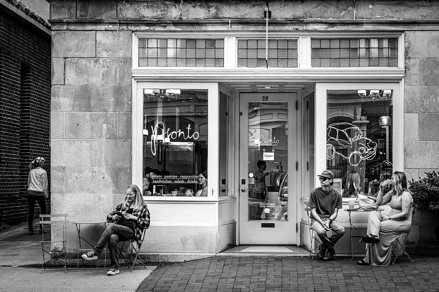
Comment |
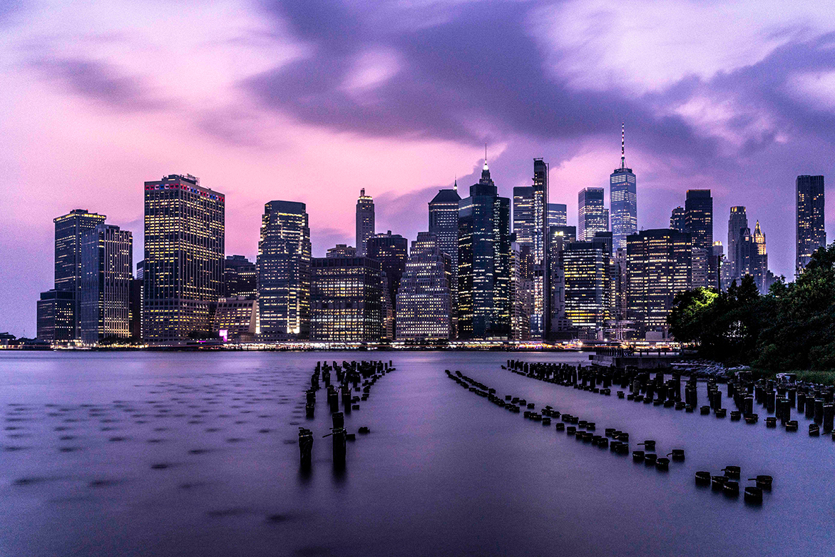
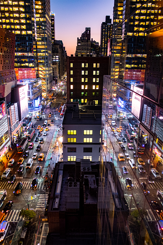
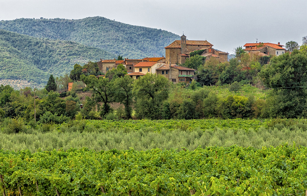
Norm,
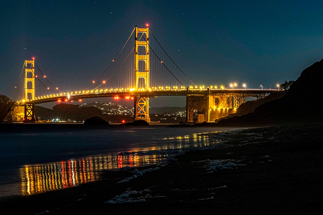
both are done very well. Both are telling the same story of the beautiful city. Both are sharp and staged correct. Many times the choice between one over the other is the context. meaning you need to submit day pictures or is it for a brochure of the night life of Florence. Personally I am a big fan of night photo especially when done right like in your example.
|
Oct 29th |
| 19 |
Oct 24 |
Comment |
I like the composition. The symmetry is perfect with both trees on each side. I would love to see a woman in a red dress and yellow umbrella passing through the main gate. |
Oct 29th |
| 19 |
Oct 24 |
Comment |
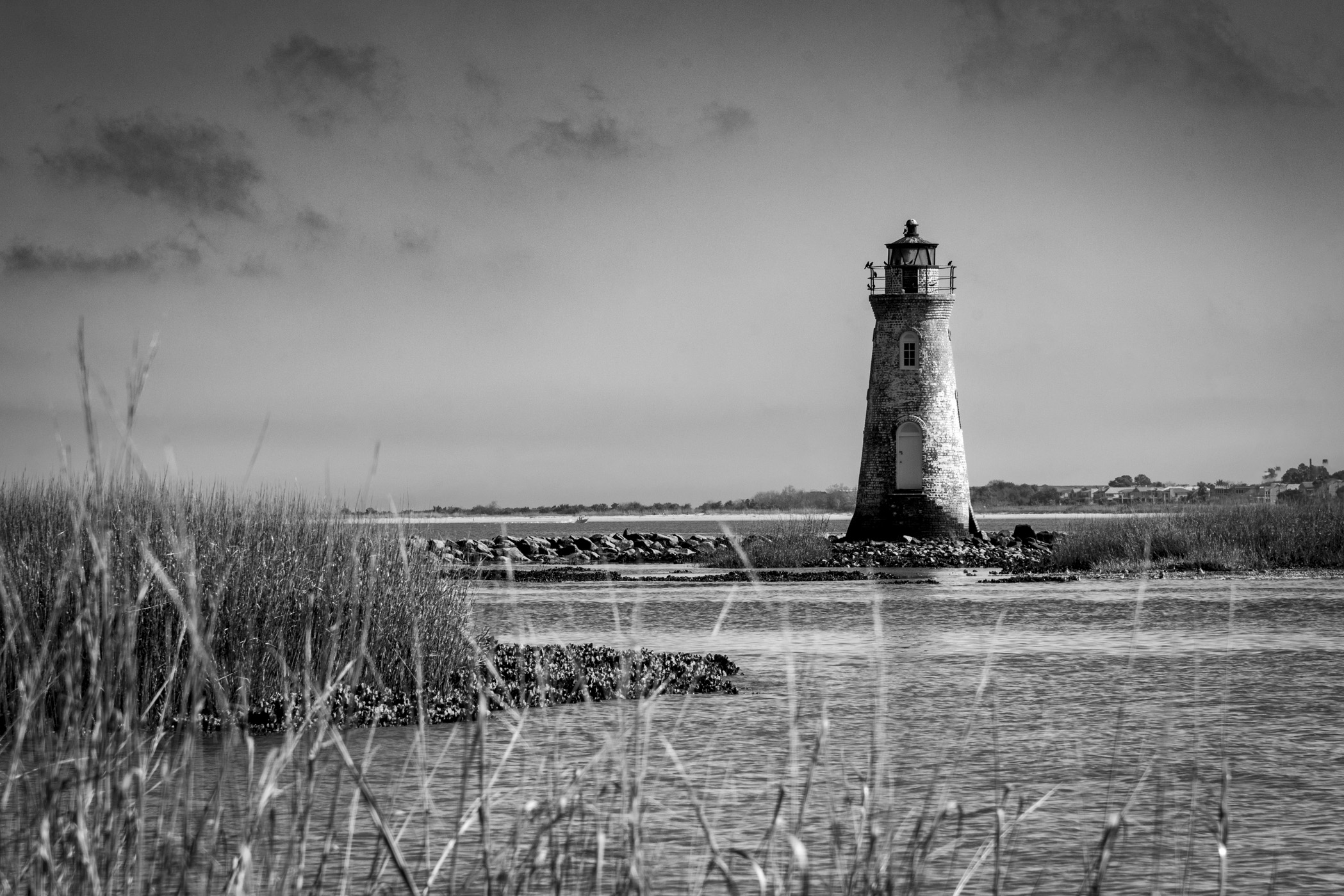
H,
Another beautiful picture to your collection. The onions in the china piece are very interesting thought.... The crop is good too.
I do recommend you considering avoiding the bright spot in the background. |
Oct 29th |
| 19 |
Oct 24 |
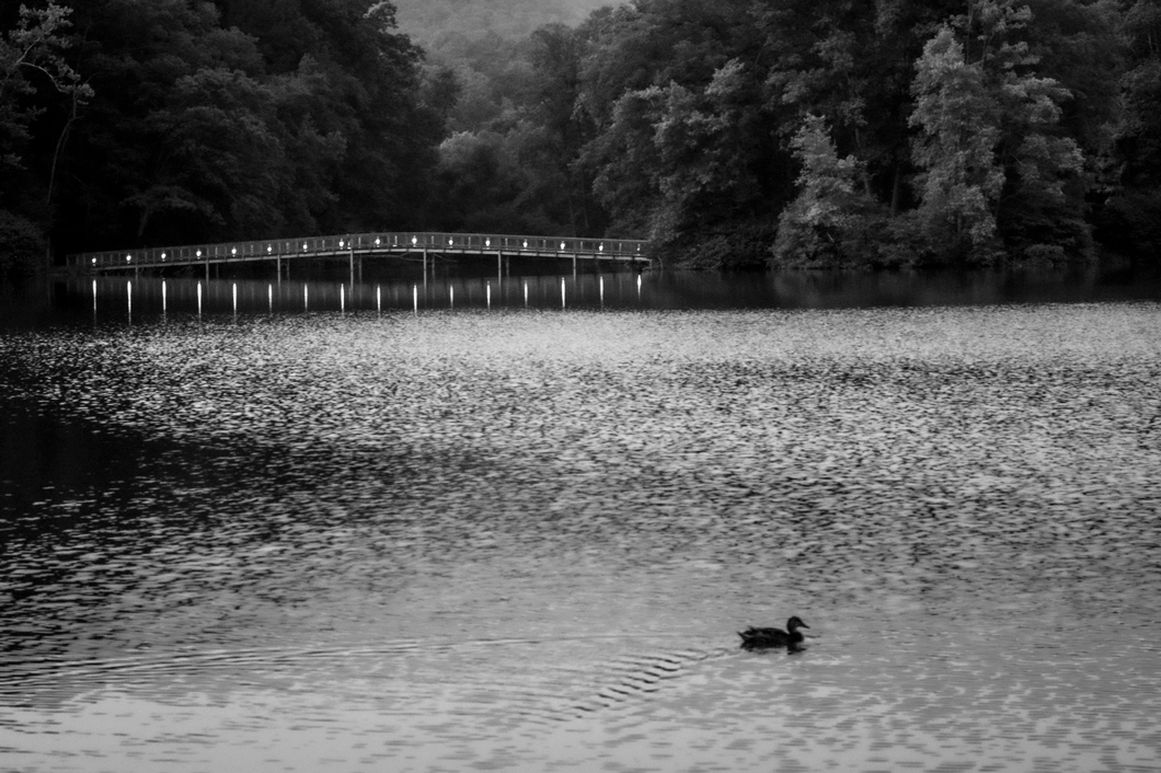
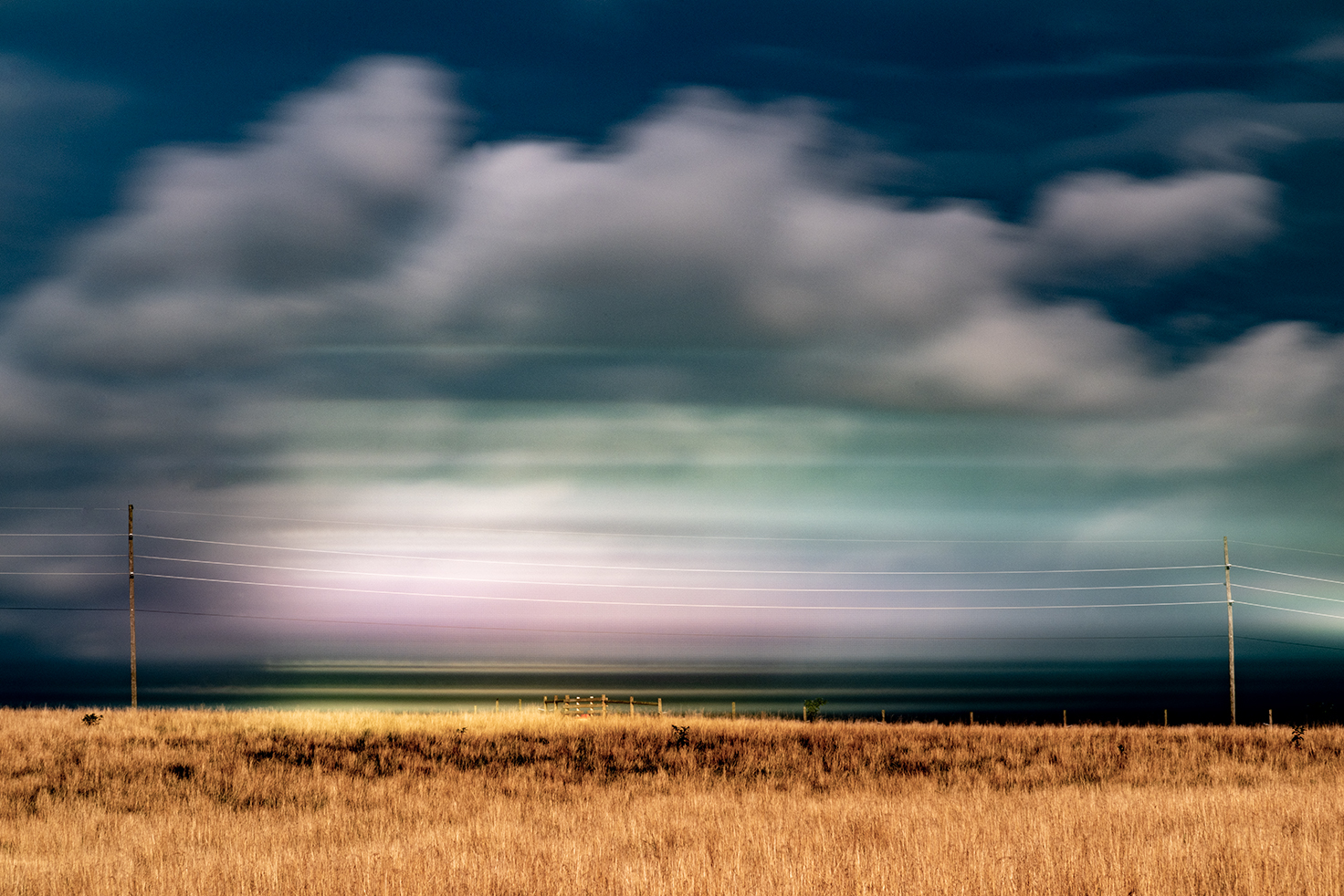
Comment |
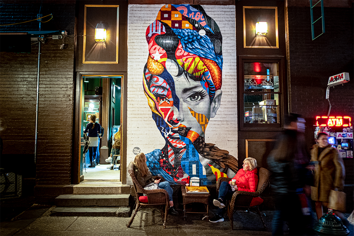
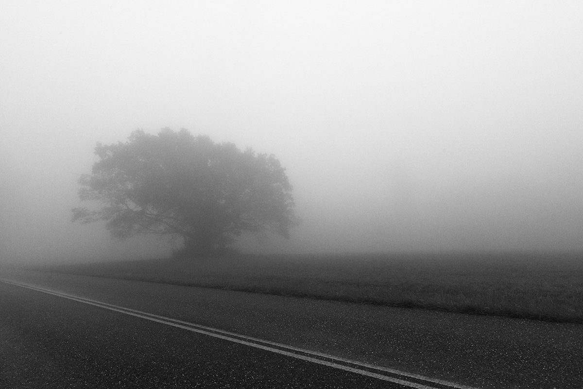
Very nicely done. The is adding to the atmosphere. Perhaps you can crop the electrical lines off the top.
|
Oct 29th |
| 19 |
Oct 24 |
Comment |
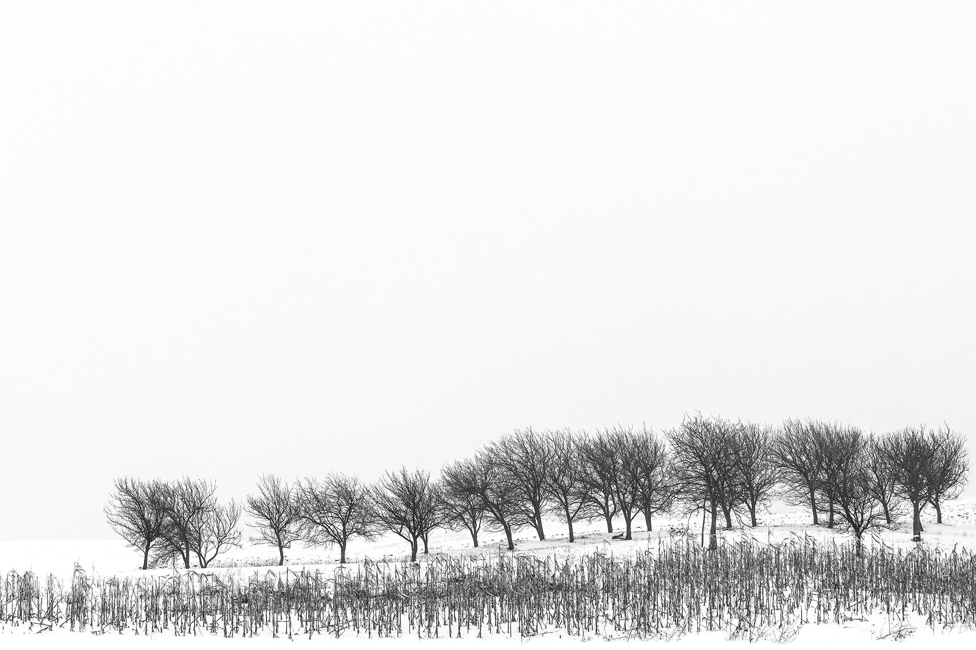
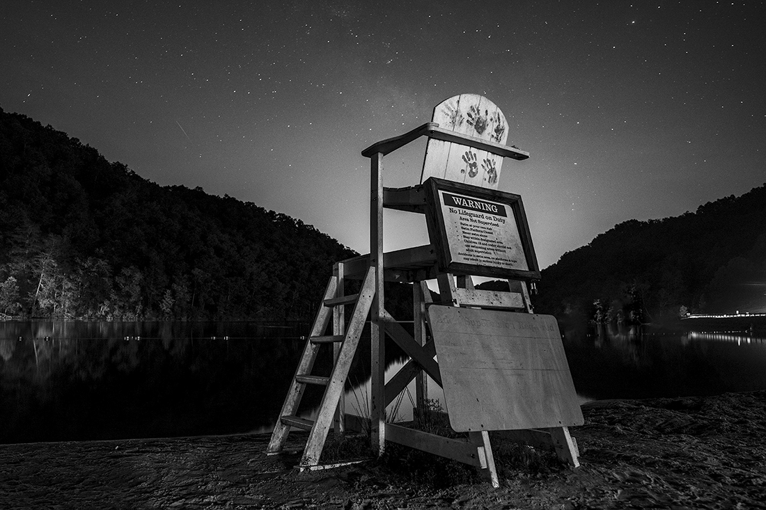
Interesting thought. I like flat black it allows the viewer concentrate on brighter areas. But i can try. Can you propose a crop 2:3 ratio ? |
Oct 12th |
| 19 |
Oct 24 |
Reply |
Indeed flat. |
Oct 12th |
| 19 |
Oct 24 |
Comment |
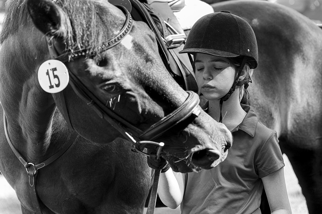
This is a wonderful portrait.
The soft light is right, the background is telling the story and the proportions of the composition are spot on. Well done |
Oct 11th |
7 comments - 2 replies for Group 19
|
| 36 |
Oct 24 |
Comment |
Love the thought thank you |
Oct 26th |
| 36 |
Oct 24 |
Comment |
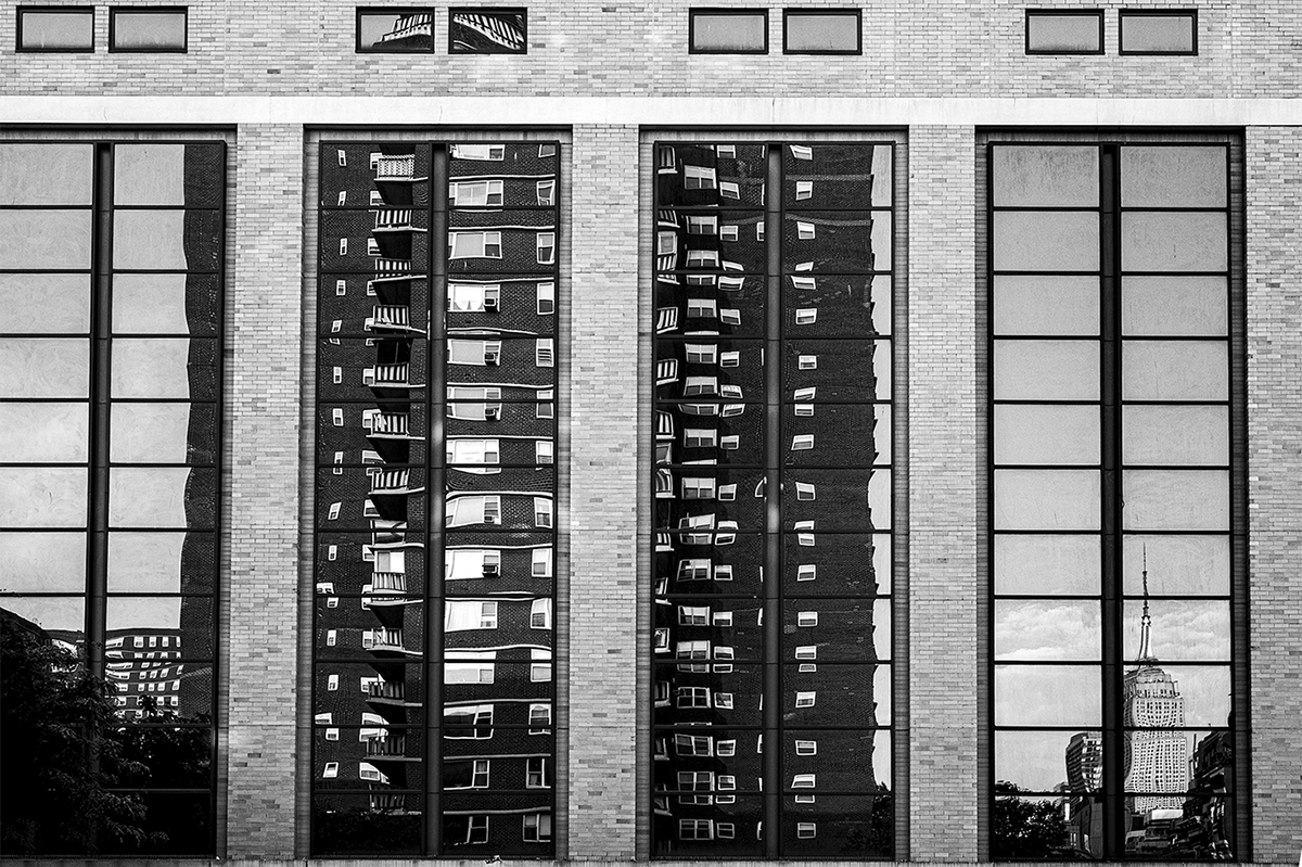
Arne,
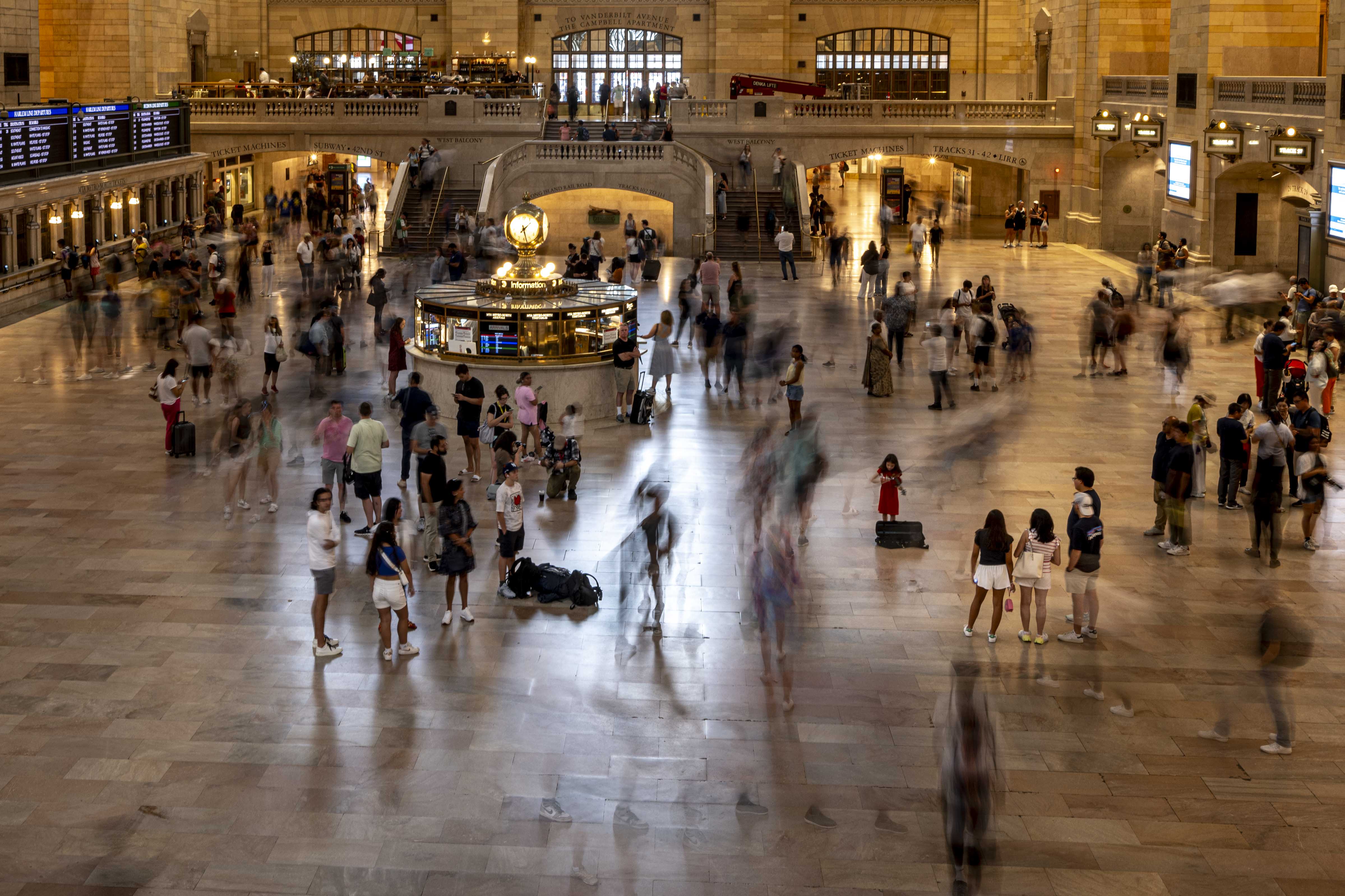
Technically wise the picture is perfect. Composition wise - correct. However, for me there are too many subjects. Is it the reflection? the mountains ? or the buildings ?. |
Oct 17th |
| 36 |
Oct 24 |
Comment |
Bill,
I like the picture however I think it is not sharp. |
Oct 17th |
| 36 |
Oct 24 |
Comment |
M,
Indeed more of a record but still a good one. Perhaps a bit less sky. See attached |
Oct 17th |
 |
| 36 |
Oct 24 |
Comment |
L,
That will be Awesome ! you are all very invited i will gladly arrange, drive, feed and host |
Oct 17th |
| 36 |
Oct 24 |
Comment |
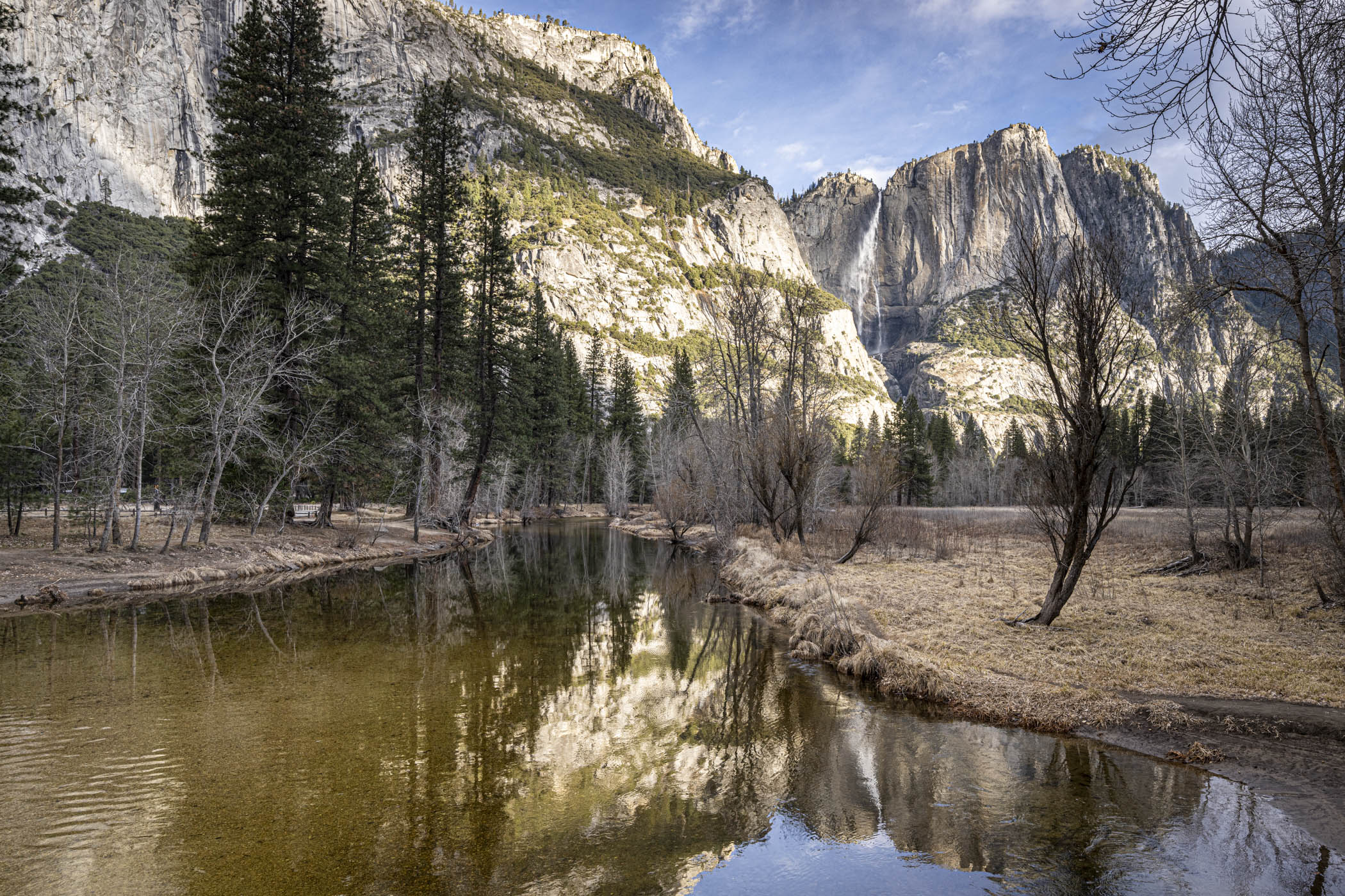
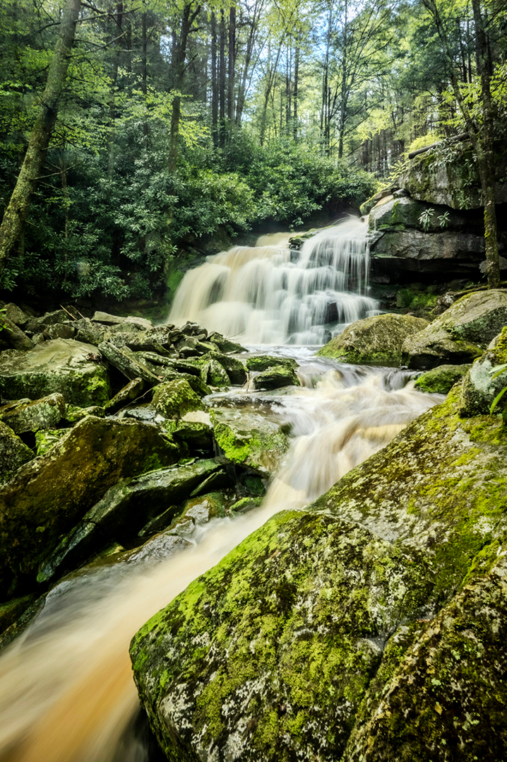
As usual very well executed Larry!
One thought - the bright green spot above the waterfall and the light brown log on the middle right hand side should be darkened.
|
Oct 13th |
| 36 |
Oct 24 |
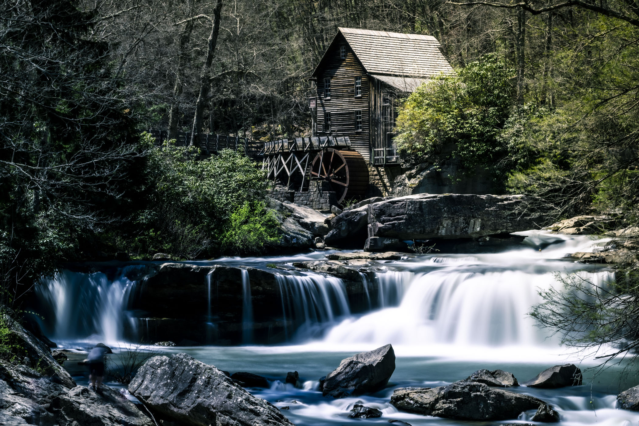
Comment |
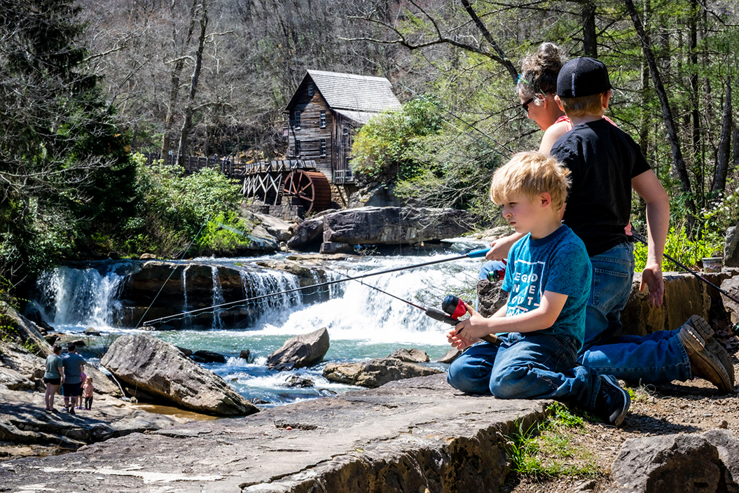
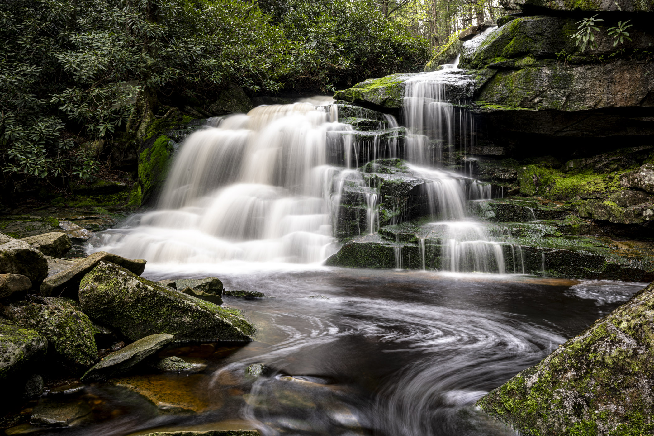
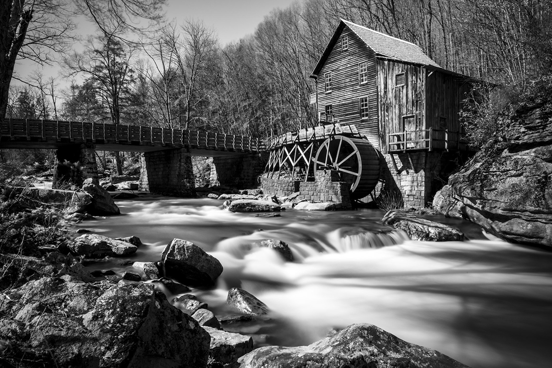
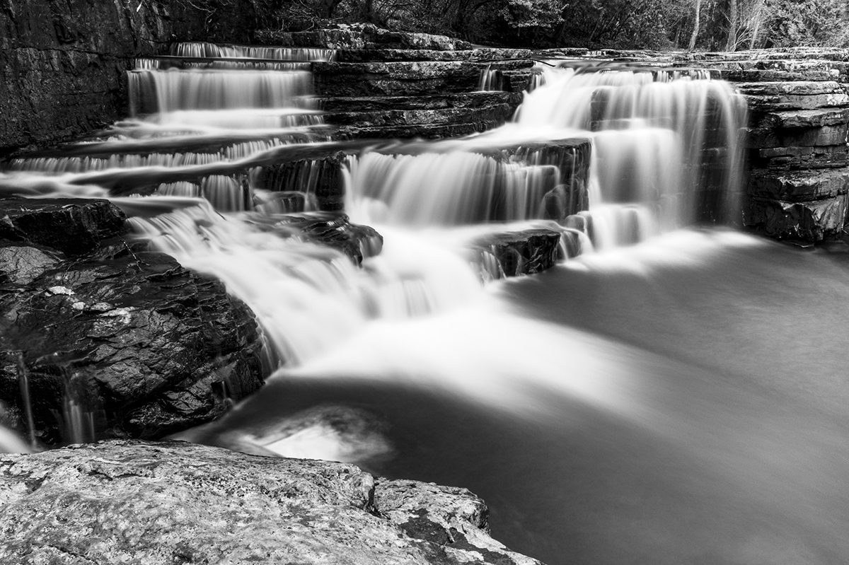
This is a Classic. I live 40 min away from the Mill so I go visit it once every while. I do believe That this is the best position for the composition. I took it with a slow shutter to chow the movement of the wheel.
|
Oct 13th |
| 36 |
Oct 24 |
Reply |
Thanks M,
And congratulations on the PSA nomination!!! |
Oct 12th |
| 36 |
Oct 24 |
Comment |
The exposure is -1/3EV as i do not want it too bright. Yes water drops on top right corner- on the leaves not on the lens. Send me a link to your camera rain coat I'll look into it. I have one but I'm not in love with it |
Oct 12th |
8 comments - 1 reply for Group 36
|
| 83 |
Oct 24 |
Reply |
Thx |
Oct 26th |
| 83 |
Oct 24 |
Comment |
I fear you will get the opposite result from your intention but may be wrong. |
Oct 18th |
| 83 |
Oct 24 |
Comment |
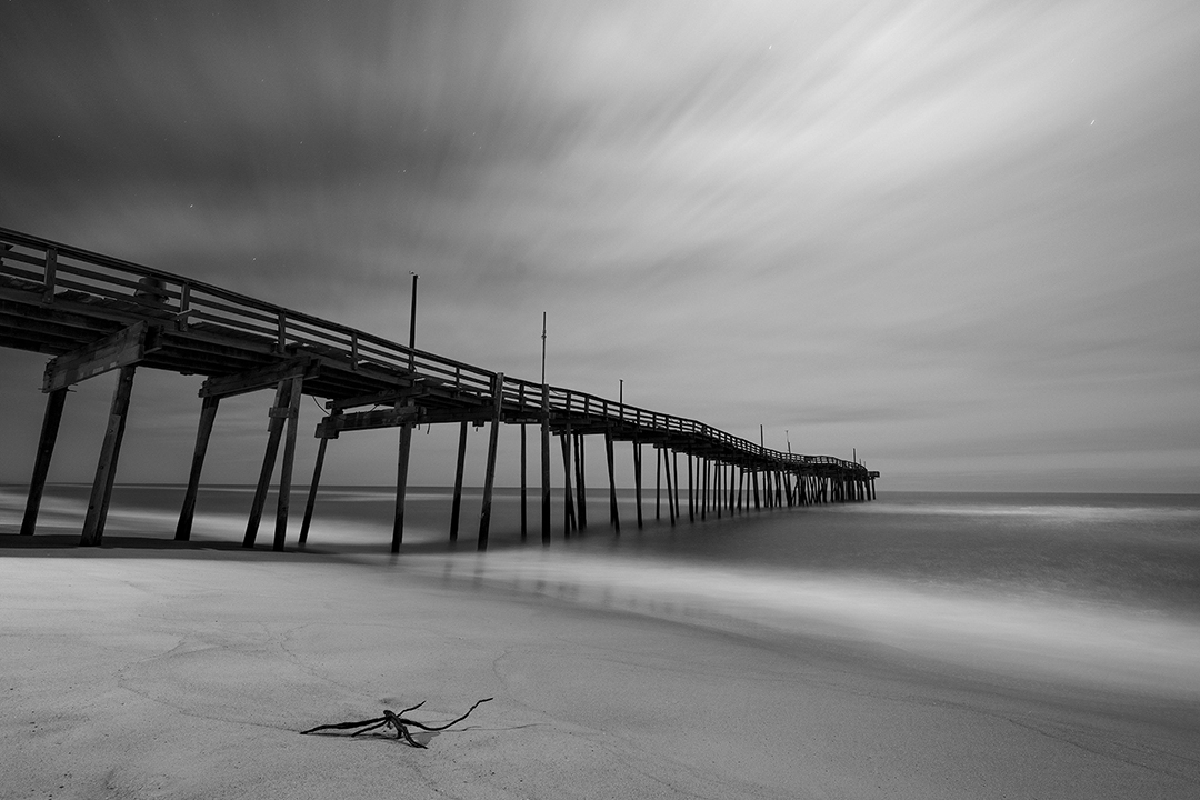
Very nicely done Lance. If I were to make one comment it would be reduce the gamut on the darker side of the curve. Fading to flat black so quick forces the eye to concentrate on the foreground which is the opposite of-the compositional intention. |
Oct 13th |
| 83 |
Oct 24 |
Comment |
Clark,
welcome to the group ( I think ?). The reduction of details and texture gives the image a "dreamy" feeling. Well done.
Soft left side Rembrandt lighting is the perfect choice. If I had t comment it would only be the frame of the picture behind touching the head of the lady
|
Oct 13th |
| 83 |
Oct 24 |
Comment |
Very nice execution of street photography. right choice of aperture. The line following the skulls is very well articulated. |
Oct 13th |
| 83 |
Oct 24 |
Comment |
M,
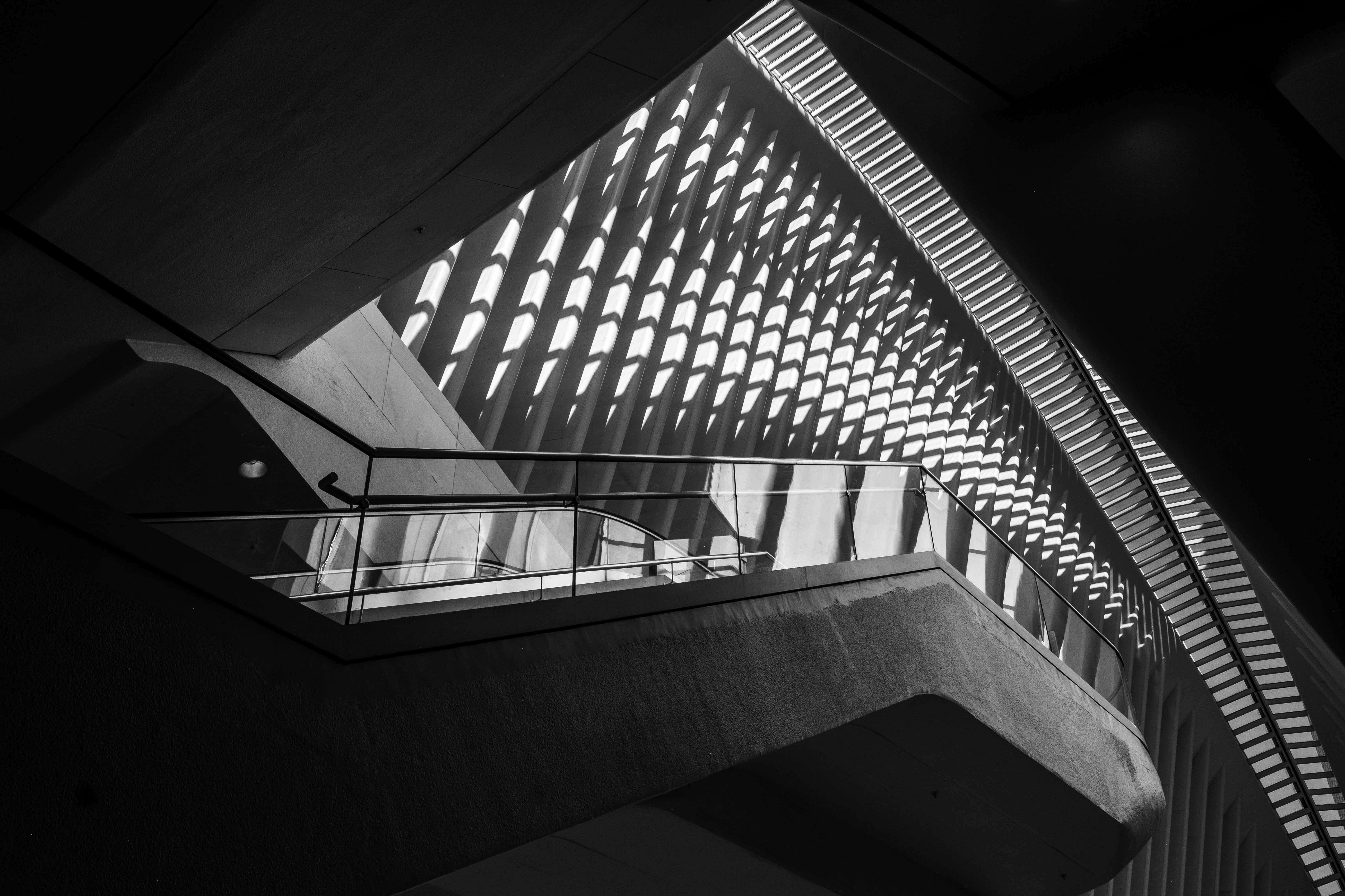
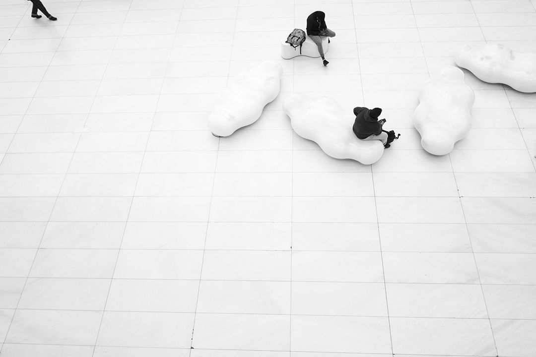
How cool is that ! I love the horizontal lines reflections and on the wall. some type of minimalism
|
Oct 13th |
| 83 |
Oct 24 |
Comment |
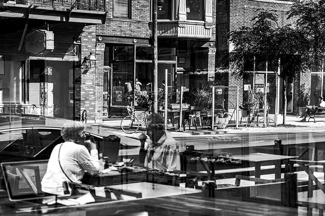
E,
The textures are good and so is the exposure. I do have a question: what is the subject ?
|
Oct 12th |
| 83 |
Oct 24 |
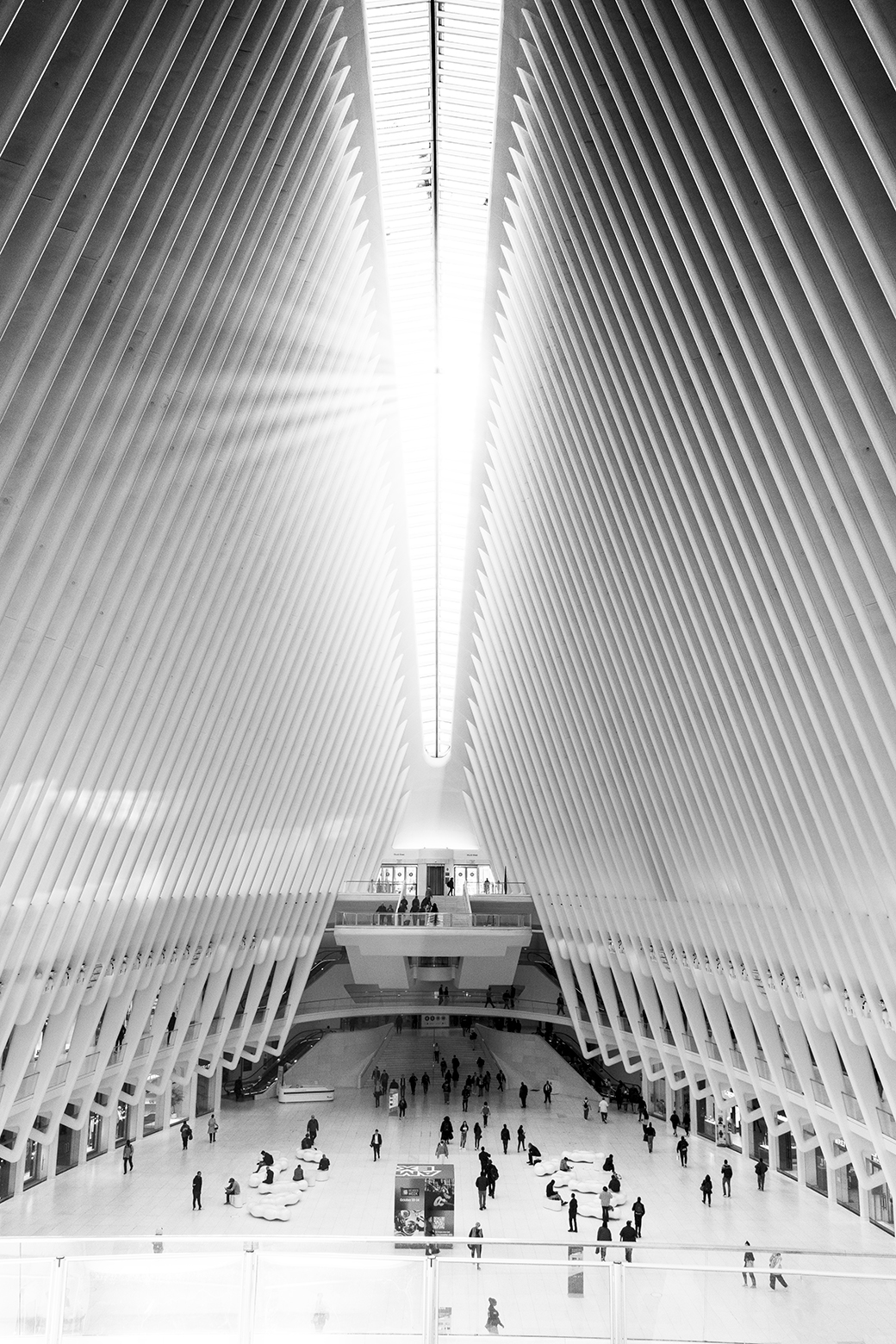
Comment |
The lady is Adding life to the picture and pointing the viewer towards the ceiling. Of which both are very positive.
The tilt is not a problem at all. This is the perspective and a rather good one.
In addition the contrast between the lady and the building is adding more interest.
Nitpicking: the column is directly on top of her head
|
Oct 12th |
| 83 |
Oct 24 |
Reply |
100% agreed |
Oct 8th |
| 83 |
Oct 24 |
Reply |
Less is more. Or in other words more is less. The more elements we have in the picture the less attention each element will get. The rest is up to you. |
Oct 8th |
| 83 |
Oct 24 |
Reply |
M,
1. If the trash was inside the frame (not close to the margins) - there will no tension
2. There is no good nor bad tension point. We are simply trying to keep the viewer engaged with the composition longer. |
Oct 8th |
7 comments - 4 replies for Group 83
|
22 comments - 7 replies Total
|