|
| Group |
Round |
C/R |
Comment |
Date |
Image |
| 19 |
Jan 24 |
Reply |
Yea that was the intention. Thank you |
Jan 27th |
| 19 |
Jan 24 |
Comment |
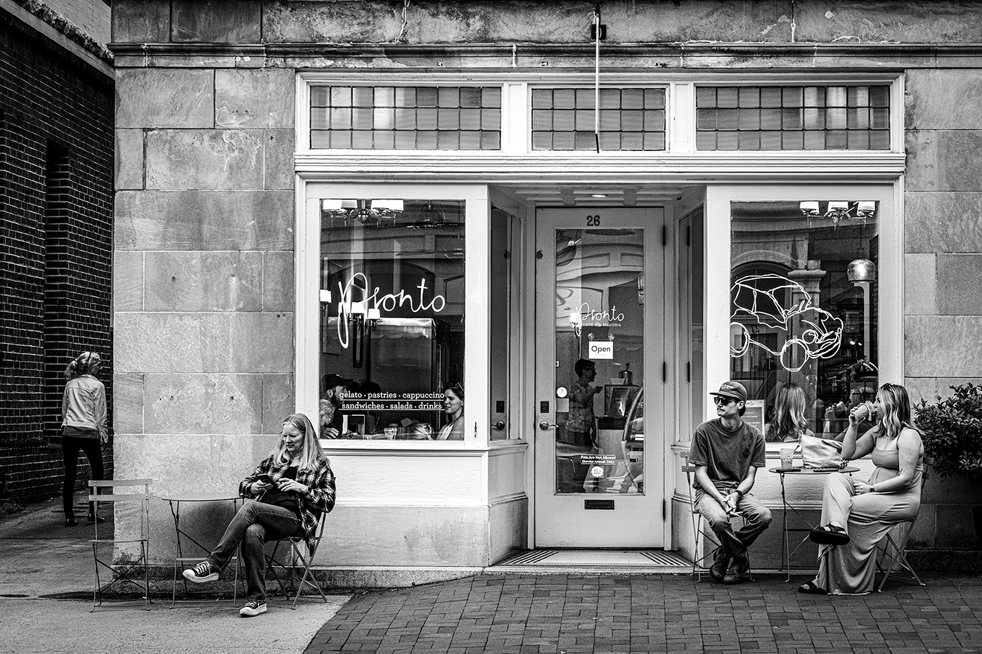
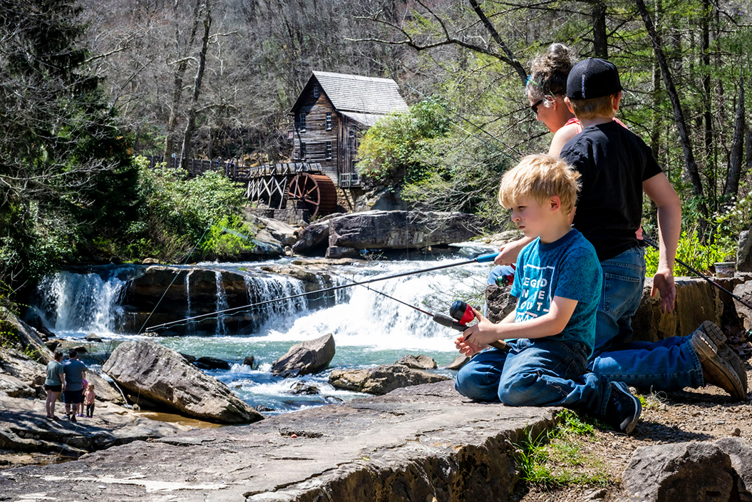
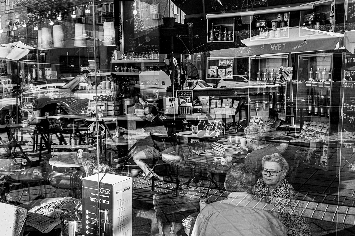
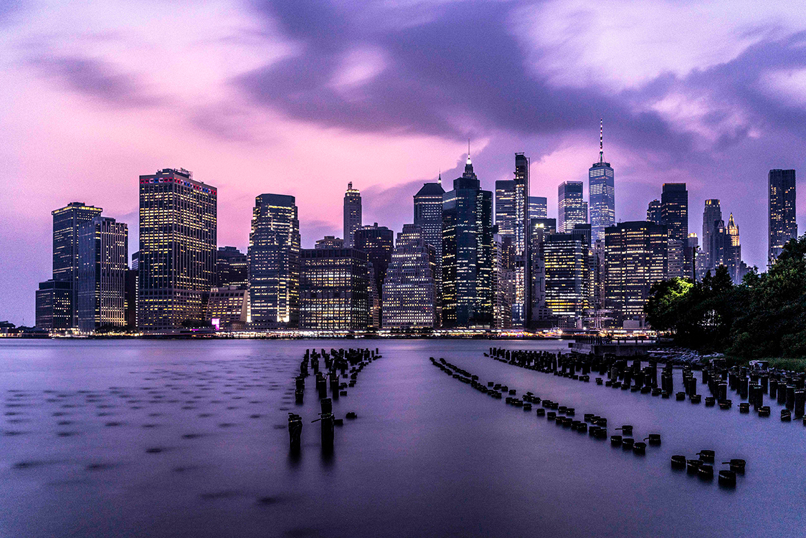
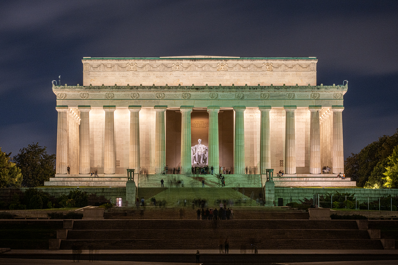
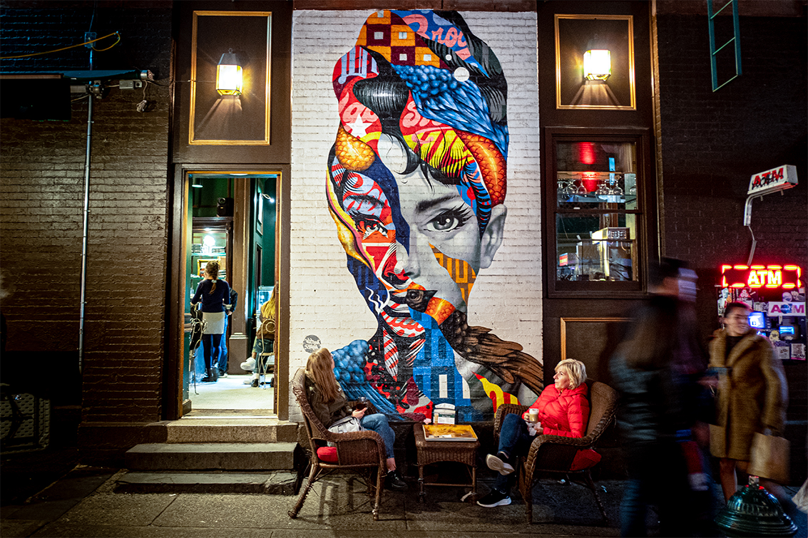
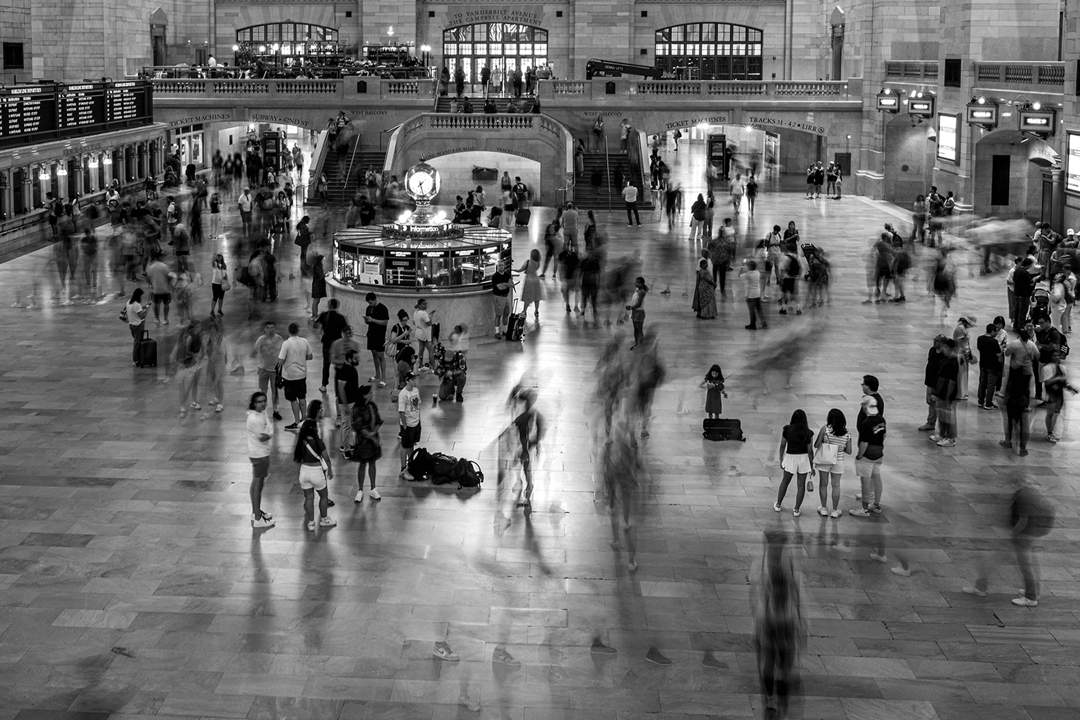
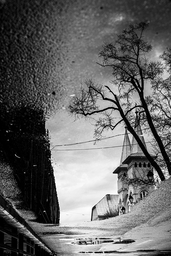
Stan, this is a very impressive picture. It is simple symmetry and color but with the wow effect as I call it. A picture the judge will pick. This is a proof that phones can work as cameras. did you crop it ? |
Jan 27th |
| 19 |
Jan 24 |
Comment |
thank you |
Jan 15th |
| 19 |
Jan 24 |
Comment |
Thank you Stan |
Jan 10th |
| 19 |
Jan 24 |
Reply |
Thank you |
Jan 7th |
| 19 |
Jan 24 |
Comment |
Thank you Norm. Much appreciated |
Jan 7th |
| 19 |
Jan 24 |
Comment |
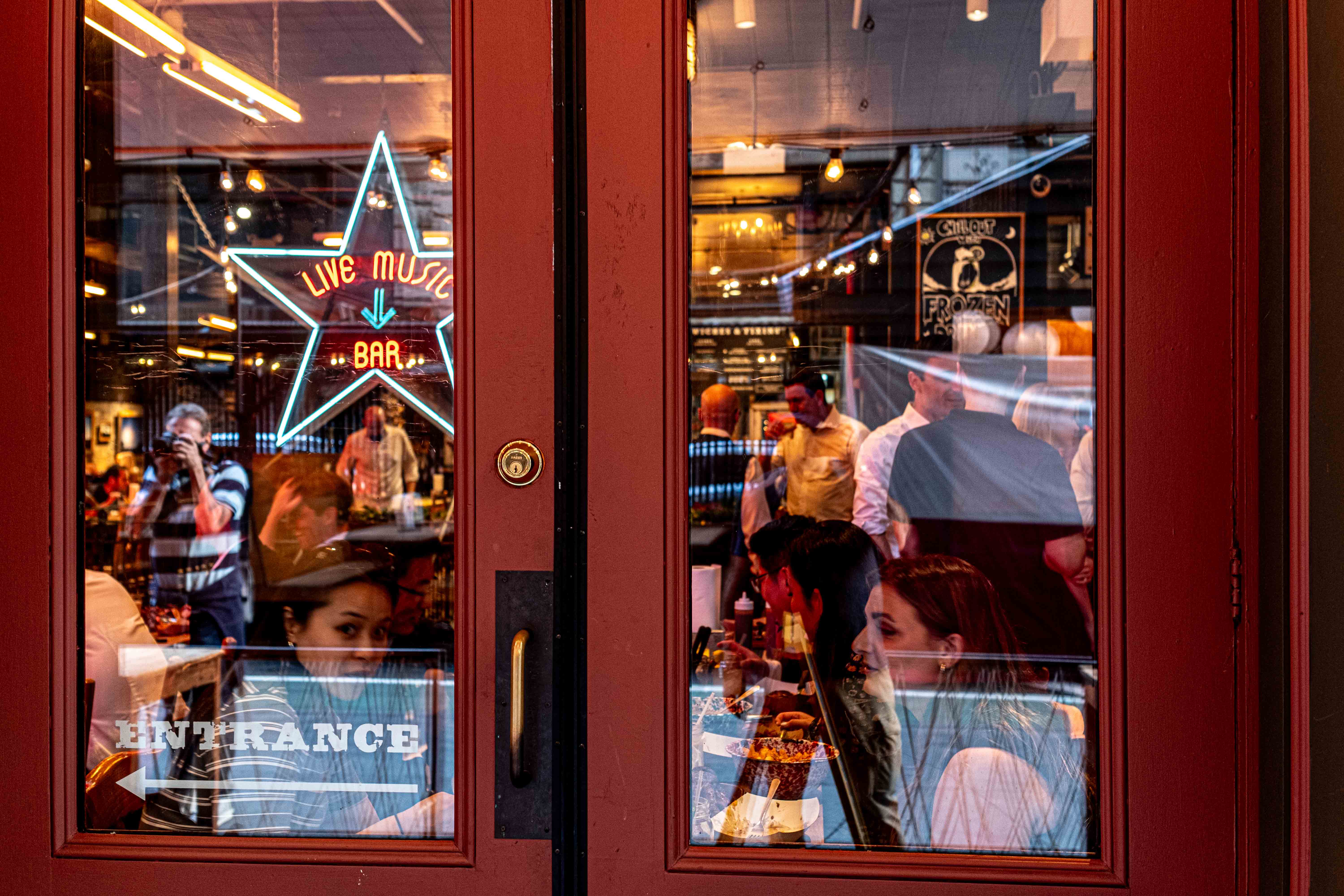
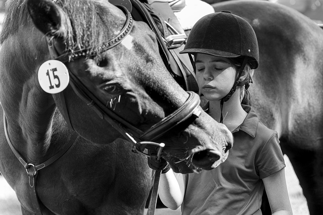
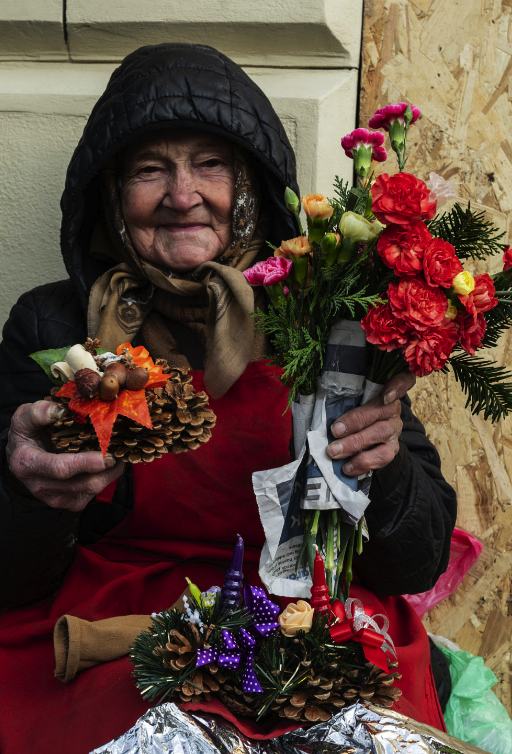
Hi Jay, Interesting story indeed. I like isolating my subjects. see my proposal |
Jan 6th |
 |
| 19 |
Jan 24 |
Comment |
Hi Harriet,
This is a good picture however, the background is distracting.
see my proposed crop |
Jan 6th |
 |
| 19 |
Jan 24 |
Comment |
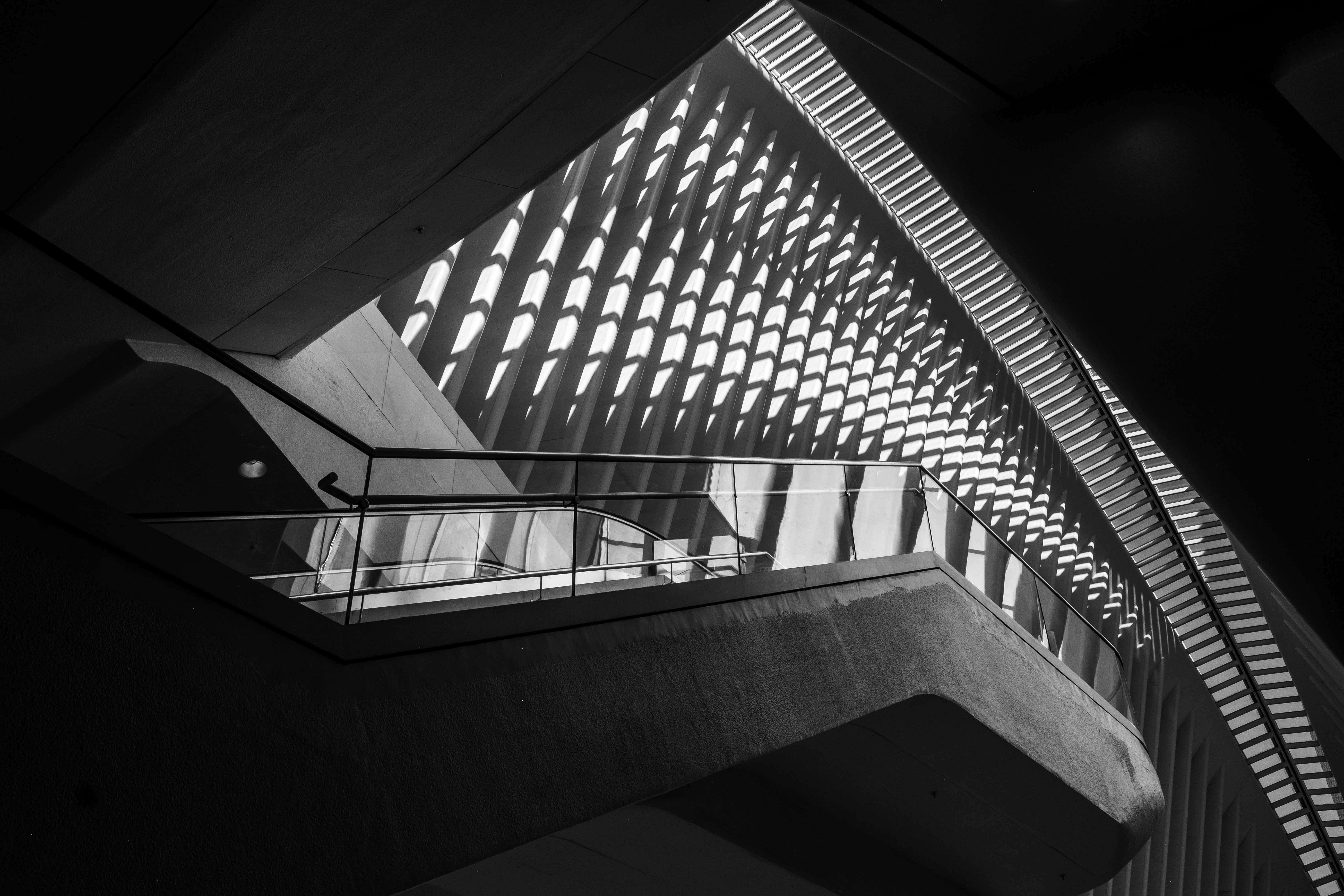
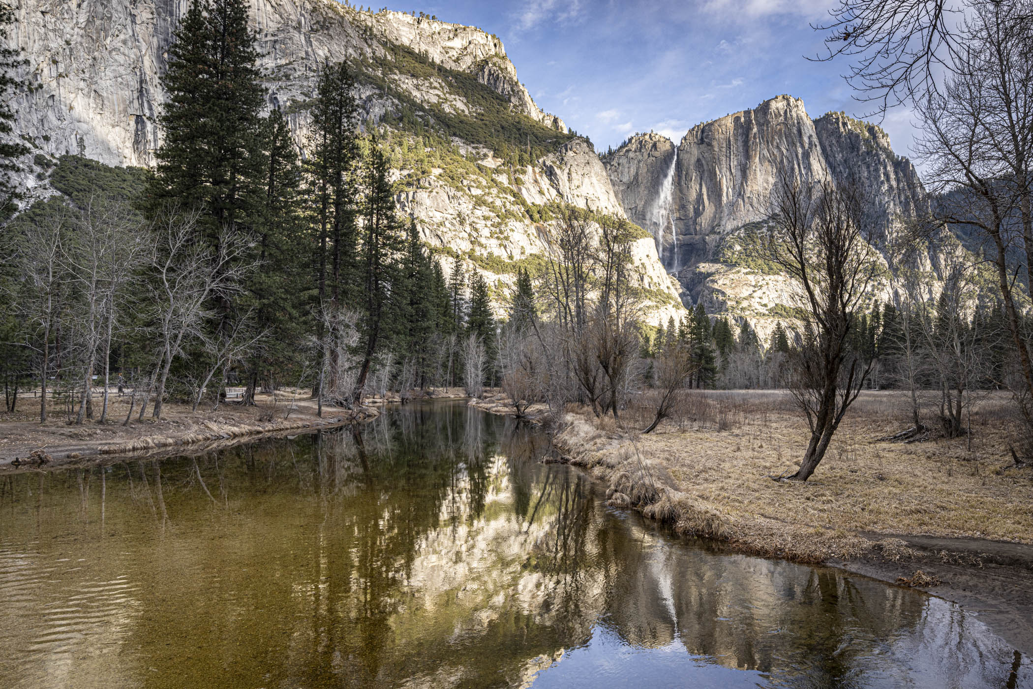
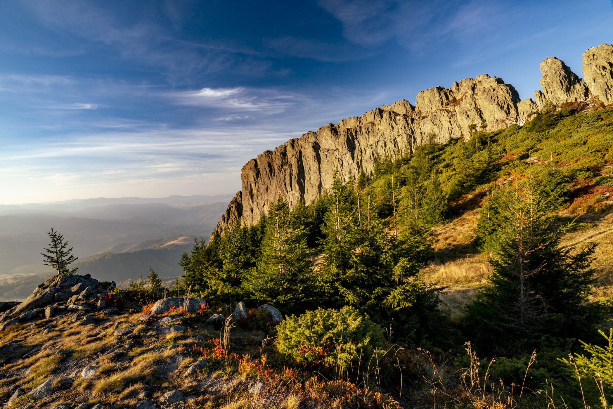
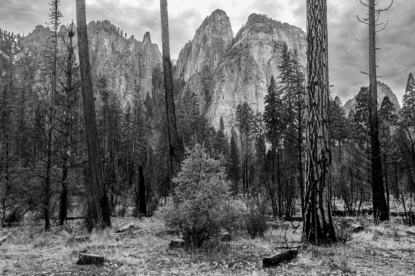
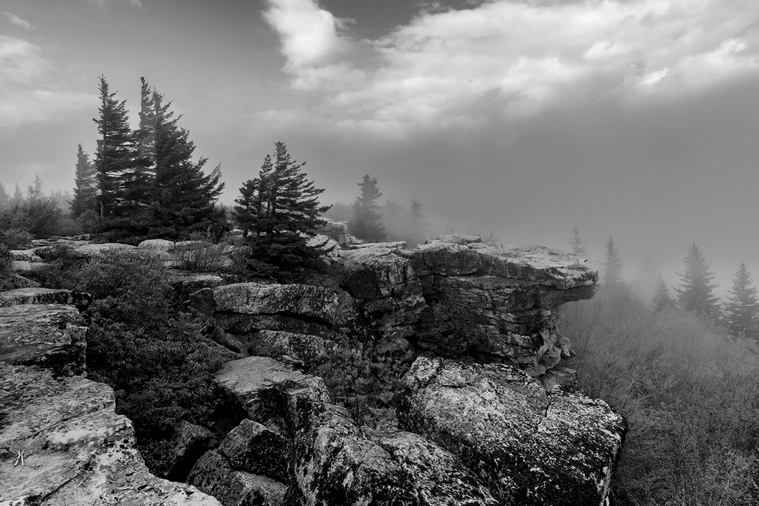
Mel, this is a very strong composition. The Crack makes is a great story. Did you try this composition at night? maybe the the color changes will blur out the white walls and emphasize even more the subject. I wonder...
|
Jan 3rd |
| 19 |
Jan 24 |
Comment |
Norm, I love this technique. you are doing a very good job. It seems that you have mastered the method and managed to create your own finger print. I love it. |
Jan 3rd |
| 19 |
Jan 24 |
Comment |
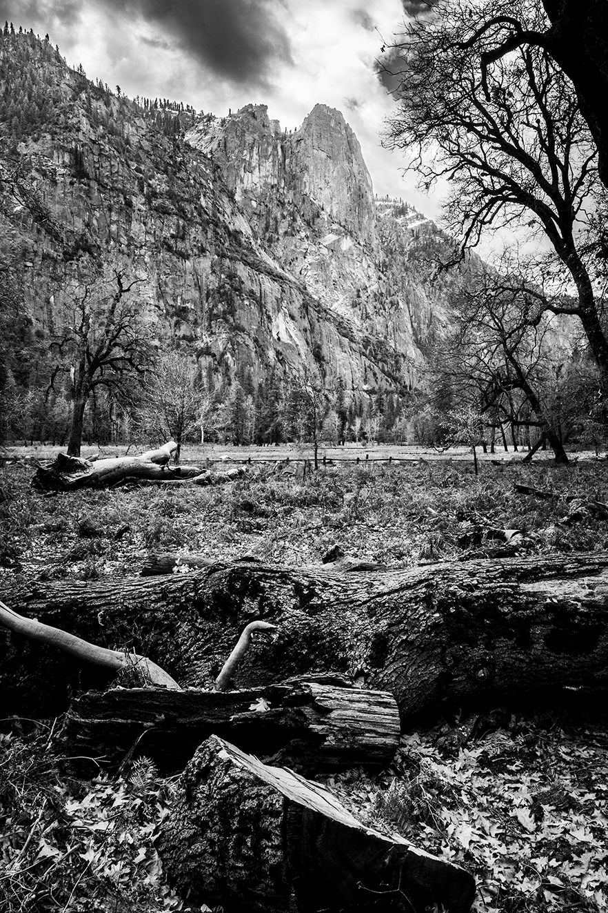
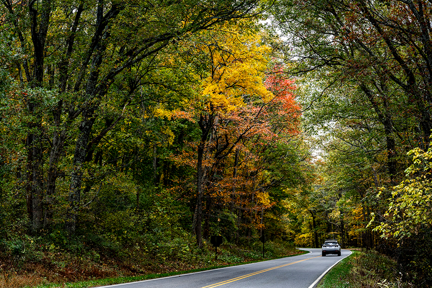
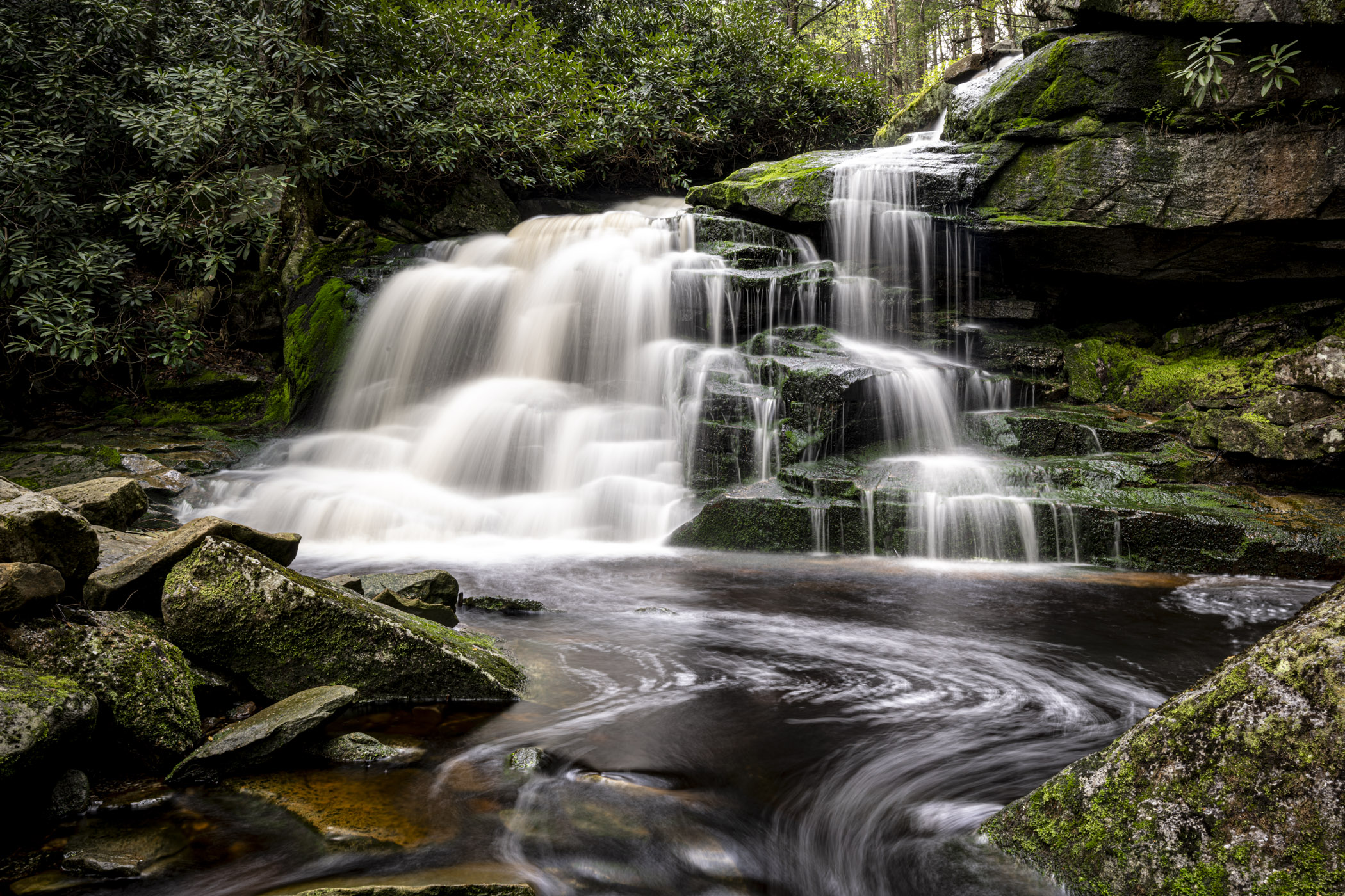
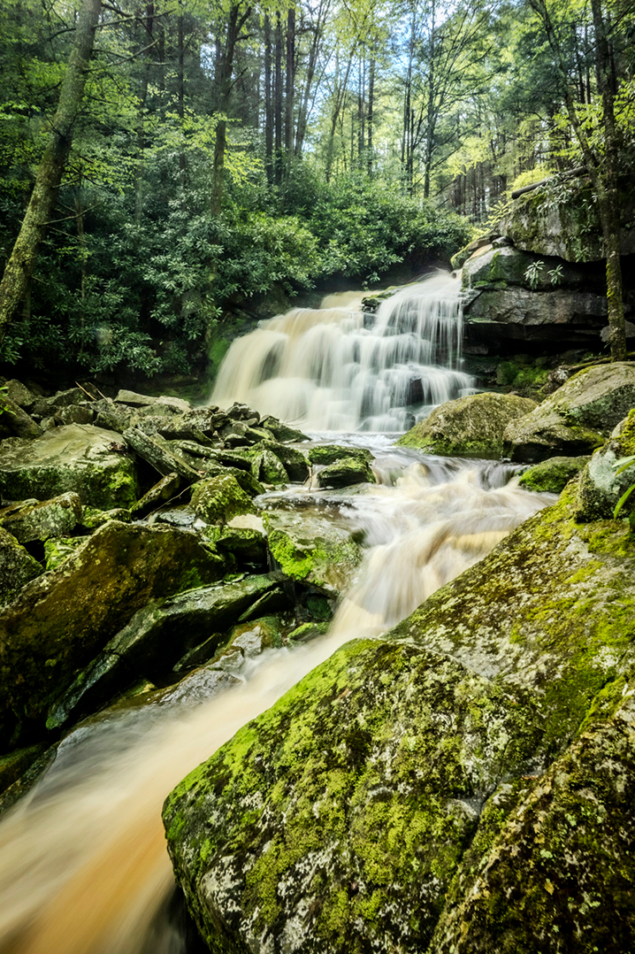
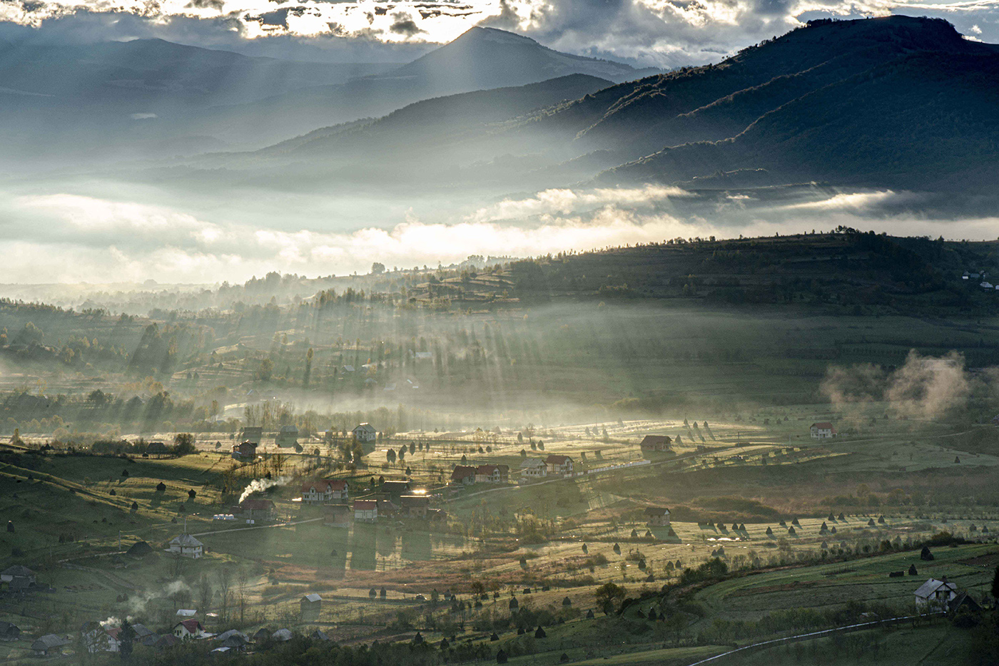
Happy 2024 J. The foreground and the textured rocks add a lot of character. This is a good choice of subject presentation. not sure about the water on the right side. I feel it overshadows the subject. I would love to hear your thoughts. |
Jan 3rd |
9 comments - 2 replies for Group 19
|
| 36 |
Jan 24 |
Comment |
I agree with Michael - the editing is wonderful. I think this is a front cover picture. Wow |
Jan 27th |
| 36 |
Jan 24 |
Comment |
D,
This is a very good landscape photo. I have a thought for you:
looking at the picture on the screen it seems lighter than on a print (passing light Vs. Reflecting light) and it may be on the dark side to view it properly. If you print it - I suggest increase it by 1EV
|
Jan 27th |
| 36 |
Jan 24 |
Reply |
works great both versions. |
Jan 27th |
| 36 |
Jan 24 |
Comment |
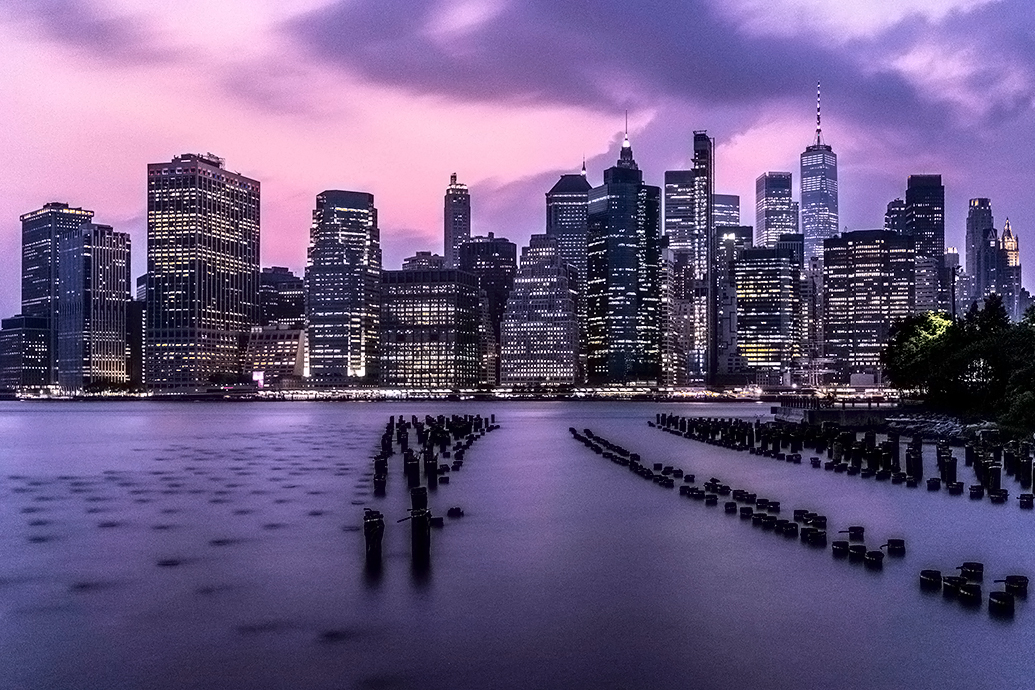
This is a screen saver. Nothing much to say it is all correctly done and well edited. the colors the composition the sky line. Good Job B!
|
Jan 27th |
| 36 |
Jan 24 |
Reply |
Thank you |
Jan 17th |
| 36 |
Jan 24 |
Reply |
Barbara,
the noise is the result of the 900kb picture.
the crop - as I wrote I work only 3:4 format. I did follow your recommendation - see attached. Is this better ? |
Jan 17th |
 |
| 36 |
Jan 24 |
Reply |
thank you Diane |
Jan 17th |
| 36 |
Jan 24 |
Comment |
I have to agree with you guys. I'll try and upload something |
Jan 7th |
| 36 |
Jan 24 |
Comment |
Thanks for good comments I do agree on cropping sky. Noise seems to be due to small file size and its low quality |
Jan 7th |
| 36 |
Jan 24 |
Comment |
Added some to the existing magenta. Thx |
Jan 6th |
| 36 |
Jan 24 |
Comment |
Yes. Im assuming tripod ? |
Jan 6th |
| 36 |
Jan 24 |
Comment |
This is a very good picture and even better edit Arne. This is one of these pictures where it works vertical and horizontal. Personally i prefer landscape pictures with horizon lines- horizontal. It feels more natural for me. Just a matter of taste |
Jan 6th |
 |
| 36 |
Jan 24 |
Comment |
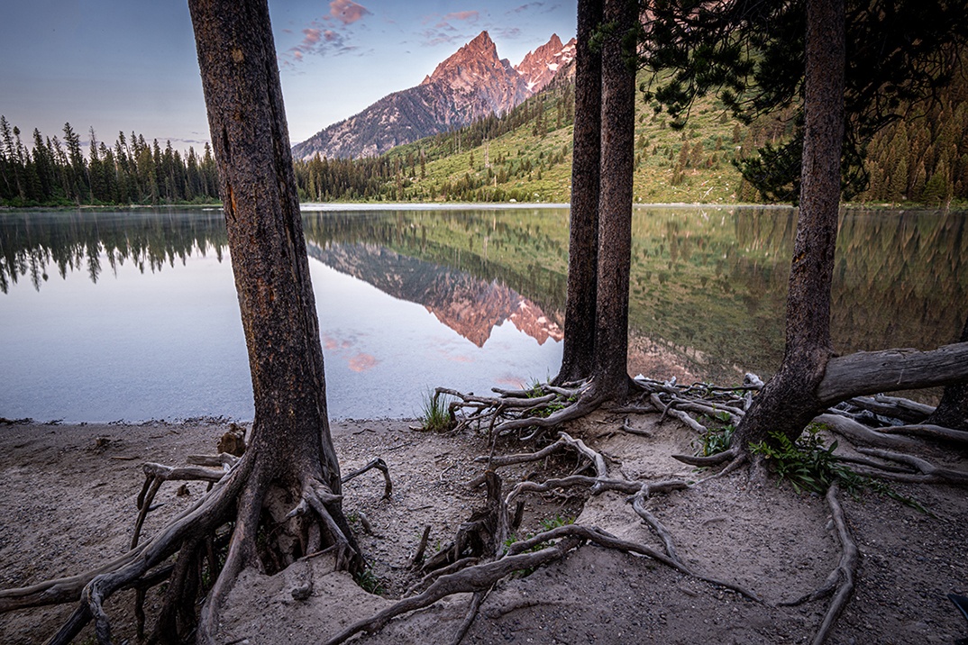
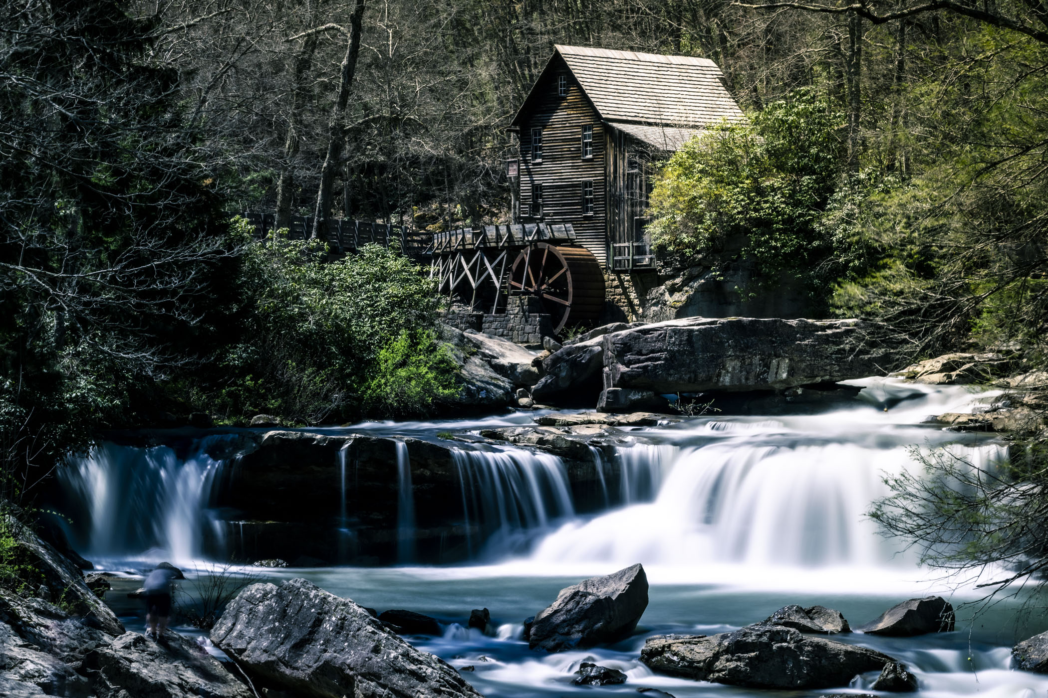
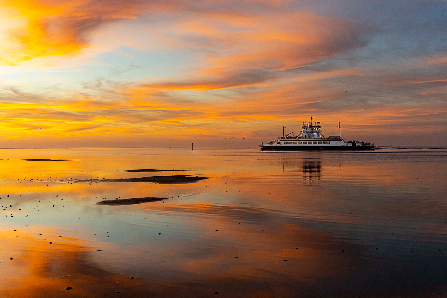
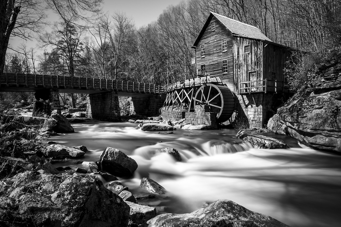
Wonderful ! The reflection, the water, the cloud all works together. Well done. can you share the expo info ? |
Jan 6th |
| 36 |
Jan 24 |
Comment |
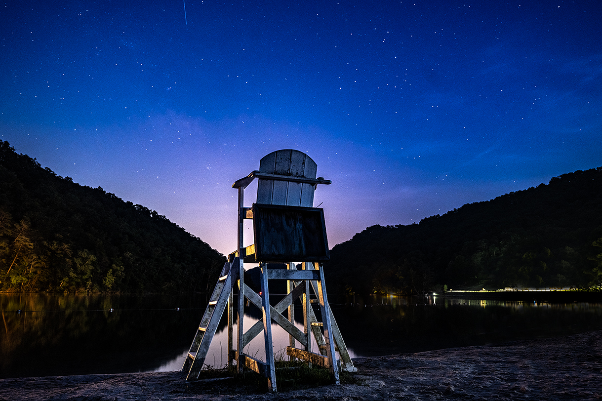
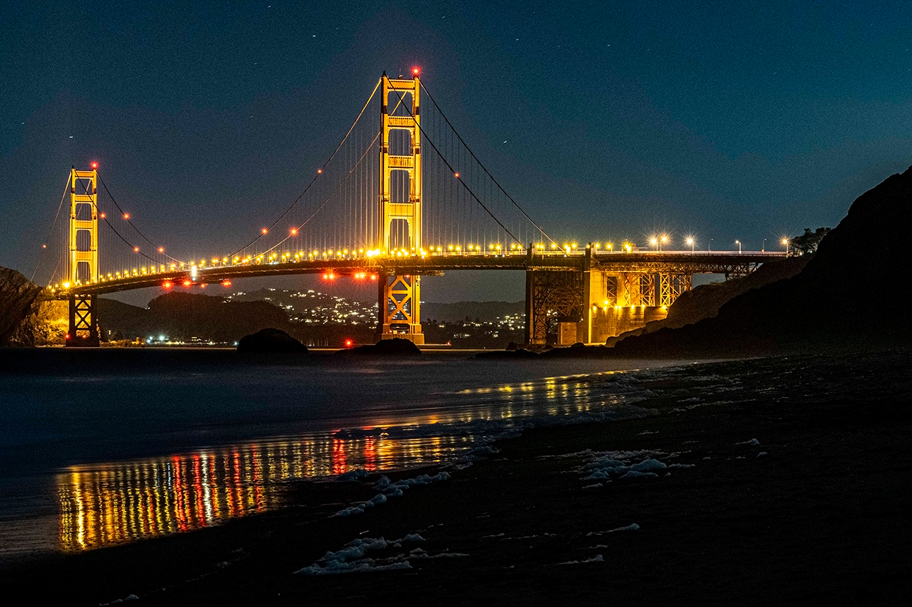
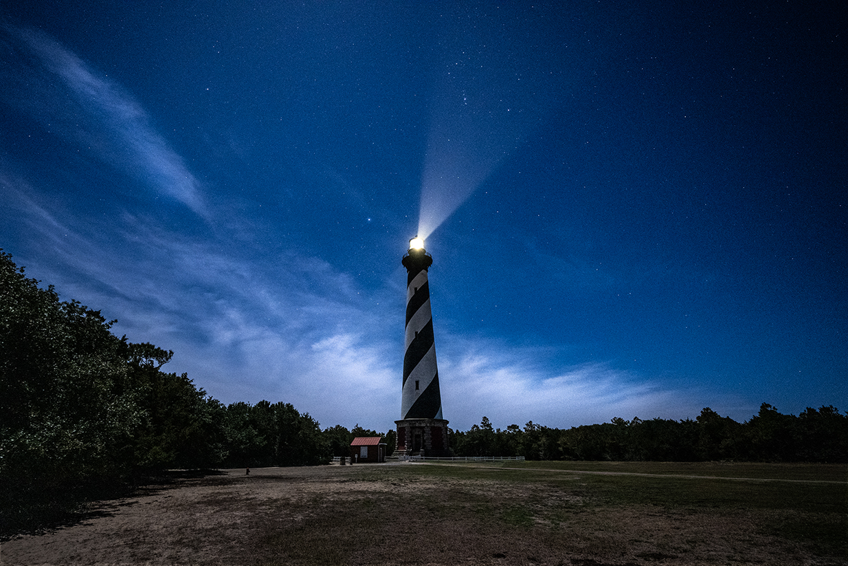
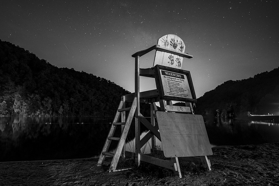
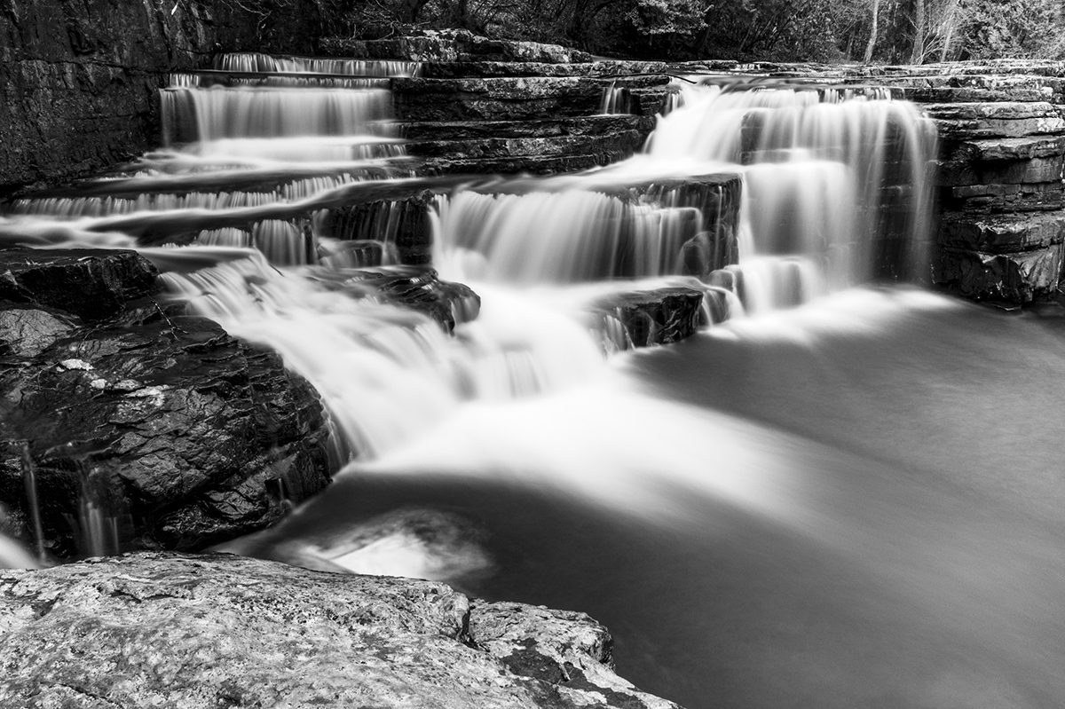
This is a perfect picture. I love the reflection of the stars in the water. one thought- did you try crop the picture to have the subject off center ? ; Can you share Exposure info ? |
Jan 6th |
10 comments - 4 replies for Group 36
|
| 83 |
Jan 24 |
Reply |
Thank you |
Jan 27th |
| 83 |
Jan 24 |
Comment |
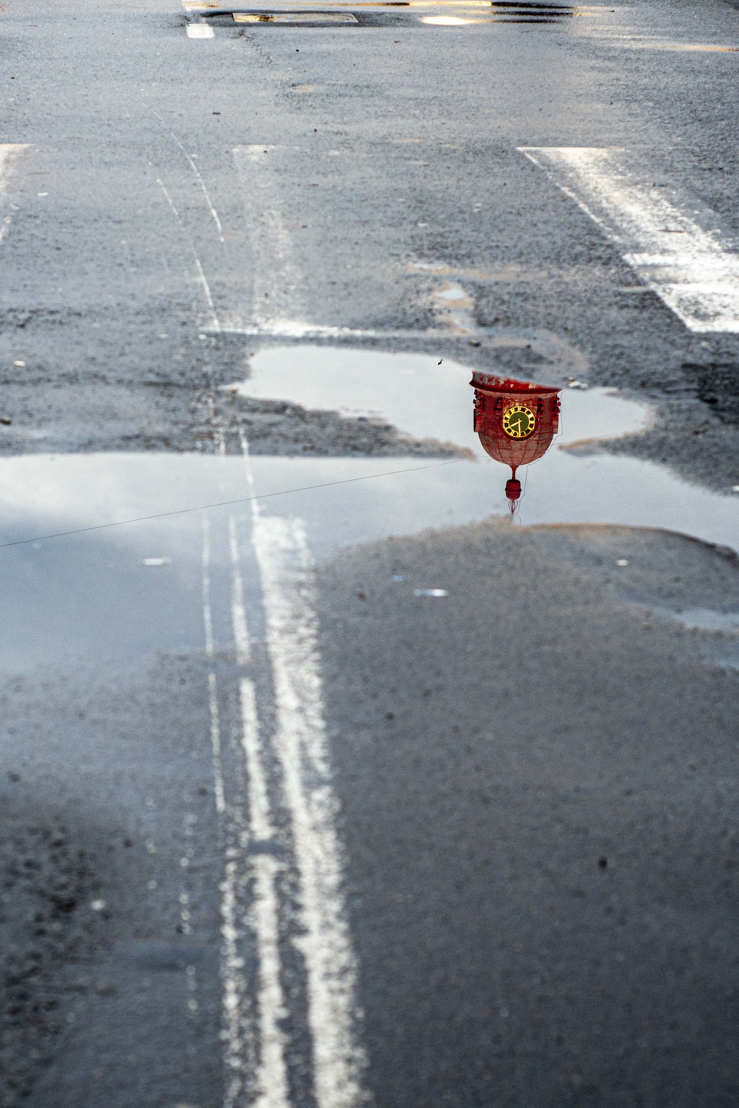
Mark,
Ive been thinking about this picture. This is a great picture. The white cloud is the subject for me. the river bed is the background and the rest- is a distraction. here is my proposed crop. As for the editing - The histogram needs to be more on the right side. - more black |
Jan 27th |
 |
| 83 |
Jan 24 |
Comment |
M,
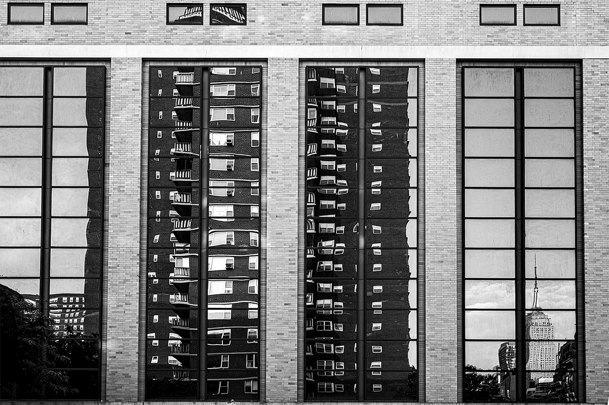
I do agree on cropping the left side but since I keep 3:4 ratio this is not working well. Yes the thought is to keep the viewer engaged with different patterns and textures. |
Jan 14th |
| 83 |
Jan 24 |
Comment |
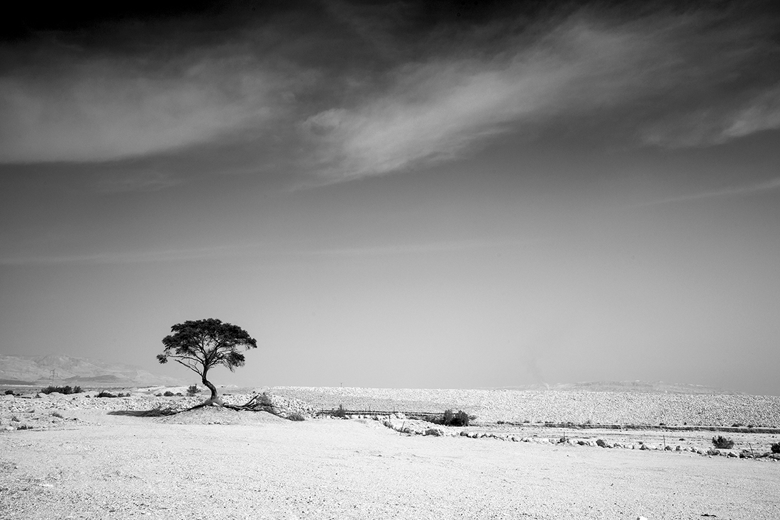
M, very interesting choice to present it in B&W. Interestingly enough - it works ! i would like to see it n color too. One thought to consider - a bit higher contrast
|
Jan 6th |
| 83 |
Jan 24 |
Comment |
I like it. I like the circle in the rectangular i like the dark to bright I like the textures I like it all. |
Jan 6th |
| 83 |
Jan 24 |
Comment |
M, I think there is a good picture in the frame. In my view there are a few distractions at the bottom side. See attached |
Jan 6th |
 |
| 83 |
Jan 24 |
Comment |
Interesting to see your choice of power point on the far right. Rule of 7th ? Vey genuine and personalized. I like it. The top left corner is too distracting for me. See proposed crop |
Jan 6th |
 |
| 83 |
Jan 24 |
Comment |
Thank you and Happy 24. I always keep 3:4 crop. The result is not always perfectly balanced. Thanks for the good thoughts.
|
Jan 1st |
7 comments - 1 reply for Group 83
|
26 comments - 7 replies Total
|