|
| Group |
Round |
C/R |
Comment |
Date |
Image |
| 36 |
Jan 23 |
Comment |
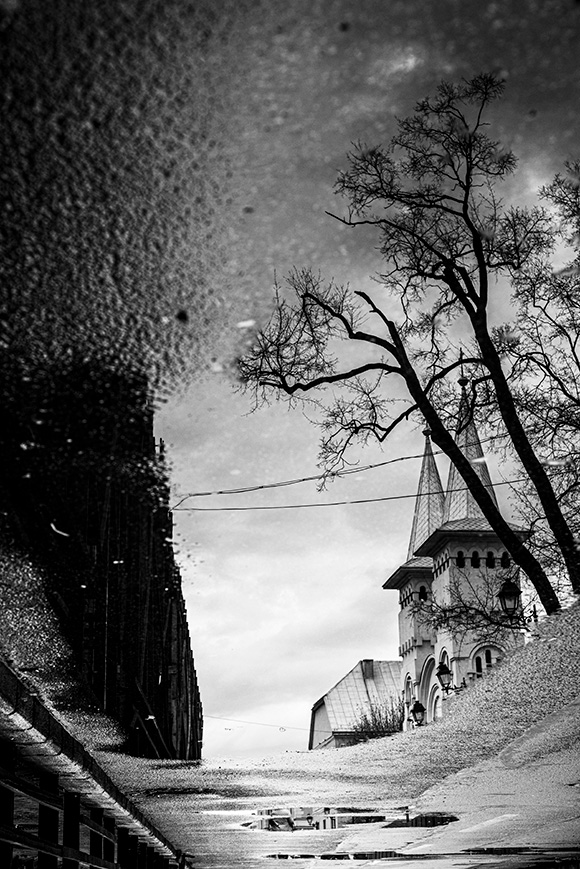
Hi Arne, thank you for the suggestion. I'll try it |
Jan 28th |
| 36 |
Jan 23 |
Comment |
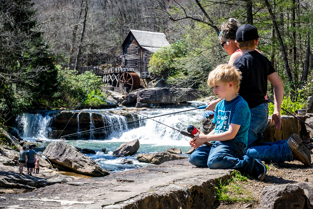
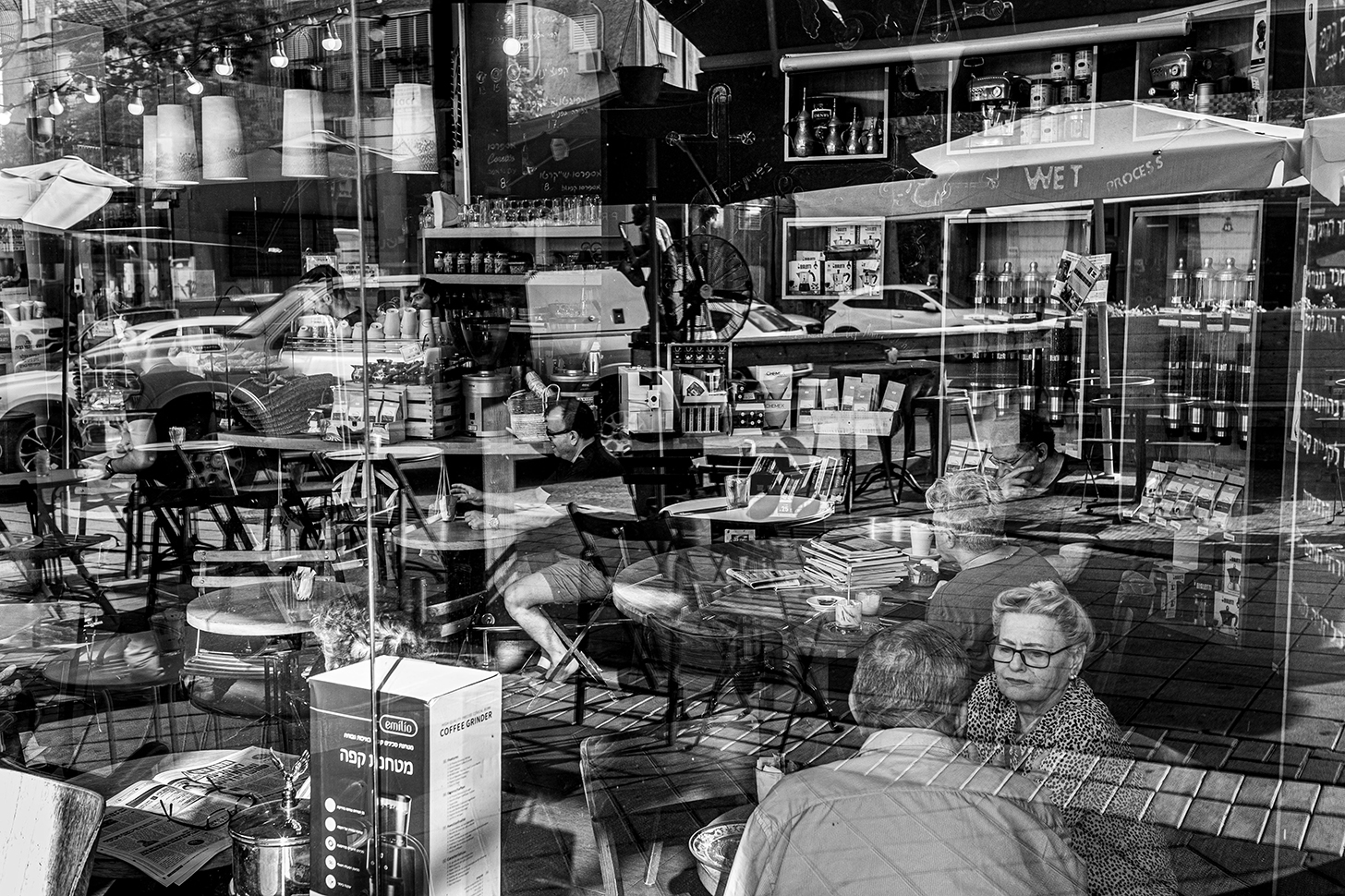
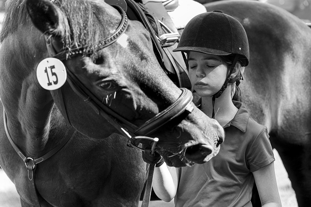
You are correct about the coffee machine. The blurred people tells of the short duration of the happening.
In my view there are 3 different stories in the picture |
Jan 14th |
| 36 |
Jan 23 |
Comment |
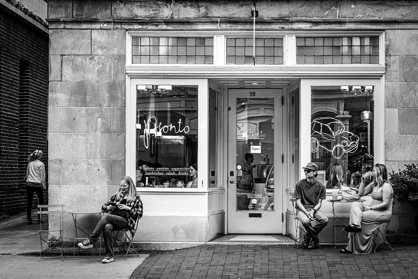
Thank you. I was trying to keep away from the trash bins on the left and the hydrant on the right. Not too much place for setting up in st. Photography as you well know. Thanks again |
Jan 9th |
| 36 |
Jan 23 |
Reply |
Thank you Larry ! it is much appreciated |
Jan 8th |
| 36 |
Jan 23 |
Comment |
Bill,the editing looks very natural and fits the picture. Well done!
The composition is correct and the exposure accurately. |
Jan 7th |
| 36 |
Jan 23 |
Comment |
While the picture is nice and the framing is interesting the post editing gives it an un natural look. I'm guessing you reduced the clarify or texture to negative values ? |
Jan 7th |
| 36 |
Jan 23 |
Comment |
Clarity and black are 2 separate sliders.Try it. |
Jan 6th |
| 36 |
Jan 23 |
Comment |
Michael, As I'm writing these lines I am in the OBX taking dune pictures. All in all this is a good picture and tells the story. However, I do have 2 thoughts:
1. There are too many elements in the picture the sand in front, the wooden pickets, the dune, the grass, the flying sand and the houses. One way is to reduce the clarity slider. Another is to break the composition into 2 pictures or use a complete open aperture reducing depth of field to the attention point only.
2. Add more black |
Jan 6th |
| 36 |
Jan 23 |
Comment |
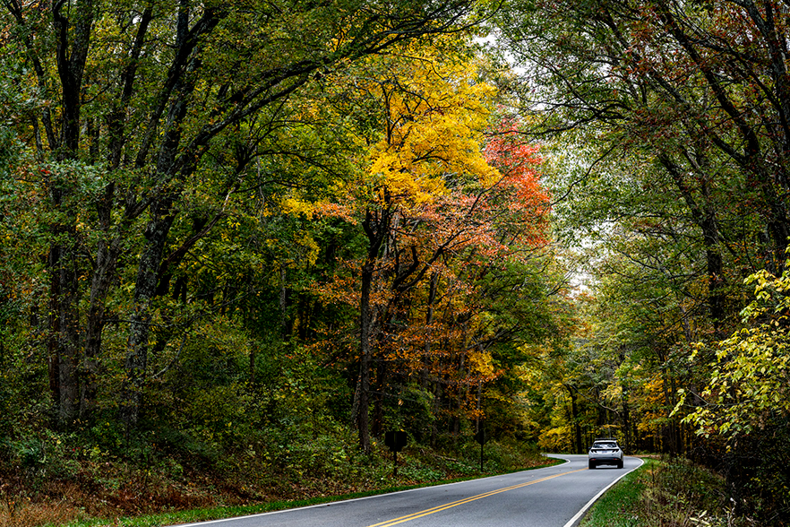
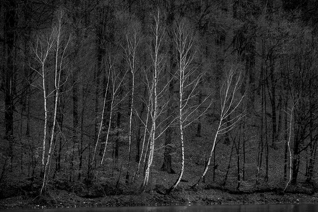
I like the moody feeling of the picture it sits well with autumn colors. Perhaps a longer focal length (105mm) would have given it a more "compressed composition" potentially cutting away the upper left bright corner. |
Jan 6th |
| 36 |
Jan 23 |
Comment |
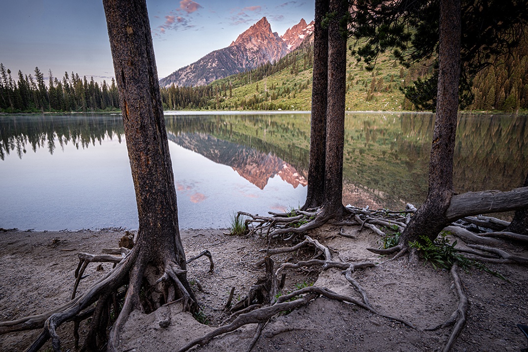
I like it. Indeed the green color is very beautiful. while i do agree with Michael I wonder if the choice of time in the day is best, perhaps early morning or late evening would have reduced the green saturation. |
Jan 6th |
| 36 |
Jan 23 |
Comment |
This is a picture with very vivid colors. The Blue, Purple and pink all complement each other and match well with the the different textures. Perhaps +1/3EV exposure would have opened up more the floor for more detail. |
Jan 6th |
| 36 |
Jan 23 |
Comment |
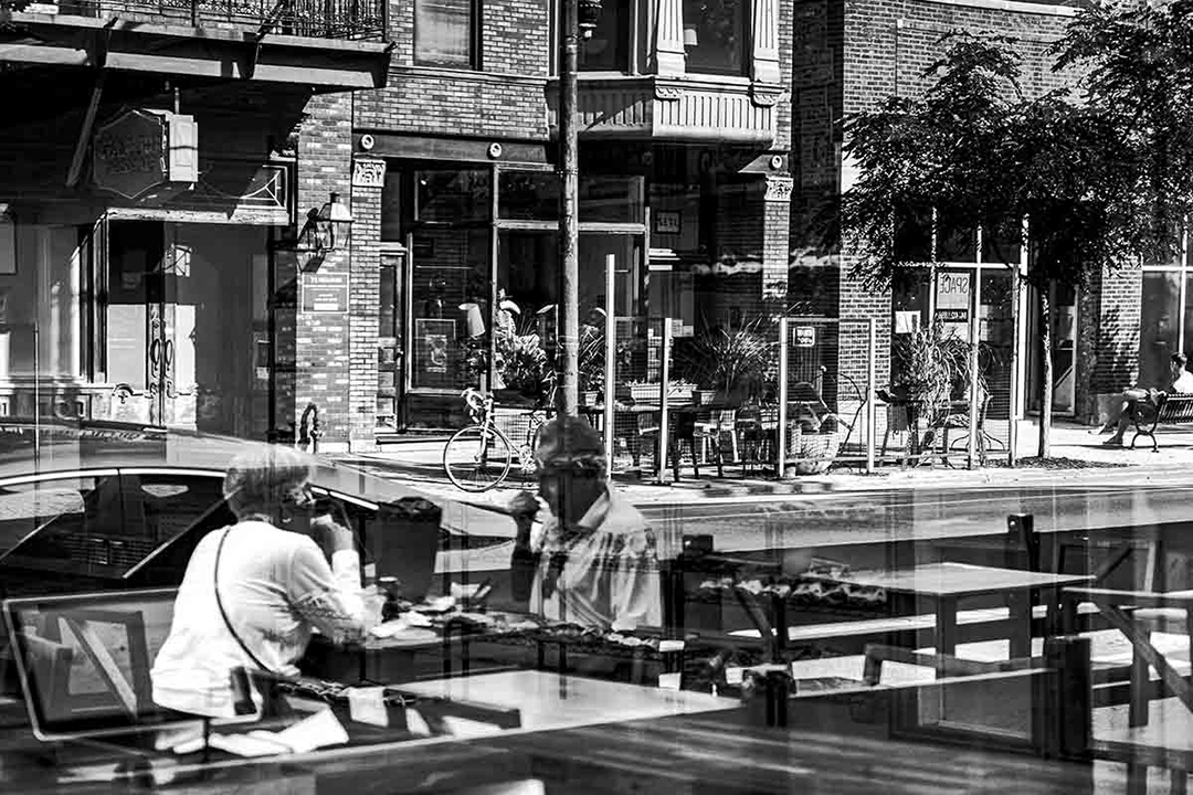
Michael and Larry,
Thank you for the feedback.
Shutter 1/12"
Softness- I reduced mistakenly the image to 99kb - way too low for submission. The original is SHARP.
I did try a portrait ver of the scene but it is too isolated and removed all the " street photo" elemnts
|
Jan 5th |
11 comments - 1 reply for Group 36
|
| 83 |
Jan 23 |
Comment |
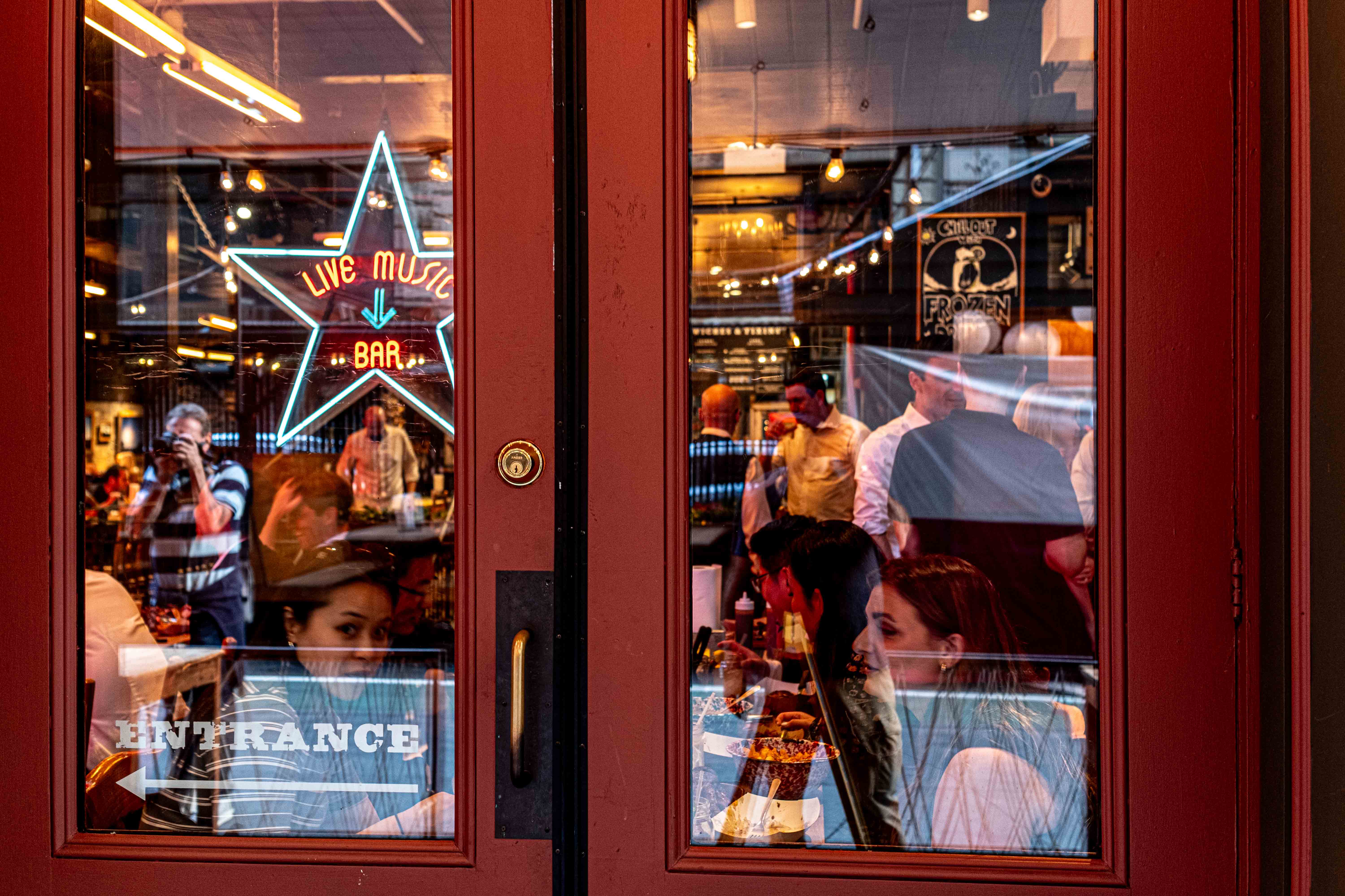
Thanks Jon. Glad you like it. As you can see in the comments above - many different ways to skin the cat and each person likes something else. It seems that most like it better without the third person. which makes think - a good choice i added him !
|
Jan 8th |
| 83 |
Jan 23 |
Reply |
Jon, in my view it is crucial to create your own photographic language. A key mile stone is coming to terms with yourself about what is allowed and what is not. Then to keep it strictly. Just as in marriage driving and family. If it is not allowed to drive on the left side then it is never allowed. If it is not allowed to skip school a few times a week then you must show up. Photography is the same. It is the COMMITMENT you take. In my photography - there is only 2/3 crop. Whatever your rules are - that's fine as long as you stick to them. |
Jan 8th |
| 83 |
Jan 23 |
Reply |
In my view this ver. is much better. 2 reasons:
1. There is a clear subject
2. The image is much more balanced. The people between the rocks balance out the "weight" while the people in front of the big rock put all the weight in 1 point.
well done.
try more contrast |
Jan 6th |
| 83 |
Jan 23 |
Comment |
Margaret,
looking at this picture 2 things come in mind:
1. This is as close as it gets to a perfect portrait.
2. The famous picture of Steve McCurry in his famous portrait of the Afghan girl.
My only comment is the fabric is too close to the pupil of the eye. Perhaps 1" away. Well done !
|
Jan 6th |
| 83 |
Jan 23 |
Comment |
Lance, this is a very interesting picture. The textures are good. Im not so sure about the crop. Is that a line you keep all along or specifically for this image ? I would love to see it in B&W too. It reminds more of the experiment of Andre kertesz in his early stages than a "typical" Japanese ( if there is such ? or perhaps i simply refer to a very clean minimalistic line) |
Jan 6th |
| 83 |
Jan 23 |
Comment |
The crop is good, the subject is placed nicely, this is a good picture in my view. More so, the low contrast gives it a vintage looks that goes along with it very well. |
Jan 6th |
| 83 |
Jan 23 |
Comment |
Jon, this is a keeper. i love the different textures and the the way all is balancing to a center point. Is the same crop proportions as your other images ? |
Jan 6th |
| 83 |
Jan 23 |
Comment |
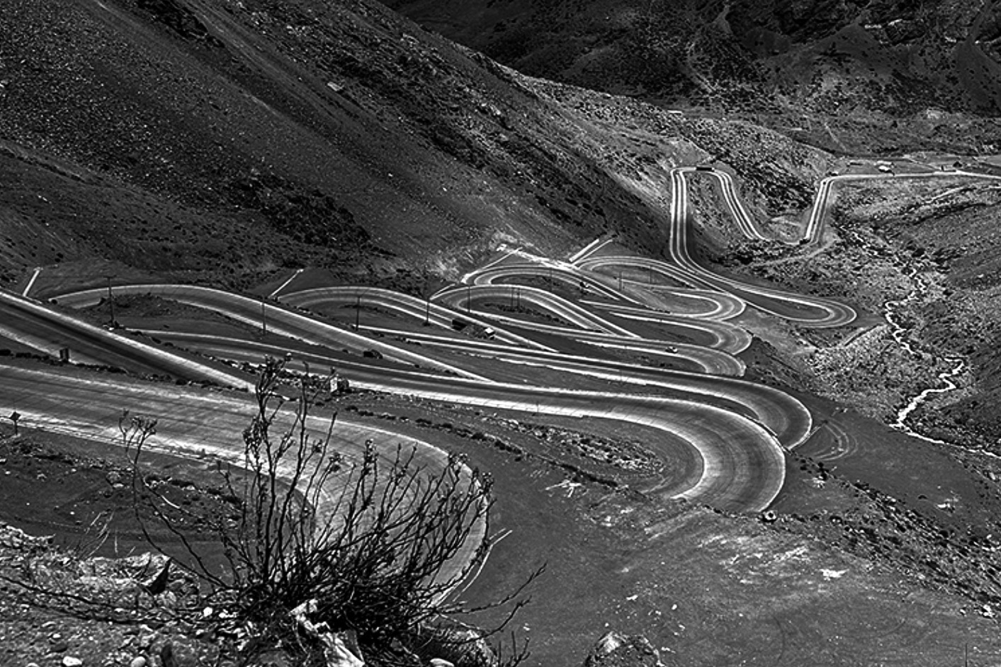
My friend, all i all this is a good picture. It is about 2 things: 1- the turns 2- the contrast between the road and the ground. In other words - less. See proposed crop |
Jan 6th |
 |
| 83 |
Jan 23 |
Comment |
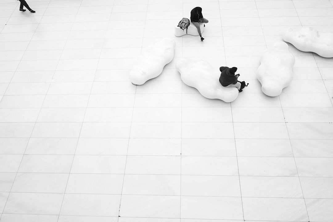
In my view this pic has all the potential to be an amazing picture. It is good but in my view 2 things to consider:
1- the position of the people is either too much to the right or can be eliminated completely. 2- the contrast as presented is too low and the dynamic range is not wide enough (can be fixed ). |
Jan 6th |
| 83 |
Jan 23 |
Comment |
Lance, your comment is inspiring. Thank you. As for the lines I did place the camera to line up with the the tiles. however
As you well know there are 2 factors to consider : parallax (x-y axis) and diagonal lines when the camera is offset to the left in respect to the subjects below. the position of the camera was the best compromise of the 2. I do agree that this has a great impact over the image perhaps even bigger than the legs and big negative space. |
Jan 6th |
| 83 |
Jan 23 |
Comment |
I like it too however I keep strict rule about cropping- the cropped image should keep the same proportion 2 by 3. |
Jan 6th |
| 83 |
Jan 23 |
Comment |
Mike,
I think cutting out the white negative space with the legs on the left side, did create a better crop than originally intended! |
Jan 5th |
| 83 |
Jan 23 |
Reply |
Hi Mark,
please do Not hesitate to criticise as long as the conversation is in good spirit.
I do encourage you to do a little experiment:
download the pic. save it. keep it in 2 ver.
a- with the legs b- clone out the legs.
show the pic to 3 people and ask which ver they like better.
share your results :) |
Jan 5th |
10 comments - 3 replies for Group 83
|
21 comments - 4 replies Total
|