|
| Group |
Round |
C/R |
Comment |
Date |
Image |
| 58 |
Feb 26 |
Reply |
Hi Bruce,
thank you very much for the time you took to comment on my image. I much appreciated.
Kind regards
Michele |
Feb 26th |
| 58 |
Feb 26 |
Comment |
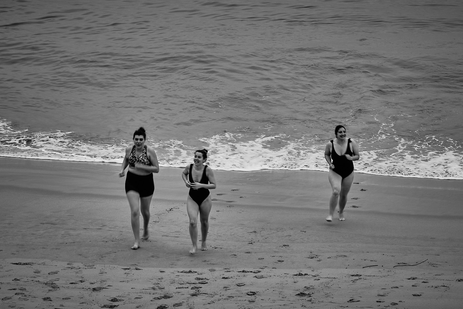
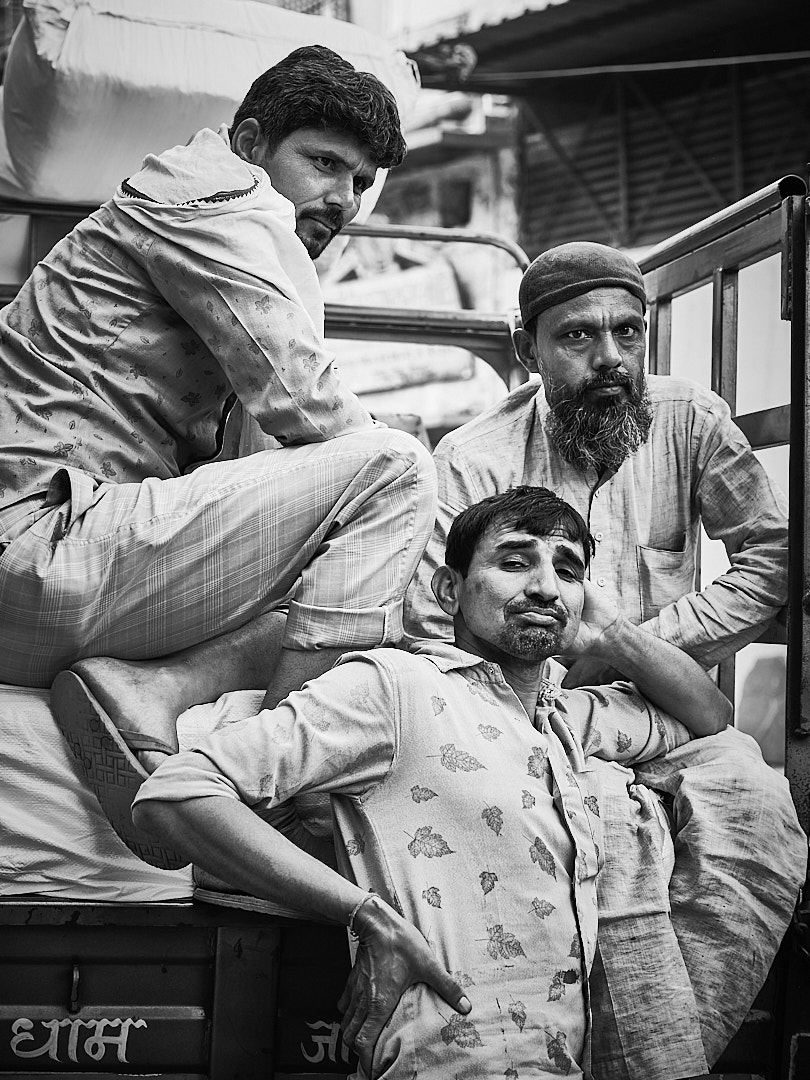
Stephen, I agree with Bruce and Isaac, if the purpose of this image was to show the expression of the people (that I agree are just fascinating), then I think the composition doesn't work. With the exception of the lady in the foreground, all other subjects are on the right margin of the image. Honestly, if you were not telling the story and the purpose of this image, my eyes would be attracted only by the cars.
Just my 2 cents thoughts
Best wishes
Michele |
Feb 26th |
| 58 |
Feb 26 |
Reply |
Stephen, I also think the first crop is better
best wishes
Michele |
Feb 26th |
| 58 |
Feb 26 |
Reply |
Isaac, I agree this is a candid image and we need to cope with what we have. I still believe however, the sign is taking away from the subject. Maybe because is so bright? It is possible that a black and white version would eliminate the distraction.
Just my 2 cents thoughts.
Michele |
Feb 26th |
| 58 |
Feb 26 |
Reply |
thank you Stephen for taking your time to comment on my image. Obviously the framing of the two individuals within the design of the wall mosaic was just luck...
best
Michele
|
Feb 5th |
| 58 |
Feb 26 |
Comment |
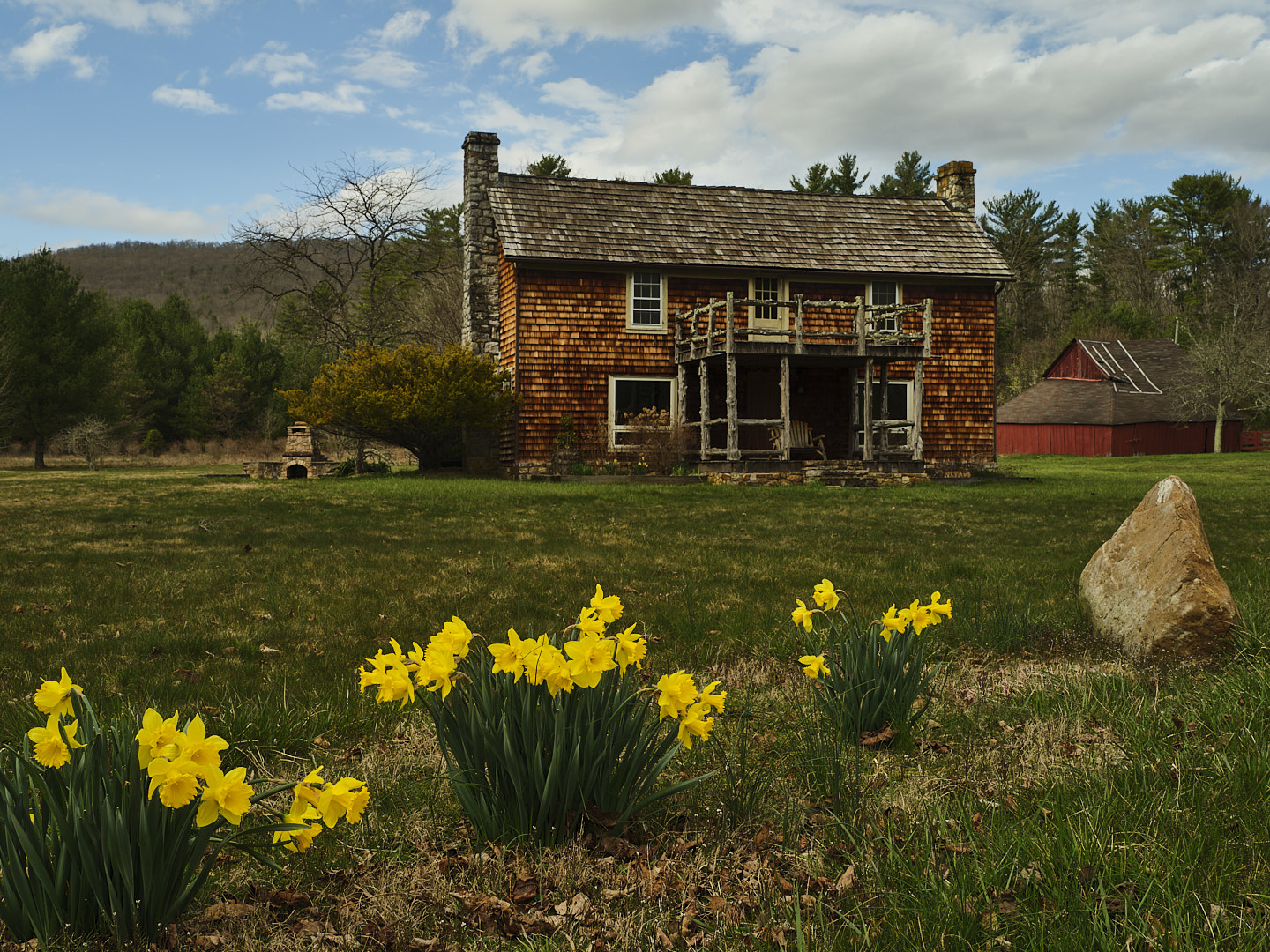
Bev, Kerry and Isaac, thank you for your kind comments and for sharing your thoughts on my image. I much appreciated.
best wishes
Michele |
Feb 4th |
| 58 |
Feb 26 |
Comment |
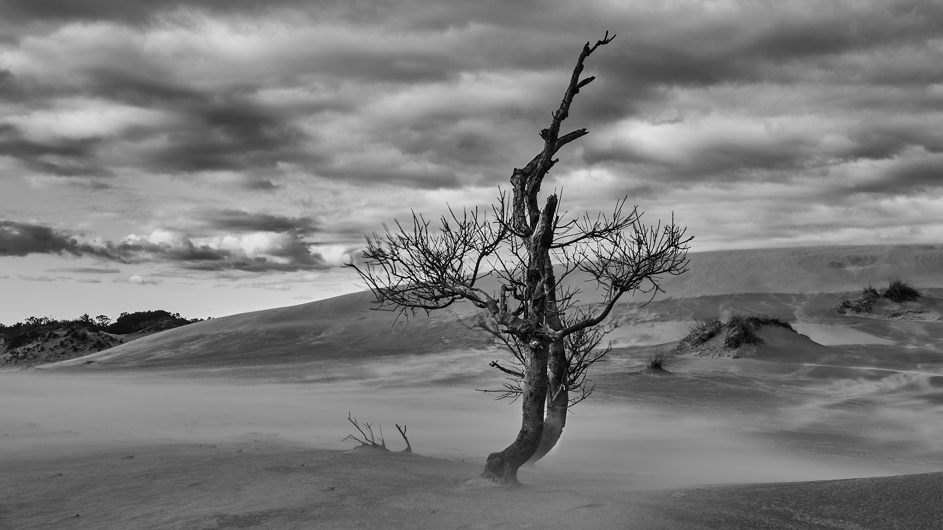
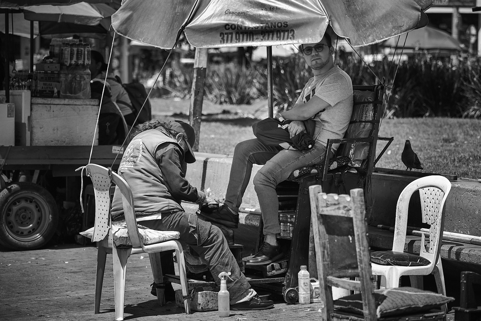
Kerry, I really like this image. To me the key point is that you crouched so that you were at the same level of the subject. It you would have stand the angle of this image would have suggested dominance on this man. The choice of going monochrome here is just perfect to me. It takes away all distractions and let us to focus on the man and his concentration.
Best wishes
Michele |
Feb 4th |
| 58 |
Feb 26 |
Comment |
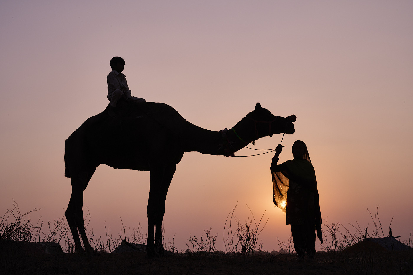
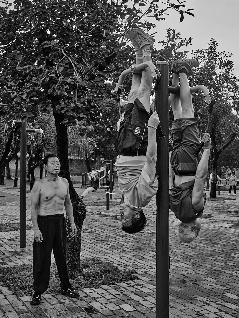
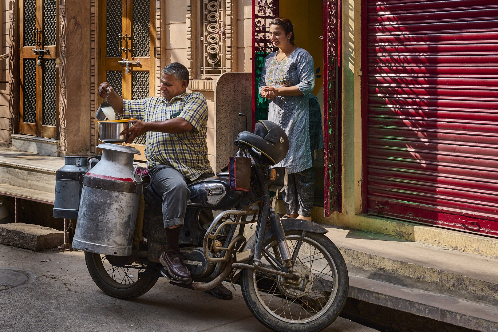
Bruce, indeed people in Rajastan are happy to be photographed. I have been there in 2022 and scenery like this one happened every corner. I think your image is well composed and I agree with Isaac that having other people doing their own business while he was "posing" for you tells the story.
Best wishes
Michele |
Feb 4th |
| 58 |
Feb 26 |
Comment |
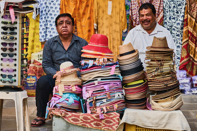
Bev, I agree with Kerry's comment. I really like the way you captured the chef. The image tells the story of how much attention is paying in doing his work. However, the head in the left bottom corner creates a distraction. I am curious to see the image without it.
best wishes
Michele
|
Feb 4th |
| 58 |
Feb 26 |
Comment |
Isaac, I would agree with Bev and Kerry, the image is telling the story but the very colorful sign on the right really create a lot of distraction since it is the brighter part of the image. The guy is just spectacular with a dress like in a Hollywood movie of the 60s contrasting with the colorful boots. The image is sharp.
best wishes
Michele |
Feb 4th |
6 comments - 4 replies for Group 58
|
| 71 |
Feb 26 |
Reply |
Thank you Dennis, for taking the time to comment on this image. Much appreciated.
Best wishes
Michele |
Feb 26th |
| 71 |
Feb 26 |
Reply |
I think the revised image is better.
Michele |
Feb 26th |
| 71 |
Feb 26 |
Reply |
thank you Tom, I agree with you
Best
Michele |
Feb 19th |
| 71 |
Feb 26 |
Comment |
Hi All,
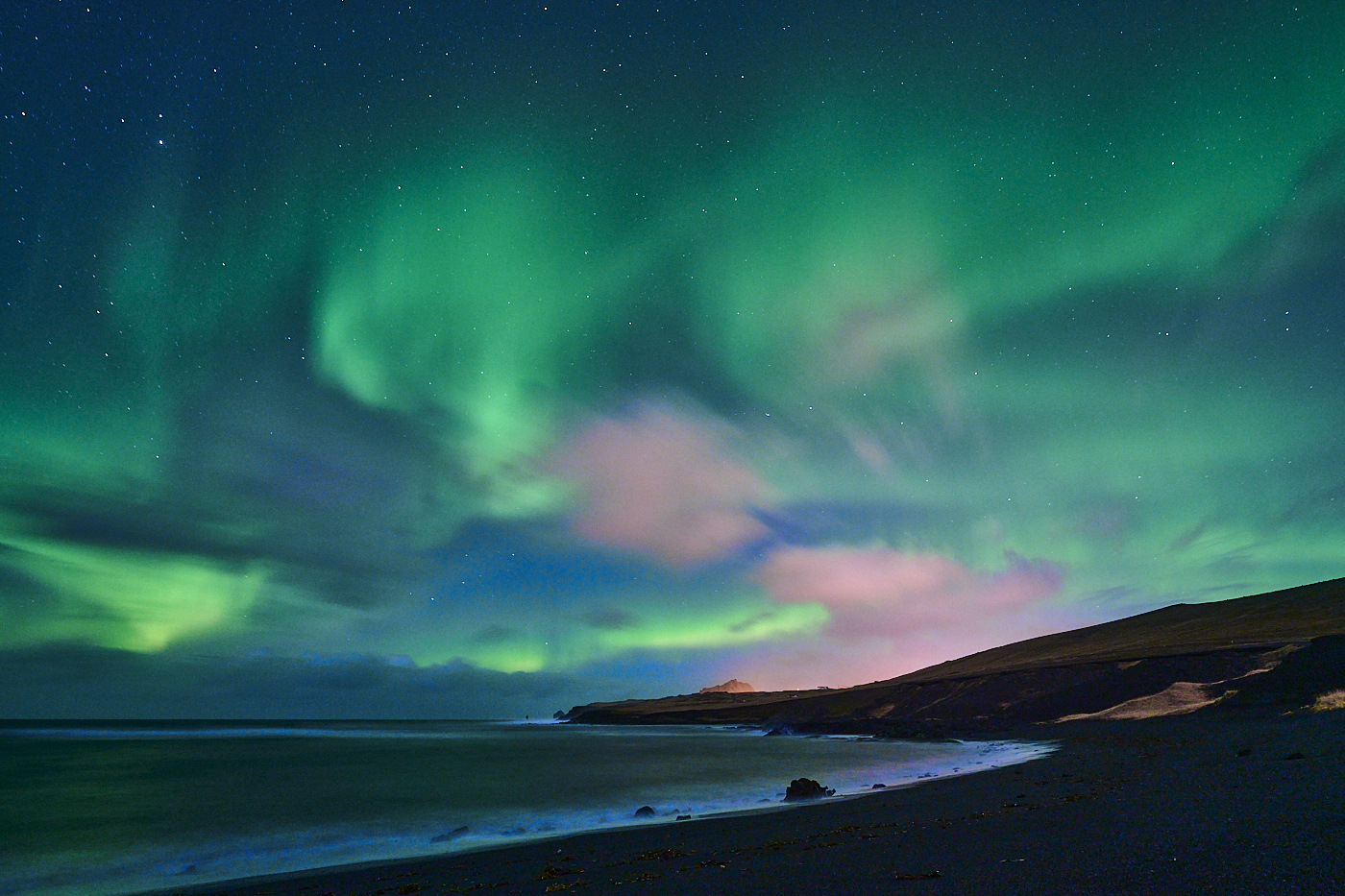
thank you for your suggestions. I am posting a revised image with the sky brightness toned down. Let it me to know what do you think
Best
Michele |
Feb 17th |
 |
| 71 |
Feb 26 |
Reply |
thank you John for your suggestions. Well taken
best
Michele |
Feb 10th |
| 71 |
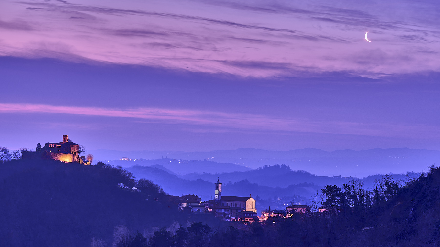
Feb 26 |
Comment |
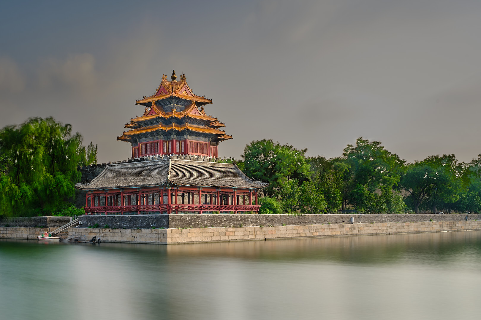
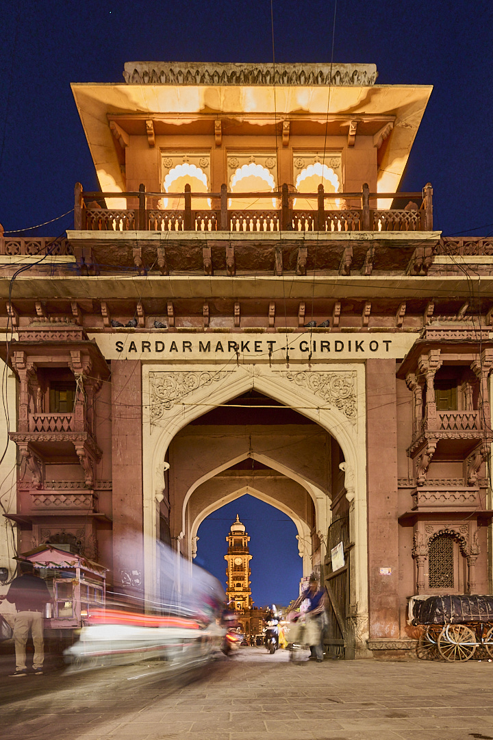
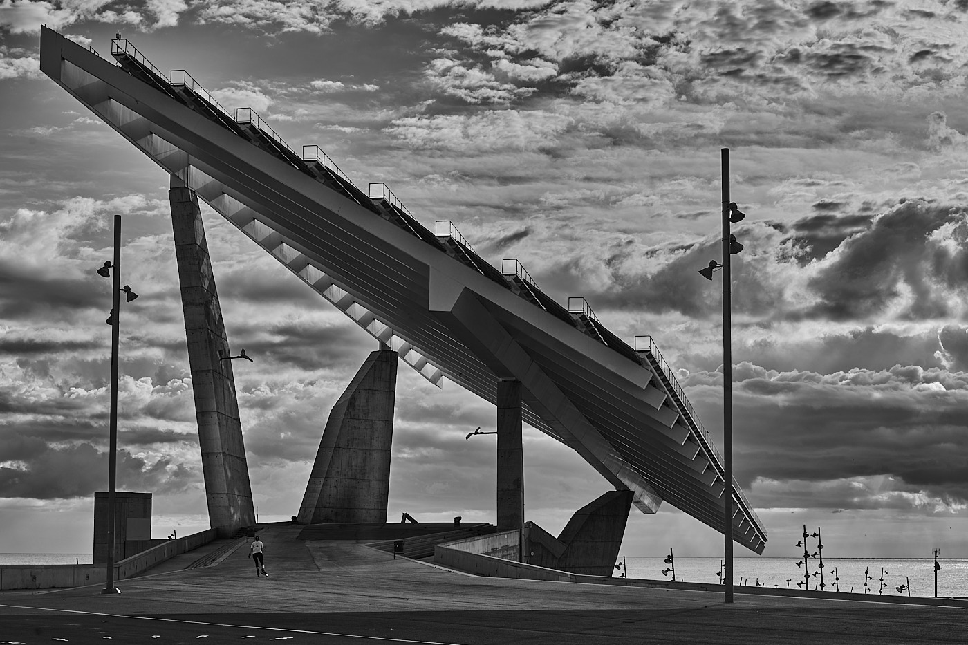
Mike I agree with Nigel and Tom about the composition of this image. The tower is the standing out and to me is the real subject of this image. I would have considered even a tighter crop of going to a vertical image taking away the opening that it just creates distraction.
best wishes
Michele
|
Feb 10th |
 |
| 71 |
Feb 26 |
Reply |
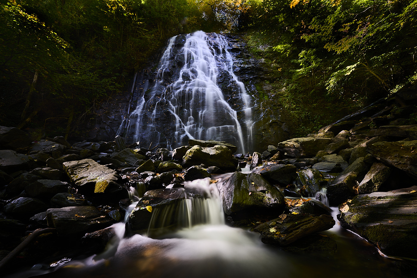
Thank you Tom, this is very detailed and kind analysis of my image. Only, the shutter speed was 60 sec and not 1/60 sec. This is the reason the water is smooth.
All the best
Michele |
Feb 6th |
| 71 |
Feb 26 |
Reply |
Thank you Nigel to your analysis of my image. Happy to read image reached the ultimate goal I was envisioned.
Best wishes
Michele |
Feb 6th |
| 71 |
Feb 26 |
Comment |
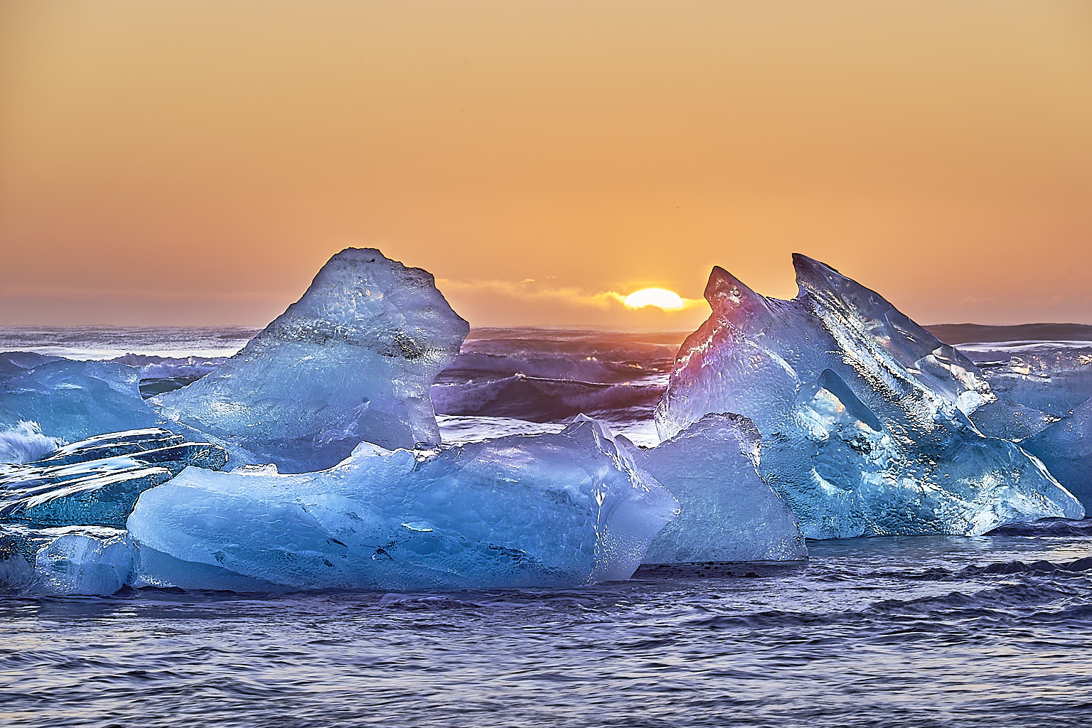
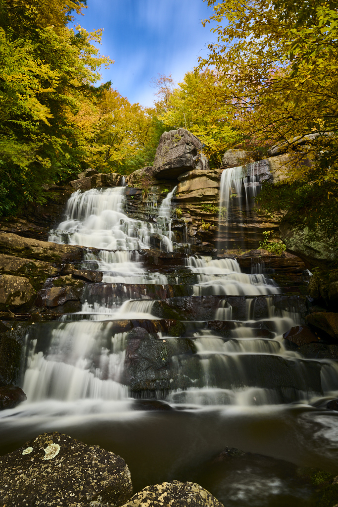
John, this is a very nice intimate landscape. I like the way the red tree almost frame the waterfall. Your shutter speed was appropriate to give the sense of motion of the water without being "unreal". The image is sharp and capture well the beauty of the scenery.
best wishes
Michele |
Feb 4th |
| 71 |
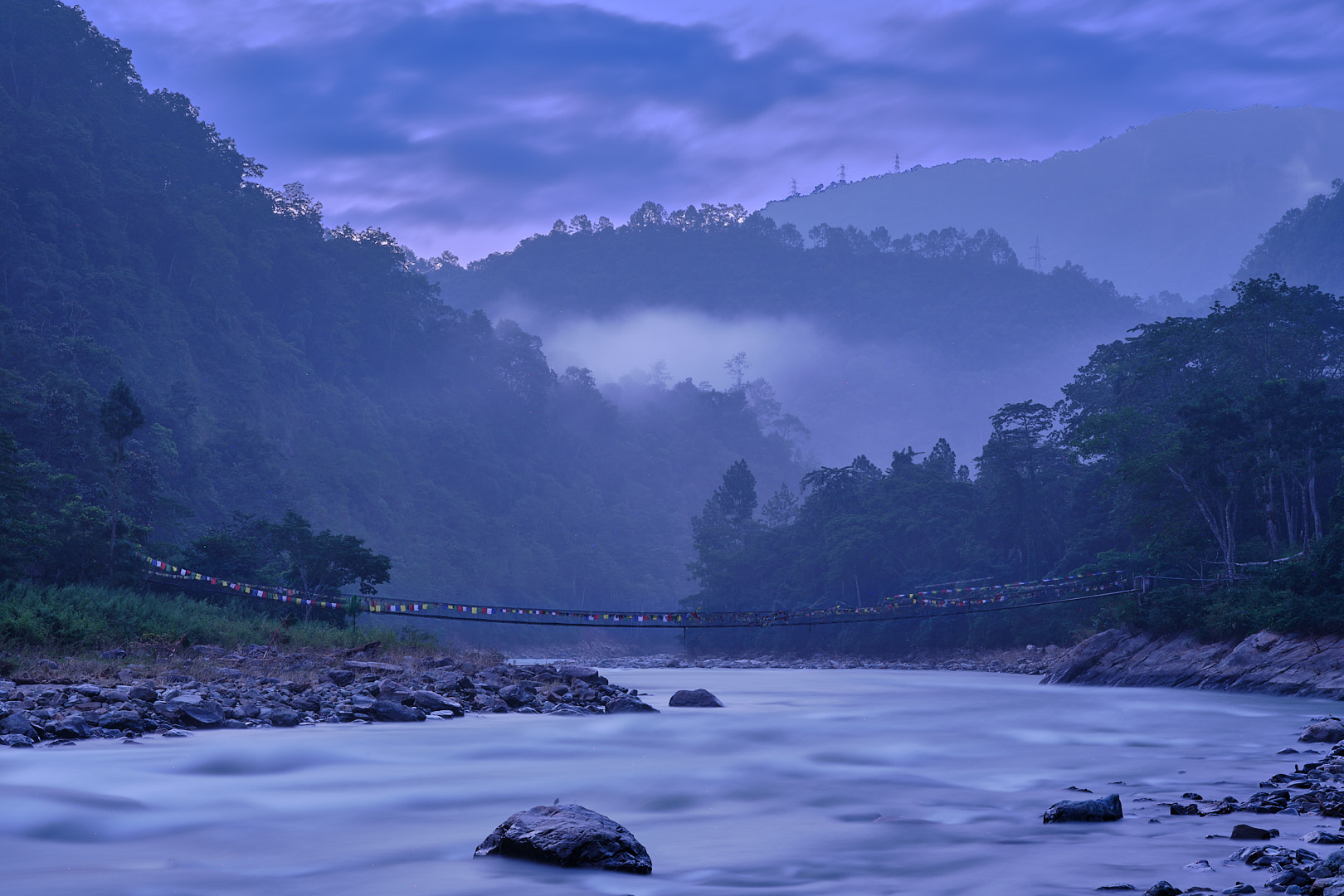
Feb 26 |
Comment |
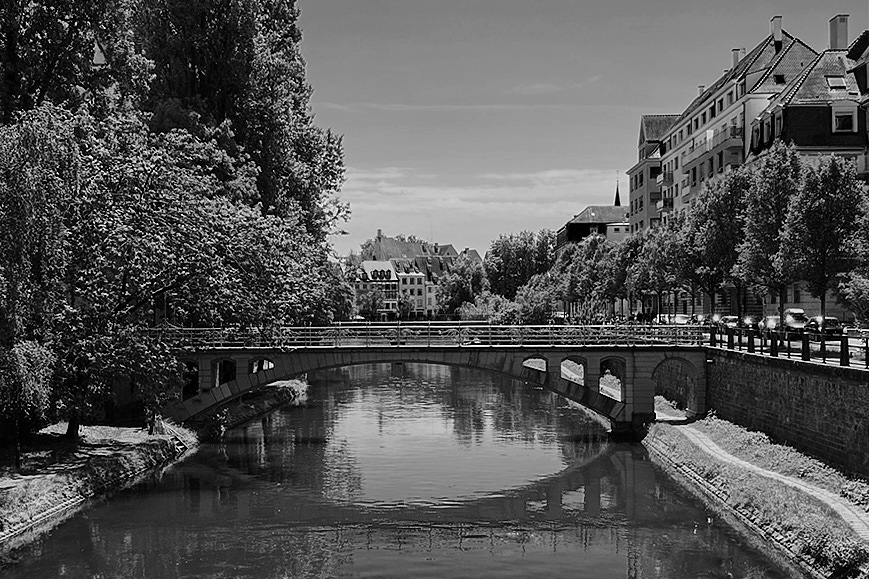
Nigel, I guess we all do that isn't it? Now, I think the first problem of this image is that it was taken midday likely with a very harsh light. Second, I am not sure what is the subject here I guess is the bridge. Now, if this is true the bridge is not very nice, it looks just an ordinary bridge with no character.
Saying that I consider your challenge and took your image and convert to black and white. I then did a crop to take away most of the empty sky. Played a little with the color slides and this is the final result...Not sure is any better but it was fun to play with!
Best wishes
Michele |
Feb 4th |
 |
| 71 |
Feb 26 |
Comment |
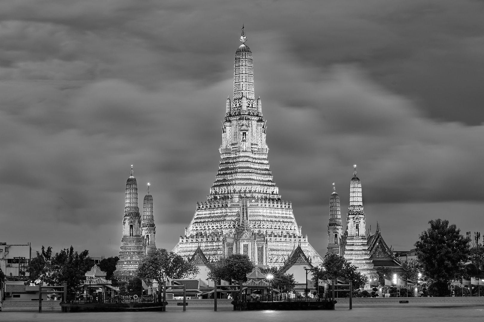
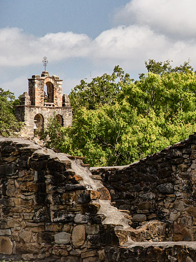
Dennis, this is a very nice monochrome documentary capture of this scenery. The image is sharp and it captures wells the architecture of this kind of buildings and fortifications that are commonly see in Asia. When I saw this image I thought it could Xi'an in China. I agree with Tom that this image does not convey (to me) the feeling of calmness and serendipity. To me walls and fortification suggest fight and war. But regardless, it is an excellent monochrome travel image.
Best wishes
Michele |
Feb 4th |
| 71 |
Feb 26 |
Comment |
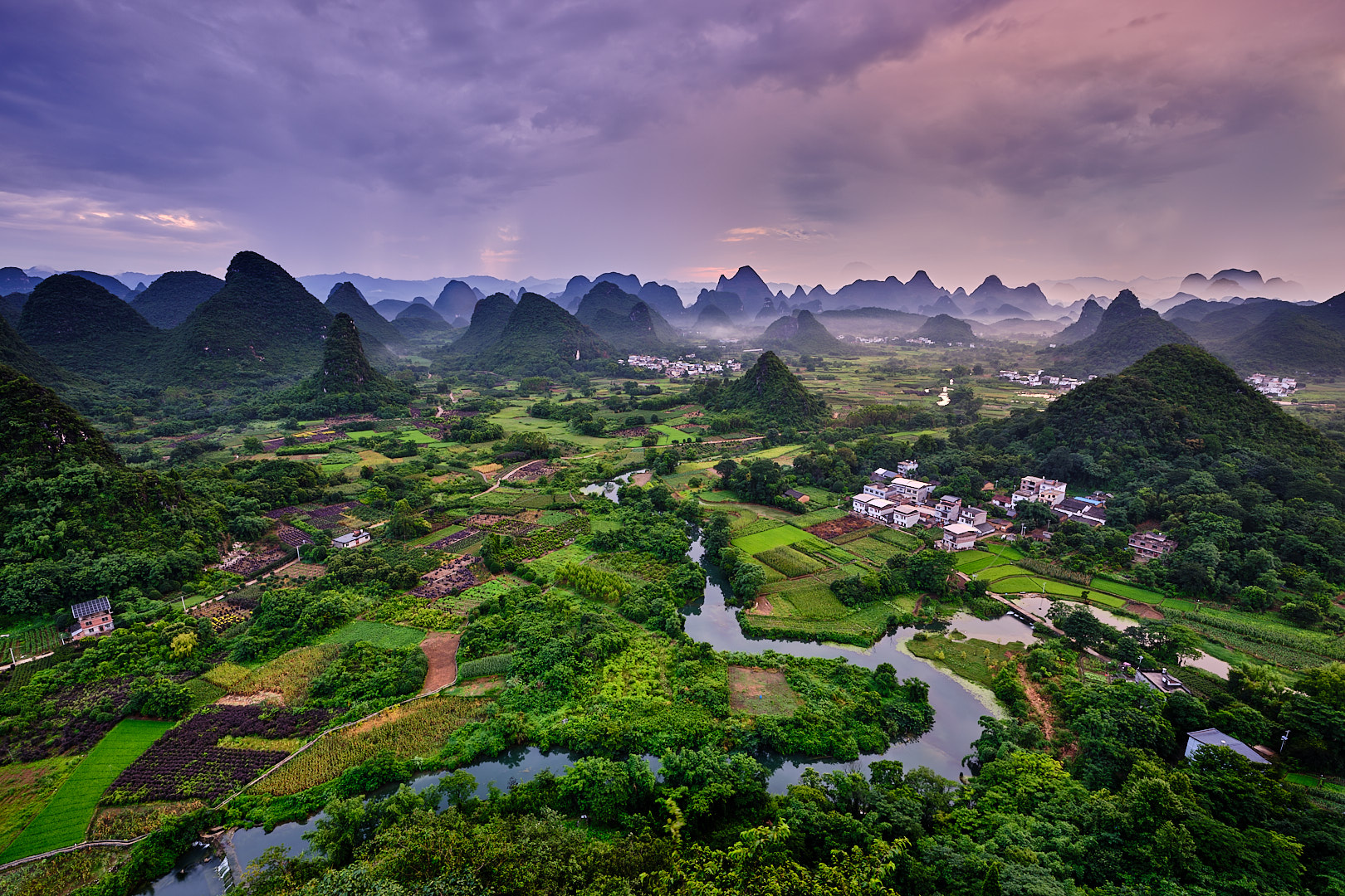
Tom, I'm glad Mike pointed out that another version of this image had already been posted previously. When I first saw your image, I did have a déjà vu feeling, but since my memory is now challenged by age, I thought it might just have been a feeling.
That said, I can definitely see the amount of work you put into this image. It now has a painterly quality. It's also clear that the sky is not real or has been heavily adjusted. I still believe the tall building on the left creates a distraction from the scenery. I think the image without it would help the viewer focus on the old city and the smog coming from the power plants.
Overall, I think the image has improved, but it now leans more toward an artistic interpretation of reality.
Best wishes
Michele |
Feb 4th |
6 comments - 6 replies for Group 71
|
12 comments - 10 replies Total
|