|
| Group |
Round |
C/R |
Comment |
Date |
Image |
| 71 |
Aug 25 |
Comment |
Hi Tom, thank you very much for your kind comment. I agree the boat and the access to the water can go...but, people that has been there would notice that this is a retouched image since every single picture on the web has the boat... so maybe the boat is now "part of the scenery?" (-:
best wishes
Michele |
Aug 17th |
| 71 |
Aug 25 |
Reply |
Thank you Spring,for your comment. I think the light at that time of the day and the color setting I use for my Fuji (Velvia) made the green that way. I like this old film simulation from Fuji and I am working on providing some consistency and "style" to my images.
best
Michele |
Aug 10th |
| 71 |
Aug 25 |
Reply |
I think John found a solution for your image. |
Aug 9th |
| 71 |
Aug 25 |
Reply |
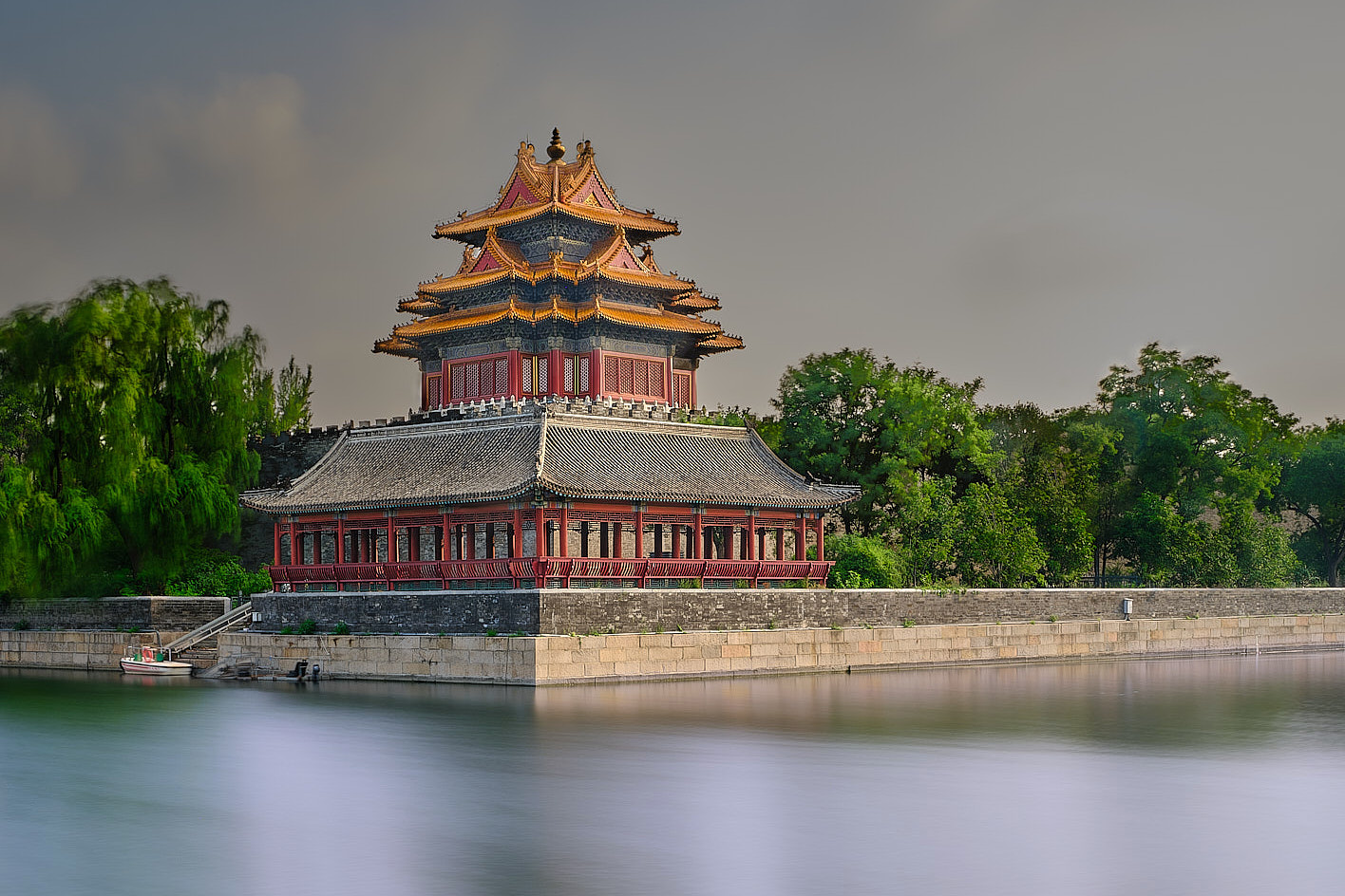
Thank you John, with the snow is very special. Beijing is a fascinating city indeed.
best wishes
Michele |
Aug 9th |
| 71 |
Aug 25 |
Reply |
thank you Dennis, for taking your time to write about my paper. Much appreciated. I still believe the original crop is working, because the water and the wall. However, I also like the second one.
best wishes
Michele |
Aug 8th |
| 71 |
Aug 25 |
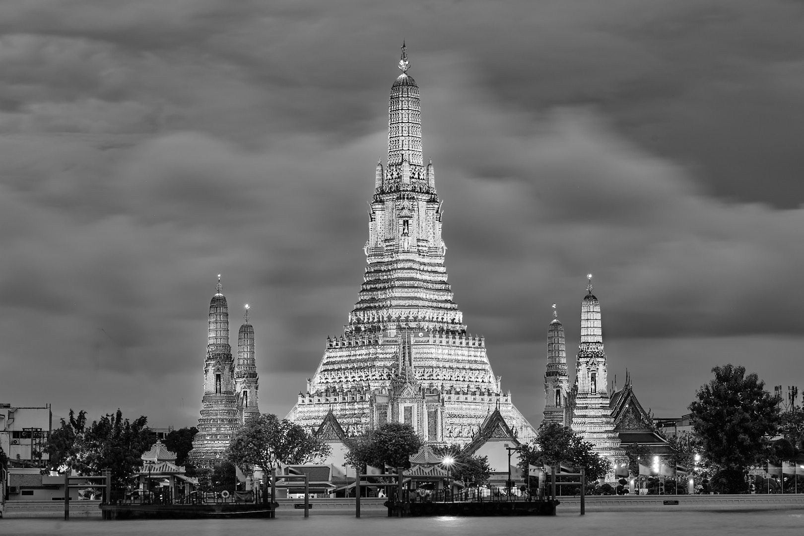
Comment |
John, as you mentioned this is a spectacular sunset, and you were lucky to be there at the right moment. I hope you printed this image and hanged on a wall, it definitively deserve it.
best
michele |
Aug 8th |
| 71 |
Aug 25 |
Comment |
Nigel this is a nice image that would get in the "travel" theme.I understand you did not want to create a "unnatural" light, but this is a very flat image with no contrast at all and color are muted. I like the smoke coming out from the chimney.
best
Michele |
Aug 8th |
| 71 |
Aug 25 |
Comment |
Mike this is a very nice scenery with the little bird showing they are eager to get food from the coming mother. As you mentioned the image is soft and the mother motion blurry mother creates distraction. At the end you capture a very nice moment regardless.
best
Michele |
Aug 8th |
| 71 |
Aug 25 |
Comment |
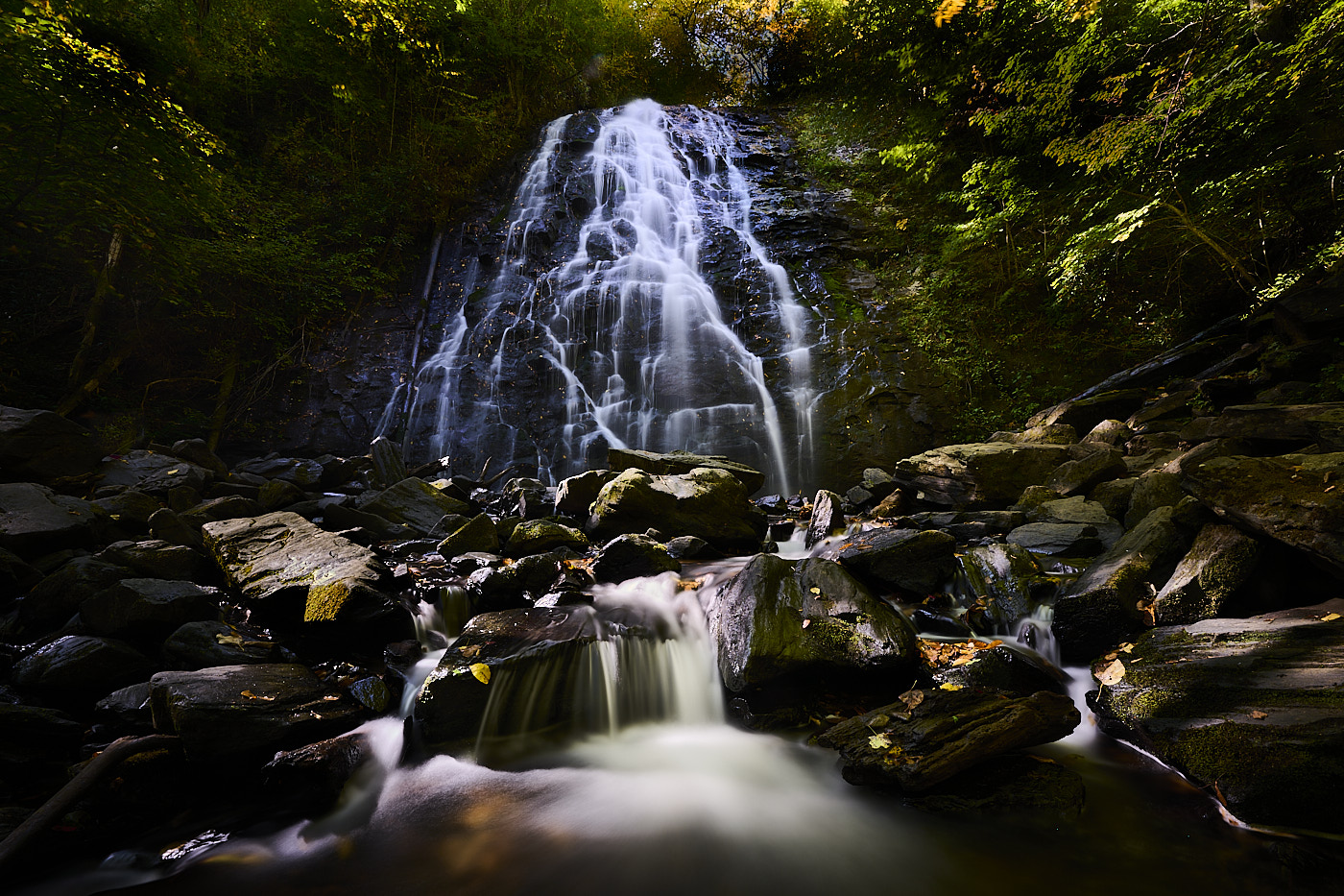
Spring this is a spectacular waterfall. I agree with others that the color saturation is maybe off. It is very difficult to photograph waterfall with this light condition. The white and bright water contrast a lot with the rest. Indeed, I think your highlight in the water are burned out. You can consider to turn them down. The use of polarize filter would also help to take away a lot of bright reflections in the water. I also think, but this is my perception, the horizon is not straight (I look at the line of the upper fall and is leaning to the left) but this could be easily corrected.
Best
Michele |
Aug 8th |
| 71 |
Aug 25 |
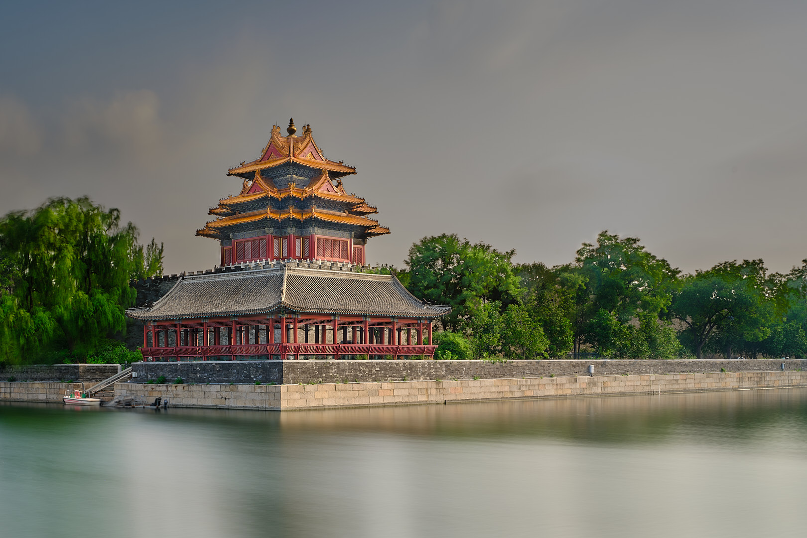
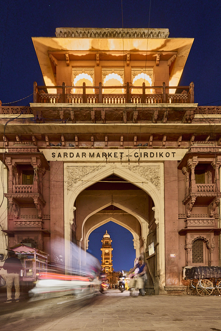
Comment |
Thank you Nigel and Mike for sharing your thoughts on the image. Mike, I cropped the image a little bit by keeping my ratio 2:3. There is now less water but I think the composition all together is better.
Nigel, I had conflicting thoughts regarding the black and white. I like it, but I still prefer the color one in this case because the tower is "colorful". I agree with your observation regarding the water. I have selected the water and correct the white balance and it looks better.
I am attaching the revised version. Let me know what do you think
best
Michele |
Aug 8th |
 |
| 71 |
Aug 25 |
Comment |
Hi Dennis, I think this is a very nice subject however your composition make it difficult to identify the cottage as the major point of interest. To me the big brown foreground is a little too much and the ducks are difficult to see because the same color. They both are distracting elements. The cottage is mostly hidden in the wood and the top is cut out as Nigel pointed out. The reflections are on the other hand well done. I think this is one of those scenery that look great when we are there, but are very difficult to capture in an image because there is "too much".
Best wishes
Michele |
Aug 8th |
| 71 |
Aug 25 |
Comment |
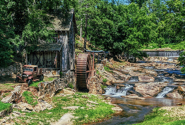
Hi Tom,
I agree with the others about the color and the composition. I like your revised image better, but it becomes almost square and I am not a big fan of square format. I took the liberty to download your image and makes some adjustments. Since the subject is the mill and the old truck, I think you can take away the sky and make the subject more clear. I also tone down saturation of colors.
Let me know what do you think
Best
Michele |
Aug 8th |
 |
8 comments - 4 replies for Group 71
|
| 92 |
Aug 25 |
Reply |
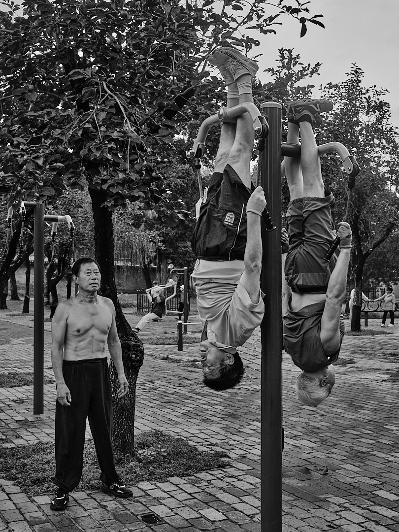
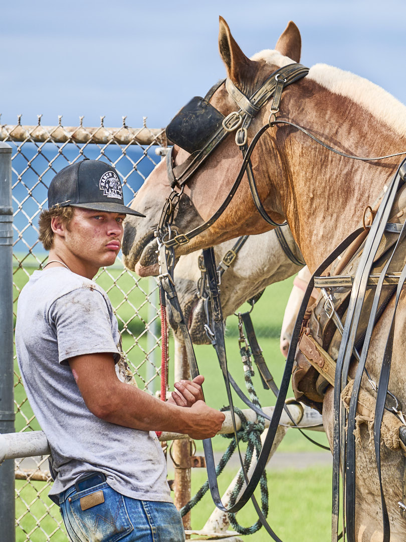
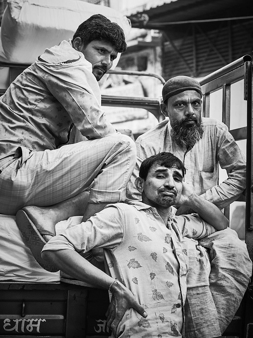
Hello Lou, thank you for sharing your thoughts. As you said sometime in street photography we don't have time. To me the white hat of the boy is an element that keep the boy the subject (together with the position in the frame). I think the only thing I could have done is going lower, but honestly I did not think about it at that time.
best
Michele |
Aug 19th |
| 92 |
Aug 25 |
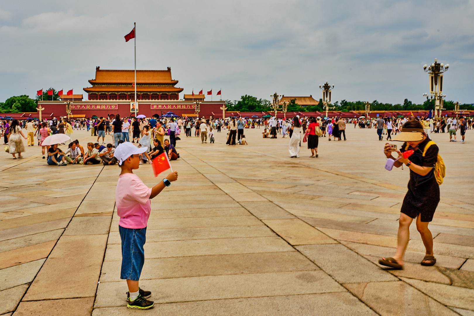
Comment |
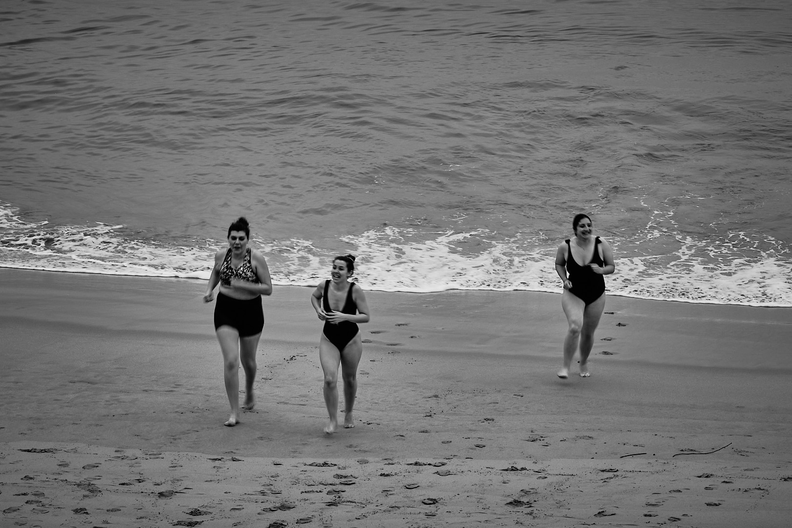
This is very nice documentary image it captures. It is clear for some the oldest participants the event is more emotional. Excellent composition and I agree the black and white fit this image better.
best
Michele |
Aug 11th |
| 92 |
Aug 25 |
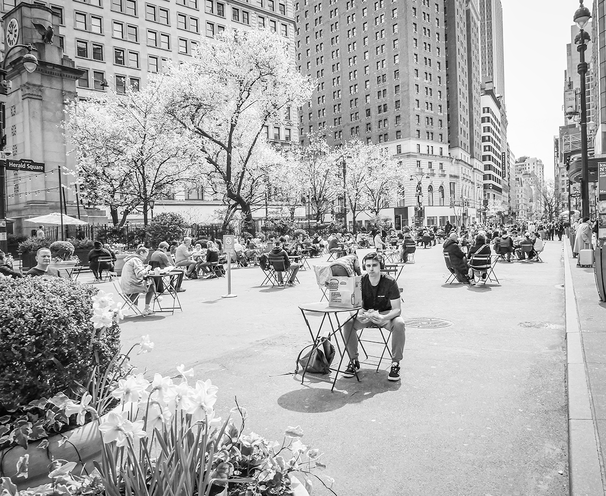
Comment |
Lou you captured a nice intimate moment in this image. I think this would work better in black and white, since the image is about the connection and the colors can create distraction.
best wishes
Michele |
Aug 8th |
2 comments - 1 reply for Group 92
|
10 comments - 5 replies Total
|