|
| Group |
Round |
C/R |
Comment |
Date |
Image |
| 71 |
Sep 24 |
Reply |
Hi Tom,
yes I think your crop is better. Good job removing the lady!
best
Michele |
Sep 18th |
| 71 |
Sep 24 |
Comment |
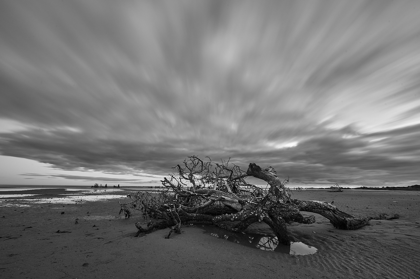
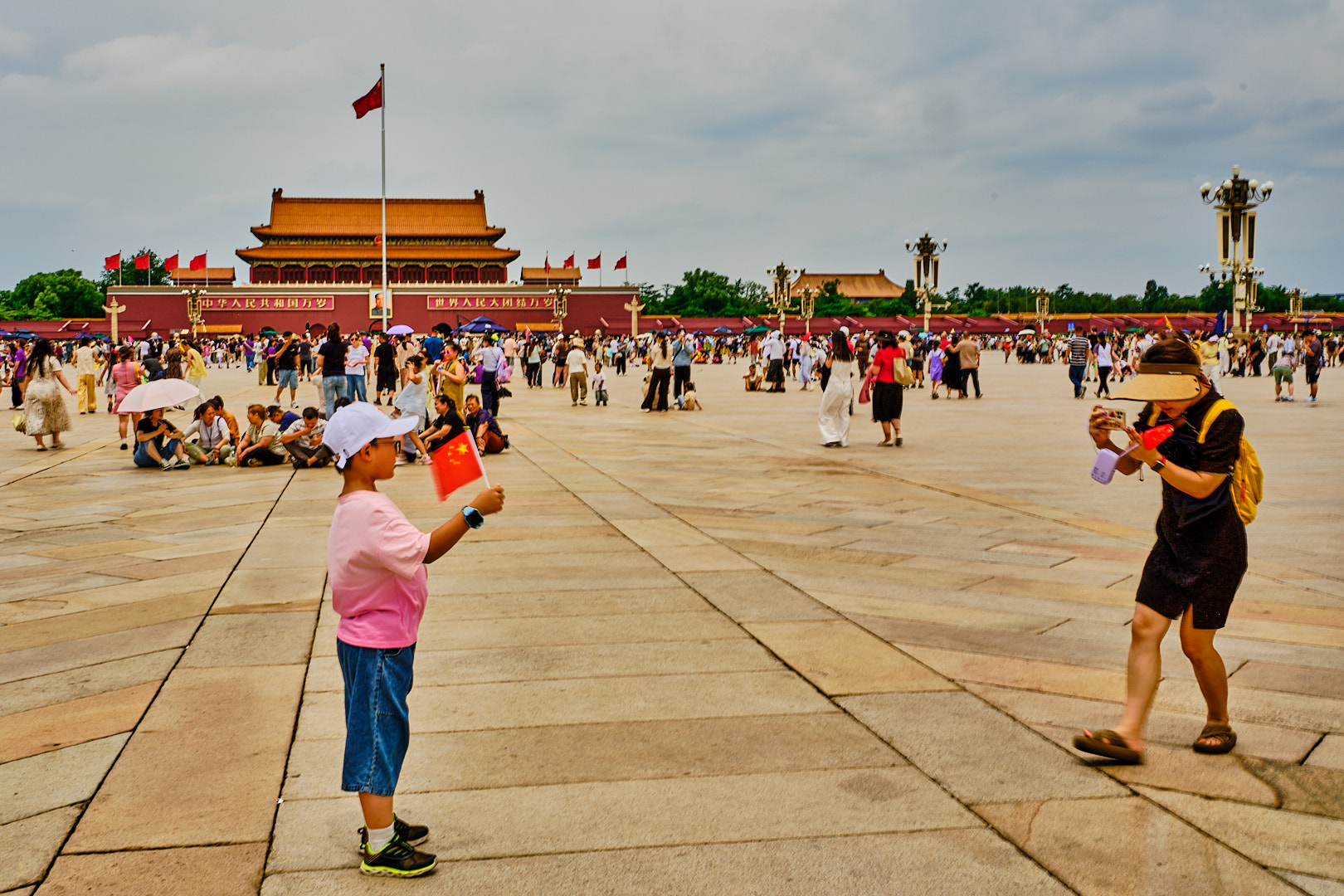
John, I think this is a spectacular view with beautiful light and color palette. I have only issue... the horizon is pretty much in the middle and this makes the observer unsure what you want them to see. In the final scenery of the Steven Spielberg "The Fabelmans" the young Spielberg meets with the famous film director John Ford who show him few images and instruct him to avoid to put the horizon in the middle because in his words "makes the image boring".
Best wishes
Michele |
Sep 16th |
| 71 |
Sep 24 |
Comment |
Nigel, can't add much more to what the others have already suggested. I guess that taking the image from very low position and looking up with a wide angle can help. Another thing this image has a very flat light. Maybe taking it very early in the morning or late in the evening could help. Finally during the night you could use a long exposure and take advantage of light from the cars to create some red lines.
Best
Michele |
Sep 16th |
| 71 |
Sep 24 |
Reply |
Guess this was a nightmare...
|
Sep 16th |
| 71 |
Sep 24 |
Comment |
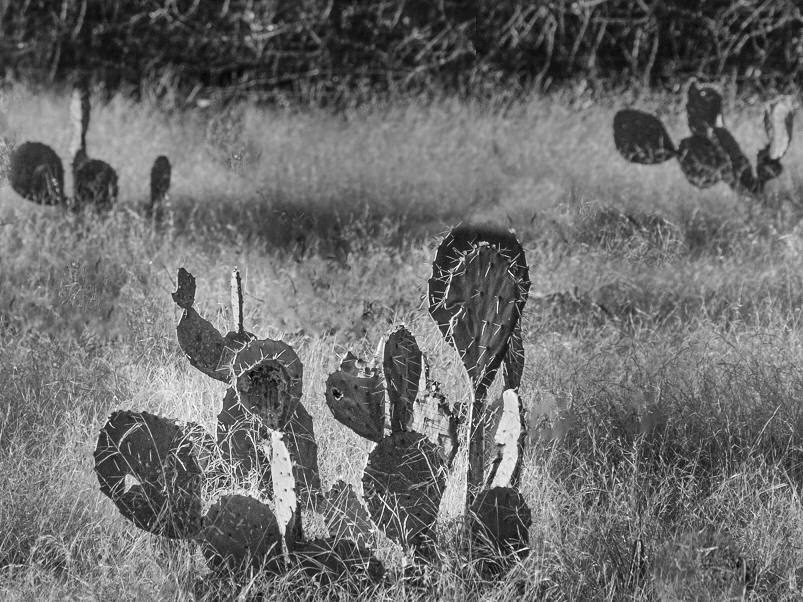
Mike,
I think this was a difficult scenery to capture. I look at your photo and my eye was wandering around. I think Tom's editing improve it. I also thought that maybe this could be better in monochrome. So I took the liberty to transform in monochrome. I also cloned out the cactus behind the main one because I think is competing with the main subject. More now we have 3 cactus and the rule of uneven is respected. I also cropped to 4:3 proportion. I applied a mask to make the cactus in the foreground to stand out more and burned some of the very bright grass so that again the main cactus becomes the main subject. Let me know what you think. |
Sep 16th |
 |
| 71 |
Sep 24 |
Reply |
Tom, this is very kind of you and I really appreciate you taking the time to comment on my image.
Best wishes
Michele |
Sep 16th |
| 71 |
Sep 24 |
Reply |
Than you John, happy you are planning to visit Italy and you like my image. Be aware that the usual touristic places can be now overcrowded and it can be challenge to find a good opportunity to take an image without somebody jumping in front of your camera for a selfie...
About the tonality, I tend to set my early morning photography with a white setting with some magenta/purple. I guess is a question of taste. On my screen doesn't look too much. But again is likely a personal taste.
best wishes
Michele |
Sep 16th |
| 71 |
Sep 24 |
Comment |
Srijan,
this is a spectacular place and you have captured it well. The image really makes me wish being able to travel there. Your composition to me is spot on. I know I am the voice out of chorus, but I find the color balance a little like "post card in the 70s", and I think there is a little bit tendency to magenta. I also find the image being a little soft, but this is possibly due to the low resolution of the file that can be posted here. You did not provide technical details about this image so it is difficult to understand if this is because the setting of the camera.
best wishes
Michele
|
Sep 16th |
| 71 |
Sep 24 |
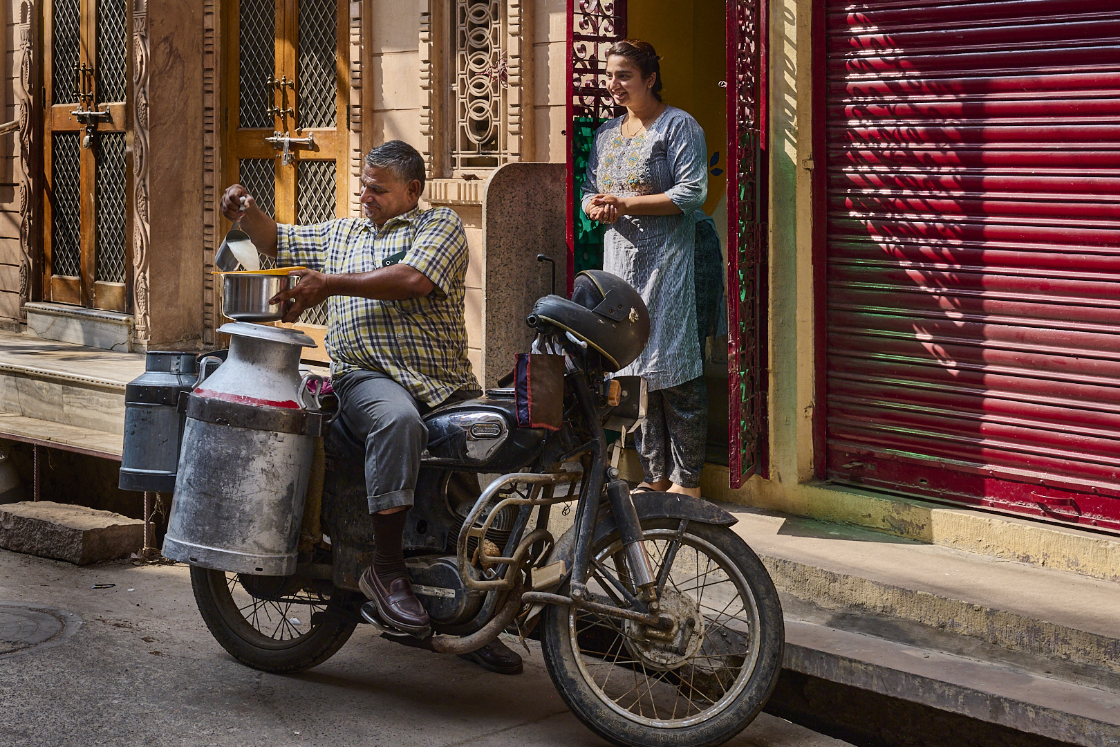
Comment |
Hi Tom,
I think this is very nice street image. As pointed by Mike the red clothes of your wife create a great contrast with the dominant white of the remaining scene. I also like the way the mannequin on her left looks like staring at her.I agree with Mike that the green post is distracting. I also think the woman walking in the scene is distracting. So I took the liberty to crop the image and roughly clone out the green post. I personally think the image is better, but this can be just my personal taste...
Best wishes
Michele |
Sep 16th |
 |
| 71 |
Sep 24 |
Reply |
Thank you Mike for taking the time to look and comment on my image. Much appreciated you sharing your thoughts.
Best wishes
Michele
|
Sep 4th |
6 comments - 5 replies for Group 71
|
| 92 |
Sep 24 |
Reply |
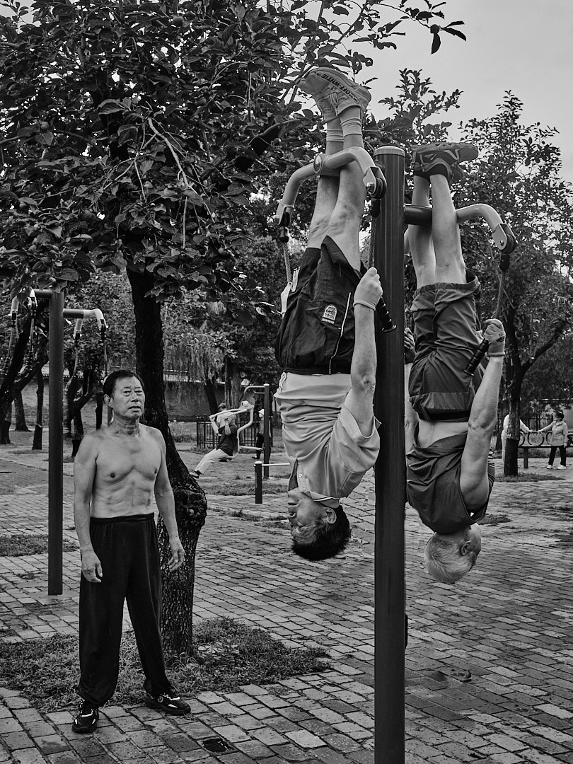
Chuck, thank you for taking the time to critique my photo. I much appreciate it. I am posting a revised version with a little bit more space over the head of the men and also with some dodging of the face (very limited). I think from the composition point of view it improves the image. However, I am not sure I understand your comment that having more space will improve to tell the story. To me is about the two men and just giving more space it does not change it. Also I understand you feel street photo should only be in black and white, but I humbling disagree with this. William Eggleston took pictures only in color, and other great contemporary street photographers have street photography projects in color. Luigi Ghirri one of the most recognized contemporary photographer took only picture in colors because he said "we see the world with color". IMHO some pictures are better in color and some in black and white. In this particular case I think the color is not distracting but is part of the scenery. Finally, I am not sure I can follow your comment on using ISO 200 and sharpness of the image. From my technical background ISO has nothing to do with sharpness. High ISO can increase the background noise but is not affecting sharpness that is affected by the lens quality, aperture and in the digital camera by the sensor. More, with current camera ISO 200 is considered a low one, indeed this image has not background noise at all. |
Sep 25th |
 |
| 92 |
Sep 24 |
Comment |
Susan and Lou,
I much appreciated your positive feedback on my image.Susan, I may agree that some more space at the top could have been better.
Thank you both
Michele |
Sep 25th |
| 92 |
Sep 24 |
Reply |
thank you Lou,
much appreciated
best wishes
Michele |
Sep 25th |
| 92 |
Sep 24 |
Comment |
Marianne also Congratulations for being featured in this month showcase. Wonderful work capturing the butterfly!
Michele |
Sep 18th |
| 92 |
Sep 24 |
Comment |
Marianne, as soon as I saw your picture I knew it was from the Van Gogh interactive exhibit. I think you have been very courageous to make this in monochrome. Vincent spent all his life to paint with colors experimenting and often struggling to find them because they were expensive and he was with no money.However, the final result is great because the subject now become the people experiencing this great exhibit.
best wishes
Michele |
Sep 17th |
| 92 |
Sep 24 |
Comment |
Susan, this is a very nice image and even before reading your story I could grasp well what is going on. The shallow depth of field help to keep the subject isolated from the noised background. Well done.
Best wishes
Michele |
Sep 17th |
| 92 |
Sep 24 |
Comment |
Cindy,
I think your idea was successful. The image is conveying a feeling of chaos.So if this was your goal you achieved it. However, I am not sure if the image is really effective. It is difficult to figure out what was the subject and maybe there is "too much" chaos...
best wishes
Michele |
Sep 17th |
| 92 |
Sep 24 |
Comment |
Lou this is a nice scenery and you captured it well. I think your idea of cropping the right side was a good one. The real focus of this image are the two people on the mope and the the couple holding hands. The right side of the image does not really add anything in my opinion. You have some crowd in the background regardless.
Just my two cents thought.
best
Michele |
Sep 17th |
| 92 |
Sep 24 |
Comment |
Chuck, this is an interesting image and I think the fact the hairdresser has the mouth open suggests she is having a conversation with your wife add to the story. I found the monitor on the right distracting. Maybe a different angle would have allowed you to get a cleaner shot. I personally prefer the color image the red shirt of the hairdresser creates a nice contrast with the rest of the image, and the eye goes directly there (making the monitor less distracting).
best wishes
Michele |
Sep 17th |
7 comments - 2 replies for Group 92
|
13 comments - 7 replies Total
|