|
| Group |
Round |
C/R |
Comment |
Date |
Image |
| 71 |
Aug 24 |
Reply |
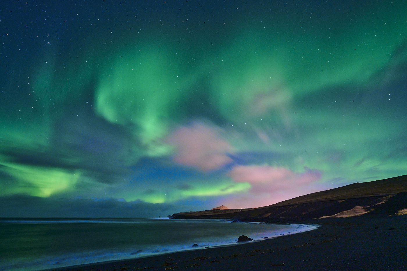
Thank you Tom, I agree this kind of landscape makes me always admire the strength of Mother Nature. I was on the beach and this is the very end of the it.
best wishes
Michele |
Aug 20th |
| 71 |
Aug 24 |
Reply |
Thank you John,
best wishes
Michele |
Aug 14th |
| 71 |
Aug 24 |
Reply |
Hi Nigel, I see your point trying to get some warm tonality on the beach. I think you can select the sky and remove the magenta tint there while leaving on the beach.
best
Michele |
Aug 6th |
| 71 |
Aug 24 |
Reply |
Thank you Mike, much appreciated your kind comment, suggesting I achieved my goal with this image.
best wishes
Michele |
Aug 6th |
| 71 |
Aug 24 |
Comment |
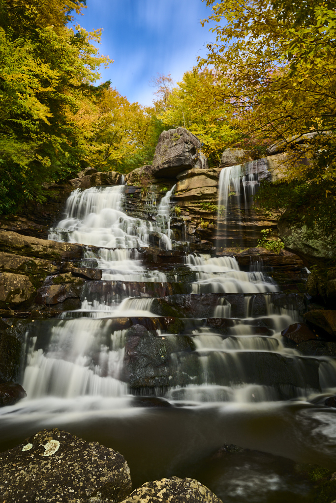
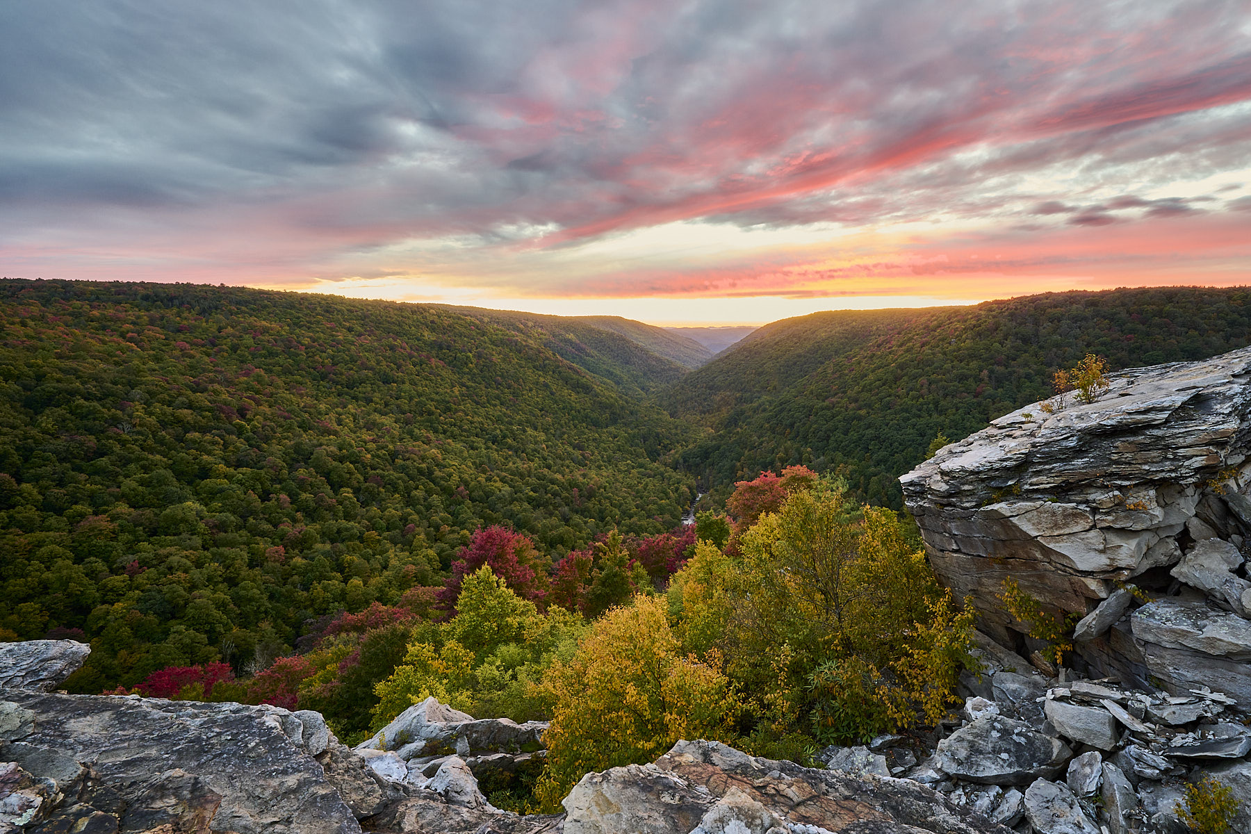
Very nice panorama John. It is a wonderful landscape and you capture it well. I guess you choose this panorama format because the sky was not particularly appealing. I think the image is technically a little flat but this is likely because the time of the day. It may work even better in monochrome with the white of the mountain to stand up even better.
best
Michele |
Aug 5th |
| 71 |
Aug 24 |
Comment |
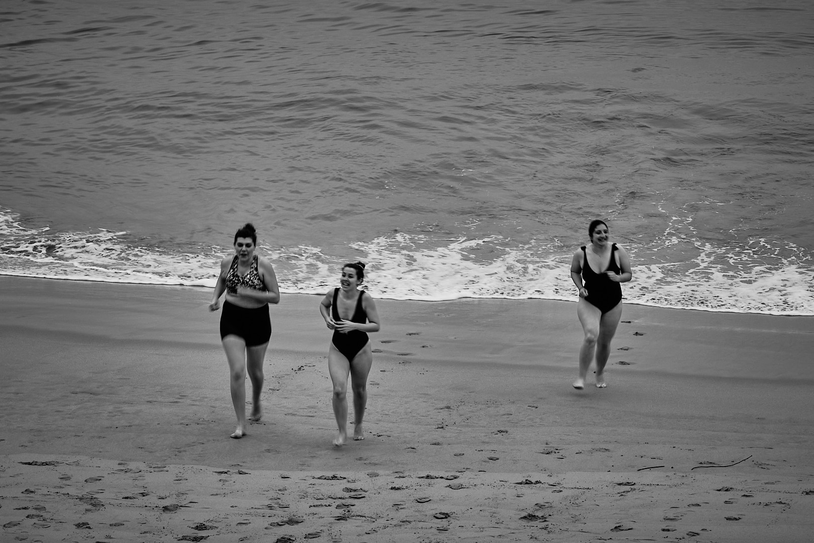
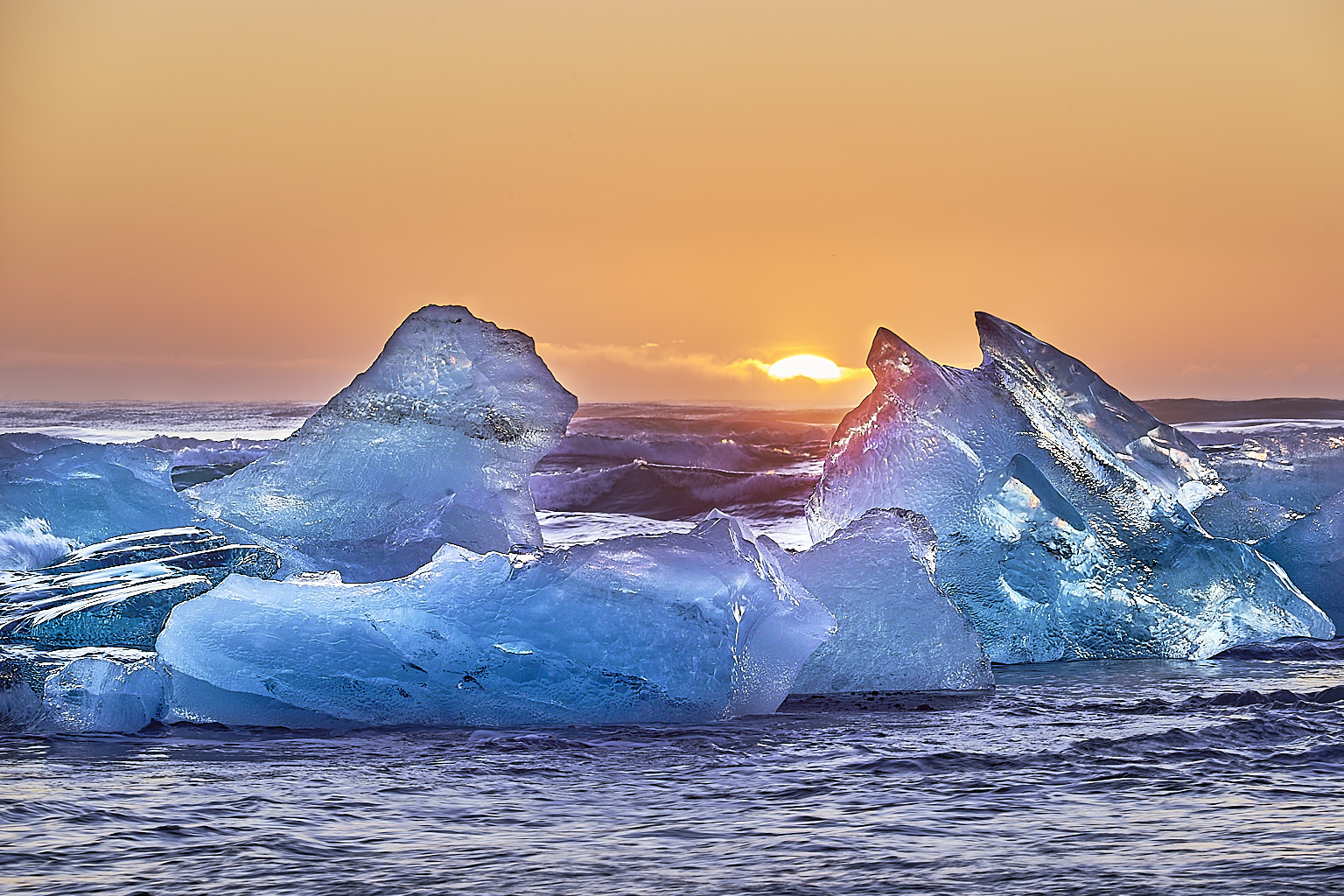
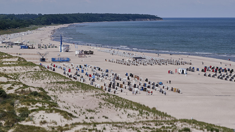
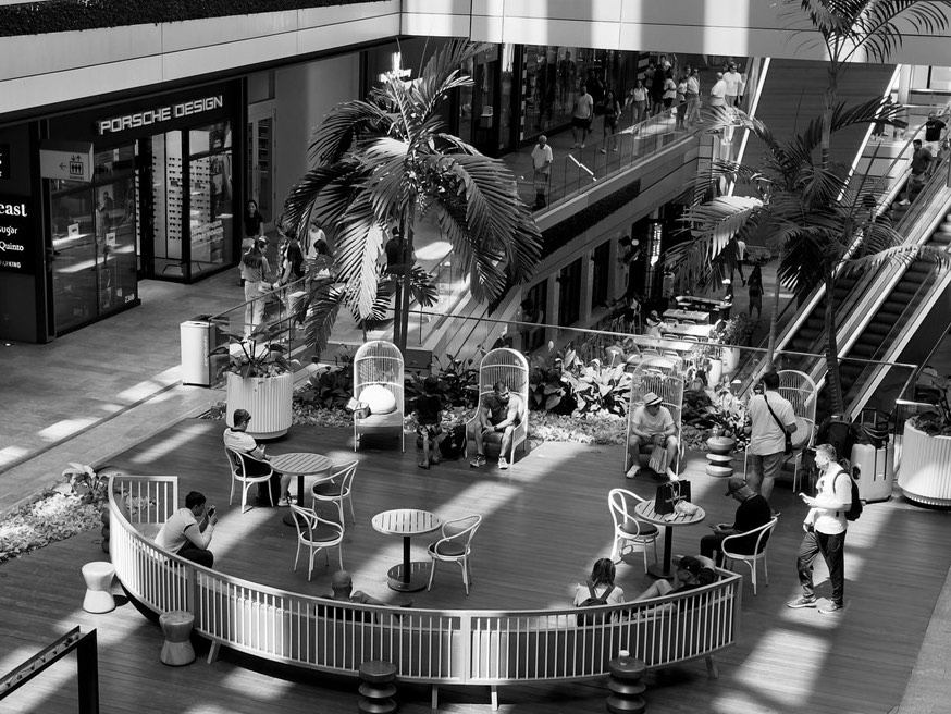
Hi Nigel, this looks like a wonderful place to go around and enjoying also some beach time. Congratulations for climbing the 175 steps. It looks like it was worth the view.
I think your white balance shows some unbalanced magenta tones. I also find the image is a little flat. I took the liberty to change the crop a little so there is less sky and the subject become the beach. I also cloned out the fence that creates a sort of barrier. I decreased highlights and white, use a little of clarity and dehaze. Let me know what do you think.
It looks like you enjoyed your cruise.
best
Michele |
Aug 5th |
 |
| 71 |
Aug 24 |
Comment |
Mike,
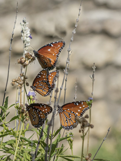
this is a very nice images and you captured well the beauty of these butterfly. I would respectfully disagree with Nigel, and found the square crop not the right one. The square crop for not symmetrical image I think does not work and creates tension. I think the 4 butterflies on the left just scream for a vertical crop. I also found the grass over the top one distracting. I know is there and if it was a "nature" photo, you would not be allowed to clone that out. However, this is digital section and this is allowed. I took the liberty to crop the image and clone out (very grossly) the grass. Let me know what do you think.
best wishes
Michele |
Aug 4th |
 |
| 71 |
Aug 24 |
Reply |
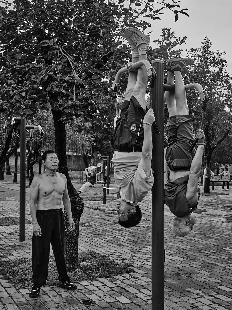
Thank you Nigel for sharing your thoughts. I agree that little more rocks on the top of the tree would have been better. Unfortunately, the vertical image I took, that had more rocks is also the one that was blurried a little, despite I checked in the camera display and looked ok...Next time I will bring my good reading glasses...
best wishes
Michele |
Aug 4th |
| 71 |
Aug 24 |
Comment |
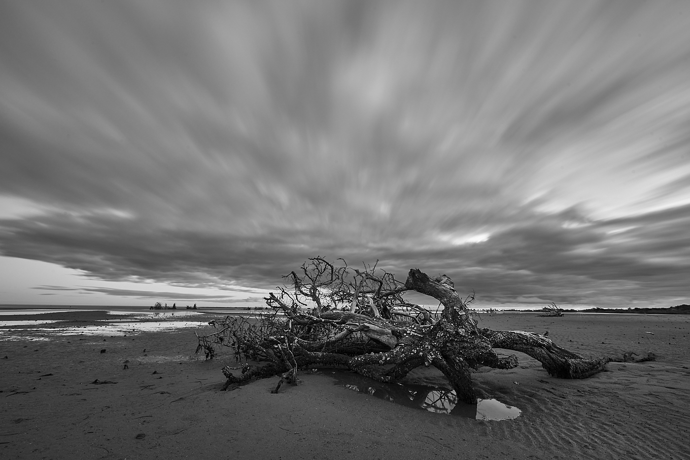
Srijan, this is a wonderful image. The clouds create a separation from the hills in the foreground and, as Tom mentioned, you have a full scale of grays going from pure white to full black. Congratulations for capturing such a good image.
best wishes
Michele |
Aug 4th |
| 71 |
Aug 24 |
Comment |
Tom,
I like this scenery and the way you capture it. I agree, the way Nigel has slightly retouched it has improved it. To be picky next to the right border of the building, there is part of a house in the background. I think that if moved to the left that would not be there. I found it distracting.
best wishes
Michele |
Aug 4th |
5 comments - 5 replies for Group 71
|
| 92 |
Aug 24 |
Reply |
Thank you Susan for sharing your thoughts. I have submitted this black and white version (with the post) to a context. Will see how it will go.
best wishes
Michele |
Aug 20th |
| 92 |
Aug 24 |
Reply |
Thank you Chuck, I appreciated your sharing your thoughts.
best wishes
Michele |
Aug 19th |
| 92 |
Aug 24 |
Comment |
Hi Marianne, I agree the light plays a great role in the success of this image. However, I feel there is too much in it. I think a crop focused on the area with the fence it would make this image even stronger. I took the liberty to crop it. Let me know your thoughts.
best
Michele |
Aug 13th |
 |
| 92 |
Aug 24 |
Comment |
Marianne and Lou,
thank you for sharing your thoughts. It is interesting each of you like a different version of the image. I posted this on another forum and most of the people voted for the monochrome. However, the few that prefer the color one (and my wife was among them) they all do for the same reason Marianne said. The monochrome appear to wash out the contrast between the boy and the background and it also lose the color of the jeans. It looks like Eggleston is right when he says "I only take one picture of any subject, so I don't have to waste time later to decide which one I prefer"
Best wishes
Michele |
Aug 13th |
| 92 |
Aug 24 |
Comment |
Lou
you click at the perfect time to capture the expression of the woman. I agree with Alex, that cropping out the man on the right would make the image stronger.
Best
Michele |
Aug 13th |
| 92 |
Aug 24 |
Comment |
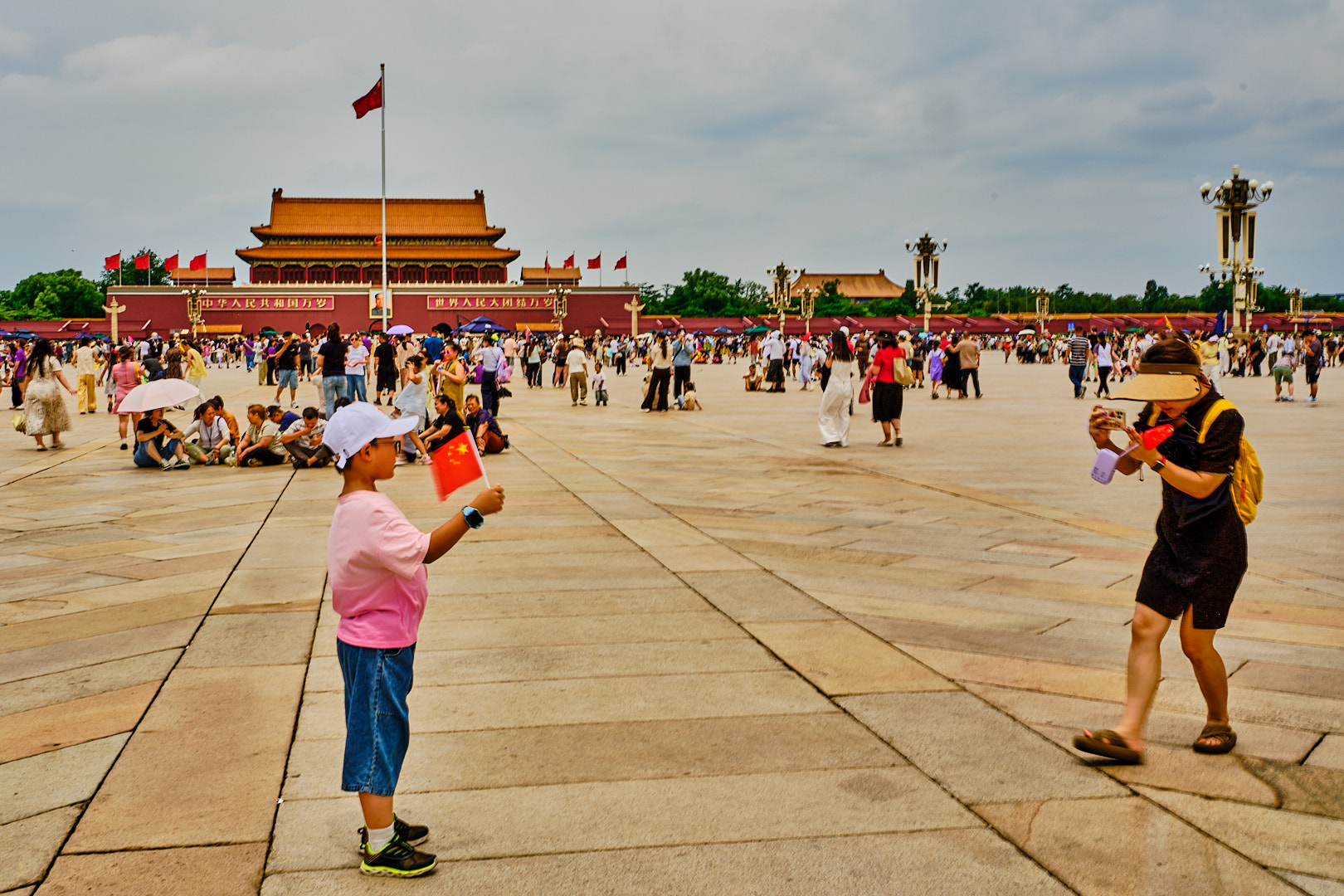
Hi Chuck, I find this imaging interesting and funny. I am not sure why the guy has his arms up. It almost look like the woman is searching him......
Good eye for catching this.
Best
Michele |
Aug 13th |
4 comments - 2 replies for Group 92
|
9 comments - 7 replies Total
|