|
| Group |
Round |
C/R |
Comment |
Date |
Image |
| 71 |
Jul 24 |
Reply |
thank you John. Much appreciated you sharing your thougths.
Michele |
Jul 26th |
| 71 |
Jul 24 |
Comment |
A wonderful nature scenery John and you have captured it well. While I agree the branch behind the couple is creating some "distraction", I honestly think the photographer added to the story. But this is just my 2 cents opinion.
best wishes
Michele |
Jul 15th |
| 71 |
Jul 24 |
Comment |
Nigel this is very well executed cityscape. The two tall buildings although having different shapes balance each others (almost same distance from the right and left border of the image) and help to focus the attention on the bright buildings in the middle. The sky with some soft blue tones help to convey a feeling of calmness.
Well done
Michele |
Jul 15th |
| 71 |
Jul 24 |
Comment |
Mike, I agree with the others this is a good image to start with. The changes proposed by Tom make him even a stronger one.
Best wishes
Michele |
Jul 15th |
| 71 |
Jul 24 |
Comment |
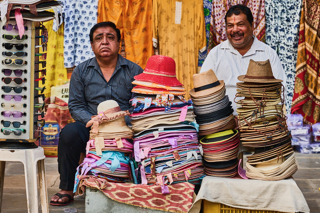
Mike, Nigel and Tom,
thank you for your comments and input. Trabuccos are interesting fishing machines and are more complicated of they look at first. They are also a very efficient way to fish.
Nigel, I am posting the monochrome image, since you asked. To me this one is working better in color despite being almost monochromatic.
best wishes
|
Jul 15th |
 |
| 71 |
Jul 24 |
Comment |
Welcome to the group Srijan. I like you image and the panning. From the technical point of view I think panning would require the main subject mostly in focus and "freeze". In this image, it looks like this is not the case. I agree with others that cropping to avoid distractions could improve the final effect. I think I am the only one out of the consensus but to me the distracting element is the bright area on the left corner. Also there is a lot of black for the upper two third of the image. So my prefer cropping would make rid of most of the upper part. In this way the mope will be also placed accordingly to the rule of third.
best wishes
Michele |
Jul 10th |
 |
| 71 |
Jul 24 |
Comment |
Hi Tom, Havana is a fascinating city. I have been there more of 30 years ago but it doesn't look too much changed. I agree with the original Mike's comment your image is difficult to interpret. As you explained the focus is the smoke on the old city. If this is the case, I believe the building on the left is just obstructive and distracted. I took the liberty to take your image, crop to take away that building, and work a little with dehaze, highlights and contrast. Let me know your thoughts.
Best wishes
Michele |
Jul 10th |
 |
6 comments - 1 reply for Group 71
|
| 92 |
Jul 24 |
Comment |
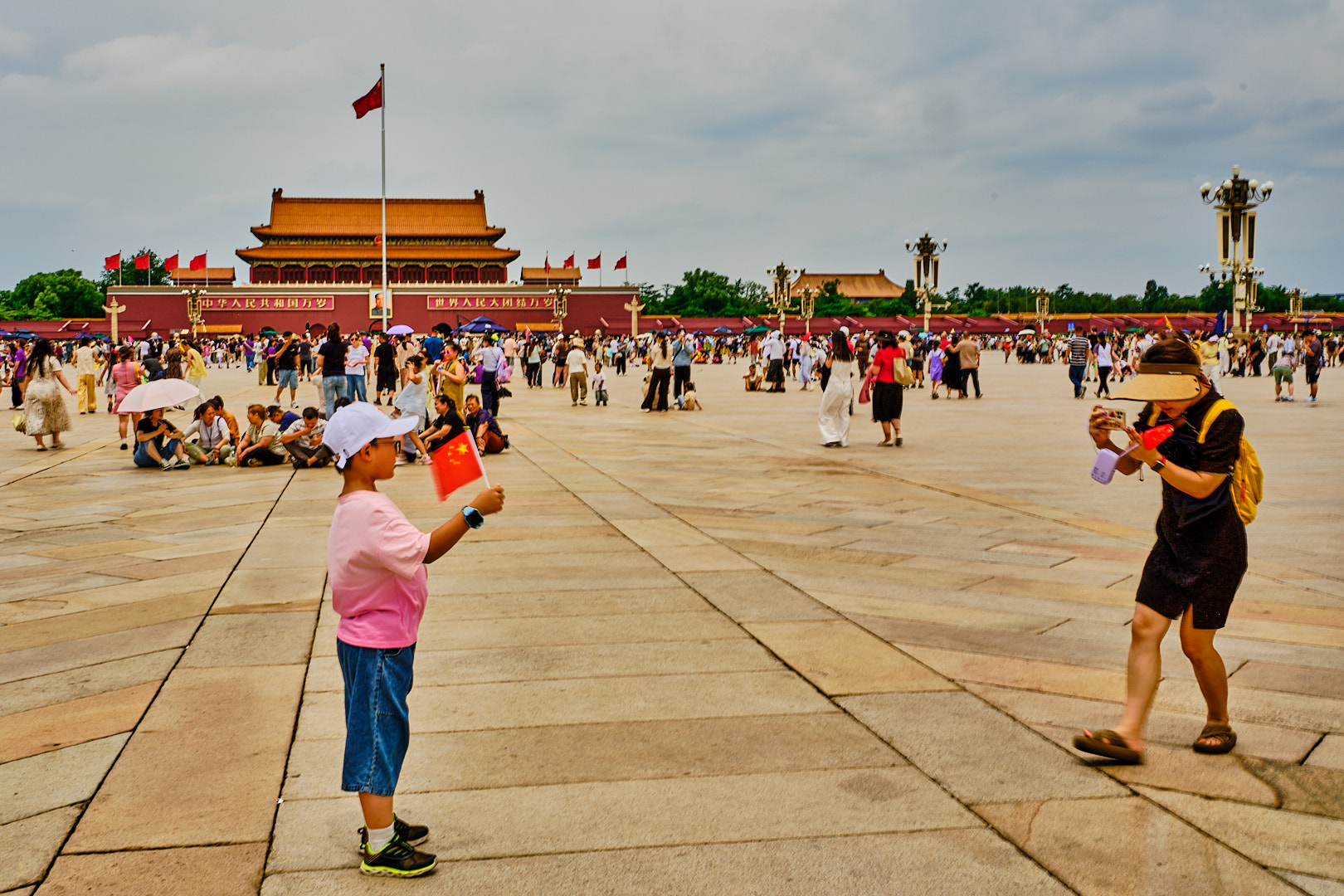
Hi Marianne, this is a sharp image and a potential interesting subject. I agree with Lou the image has a lot of distracting elements and the reflection of the sun on the car creates a strong very luminous spot. Maybe a different angle and using a more shallow depth of field would have helped to isolate the subject more. Also there are a lot of signs and my attention keep going to those. Maybe trying to compose in a different way and having just one would have improved this too. Finally, I think that including some spectators would have add to the story.
best
Michele |
Jul 15th |
| 92 |
Jul 24 |
Comment |
Hi Susan, I would agree with Lou's critique. The image clearly suggest there is some celebration/event/speech going on, but is hard to image why those people are there. I understand this is a "stereotypical" vision of who Aborigen are and look like, but it is impossible to figure out who she can be from this image. She could be anyone reading a speech. Maybe a different angle (such the one of the photographer in the image) would have helped.
best wishes
Michele
|
Jul 15th |
| 92 |
Jul 24 |
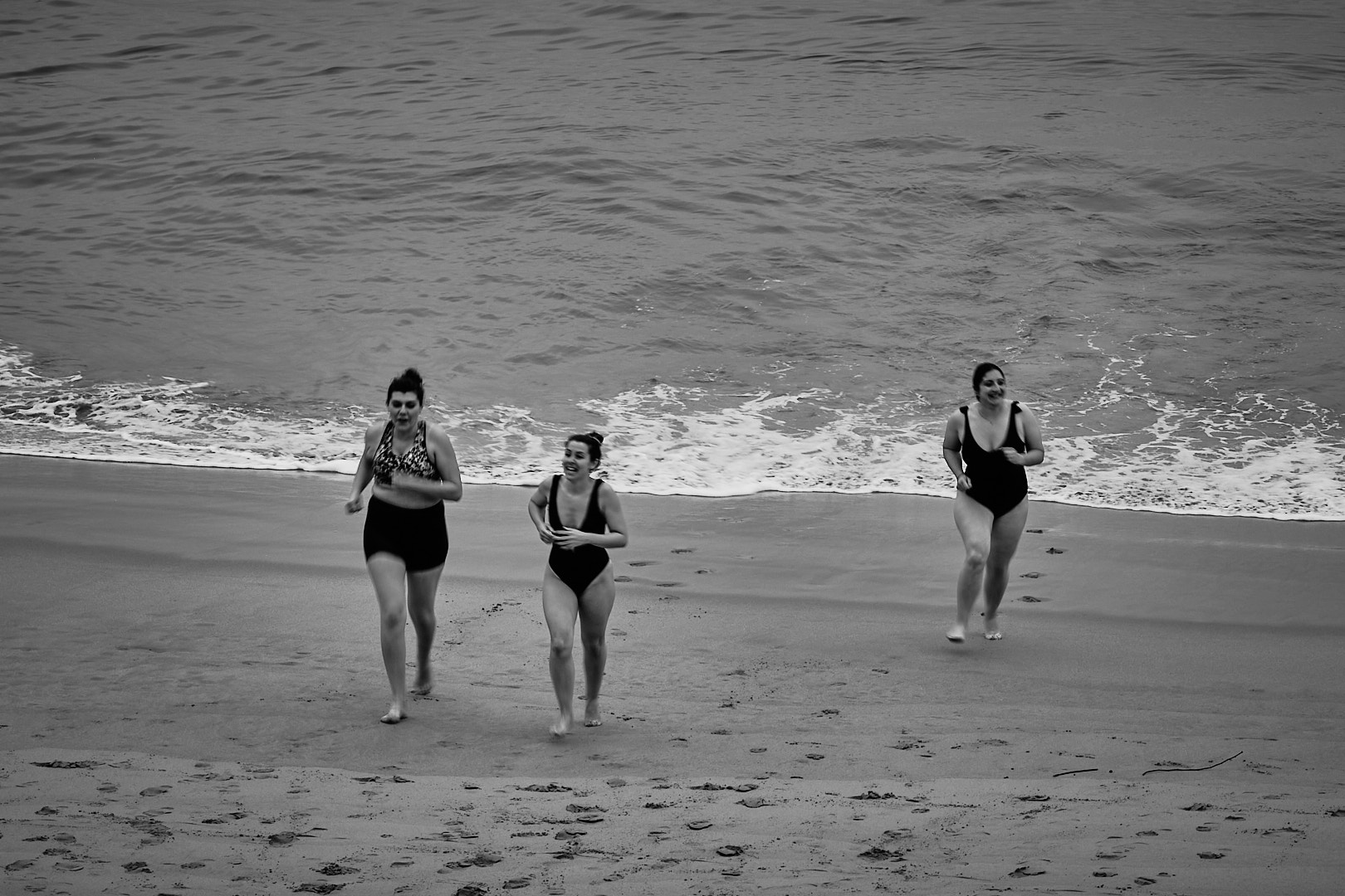
Reply |
Thank you Lou. These captured my attention few moments earlier and I was hoping something could happened. I wait a couple of minutes and they decided to split and run. I was lucky to be there at the right moment...
best
Michele |
Jul 15th |
| 92 |
Jul 24 |
Comment |
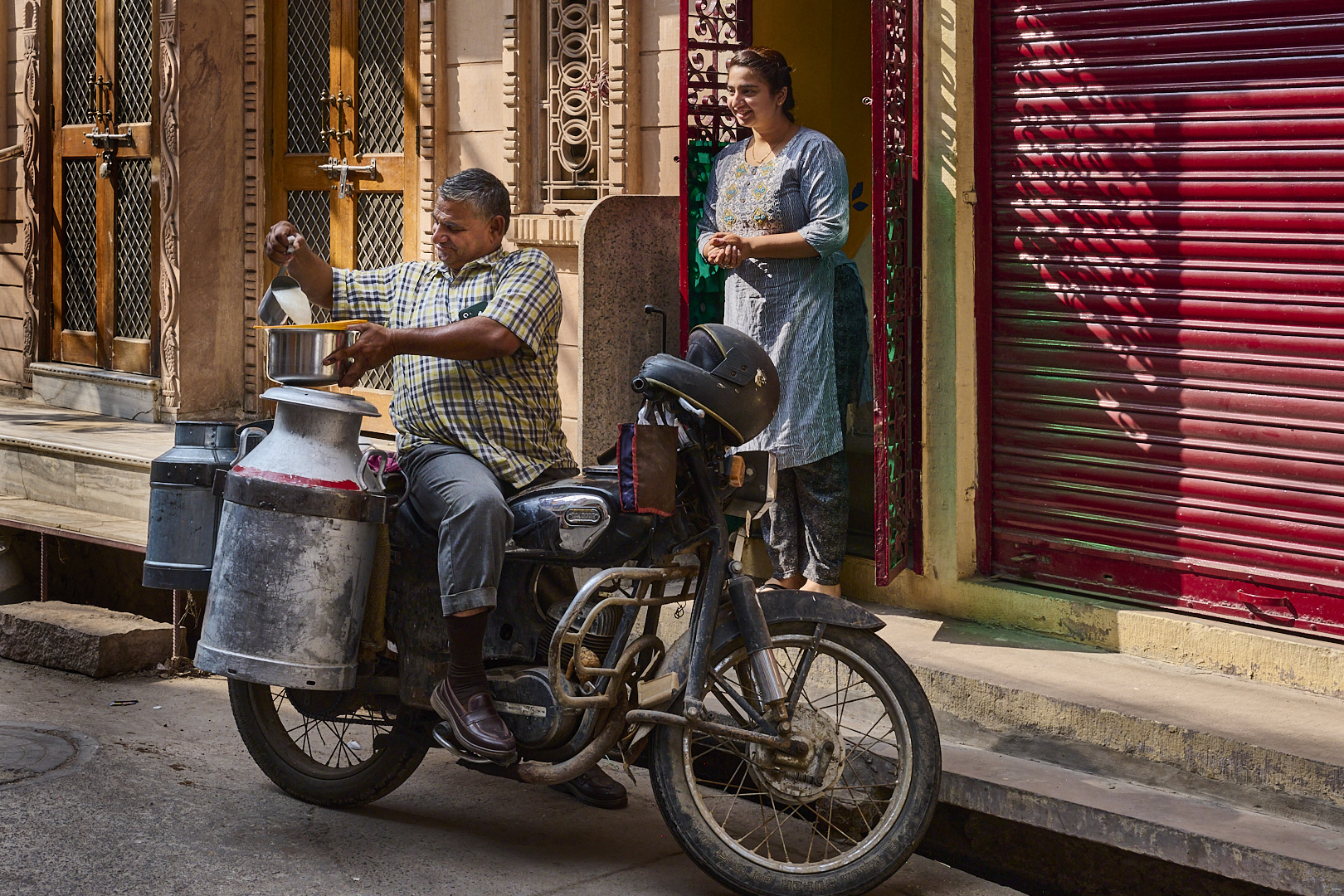
Lou this is an excellent documentary/street image. I really like your panning effect. Interesting the motorcycle is moving in the opposite direction of the pedestrians who appear almost like ghosts. However, they don't have any suggestion they are worried about the all situation.
Really a great photo.
best wishes
Michele |
Jul 15th |
| 92 |
Jul 24 |
Comment |
Chuck this image tells the story of our society. Even when we walk our dog in such a beautiful place we have our attention dragged by the small device we call phone....
I like your composition and the fact the image tells me a story even without reading your caption. I think the post processing is creating a very pixelated image but this can simply be caused by the low size images that can be posted.
Best
Michele
|
Jul 15th |
4 comments - 1 reply for Group 92
|
10 comments - 2 replies Total
|