|
| Group |
Round |
C/R |
Comment |
Date |
Image |
| 71 |
Apr 24 |
Reply |
thank you Theresa for your comments and suggestions. Before submitting the image I tried to increase contrast in the clouds but in that case it would create an unreal image because it would change the mood of the image.
best wishes
Michele |
Apr 20th |
| 71 |
Apr 24 |
Comment |
John, I like this image and the the woman with the child add a lot to it creating a great story. I think having a little bit more of space below the mother would have helped to make the image stronger. It looks like you have cropped it, so maybe you have another version of the image. The image is very sharp.
best wishes
Michele |
Apr 20th |
| 71 |
Apr 24 |
Comment |
Hi Mike,
this is a very nice bird portrait and can't add much more to what the other said. Great work
best wishes
Michele |
Apr 20th |
| 71 |
Apr 24 |
Comment |
Welcome to the group Ryan and thank you for sharing this excellent image. I can't add anything else to what the others in the group said. Just an excellent image.
best wishes
Michele |
Apr 20th |
| 71 |
Apr 24 |
Comment |
Theresa,
you have done an excellent job in isolating this tree and creating a painterly image reminding me some of the french painters like Monet. I also like the "high key" effect.
best wishes
Michele |
Apr 20th |
| 71 |
Apr 24 |
Comment |
Tom, you managed to capture the moment and the sky with some clouds was helping. Photopills is a great app (although not always user friendly). I personally prefer the first image but this is just becasue I think is more natural (is what our eye see when looking against the sun). My comment is that this image is essentially split in two. I understand rules are there for being broken, but in my humble opinion the foreground, apart the sun reflection) is not of particular interest. Maybe having less water and a little bit more of sky could make this image stronger.
Best wishes
Michele |
Apr 20th |
| 71 |
Apr 24 |
Reply |
Thank you Tom for sharing your thoughts. I need to get use to the Fuji color. You are right, the files are huge, but the camera is not, considering is a medium format.
All the best
Michele |
Apr 3rd |
| 71 |
Apr 24 |
Reply |
Thank you Mike for sharing your thoughts on this image. I agree the final image looks a little bit over saturated (I am attaching the original one here). I think this can be caused (is not an excuse...) by posting it after post processing on a screen that was not my usual. I also noticed the dark porch and I agree it would have been better trying to selectively open the shadows there a little.
Best wishes
Michele |
Apr 3rd |
 |
5 comments - 3 replies for Group 71
|
| 92 |
Apr 24 |
Reply |
I like your revised image Chuck. Thank you for considering our suggestions.
best
Michele |
Apr 24th |
| 92 |
Apr 24 |
Reply |
Hi Chuck,
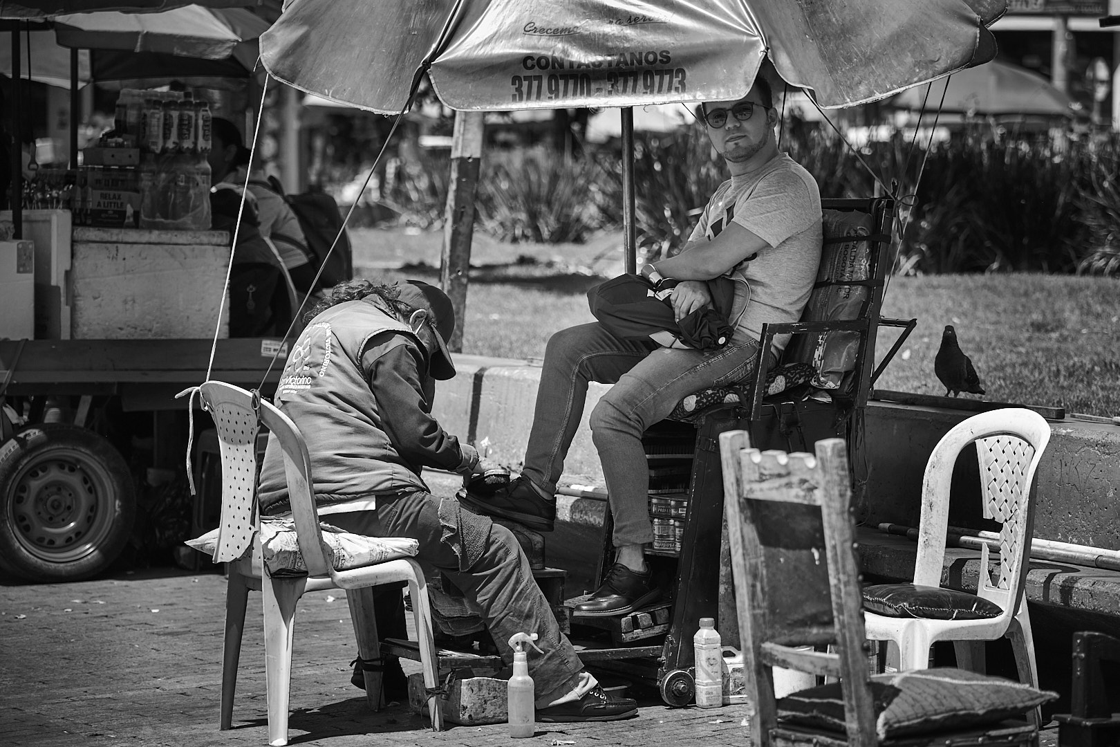
thank you for taking the time to comment and provide suggestions for my image. About the cropping this would definitively be the easiest way, but I tried to stay consistent with my picture format and I am not a fan of the square one. I can definitively go a little bit further with making the chair less bright. However, on a second thought I think that chair is complementary with the bright chair of the shoe shiner and it may be consider part of the story (the next client will use it?). Just my two cents thought
best
Michele |
Apr 24th |
| 92 |
Apr 24 |
Reply |
Hi Susan,
thank you for taking the time to look and comment my image. I appreciate your suggestions and will try them.
best wishes
michele
|
Apr 24th |
| 92 |
Apr 24 |
Comment |
Very nicely seen and captured Marianne. I think your image tells the story you describe. I agree with Lou that the post on the right is very close to the right border. I also notice your crop is cutting away a little of the track. Maybe a different crop could make the image stronger.
best wishes
Michele |
Apr 20th |
| 92 |
Apr 24 |
Comment |
Susan, I would echo Lou's comment for this image. It is well composed and the saxophonist in the foreground is the obvious subject. However, as Lou said he is a little "soft" and there are some background element that create distractions. So trying to sharpen him and darkening the background elements may help to make the image stronger.
best wishes
Michele |
Apr 20th |
| 92 |
Apr 24 |
Comment |
Hi Jeff,
I like your image and I think it tells the story. The monochrome is to me the right choice. The image tells the story. I think your original format is probably better because of the crabs in the pan would help to tell the story. Also, your cropping still left the bottom of the bottle overlapping with the chef and to me this creates a little bit of distraction.
best wishes
Michele |
Apr 20th |
| 92 |
Apr 24 |
Comment |
Thank you Lou for sharing your thoughts. I also, like you, prefer to look at the image before reading the description. So I am very glad you got the message even without reading the description. I noticed the chair and already have darkened it a little. I can probably darkened it a little bit more.
best wishes
Michele |
Apr 20th |
| 92 |
Apr 24 |
Comment |
Lou, I think this is a good street photo. I think you have done a great job to get the most of it with your cropping and eliminating distracting elements. The woman is looking at you, suggesting she is engaged with you in someway. The two men are exchanging money and we can suppose the guy on the right is buying from the one in the middle.
best wishes
michele |
Apr 20th |
5 comments - 3 replies for Group 92
|
10 comments - 6 replies Total
|