|
| Group |
Round |
C/R |
Comment |
Date |
Image |
| 71 |
Feb 24 |
Reply |
John
this is definitively better. |
Feb 19th |
| 71 |
Feb 24 |
Reply |
Hi Tom,
You are right is hard to image there are such huge sand dunes formation almost in the middle of the town. I am happy I was eventually able to visit this place with no one around (although it has been challening and I had to spend a lot of time to clean my gear after this..).
best wishes
Michele |
Feb 19th |
| 71 |
Feb 24 |
Reply |
Thank you John I appreciate you sharing your thoughts
best
Michele
|
Feb 14th |
| 71 |
Feb 24 |
Reply |
Hi Mike,
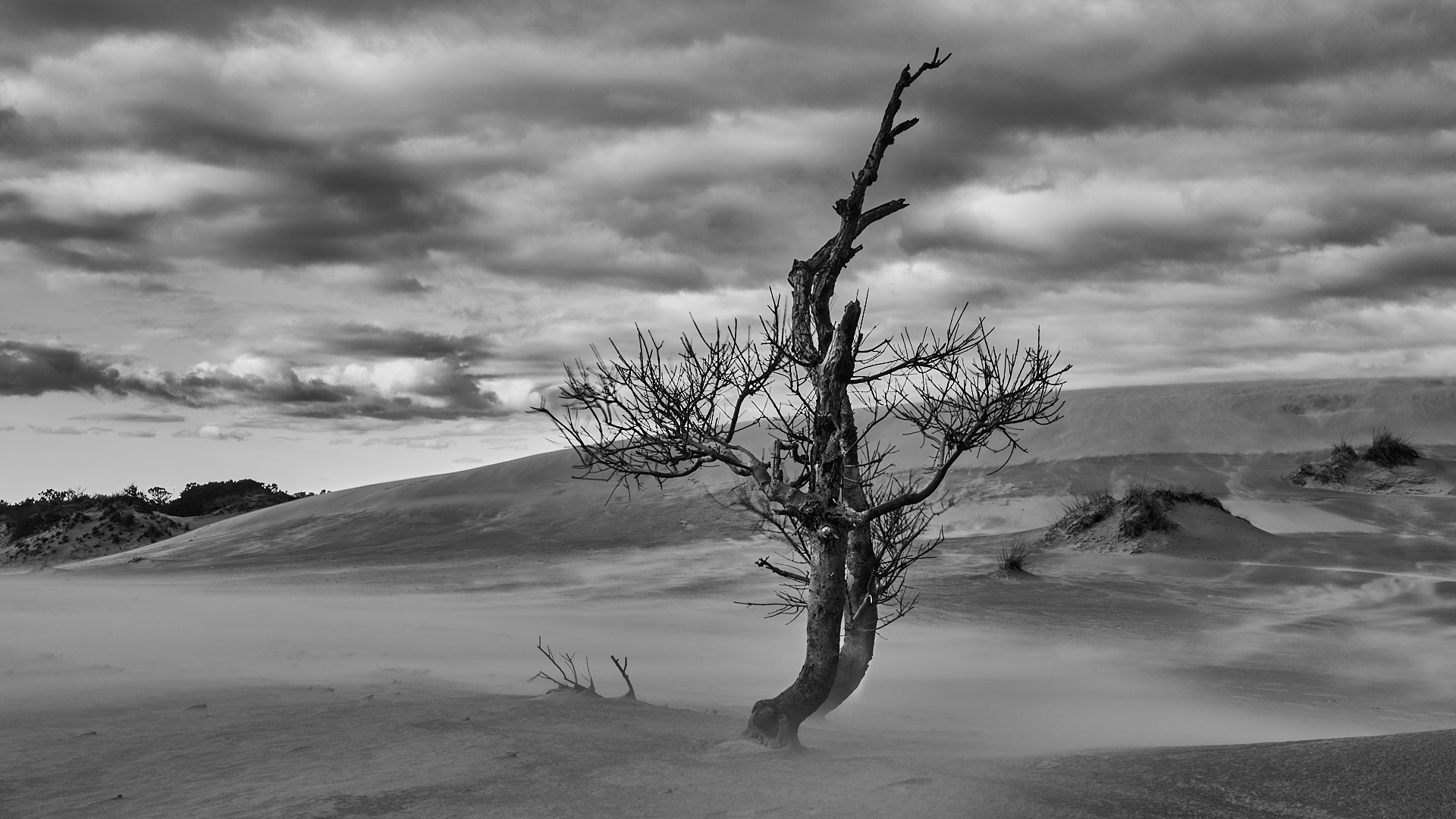
the idea of the image is to create a feeling of desolation and conceptually the two tree would represent two friends fighting against the storm. I appreciate you sharing your thoughts about the position of the trees. While they could be a little bit more to the right, they are not in the middle. Actually they are "almost" at the third position. The reason I did not push them too much is because there are two dunes on the right that almost create a diagonal leading the eye out of the frame. In my opinion the trees are balanced by the dark dunes with trees on the right of the image. Obviously this is the way I see it and I can be completely wrong.
best wishes
Michele |
Feb 13th |
| 71 |
Feb 24 |
Reply |
thank you Ted for sharing your thoughts. Much appreciated.
best wishes
Michele |
Feb 13th |
| 71 |
Feb 24 |
Reply |
Thank you Theresa for sharing your thoughts about this image. Thank you for picking up the halo on the lower ridge of the tree. It is caused by not enough careful post process of the tree.
best wishes
Michele |
Feb 10th |
| 71 |
Feb 24 |
Comment |
John, at first sight I thought this was a great image. However, after the first impression I don't think this image works well. The beautiful light on the half dome is what creates a bright spot of interest and the eye naturally goes there. In this way, the moody scenery in the bottom of the image almost disappear. My impression is that here you have two separate beautiful images and putting them in one single frame to my eye doesn't work well. Obviously this is my personal way to see it.
Best wishes
Michele |
Feb 5th |
| 71 |
Feb 24 |
Comment |
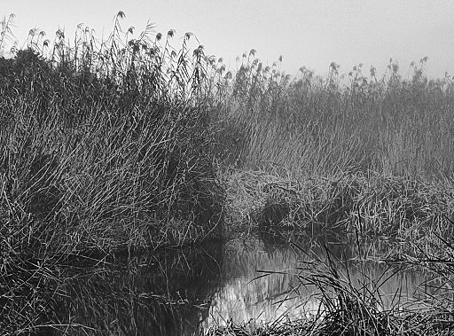
Hi Mike, fog is always attractive and challenging. I see what was your intent but honestly in this image I just see some brown dead grass. The water is barely visible and the upper third of the image is not showing anything interesting. I think this image would work better in black and white and maybe cutting some of the foregroung and use the white empty space as a negative space to show the pattern of the grass. I took the liberty to play with it a little. Let me know what do you think.
best wishes
Michele |
Feb 3rd |
 |
| 71 |
Feb 24 |
Comment |
Ted, this is an excellent image with a good composition. The puffy clouds appear to originated from the tree and they create a diagonal from left to right that makes this image "dynamic". I think there is something odd on the right border of the image. It looks like you cloned some of the clouds but you capture the top of the group of trees on the left that magically appears from the clouds. I think you can consider to crop the image to 2x3. It can make it more appealing. Not sure why you could not use your "large zoom" lens for this (unless you meant you have a telephoto zoom that would not you allowed to take all scenery).
Best wishes
Michele |
Feb 3rd |
| 71 |
Feb 24 |
Comment |
Theresa, this is a well executed image conveying a feeling of festivity. You have done a good job in your post process and the final image is sharp with not burned highlights (that is always a challenge in this kind of images). I am wondering if moving a little to the right would have bring the branch of the trees in the upper border to fill all the border creating a frame in the frame of the image. In this version they occupied most of the upper border but they miss the right upper corner and give the feeling of something missing. I agree with the other of removing the chord. |
Feb 3rd |
| 71 |
Feb 24 |
Comment |
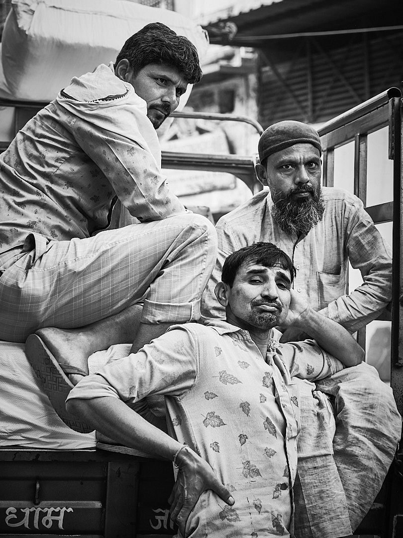
Tom, I like the composition of this image and I also think that human presence in this case helps to give a sense of scale. Saying that, I think the photo would be great even without her. I am wondering if you have a horizontal image. The line created by the bridge in my opinion would lead to a horizontal format. I feel the vertical format create some tension. I also think the bridge and the sky are the subjects of this image so all the water in the foreground does not add much (apart having the woman). I tried to cover the bottom part of the image and I personally believe it would work better. Finally, but this is a question of personal taste, I find the post process a little bit overdone. |
Feb 3rd |
5 comments - 6 replies for Group 71
|
| 92 |
Feb 24 |
Reply |
thank you Lou, happy you think the image does work.
have a great day!
Michele |
Feb 19th |
| 92 |
Feb 24 |
Reply |
(-:
have a great weekend! |
Feb 14th |
| 92 |
Feb 24 |
Reply |
Thank you Susan for reading my image and making a story. Much appreciated.
Best
Michele (with only one "l" (-: ) |
Feb 14th |
| 92 |
Feb 24 |
Reply |
Thank you Marianne, I much appreciate you sharing your thoughts on my image. I barely touched the dehaze on this image so I think is your computer screen.
best
Michele |
Feb 14th |
| 92 |
Feb 24 |
Comment |
Patti, you found a very interesting character and you capture her in a very effective way. I think her hand over the crocodile head adds some interest to the image. I wonder if using a faster aperture would have (e.g. f/4 or f/2.8) would have create a shallow DOF taking away distractions from the background. You may consider to open a little the shadow on her face to make it to stand out a little bit more.
Michele |
Feb 9th |
| 92 |
Feb 24 |
Comment |
Marianne, you definitively captured the moment in this image and I think your composition is spot on. Love the image captured all faces of people attending the ceremony looking in the same direction some smiling some not.
Well done
Michele |
Feb 9th |
| 92 |
Feb 24 |
Comment |
Susan,
I think this is a very nice image that definitively tell the story. I agreee with your choice to keep the image in color. I think the "panorama" crop you did not necessary work to me. In my opinion, the towels on the right do not add much to the story of the image, so you could crop to eliminate the excessive amount of background created by the building, by keeping your original proportion by cropping most of wha is on the right of the image.
Michele |
Feb 9th |
| 92 |
Feb 24 |
Comment |
Jeff, this is a very nice rendition of this classic view. I was there in July and had the similar idea of shooting a relative low speed to get a mix bag of frozen and moving people. I agree the color works better and I am not sure what you are referring to "rules are rules". I can guess that for you street photography must to be in black and white? I found the triangular dark shape on the bottom right distracting, so I would consider to crop the image to remove it. You can also consider to sharpen the clock and the area surrounding it.
Michele |
Feb 9th |
| 92 |
Feb 24 |
Comment |
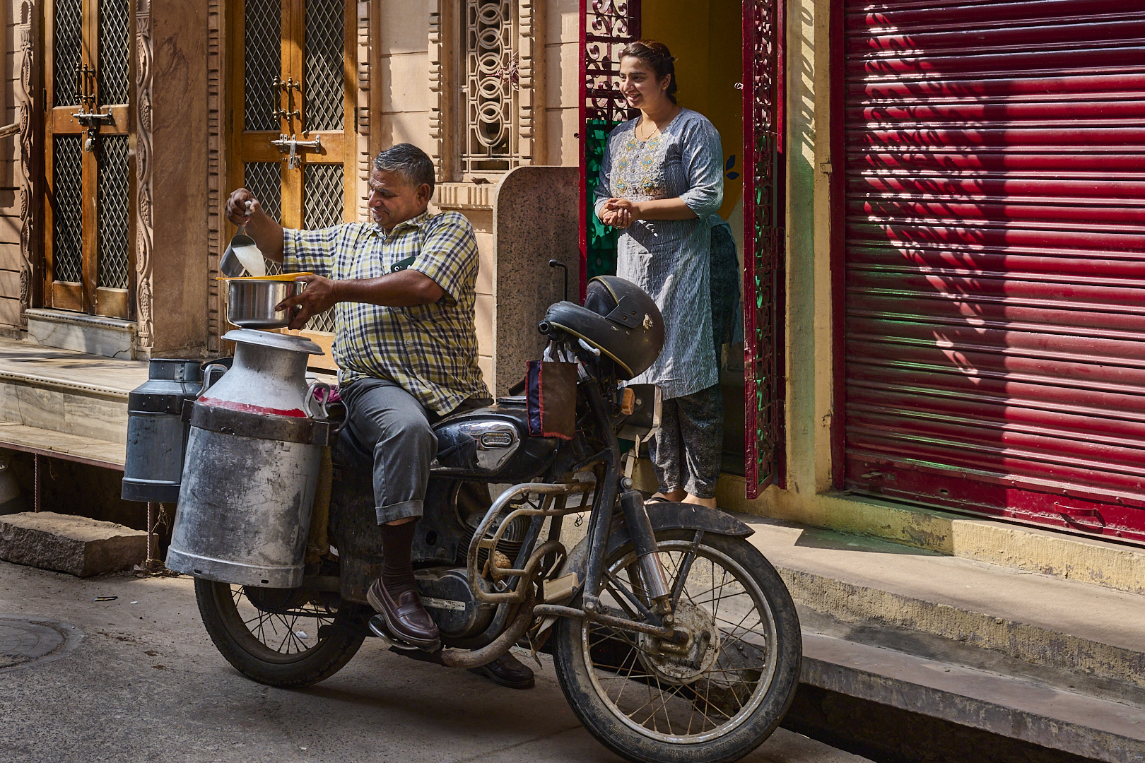
Lou this is a very nice scenery well captured. I like the pose of the merchant and the fact his attention is focused on the phone. I think your post proecess is well done. I honestly think this image does work better in colors. The red shirt of the man is standing out beautifully, from the dark background and the colors of the olives and oranges create a point of interest.
Michele |
Feb 9th |
| 92 |
Feb 24 |
Comment |
Chuck I guess it has to be fun to spend some times to takes pictures there. I think definitively Mary maybe a character,and I agree that the monochrome version is better. However, I honestly think the photo doesn't work. Technically is not sharp. But I am afraid that this image doesn't work also from the point of view of the composition. We see Mary likely to interact with a customer that we don't see. We see only some merchandise. More, the deep of field in this image makes the background outside a point of distraction since is very bright.
Michele
|
Feb 9th |
6 comments - 4 replies for Group 92
|
11 comments - 10 replies Total
|