|
| Group |
Round |
C/R |
Comment |
Date |
Image |
| 71 |
Jan 23 |
Comment |
Thank you Theresa
best
Michele |
Jan 26th |
| 71 |
Jan 23 |
Reply |
Thank you Mike |
Jan 10th |
| 71 |
Jan 23 |
Comment |
Thank you John, I think it could be a good idea. I am uploading a new version of the image with an increased contrast. I did not exaggerated but I think the image is definitively improved. |
Jan 9th |
 |
| 71 |
Jan 23 |
Comment |
Tom I took the liberty to crop your image as I was suggesting in my previous comment.I think in this way the lighthouse becomes the subject of the image. I also open a little bit the shadow so you there is now some details in the trees around the lighthouse that looked very dark.
Let me know what do you think |
Jan 7th |
 |
| 71 |
Jan 23 |
Reply |
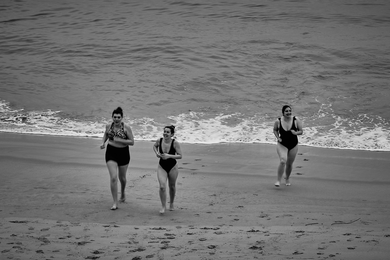
Thank you Theresa for considering my comments. I can see what is your intention and I understand condition you photograph this scene were complicated, but if your main subject is the dragon, and I agree it should be, then the part in the foreground is mostly lack of detail and is distracting. In this image you have a completely dark area and a very bright area and the eye goes naturally to the bright area and to the dragon session in the middle of the image. May be if you open the shadow and in the session of the dragon that is in the foreground and decreased the luminescence of the area in the foreground would help the image. Just my 2 cents thoughts
best
Michele |
Jan 7th |
| 71 |
Jan 23 |
Comment |
John, this is a very interesting image. One that require some time for understanding and for this reason I like. However, because its complexity, I think there is too much and a simplify version of the image would work better. I took the liberty to crop to a 3x2 format and straighten your image. I think this version is working better also becasue the frame create an image according to rule of third. Let me know what do you think
best
Michele |
Jan 7th |
 |
| 71 |
Jan 23 |
Comment |
Nigel,
this is a very interesting story and while I am sorry you could not went for your whale watch, but I am happy to hear that marine conservation authority value safety of these beautiful creatures above anything else. I agree with other this is a great blue hour image with a great light and that the very bright sign on the left is distracting. I also agree with Mike that cropping some of the empty parking lot would make this image stronger. You can probably keep the proportion of the image by doing this and at the same time cropping out the very bright sign.
Best wishes
Michele |
Jan 6th |
| 71 |
Jan 23 |
Comment |
Mike
Your story is really compelling and your image helps to fully understand it. I agree with the others that a tighter crop make this image much stronger accentuating the relationship between the mother and the lamb and eliminating all other distracting elements.
best wishes
|
Jan 6th |
| 71 |
Jan 23 |
Comment |
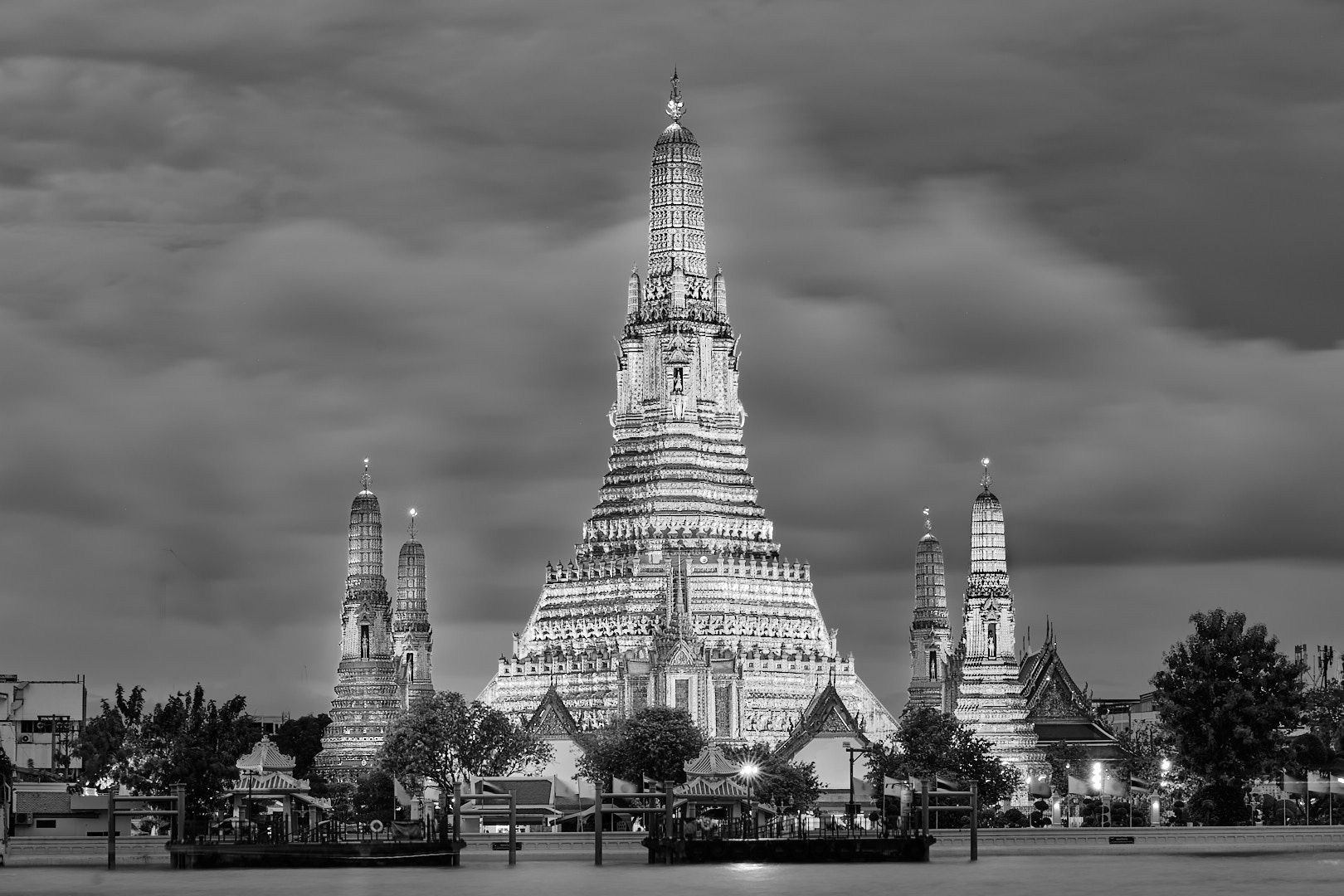
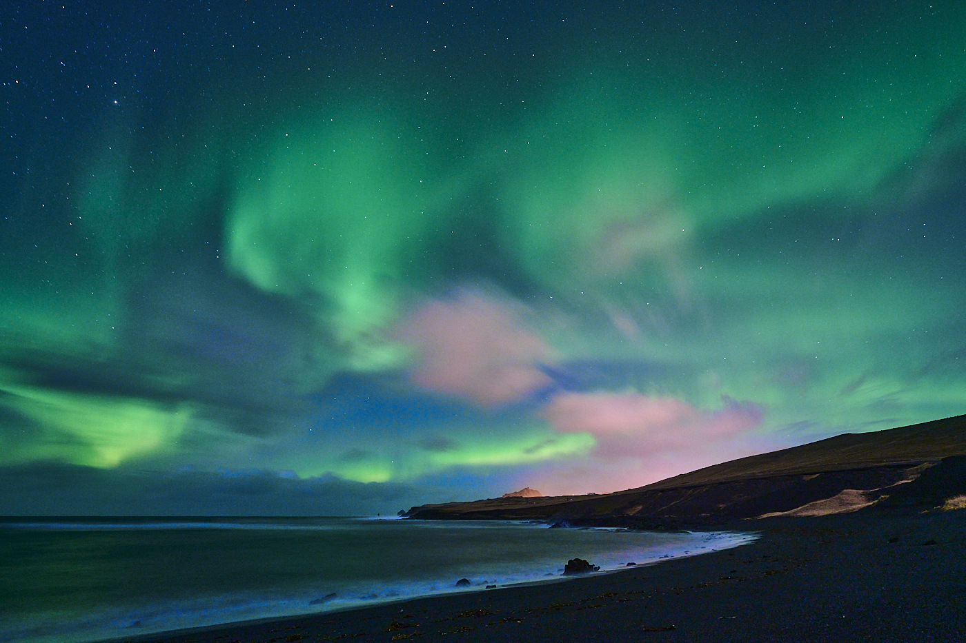
This is a very nice image Theresa and a fascinating story, that also tells us people today does not show much respect for rules. I like the dragon structure and shape. However, I am struggling a little from understanding what is the subject of this image. There are so many elements. The dragon, the lights in the background, the mountains and the Milky way and the stars. The bright lights in the background are the lightest part of the image and the eye goes directly there. The big curve of the dragon in the foreground is also splitting the image in two part and this is accentuated by the green light on the right of the image. The long shutter speed also make the stars not sharp and I am wondering if, since you compose this image you have two different exposure to make everything sharp.
best wishes
Michele |
Jan 6th |
| 71 |
Jan 23 |
Comment |
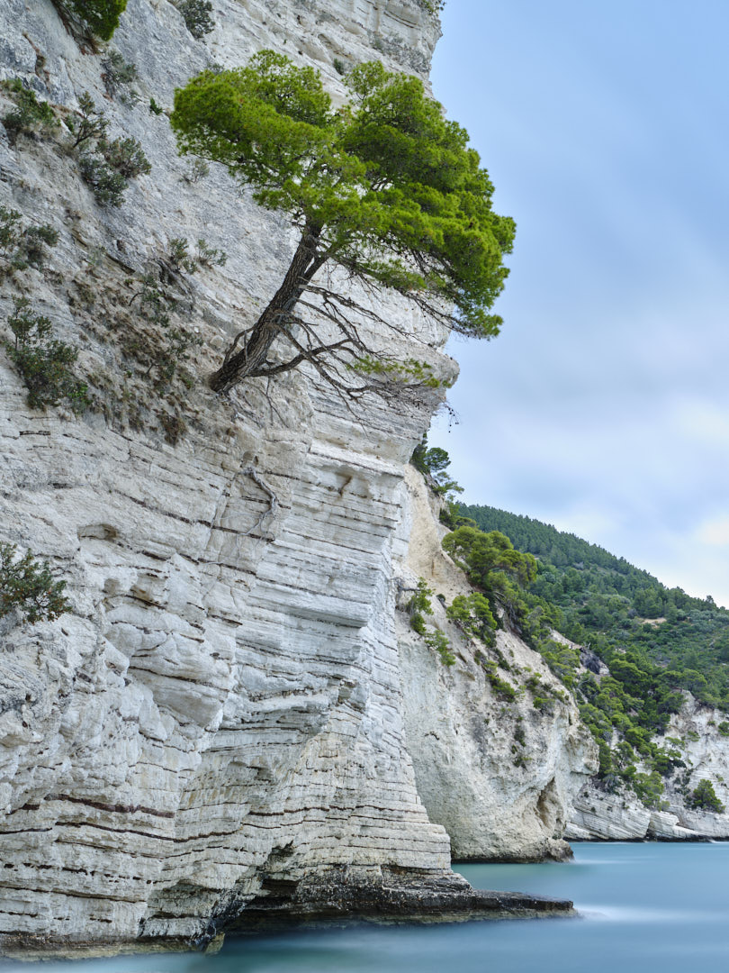
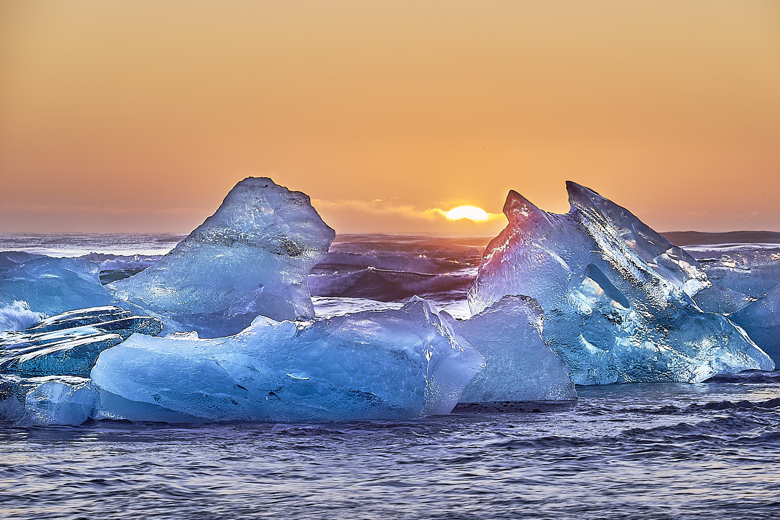
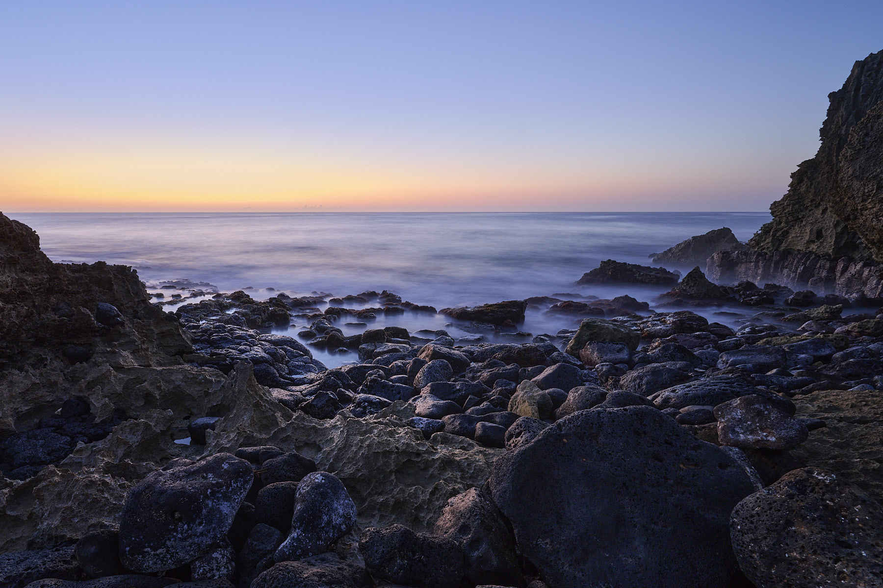
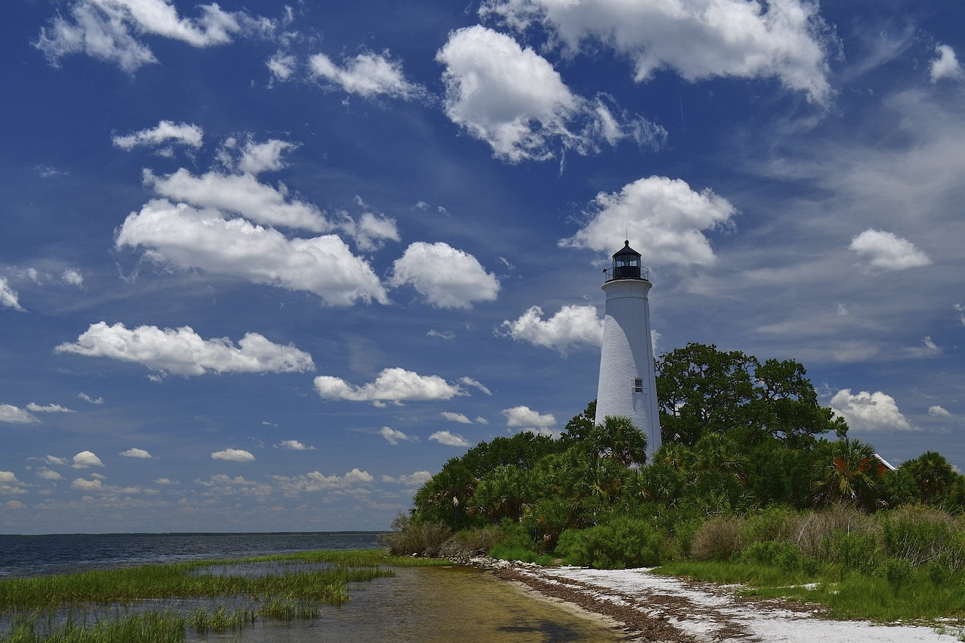
Tom this is a beautiful scene and you captured it well. We all known sometimes things to do not work the way we planned especially in landscape photography. I agree with the others that the beach appears the dominant subject of the image. Also the image is almost 50/50 with the sky. I tried to crop it as an horizontal one and in my opinion it works better. In that way you have less beach (1/3) and have 2/3 of the image with the beautiful clouds in the sky and also emphasize the lighthouse.
Best wishes
Michele |
Jan 6th |
| 71 |
Jan 23 |
Reply |
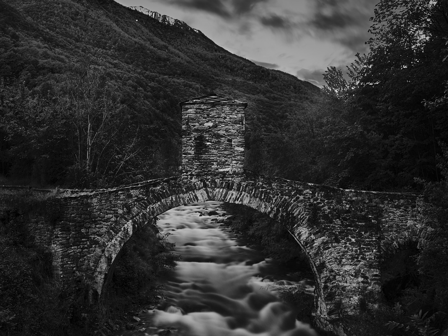
Hi Tom,
when we bought the house the lighthouse was already at its current location. I got great images these past 10 days here. Weather was fantastic.
best
Michele |
Jan 6th |
| 71 |
Jan 23 |
Comment |
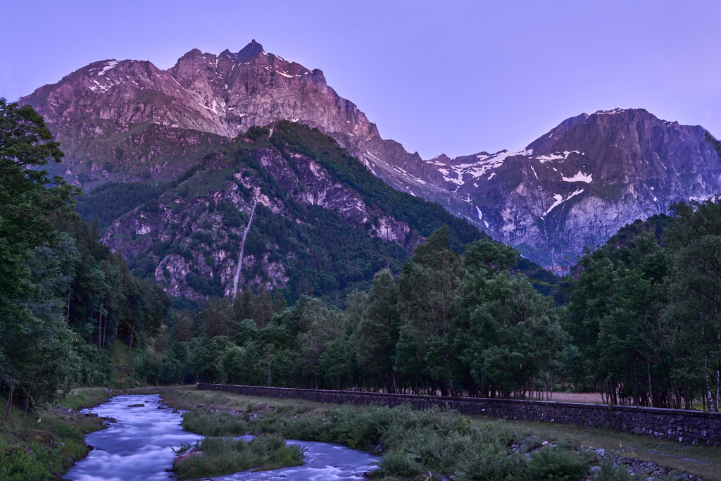
Tom, thank you very much for looking at this and your very kind words. We have a house at Frisco and we try to come here as much as we can during the winter (that is my favorite time). About the original image, I used a fluorescent white balance for my dusk images because it helps to pop up the pastel palette of color. For this image, I wanted to highlight the structure of the scene and avoid the distraction that could be created by the color.
Best wishes
Michele |
Jan 6th |
9 comments - 3 replies for Group 71
|
9 comments - 3 replies Total
|