|
| Group |
Round |
C/R |
Comment |
Date |
Image |
| 58 |
May 25 |
Reply |
The Blue of his riding pants was actualy a shade of blue and it only showed that shade of blue on the right side and a bit on the left upper portion of the left. Having said that it would not be hard to clone out the blue and I think that would help the image to some degree. Have to try it. I think you are fortunate to only senior moments, I have them as well but they are like hours not moments. |
May 27th |
| 58 |
May 25 |
Reply |
Thank you I am going to try something like that as using the Adamski effedt I should be able to do what you suggested. |
May 18th |
| 58 |
May 25 |
Comment |
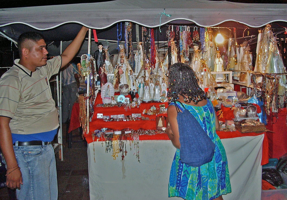
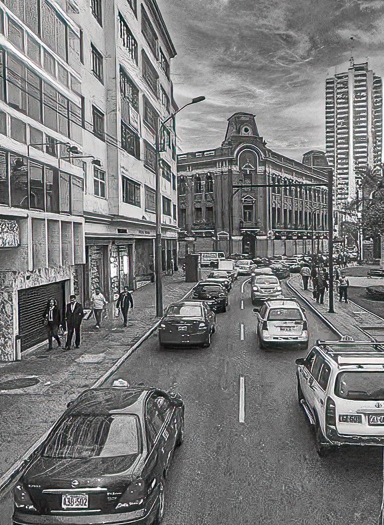
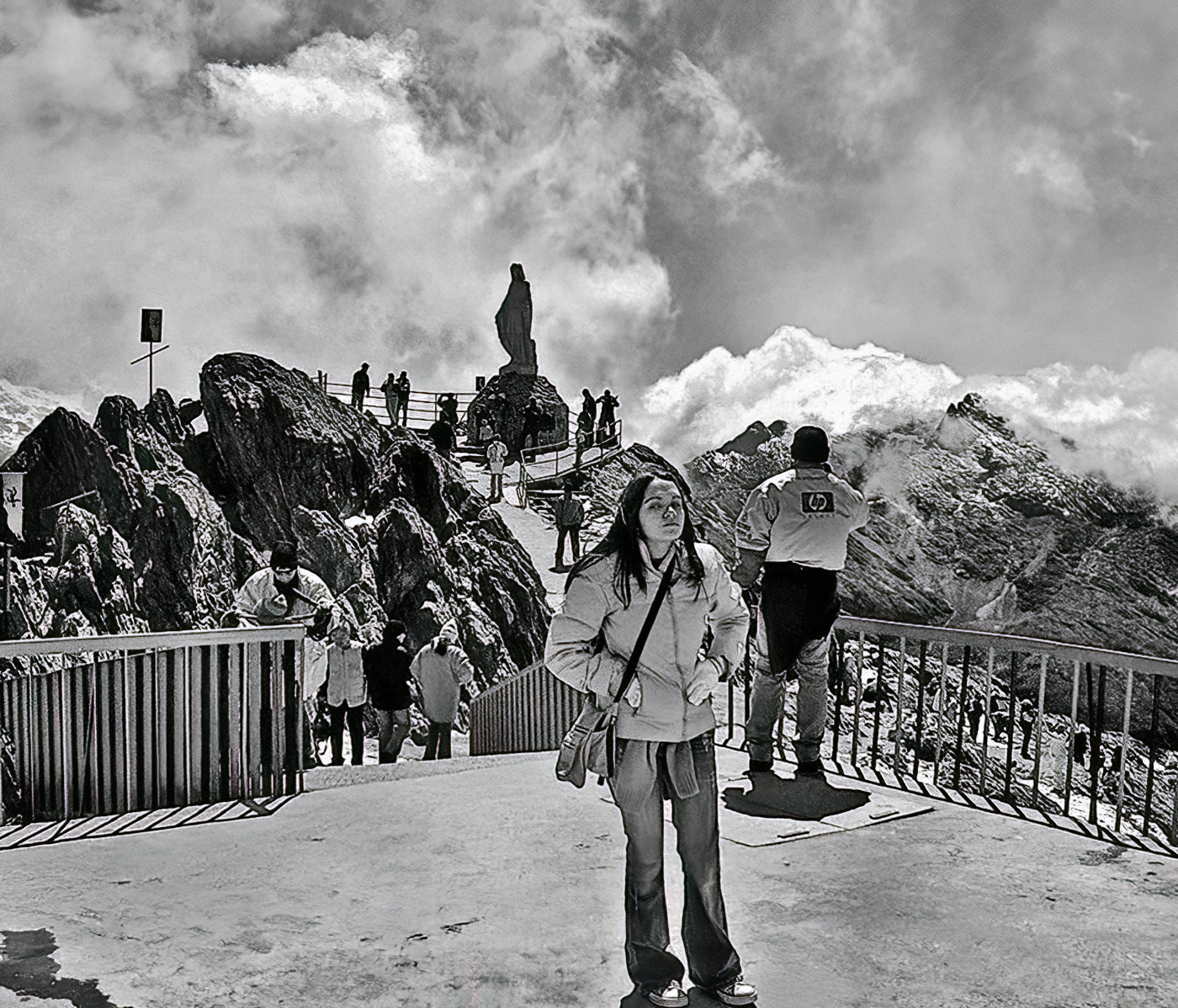
This is a very busy image and is appropriate for the scene showing a street with the various people either engaged in the "practice" watching it or just going about their daily lives. The colours are not overly bright and as such do not distract from the scene or principle subjects. What I find interesting is this image can be cropped to produce two seperate images that highlight the "players" and still show enough of the plaza to put context to the story the individual images would show. |
May 18th |
| 58 |
May 25 |
Comment |
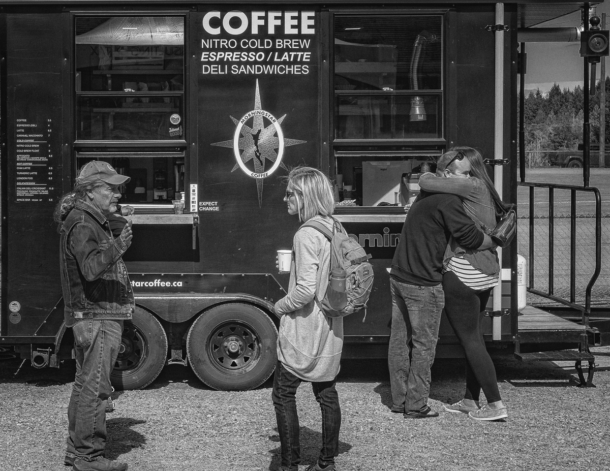
The image shows two sides, the colour and activities inside the bar , or perhaps the good time environment, and the other person on the outside going about her business and not paying attention to the activities behind the window. I think I might have cropped the top portion of the window to eliminate the the bright yellow lights or perhaps muted the yellow somewhat as it does in my mind distract from the scene. |
May 18th |
| 58 |
May 25 |
Comment |
The toning is reminiscent of early film photographs and fits well with the subjects. it is well comoised and the grainy effect suits this image well. Pehaps a slight lightening of the central persom might show a bit more detail and reenforce what he appears to be doing, teaching or mentoring his young charge. |
May 17th |
| 58 |
May 25 |
Comment |
I am on the same page as Kathleen in that I like the image with the door as it leads across the image from lower left to upper right. The colour of the people in both windows contrast with colour of the bulding and the statue. and the upper left window leads one to the lower door and then the line across the image allowing one to take in all the image. |
May 17th |
| 58 |
May 25 |
Comment |
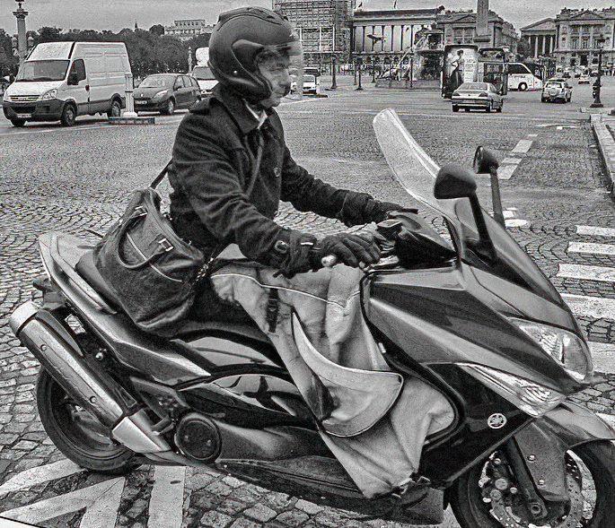
I like Isaac's rendition as from one point of view it puts the rider into context on a quiet street. On the other hand i like the mono, although I would prefer BW, The leveling of the image is well done in your shot, and i do like the image as there is enough of the street included and then the focus is on the rider going about his daily, i assume, routine. I have included my thoughts in BW as opposed to the very light sepia. |
May 13th |
 |
5 comments - 2 replies for Group 58
|
| 74 |
May 25 |
Reply |
Very fast edit with help or likely hinderance from Arthur in my hand, Keeping the original handy so I can do a proper more precise edit once things work out might be a while but I think this does show the concept and the potential Thanks for the idea. |
May 27th |
 |
| 74 |
May 25 |
Reply |
As soon as I clean up a bunch or Club stuff for our AGM |
May 21st |
| 74 |
May 25 |
Reply |
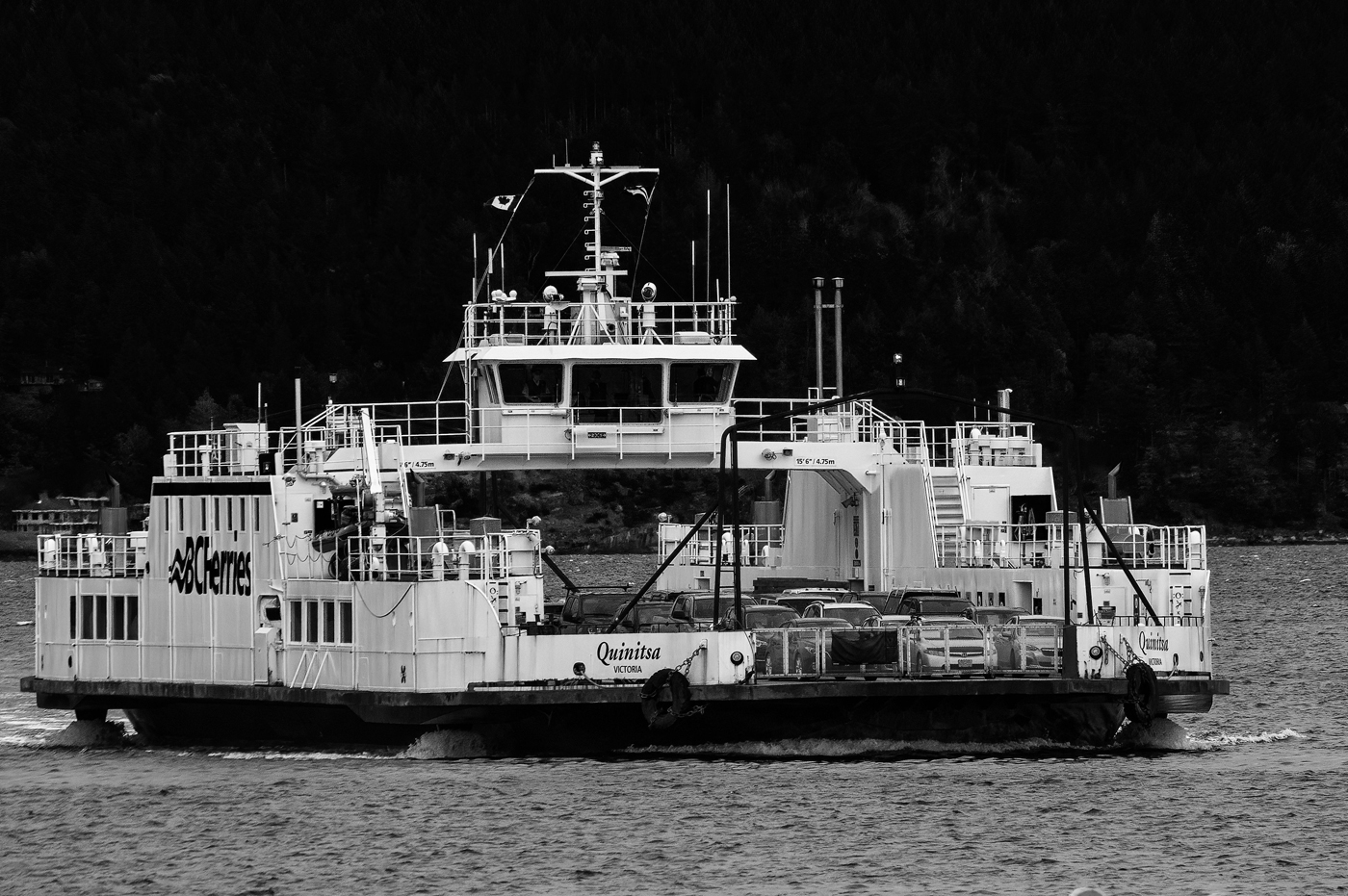
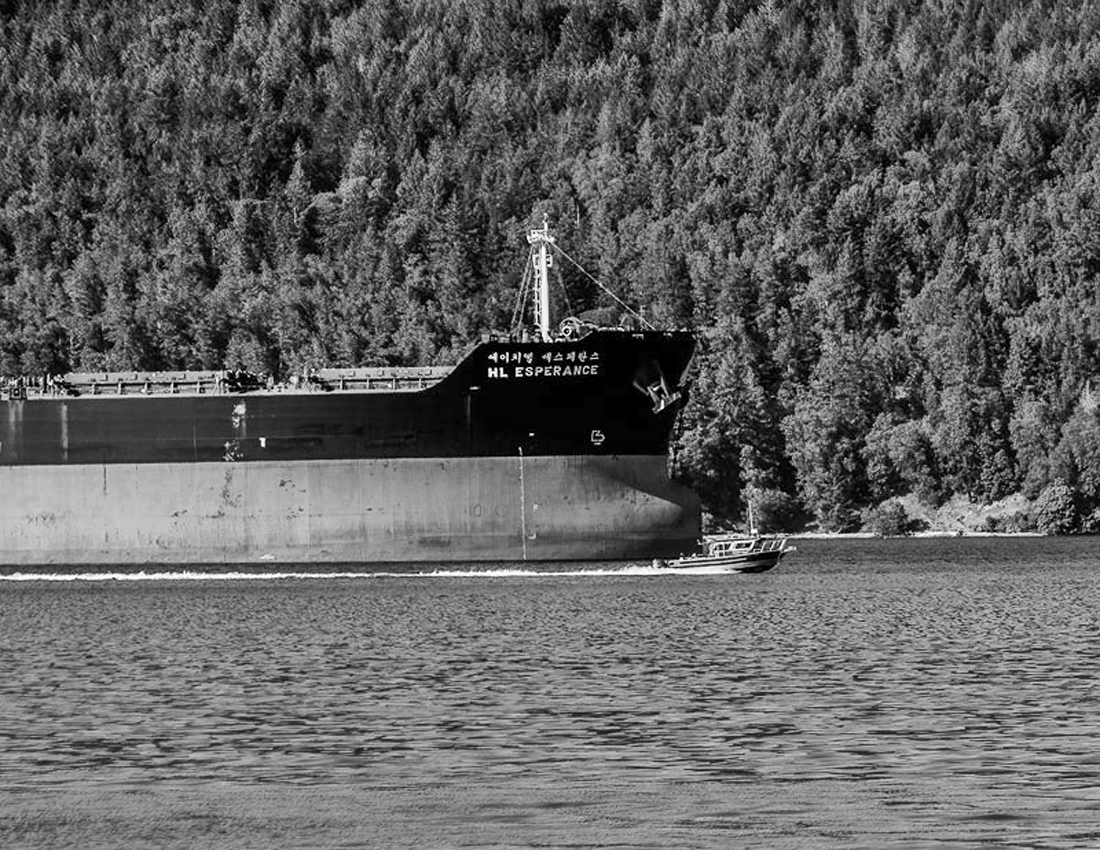
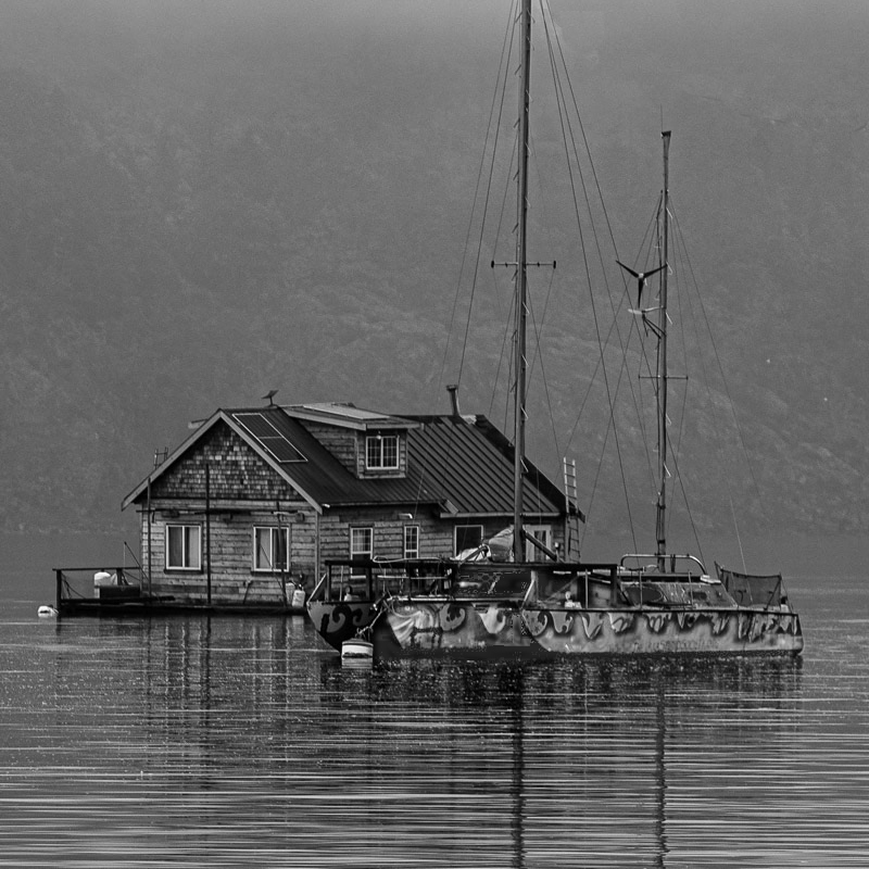
Gong to try the cloning first, that should be easy and then try to mask and lighten the hull. Thanks
|
May 20th |
| 74 |
May 25 |
Reply |
That would work as well although I wonder how many would grasp the concept and even less taking the time to look it up |
May 20th |
| 74 |
May 25 |
Comment |
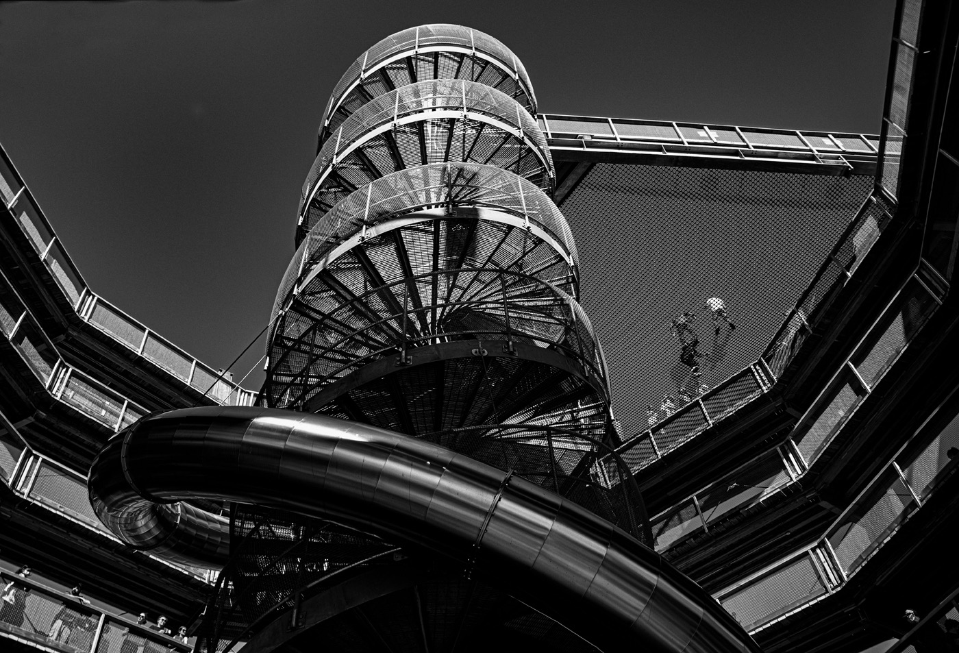
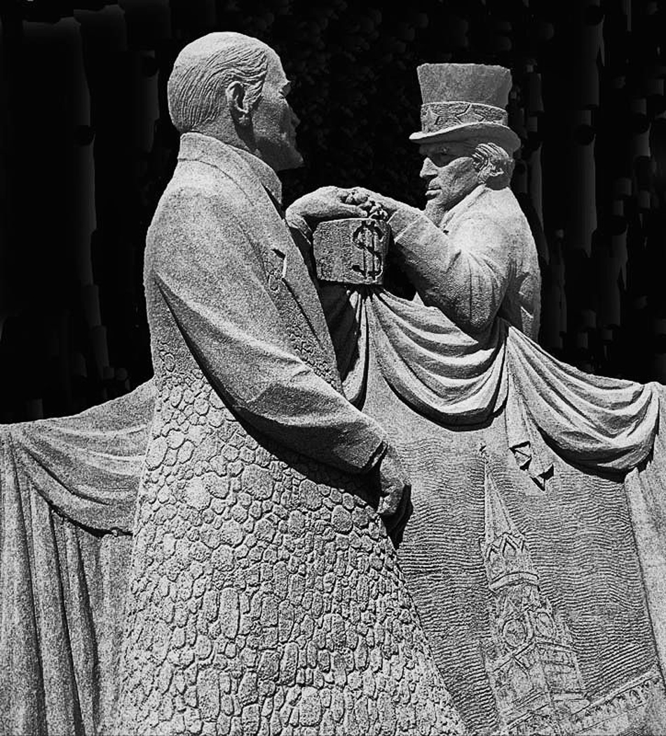
Very interesting. sharp, well composed , toning is appropriate. This is a building I would I would like to see, and I am left with one Question Why? |
May 9th |
| 74 |
May 25 |
Comment |
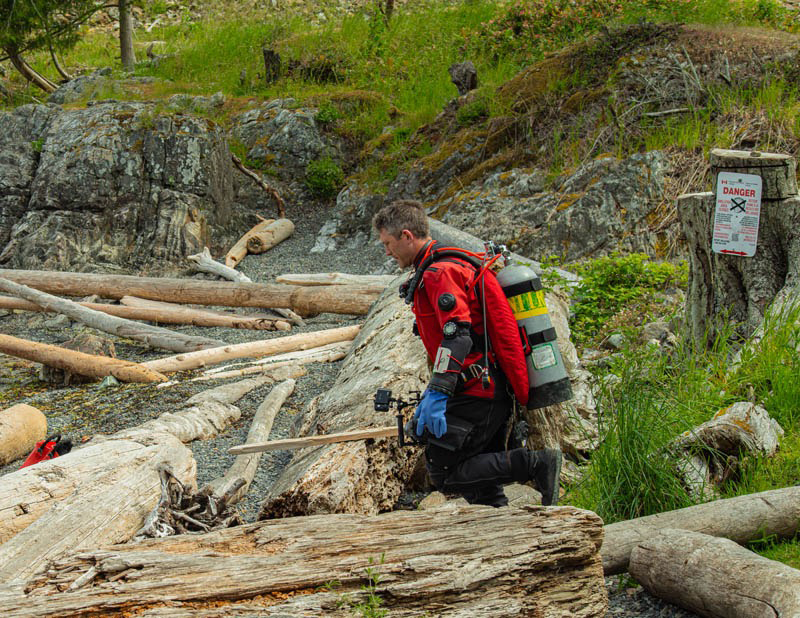
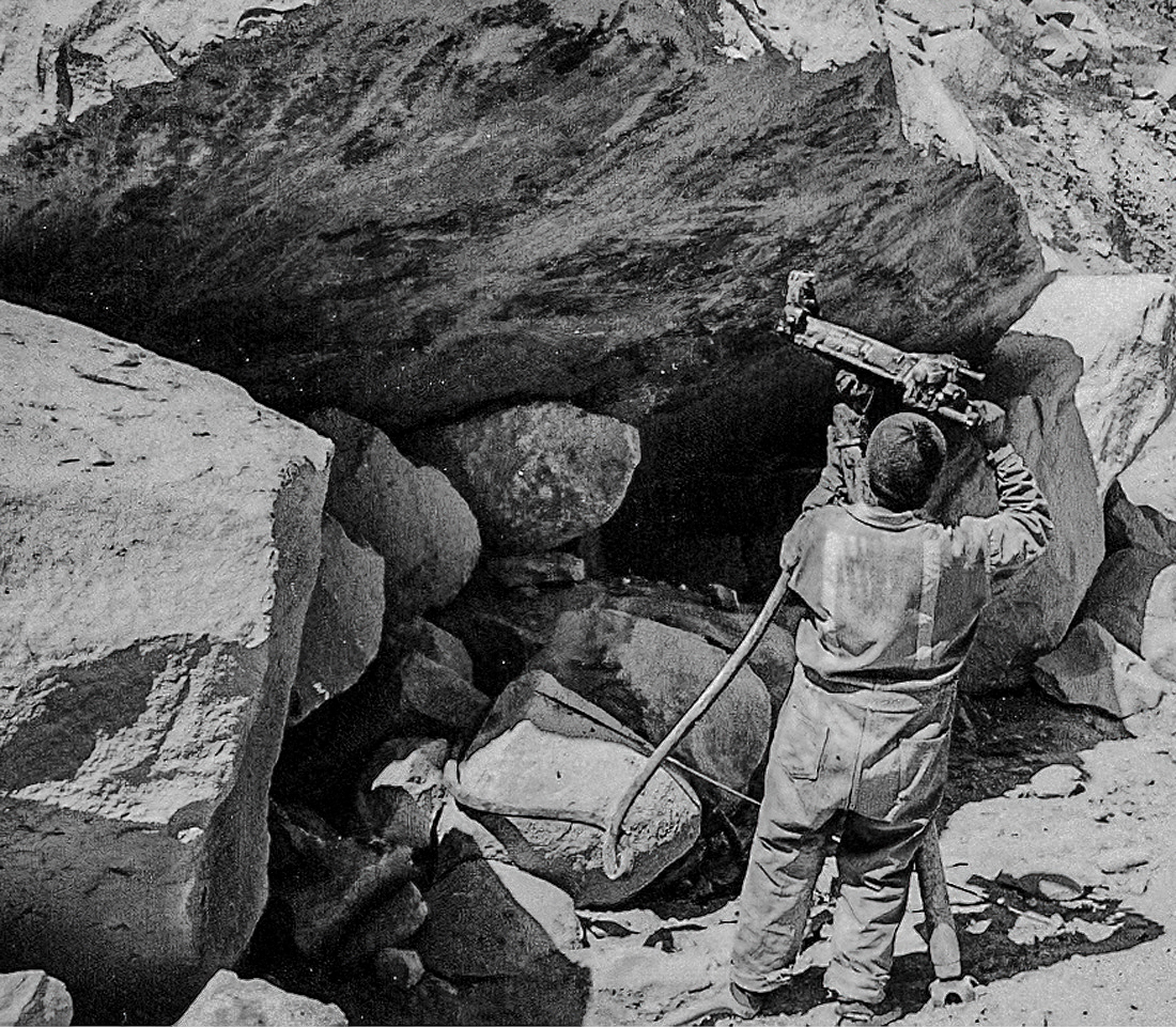
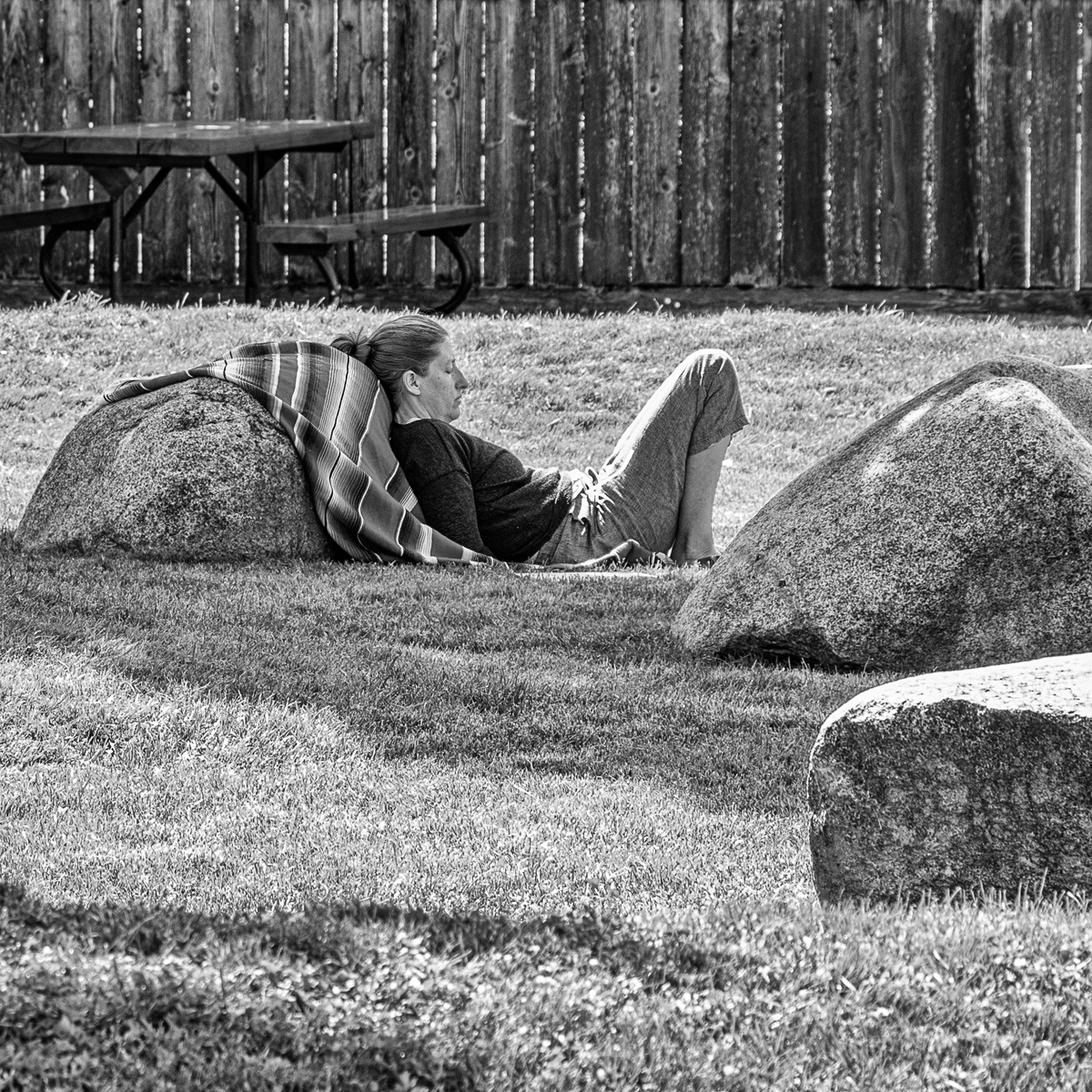
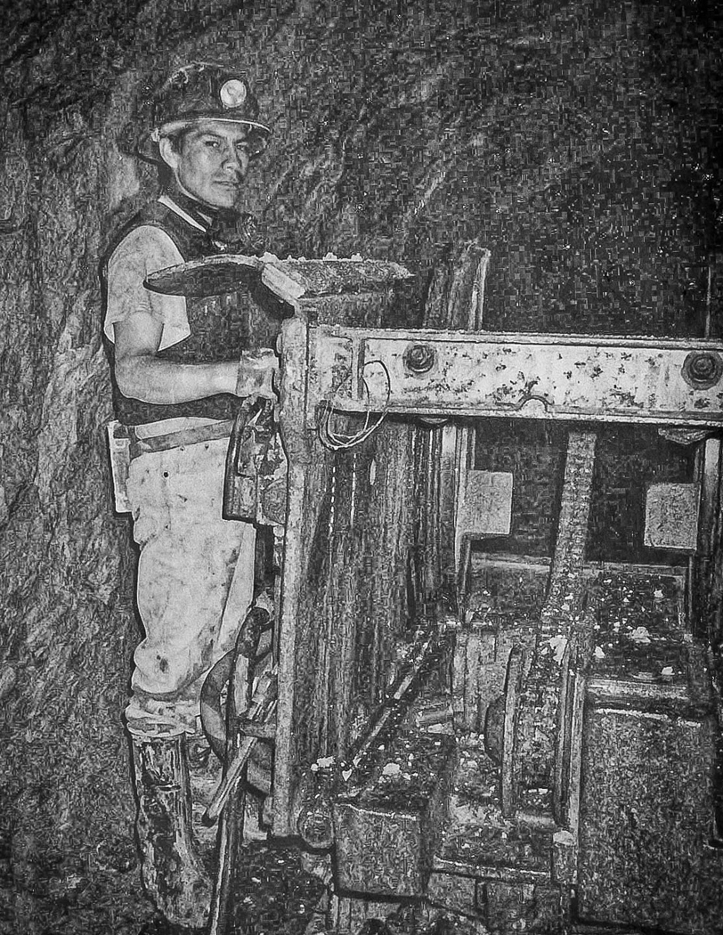
I like this image as posted, part of it is due to the rock structure which I enjoy studying even though i am retired. The scale of the man aginst the rock wall, plus with no sky in the image implying the wall goes even higher adds to the effect. using the shadow of the man creates the idea that the person can be anyone of us. I have no suggestions to improve the image , and like the BW better. The only suggestion I have is change the title to - The intrusion of man - as at this point in time there is no impact either positive or negative. Well done
|
May 9th |
| 74 |
May 25 |
Reply |
Thank you for changing to the correct title |
May 7th |
| 74 |
May 25 |
Comment |
Where did that Title come from? |
May 5th |
3 comments - 5 replies for Group 74
|
8 comments - 7 replies Total
|