|
| Group |
Round |
C/R |
Comment |
Date |
Image |
| 58 |
Mar 25 |
Comment |
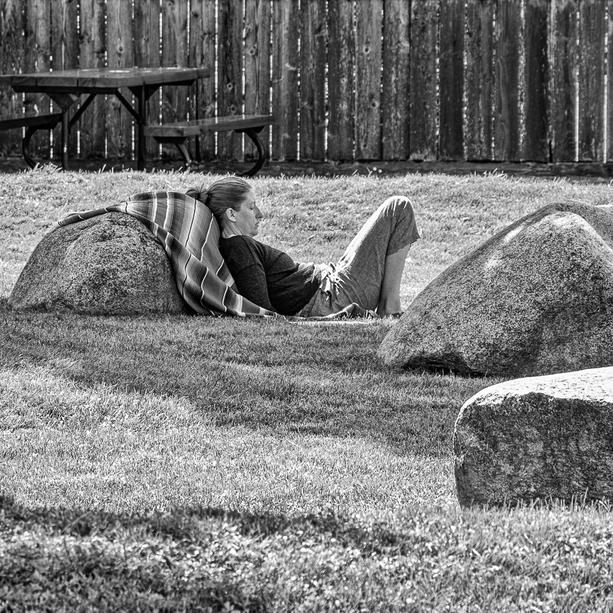
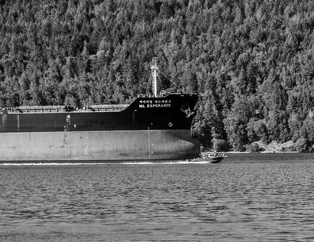
A well composed image and an interesting presentation with the lines leading one from the lower right to the centre. shows the subject well I tried a different toning just to see the effect and I took out the crane as Isaac suggested . |
Mar 17th |
 |
| 58 |
Mar 25 |
Reply |
thank you |
Mar 16th |
| 58 |
Mar 25 |
Comment |
I agree with Bev, I don't think this good photo could be improved. I also like the the other images you have presented. |
Mar 12th |
| 58 |
Mar 25 |
Comment |
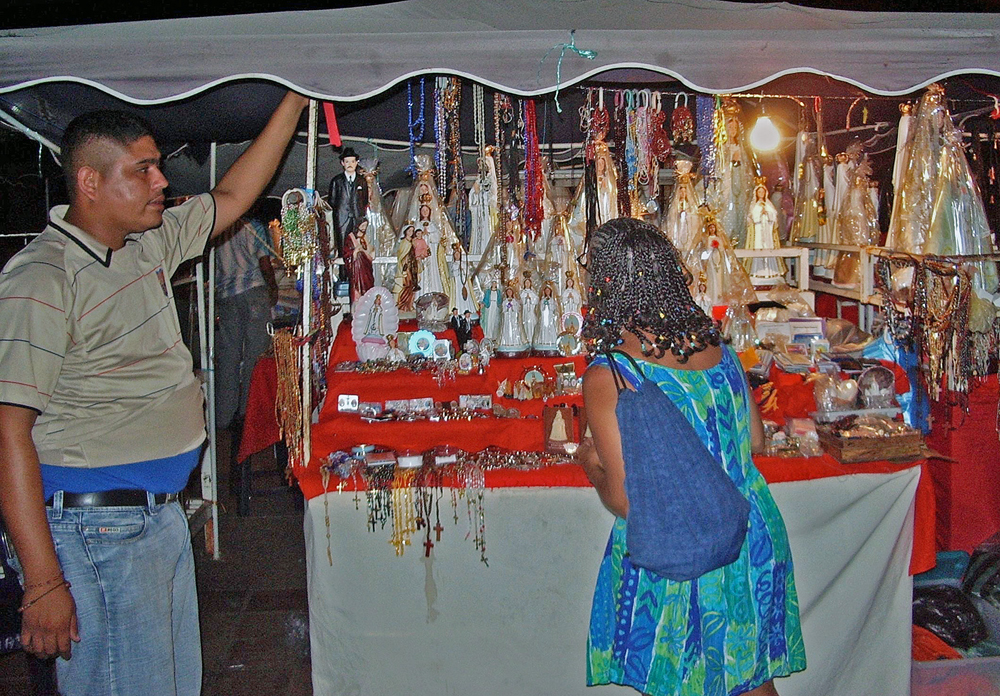
This is interesting in that the subject is the person sitting on the sidewalk. The mismatched shoes suggest that perhaps a panhandler but with your original you were not close enough to contribute. In my mind, his facial expression tells it all. I am not sure if the thumbs up has the meaning as up here. It is a good image. The original tells a somewhat different story in that it shows what looks like somewhat expensive shops and shoppers contrasted against an individual to whom that would be an alien environment, It could be somewhat cropped show the person a bit larger and then some editing to make him stand out a bit more. |
Mar 12th |
| 58 |
Mar 25 |
Comment |
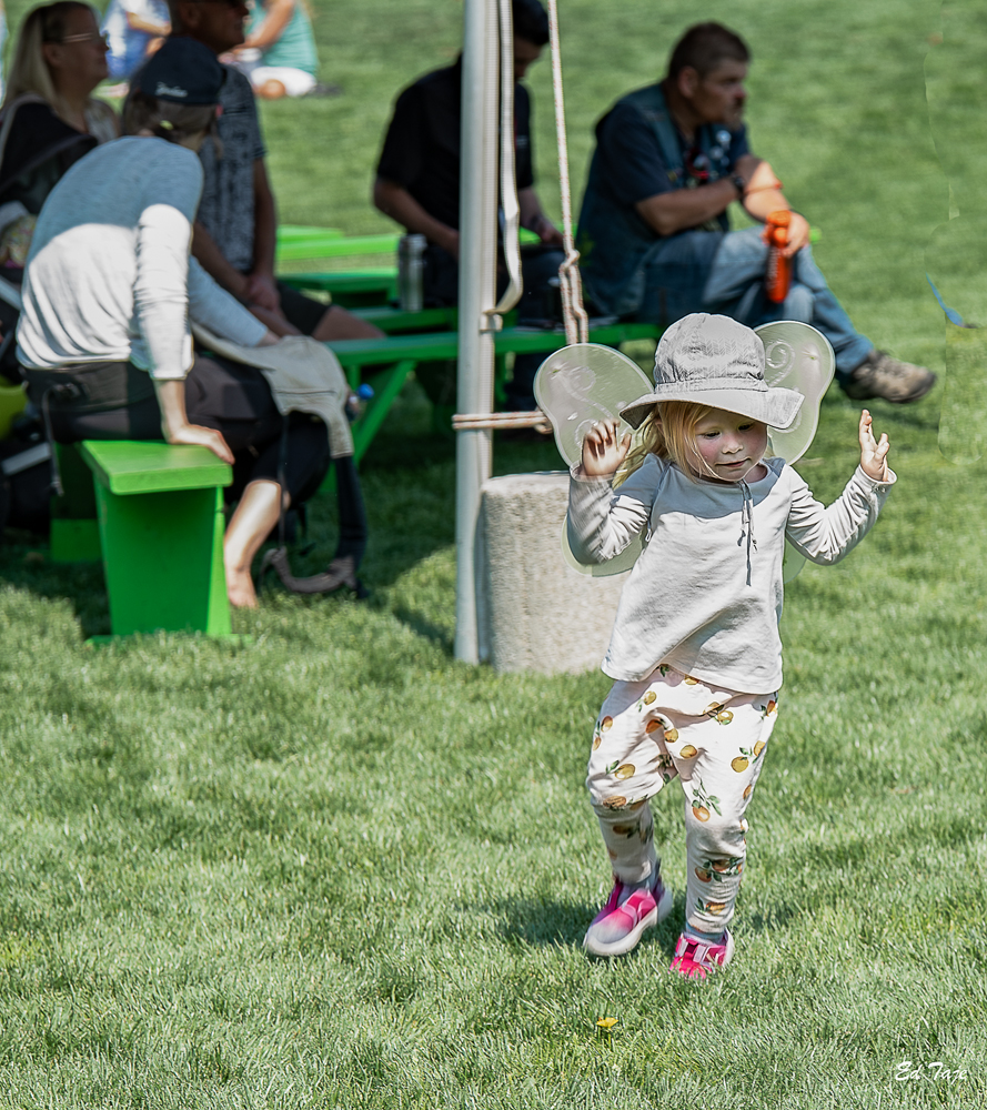
The picture is interesting and the expression on the girls face says it all. I agree with Isaac on the tighter crop, but the cropping of the in camera capture of the legs are not at a joint so should not impact the score if judged (based on my CAPA judges course, PSA may be different). The partial amputation of the green shoes may have a minor effect on the final score. |
Mar 12th |
| 58 |
Mar 25 |
Comment |
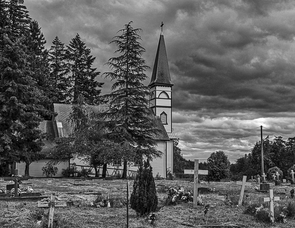
I am always amazed by the "art" produced by those whose canvas is the street, and including graffiti on wall, or buildings, and murals. In this case you have captured the moment well, and I particularly like the expression of concentration on her face. All of the colours add to the scene but do not detract from the Artist (principle subject). the image is sharp , i put it into topaz sharpen and there was no change. The only suggestion I have is perhaps level the horizon, and I have included an edit with that suggestion. Well done, |
Mar 2nd |
 |
5 comments - 1 reply for Group 58
|
| 74 |
Mar 25 |
Reply |
Hi Ed , I tried that and it creates a different perspective and image, which I like and am keeping for future use, thanks for the idea. |
Mar 18th |
| 74 |
Mar 25 |
Comment |
Hi Ed, this is a well composed and sharp image. The BW stands up much better, but the colour also has some good point. I agree with Melissa and would make one slight change , that being a touch more exposure in the Centre to bring out the seeds a bit more
|
Mar 18th |
| 74 |
Mar 25 |
Comment |
Love it, the BW is much better, more detail no distractions and the only suggestion I could make to further improve the image would be for me to clean my dam glasses. |
Mar 6th |
2 comments - 1 reply for Group 74
|
7 comments - 2 replies Total
|