|
| Group |
Round |
C/R |
Comment |
Date |
Image |
| 17 |
Jan 25 |
Comment |
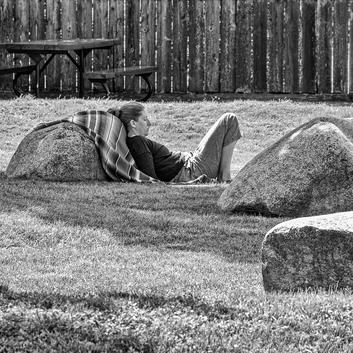
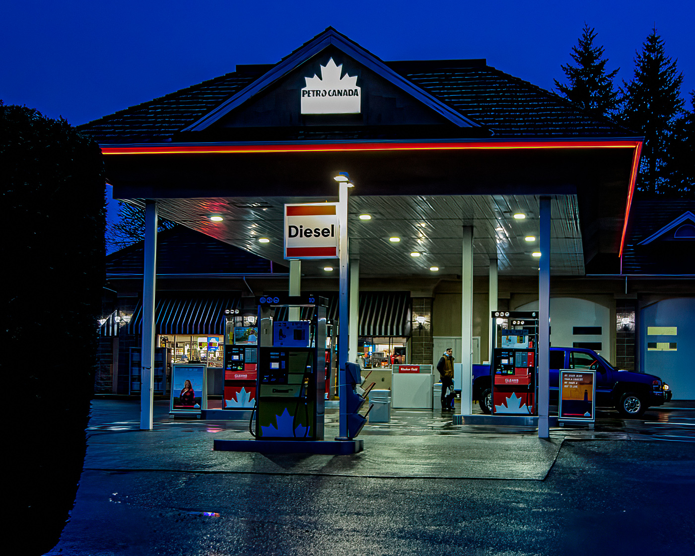
I perhaps am going to be a minority, but in addition to the building which you have shown very well, you, due to the people in the image have captured a moment in time (street photography) that will never be repeated. Well done
|
Jan 12th |
1 comment - 0 replies for Group 17
|
| 58 |
Jan 25 |
Comment |
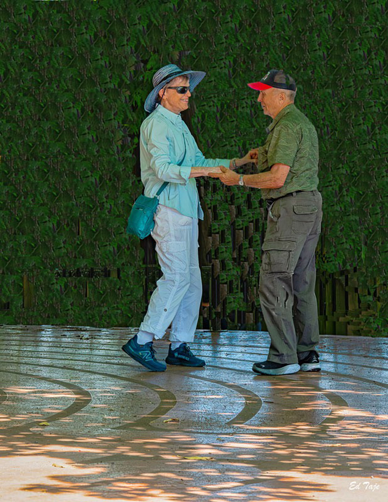
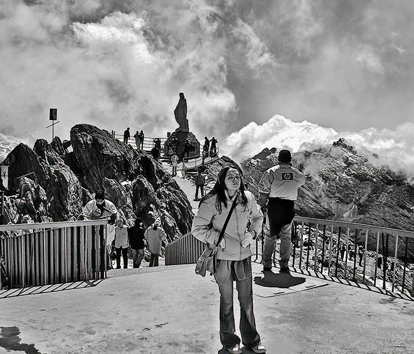
I think I would leave the image much as is, perhaps a small amount of crop on the right side removing the black object and an equally small crop along the top to maintain the ratio of your image. I do see some humour in the image as it seems that she is to some degree a walking billboard with a regulation for an area that does not seem to be able to support vehicle traffic. The image is sharp and the overall image shows the woman in her everyday environment. A pleasant and to me showing some humour in our daily lives. I enjoyed looking at this image. |
Jan 17th |
| 58 |
Jan 25 |
Reply |
I agree, except the other angle was into the sun and just to the left was a parking lot |
Jan 16th |
| 58 |
Jan 25 |
Comment |
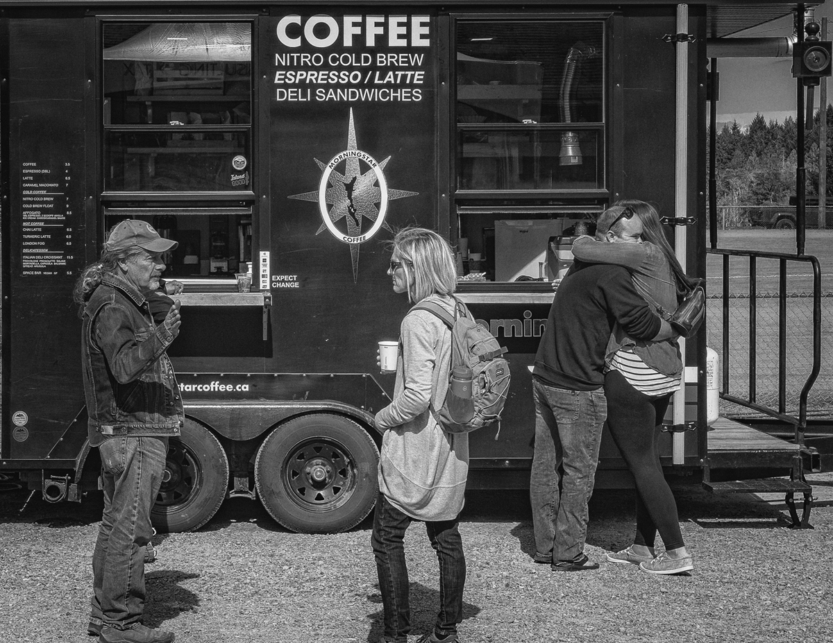
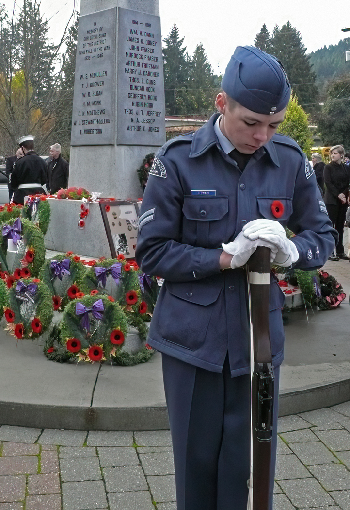
Good image, captures the moment and incling the weather well. Looking at the person with his back to us and his plastic "rain coat" one can almost feel the wetness of the scene. Well Done particularly with the person looking for some one or thing. |
Jan 12th |
| 58 |
Jan 25 |
Comment |
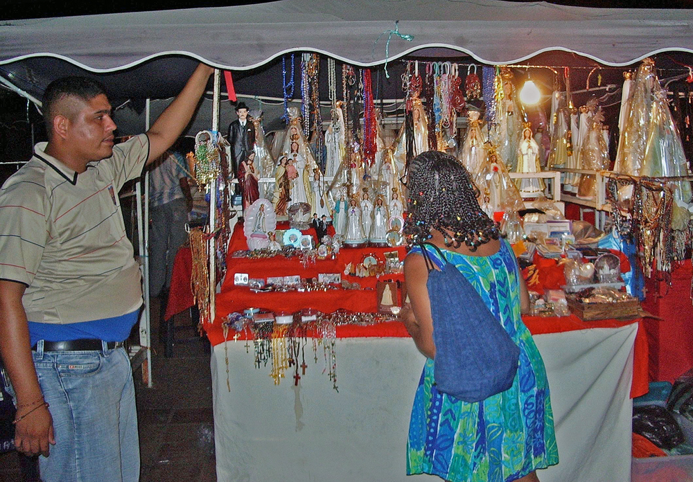
Three ladies happy to pose and get a break from their daily? work. While more of the surroundings would add to the story and give some context, I think the moment as well captured in your image, ie: the facial expressions, would be lost |
Jan 8th |
| 58 |
Jan 25 |
Comment |
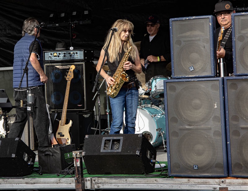
I like the image it is well done, I wonder what the pole, Bev mentioned ,is for. I am guessing it is for some sort of shade over the singer-musician Not sure if removing it would make much of a difference. |
Jan 8th |
| 58 |
Jan 25 |
Comment |
The subjects as photographed at the time capture the vibrance of the street , Well done. I think I will be part of a minority but I like the toning you used better than the original colour |
Jan 7th |
5 comments - 1 reply for Group 58
|
| 74 |
Jan 25 |
Reply |
Hi Ed, thanks for the suggestion I am going to do that. |
Jan 16th |
| 74 |
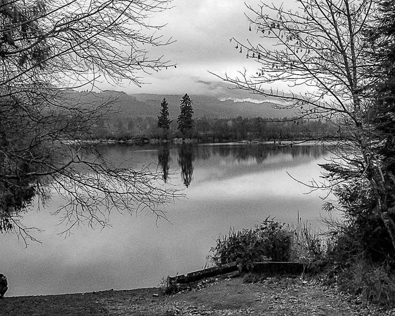
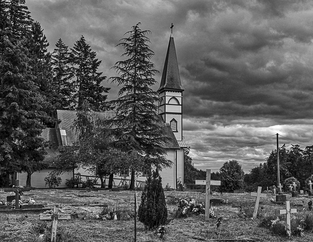
Jan 25 |
Comment |
Hi Ed, you did it again. This image really stand out in the format you used as all the layers are such that they lead you through the image from the foreground to the clouds at the top of the frame. While the colour image has it's own positives it does not compare to the BW, For example the brightness in the colour image upper left is a bit of a distraction, and that does not really stand out in the BW Well done |
Jan 10th |
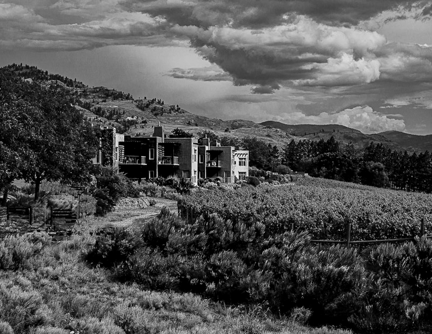
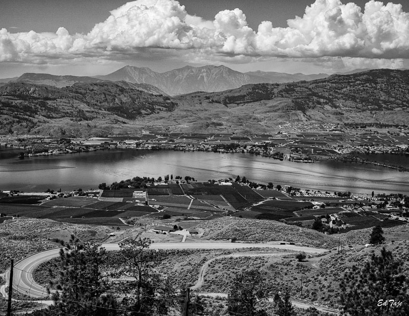
| 74 |
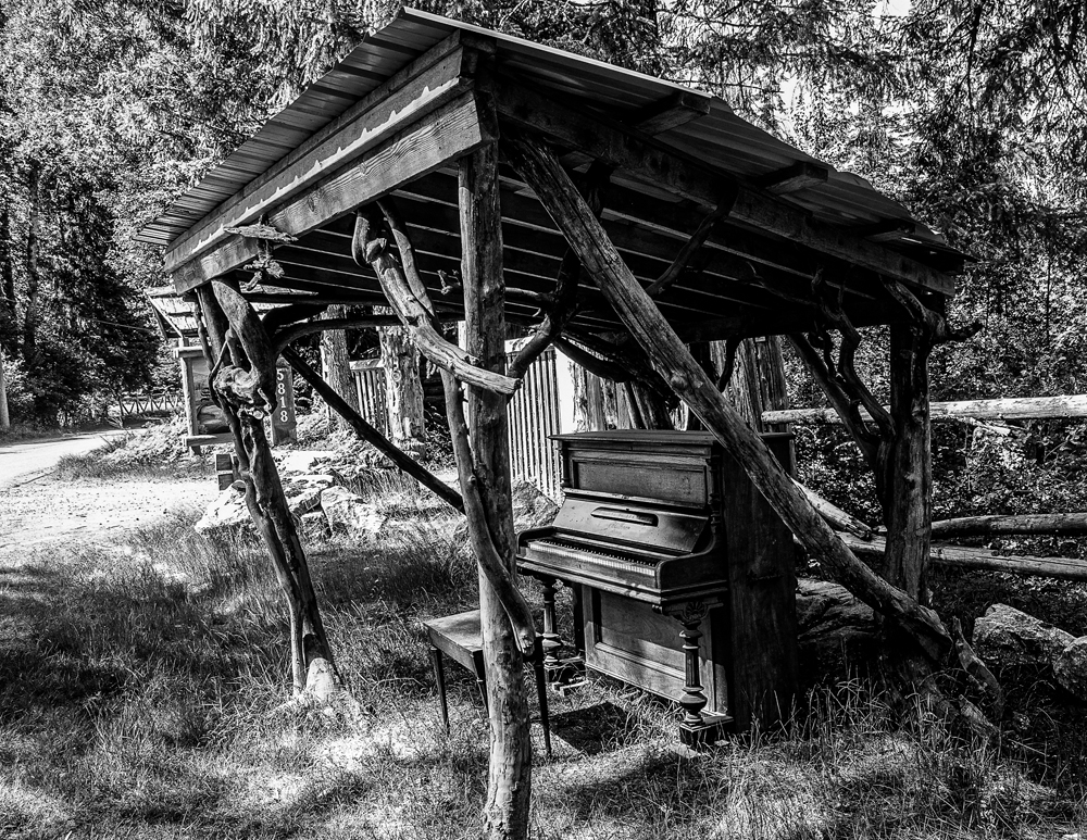
Jan 25 |
Comment |
The structure does stand out much better in BW and the composition with just enough foreground to lead to the structure. Changing the sky was a good choice as the original sky was somewhat boring and did not add. One other option I think would be to darken the blue sky to black and remove the clouds from the original. I think that woud really make the structure stand out even more. Just my taste for blue skies. Your image is well done. |
Jan 6th |
2 comments - 1 reply for Group 74
|
8 comments - 2 replies Total
|