|
| Group |
Round |
C/R |
Comment |
Date |
Image |
| 58 |
Oct 24 |
Reply |
thanks i will try that at some point
|
Oct 30th |
| 58 |
Oct 24 |
Reply |
Hi Pinaki: I apologize I had the title an name wrong for Lord Rama, my fault, as i looked it up then typed the wrong name. One of the interesting things with these sites is that in addition to photography how much more beyond that we can learn I was unable to open the link you sent as for some reason a message came up that the site was not available in my country, no idea why. |
Oct 30th |
| 58 |
Oct 24 |
Comment |
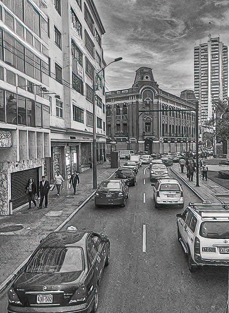
This for me was a difficult image as the intent was to show architecture. The corrugated wall with the red line does lead to a more interesting structure, that being the buildings that seem to be above the street. Perhaps more attention to them would make the image stand out. the persons seen are a bit of a bonus |
Oct 16th |
| 58 |
Oct 24 |
Comment |
Captures the moment well, ie: the lone person apparently taking a photo with his cell phone. the very bright area from the fireworks in the centre distracts from both the story i see and the figure which I believe represents King Ravana. |
Oct 16th |
| 58 |
Oct 24 |
Comment |
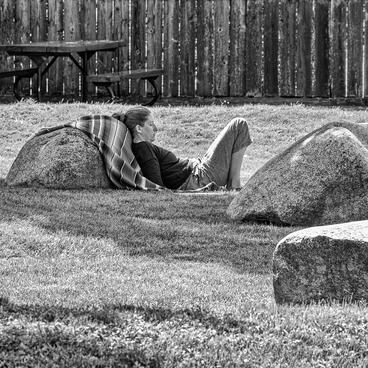
While the image contains a good representation of your intent to capture the "ghosts" there are a couple of persons that are a bit too sharp for your intent. In general I like the image and it is something I am going try today at a field trip our club has scheduled. I did a crop to eliminate the diagonal line at the bottom and along the sides to attempt to create a slight change in the balance. |
Oct 12th |
 |
| 58 |
Oct 24 |
Comment |
The image shows the teacher relating to and sharing her subject with the young students. The teacher seems to be leaning slightly away from the students and perhaps could be straightened which I think was accomlished with Isaac's edit. His crop also removed what appears to be the toe of a shoe on the right edge. The black background really makes the principles stand out.. |
Oct 9th |
| 58 |
Oct 24 |
Comment |
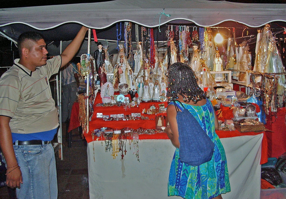
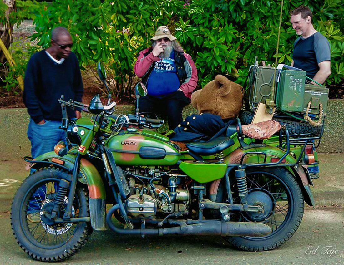
I like the scene as shown. The car and the truck behind the vendor show the how in some cases things do not change, modern and the past, Although the crop does highlight the vendor and his load it leaves me wondering what he is looking at as there seems to be a void in that area. |
Oct 9th |
5 comments - 2 replies for Group 58
|
| 74 |
Oct 24 |
Comment |
No question, the BW stands out much better. Well done |
Oct 16th |
| 74 |
Oct 24 |
Comment |
Did it again don't know my left from my right, lines lead from "lower left" to the void ahead of the last bright spot in the upper "right" |
Oct 9th |
| 74 |
Oct 24 |
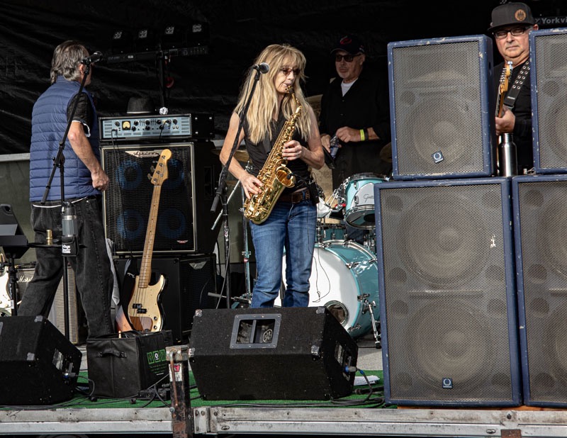
Comment |
Showcasing the front man (drummer) does well, it is sharp and very clear, the BW is much better than the colour. I agree with Stacy on perhaps cropping square to eliminate the fiddler for the same reason as hers. |
Oct 8th |
| 74 |
Oct 24 |
Comment |
I like the composition and the attention to the soles of his shoes, perhaps his face could be lightened up a bit and a smaller aperture would put his face in a better focus ( not real sharp) and show a bit more detail. |
Oct 8th |
| 74 |
Oct 24 |
Comment |
Hi Haru, what I am looking at is an abstract in BW. What I see is the balance light versus heavy is good and the light lines lead one through the upper left and lower right to the void. I have no ideas how to improve this image except perhaps bring out some of the grey tones , sort of similar to how the Zone System works, and at that I am not sure, Perhaps others may see something else in it and have some ideas, I wil watch this posting as well to see. |
Oct 8th |
5 comments - 0 replies for Group 74
|
10 comments - 2 replies Total
|