|
| Group |
Round |
C/R |
Comment |
Date |
Image |
| 58 |
Sep 24 |
Reply |
Sergio: I missed the foot as well
|
Sep 23rd |
| 58 |
Sep 24 |
Comment |
AS is this image needs no change to my way of thinking. It also lends itself to a number of other possibilities featuring the barber. |
Sep 22nd |
| 58 |
Sep 24 |
Comment |
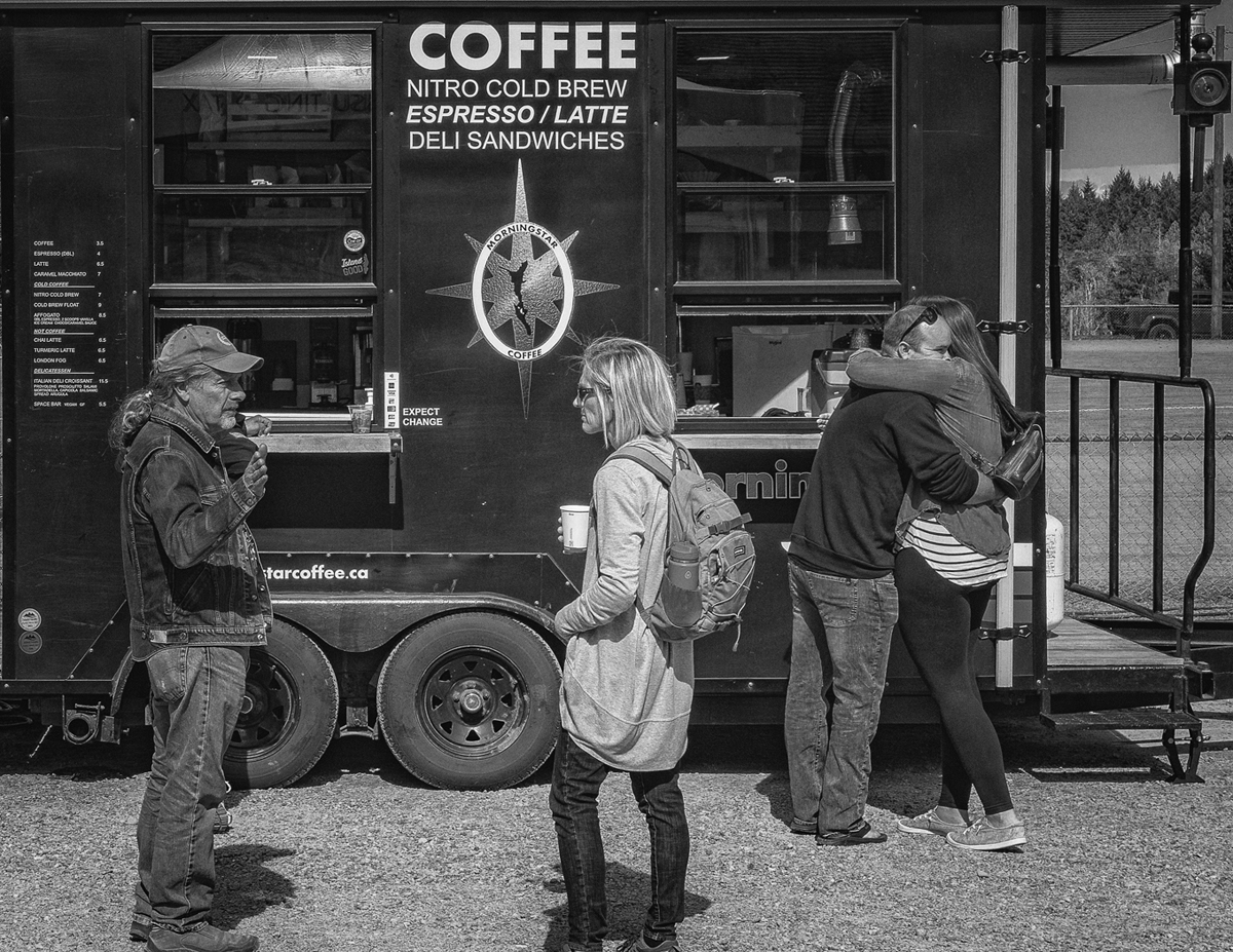
Image is sharp and the detail in all the components is on the mark. She seems to be at a loss with what is on the screen, perhaps even though the computers seem to be on some sort of protective matt she would up with sand in one of the keys. I doubt this particular scene could be improved. All of the elements including the story are included. A very nice image |
Sep 22nd |
| 58 |
Sep 24 |
Comment |
Would not change a thing, a single runner in the empty city and with the mist, Well Done |
Sep 22nd |
| 58 |
Sep 24 |
Comment |
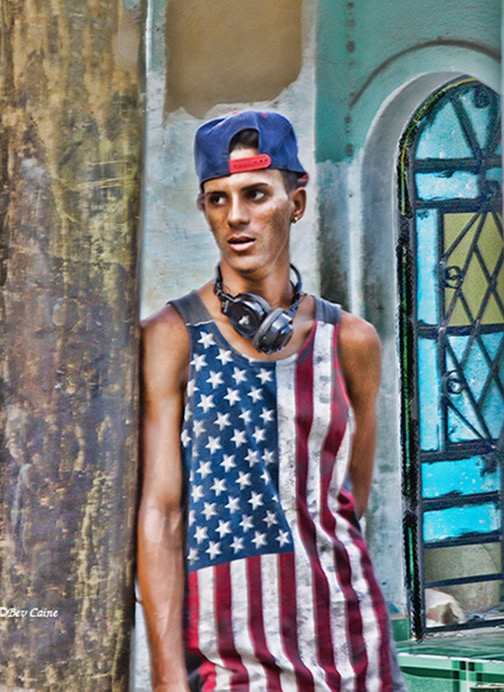
I like the edit as to tones you used , the expression on the young man's face which seems to convey a sense of wonder looking forward. I did some cropping to bring him up a bit remove a couple of minor distractions along the sides. |
Sep 22nd |
 |
| 58 |
Sep 24 |
Comment |
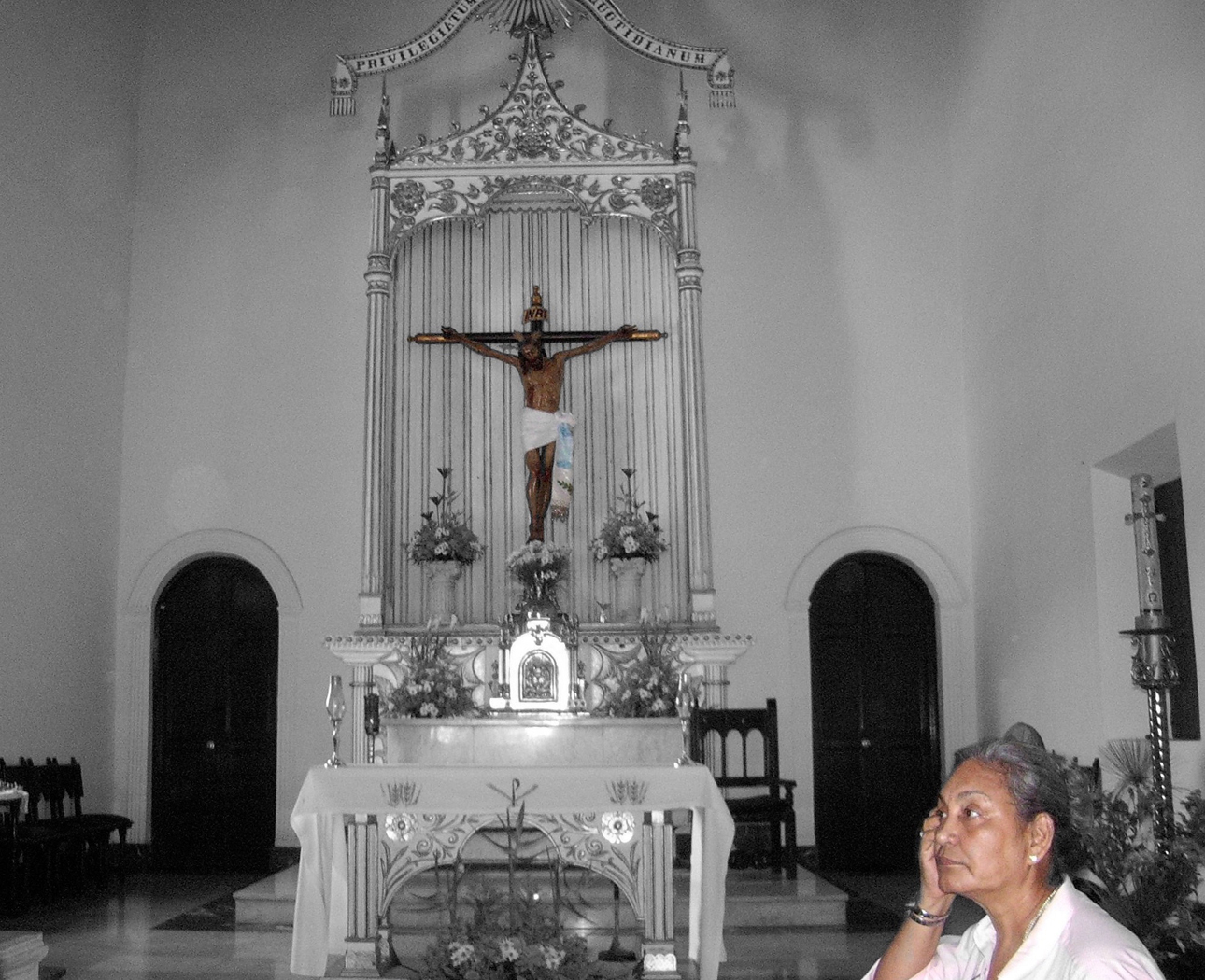
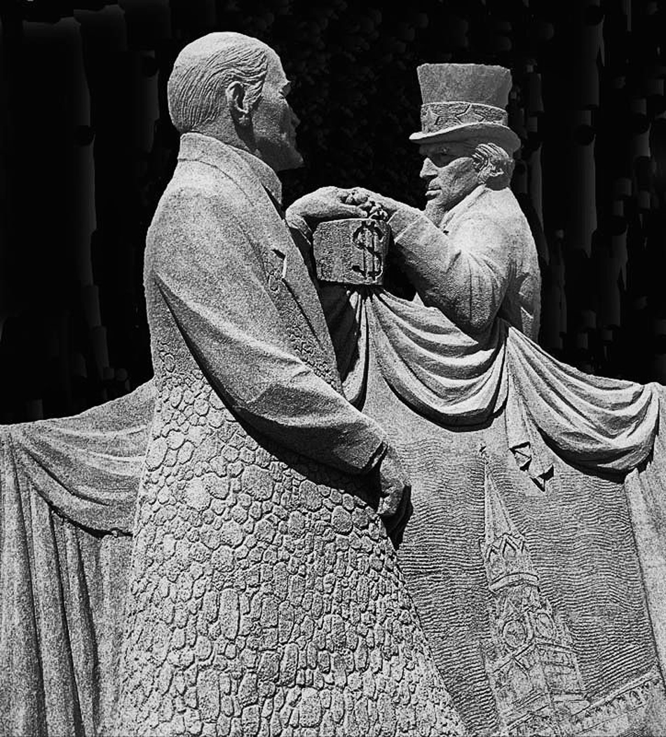
I love the contradiction between the statue which seems to be focussing on the busker and the small group of people who seem to be in their own world and ignoring the music. Would not change a thing. |
Sep 22nd |
5 comments - 1 reply for Group 58
|
| 74 |
Sep 24 |
Comment |
As a straight out of the camera image it is amazing with good depth and lighting for the image. I think with subtle darkening of the bright leaves on lower right more attention would be drawn to primary subject that being the well lit and exposed leaves that make up most of the image, while keeping the shadows along the right side |
Sep 22nd |
| 74 |
Sep 24 |
Comment |
He is definitely ignoring those around him. I like both images, with a slight lean to the colour. The detail in the BW really stands out well done |
Sep 22nd |
| 74 |
Sep 24 |
Comment |
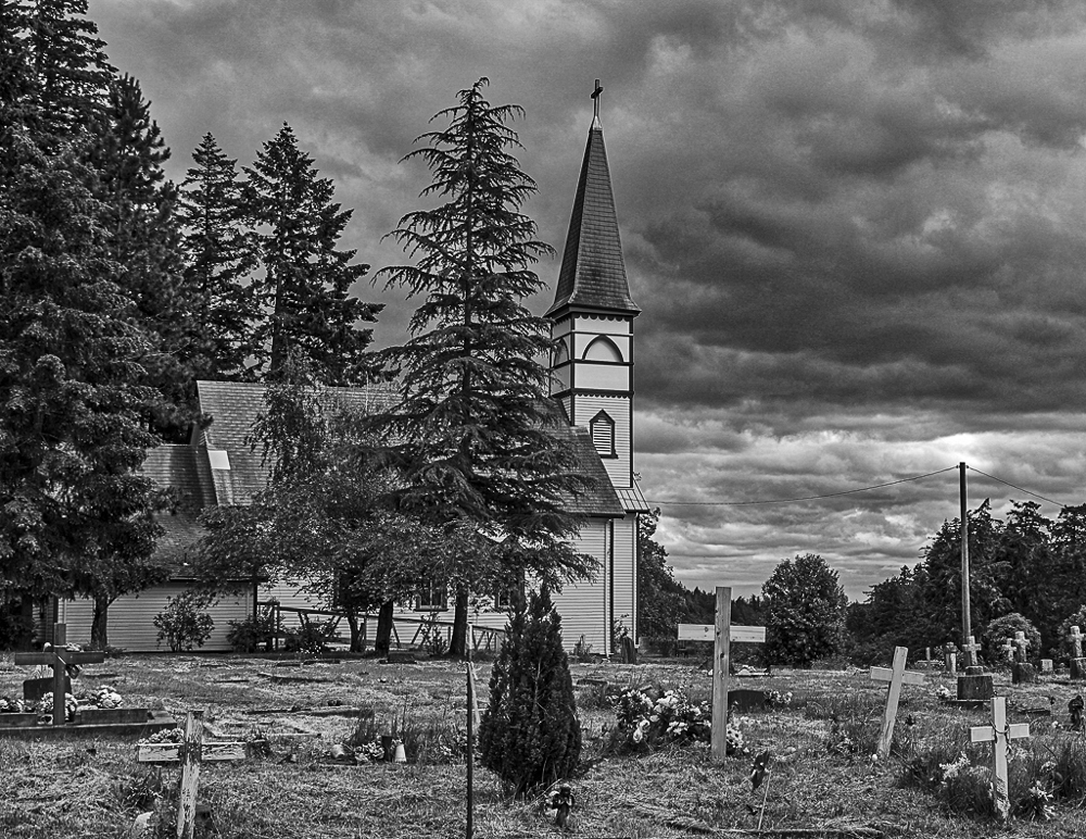
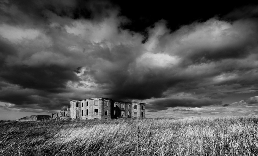
I like the BW version as it seems to convey the past which seems to fit the aging old building. The sky with the dark clouds adds to the mystery of the building . I did one crop which I think puts a bit more attention on the building against the sky and to some degree adds to the loneliness on the plain, |
Sep 22nd |
 |
| 74 |
Sep 24 |
Comment |
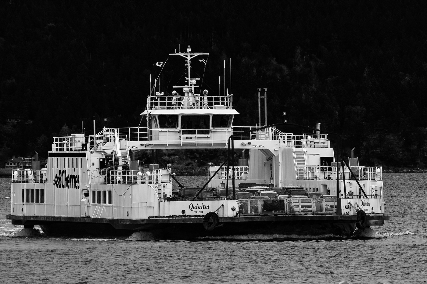
In looking at the image I also thought of lightening the ship, then I tried it and it did not look too bad. In the end I liked the darker ship as to me it seemed more ominous sort of more final. the composite is well done and the title abandon ship seems to be a rhetorical statement as the result for those on board would be the same. As a composite perhaps the ship could have been moved to the left somewhat so that it was just over the edge of the falls. |
Sep 13th |
| 74 |
Sep 24 |
Comment |
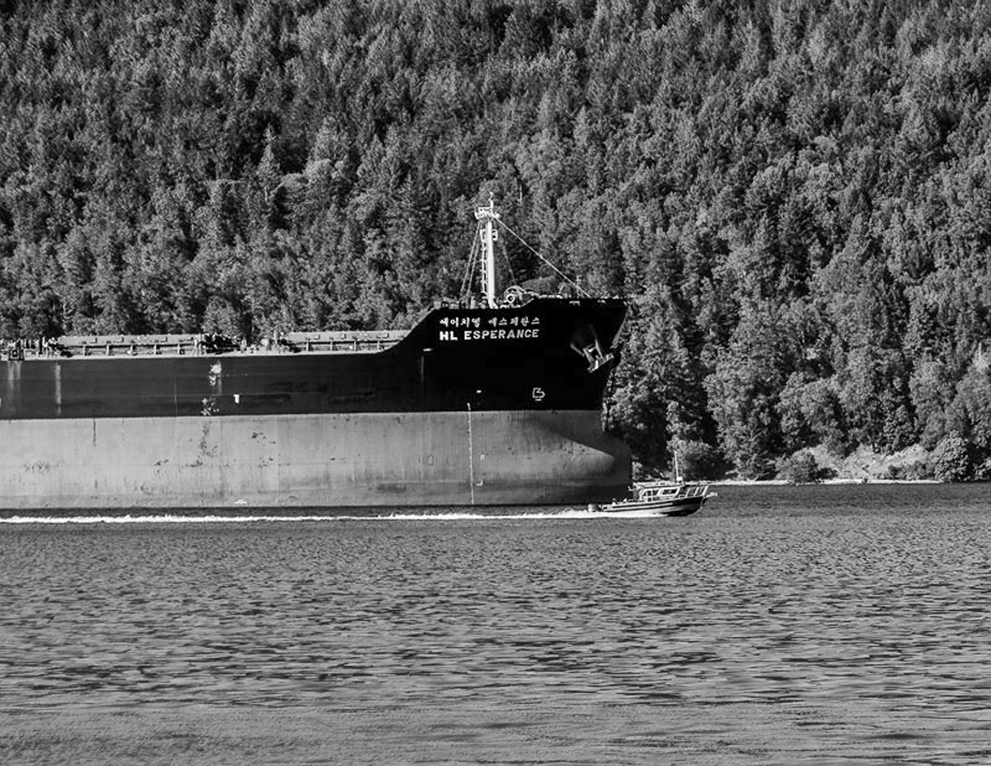
Haru I think this a very clear case where you conversion to Mono far exceeds the colour image. It creates an other world experience. You asked for possible suggestions and all that I could come up with would be to crop the right side slightly to establish an even margin in the image. Your turn please, how did you achieve the excellent result with this image. |
Sep 9th |
5 comments - 0 replies for Group 74
|
10 comments - 1 reply Total
|