|
| Group |
Round |
C/R |
Comment |
Date |
Image |
| 58 |
Aug 24 |
Comment |
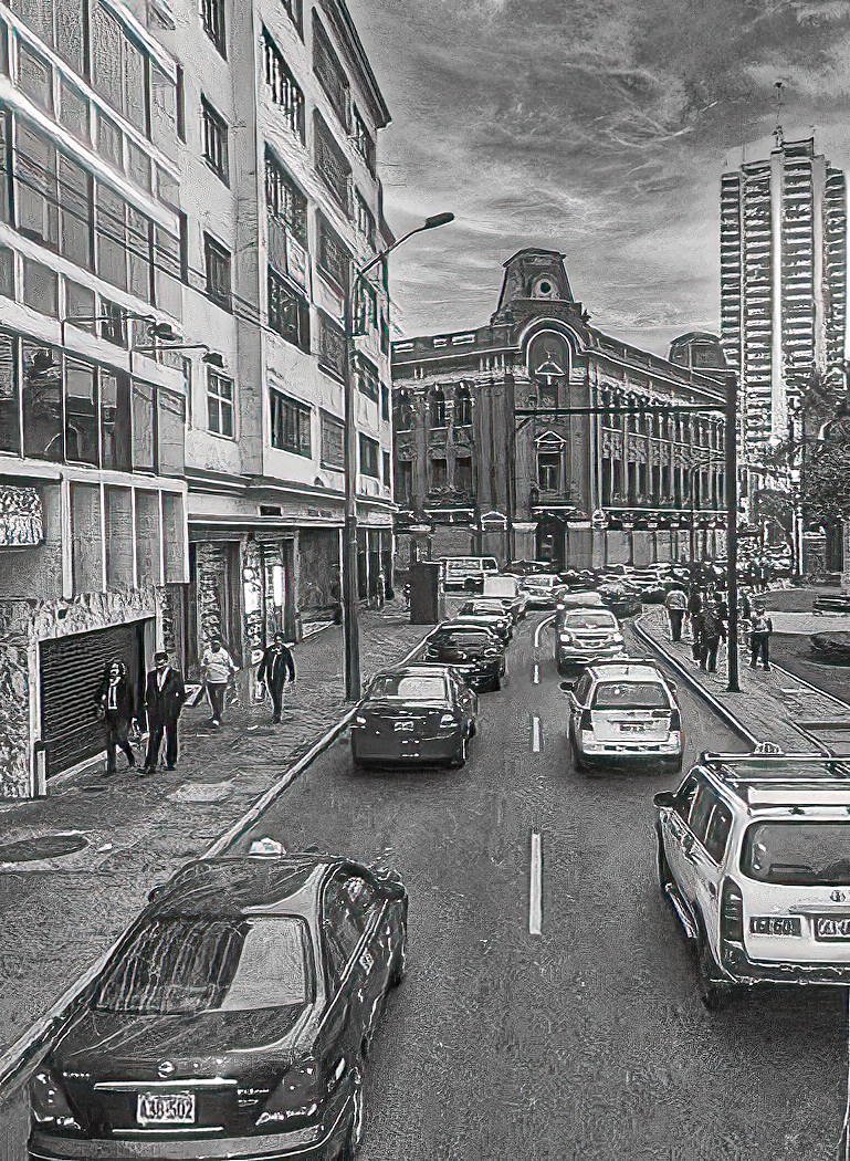
I like the contrast of the person against the bright background and then the feeling created by showing one person against the the city he seems all alone in the big city and is just a shadow. I did try to crop it tighter and the result was not good. |
Aug 18th |
| 58 |
Aug 24 |
Comment |
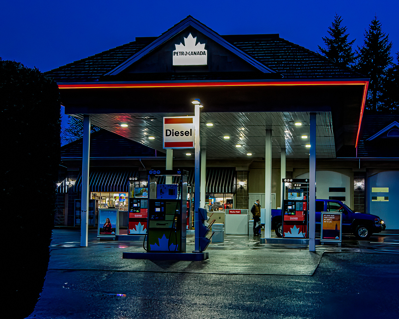
This is a well processed image, and the composition is good. I think I might have cropped it a bit more tha Sergio's crop on both sides, On the left I would have cropped to eliminate the sign and on the right almost to the ?boxes. |
Aug 18th |
| 58 |
Aug 24 |
Comment |
A very nice image, I can't anything that could be changed or even considered. Final processing is amazing when compared to your original, Really well done
|
Aug 11th |
| 58 |
Aug 24 |
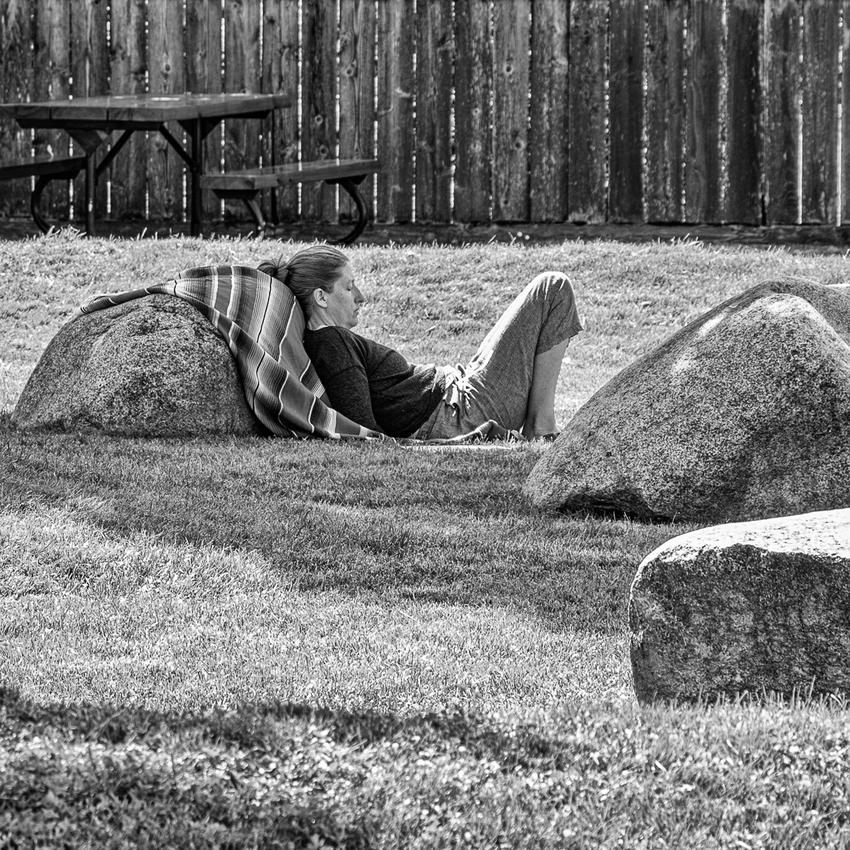
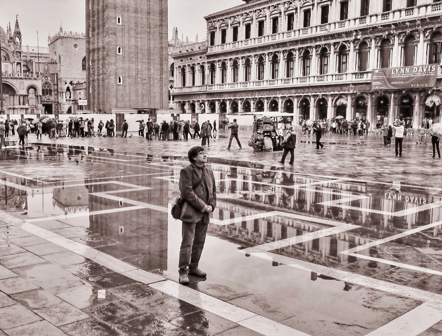
Comment |
This image to raises the same question Bev was wondering about. It is good timeing, the reflections in the wet plazza add to the image, the distance from the subject to the others in the scene leads one to think he is in his own world. Very nice image. I did try one crop and toning adjustments just to see the effect as I think your image stands on it's own |
Aug 10th |
 |
| 58 |
Aug 24 |
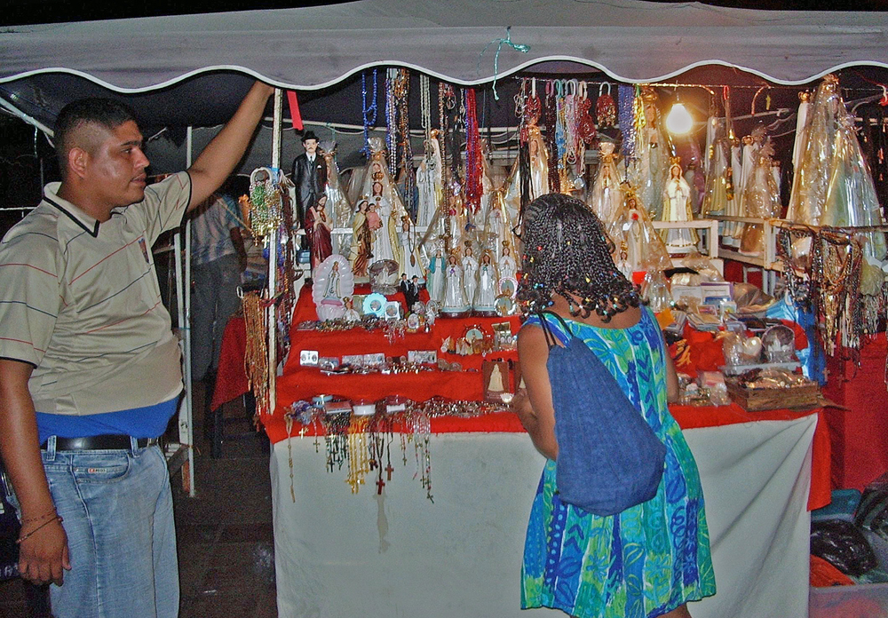
Comment |
This is a good example of a , as you said, posed street portrait . Although you have changed the background which removed any context to the street I like what you did with the background as it really makes the subjects stand out. About the only suggestion I have , would be is that it would improve the image to some degree if there was about an equal amount of space on the left side , which would also include the portions of the arm that are cut off. I do like this image though as is. |
Aug 8th |
| 58 |
Aug 24 |
Comment |
Interesting story in this image, I tightened the image to put more attention to the detail on the two boy, and toned to a small degree the the background with did add a bit of detail to the people sitting with what I think is some indifference to the two boys. It I think shows the persons on the left and right walking out of the scene , again ignoring the two boys. This also to some degree contrasts with the coins the boys have collected. I had a hard time with the tiles and think I have them too dark.
Just my view on what is a good scene as presented. |
Aug 8th |
 |
6 comments - 0 replies for Group 58
|
| 74 |
Aug 24 |
Comment |
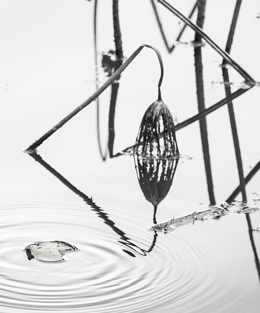
This is a hard image to judge. It has potential as minimalist or maybe a unique fine art image. Removing some of the elements and a slight toning might accomplish that. I might crop it a bit further on the left and remove the triange. That would still show the ripples in the water. Just a thought and one opinion. |
Aug 18th |
 |
| 74 |
Aug 24 |
Comment |
I think you nailed it with your second crop. As it puts the attention on the subject and eliminates the somewhat distractions on the right side. A very nice image
|
Aug 18th |
| 74 |
Aug 24 |
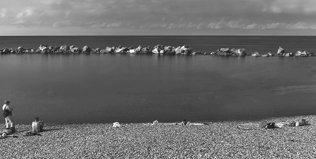
Comment |
Interesting image of a Beach, I like the BW version. I tried something different , I cropped it to make a fake panorama, and did some minor adjustments to the toning,
Just something different it does highlight the rock breakwater a bit more, |
Aug 10th |
 |
| 74 |
Aug 24 |
Reply |
Hi Ed
The crop you suggested works for me and does help thanks |
Aug 7th |
| 74 |
Aug 24 |
Reply |
Somehow, I missed those dust spots Thanks will also do some clean up as you suggested. |
Aug 7th |
| 74 |
Aug 24 |
Reply |
Hi Stacey, I missed out on the eves but your toning is quite good, I still think a bit of darkening on the highlights i mentioned will help,. |
Aug 7th |
| 74 |
Aug 24 |
Comment |
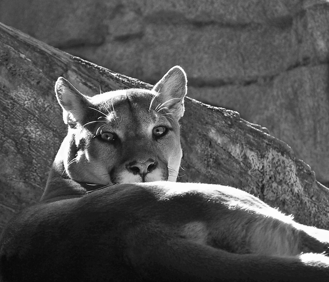
This is a difficult image to judge. I cropped the right side to eliminate the distraction and still maintain some of the detail in the background rock, I did attempt to tone down the highlights on the top of the head and left side along with the portion of the legs on the right slightly. I had some help from Aurther, as in arthritis, and it seemed to help . As my hand was not steady enough and I could not keep within the areas I targeted I did not leave them in my cropped image. It is a good nature picture, Perhaps if the cat raised it's head a bit more that might help, but with a 123 focal length I doubt that I would have waited for that to happen, as these cats can be quite unpredictable |
Aug 7th |
 |
| 74 |
Aug 24 |
Comment |
Hi Stacy
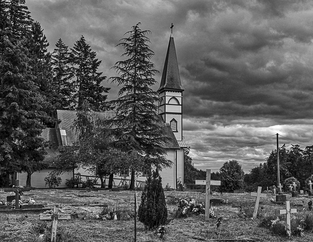
This image to some degree strikes me as a scene from a Hitchcock film and it suits that very well. It is sharp with good definition of all the details. It is a very busy image with a lot to look at, This is a case where being busy is in my mind a good thing I think though that cropping the light areas on the left side would add even more to the story as I see it. |
Aug 7th |
5 comments - 3 replies for Group 74
|
11 comments - 3 replies Total
|