|
| Group |
Round |
C/R |
Comment |
Date |
Image |
| 58 |
Jun 24 |
Reply |
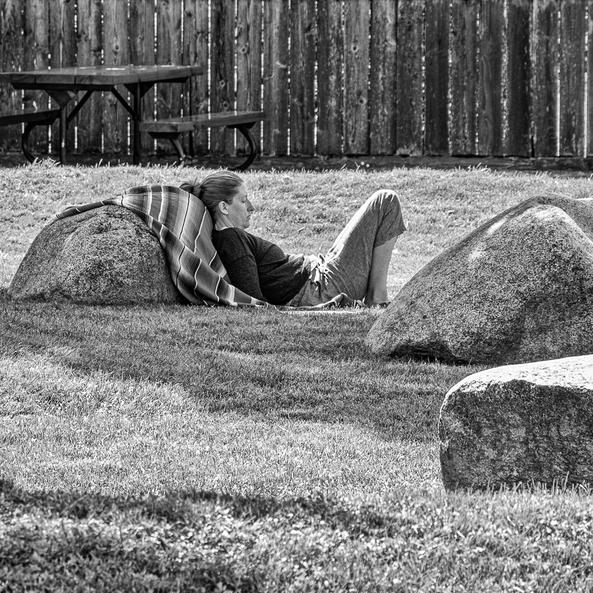
When I did the image i though the fence and the empty bench added to it. In looking at your crop I see a much better take on the scene, thanks
|
Jun 14th |
| 58 |
Jun 24 |
Comment |
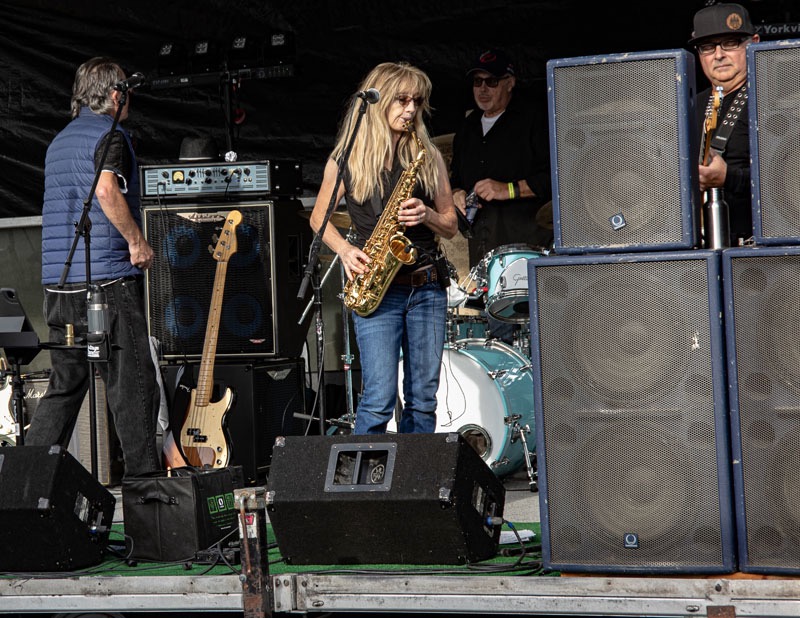
I like the colours and the artist who seems to considering his next step. well timed . I think I agree with Bev on cropping out the white and perhaps the top to remove the header across the image, leaving the focus on the art and the artist
|
Jun 14th |
| 58 |
Jun 24 |
Comment |
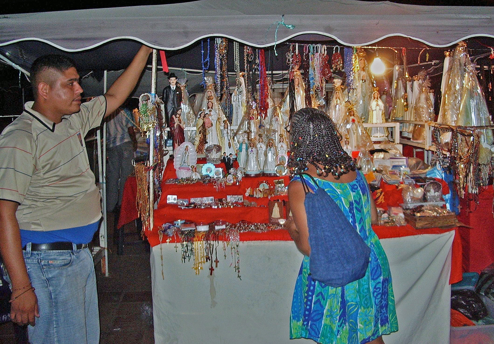
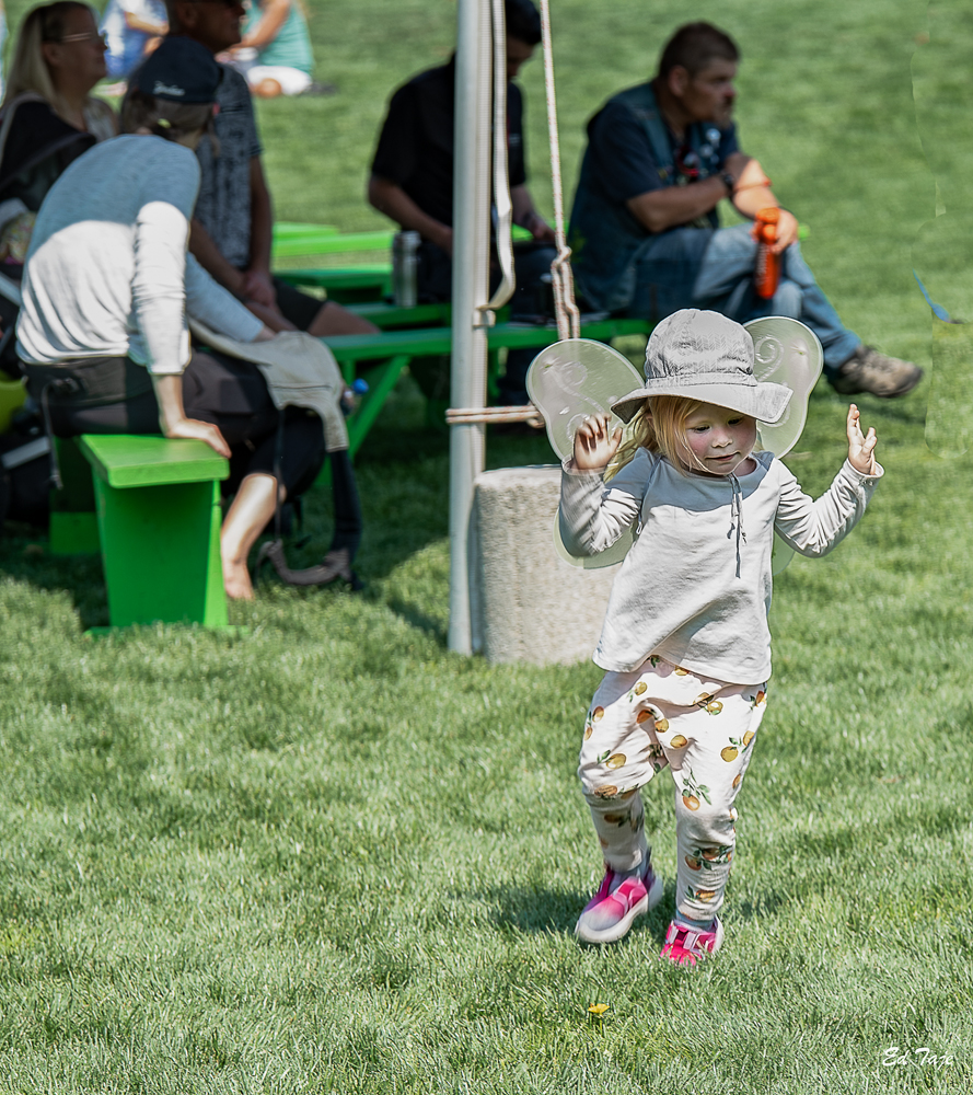
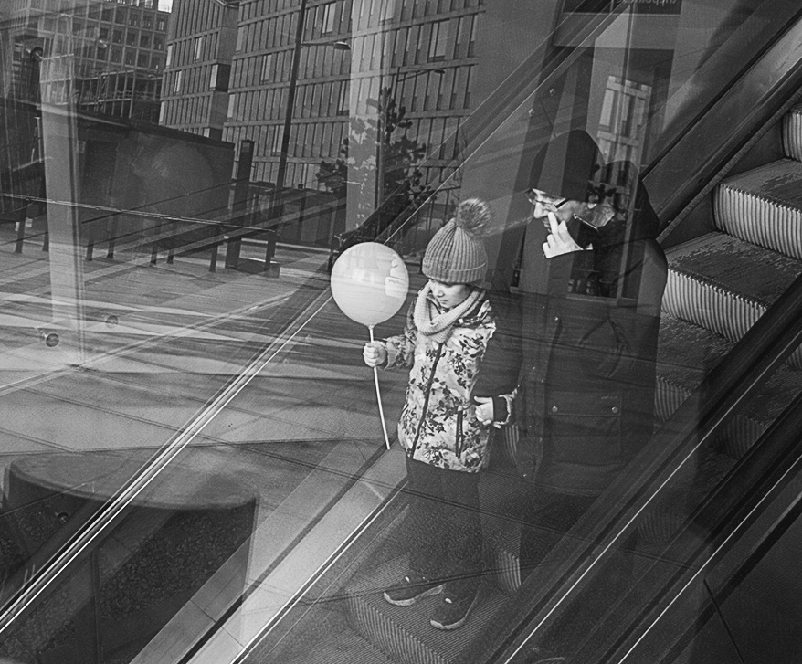
This is a very busy and interesting image. The little girl? stands out well from the confusion created by the environment building light and shadow etc. The dark man also adds to the overall impression in a positive manner. My only suggestion would be to crop as I have shown, which would put more attention on the girl? and still retain all the environmental "features" that make this an interesting image. |
Jun 14th |
 |
| 58 |
Jun 24 |
Comment |
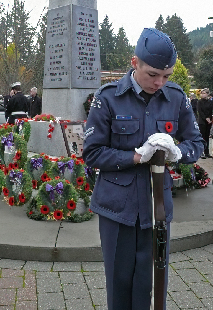
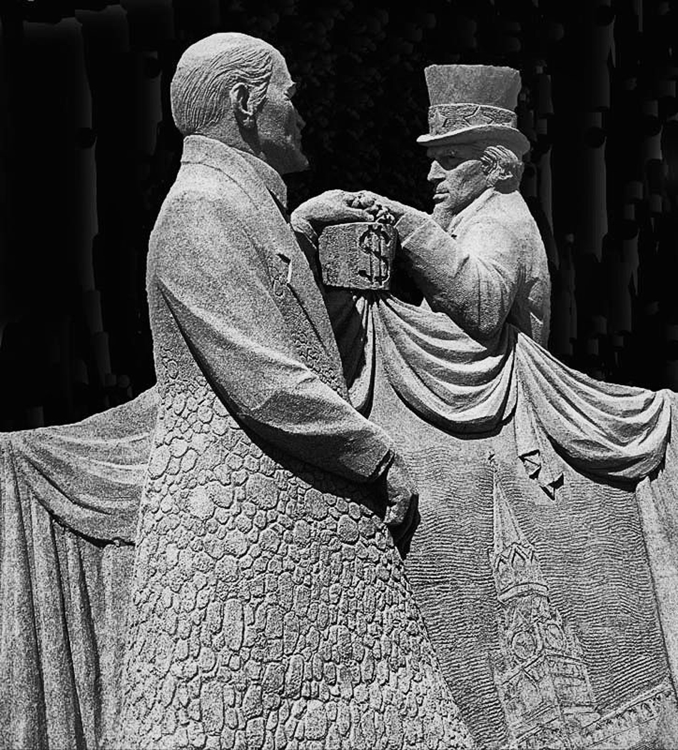
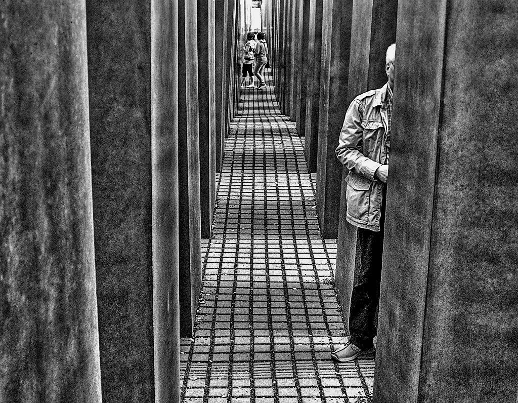
You show the intent and of the structure well. I think the man in the forground adds to the intent (or what I think the intent is) of the memorial as he seems to be studying somethin on the stone slab. I made a black and white version as I think the darker tones better reflect a vary dark time in our history and better provide a more graphic reminder and lesson from our past. Your image is well done. The girls at the back end appear to be fairly young and show hope that our younger generations are also learing the lessons of history. |
Jun 13th |
 |
| 58 |
Jun 24 |
Comment |
You captured the expressions well , the Bride to me seems to wondering if the groom will show up, and to me , my opinion is supported in my mind by the looks of concern on the faces of the ?? mother and grandmother. I think cropping out the second bench would put more attention on the womem/ |
Jun 13th |
| 58 |
Jun 24 |
Comment |
great story .Scene and composition It appears the women in the back is waiting for her cat who seems to be fascinated by the man. I feel the fairly bright red does draw some attention away from the man, the cat, and the women in the back as I was drawn to it before I followed the line of the road and noticed the women. |
Jun 13th |
| 58 |
Jun 24 |
Comment |
I like this image, as Isaac said it shows a wonderful relationship between a grandfather and his Grandchild. I feel that the dark blurring around the girls head could be slightly lightened and the bright strip above the girl could be toned down some. To leaving the poster in adds some context to the image and perhaps a reason for the face painting. |
Jun 13th |
6 comments - 1 reply for Group 58
|
| 74 |
Jun 24 |
Comment |
A very simple image where your timeing based on the birds location and the light worked out well. I liked the original as it showed a bit more of the features of the sky. |
Jun 18th |
| 74 |
Jun 24 |
Comment |
The BW makes this image pop out, the wispy clouds in the darkened sky add to the effect. I first thoughe the gargoyle could be lightened somewhat but when I tried it it did not work out, so leaving the two gargoyles as you had was the best option. An ideal image for conversion to BW . Details stand out much better
|
Jun 18th |
| 74 |
Jun 24 |
Comment |
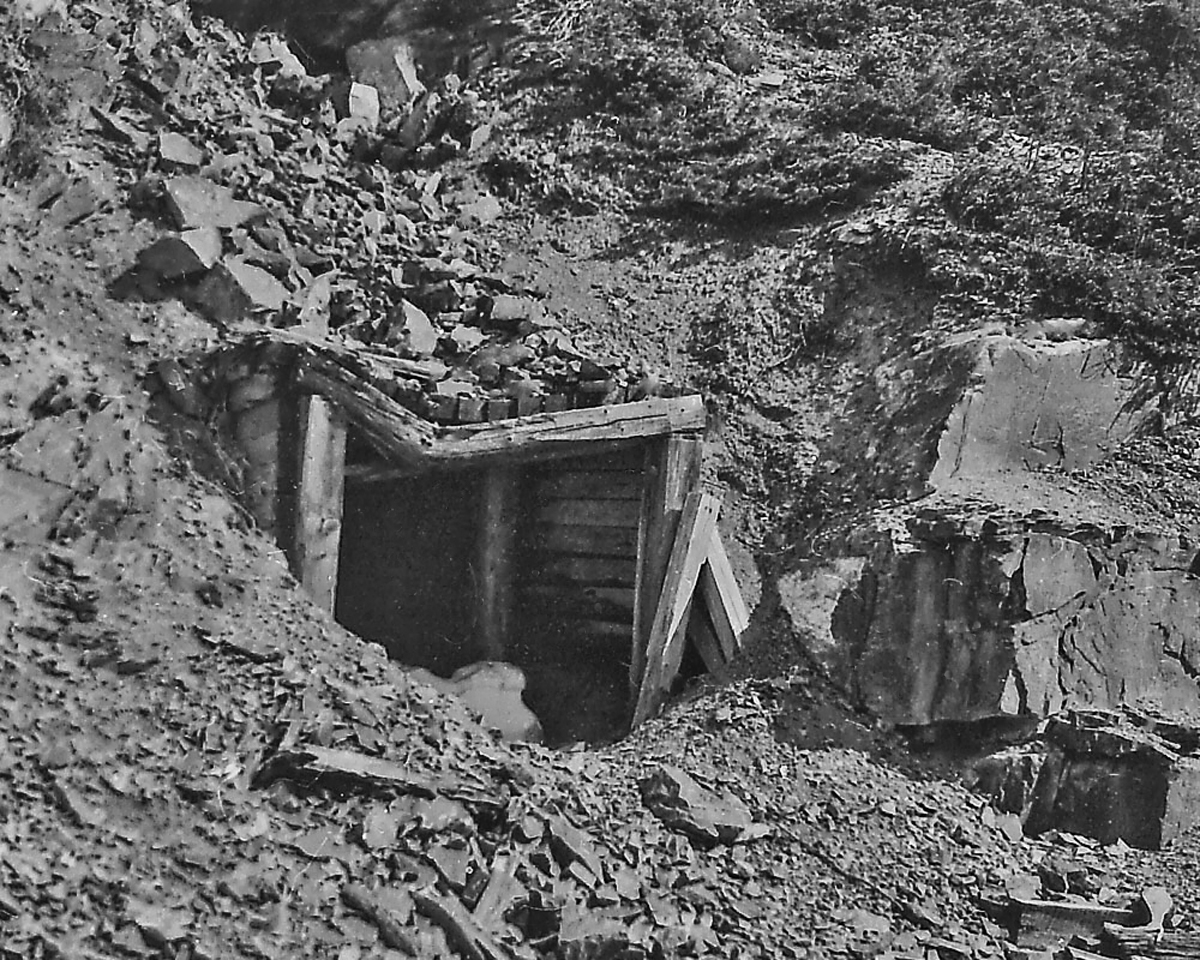
Looked at this long and hard, came to the conclusion I would not do anything more with it, it is sharp, well composed , and well done. |
Jun 15th |
| 74 |
Jun 24 |
Comment |
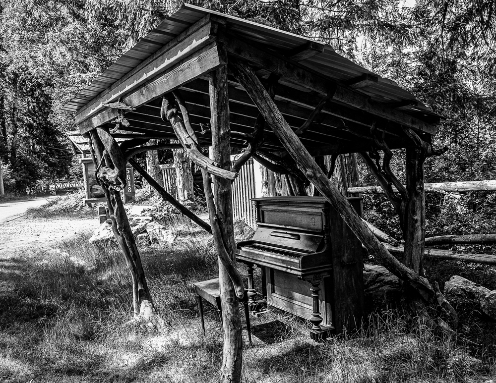
This is a different take on a rather bland image that makes a very big positive change in the photo. I think the somewhat bright area in the upper right could be removed to create a more consistant background and eliminate a minor distraction. |
Jun 15th |
| 74 |
Jun 24 |
Comment |
This is a different take on a rather bland image that makes a very big positive change in the photo. I think the somewhat bright area in the upper right could be removed to create a more consistant background and eliminate a minor distraction. |
Jun 15th |
| 74 |
Jun 24 |
Comment |
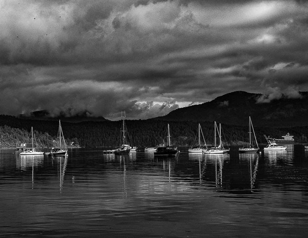
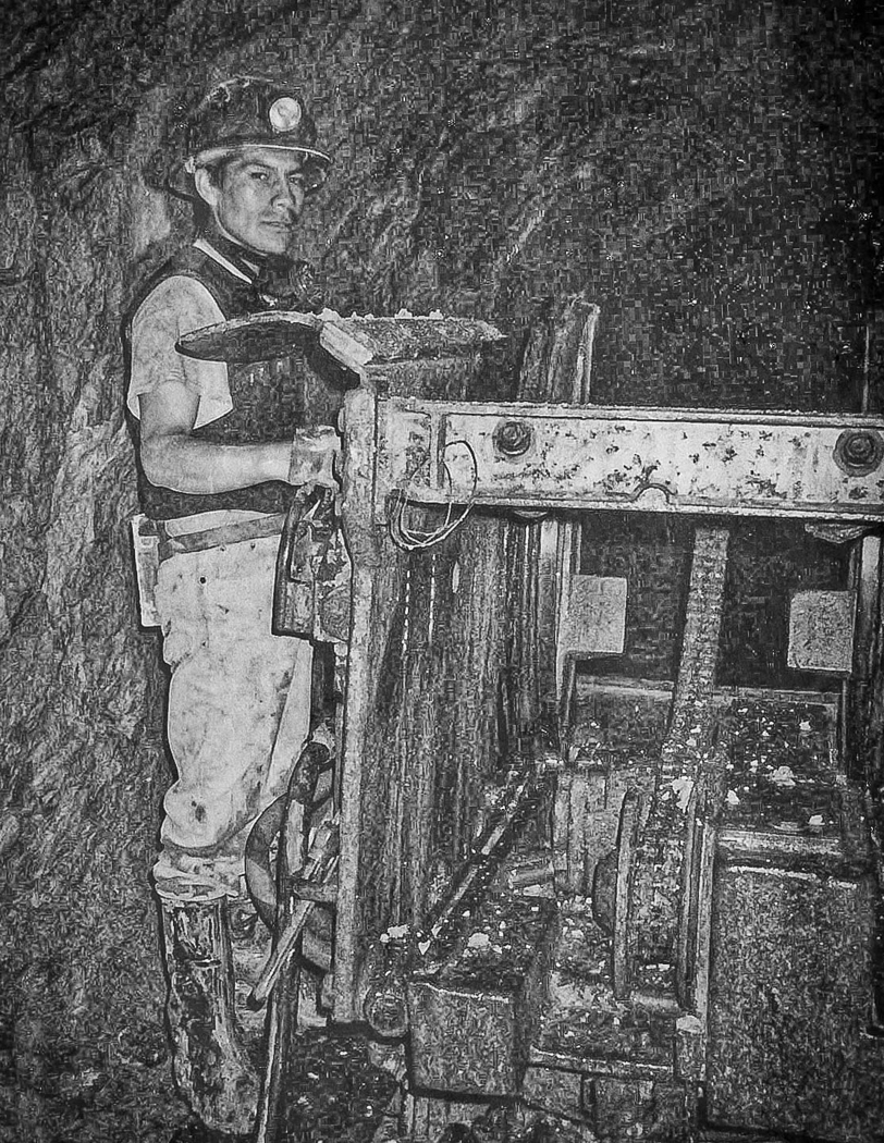
I like this image, and I do not think I would make any changes. I thought that perhaps the bright areas around the instrament could be toned down, but when I tried it , it did not do anything for the image. Well done. |
Jun 15th |
| 74 |
Jun 24 |
Comment |
I like this image, and I do not think I would make any changes. I thought that perhaps the bright areas around the instrament could be toned down, but when I tried it , it did not do anything for the image. Well done. |
Jun 15th |
| 74 |
Jun 24 |
Comment |
I do not think having a shore on the right would add to the image. I might crop a bit on the right where the petals seem to stand out a bit might keep attention on the petals in the centre. For what I think you wanted to convey the blur is appropriate. As it is , it does have a slight abstract quality to it , and a longer blur would in my mind make it too abstract. We (our camera club) have a field trip to a park with a similar environment and in looking at your image you have given the motivation to try to do something similar as I do find it interesting. |
Jun 15th |
8 comments - 0 replies for Group 74
|
14 comments - 1 reply Total
|