|
| Group |
Round |
C/R |
Comment |
Date |
Image |
| 58 |
Dec 23 |
Reply |
I tried your idea, but cropped some from the top as well, and it does put more attention on the family and the boy. Thanks. Something to think of going forward |
Dec 15th |
| 58 |
Dec 23 |
Comment |
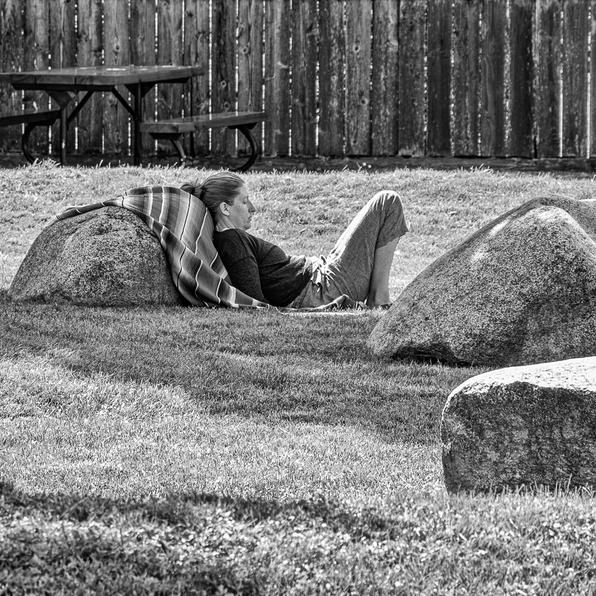
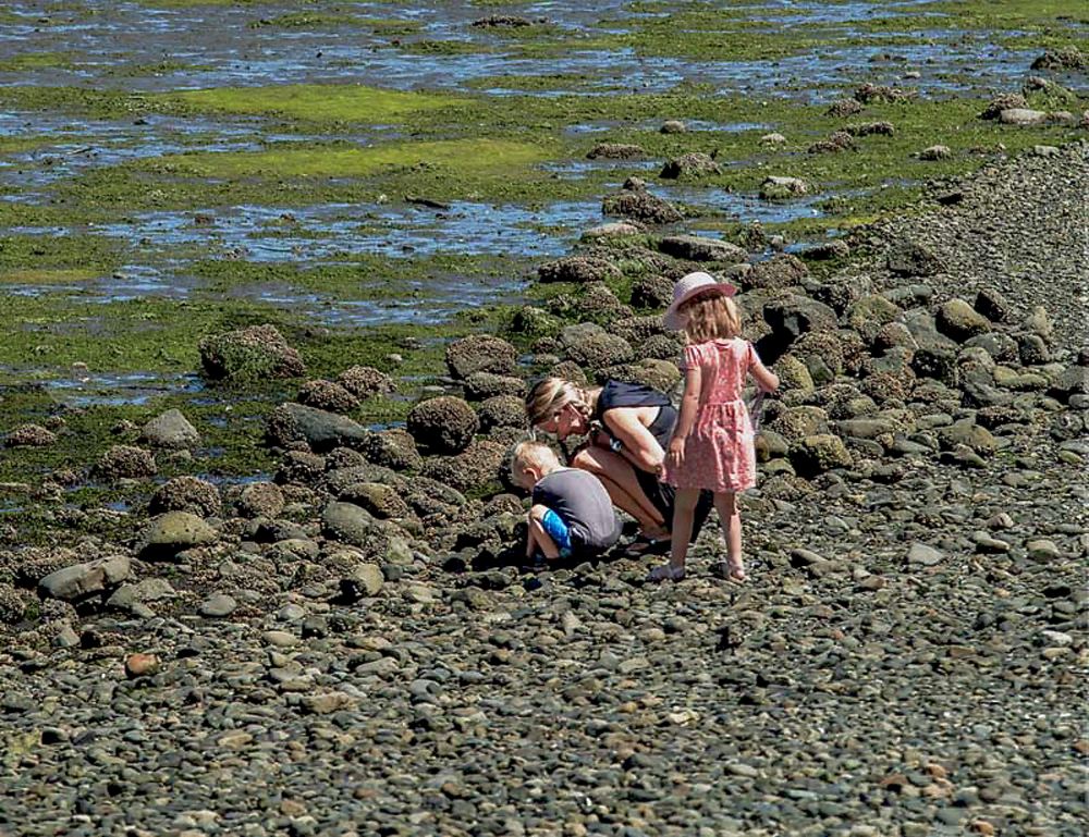
I don't think I would change this image, it does tell a story about the two kids in that particular environment. To me in many respects it shows that we are all different, yet we are all the same. I like your original 1 as although it is very busy, it shows the day to day reality of people's lives as they go about their daily business. |
Dec 14th |
| 58 |
Dec 23 |
Comment |
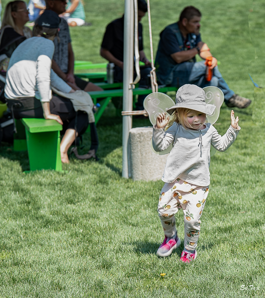
I tried to crop as a square format with the opening in the centre. Then I saw Isaac's crop and liked it better so I discarded mine. This is a nice image and well planned out. |
Dec 14th |
| 58 |
Dec 23 |
Reply |
I felt colour added to the Xmas sprit but I agree it is too saturated. Also the lighting with the multitude of coloured lights was a challange. I do like your BW version. I did a real fast edit in NIC analog only using the preset to tone it down, but even at that the lights do have an effect making this difficult. |
Dec 13th |
 |
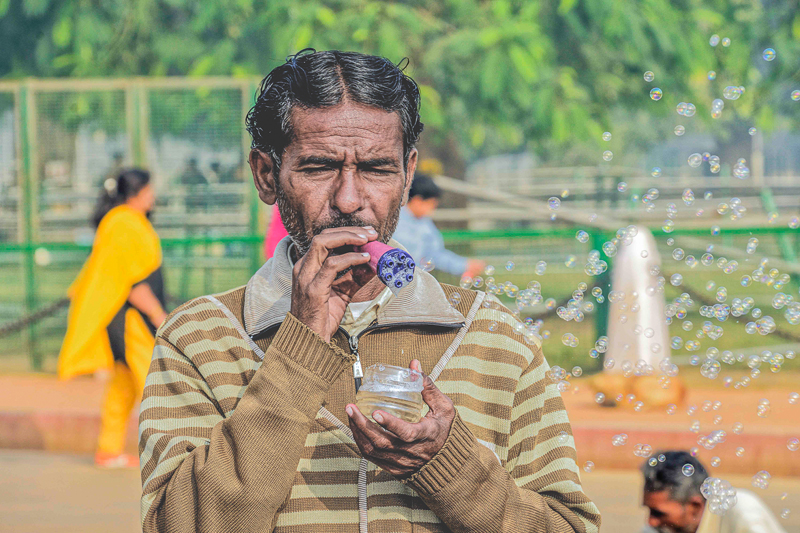
| 58 |
Dec 23 |
Comment |
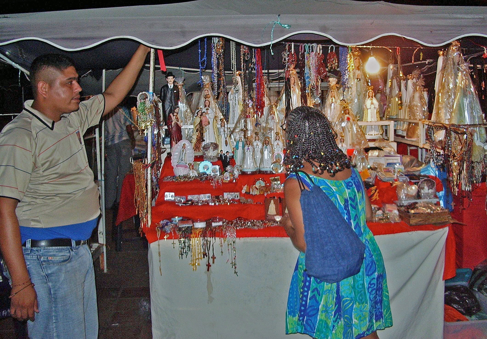
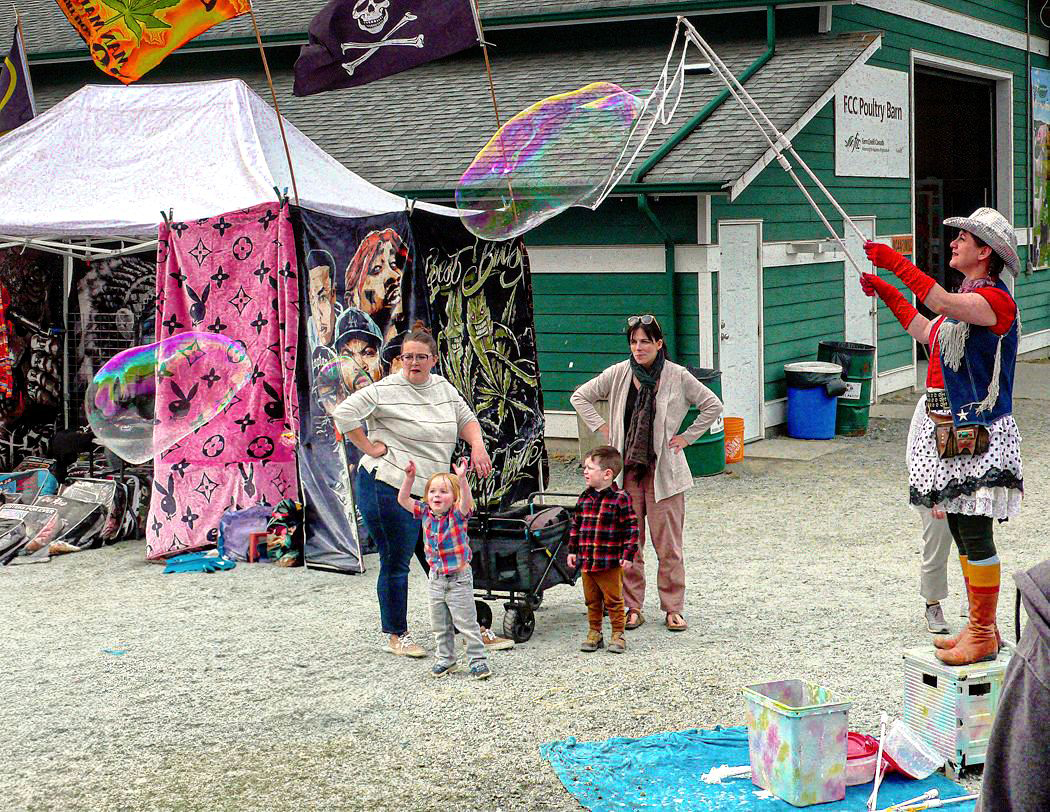
I look at this as an example of a candid portriat of a vendor demonstrating his wares. took out the person on the bottom right but felt it put the image out of balance and took away from the environment. The other two individuals although blurred along with the person on the right add to the environment in my mind and really do not create any significant distraction. In the end I toned down the vendor some and that brought out a bit more detail in his face. |
Dec 7th |
 |
| 58 |
Dec 23 |
Comment |
I used the original, and tried two crops , both leaving a bit more space ahead of the Police, so that i felt they were not walking out of the street. I did lighten the girl a bit and used the second crop as in the first one with a lot more space in front of the mounted police it seemed to me to be out of balance. I did the editing in lightroom and just used the simple sepia preset which was closer to your toning than a pure greyscale image. I do think your toning works well. |
Dec 6th |
 |
4 comments - 2 replies for Group 58
|
4 comments - 2 replies Total
|