|
| Group |
Round |
C/R |
Comment |
Date |
Image |
| 58 |
Nov 23 |
Comment |
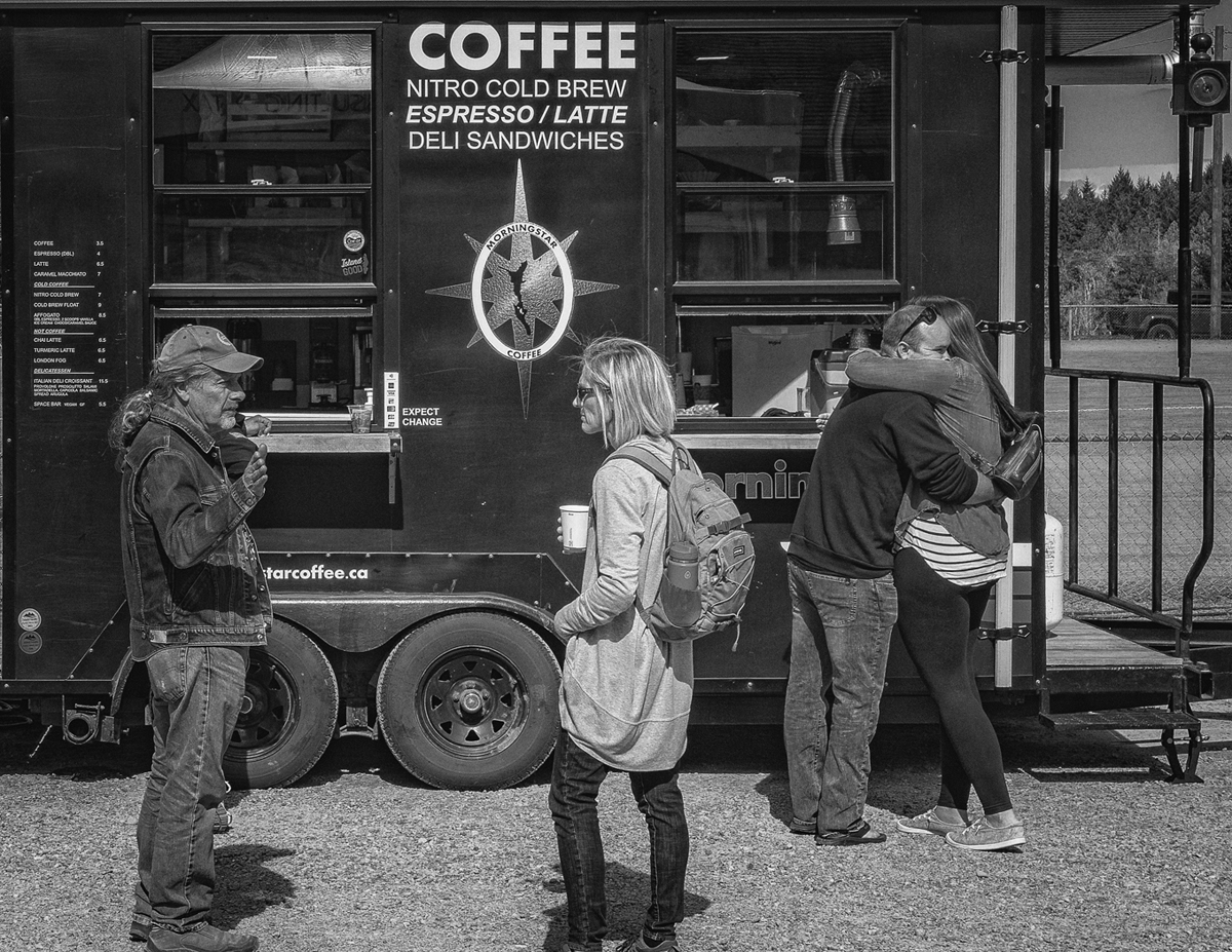
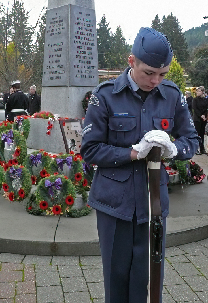
This image to me shows what could be a father and son, or even a boy with his uncle just taking five and sharing a moment. Their time was disturbed by the photographer, something that is not unusual nor is it a negative thing as far as the image goes. The look on their faces as they were looking at you tells it's own story. While often, actually more often than not some context helps and provides more to the story, I do not think in this case it is important, it is two people on the street facing a short disturbance in their personal time and as such I think it is well done. |
Nov 19th |
| 58 |
Nov 23 |
Comment |
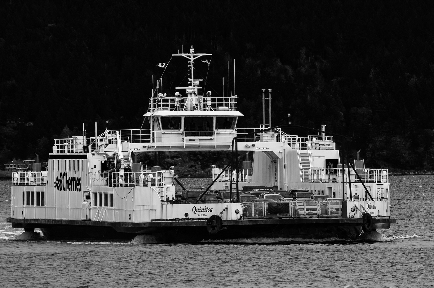
This is a very interesting photo showing a mix of modern and traditional. The colours add to the overall image and story. I kind of like original 2 as it shows the traditional structure against the march of time, IE: more modern buildings. |
Nov 18th |
| 58 |
Nov 23 |
Comment |
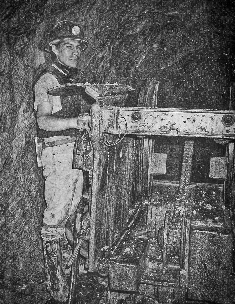
I agree with Isaac this was difficult lighting and the predominent colours seened to add to the overall orange effect on what is a good image. There are times when the colours take away from and image and Mono is the best route. In this case mono then focuses on the man and not the colourful environment he is in which is a major part of the story. I had done a toned down version then came back and seen Isaac's and noted it worked out better than what I had done. I think this is a good image with potential to be better as is seen in the comment above. |
Nov 9th |
| 58 |
Nov 23 |
Comment |
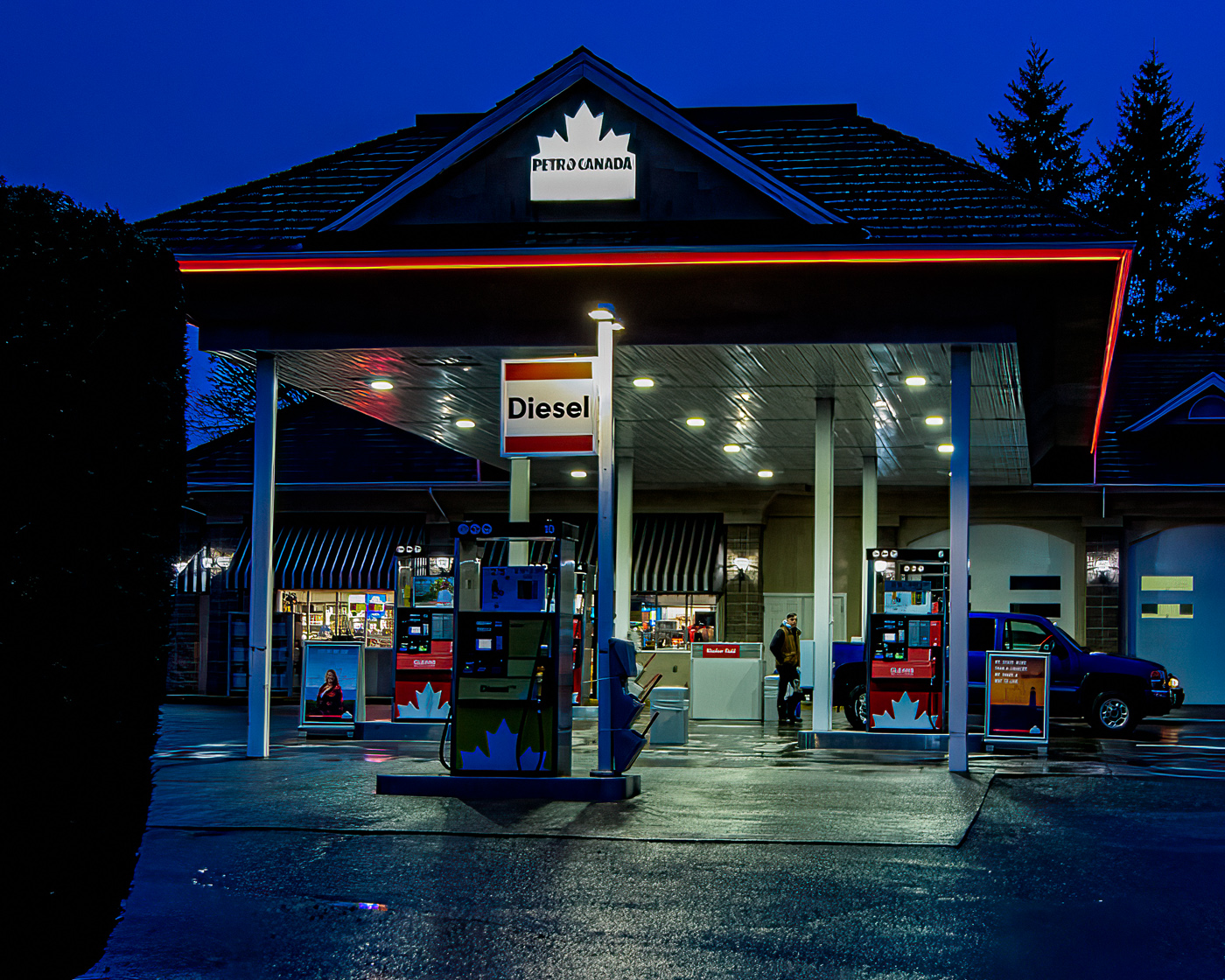
This image stands on it's own as presented. I believe your cropping and processing from the original are spot on. Well done. I made one small change that may have at best a marginal effect. I sharpened the sign slightly so that is was about he same as the large clock. You have created depth and the feeling of distance as the image is sharp until one after following the lines of the image gets to the back end where the blurring adds to the depth and distance. Well done. |
Nov 9th |
 |
| 58 |
Nov 23 |
Reply |
It worked out quite well thanks |
Nov 5th |
| 58 |
Nov 23 |
Reply |
Thank you I will give that a try. Good Suggestion. |
Nov 5th |
| 58 |
Nov 23 |
Comment |
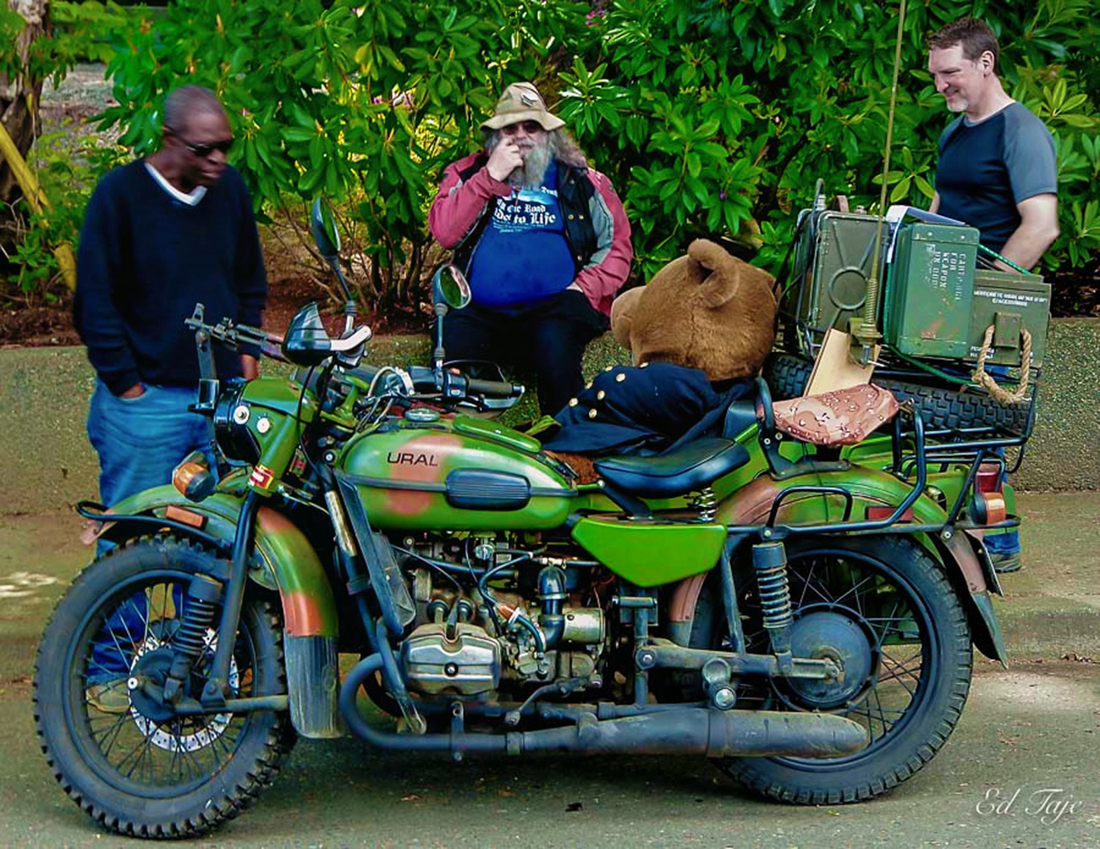
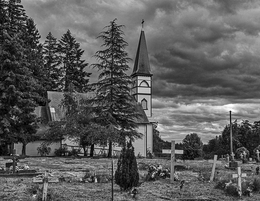
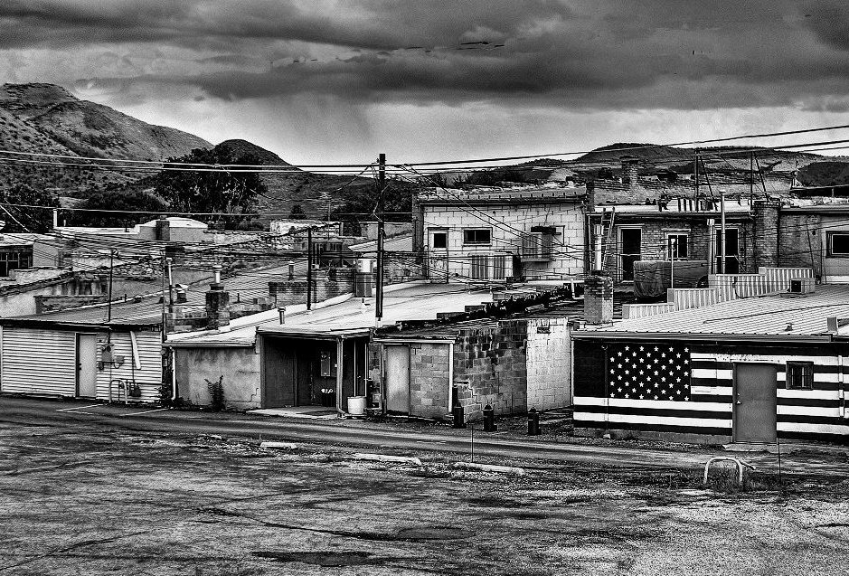
I think I will look at this image from a different viewpoint. From that viewpoint I like the image as it shows perhaps a different side of the society we live in. Most often we show the "pretty more pleasing side " of our communities and streets. This image shows the other side, sort of the opposite of what we believe to be our countries standard. Your image has a lot of potential to show that side. The back streets, older structures and little maintenance, and in my view would do well as part of a series showing our not so pleasant side. While a person would show some scale I do not think it is necessary. If by chance a person was in the scene, he/she would have to fit the environment. I think this image lends itself to B&W. I did one colour edit but it looked too dingy in my mind. I have attached a mono, did some cropping and remove a couple of items, the power lines in the clould, the satellite Dish (although it did have some value it seemed out of place to me) and the ?sign on the right side. I have attached a BW images |
Nov 4th |
 |
5 comments - 2 replies for Group 58
|
| 74 |
Nov 23 |
Comment |
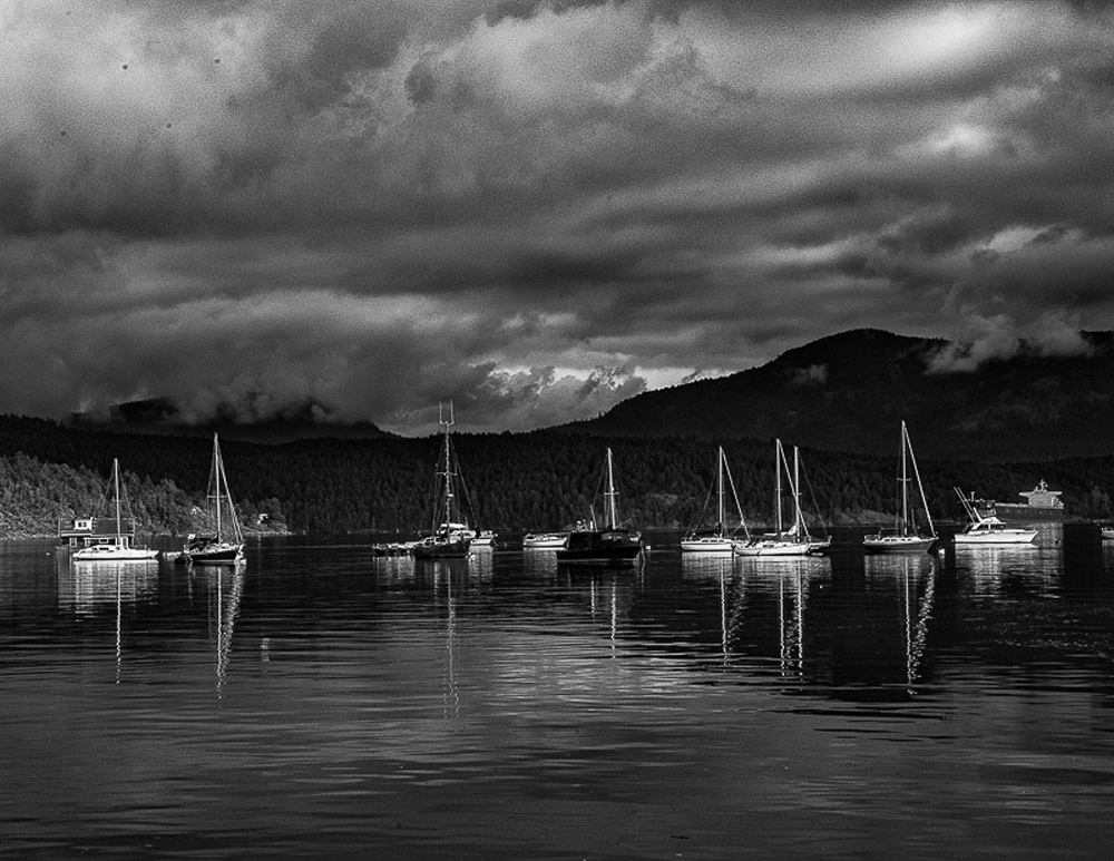
I like the mood set by the image and I don't think I would make any changes to what you have presented. |
Nov 20th |
| 74 |
Nov 23 |
Comment |
Well composed and a great subject. We have the same issue with vignetting in CAPA but this tree as a nature biological image at least up here does not need it in my opinion. I like the dark tree against the brighter background. Just for fun I tried a somewhat high key version to bring out some details in the tree trunk and branches which in my mind gives the tree even more character. Having done that I still like your image better. I have attached a different version just for comparison. |
Nov 9th |
 |
| 74 |
Nov 23 |
Comment |
The image is well composed. I feel the sky and the top of the bridge are blown out and take some away from the image. I tried to add to the top of the Arch and a bit to the sky and toned it down a bit without affect to any degree the rest of the image. |
Nov 9th |
 |
| 74 |
Nov 23 |
Reply |
That is kinda neat looks good |
Nov 8th |
| 74 |
Nov 23 |
Comment |
Thank you will have to try that |
Nov 6th |
| 74 |
Nov 23 |
Reply |
Mostly on the right, but like I said , if that is what it is it would only effect a large print to any degree. I still like this image. |
Nov 6th |
| 74 |
Nov 23 |
Comment |
I like this picture as it is a creative approach to a somewhat static subject It for me is a toss up between fine art and minimalist. Not sure how the red ladybug would fit it other than it would stand out agaist the black. The white bacground is what makes this stand out for me well done
|
Nov 4th |
| 74 |
Nov 23 |
Comment |
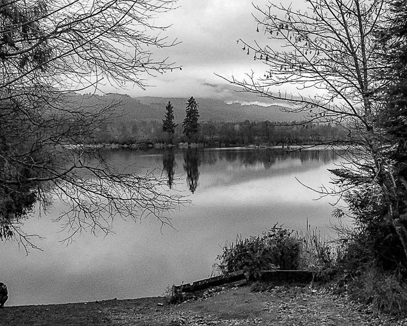
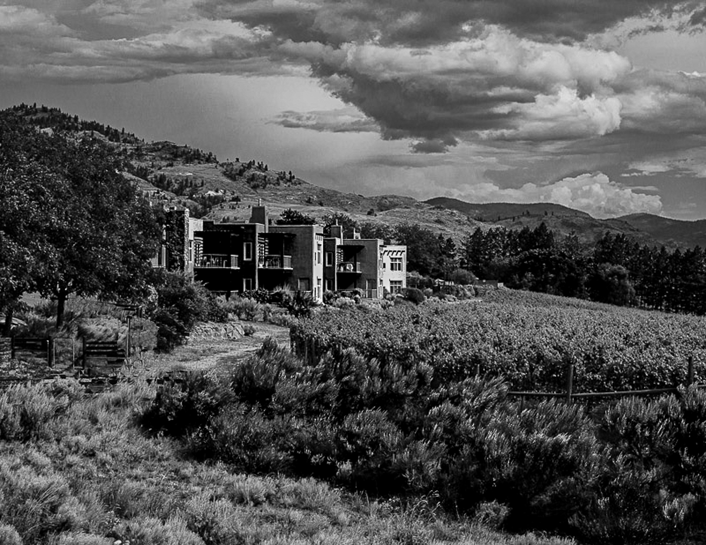
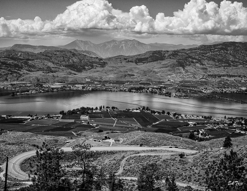
A very nice scenic the tones reflect the lighting well. I would not change the overall image it is good. One suggestion, there is a halo along the edge of the front range suggesting perhaps oversharpening. I think that could be correct with defringe. I would be more noticiable if this made into a large print, not so much at the size on my monitor. |
Nov 4th |
6 comments - 2 replies for Group 74
|
11 comments - 4 replies Total
|