|
| Group |
Round |
C/R |
Comment |
Date |
Image |
| 39 |
Aug 23 |
Comment |
I like the capture. Makes me wonder what she is thinking about. Seems a bit strong and harsh contrast. Maybe bring down the brightness in her dress, so the point of interest is more on her face. The card rack in the upper right is a bit distracting to me. I feel the shadow adds a nice element of interest. I think I prefer the color. |
Aug 13th |
| 39 |
Aug 23 |
Comment |
I like how the subject is framed in the door. I think you chose a very good location for this portrait. The pose is ok, but seems a little "stiff". For me the guitar adds another element of interest. I prefer the color because it has more depth an interest for me. |
Aug 13th |
| 39 |
Aug 23 |
Comment |
The lighting gives this image a moody feel to me. The people in the water provide a nice perspective. I think the tones are very nice, give depth and make for a compelling b&w. |
Aug 13th |
| 39 |
Aug 23 |
Comment |
I like your creativity. The angle to the subject doesn't feel quite right to me. Needs more separation between the subject and background for my liking. Cutting off the head in the reflection bothers me. The b&w feels a little flat compared to the color. |
Aug 13th |
| 39 |
Aug 23 |
Comment |
I prefer the color. The light and color variation on the rocks give more depth than the b&w. The b&w seem a little harsh to my eye. I like how the composition holds me right in on the Water. |
Aug 13th |
| 39 |
Aug 23 |
Comment |
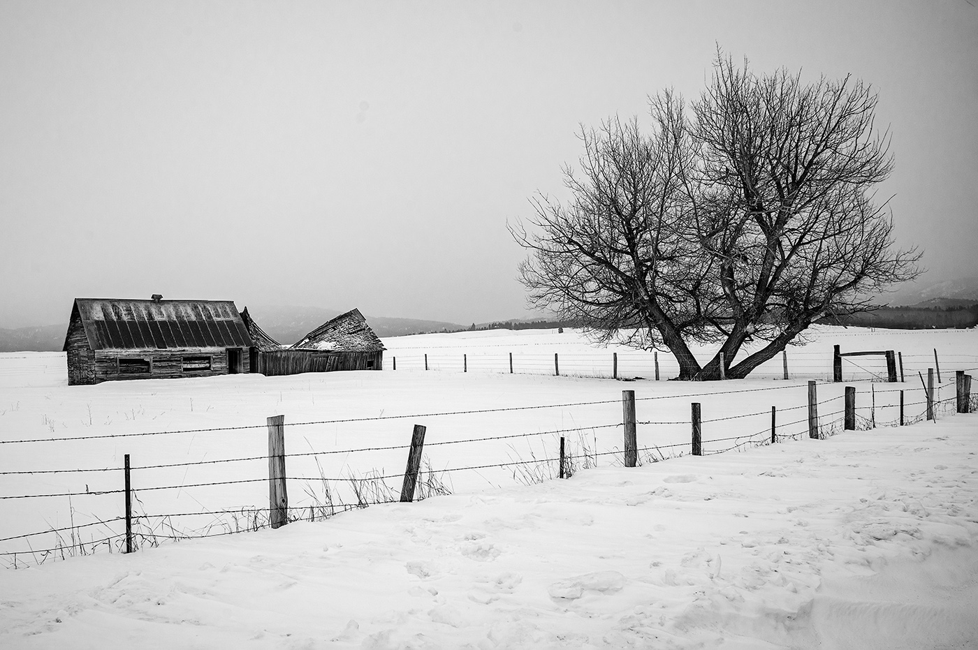
I feel the simplicity and the tones make this an excellent choice for black and white. I like the lines leading to the silos. The intentional blur is a nice artistic effect. You might consider removing the power poles for an even more minimalist approach. However this is a compelling image.
|
Aug 13th |
6 comments - 0 replies for Group 39
|
6 comments - 0 replies Total
|