|
| Group |
Round |
C/R |
Comment |
Date |
Image |
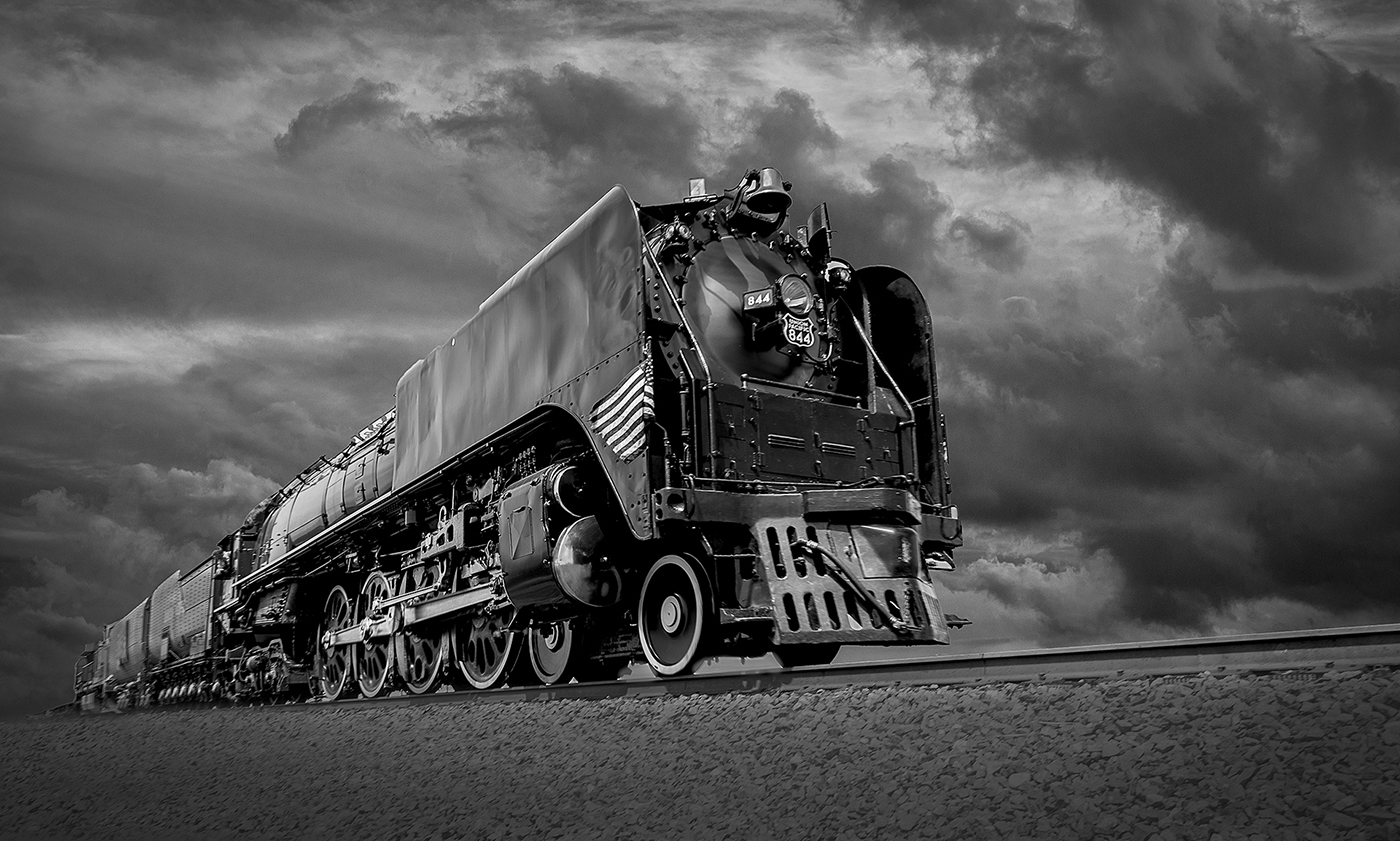
| 39 |
May 23 |
Comment |
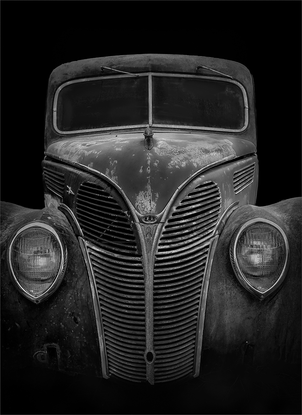
I like old vehicles. I like how you featured the grill and headlights in this photo. The angle you chose works very well. The B&W version works very well. |
May 19th |
| 39 |
May 23 |
Comment |
I, too, like the square crop and the symmetry in this image. I would try cropping in to eliminate the blocks on the far right and left to make it more symmetrical. Seems a bit strong on the contrast.. Would like to see more detail in the statue and blocks. |
May 19th |
| 39 |
May 23 |
Comment |
I really like the long exposure effect on the water. The range of tones is very nice from blacks to whites and shades of grey. I would suggest darkening the plants in the upper left and the grasses slightly. They draw my eye away from the water which is the primary subject in this image. Otherwise very nice work! |
May 19th |
| 39 |
May 23 |
Comment |
I prefer the color version although maybe a little saturated for my taste. The black and white version would work better for me with more detail in the rock formations. Perhaps darkening the sky a bit also. I think the wavy texture in the sand works well for black and white. |
May 19th |
| 39 |
May 23 |
Comment |
I think the subject {the island} shows more separation in the color version. The range of tones and the composition is nice in the B&W version. I agree that a little dodging and burning on the island would draw the eye more. |
May 19th |
| 39 |
May 23 |
Reply |
Yes, I thought I had them removed in the B&W version. Guess I need to clean my sensor. |
May 11th |
| 39 |
May 23 |
Reply |
I like and agree with your suggestions about cropping. Thank you! |
May 11th |
5 comments - 2 replies for Group 39
|
5 comments - 2 replies Total
|