|
| Group |
Round |
C/R |
Comment |
Date |
Image |
| 39 |
Apr 23 |
Comment |
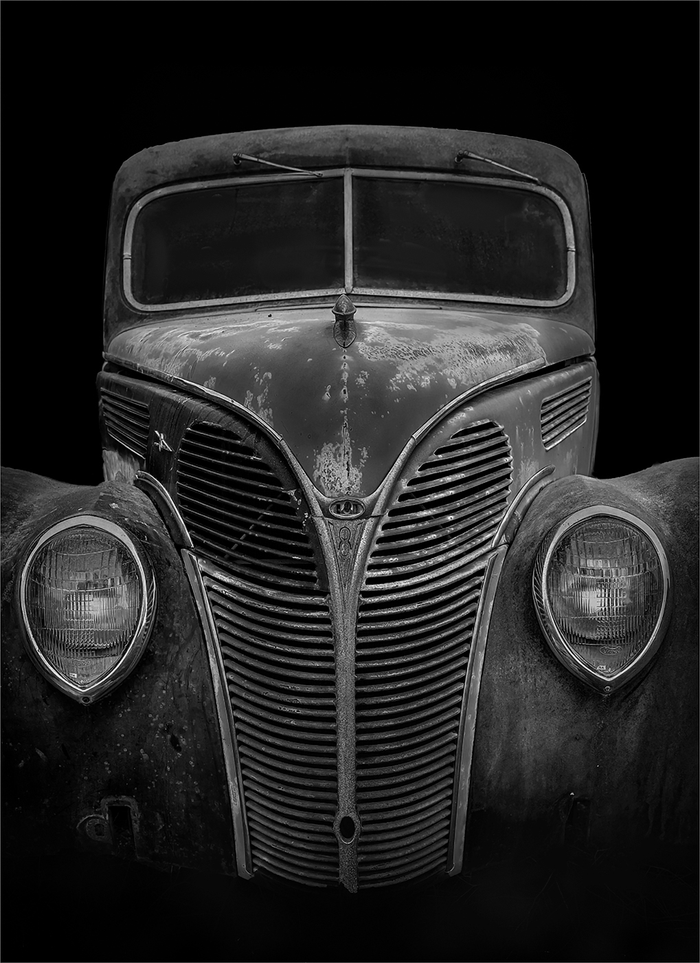
I agree with the comments about cropping/composition. I would like to see the entire grill and right headlight. I think symmetry would work well here. I think this makes for a nice b&w because it is more about lines and shapes than color. |
Apr 12th |
| 39 |
Apr 23 |
Comment |
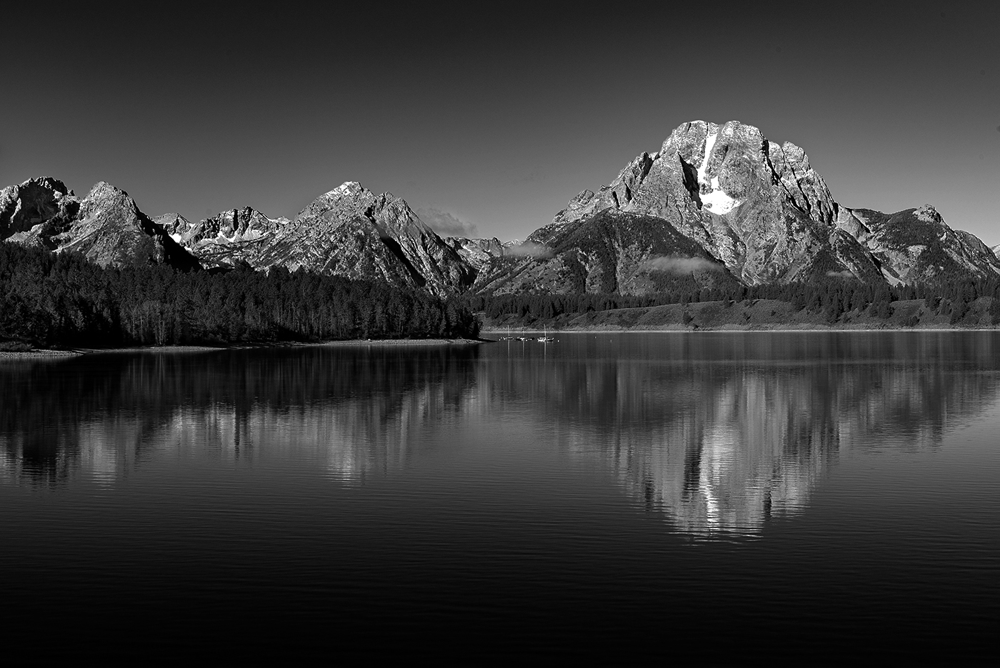
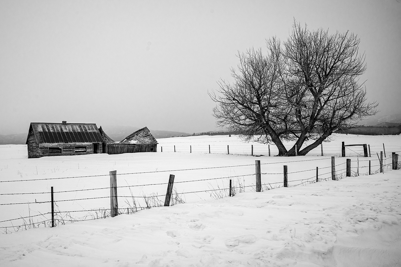
I also prefer version 2. The lighting is better and of course the clouds add interest. The light in the original made it difficult to get a good exposure. Shooting into a bright sky with heavy shadows on the subject create a problem. I think photographing this building with light on the front of the church would make a more compelling image. I would like to see more contrast and detail in the stones on the church.
|
Apr 12th |
| 39 |
Apr 23 |
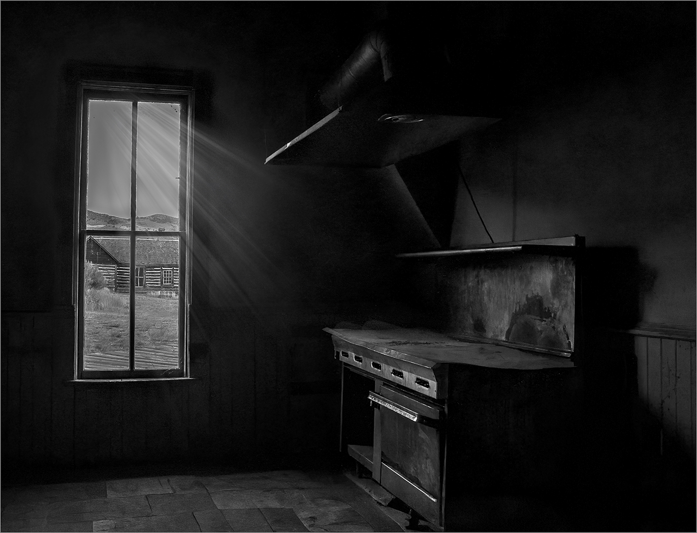
Comment |
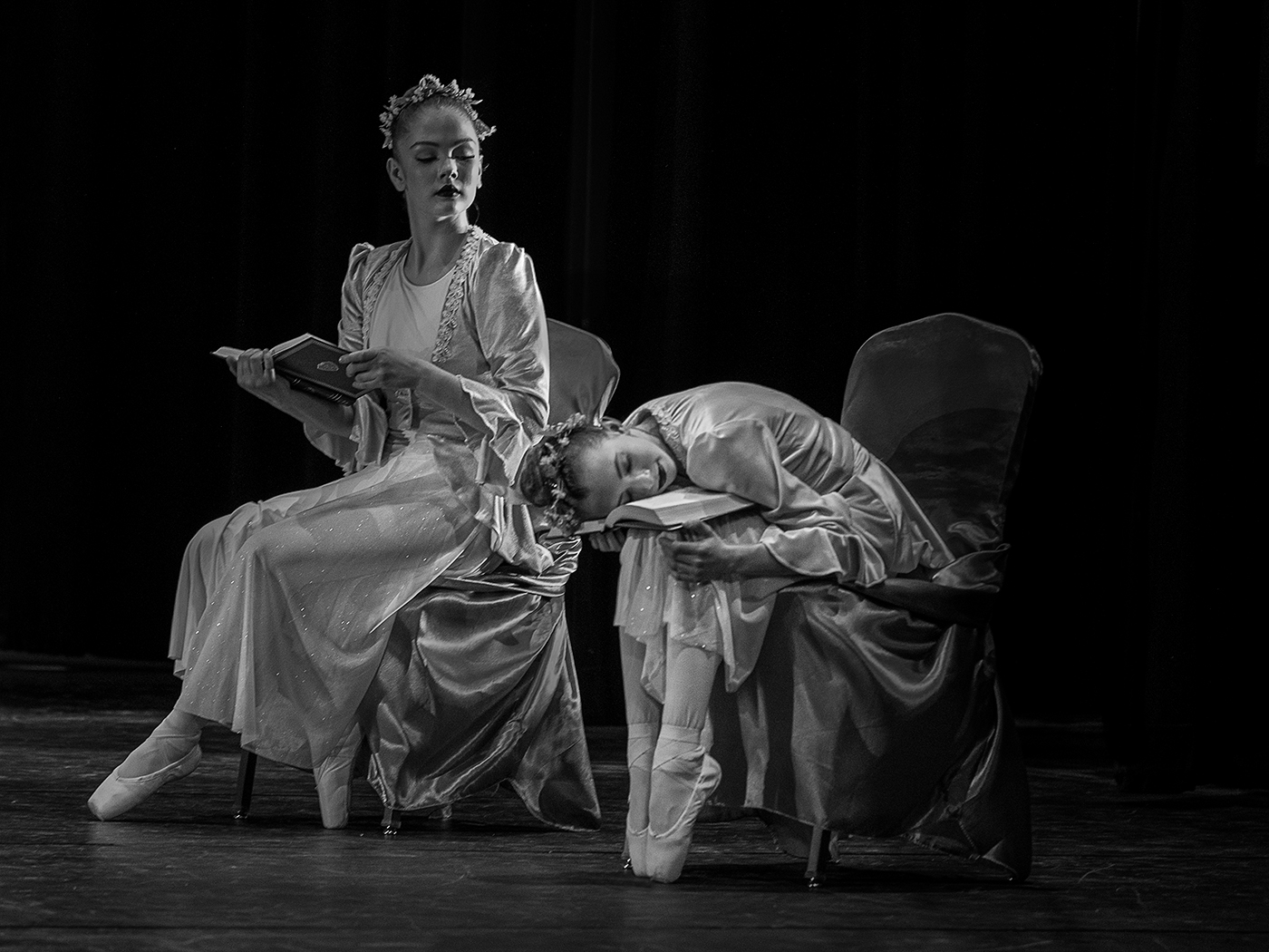
Nice story telling image by including the man at the gate. The tonality is well done. It is a bit busy for my eye. I tend to like more simplicity in b&w images. I prefer the color version. A little tight on the left and I don't care for the shadow in the bottom right. With that said, your conversion to b&w was technically well done in my opinion. |
Apr 12th |
| 39 |
Apr 23 |
Comment |
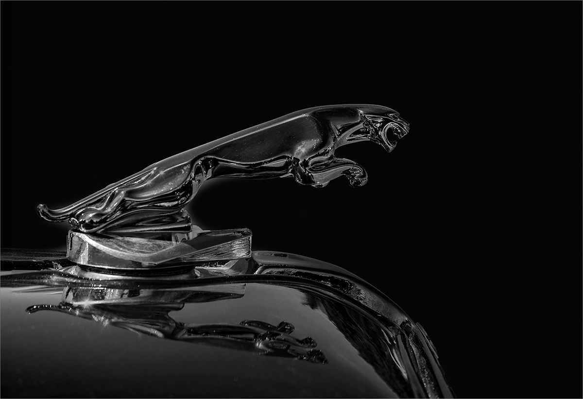
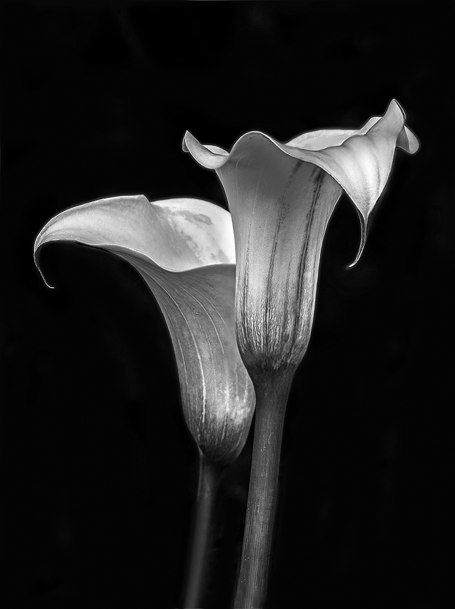
Although this makes a nice b&w I prefer natural color in wild animals. Nice separation between background and subject. Nice contrast in the lion's mane. Maybe brighten eyes a bit. Nice b&w conversion. |
Apr 12th |
| 39 |
Apr 23 |
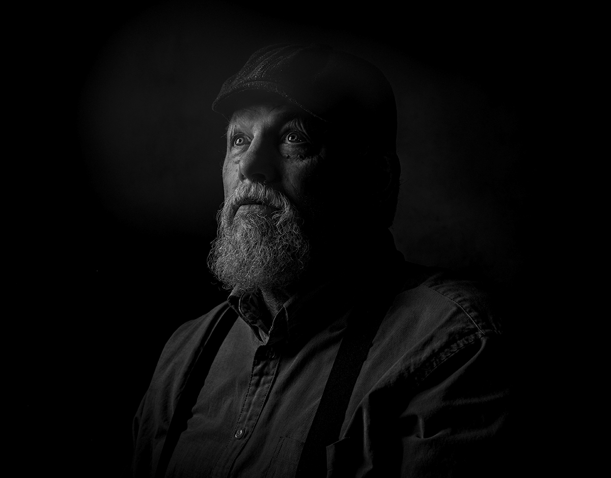
Comment |
I like the depth of field, the catch light in the eyes and the pose. I prefer more contrast in b&w portraits. What lighting did you use? I agree with cropping in on the left. |
Apr 12th |
| 39 |
Apr 23 |
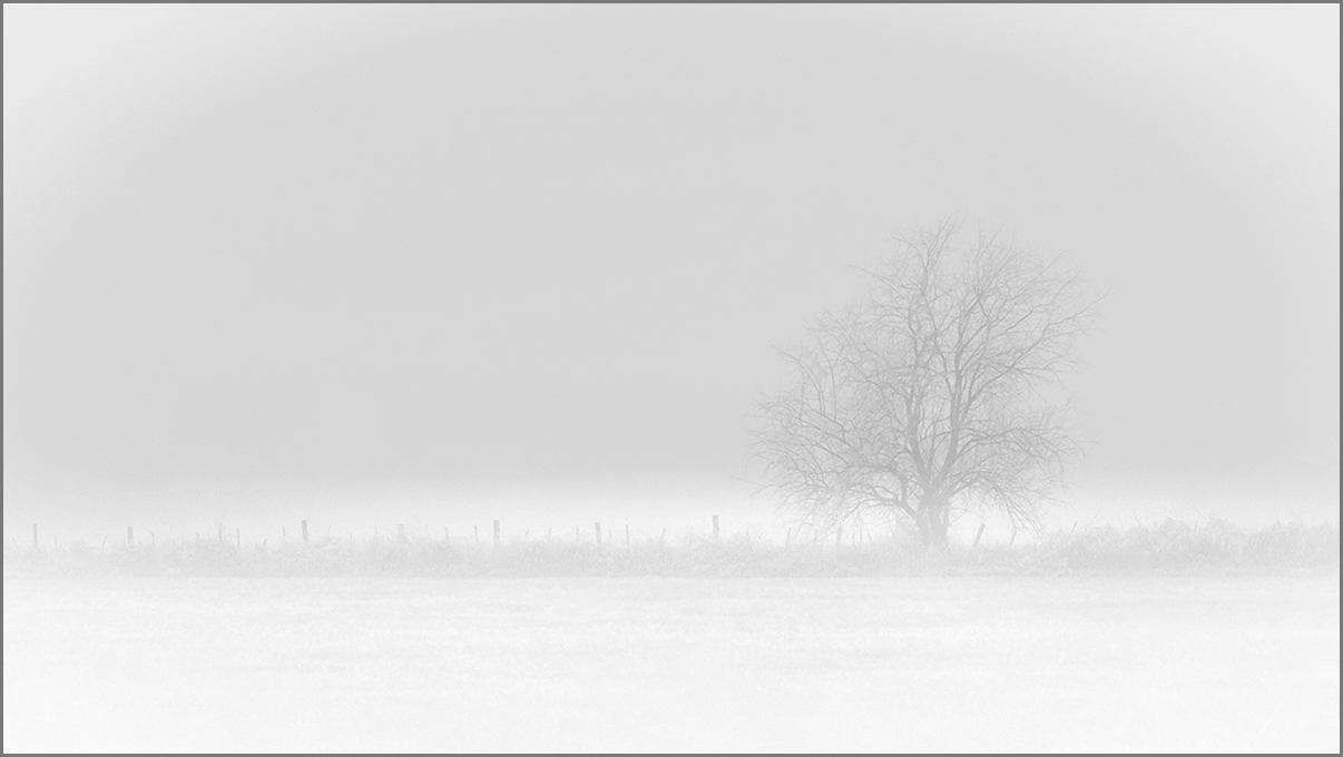
Comment |
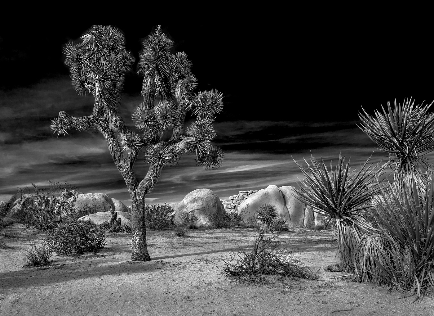
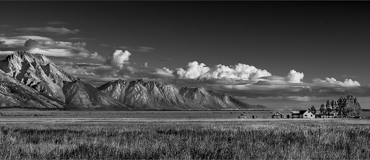
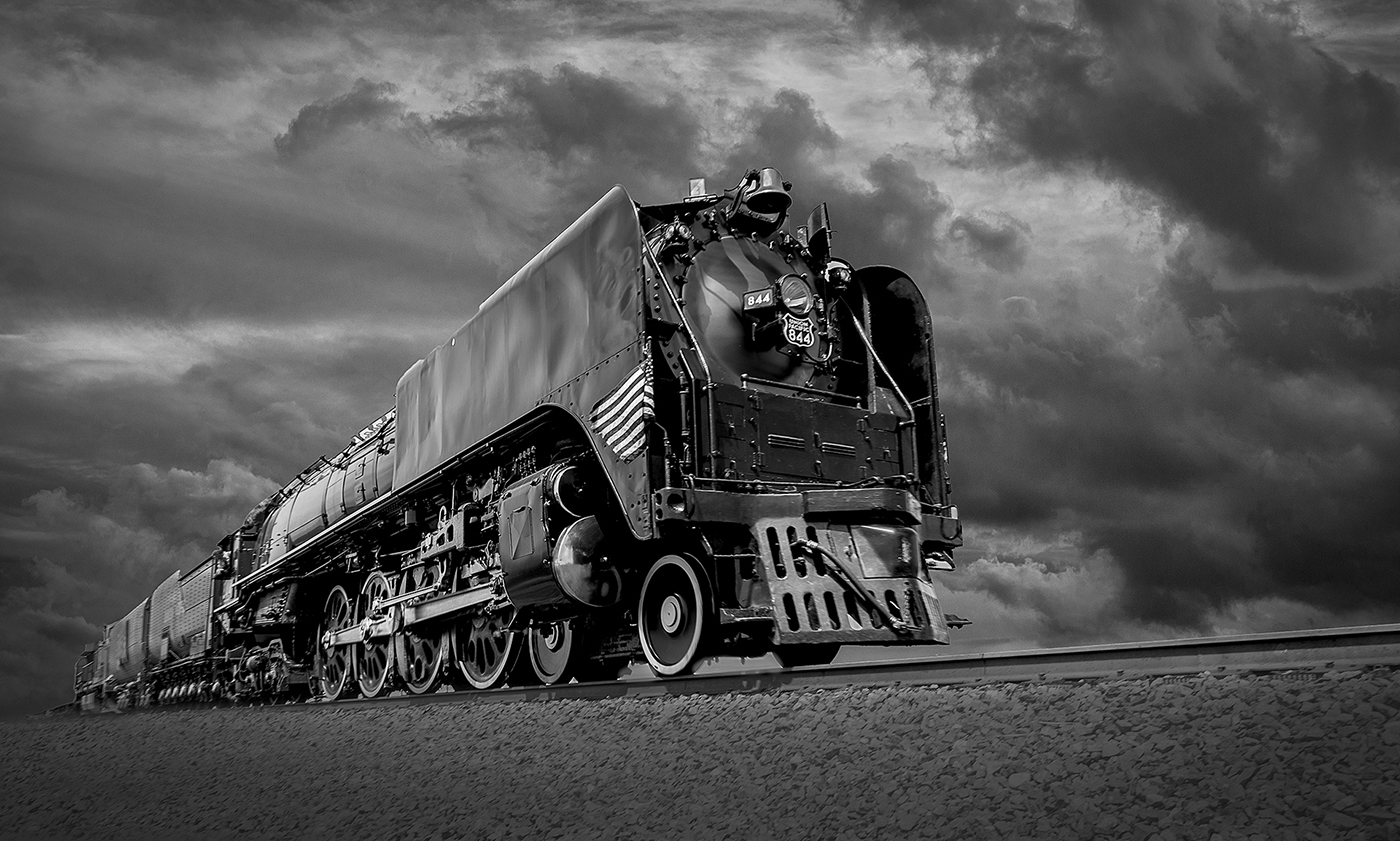
The clouds add drama/interest. I feel the tones are nice and like the angle you chose to capture this image. The bottom distracts my eye a little. I think cropping from the bottom slightly would help. |
Apr 12th |
| 39 |
Apr 23 |
Reply |
Agree with your suggestion about thin border. |
Apr 12th |
| 39 |
Apr 23 |
Reply |
I did not photograph this image in b&w with camera, but converted it in photoshop with the b&w adjustment sliders. I moved the yellow and red sliders in opposite directions to achieve the contrast I like between blacks and whites. |
Apr 12th |
6 comments - 2 replies for Group 39
|
6 comments - 2 replies Total
|