|
| Group |
Round |
C/R |
Comment |
Date |
Image |
| 11 |
Oct 24 |
Reply |
I'll still drop by on occasion to get some inspiration.
I suppose the exposure could be lowered a bit. This is a more documentary rendering if you compare to the original color image. This was hand-held but it looks perpendicular, probably because it was shot at a distance. I was immediately struck by how shocking the white border came out when I first saw it posted. That needs correcting. And it's also not the same spacing on the right and left side... |
Oct 18th |
| 11 |
Oct 24 |
Comment |
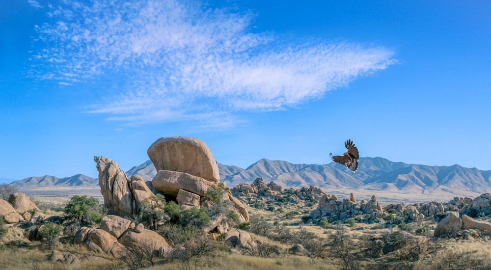
Jim, the out-of-focus blades in the foreground mar the picture for me because I have been traumatized by club competitions where this would have been stigmatized by judging; if it matters to you they can can be edited out while still leaving the smaller in-focus ones in the foreground. Also, the small cloud on the left could be sacrificed IMO. |
Oct 18th |
| 11 |
Oct 24 |
Comment |
The lynchpin of the image for me is the wavy vertical line of foam on the shore. The foreground, near the bottom left corner stands out because it is sharper, and feels crunchy, maybe also because of small branches coming out at chaotic angles. This distracts from the beautiful composition above it. The processing of the pine trees coming down diagonally towards the bottom right looks very good. The tree on the bottom right has a semblance of a waist where it goes in a bit on its right side. I would tend to crop below that area and then retouch the above-mentioned branches on the left to eliminate these distractions to focus the viewer's gaze and emphasize your composition. |
Oct 18th |
| 11 |
Oct 24 |
Comment |
Very cool image. ISO 5000 even looks good in color. As Jim said. I think cropping off some of the right side would balance it a little better. in fact, Jim did that too. But if you crop it even a little bit further, then the glove in the face is exactly in the middle of the image. |
Oct 16th |
| 11 |
Oct 24 |
Comment |
That's a neat trick! (Maybe it could be reproduced with a portable basin?) Now that I know it's a hot tub I notice the rim but otherwise wouldn't have guessed. So wondering whether the rim could be seamlessly eliminated or retouched on the right side. |
Oct 16th |
| 11 |
Oct 24 |
Comment |
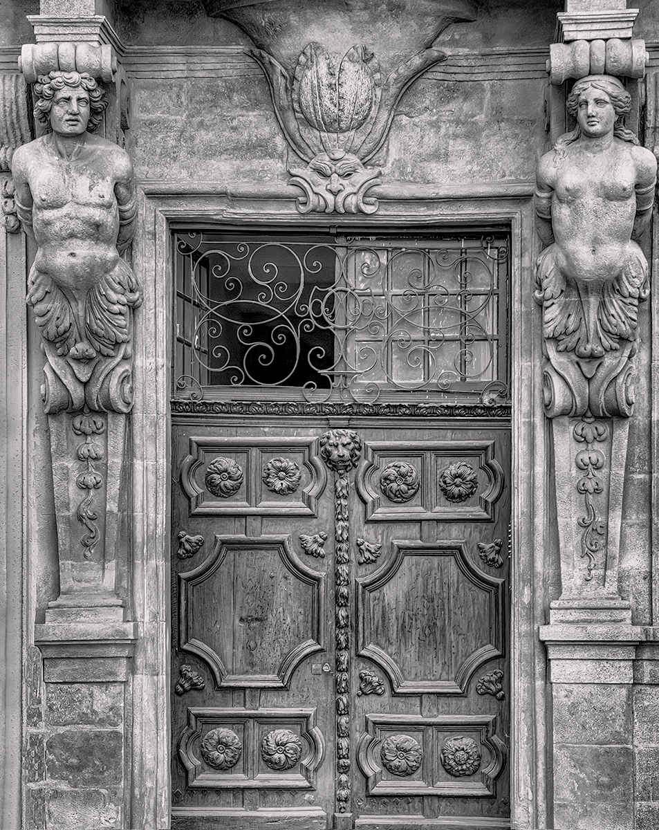
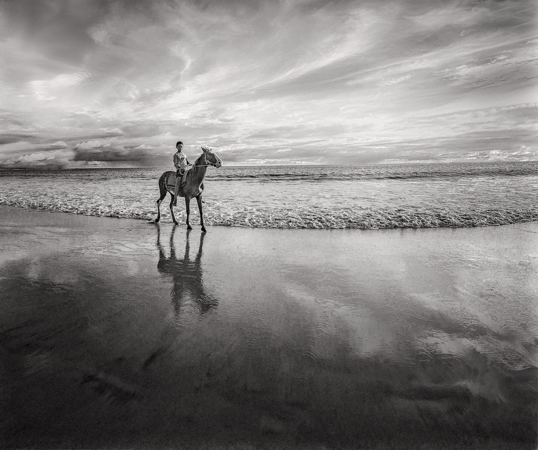
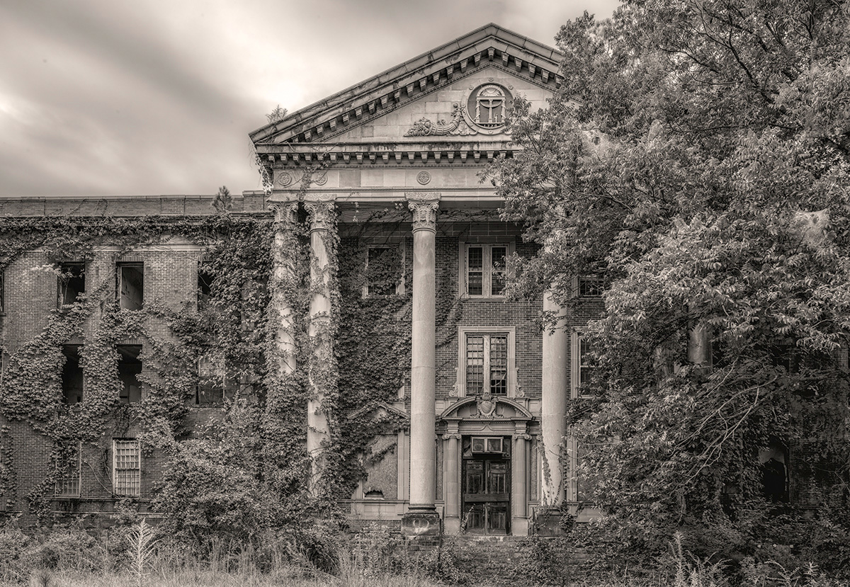
Yes, this is much better. Very beautiful. Love how the clouds balance the composition, like celestial wings. Although skewing on the lighter side for my own images the tonality strikes me as perfect. The black in the doorway may already be at the maximum, but if you can go darker, richer even better. Just to suggest something, you could experiment widening the image slightly with the Photoshop transform tool or even generative fill as Darlene sometimes has suggested. I would probably have a tendency to crop the bottom a little to widen the proportions if it were my image. |
Oct 15th |
5 comments - 1 reply for Group 11
|
5 comments - 1 reply Total
|