|
| Group |
Round |
C/R |
Comment |
Date |
Image |
| 11 |
Sep 24 |
Reply |
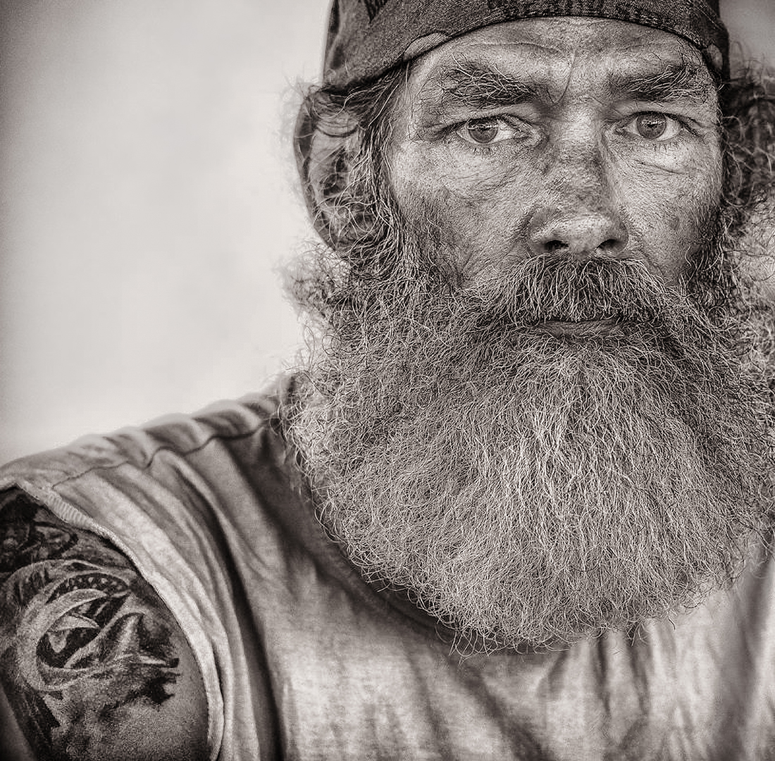
Thanks. I did the original B&W conversion empirically years ago, maybe in 2017 or 2018, without a lot of knowledge of Nik Silver Efex. I might have combined it with Lightroom presets. I don't remember exactly. I lucked out with this gritty look that I wasn't able to reproduce since. I did further modifications in Photoshop for this month's submission with my now better retouching skills. Originally I thought the skulls on the cap were just too much of a distraction and too cute and self-aware to make the model look authentic. He was an electrician that did a lot of work on boats, BTW. I deliberately made this crop because I liked the subjects face and the tattoo and what it evoked. I didn't feel any need to stick with a documentary approach. I wasn't interested in the background at all. |
Sep 17th |
| 11 |
Sep 24 |
Comment |
I'm a fan of sea lions but I have only seen them in California. You are fortunate to have been to the Galapagos and be that close. I like the original but the conversion is good. No suggestions. |
Sep 17th |
| 11 |
Sep 24 |
Comment |
The texture is great! It fades only so slightly in the background. The composition and texture work well together. |
Sep 7th |
| 11 |
Sep 24 |
Comment |
Great subject and composition. Everything works well - almost fine art... or is it fine art? The sky, the lines of the ripples, the decaying bridge... Would it be possible to see a higher resolution version somewhere? |
Sep 7th |
| 11 |
Sep 24 |
Comment |
This is a cool concept. I would tend to crop it in a little, maybe off the bottom, in the middle of the lower section of the lamp, right below the lower ring, to amplify the reflection of the town more. |
Sep 7th |
| 11 |
Sep 24 |
Comment |
Peter, I like this image the way it is. Wet cobblestone shot near ground level at night does look good, indeed. I like the tonal range, too, but I am not a true adept of the dark arts ☻. Jim's version has a less blown out neon sign in the middle, but this is not a photo contest. The image works aesthetically, if that's your vision. You could attenuate these highlights locally with luminosity masks or the equivalent, but the glare may be an intended feature. I see sunstars. Did you deliberately use a high f-stop - and a long exposure - to get that effect?
|
Sep 7th |
5 comments - 1 reply for Group 11
|
5 comments - 1 reply Total
|