|
| Group |
Round |
C/R |
Comment |
Date |
Image |
| 11 |
Aug 24 |
Reply |
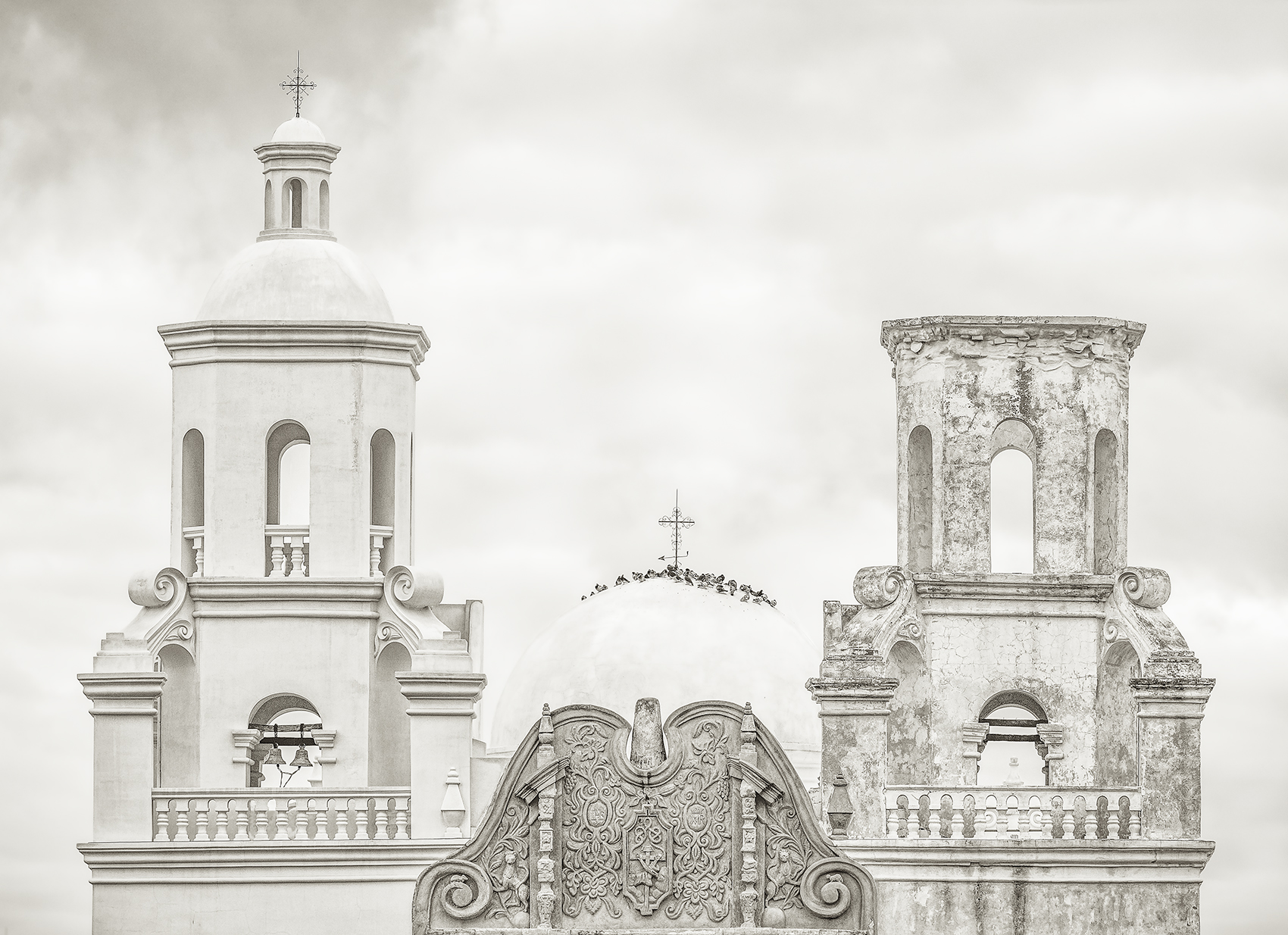
Jim, see my general comment below about depicting a dark church. Thanks for taking a stab at this. I think the tone of the dome is the problem. I never noticed it until now but maybe it should have been color corrected first before converting to mono. I have only recently considered fine art imagery as a goal. My photo club just opened up that category. It's more demanding than what I am used to. |
Aug 31st |
| 11 |
Aug 24 |
Reply |
I didn't use the Fine Art setting in Nik Effects. I generally start with colors and soft contrast first and do my own custom settings. See also my general remark below explaining why I didn't go for a dark church. Essentially, I found it antithetical. |
Aug 31st |
| 11 |
Aug 24 |
Reply |
Thanks Henry. I get you. I like the processing of the sky. See my general reply also. |
Aug 31st |
| 11 |
Aug 24 |
Comment |
This image of a church is where the allegories of light and darkness hit the fan - metaphorically speaking.
The suggestion here, particularly in the 3rd image with more space, is of an edifice in the clouds tending towards the divine light. Though I'm a Christian in name only, it's what Mission San Xavier evokes for me. Note that the title highlights the contrast existing between the renovated tower and the dilapidated tower... the good, the bad... I'm hearing the piano theme of "The Good Place" rather than the soundtrack of "Star Trek Enterprise" "In a Mirror Darkly", Messiaen, rather than Bartok.
I prefer my lighter image and particularly the finesse it reveals in the ornate frontispiece.
I may be wrong, certainly in respect to the idiom.
The flaws are the dome and the sky, both of which you, Jim, Henry, have addressed.
The Dome is a bit off color compared to the 2 towers.
Maybe I should have better adjusted the color tone somewhere between the 2 towers before converting to mono. And the dome doesn't distinguish itself well from the sky.
I already penciled in the outline but I didn't want to be heavy handed. Perhaps that goes against the idiom and I should be looking at it more like a drawing accented with charcoal. The other solution is to change the sky. The original sky was too busy and contrasted so I smoothed it out. But slightly darker like Henry's image would insure a better contrast with the dome. |
Aug 31st |
| 11 |
Aug 24 |
Comment |
Your image has a silvery, slightly shimmering tone I find attractive within this round volume. I like the tones and the feel of it. This works really well in B&W. |
Aug 31st |
| 11 |
Aug 24 |
Comment |
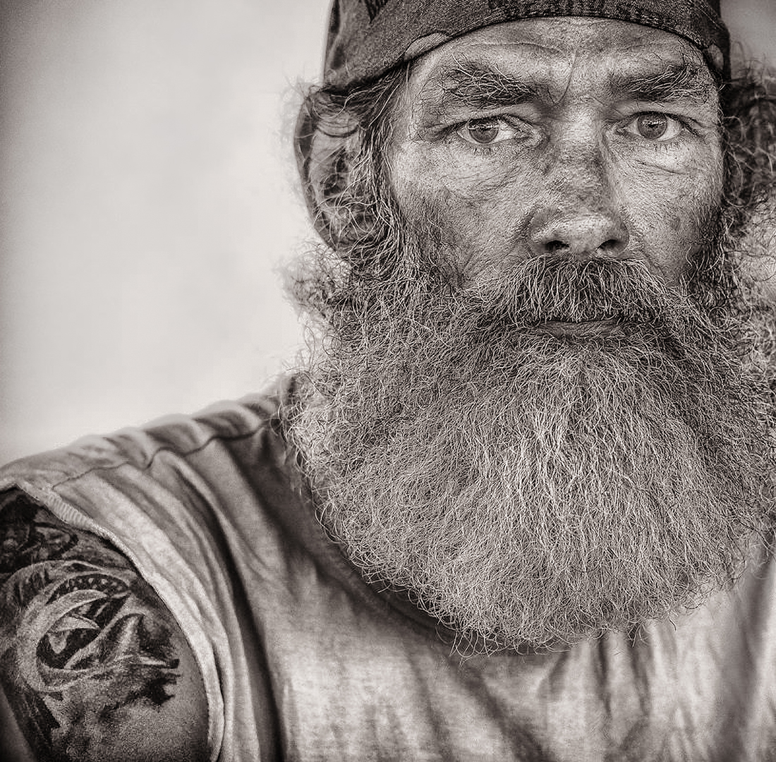
Good composition and texture. Agree with Darlene about the importance of retouching the eye but it looks pretty good already. |
Aug 31st |
| 11 |
Aug 24 |
Comment |
Henry, You might get more drama out of this image if you wanted. Otherwise, sharp from front to back and well toned. There seem to be wires (?) between the end of the blades forming a square. Was that intentional? |
Aug 31st |
| 11 |
Aug 24 |
Comment |
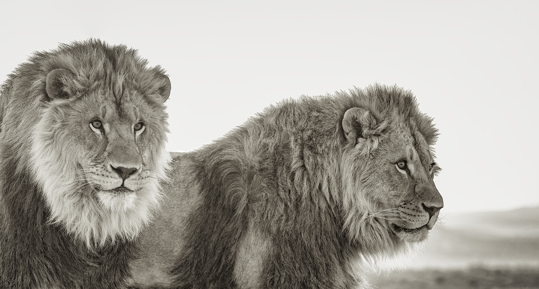
Very beautiful, painterly image. It seems perfectly balanced. The only suggestion is that you might consider retouching the mane to eliminate the dark flecks of the background coming through it. |
Aug 31st |
| 11 |
Aug 24 |
Comment |
Very well done. Congratulation on the award. I live in Arizona and should take some inspiration here. |
Aug 31st |
6 comments - 3 replies for Group 11
|
6 comments - 3 replies Total
|