|
| Group |
Round |
C/R |
Comment |
Date |
Image |
| 11 |
Apr 24 |
Reply |
Thanks Henry. |
Apr 9th |
| 11 |
Apr 24 |
Comment |
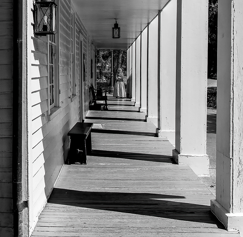
Henry, I really like the cyanotype and sepia related tones of the color image. I'm wondering whether a 2 tone B&W image with cyanotype and sepia tones would look good... probably not but worth a try, maybe! You've neutralized the green in the mono image. That's good.
I see you cropped the top to give it a more panoramic format. Another way that could be done is to judiciously stretch the image laterally with a free transform and the shift key in Photoshop, and optionally crop the top to some varying degree, or not. Just brainstorming things I might try if it were my image. No suggestions otherwise. |
Apr 9th |
| 11 |
Apr 24 |
Comment |
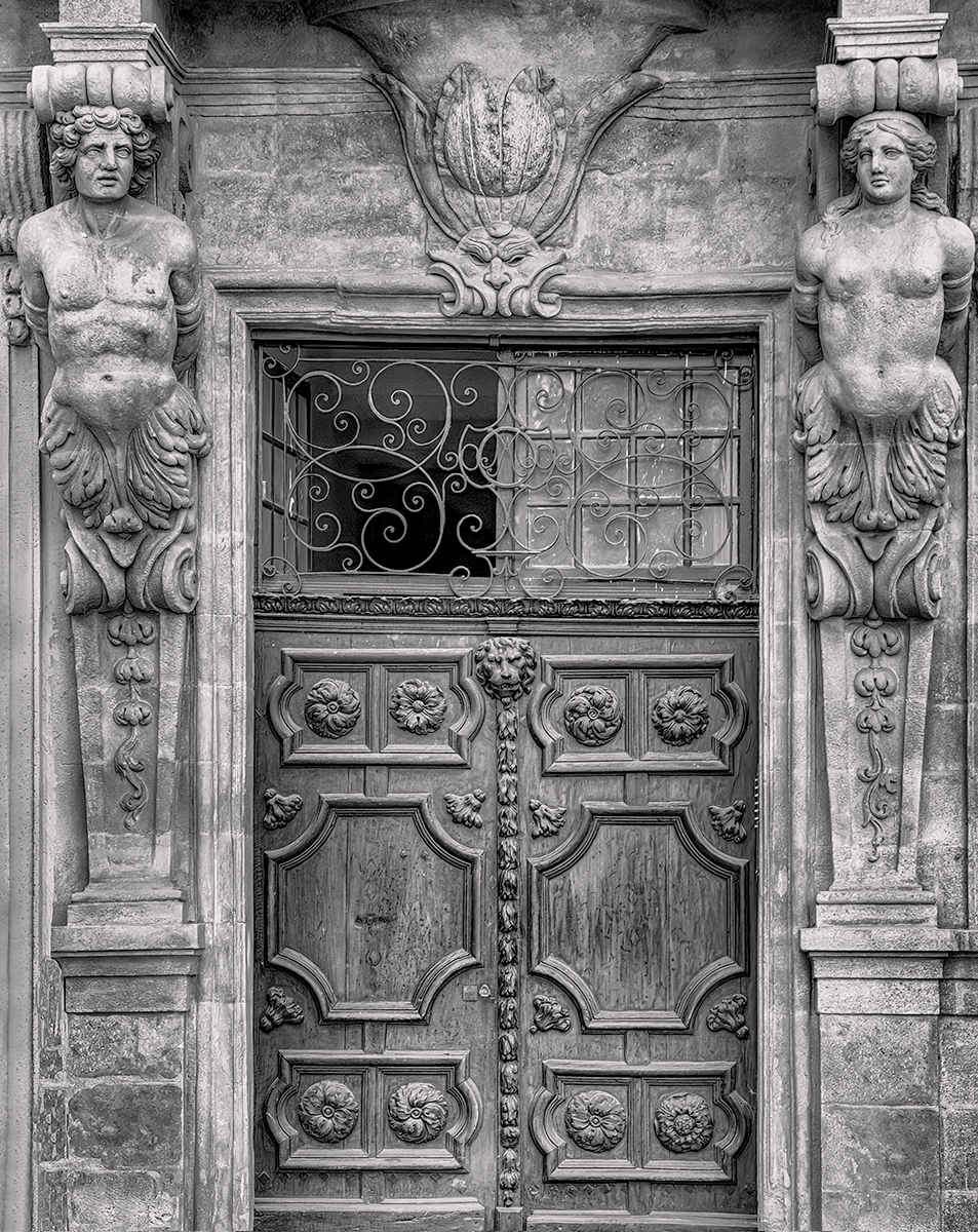
Peter, Format matters. To get a true perspective of your composition I downloaded the mono and color images and then viewed them on a Dell 34 inch diagonal monitor at work. Your images fit well on this screen. The mono image has been cleaned up, of course, but regardless, the proportions look just right. For me the mono image is clearly better than the color image. On my laptops it didn't look convincing. I was not relating to the light background either. This looks great on the bigger screen. No suggestions. |
Apr 9th |
| 11 |
Apr 24 |
Reply |
I see and agree with your point. I worked with the color image I currently have. Although my memory may fail me, I believe there is a sort of ledge-like step that protrudes outwards. Like many other images from an earlier period that I've presented lately, the originals still haven't been merged to my current catalog, so I can't verify this. For the anecdote, this doorway is maybe a half a mile from where my Mom lives. There is a café just to the left with a big outdoor patio. They were nice enough to allow me to move an outdoor menu temporarily so I could get the shot on a tripod very early in the morning before there were too many people. |
Apr 4th |
| 11 |
Apr 24 |
Comment |
Thanks Peter. |
Apr 4th |
| 11 |
Apr 24 |
Reply |
Cool! |
Apr 4th |
| 11 |
Apr 24 |
Comment |
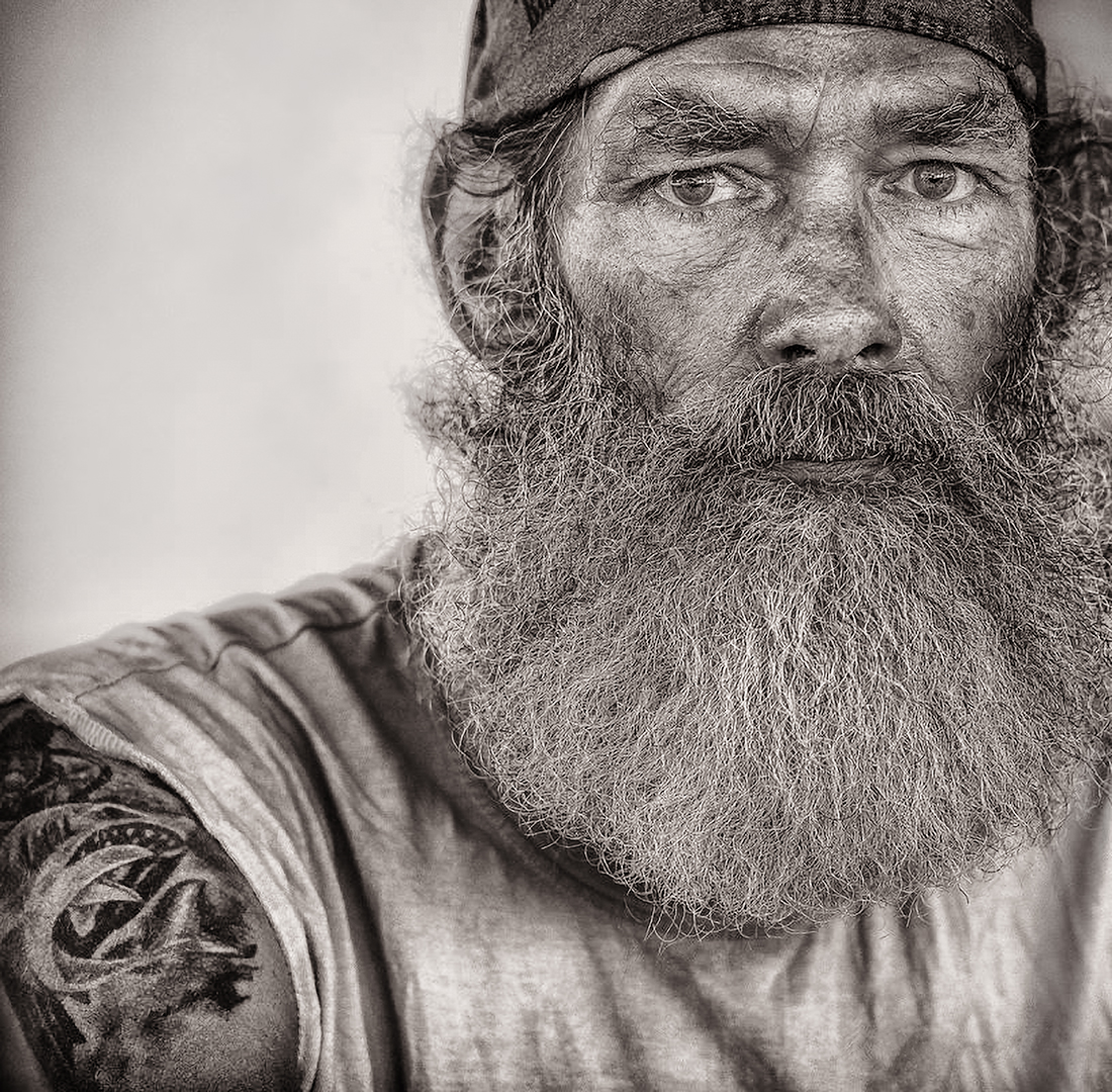
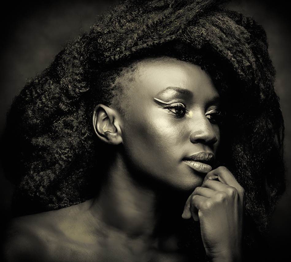
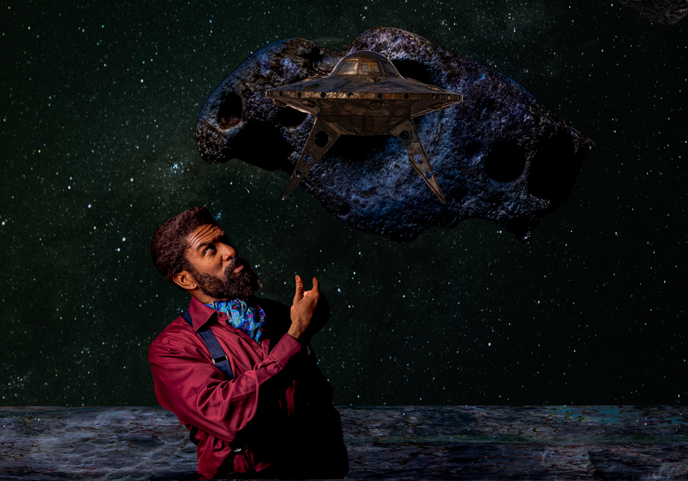
Very nice composition. I find the hand a little too "crunchy", i.e. it could be a little softer, in order to focus more on the face. You could do great things experimenting with burning, IMO, particularly around the top left side of the image. |
Apr 3rd |
| 11 |
Apr 24 |
Comment |
I believe less of the ceiling helps to focus more on the woman. This crop could also be a little higher to include the angle of the second pillar with the ceiling. |
Apr 3rd |
 |
5 comments - 3 replies for Group 11
|
5 comments - 3 replies Total
|