|
| Group |
Round |
C/R |
Comment |
Date |
Image |
| 11 |
Mar 24 |
Reply |
|
Mar 8th |
| 11 |
Mar 24 |
Reply |
I agree with your conclusion. |
Mar 8th |
| 11 |
Mar 24 |
Comment |
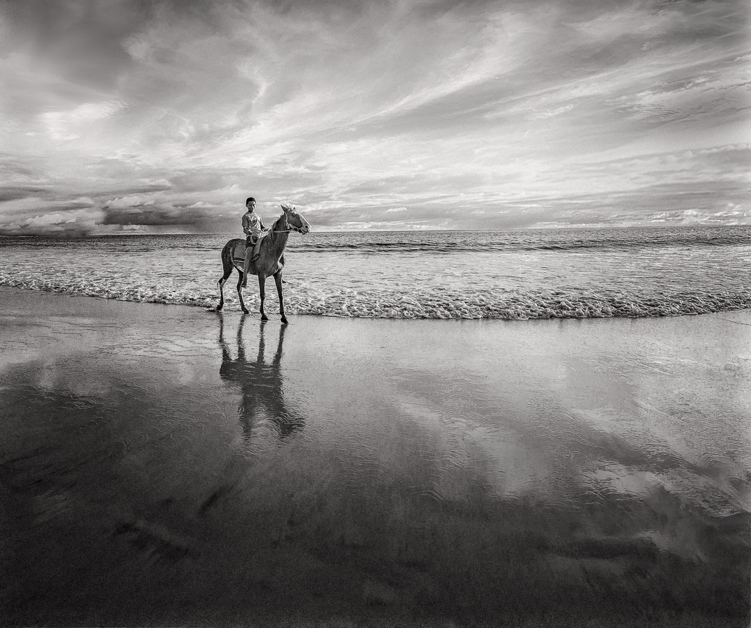
What Jim said.. Tulips with water drops are tried and true. Very well rendered. |
Mar 8th |
| 11 |
Mar 24 |
Reply |
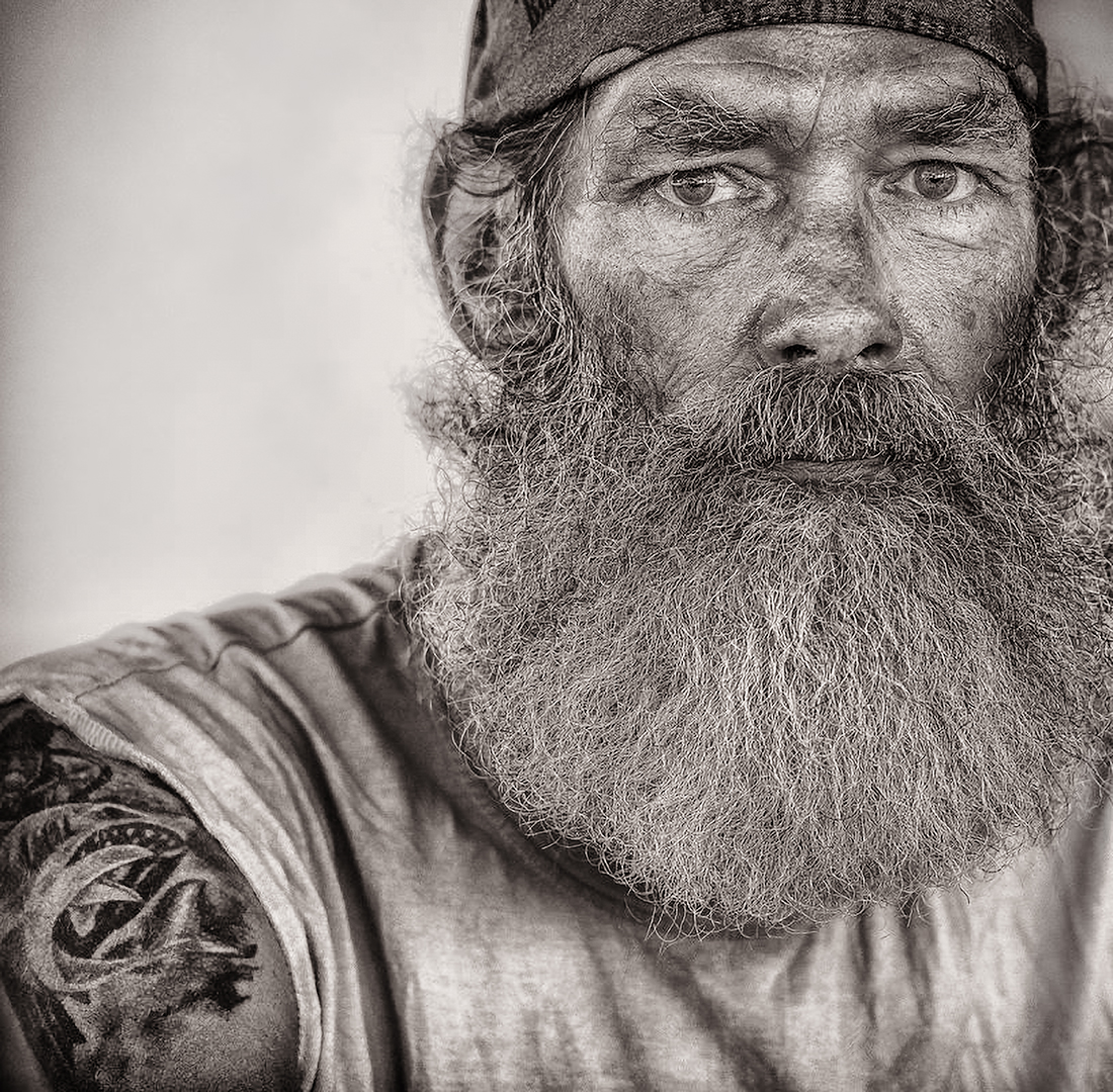
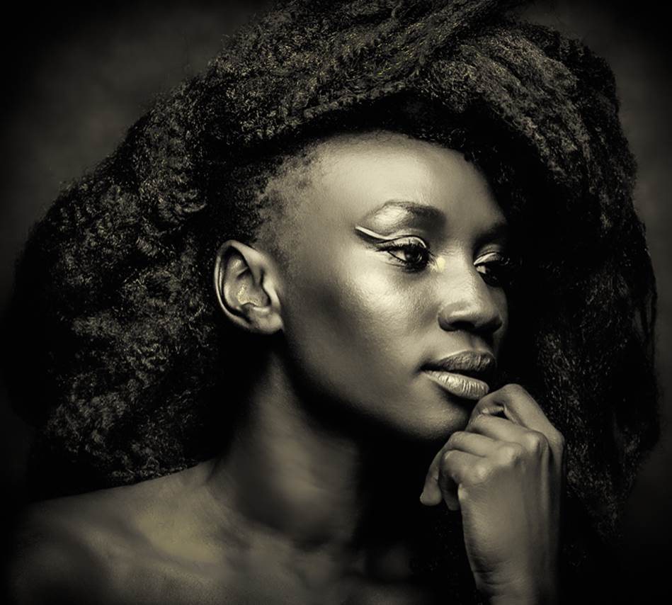
About the chin, OK. The color jpg above, from circa 2012 (not even sure of the date since no meta data) was all I had to go off of. I did not have the editing skills I have today so there must have been a technical reason for this crop of the chin.
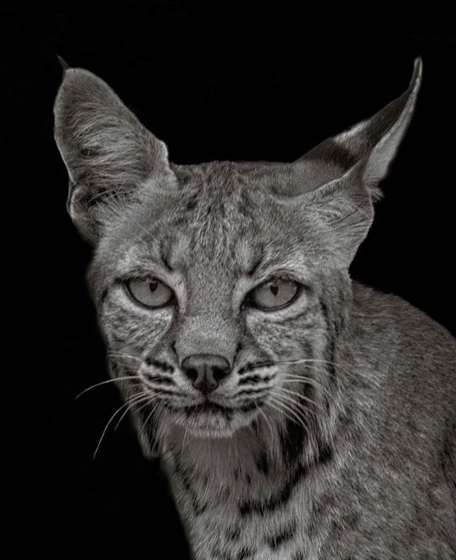
About the title, I think it comes from my instructor in a fashion photography class at Mesa Community College many years ago. He made a distinction between fashion and glamor photography. He said glamor photography involved the model looking into the camera as opposed to fashion photography not looking into the camera. Fashion photography comes across as top of the line but also snooty. Looking into the camera - at the viewer - is more engaging. This is an insider analysis rather than an exact definition. I googled glamor photography and did not find that definition. Yet, if you check "Glamour photography" on Wikipedia, although it mostly equates glamor with eroticism, it includes pictures of dressed models, including Elizabeth Taylor and a head shot of another model looking into the camera. I did not find the erotic element to be evident in either of those shots. Yes, the models are good looking, so de facto seductive... maybe. Looking at the camera is engaging. It's not just a human characteristic. It's true in the animal kingdom generally. In last month's picture the bobcat in my yard is looking directly at me and is perfectly at ease with the camera, communicating non-verbally. I have had similar experiences while diving. In this instance the model is also seductive, not just engaging.
Concerning your comment that the model "would not feel that the image is a glamor shot", I don't know that she would be upset or would care about the title per se. I am respectful of models. I have a model release, BTW. I have lost contact but from our interactions she did not strike me as an excessively vain person, strangely enough.
I did several years of model shoots, both of men and women, and I did a lot of healing in Photoshop. Because of that and from having participated in photo competitions, cleaning up an image, to some extent, is a reflex in everything I shoot. I always process women differently from men. For example, I tend to pull down the mid-tone structure adjustment slider in Nik Efex when processing pictures of women. I do not find the details of this models face objectionable. The flaws I see in my image are the ill-defined, blown out area left of the model's nose, that I might be able to correct if I find the raw image, and maybe the hairline and a few stray hairs. Conversely, I really like the fine blonde facial hair over her right eye-brow. I don't think it or the expression lines should be removed. And yes, we see her pores and the texture of her skin. It's true that my B&W conversion still has a gritty aspect to it. I don't know that it can be avoided completely in a B&W close-up like this without looking inauthentic.
You wrote "your mono image is a very good exact image of a beautiful face." Yes, it is sort of documentary, I guess.
A similar image I found inspiring is the cover of the book
"Photographing Women: Posing, Lighting, and Shooting Techniques for Portrait and Fashion Photography" by Jeff Rojas.
|
Mar 8th |
| 11 |
Mar 24 |
Reply |
Concerning your suggestion of re-processing the image, once I find the original I'll see what I can do. Maybe next week. |
Mar 5th |
| 11 |
Mar 24 |
Comment |
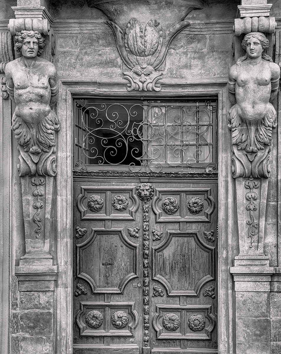
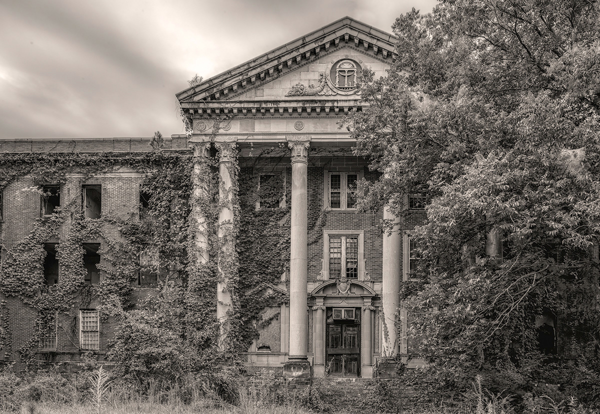
That last large diagonal shaded area near the bottom as outlined by the sunlit bottom left corner is really essential to your image. The suggestion above was rhetorical. |
Mar 5th |
| 11 |
Mar 24 |
Reply |
BTW, nothing wrong with this crop, but it would still work if you cropped the arch out - only if you are trying to simplify the focus in your image. |
Mar 5th |
| 11 |
Mar 24 |
Reply |
Lance, I was a neophyte/total newb when I took this shot. I was not constrained by the standard photography dos and don'ts of exposure - or cropping. Conversely I was more open-minded and creative with this somewhat over-exposed image. It has a sort of pop art appeal where the color dominates because the contrast, precisely, is not developed at all! The strict conversion to monochrome that you made - feel free to include it below - illustrates that without color the image is diminished and requires contrast correction. 12 years later and after a B&W mentorship (with you!) and participating in this monochrome study group I am more conscious of contrast and tonality. |
Mar 5th |
| 11 |
Mar 24 |
Comment |
Based on what you wrote in the description I'm sure you've tried everything. One possibility, nevertheless, would be to crop out the bottom so that the sunlit area in the bottom left corner is no longer visible. That would result in the image being more grounded with a uniformly dark shaded area straight across the bottom. Here's the rationale: the image already works great as it is. It has this "meta" quality where the image seems to continue on and out of the screen and include the viewer. That is due to the repetitive, recursive and EXPANDING pattern of the alternating shaded and sunlit areas. Cropping as I suggested removes that interesting feature. I would keep it - of course! - but if you are submitting to a competition then you have to think like a photography judge and they usually only have 4 seconds to judge among a few hundred images, as explained to me by actual judges. It's just speculation on my part, but your image may not be "simple" enough to be appreciated in the blink of an eye they are given to judge it. Also this sort of concept is really not part of the criteria they systematically judge. It's much more basic. You might crop a little bit of the left side but no suggestions otherwise for normal sharing or contemplative viewing in an art gallery. An afterthought... having just commented on Henry's wonderful image, I noticed that you chose to have no texture. It's all very smooth. Have you already experimented with texture and ruled it out? |
Mar 5th |
| 11 |
Mar 24 |
Comment |
This is lovely, very convincing. Beautiful toning; the cobblestones in particular. I am equally impressed with your gear being able to render F16, 1/800s and ISO 6400 so well. The dream! Not much improvement to suggest here. |
Mar 5th |
4 comments - 6 replies for Group 11
|
4 comments - 6 replies Total
|