|
| Group |
Round |
C/R |
Comment |
Date |
Image |
| 11 |
Feb 24 |
Reply |
You have inspired me to get back to compositing for next month's image. |
Feb 20th |
| 11 |
Feb 24 |
Reply |
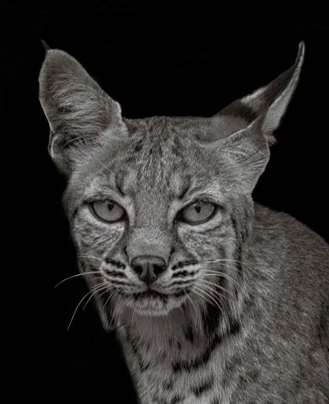
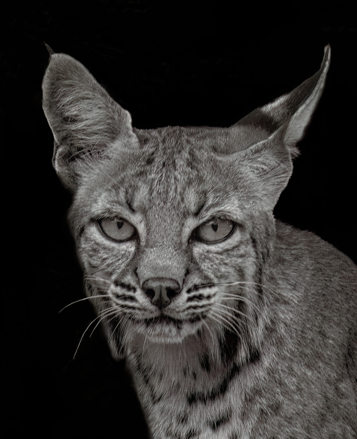
The profile of the left ear (on the right side, facing the viewer) and the jowls are indicative of this being a lynx. The tip of the right ear (left side, facing the viewer) is present. True, it's not on the other side, but since it is black on a black background I thought I could get away with it when it is not being compared to the original color image. Guess not. Indeed, I didn't do a good job of refining the edges.
I will check out your "hair" brush tip and see if I'm clever enough to make it work before month end and re-submit it here. Were you referring to the technique in this link "https://www.adobe.com/products/photoshop/photoshop-brushes/hair.html"? That looks like adding something that's not there, maybe I'm getting it wrong... There are lots of youtube videos about selecting fur in Photoshop. Could you recommend one in particular that works well? Thanks.
|
Feb 20th |
| 11 |
Feb 24 |
Comment |
I prefer the color image. IMO there is more of a story between the green and the beautiful tone of red than just in the forms and gray tones. BTW, you don't have to keep the background as it is unless you are submitting to competitions with specific rules about not modifying the image. |
Feb 11th |
| 11 |
Feb 24 |
Comment |
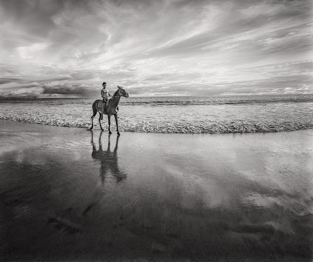
Thanks Henry, Jim. My original submitted image was only 84KB. Yikes!!!
Maybe that accounted for the darkness and lack of sharpness you noticed.
Here is a higher resolution version. I still made it slightly lighter and sharper as you suggested.
|
Feb 11th |
 |
| 11 |
Feb 24 |
Comment |
It looks great! You made something out of not much (fury). The processing of the crests of the waves and the highlighted clouds are complementary and really well done. The darkness at the bottom underscores it well, IMO. I don't have any suggestions. |
Feb 11th |
| 11 |
Feb 24 |
Comment |
Indeed, it is better in monochrome. |
Feb 5th |
| 11 |
Feb 24 |
Comment |
I would have experimented keeping more of the left side. I think the levers AND the octopus-like hoses are cool but all I see immediately is the octopus-like assemblage of hoses because the levers are pushed to the left. I could conceive even having some of the tread in the image. |
Feb 5th |
| 11 |
Feb 24 |
Comment |
The horizon is crooked. Is that intentional? Easy fix. The original is straight. I like the tones and spaces of the original, but I tend to over-do spaces. Understood you are tightening it up and making a nice panorama format. If it were my picture I would experiment balancing a little bit more vertical space, on the top and/or bottom. |
Feb 5th |
6 comments - 2 replies for Group 11
|
6 comments - 2 replies Total
|

