|
| Group |
Round |
C/R |
Comment |
Date |
Image |
| 11 |
Jan 24 |
Comment |
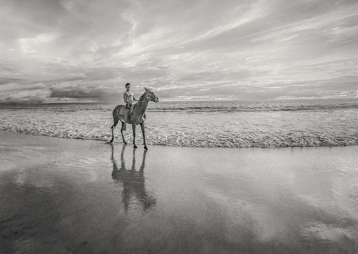
Final version. Thank you everyone. |
Jan 28th |
 |
| 11 |
Jan 24 |
Reply |
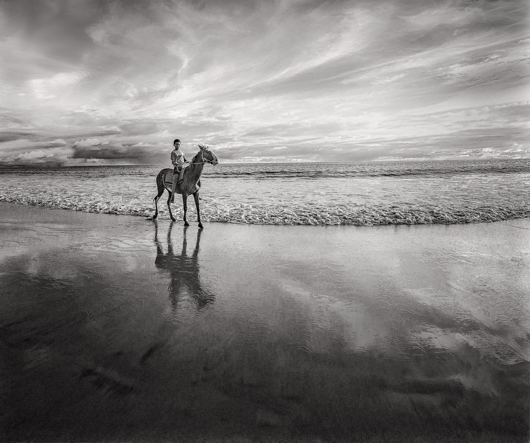
Yes that looks really good with a darker lower half. Thanks Peter, good idea. This is added to Lance and Jim's version. My original version was darker in the lower half so adding that back in. |
Jan 28th |
 |
| 11 |
Jan 24 |
Reply |
I don't contest at all what you are saying. I think the framing is fine. It goes more to Jim's point about blurring the background; it's to get better separation from the background. It has to do with the light area in the upper right corner. The cropping minimizes it a little but also makes me focus less on the background in the top of the image. I don't dare suggest burning the top right corner or replicating the dark shrubs a little towards the top right corner because this is not the style of the picture, but ultimately that's up to you. So it was a trade off. It's a cool place. I was there last year. We don't have a lot of choice of safe vantage points. |
Jan 28th |
| 11 |
Jan 24 |
Reply |
See below the 2 versions as per your suggestion, one made with Light Room and the other in Nik Silver Efex. See also Jim's suggested crops of these versions above. I actually didn't need to backtrack. I like your suggested version a lot. Thanks! |
Jan 21st |
| 11 |
Jan 24 |
Reply |
I was just lucky to have such a beautiful sky. I was only there less than an hour. |
Jan 21st |
| 11 |
Jan 24 |
Reply |
|
Jan 21st |
 |
| 11 |
Jan 24 |
Reply |
|
Jan 21st |
 |
| 11 |
Jan 24 |
Reply |
|
Jan 21st |
| 11 |
Jan 24 |
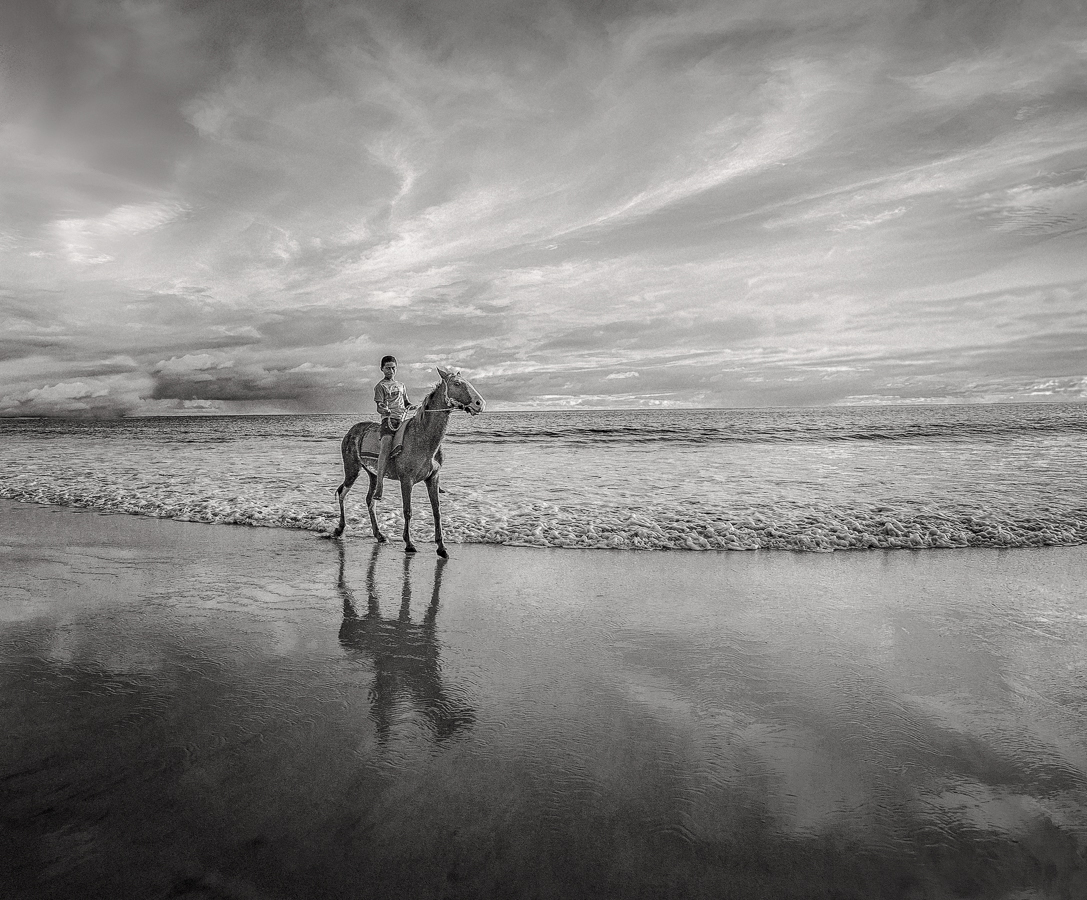
Reply |
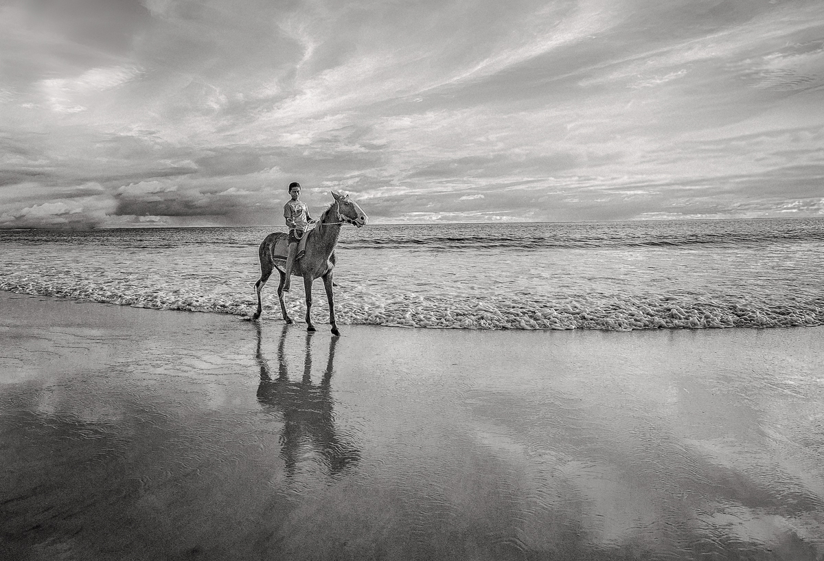
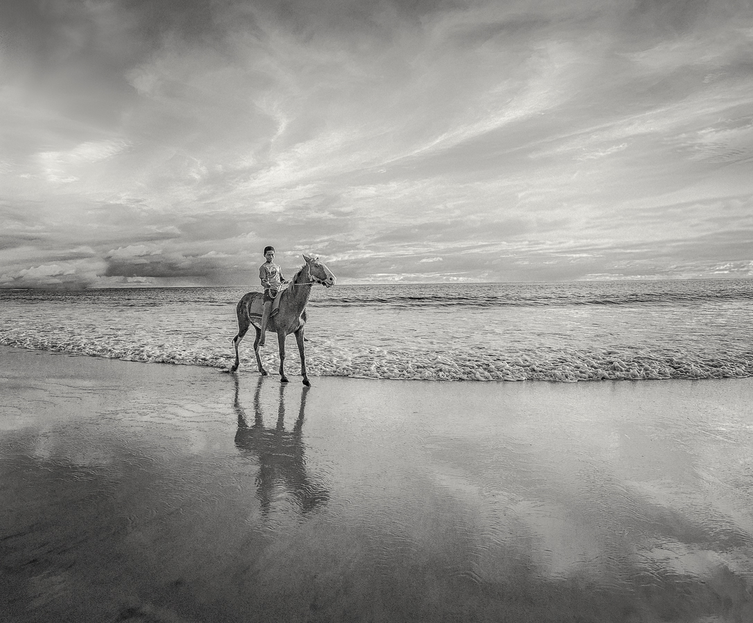
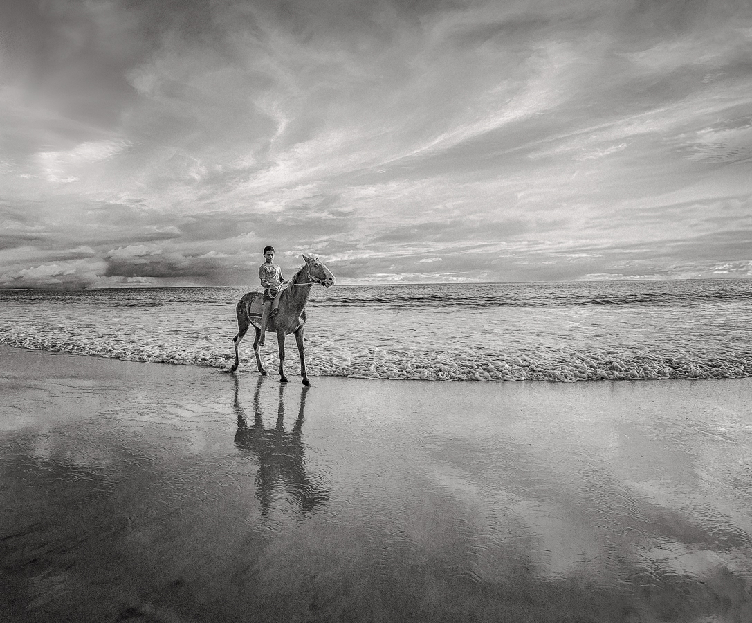
I followed Lance's suggestion (see below) and made 2 lighter versions. I first added some improvements; I darkened the transversal section of sky just above the boy on the horse, homogenized the top 2 corners and removed the dark spot below the reflection of the horse in the sand. Below I applied the crop you suggested to the lightened versions I made in reply to Lance. Both of your suggestions are great. Thank you. |
Jan 21st |
| 11 |
Jan 24 |
Comment |
|
Jan 21st |
 |
| 11 |
Jan 24 |
Comment |
|
Jan 21st |
 |
| 11 |
Jan 24 |
Reply |
I'm working on a softer mono version as per your suggestion. I have to backtrack quite a bit so it might take a couple of days. |
Jan 16th |
| 11 |
Jan 24 |
Reply |
I see your point about making the subject more prominent. I think that is good advice particularly for PSA competitions since judges automatically look for a subject as does the average viewer.
However the beautiful beach and sky are the subject - at least for me, the person who made the image - and the boy on the horse complements them very nicely. Imagine that I separate the boy and the horse from the beach and sky into 2 different color images. If you had to choose only one, then which one would you put on your wall? For me, it's hand's down the beautiful beach and the sky. Part of my decision has to do with the fact that the boy and horse are actually small in my original photo and don't have a lot of definition when we crop in. In B&W things are different. The beach and sky are not as dominant as in the color version and the definition of the cropped-in "subject" is less a problem in B&W. Your crop is a good solution in B&W. If I submit either the B&W or color image for competition I will adopt a similar format. I have several other versions where I also removed more from the bottom or the top and fiddled around with overlays to see how the golden mean and other proportions applied. I'm still looking for a slightly different placement. |
Jan 16th |
| 11 |
Jan 24 |
Comment |
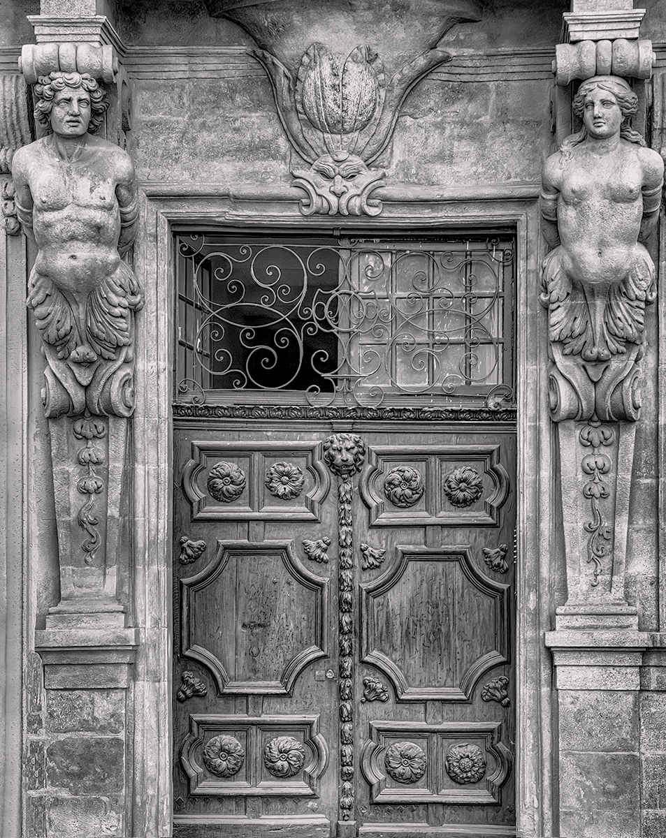
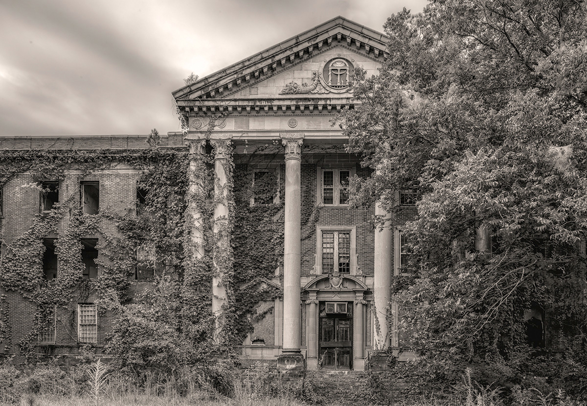
Good light and shadow brought out from the original as per Peter's remarks, and also harmonious texture and balance in the composition, the artistic lines on the window frame. It's not clear to me what the object you moved is, in front of the window, maybe some utility? Although it balances the composition it doesn't seem to go together. Maybe I'm missing a cultural reference here. |
Jan 15th |
| 11 |
Jan 24 |
Comment |
The image works. Looking at the color version I was wondering if you could get more out of the hazy sky and mountains in the back in NSE. |
Jan 15th |
| 11 |
Jan 24 |
Comment |
I like the tonality and general look of the melting snow/ice on the tip of the branch and its immediate background. I agree with the gist of Jim and Peter's suggestions. |
Jan 15th |
| 11 |
Jan 24 |
Comment |
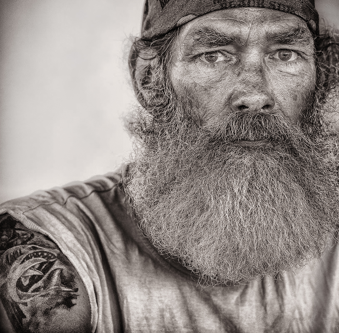
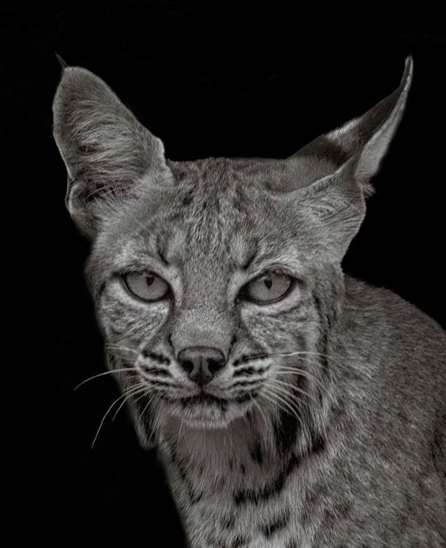
You captured the essence of what made the color photo interesting. The gray tones are perfectly balanced and spot on as far as I can tell. Maybe it's just anthropomorphism on my part, but pinnipeds seem so expressive and familiar, a bit like canines. |
Jan 15th |
| 11 |
Jan 24 |
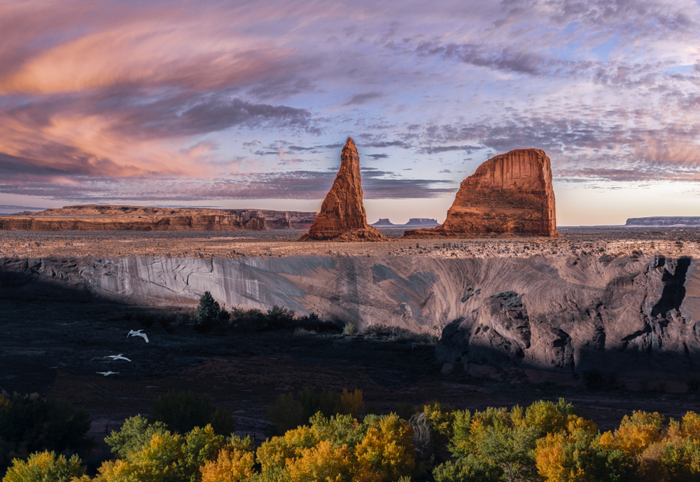
Comment |
You might consider cropping a little off the top, just
a smidgeon above Spyder Rock. |
Jan 15th |
| 11 |
Jan 24 |
Comment |
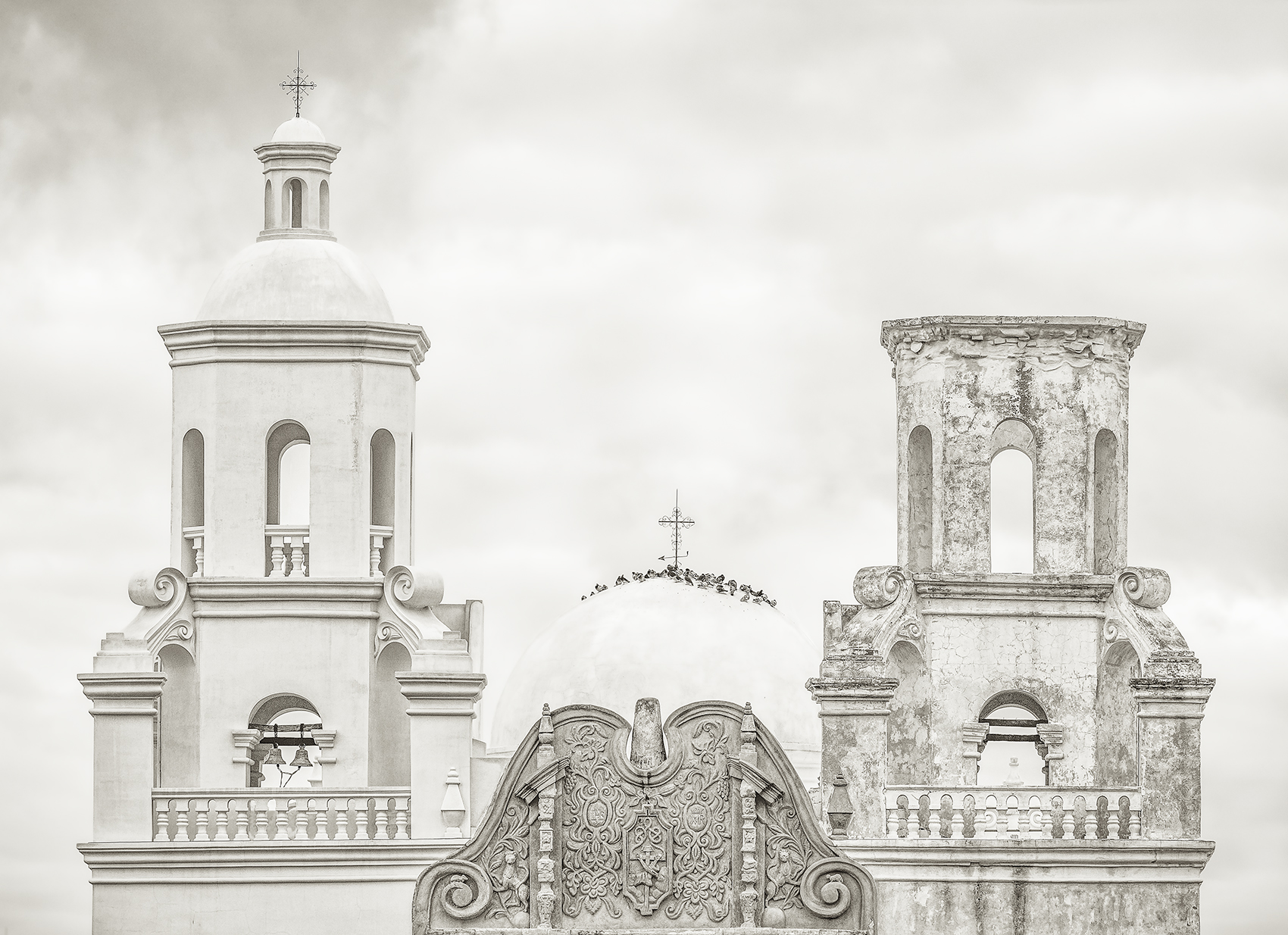
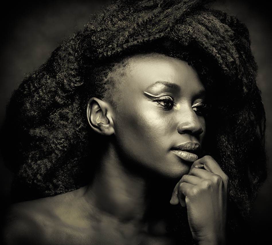
On the sepia bandwagon. I don't notice any blown highlights, no doubt given your processing choices. Very nice composition helped by effective highlighting and painterly look. |
Jan 15th |
9 comments - 10 replies for Group 11
|
9 comments - 10 replies Total
|