|
| Group |
Round |
C/R |
Comment |
Date |
Image |
| 11 |
Nov 23 |
Comment |
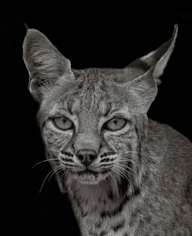
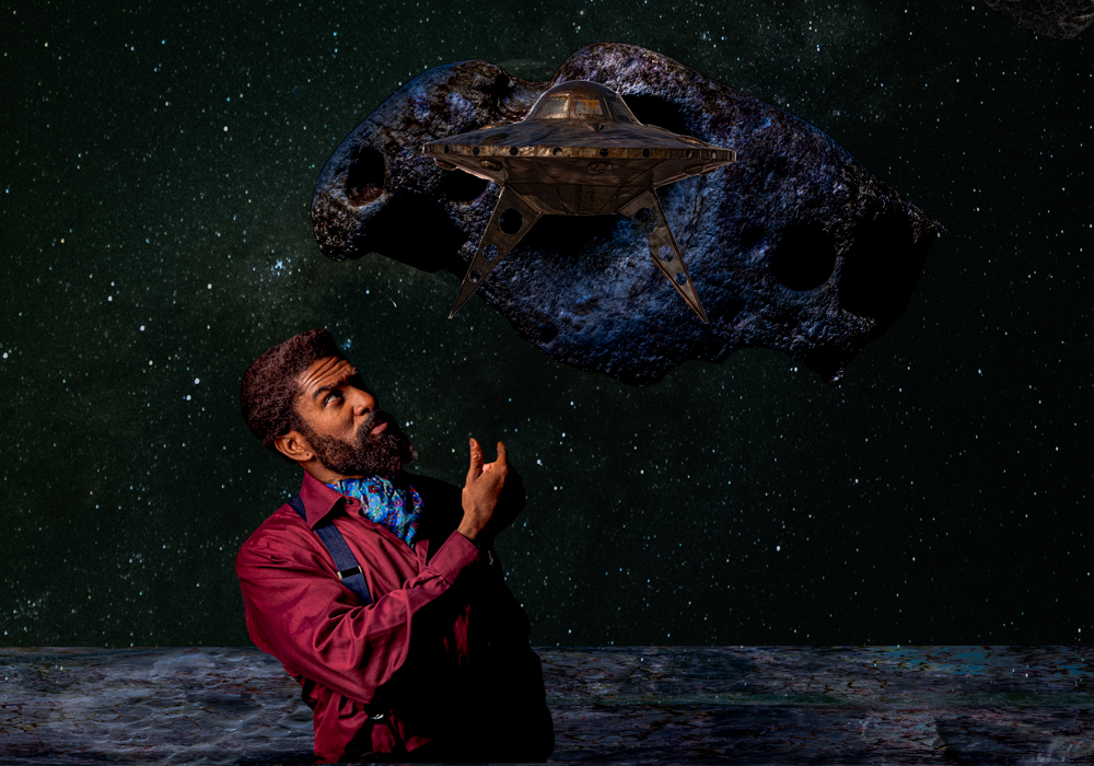
Suggestions?... The facial area is a little blurry. The feet and the body are more in detail. That being said the detail is less interesting in the facial area. Maybe a little sharpening or some kind of accent on the face could help. Otherwise looks fine. Maybe experiment darkening the highlights of the background further? |
Nov 21st |
| 11 |
Nov 23 |
Reply |
I followed your advice for the crop - see color image below. I will come back to this image in B&W when I'm more experienced. |
Nov 21st |
| 11 |
Nov 23 |
Comment |
This cropped color version did much better in my club's competition 2 weeks ago. To Darlene's point I had also thought to trim the branches between the roof and sky on the left. I burned some hotter spots on the right side. I should be using dodge and burn more. Working in B&W should help with seeing that better. To Henry's point I have concluded that one should not bring white chocolate to a dark chocolate competition. And as Darlene points out this is a very detailed, high resolution image. That seems antinomic with what goes on in Nik Silver Efex. I have been using the Fine Art setting a lot. I assume that is the epitome of B&W, and I like it too. It tends to reduce resolution and make everything grainy with amplified black and white. I conclude this was not an easy image for a B&W conversion. Thanks for all the help. |
Nov 21st |
 |
| 11 |
Nov 23 |
Comment |
Since you are eliminating what is not round or circular, a gear or a helicoidal shape, I'm wondering if the chain on the lower right was left intentionally for a purpose or whether removing it would be beneficial. I see that it does balance the image but it seems incongruous. |
Nov 10th |
| 11 |
Nov 23 |
Comment |
This is intriguing. Black on snow; you can't get more contrasted than that. And the sky is gray...
The diagonal angle of the barbeque and the interesting shapes, almost like duplicated double threes, one set black and the other white, crossed by the handle or that weird coil are striking. The other unit behind it gives this enigmatic perspective that is simultaneously on a diagonal and horizontal. Does this apparent banal reality hide abstract and/or symbolic intentions? There's something to it. It can definitely provoke a further look and suscitate speculation from feverish intellects (maybe it's just a barbeque?). How do you analyze your image? What was your artistic intention? Or is this purely a technical exercise? |
Nov 10th |
| 11 |
Nov 23 |
Comment |
I like Henry's version. True, you can't tell that the sloping walls are not the result of lens distortion. There is no way in the image to do that. Jim's version pops out and grabs you and is more dramatically contrasted. As they are not true to life the buildings proportions seem even more fantastical. Feels a bit like a Jorge Luis Borges or Lovecraft story to me. That's good too. |
Nov 10th |
| 11 |
Nov 23 |
Comment |
What a stark difference with the original; the magic of B&W.
Notwithstanding Henry's remark, independently of the global evaluation of the image, I really love the dark rocks.
|
Nov 8th |
| 11 |
Nov 23 |
Comment |
If these guys didn't find anything to improve upon then..
Yes, it is much better than the original. |
Nov 8th |
| 11 |
Nov 23 |
Comment |
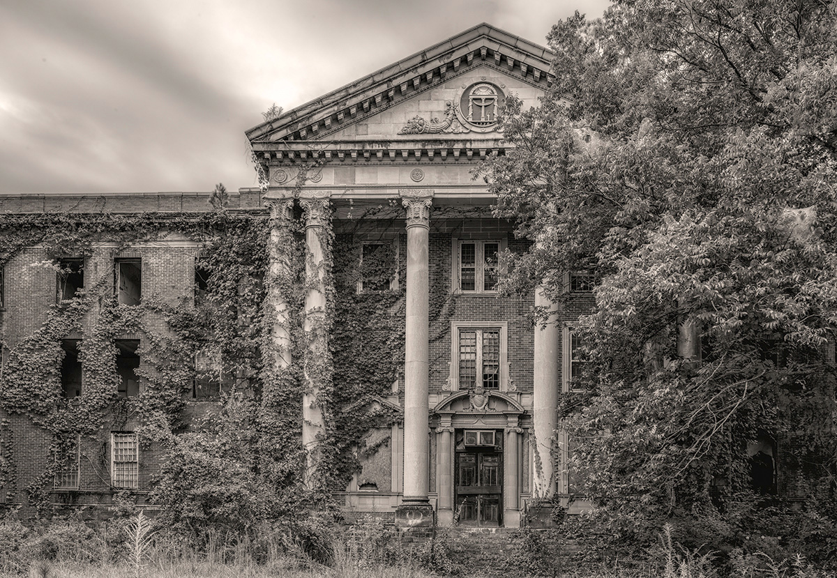
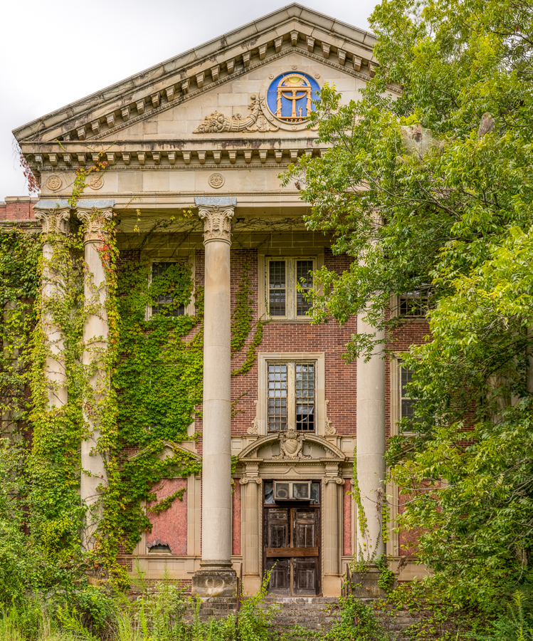
This image was unsuccessfully submitted in my local club's B&W category last month.
This month's "digital theme" in my club is "Ruins", Image of structure(s) in abandonment or decay.
Seems like a perfect opportunity to submit an improved version if it could be competitive.
But the sky isn't great and perhaps that condemns the image to fail in a high level competition (my club is the best in AZ).
Maybe this image is not worth resubmitting in a PSA contest even with a better crop; I'm speculating that perhaps a better photographer would have considered the sky and waited for it to change to make a better composition.
I can't tell if the monthly digital category allows creative license, particularly with the sky. I would suspect not. I could always change the sky to make it a better image though not for competition. Then again maybe the sky would be less noticeable/damning if it were in color. What's your take? I really prefer the B&W version. I also suspect that the image didn't do well because the judges probably have similar taste to Henry for B&W, hence the need to maybe try another processing technique for competition. |
Nov 8th |
| 11 |
Nov 23 |
Reply |
Thanks Henry.
Since the idiom is new to me, what do you mean by "toned black and white"? As opposed to...what type of more standard B&W image?
I'm guessing the idiom tends to images with a lot of black.
(I just bought a book called "52 Assignments: Black & White Photography" and all the images in it are REALLY black). Is that what you mean?
What would this image look like if it weren't toned black and white? What effect could I apply instead? |
Nov 8th |
| 11 |
Nov 23 |
Reply |
Thank you for this improvement.
I was told by people in my club that my image was too busy and they didn't know where to look or what the main subject was supposed to be. They recommended cropping in.
I wasn't seeing what crop would improve the image.
That's probably because I'm OK with an image having nooks and crannies to visit. I spend so much time looking at an image as I edit it that I don't necessarily see it as a flaw.
Seeing your crop didn't immediately register.
After further reflection however here is why I think this crop improves the image, since I feel I need to understand it intellectually.
Immediate human perception of a "good image" is facilitated by the lack of competition of multiple focal points.
This speaks to judging standards that require rapid evaluation.
The Tree was a subject competing with the building.
The part you chopped off the right side had a sort of creepy black hole with a dead branch framing it on the left.
Your crop eliminated the side distraction of the "black hole" and only the left side of the tree persists.
Since only a fraction of it remains and that is adjacent to the right border it is no longer a competing subject; the arc of leaves now frames the left part of the image, the building itself.
The cool-looking ivy spreading from left to right on the façade now becomes more visible and consistent as a unifying element across the image.
I still like my original image because of the slightly more panoramic format. Maybe I would cut off a little less on the right side and/or stretch it out laterally. Agreed, the sepia tone feels better.
I didn't notice that there were still perspective/straightening issues. Where did you apply additional straightening? Is it the top of the building on the left side? |
Nov 8th |
8 comments - 3 replies for Group 11
|
8 comments - 3 replies Total
|